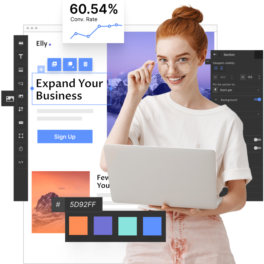
Effective landing page design is the first step on the long road to conversion. If your page is clear, engaging and aligned with design best practices, visitors are more likely to take desired actions. Forester reports that optimized landing page UI (user interface) can boost CTR (click-through rate) by up to 200%, whereas a well-crafted UX (user experience) can enhance it by as much as 400%! Both things are closely related to landing page layout, which is, of course… a matter of design!
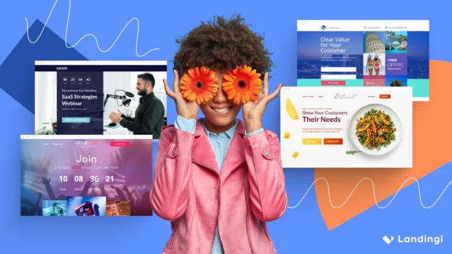
Learn the best design practices and discover the five perfect landing page design examples I’ve encountered during my research. Also, check out similar page templates, which are ready to serve as a starting points for building your own landing pages. Here is the list of examples covered:
If you need a very specific or hyper- creative landing page design and don’t want to create it on your own from templates (or scratch) using a landing page builder, you may always reach out to Landingi design services and simply hire an expert. But even then, knowing the best design practices will allow you to make informed optimizations that are necessary over time to maintain page efficiency.
Let’s start!
What is Landing Page Design?
Landing page design can be viewed as both the creative development and the physical structure (layout) of the page, both following best practices with an eye on its final purpose (conversion). Let’s get into the essentials of both understandings.
Landing Page Design as Creative Development
In the context of the creation process, landing page design involves brainstorming, strategizing, and building a page that meets specific marketing objectives. This includes:
- preparing a landing page project and structure,
- crafting engaging and relevant copy,
- designing visuals (images, videos, animations, buttons, etc.),
- and implementing features like forms or CTAs that align with expected user behavior.
Landing Page Design as Physical Structure
On the other hand, design as a layout refers to how these elements are organized on the page – where text, images, and buttons are placed to create a smooth and intuitive user journey. A well-structured layout ensures that the visitor’s attention flows naturally toward the primary goal of the page, whether it’s a sign-up, purchase, or download. In this sense, landing page design is sometimes equated with landing page templates or landing page kits.
What Are The Best Landing Page Design Principles?
The most prominent landing page design principles can be grouped into several core categories, each addressing a different aspect of design that influences user behavior and, ultimately, conversions. These categories include simplicity and focus, effective communication, user experience, and credibility and trust. Each one includes a set of best practices for a page design. Let’s explore them in more detail and indicate some of these practices that are of major importance.
1. Simplicity and Focus
A key principle in landing page design is to keep the page as simple and focused as possible. This means removing unnecessary distractions and honing in on a single message or offer. For example, a minimalist design helps draw attention to the most important element on the page: the call-to-action (CTA). Pages with too many elements can overwhelm visitors, reducing the chance of conversion. Keeping the design clutter-free ensures that users can immediately grasp the message and understand the next step they need to take.
A focused design might include a clear, concise headline that aligns with the page’s purpose and a CTA button that stands out through contrasting colors or prominent placement. Keeping the number of form fields limited is another way to maintain simplicity, as long, complicated forms can drive users away.
2. Effective Communication
Your landing page should communicate its value proposition and key message quickly and effectively. Visitors spend only a few seconds deciding whether to engage, so it’s crucial to convey the benefits of your product or service in a compelling way. Strong, benefit-driven headlines and subheadings should immediately tell users what’s in it for them. Likewise, using succinct and persuasive copy helps capture and retain attention.
For instance, rather than listing features, the copy should highlight how those features improve the visitor’s experience or solve their problem. Visual aids such as icons or images can also support the messaging by providing an immediate understanding of what the offer entails without requiring too much reading.
3. User Experience (UX)
A well-designed landing page is intuitive and easy to navigate. User experience is fundamental to keeping visitors engaged and encouraging them to take action. This includes ensuring the page is mobile-responsive, loads quickly, and has a clear structure that guides users toward the desired conversion. Pages that are difficult to navigate or perform poorly on mobile devices are likely to result in high bounce rates.
A good UX principle is to use visual hierarchy to direct users’ attention. Important elements like headlines, images, and CTA buttons should be placed prominently and strategically. Whitespace can be used effectively to prevent the page from feeling cluttered, while contrasting colors and large fonts help key elements stand out.
4. Credibility and Trust
Visitors need to trust your business and feel confident in the decision to take action. Building credibility on your landing page is crucial, especially when asking users for personal information or purchases. Trust signals like customer testimonials, case studies, security badges, and third-party endorsements can go a long way in reducing skepticism.
For example, including client logos or review stars gives social proof that others have successfully used the product or service. Testimonials with real user photos and names can make the experience feel more authentic. Additionally, trust badges that communicate secure payment methods or data protection standards offer reassurance to users wary of sharing sensitive information online.
5. Aesthetic Appeal and Visual Design
While simplicity and focus are essential, aesthetic appeal also plays a significant role in how users perceive and interact with your landing page. A visually attractive design with high-quality images, consistent branding, and appealing color schemes enhances the user experience and conveys professionalism. A poorly designed page can give the impression of low quality or unreliability, which can drive visitors away.
For example, using images that are relevant to the product or service reinforces your message and can evoke an emotional response that encourages conversion. Consistent use of branding elements such as fonts, colors, and logos helps create a cohesive experience that strengthens brand recognition and trust.
5 Landing Page Design Examples
The best landing page design examples are ones that are not only visually appealing but, first and foremost, ones that effectively drive conversions to business. There is no better way to learn landing page design practice than analyzing other landing pages made by professional designers for renowned companies. Thus, let’s explore five prominent pages created with the best design practices and principles in mind.
#1 Afluencer
The fourth landing page inspiration is by Afluencer, a platform that helps brands connect with influencers across various niches. Its design enables clear focus from the very first moment you land on the page. The top menu is limited to only one button (“Resources”), so eyes immediately run to the headline and call-to-actions. The former concisely (and precisely!) communicates two value propositions for potential users, while the latter directs them to specific videos, depending on whether they are company workers seeking influencers or influencers looking for collaborations with companies. For both of these groups, Afluencer prepared other videos, which means the audience segmentation job is done.
The page is filled with animations, background videos, and explainers, which perfectly fit with what many influencers do for a living and what companies would like to benefit from. The social proof section, with a number of collaborators and logotypes from different industries, effectively strengthens the overall messaging.
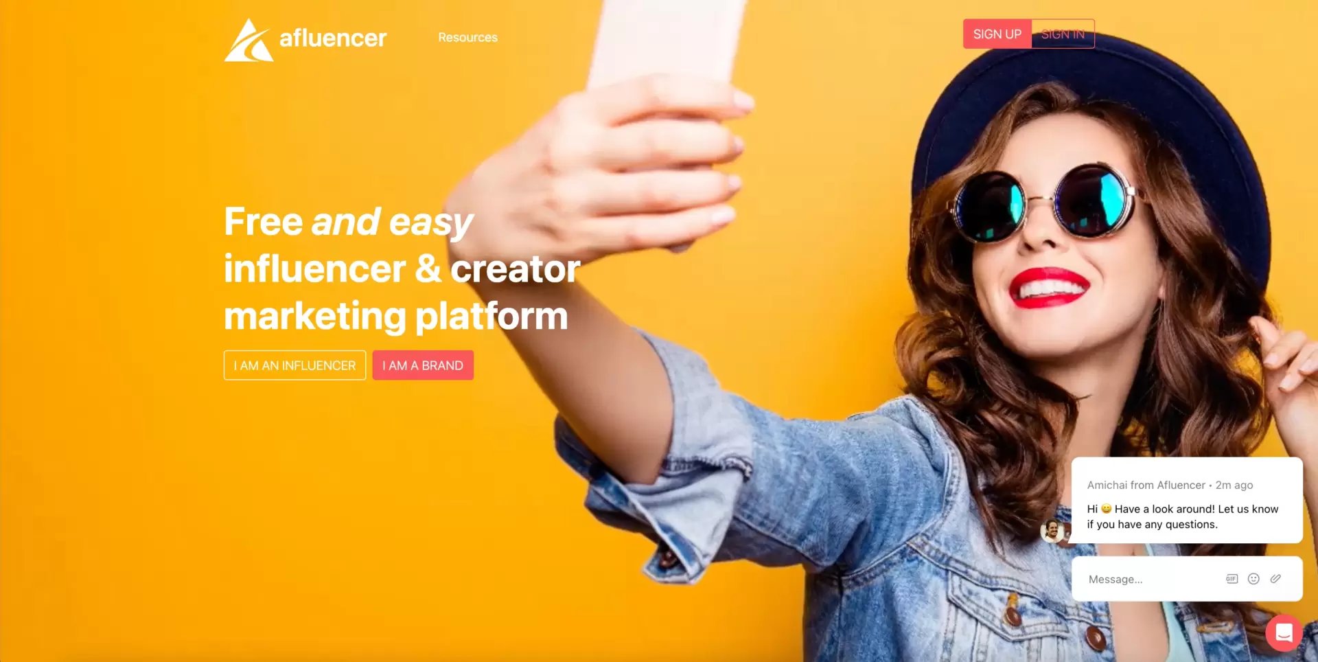
Key takeaways to learn from this example:
- Web design and product alignment: The style of your page should correspond with your product characteristics and the types of elements you use to compose it.
- Eliminating distractions: The key is to have only as many elements (CTAs, links, copy pieces, etc.) on your websites or landing pages as you (really!) need, as every unnecessary element steals attention from key elements and decreases conversions.
- Speaking to audience with multi-media: Some kinds of messages may be more effectively conveyed by visuals (image, video, icons, illustrations etc.) than copy.
- Power of numbers: Copy persuades in minutes, numbers (if properly used) can do it in seconds. They are ideal to foster credibility and confirm that your narrative is true.
- Audience segmentation: To increase the impact, landing page or webpage communication should take into account key groups of targeted visitors and bear messages and/or resources for each group separately.
If this design is close to what you’d like to have on your own landing page, use the Clothing Sale template by Landingi and adjust it freely to your needs.

#2 Similarweb
The Similarweb landing page immediately highlights its core offering: detailed insights into website traffic. The headline clearly communicates the product’s primary function. The only action promoted is typing in the search field URL address of the website or landing page to be audited. Similarweb is confident in its product and, therefore, wants to show users how it works first, thinking that they will definitely get what they expect. But… earlier, after clicking “Search”, the user must provide an e-mail address. So you can test the platform, but only as a lead! The customer journey is precisely mapped and well thought-out (if users click the button, they are potentially interested in the product, so they are likely to share their e-mails…).
No redundant elements, plus many clearly visible social proofs, like big companies’ logotypes and trust badges from G2, complete the picture of the very professionally designed landing page. Also, its loading speed is impressive.
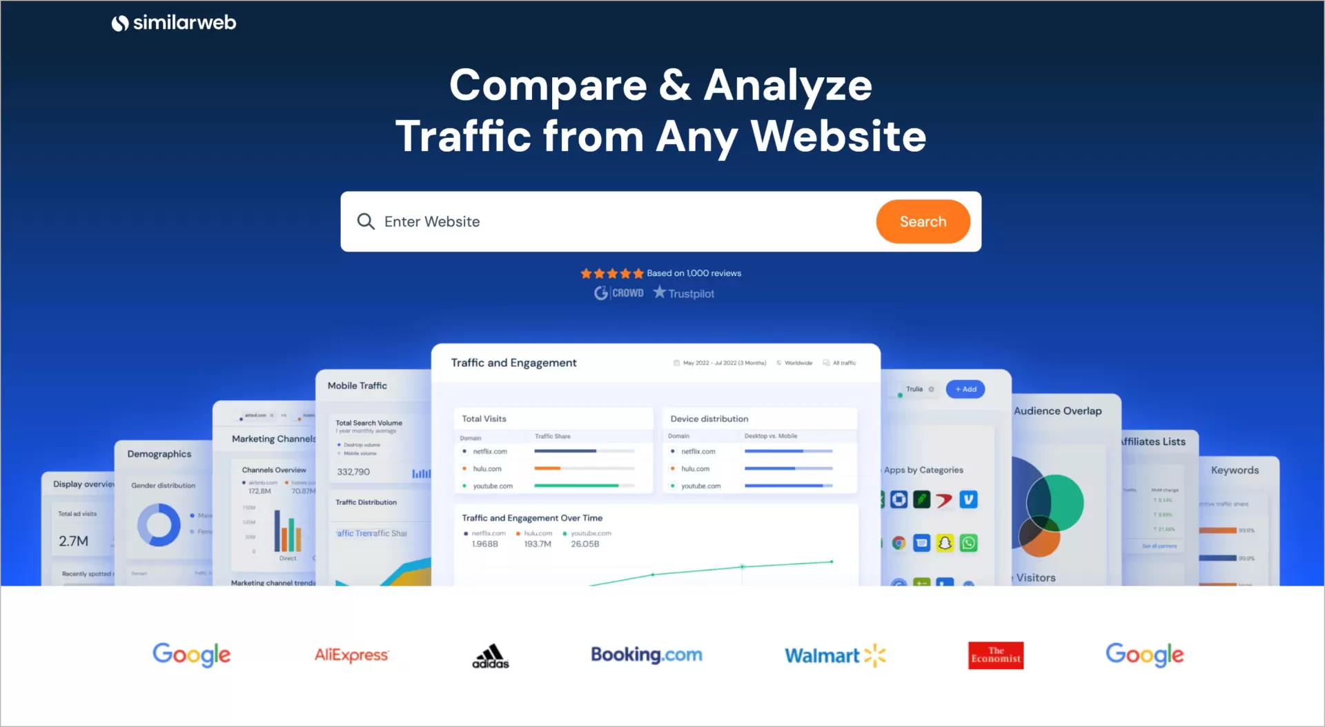
Key takeaways to learn from this example:
- Structured content for easy scanning: The content is divided into straight and clear sections with bold headings and brief descriptions (better for readers than walls of text), making it easy for visitors to quickly scan and understand the main benefits without needing to read every word.
- Highlighting user pain points: By addressing common challenges like competitor analysis and SEO insights, the page resonates with the visitor’s needs, providing solutions directly tied to their potential pain points and encouraging them to convert.
- Clear value proposition through visuals: Each section includes product screenshots that represent the core idea being discussed, allowing users to quickly understand the benefits visually without relying solely on text.
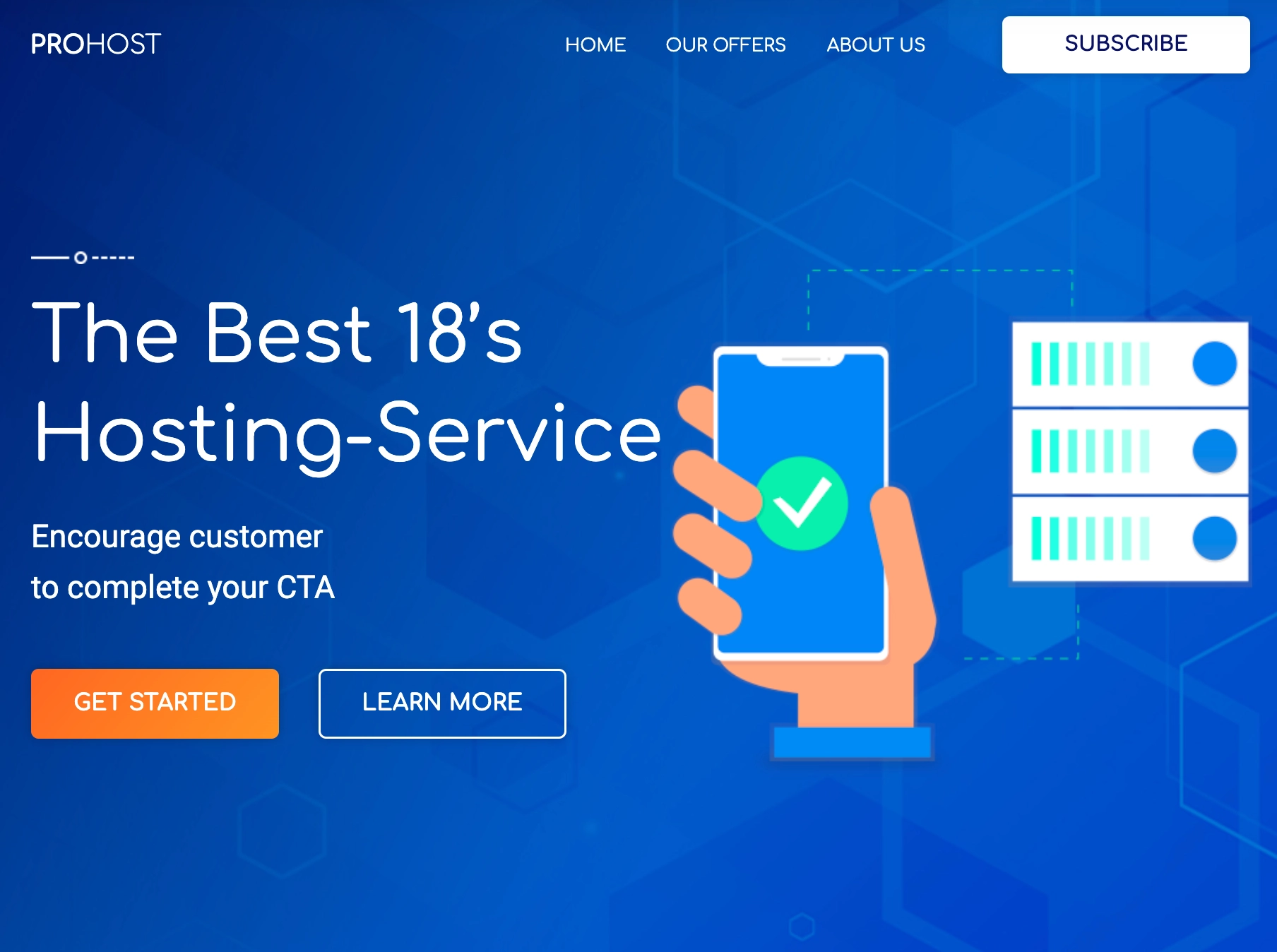
If you aim to create a similar landing page, dive into Landingi’s Software & Technology templates collection and pick one that suits you best. Below, as an example, the Hosting Service kit.
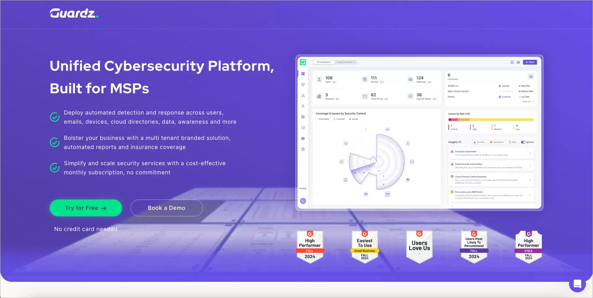
#3 Guardz
This specific page by cybersecurity company Quardz welcomes users with vibrant colors. The first thing catching eyes is the powerful violet in the background and green CTA. White fonts and screenshots are very readable, and you cannot overlook them. The client testimonials box fosters trust, especially when opinions are not anonymous but signed by real people along with their company and position details.
Also, double CTA is a reasonable solution, as both are addressed to different groups. While people who are more advanced in their customer journeys would probably be more interested in a free trial, users who are not sure if the product meets their needs but consider it along with other products would most likely prefer booking a demo. Free resources (“Cyber Risk Prospecting Report”) may, on the other hand, serve as a strong lead magnet, enticing “cold” visitors to engage and explore further. This way, Guardz’s page responds to the demands of three specific groups without losing any of them as potential clients.
Key takeaways to learn from this example:
- Using contrast to highlight essentials: The page takes full advantage of the contrast idea to establish visual hierarchy. Only one green element in the hero section is also the most important one and, indeed, the one visible at first. Also, white screenshots and trust badges stand out brilliantly from the violet background and are immediately noticeable.
- List of benefits means UVP ASAP: You can tell stories about your product’s benefits, but to quickly demonstrate what you mean, it’s better to simply list them. A good practice is also to highlight each benefit with a standing-out icon like a tick.
- Lead magnet for collecting contact information: By offering valuable resources like white papers, webinars, or reports, you can easily get a lead that could be difficult to acquire by other means.
- Quick and easy access to information: Rather than overwhelming the visitor with dense paragraphs, the page uses brief statements and bullet points to highlight key features, ensuring that visitors can absorb the core points quickly and efficiently.
Got inspired by this example and would like to build something alike? Just use Landingi’s Webdesign Ebook template, customize it easily in every detail and publish for free.
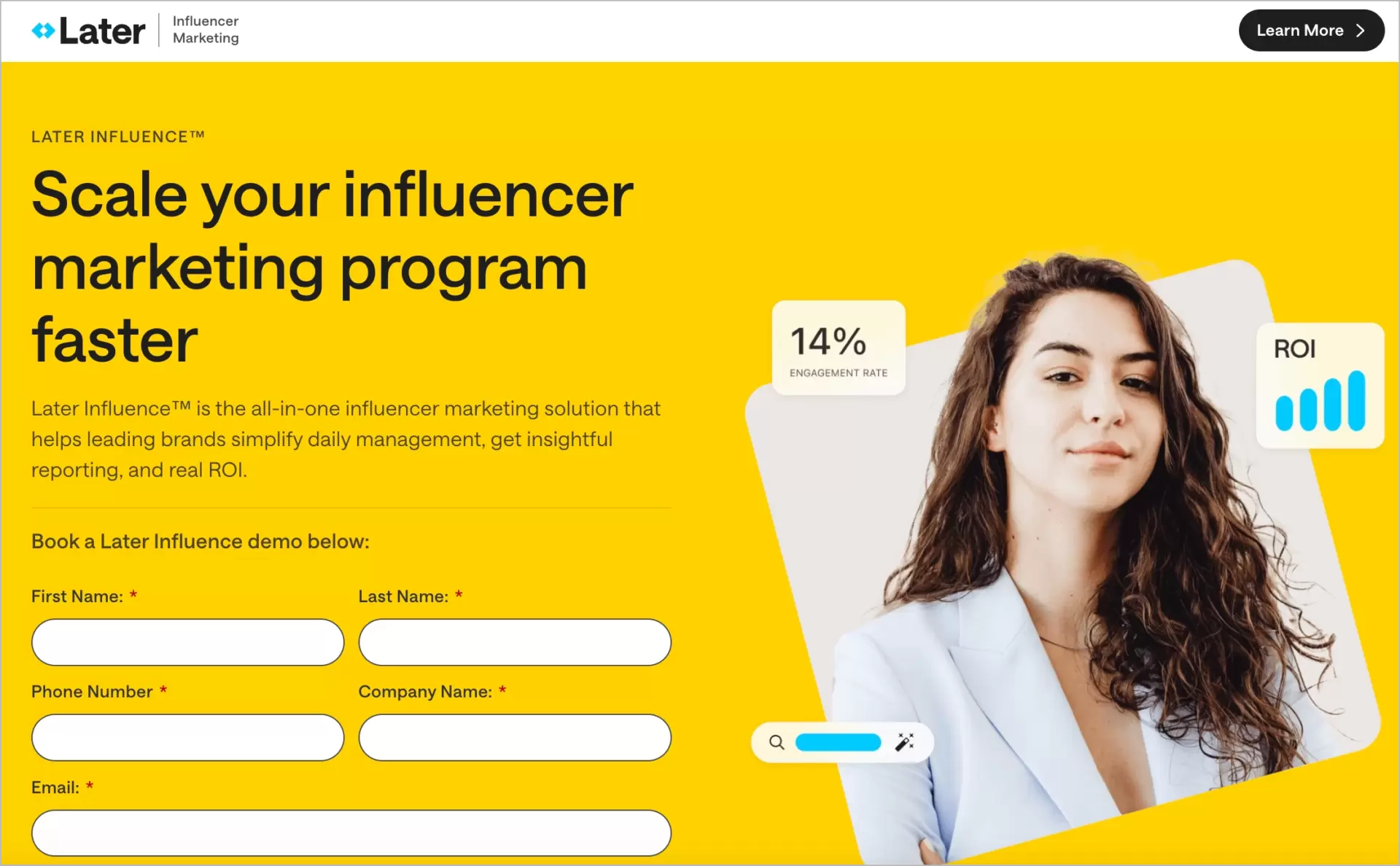
#4 Later
The Later landing page focuses on providing a straightforward solution for finding and collaborating with influencers (just like Afluencer from one of the previous examples), emphasizing simplicity and user-friendliness. The design aligns perfectly with its target audience – visually-driven, social media users – using a soft color palette and modern typography that feels … inviting. The headline, “Scale your influencer marketing program faster,” directly addresses a common pain point and clearly stands out against the background, encouraging conversions.
The page effectively uses visual hierarchy to present content in digestible sections, guiding users from the problem to the solution. With well-exposed form, concise copy and product imagery, the benefits and key features of the platform are easily understood.
Later, it segments the audience by addressing various niches, reassuring users that the platform suits a wide range of influencer marketing needs. Subtle animations and images enhance engagement without distracting from the main message, while screenshots of the product showcase the dashboard, helping visitors visualize its use in their own work.
Key takeaways to learn from this example:
- Highlight a clear value proposition: The main headline directly addresses a pain point and offers a solution, effectively grabbing attention and setting the tone for the rest of the page.
- Guide users through a logical flow: A well-structured visual hierarchy helps users easily follow the narrative from problem identification to solution and action, ensuring clarity.
- Showcase product benefits visually: Screenshots and visual cues allow visitors to quickly understand how the product works and its advantages, providing context without overwhelming text blocks.
- Drive conversions with a straightforward CTA: Although “Learn more” isn’t generally considered an “actionable” CTA, it could be a perfect fit for nurturing leads that are, at the moment, not hot enough to bring monetary conversion.
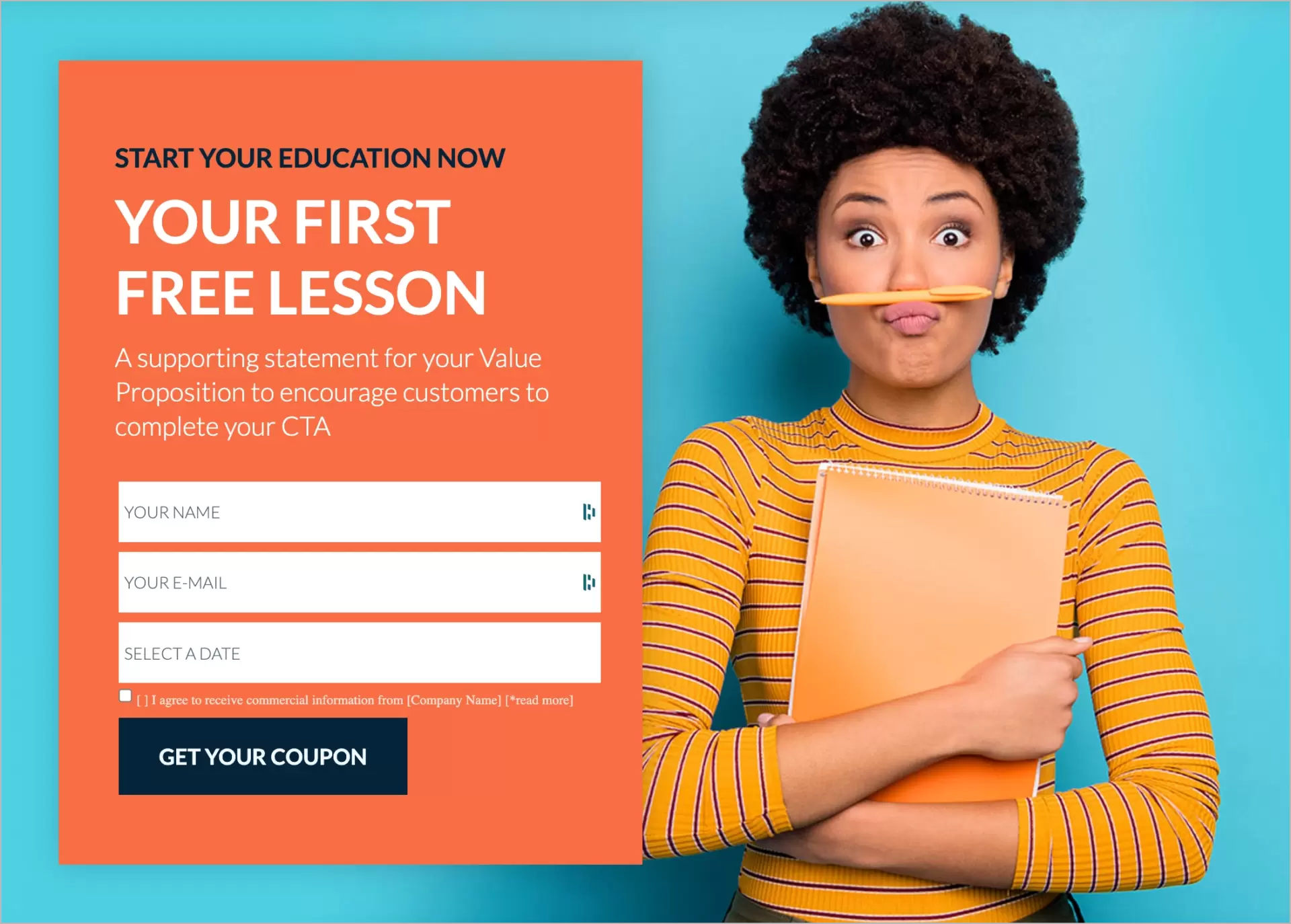
If you need a straight page with a form in the hero section, you may want to try Landingi’s School Courses template, presented below.
#5 Zoho CRM
This landing page from Zoho CRM is designed to emphasize its main value proposition: helping businesses build “everlasting customer relationships”. The page creates a clear focus by using a minimalistic design with no links and disctractions in the header. This directs user attention to the headline and the prominent call-to-action (CTA) buttons that prompt visitors to sign up. The headline itself delivers a strong and emotional appeal, highlighting long-term customer relationships as the key benefit of using their CRM software.
The page’s design echoes the professional nature of CRM software, using clean lines and a modern color scheme that matches Zoho’s branding. The design is understated yet effective, ensuring that the product’s features and benefits are at the forefront without overwhelming the visitor. This simplicity is key to allowing the complex nature of CRM software to shine through in an approachable manner.
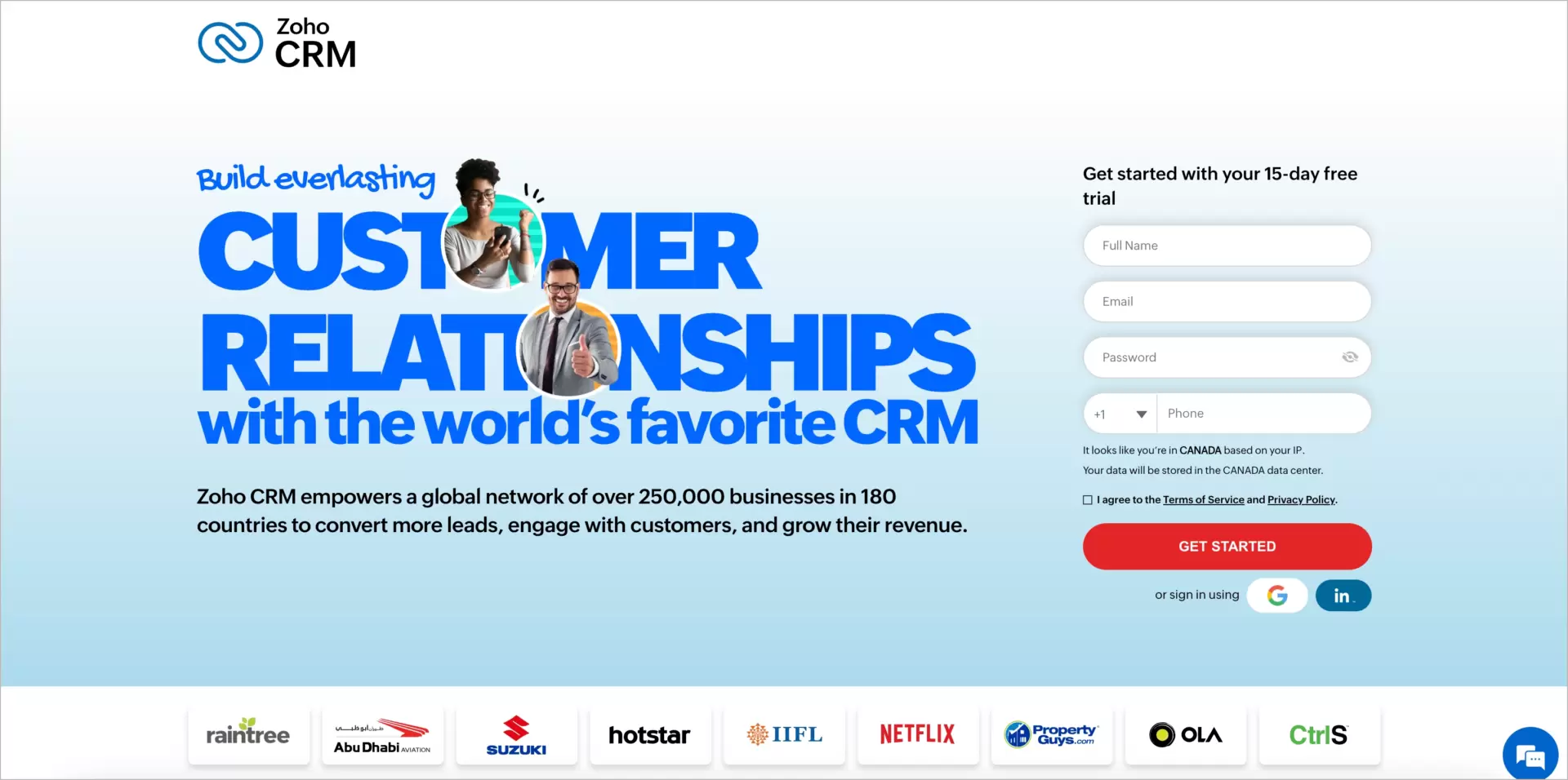
Key takeaways to learn from this example:
- Web design should complement the product: Zoho CRM’s simple yet professional design matches the business-centric nature of the product.
- Focusing attention: Limiting navigation and distractions helps direct user attention to the key CTA and the benefits of the software.
- Social proof: Highlighting trusted brands and user numbers helps build credibility and reassures potential customers about the software’s reliability.
- Consistency in messaging: The emotional appeal of “everlasting relationships” is consistent throughout the copy, visuals, and design, making the value proposition clear and memorable.
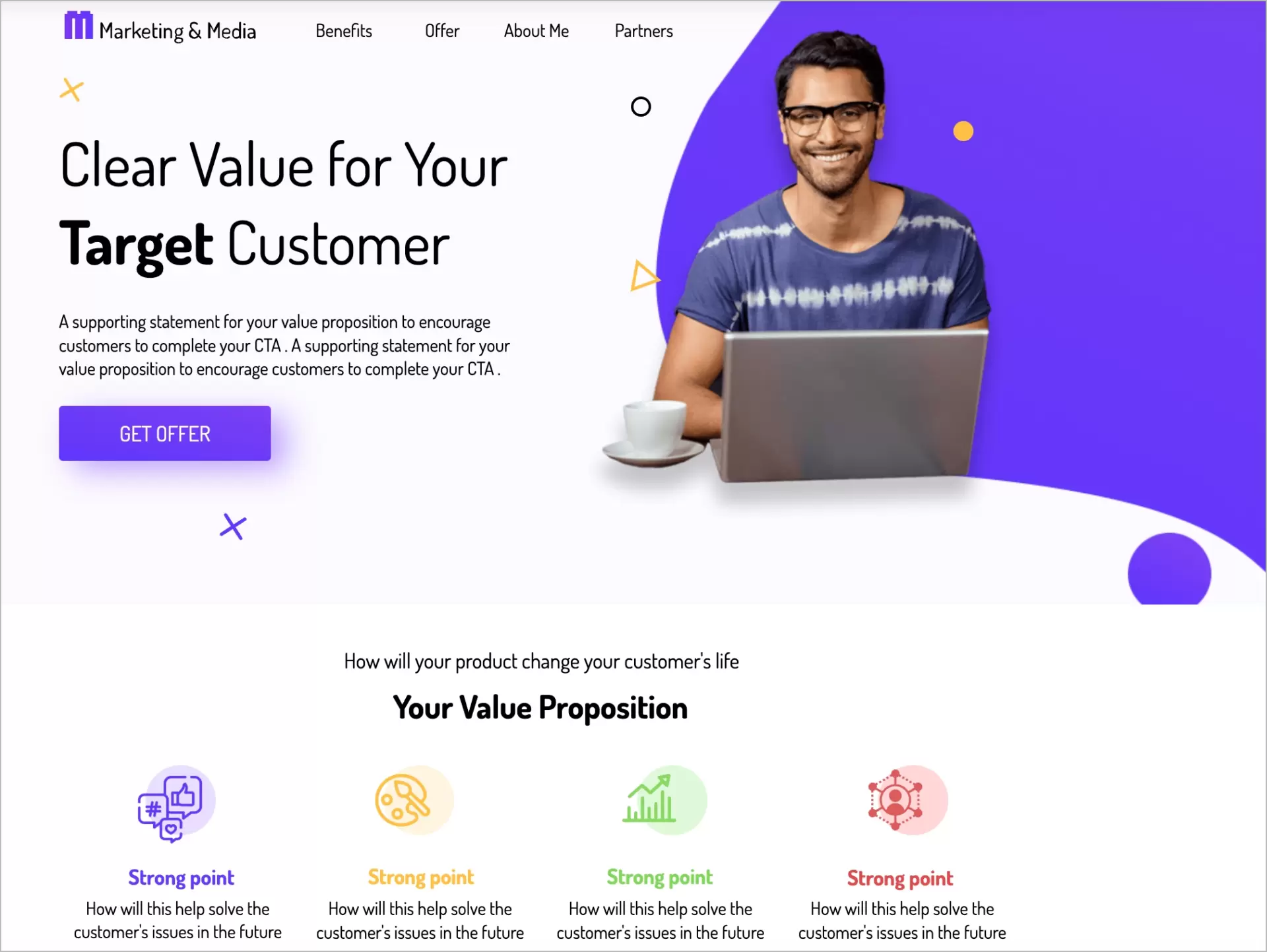
If you are looking for a landing page template for your marketing software product, consider the Digital Marketing Consultant kit by Landingi:
Do you know other pages you feel are good enough to be listed here? Or maybe your own deserve it? Just let us know, and we’ll consider an update to this ranking!
What is the Landing Page Design Cost?
Landing page design cost vary from $0 (if you use free landing page builders and create it yourself) to more than $3000 (if you order a very specific landing page from a marketing agency). These numbers apply for most landing pages, but a real cost depends on many factors such as functionalities used, the level of complexity, content delivery, SEO and mobile optimization, established integrations and technical parameters (like infrastructure, page-loading times, etc.). Here is a more detailed cost estimation for basic, advanced and custom landing pages:
- Basic landing page design typically costs between $0 (if you use free plans in landing page building platforms like Landingi) to $500 (agency services).
- Advanced landing page design usually costs between $1160 and $10,000.
- Custom landing page design costs usually are in the range of $500–$3,000.
One general rule applies to these estimations: the more you do yourself with the landing page builder, the greater your savings. Simultaneously, hiring a freelancer or design expert is often more cost-effective than outsourcing it to an agency.
Where to Find Best Landing Page Design Templates?
Best landing page templates can be found in Landingi, Carrd and Kajabi. All of these platforms offer modern and fresh kits for various industries, page goals and with different styles applied. One feature that makes Landingi the most reasonable option is the outstanding number of these templates, which exceeds 300. This value is currently the highest one on the market.
Also, it’s noteworthy that both Carrd and Landingi offer free design templates that you can use even on their free plans. Dive into their galleries and check out whether there is a pick for you.
Why Landing Page Design is Important?
Landing page design is crucial because it directly impacts conversions and user engagement. Companies that follow best practices and principles of design web construction observe surges in CR. Statistics confirm this without a shadow of a doubt. Here are a few examples to consider:
- Removing the navigation menu from landing pages can increase the conversion rate twice (according to VWO).
- Removing at least one field from the form placed on a sales page may increase CR by 50% (according to Sender).
- Adding a value proposition to copy around the CTA (like, e.g., “receive response in 24 hours”) is able to bring you 15% rise in CR (according to KlientBoost).
- A responsive website design can boost mobile conversions by 25% (according to Snap Agency).
Sometimes, even a very minor tweak, like adding a single call button or changing the CTA’s background color, can be a real game changer.
Design Landing Pages with Landingi
Enough theory, let’s step ahead into the practice! Build your own landing page and try to apply all the design principles and best practices you’ve learned.
In Landingi you can start your landing page design adventure for free. The platform allows you to create landing pages using a no-code landing page builder equipped with features like ready-to-use sections and elements, AI content and SEO tools, or thousands of images from an integrated Unsplash gallery.
You can build pages from scratch or use one of 300+ landing page templates crafted for different industries and goals. If you don’t want to build yourself, you may even hire an expert from Landingi’s design services and enjoy a hands-off experience while they bring your vision to life.
Hop on a free trial and test your design skills in action!