
Selling B2B products often comes with a lengthy sales process — and a lot of prior research by the customer before they sign up or reach out.
Yet, a powerful B2B landing page can help convert prospects earlier in the funnel through early-stage signup forms (Like e-book signups, webinars, etc.), allowing companies to start nurturing prospects through email drip campaigns, retargeting, and follow-up by the sales team.
An effective B2B landing page can even persuade later-stage prospects into finally converting, whether that means direct signup, demo request, or call to your business.
To help put you on the path to building the perfect B2B landing page for your business, this guide will cover best practices and real-life examples for you to draw inspiration from. So let’s get to it!
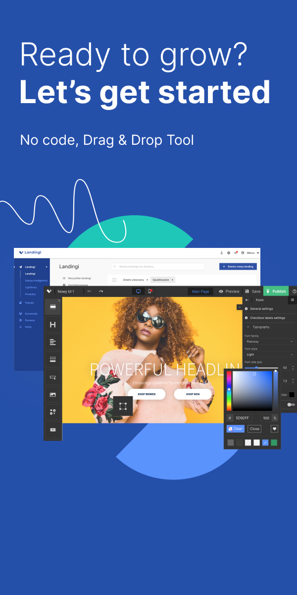
Make your sections smartable and let go of mundane manual tasks with Smart Sections! An easy way to manage bulk changes.
What are B2B Landing Page Best Practices?
- Focus on clear copy: Your landing page copy should clearly highlight the audience’s pain points and explain how your solution/product addresses those pain points. The headline and subheader should also showcase the company’s Unique Value Proposition (UVP).
- Ditch the navigation bar: B2B landing pages need to draw full attention to the promoted product. Including a navigation bar will likely distract visitors and lead them to other parts of your website.
- Emphasize visuals: Use your hero image and supporting visuals to showcase your product in action. This provides more context and further educates visitors about how your product works and how it addresses their pain.
- Add social proof: B2B products may take more convincing due to their complexity. Include social proof (e.g., testimonials, reviews, or trust badges) to build credibility and eliminate any potential uncertainties.
- Include minimal CTAs: It’s best to include one or two CTAs on your landing page — one above the fold and the other at the bottom, for instance. They should stand out and clearly state your intentions.
25+ High-Converting B2B Landing Pages
1. Intercom
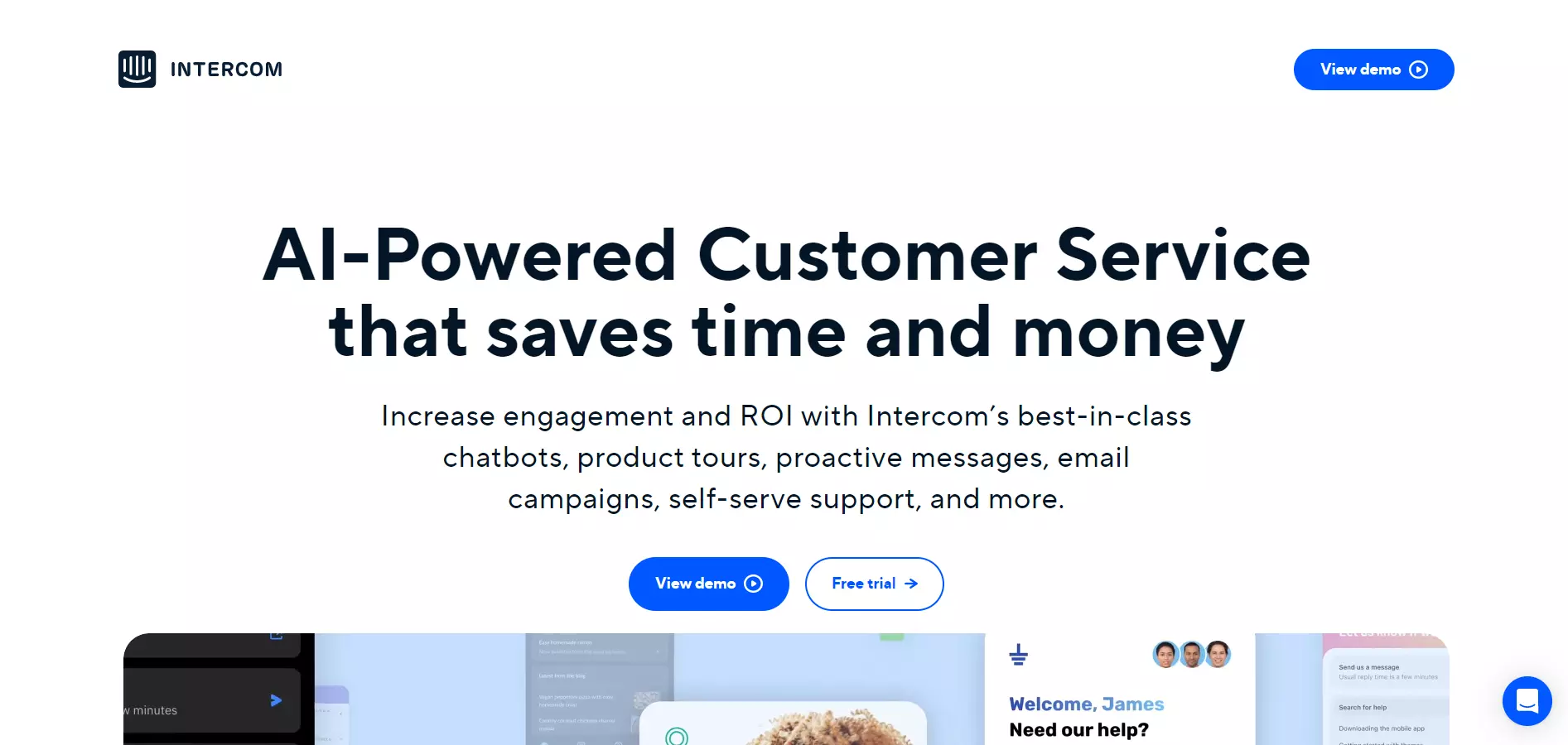
View Full Page: Intercom
Intercom is an excellent example. The page’s headline and supporting copy successfully present what the product is and its benefits.
Visitors have the option to view a demo to see the product in action, or signup for a free trial immediately via the two CTAs placed in the center of the webpage. Notice how the headline, tagline, and CTA buttons are in line.
This complements visitors’ natural reading patterns and guides users down a straightforward conversion path. There’s also a secondary CTA in the top-right corner of the screen.
More information regarding the product’s key features is found below the fold, along with supporting visuals.
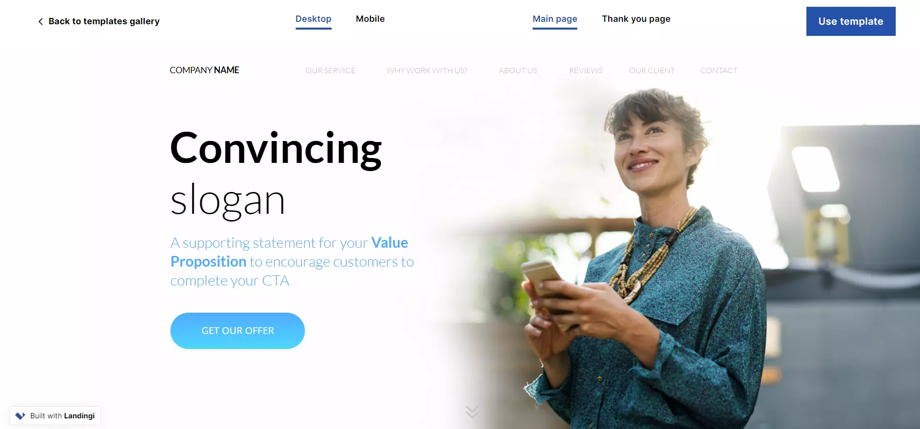
Build a page just like this one with Landingi’s Web Platform template.
2. Zoho Social
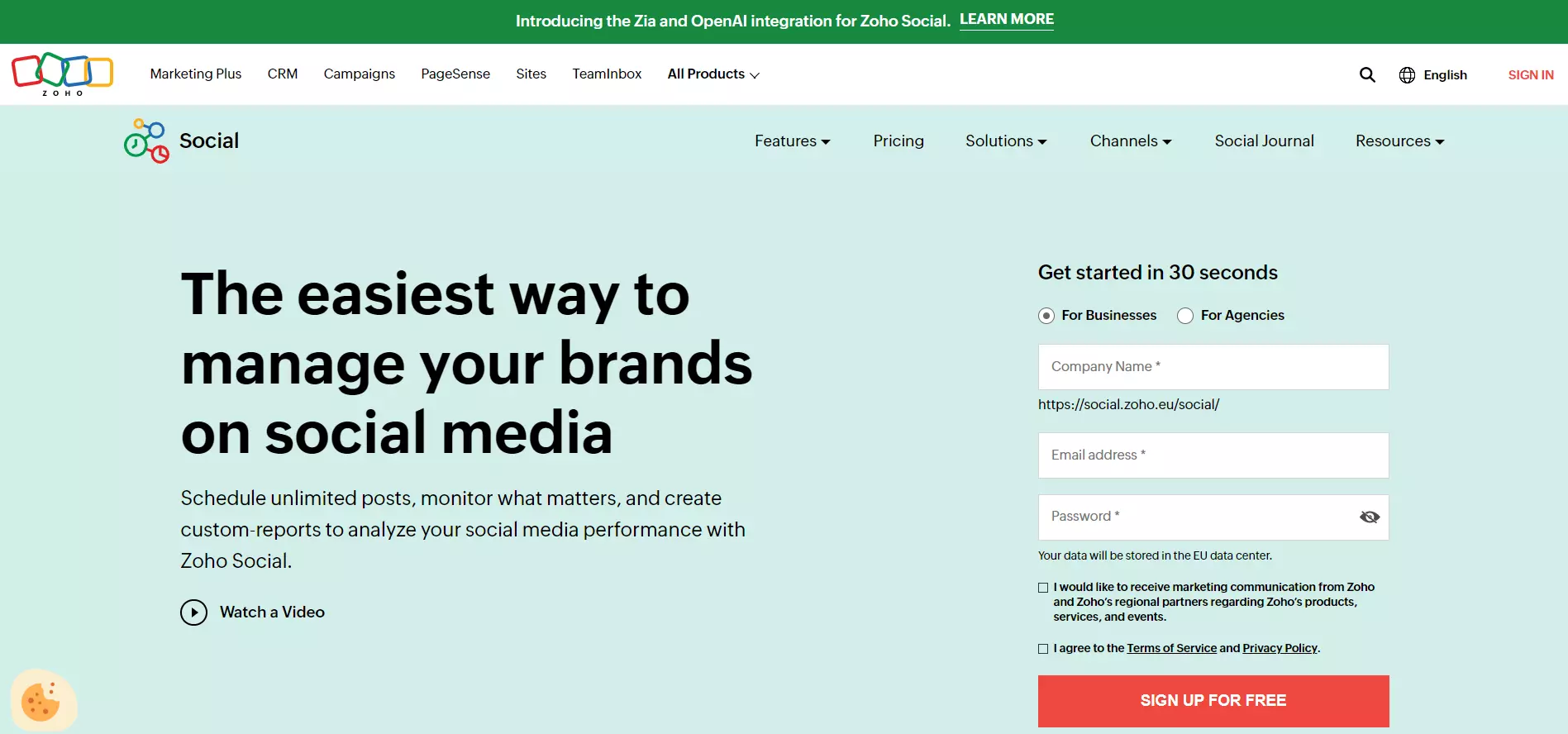
View Full Page: Zoho Social
Unlike Intercom, Zoho Social doesn’t hide its signup form behind a CTA button. This makes the conversion process straightforward, prompting users to enter their details.
Additionally, the signup form is short, containing three fields. This helps reduce friction, as users won’t get overwhelmed by numerous fields. The copy above the form further reinforces the fast signup process.
Meanwhile, the headline and tagline promptly highlight the platform’s main benefits and features. Trust badges and more details about Zoho’s key functionalities are placed below the fold.
Build a page just like this one with Landingi’s Advertising/Marketing template.
3. Monday.com
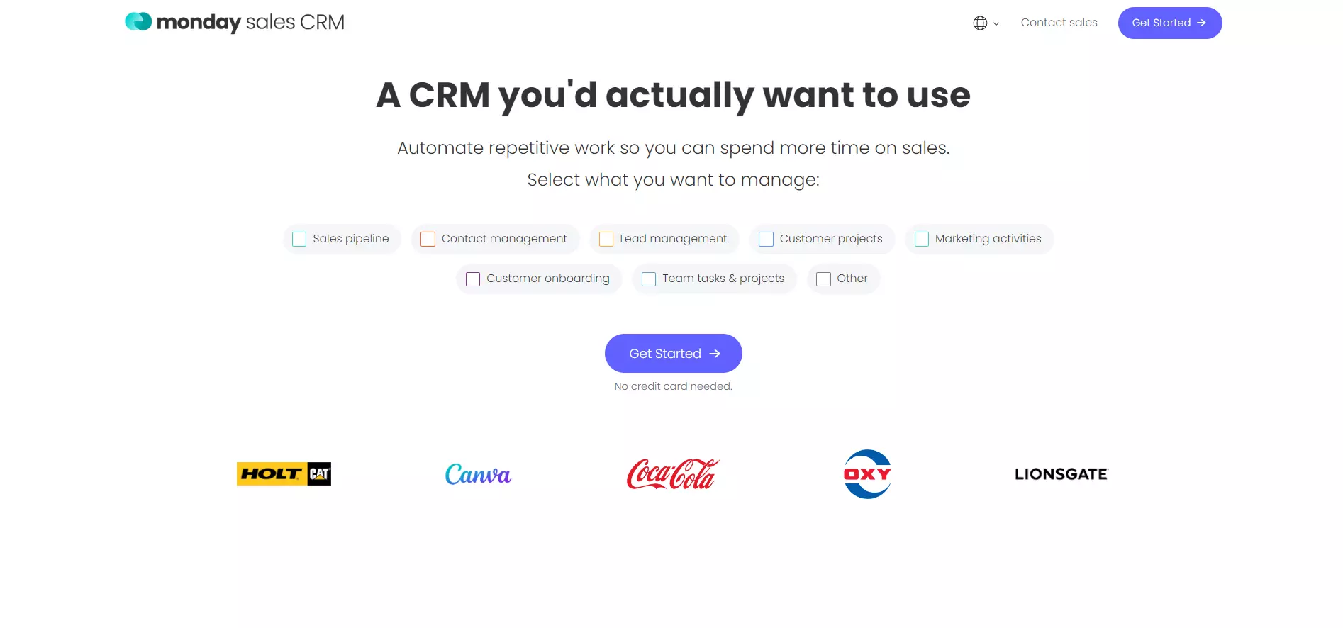
View Full Page: Monday.com
Monday.com guides users down the conversion path through its minimalistic design. The headline is short yet catchy, while the supporting copy highlights the tool’s main benefit.
Additionally, the checklist showcases the product’s use cases. The CTA pops out through its placement and the use of contrasting colors.
Unlike the other two examples shown above, Monday.com places its trust badges above the fold, letting visitors know about the company’s reputation as soon as they land on the page.
4. Chargebee
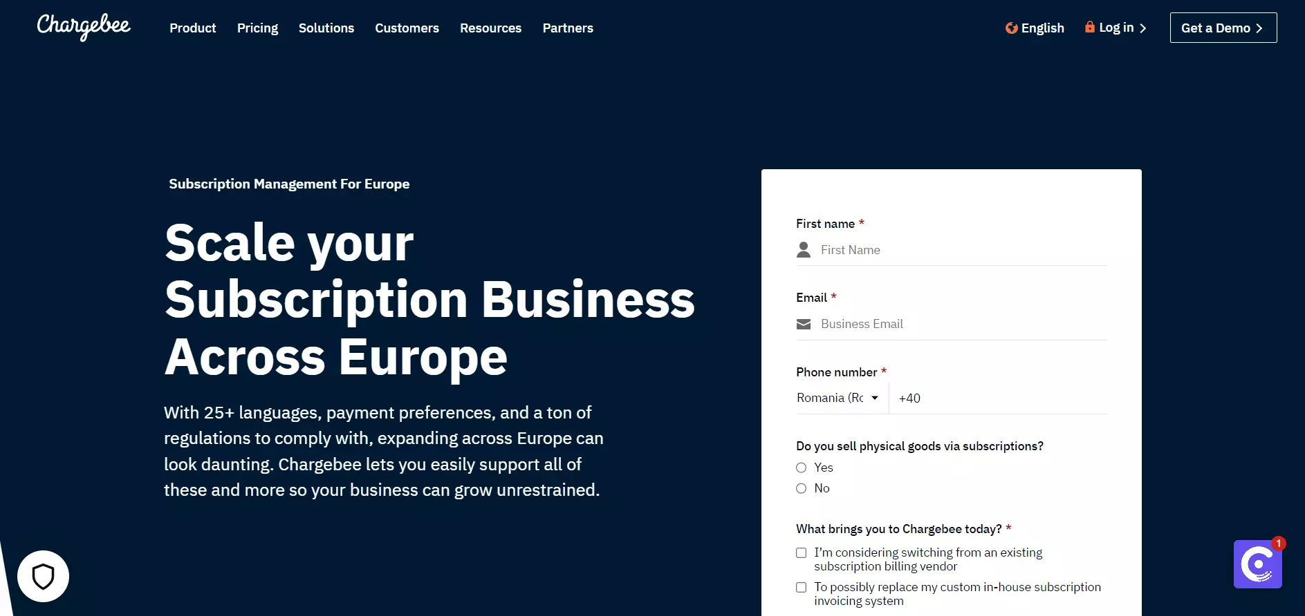
View Full Page: Chargebee
Chargebee’s headline highlights how the platform can help users. The tagline’s first sentence brings out a pain point — expanding across Europe can be difficult. The second sentence promises the solution.
Users can then quickly schedule a demo via the short form on the right. However, the CTA button is placed below the fold. This makes the button less visible, and it can potentially confuse first-time visitors, as they do not have clear instructions on what to do.
Build a page just like this one with Landingi’s Marketing Software template.
5. Typeform
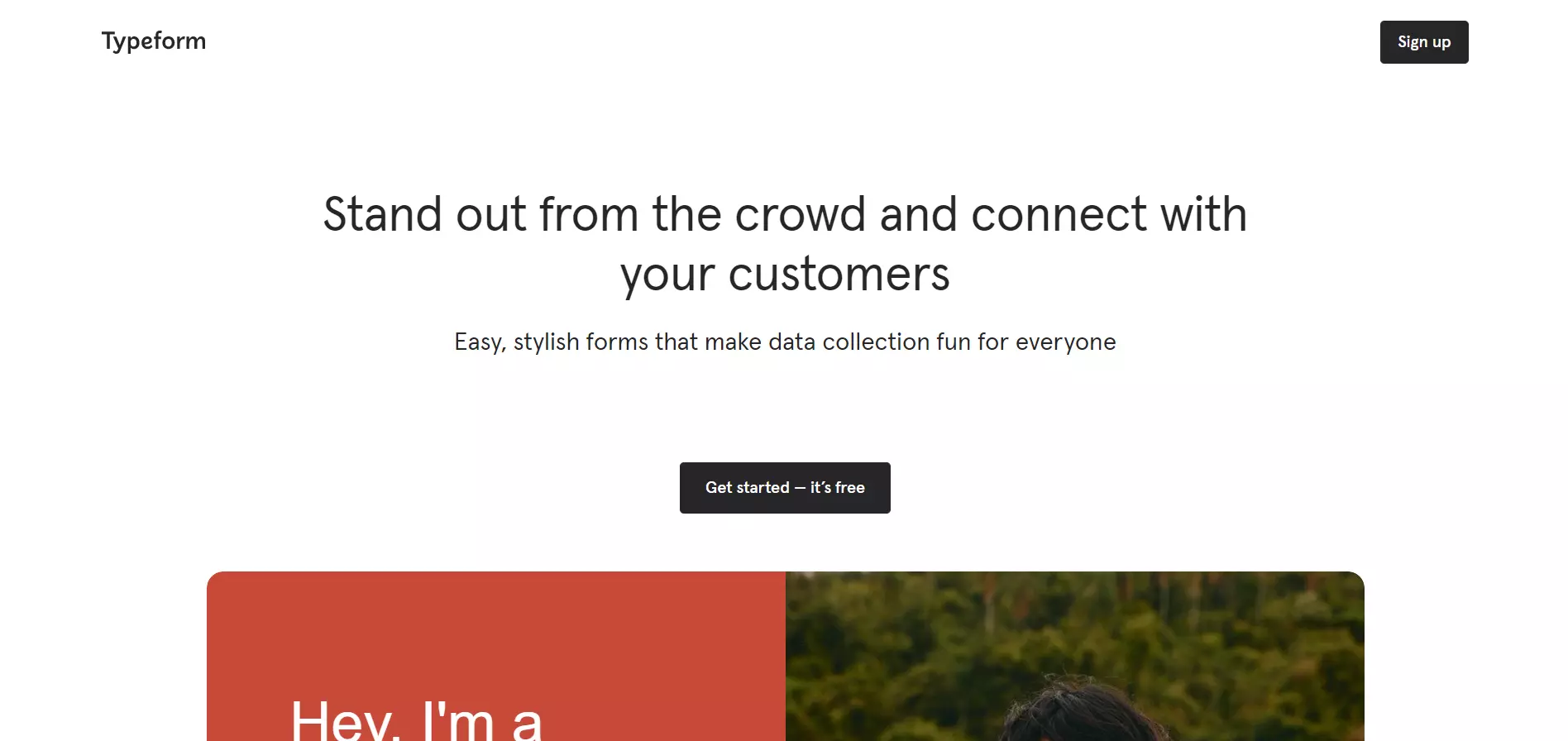
View Full Page: Typeform
Typeform includes minimal design elements above the fold, drawing full attention toward the headline, supporting copy, and CTA, which are in line and placed in the center of the page. The headline and supporting copy are short and sweet, briefly highlighting the platform’s main benefits.
Meanwhile, the CTA stands out through contrasting colors. Its copy also incentivizes visitors to click by stating that users can sign up for free.
Build a page just like this one with Landingi’s Digital Marketing Consultant template.
6. Scoro
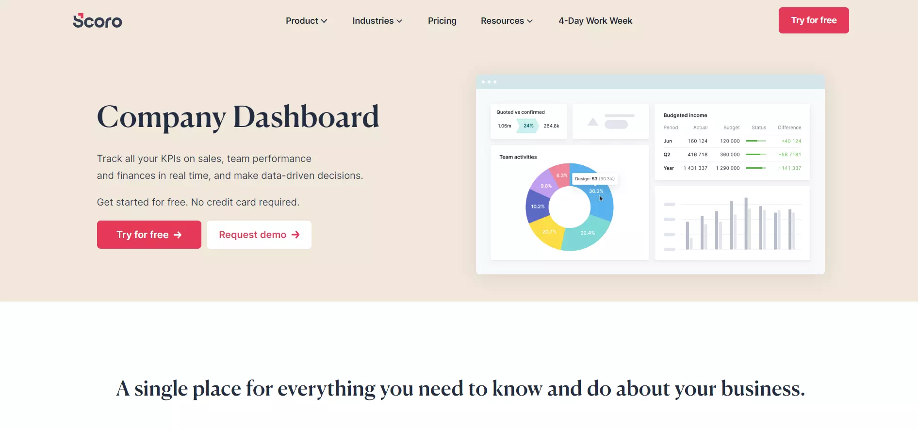
View Full Page: Scoro
Scoro’s tagline and supporting visuals briefly state what the company dashboard is for and how it looks in action.
The page includes multiple conversion options — users can either sign up for a free trial immediately or schedule a demo.
This is excellent for visitors who need more convincing. They can learn more about the platform by scheduling a demo, while Scoro has the contact information needed to nudge these users to convert further down the road.
7. Semrush
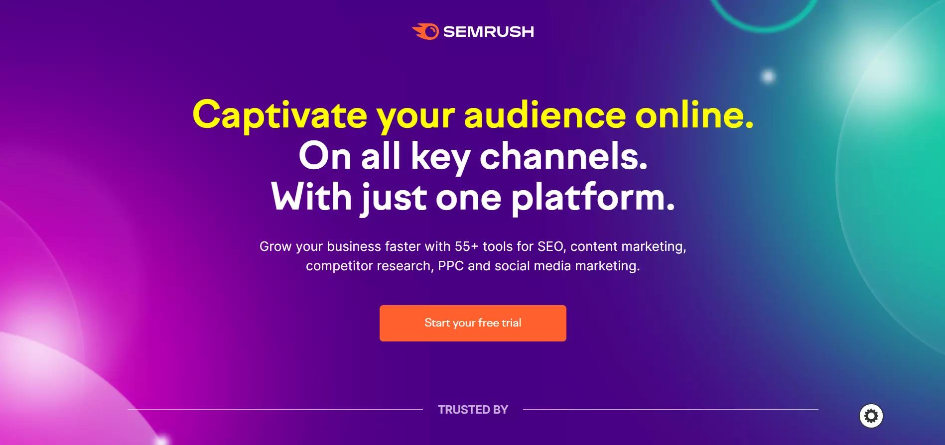
View Full Page: Semrush
Semrush’s page is catchy and attention-grabbing. The background is attractive yet not distracting, while the platform presents its main benefit by highlighting the first line within the headline in bright yellow.
Moreover, the supporting copy showcases the platform’s key functionalities. The conversion path ends with a bright CTA button, nudging users to signup for the free trial.
Build a page just like this one with Landingi’s Click-Through Mockup template.
8. Shopify
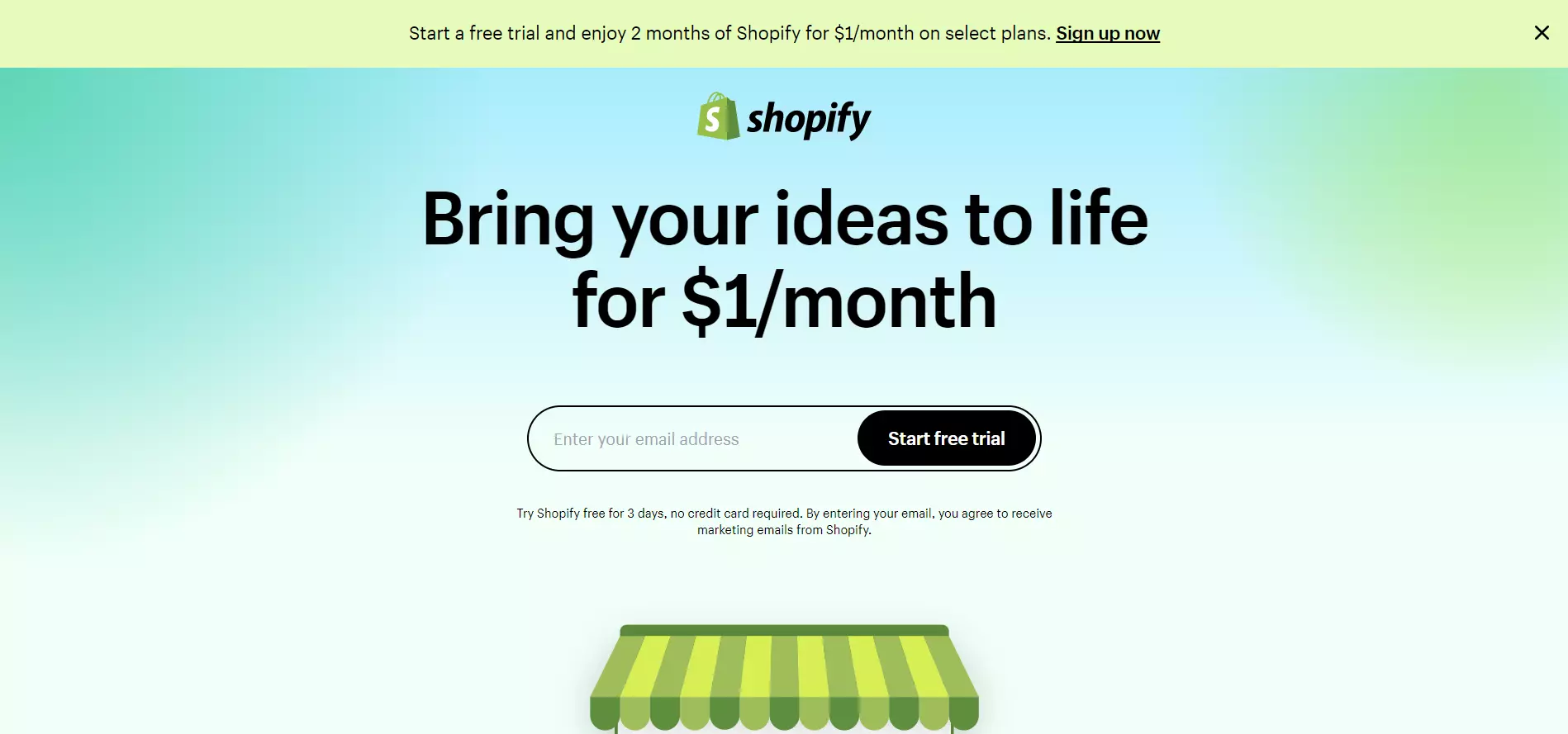
View Full Page: Shopify
The same story goes for Shopify, though this page is more minimalist. The headline emphasizes the platform’s cheap price tag, while users are prompted to convert by typing only their email addresses.
Shopify presents its key benefits and places trust badges as well as a testimonial below the fold. The page concludes with a FAQ section, aiming to eliminate any potential visitor uncertainty.
9. Jira
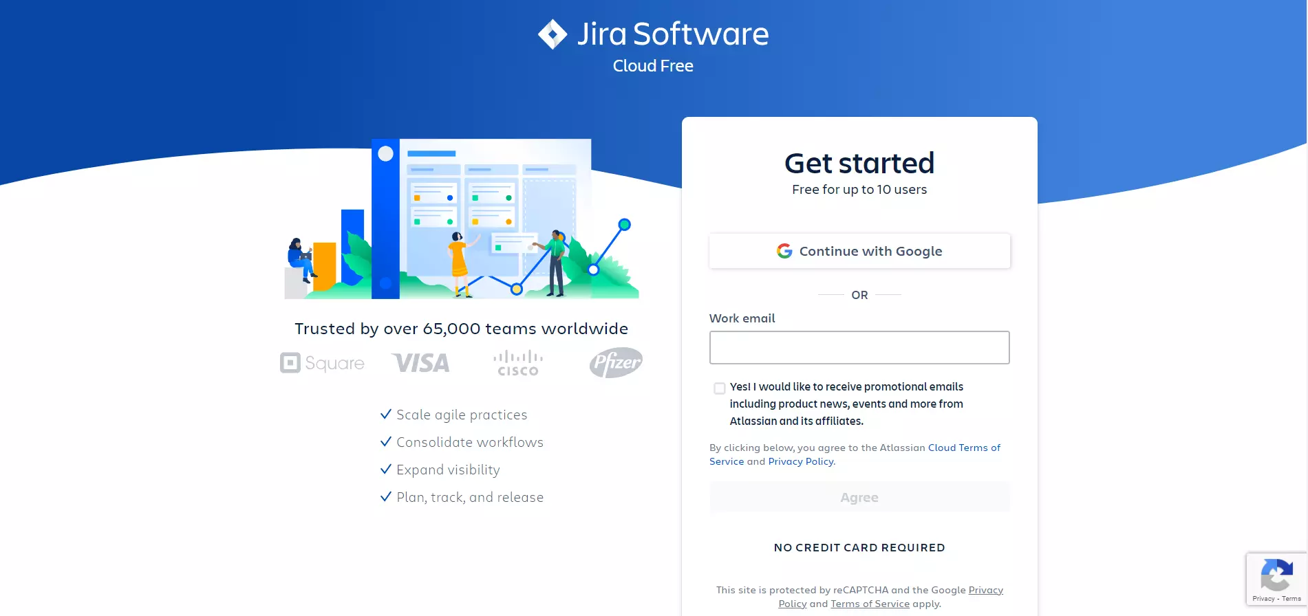
View Full Page: Jira
Jira aims to convert visitors as quickly as possible. The signup form contains a single field, while users also have the option to register with Google for an even faster process.
Additionally, trust elements are found above the fold, helping to earn the visitors’ trust as they land on the page.
The platform’s benefits are shown under a bulleted list, ensuring that visitors read through it in its entirety. However, they could’ve been shown in a headline/tagline for enhanced visibility.
10. HubSpot
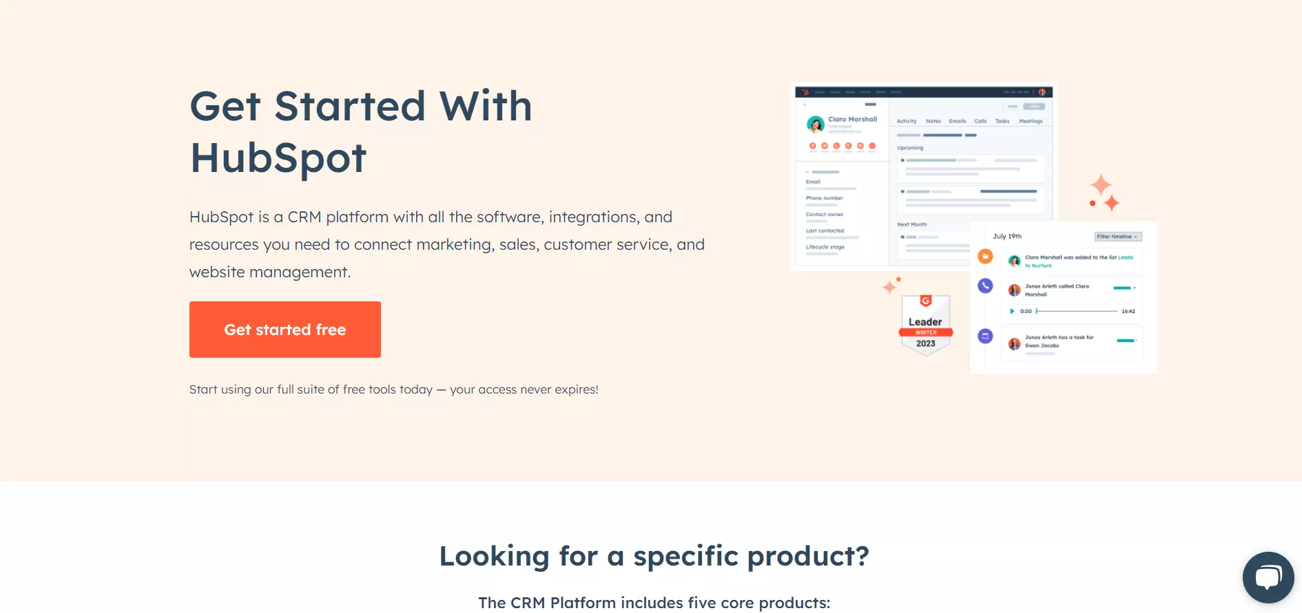
View Full Page: HubSpot
HubSpot’s page is straightforward. The supporting copy briefly explains what the CRM is and the tools it offers. The visuals next to it show how the platform looks in action, while the CTA stands out through its size and bright color.
The below-the-fold content goes into detail about what the platform includes. The page concludes with customer testimonials.
Build a page just like this one with Landingi’s Business Page template.
11. Webflow
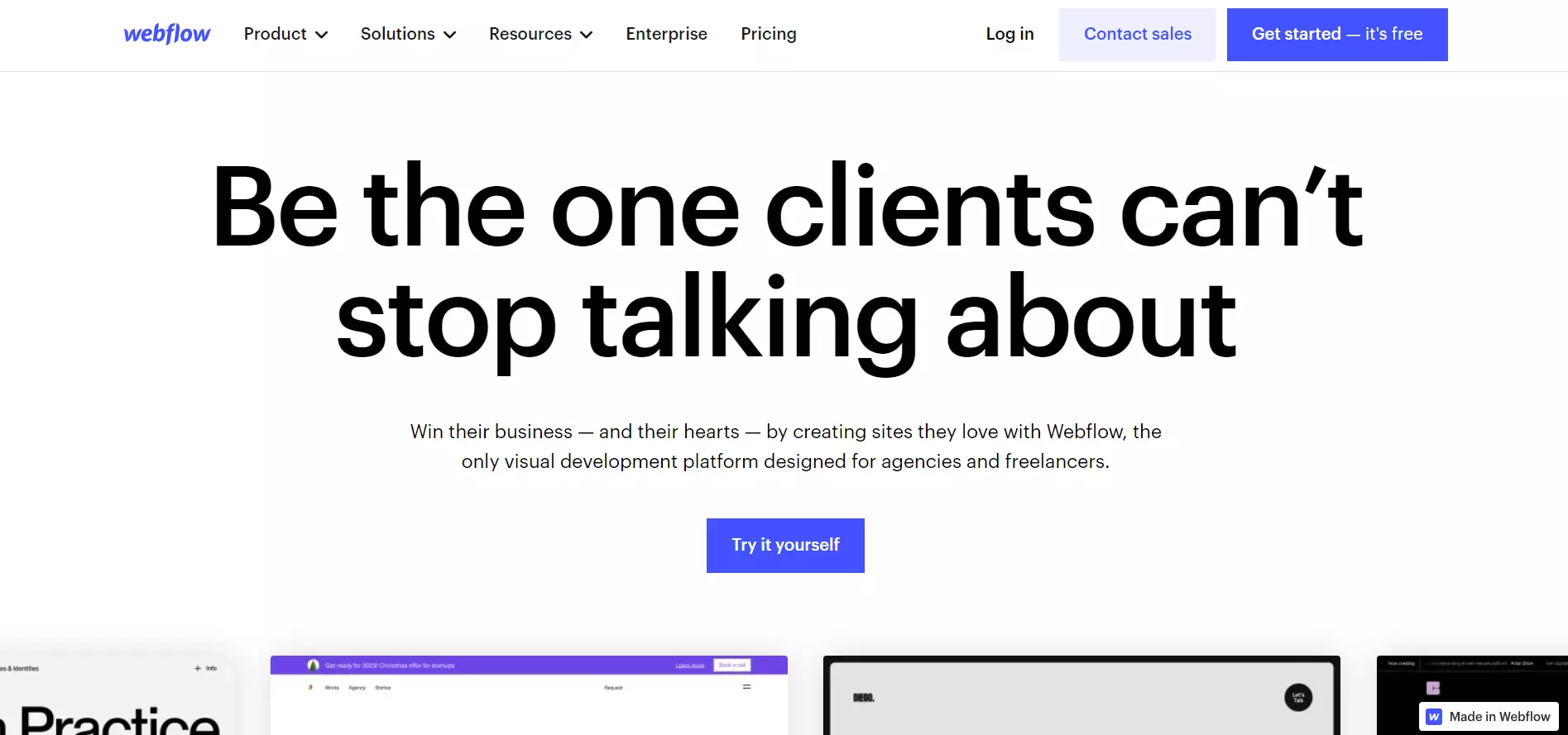
View Full Page: Webflow
Webflow’s headline and supporting copy are highly engaging — they nudge visitors to imagine themselves using the platform and experiencing success. This idea is then reinforced by showcasing examples of web pages created within Webflow.
The below-the-fold content emphasizes customer testimonials and presents the platform’s pricing plans.
12. Vimeo Enterprise
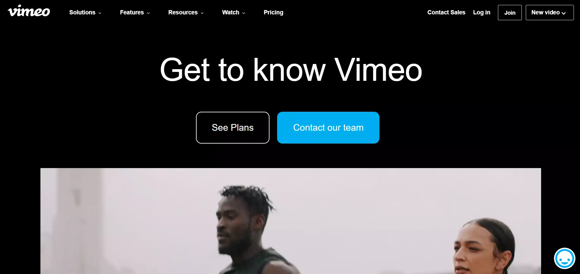
View Full Page: Vimeo Enterprise
Vimeo Enterprise uses little to no copy to highlight the CTA buttons. The page makes up for the lack of copy by including a video that explains how the platform works and its key features.
The below-the-fold content highlights the platform’s main benefits and invites users to get acquainted with its functionalities.
Build a page just like this one with Landingi’s Software Functionality template.
13. Lattice
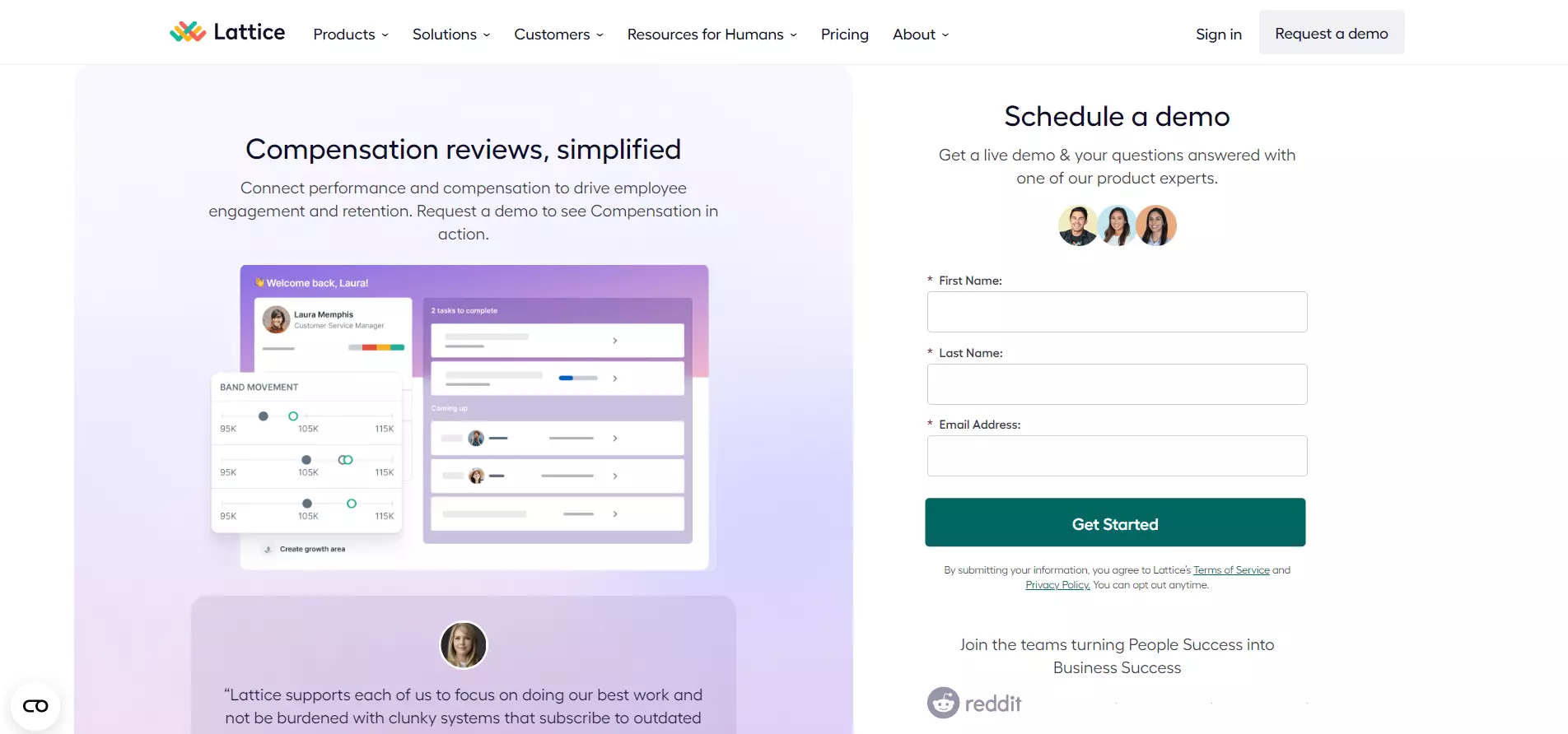
View Full Page: Lattice
Lattice uses a two-tone design to distinguish the signup form from the rest of the page.
The left-hand section (where users will likely look first when they land) provides visual support, trust elements, and a brief overview of how the platform works via the headline and supporting copy.
Meanwhile, the signup form includes minimal form fields, prompting users to enter their details.
Build a page just like this one with Landingi’s Simple Lead Generation template.
14. Gusto
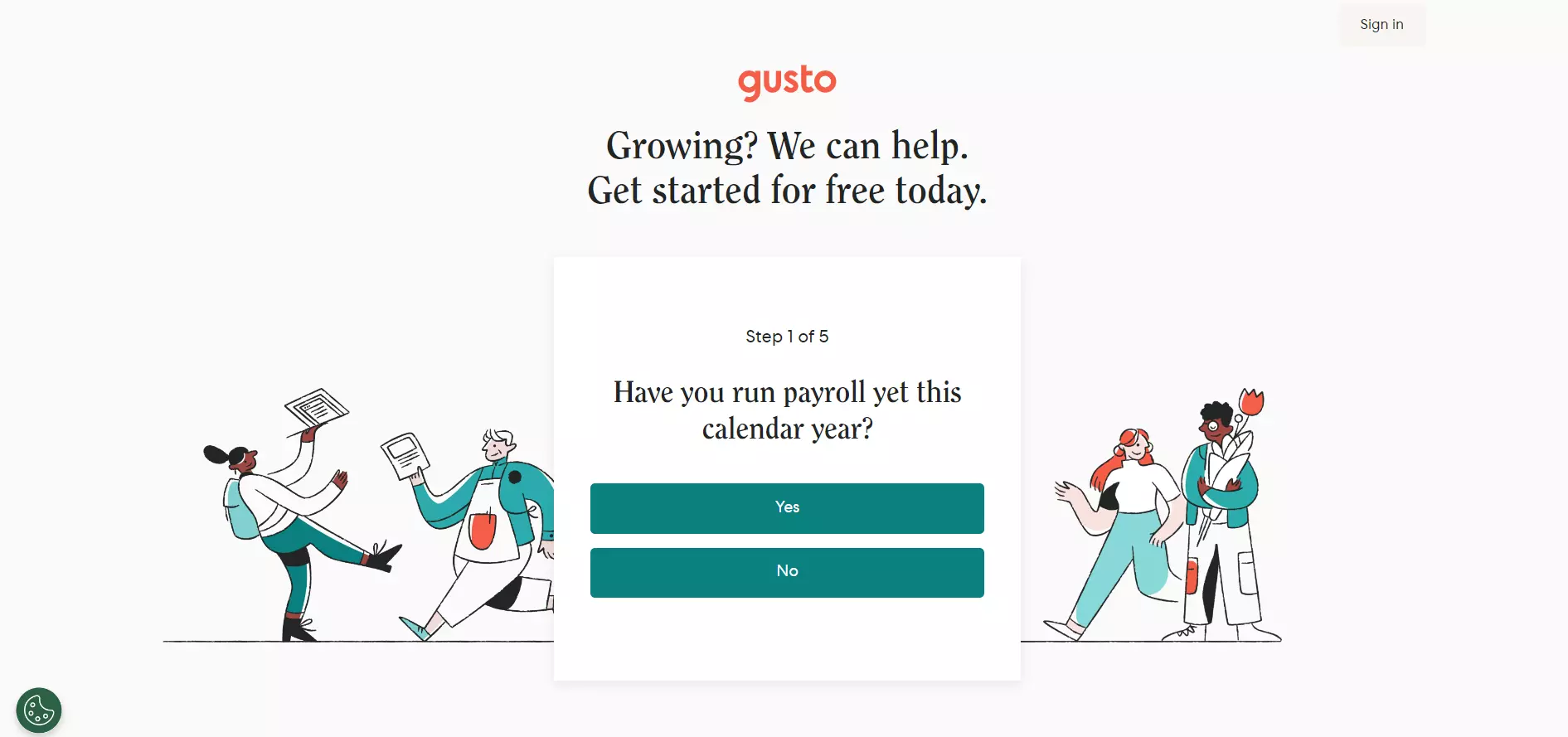
View Full Page: Gusto
Gusto takes a rather unique approach. The page gets visitors engaged as soon as they land via a quick quiz. This theme can also be found within the headline, which starts with a question.
Aside from pushing users to interact with the page, the quiz is also useful for collecting relevant data from visitors, which can then be used to send targeted marketing emails, for instance.
The page concludes with a brief overview of the software’s key features and the inclusion of trust elements.
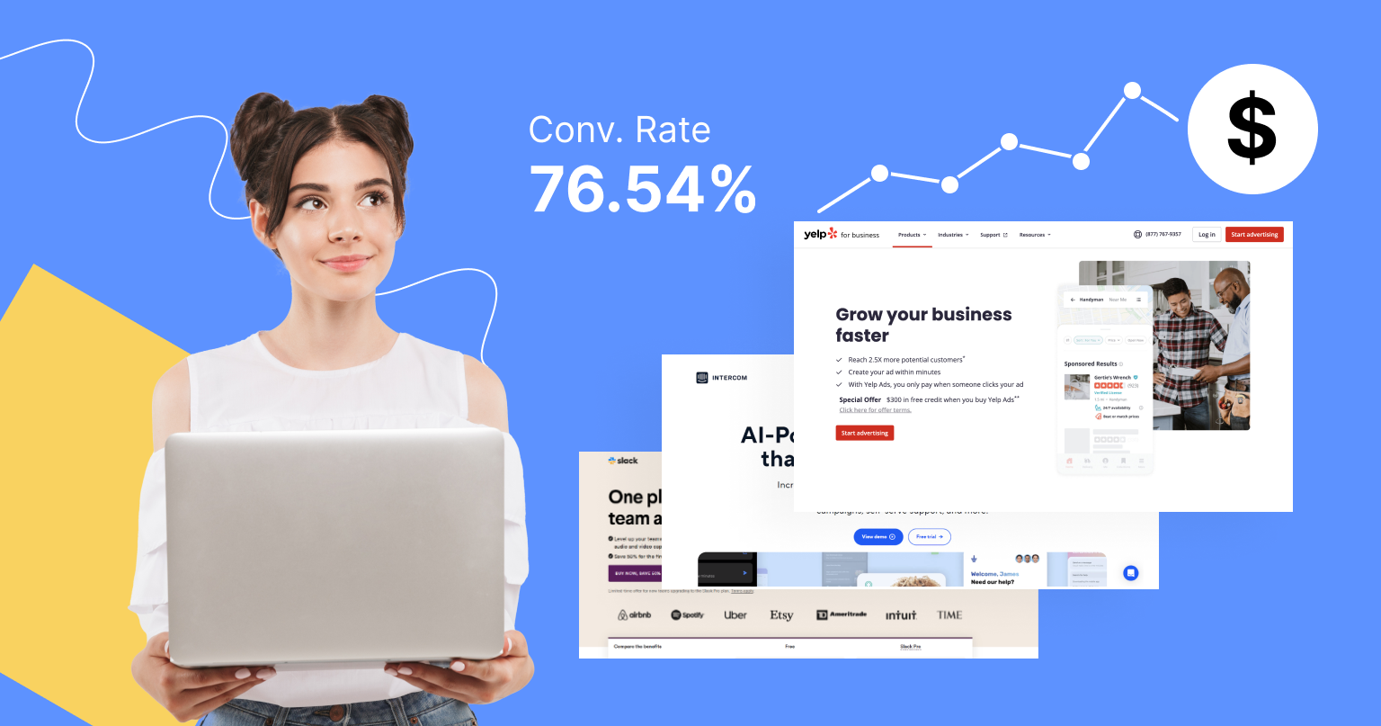
15. Yelp
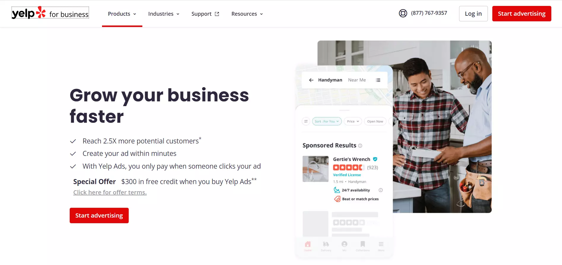
View Full Page: Yelp
Yelp uses a simple design to drive attention toward the headline and supporting copy. These elements emphasize the platform’s main benefits and showcase a special offer, adding a little incentive and persuading users to convert.
The CTA button pops out through its bright red color, while its copy is straightforward yet engaging. The below-the-fold content presents the platform’s main benefit in more detail and also shows visitors how they can create their first advertisement.
16. Slack
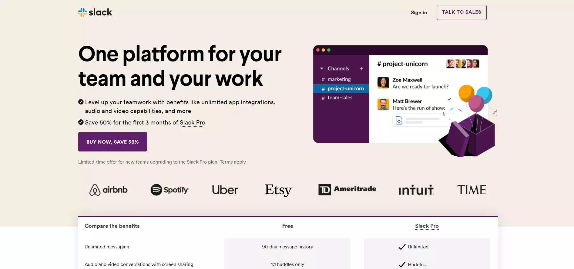
View Full Page: Slack
Similar to Yelp, Slack displays the platform’s special offer and benefits within the headline and supporting copy. It also uses visuals to add more context and show the tool in action.
However, the CTA is slightly more pushy, mentioning a 50% discount. Trust badges are also present above-the-fold. Moreover, Slack compares its free version against the Pro plan, aiming to convince visitors to opt for the paid subscription.
17. Asana
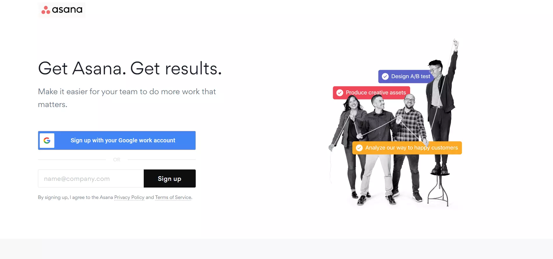
View Full Page: Asana
Asana’s page is highly minimalist, yet effective. The headline is punchy, while the supporting copy is short and sweet.
Visitors are required to fill in a single form field, reducing friction. They also have the option to signup through Google to speed up the process.
Meanwhile, the visual on the right highlights the platform’s features and benefits.
18. Clearbit
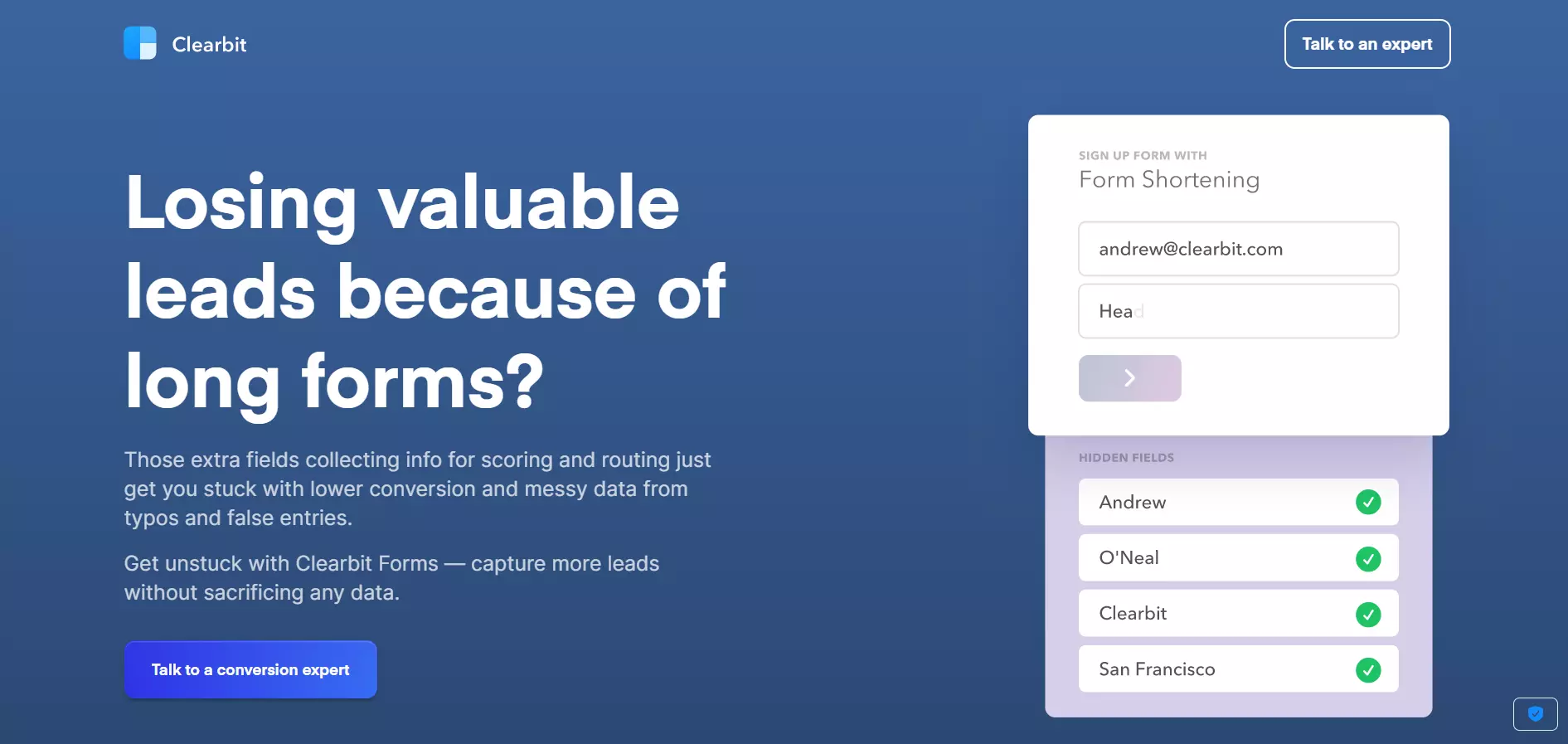
View Full Page: Clearbit
In contrast, Clearbit is more copy-heavy. However, the headline reveals a common pain point and asks a question to engage with visitors. The supporting copy explains the root of the problem and highlights the solution.
The animated section on the right briefly shows how the tool works, familiarizing users with Clearbit. The CTA button’s visibility could be improved through a brighter color.
Build a page just like this one with Landingi’s SaaS Website template.
19. Salesforce
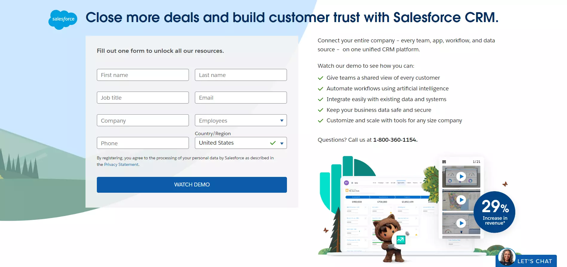
View Full Page: Salesforce
Salesforce’s supporting copy nudges visitors to signup for a demo by describing its contents. The description is presented in a bulleted format, ensuring that users read through the copy in its entirety.
Meanwhile, the signup form is on the heavy side, containing eight fields. The below-the-fold content showcases Salesforce’s solutions and its key benefits.
20. MediaValet
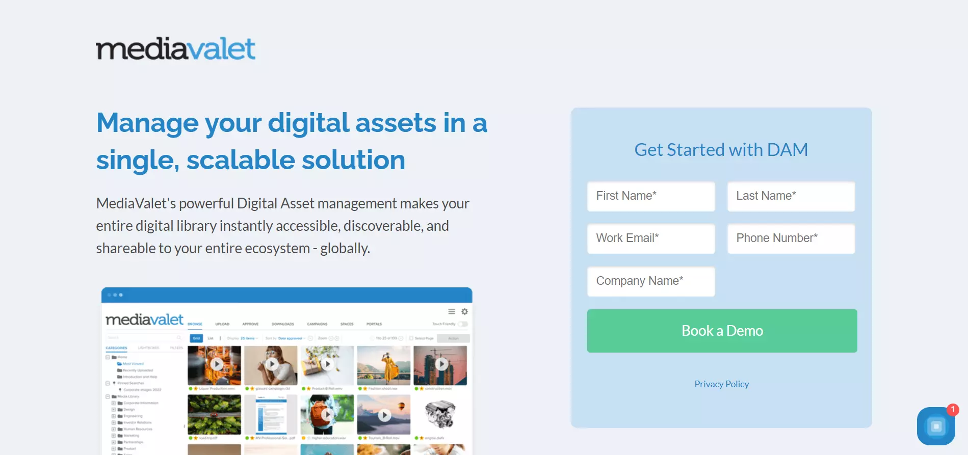
View Full Page: MediaValet
In contrast, MediaValet placed the headline and supporting copy in the left-hand portion of the screen. Since users read from left to right, this layout assures that readers will familiarize themselves with the platform and its benefits as soon as they land on the page.
Additionally, the signup form contains fewer fields, helping to reduce friction.
21. EngageBay
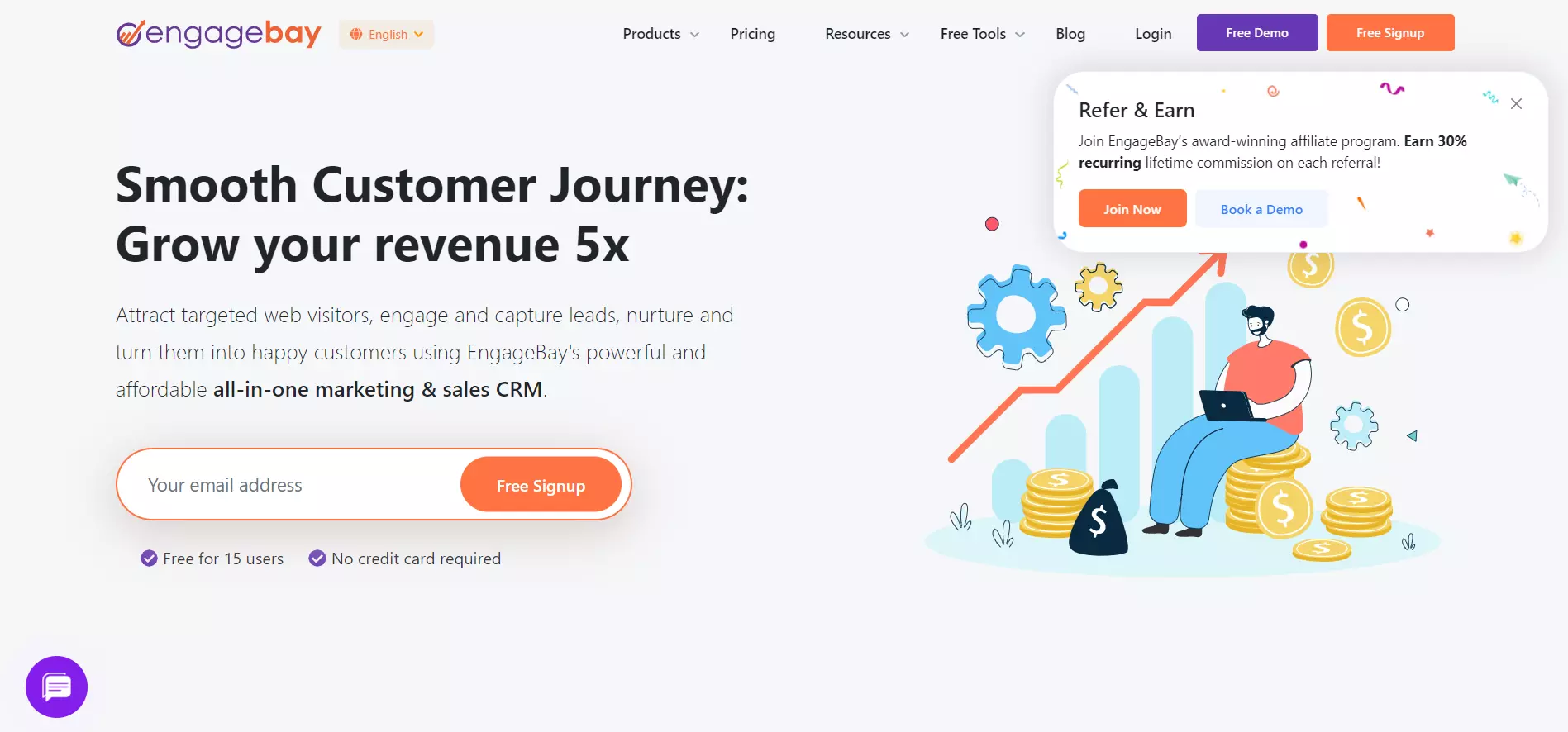
View Full Page: EngageBay
EngageBay rushes users to convert by emphasizing the platform’s benefits within the headline and supporting copy. The signup form also only requires the visitors’ email address.
The checkmarks below clarify that the platform is free for up to 15 users, and users can sign up without their credit cards, eliminating any potential uncertainties and prompting visitors to convert.
Build a page just like this one with Landingi’s Special Offer template.
22. Notion
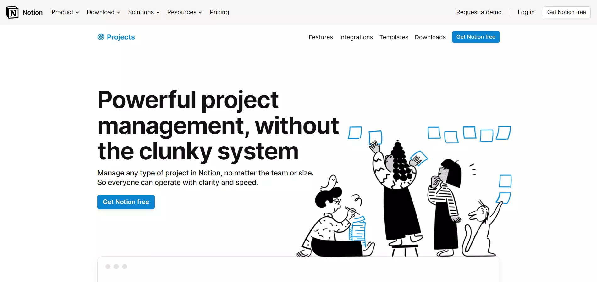
View Full Page: Notion
Notion highlights its ease of use within the headline. The supporting copy briefly explains what visitors can do with the platform, while the CTA copy encourages visitors to convert by mentioning that the platform is free.
The illustration alludes to the idea of teamwork and gives the page a more fun look. The below-the-fold content is image-heavy, showing the software in action along with its key functionalities.
Build a page just like this one with Landingi’s AirLand template.
23. 8×8
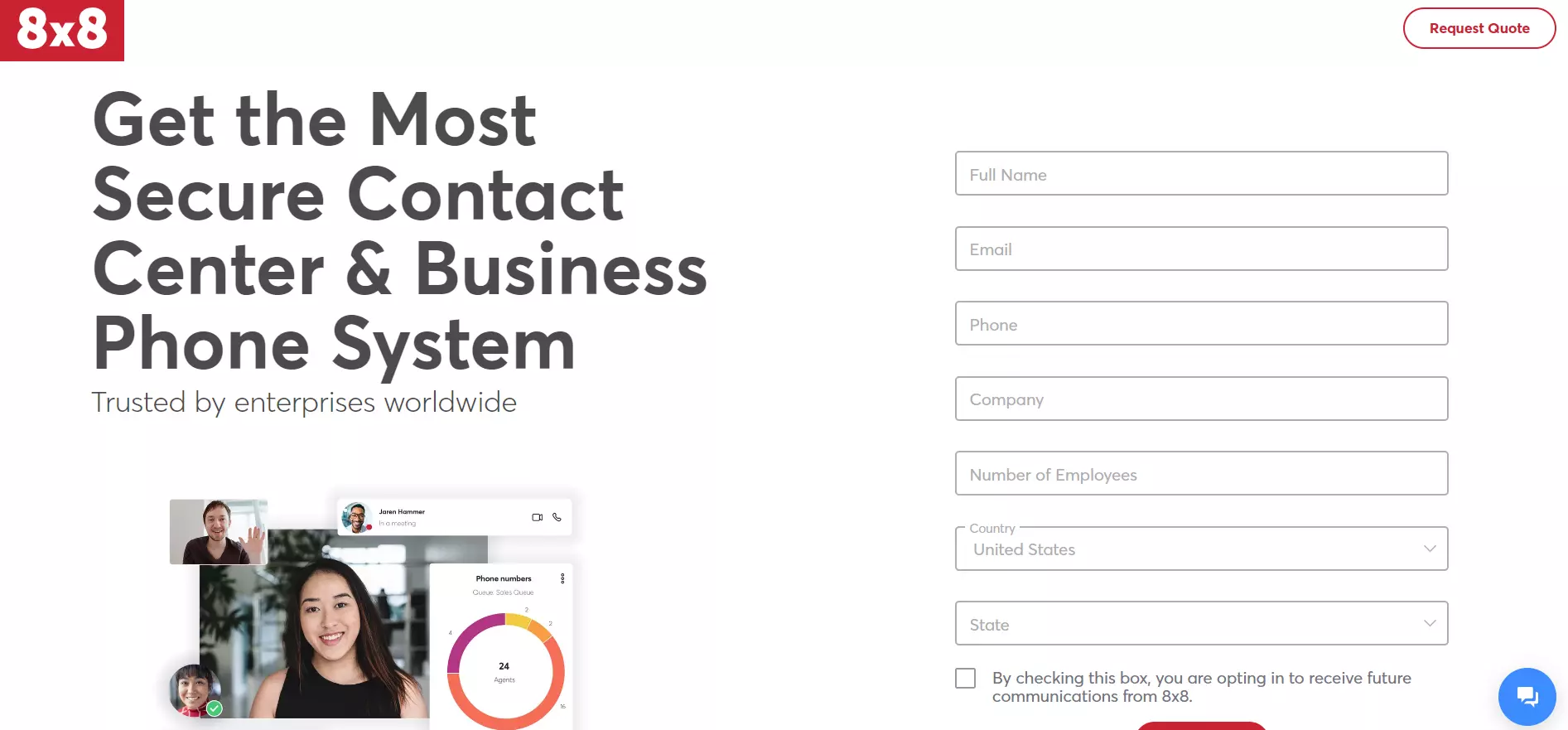
View Full Page: 8×8
8×8 banks on earning the visitors’ trust. The headline emphasizes the platform’s security, while the supporting copy adds a trust factor (“Trusted by enterprises worldwide.”). Customer testimonials are also found below the fold.
However, the form includes seven fields — potentially preventing users from entering their details.
24. Vonage
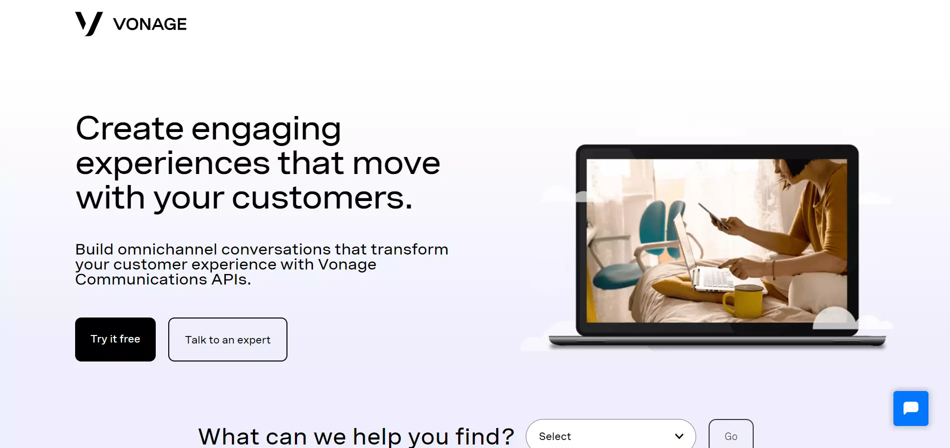
View Full Page: Vonage
In contrast, Vonage hides its registration form behind a CTA button, which stands out through its contrasting color.
However, the stock image on the right adds little to no context and it doesn’t showcase the platform in action.
Moreover, the page encourages visitors to explore Vongage’s product offerings through the drop-down menu placed at the bottom portion of the screen. This helps visitors find solutions specific to their needs.
Build a page just like this one with Landingi’s Technology Company template.
25. Vagaro
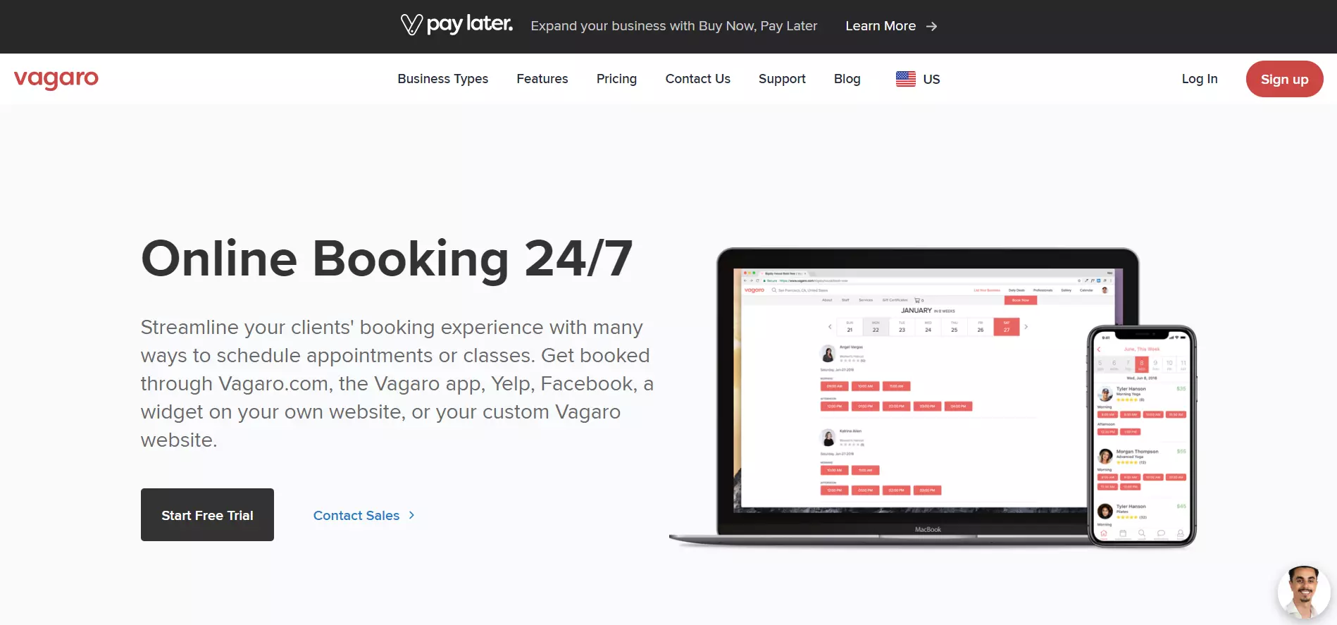
View Full Page: Vagaro
Unlike Vonage, Vagaro uses visuals to showcase the platform’s UI on laptops and mobile devices, alluding to its flexibility.
The same theme is seen in the page’s tagline, which explains that users can use the app across multiple platforms.
The page goes into more detail about Vagaro’s key functionalities below the fold.
26. SE Ranking
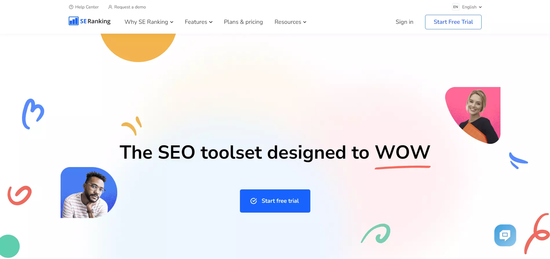
View Full Page: SE Ranking
SE Ranking’s landing page is simple, yet attractive. The page uses playful colors and illustrations to provide a fun look. The headline is catchy, while the CTA stands out through its placement and color.
The page displays trust badges, key functionalities, and benefits below the fold.
Conclusion
And there you have it — 26 examples of well-done B2B landing pages, along with some best practices to follow. Now it’s time to go ahead and build your own!
Speaking of which, consider using Landingi. The platform offers 400+ conversion-optimized templates fit for various use cases, industries, and more. Moreover, its Smart Sections and pixel-perfect interface allow you to fully customize your landing pages quickly and at scale.