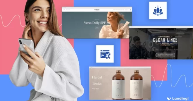


Landing pages are web pages reached by users after clicking on an advertising link or banner. Unlike classic websites, they are designed to focus their attention from the very beginning and most effectively drive them to take a specific action, i.e. a conversion (making a purchase, subscribing to a newsletter, attending a webinar, etc.).
What specifically is at stake? In short: the more mistakes made at the landing page design stage, the lower the conversion rate, which also means lower effectiveness of marketing activities or campaigns and — usually — lower business efficiency.
Make your sections smartable and let go of mundane manual tasks with Smart Sections! An easy way to manage bulk changes.
Landing page — a strong player in the game
However, the Internet is bursting at the seams with tutorials, instructions and recipes for a good landing page, in order to build one, it is essential to know the other side of the coin as well and what to avoid. Especially since — as we can easily find out by visiting the thousands of landing pages available on the web — this is not common knowledge…
In this article we show you what are the most frequent mistakes lurking for users building landing pages, and in a series of additional tips (Pro-Tips) we also suggest what to do to avoid them.
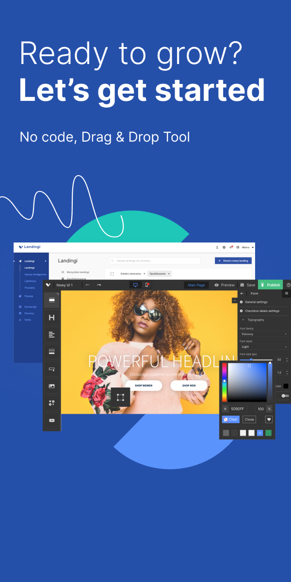
With such background, you’ll be able to think of your own landing page (or landing pages). With Landingi’s landing page builder, you can now create your premiere landing page at zero cost! Check out our Free Plan!
Ready? Well, here we go!
Landing page – mistakes (and how to avoid them?)
1. Mismatch with the persona
In the Internet’s ocean, you will find myriads of landing pages that you are ready to fall in love with at first sight. Many of them are little works of art. They dazzle you with design, seduce with colors, and mesmerize with sparkling copy. You enter them, and after a while… full of admiration, move on. After all, you were looking for a specific product or service…
Unfortunately, the business game is not a beauty contest. Every landing page should be designed for a specific type of user called persona, and meet his expectations. This is simply a model person you want to reach with your offer.
An example of a persona? Jobseekers with higher education and living in the New York.
Pro-Tip: Try to get to know your target audience as thoroughly as possible, understand their values, behaviors, and motives pushing them to action. Be sure to define the problem they are facing and think over what solution you could come up with. Equipped with this insight, start building a landing page!
2. Too many goals
A model landing page serves to increase the conversion rate on a single, strictly-defined goal. A jack of all trades is a master of none…
Nevertheless, on the Internet, it is pretty easy to come across landing pages glistening with links and multiple calls to action, or containing a form and a call-to-action button encouraging different shares (e.g., purchase and newsletter signup).
By doing so, instead of focusing the user’s attention and orienting it to the desired action, you only distract it, reducing the chance that they will take any action.
Pro-Tip: Decide which user’s move is most valuable to you, and make all elements of your landing page entice the user to follow it. However, if you aim many different actions, nothing prevents you from creating multiple landing pages. Using the Landingi creator, record-breakers have put thousands of landing pages on their accounts!
3. A misguided headline
Like a magnet, the headline draws the eyes of a user landing on your landing page. Its design, placement, and content often determine his first impression. And this is very tough to change later…
One of the most common mistakes when working on it is to concentrate too much on its language appeal. But what’s the point of a headline that, although engraved in a user’s mind, won’t be able to keep him on the page, induce further exploration, and ultimately, conversion?
Another case: headlines that are trivial and say nothing. Don’t be resentful if to a shouted “Hello!” spelled out in beefy letters, the user responds with a quiet but equally clear-cut “Goodbye!”, leaving your landing page…
Pro-Tip: The headline should be memorable, but at the same time persuasive. It has to contain or highlight the core thought, the essence of your communication, emphasize what is key, convey the most important information, and ideally also: communicate value to the users and engage their emotions.
Check out some additional tips and rules for creating converting headlines.
4. Unexposed CTAs
The call-to-action (CTA) is the heart of a landing page. Solely for this reason, it should take its rightful place to attack the user’s attention from the first moment.
Meanwhile, it is not difficult to encounter landing pages in which the CTA button blends into the background of the site and is not graphically distinguished in any way. Sometimes, even worse, it is hidden below the hero section. This is an easy way for the user to miss it. If it doesn’t catch his eye right away, there’s little chance he’ll look for it by scrolling back and forth.
Another problem is the vagueness of the content. A button that says “Click here” is not the best idea, because it doesn’t say why the user should… click here.
Finally: multiplying CTAs beyond the need. The rule of thumb — although not uncommon — is: one type of CTA per landing page. In most cases, the multiple CTA buttons fight each other for the user’s attention. It’s easy to imagine none of them will gain it enough to cause his action.
Pro-Tip: Place the CTAs in a highly visible place in the hero section. Expose them with colors contrasting with the page background. Use messages naming actions you are encouraging: “Download”, “Buy”, “Send”. If you’re going to duplicate CTAs, place them in separate sections or at least at an appropriate distance from each other.
5. Duplication of website elements
A model landing page prides itself on being a standalone website, and should remain such.
Remember that — unlike a classic homepage — a landing page serves a single purpose. The more unnecessary elements it contains, the greater the chance that the user will deviate from the path you have set for him.
The presence of a menu bar (especially if it’s elaborate…), a multitude of buttons and links, large chunks of text – all of these neutralize the potential of your CTA and sabotage conversions!
The presence of a menu bar (especially if it’s elaborate…), a multitude of buttons and links, large chunks of text – all of these neutralize the potential of your CTA and sabotage conversions!
Pro-Tip: Therefore, as soon as possible — if you haven’t already done so — cut the cord connecting your landing page to your website. On the landing page, go for simplicity and get rid of any redundant elements. Keep the purely informational content on the website. On the landing page, leave only the information that serves a persuasion related to its purpose.
6. Slogans instead of specifics
As you know, a well-designed landing page can significantly increase the conversion rate. One of the most common reasons why it doesn’t always succeed in this is the lack of a clear value proposition.
If a potential customer, subscriber, or user is forced to look for it, wading through a thicket of slogans, he will most likely give up quickly. And he’ll pay a visit to your competitors…
Therefore, don’t ply him with slogans that make his eyes (and ears) swell! Instead of communicating that your company is all about quality, offers only the best solutions and makes dreams come true…
Pro-Tip: …better reach for a handful of specifics: 30% discount, 10 years in the industry, smart opening function, “Your Company” magazine award, 16 thousand customers in 2023! General rule: names and numbers first, and only then power epithets (unique, efficient, reliable, etc.).
7. Wall of text
Have you heard of TLDR syndrome? No? Admittedly, you won’t find it, for the time being, on the WHO list of diseases, but — as we know — the vast majority of Internet users suffer from it. Among them, for sure, also … your customers.
TLDR (too long; didn’t read) causes many of us to collide with a wall of text upon entering a website (including a landing page), almost instinctively looking for an evacuation option.
According to Contentsquare, the average user spends only 54 seconds on a company website. See how much you are able to read in that time!

Pro-Tip: Weigh every word, and assign a specific purpose to each sentence. It could be, for example, to build trust, to describe a product or service (build value), or to elicit sympathy and create a connection with the user. After that, highlight all other sentences and vigorously tap the “Delete” key!
8. Navigation
One of the most common mistakes (and also the easiest to avoid…) are navigation problems, which instantly translate into a negative user experience.
A disappearing scroll bar, links that don’t work, skipping sections, a convoluted and unintuitive site map — here’s a sample list of navigational sins.
Pro-Tip: Opt for proven solutions and a simple interface. Give users exactly what they expect and where they usually look for it. After all, one of the greatest strengths of a landing page and the secret of its effectiveness is a typical and repeatable structure (despite the endless wealth of its graphical and content implementations).
9 Generic copy
Since a landing page should be sparing with words, you can include relatively little text. All the more reason why the phrases, words, and sentences you go for must be every bit as thoughtful and polished.
Meanwhile, the Web is teeming with landing pages that drip with a generic copy of the “we’ve read this a thousand times before…” series. One can get the impression that the finished paragraphs almost come off the production line! And in the age of electronic text generators is not so surprising. It is, nevertheless, crucial to making it then relevant, to the point, and original. Generating copy with AI may be very helpful, but remember to keep the final touches on your part.
Copy on a landing page serves to engage visitors (oftentimes potential customers). It’s a chance to make yourself memorable, but also an element through which you can pay respect to them, and ultimately get them to click on a CTA button or perform another action. Don’t trifle with its potential!
Copy on a landing page serves to engage visitors (oftentimes potential customers). It’s a chance to make yourself memorable, but also an element through which you can pay respect to them, and ultimately get them to click on a CTA button or perform another action. Don’t trifle with its potential!
Pro-Tip: Take a tour of your competitors’ sites and consider where you’ve spotted the best copy. Have you found some of the wordings to be memorable? If so, someone here has done a good job… However, don’t copy the specific phrases and ideas of your competitors, but think about the structure and what specifically worked in this message. Then grab your pen, turn off notifications on your phone, close the door, take a deep breath and… write something “from yourself”!
Get 111 Landing Page Examples—The Ultimate Guide for FREE
10. Distractors
The landing page should create conditions in which all the user’s attention is drawn to one specific action.
The use of additional elements can be helpful here. On a sales page, for example, a countdown timer (counter) counting down the days until the end of the promotion will work, which, in a way, “pushes” customers towards a purchase. If your company sells subscriptions to a streaming platform, it seems natural to reach for persuasive video content.
However, there is a multitude of landing pages on the web, where the accumulation of various elements and persuasion techniques makes their purpose gets lost in the opulence of impressions, while the user’s dazed eyes nervously search for the CTA.
Design and technical setting are important, but it is not at all said that more is better!
Pro-Tip: Always take user experience as your starting point (learn more about the relationship between site interface and user experience). Before publishing, run your landing page through professional software analyzing its structure as well as the distribution of elements from the user’s point of view (PageInsider™ will work perfectly here). That way, you avoid losing the conversion pool right at the start.
11. Ill-conceived form
One of every user’s nightmares is… form-beast. It consists of many fields, though in most cases only one or two are necessary. This is a sin! A grave sin, on the other hand, is when a form of this kind… is hard to find at all.
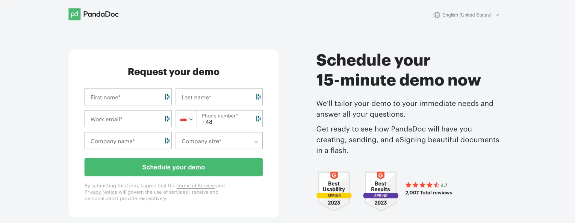
In principle, we don’t like to share our data and only do so when we hope to receive in return something valuable. This, moreover, is what the rule of reciprocity — according to psychologists, one of the most powerful regulators of human behavior — dictates. Demanding private data without adequate compensation will most likely end in a fiasco.
Pro-Tip: In the form, collect only the data you can’t do without. If you really need more information, split the process into two or more steps. Your form might have one field in the first step and an additional one in the next step. You can ask for some of the information once you have “captured” the lead. And most important: as a reward for filling out the contact form, offer your users something extra (a discount code, a free PDF, trial access to a platform or tool, etc.).
Check out what the perfect contact form should look like!
12. Inconsistent layout
Yes, a landing page is a standalone site, but it doesn’t have to be a lonely island at all!
Many landing pages by design, color scheme and communication style seem to cut off from the parent brand, which may after all give it some popularity…
Pro-Tip: If your company already has a website or uses multiple landing pages, the layout of the landing page should be consistent with it, or at least non-contradictory. It is good practice to have common elements: logo, banner, footer, similar graphic themes — the choice is quite wide. To easily duplicate individual sections on different landing pages, you can use the Smart Sections feature available in the Landingi creator.
13. Page loading time too long
As the practice of digital marketing shows: every second matters.
This is especially true for loading web pages, including landing pages.
If, by chance, your site isn’t the only one in the universe where a certain group of users can find what they’re looking for, having received a slap in the face in the form of a “loading” sign or having seen a wheel spinning in the address bar… over and over again, they are likely to flee to the competition with all speed.
That’s how you lose leads. Read: potential customers…
Pro-Tip: Embed your landing page on a verified server and ensure reliable hosting. Compress audio-video files as much as possible without a noticeable loss of quality. By the way, don’t overdo the number of them… In case of problems, check the site code and get rid of bugs and anything unnecessary.
14. Excess audiovisual content
While users suffer from the aforementioned TLDR syndrome, sites sometimes have… ADHD. And this is curable! Or at least it should be cured…
What do I mean? First of all, sites overloaded with graphics, videos, visuals, full of interactive elements pushing everything else into the shadows. There is so much going on there that it’s easy to forget why the user lands there…
In addition, not everyone is a visualizer. Some will need a bit of text to be persuaded to follow the path of the CTA.
To exacerbate matters, the more audio-video on a page, the — as a rule — slower loading time. And that means drops in search results — ergo also lower visibility.
Pro-Tip: If you’ve decided to go for video content, don’t overuse it. One video on a landing page is quite enough. Sometimes its role is played by an animated background. Photos should illustrate and/or highlight key elements of the copy — as they rarely speak for themselves.
15. Opting out of tests
Novice landing page adepts often succumb to the illusion that once you click the magic “Publish” button, when the page sees the light of day, all the fun is over, and you can just cut off coupons from future profits in the form of a bag of leads, sign-ups, deals, etc.
Wrong! In fact, the real fun is just getting started…
It’s somewhat natural that the website you’ve created seems great to you. After all, you have put your efforts into it, invested time, mobilized creativity. Unfortunately, it’s hard to be an objective judge in your own case. The fact that your landing page appears to you as exemplary does not mean that… it is exemplary!
Only by tracking user behavior and paths will you learn what works optimally, what works well, and what you still may improve.
Sometimes you will have to make corrections in multiple turns. And as a matter of fact… this is absolutely normal. Because a landing page is not just a product, but also a process!
Pro-Tip: Take advantage of professional A/B testing tools that allow you to compare the effectiveness of different landing page elements, such as variants of graphics, advertising slogans versions, or CTA placement.
16 No SEO optimization
If your landing page is not part of a paid campaign and competes with other landing pages for organic traffic, it will be an unforgivable mistake to skip search engine optimization.
What is meant here is, foremost, giving the page a title, completing the keywords, description (it appears under the link in search results), tags and ALT parameters of the images used. All this helps to increase visibility and improve your landing page’s position in search results. It’s also one of the best ways to crank up your conversion rate.
Another issue: bad optimization. E.g., senseless stuffing of key phrases everywhere and lack of research on which specific phrases and in what variant to choose.
One of the common mistakes is also the overuse of generic phrases and the underuse of “long tail” phrases, which, albeit bringing less traffic volume, generate more conversions.
Pro-Tip: Use landing page builders that offer the option to optimize from within the tool, without interfering with the site’s code. This feature is also available in our creator (check out how it works). For valuable tips and expert knowledge, check out the websites of leading SEO tool providers like Surfer SEO and Senuto.
17. Too many links
A model landing page is a highway leading straight to the destination, that is, a specific user’s action. There are no obstacles in the way, and things happen at a dizzying pace.
In reality, however, there are plenty of landing pages looking more like an intersection… Sometimes a circular intersection, with traffic lights and streetcar tracks running across it. Under renovation…
This is what landing pages can be compared to, especially these with lots of links, which usually, instead of conversions, cause con… fusion. Each one pulls the user off the designated path, makes it more difficult to reach a goal (filling out a form, making a purchase, signing up for a webinar, etc.), and can become an escape route…
Pro-Tip: If you need to add additional links to your landing page, place them below the bend line. Be sure that they are not fighting for visibility with the call to action.
18. Lack of (reliable) references
Hundreds of experiments conducted by social psychologists have proven that most of us make our decisions based on others’ opinions. That’s why it seems to be a golden idea to include an opinion and testimonials section on the landing page, showcasing the brand at its best.
And while many landing page builders are aware of this, the way they do it usually leaves much to be desired…
You’re planning to sign up for a language course. The landing page of the school you’ve pre-selected includes a feedback section. In it, you suddenly notice such a gem: “Amazing!! Joe”. Do you now feel convinced? Or have you moved one step ( no matter how small) closer to a decision? No?
And what if the above opinion was replaced with something more persuasive? For example, “Professionalism in all respects, experienced lecturers, and reasonable prices, I recommend! Andrew Robertson, chief accountant at DirectProject Agency)”.
Sounds better, doesn’t it? And if we add an authentication link to the Google or LinkedIn profile, it would be just perfect!
Sometimes, as in the example below, opinion sections are named in such a way that pushy marketing immediately comes out. Remember: if we are willing to believe good reviews, it’s only because we believe that bad ones can appear alongside them at the same time!
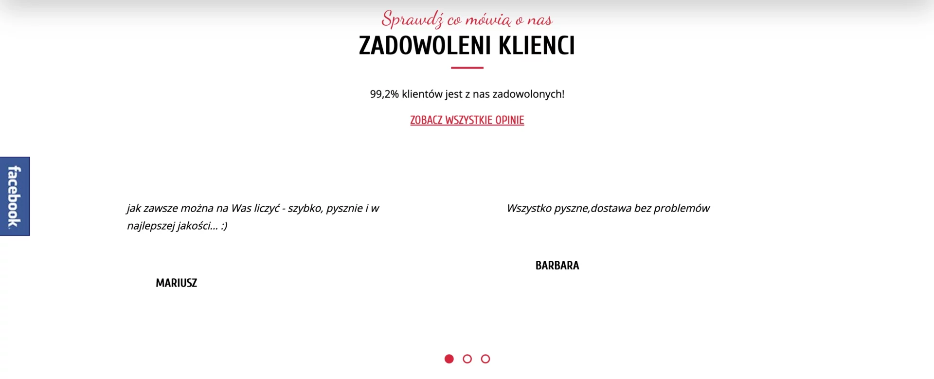
Pro-Tip: After the review author agrees, include his/her photo, name, and a link to a real profile on one of the social media platforms. Take care of the multiplicity and variety of opinions, so that those scrolling in the slider do not repeat themselves around the clock. For exposure, choose those that highlight the most important assets of the offer (e.g. price, quality, experience, etc.). It’s also not a bad idea to put a fly in the ointment: posting among the laudatory reviews one not-so-flattering — this way you will increase your credibility.
19. No thank you page and “thank you” by force
When receiving something from another person, anyone who didn’t grow up in a jungle (or grew up in an urban jungle…) usually says “thank you.” This is what the rules of savoir-vivre dictate, and all in all… why should it be any different on a landing page?
Although most landing page makers already know that every conversion should end with a landing on a thank you page, one often gets the impression that pages of this kind are treated like Cinderella… They are just there to be. Or as a punishment…
It’s like an insincere “thank you” muttered under your breath… Sounds more like “next please”. Or a spit in the face. In such a situation, how willing would you be to further develop and deepen your relationship with the site owner? That’s it!
Pro-Tip: First of all, it’s worth realizing that a thank you page not only ends the user’s path (customer journey) but often also begins it! Yes: in many cases, skillful use of the thank you page can make the prospect or customer come back to you again and convert again. This is the right place to offer a discount code, a bonus, or to encourage him to buy other products (cross-selling).
20. No optimization for mobile devices
According to Exploadingtopics, 55% of the world’s web traffic comes from mobile users, using mainly phones.
This makes it all the more surprising how many landing pages on mobile devices do not display properly. Scattered menus, overlapping widgets, and tiny text that can be read only using… telescope. Here is one of the worst landing page recipes. Use only if you want to upset your customers or set a world record in the bounce rate.
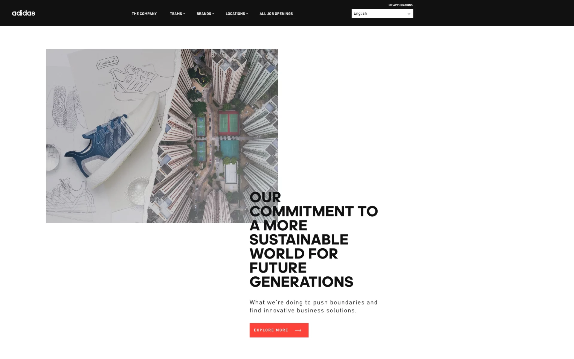
The text overlaps the image. Something went wrong… (Source: https://careers.adidas-group.com/).
Pro-Tip: When building a landing page, configure the mobile view and — as much as possible — make it consistent with the desktop view. To maximize the ease of your work, choose landing page builders that intelligently adjust both views, but at the same time allow you to make necessary changes in each of them. Such an opportunity is provided to you, for example, by the Landingi creator.
Build a free landing page with Landingi!
You already know what you should beware of. Thanks to our guidelines (Pro-Tips), you also know how to avoid basic mistakes. It’s time to set out on the journey ahead, the goal of which will be to create your own landing page and, through it, increase conversions.
With Plan Free, you will create in Landingi your first landing page at no cost! You won’t need expert knowledge or coding skills either. The intuitive drag-and-drop interface, the availability of hundreds of fully customizable templates, and one-click duplicate sections (Smart Sections) should make your job as easy as possible.
Let us know how it went for you!