
Recently, someone at Quora asked: „What are the secrets to building up a landing page that actually converts?” I decided to answer this question, but during the process, I realized that to fully cover this complicated matter, I’d have to spend some more time on this article and write it in a more detailed way. So here it is – dig in to learn a thing or two about how to create landing pages that convert!
- Landing pages in a nutshell
- Why should I choose a landing page over a regular website?
- Why doesn’t my landing page convert?
- How to make a landing page convert?
- A landing page is ready… now what?
- Check before launch
Many factors affect the quality of a landing page. Some of them are more important than others. However, there is another thing that practically defines a landing page. It’s called landing page conversion rate.
Of course your landing page can be beautiful, functional and responsive. It can be colorful, yes, and maybe entertaining too, but lacking any real value. Its true success is measured by conversions. Well then, there’s got to be something we can do about it!

It would be great to have a recipe for the perfect landing page, with all the dos, don’ts, and a guarantee of at least a 10% landing page conversion rate. One that would be a fit for all future landing pages and marketing campaigns, but…
Back to reality. There’s no such thing as a perfect, all-purpose way to have all this. Every landing page we create has to be handcrafted, individually adjusted to its goal, theme or product. Sure, some things never change, but I’d say there are some generalizations we can make. And when “general” is not enough, I’ll provide some real-world examples.
Let us begin and see what we can do to create landing pages that convert!
Landing pages in a nutshell
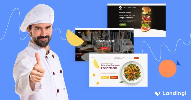
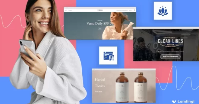
A landing page is a simple website, built around a goal. There are many purposes that landing pages can fulfill, but you should always select exactly one for your page. Here are some examples:
- collecting leads
- convincing people to buy your product
- signing up for a newsletter
- registering for a webinar or event
Once you select the one goal, you’ve got to choose the right landing page template to fit this purpose and create an environment to help people fulfill it.
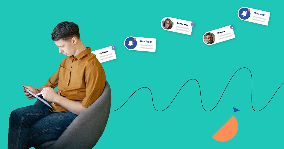
What is the conversion rate?
Conversion rate is the number of people who click on your website and do what you wanted them to do. If your goal is to get signups for a webinar, every time someone clicks the “submit” button after filling out the form counts as a conversion. If you’re selling products directly on your landing page, every “add to cart” or every payment counts as a conversion (depending on the settings).
A conversion rate is shown as a percentage. The average conversion rate varies in different industries. Keep in mind that a sales page will have many fewer conversions than a lead-generation page. That’s because the requirements for a ‘conversion’ are so much higher. While you’re collecting leads, people only need to type in their email addresses. A sales page, on the other hand, needs customers to pay real money.
For example: getting a 5% CR on a product page is alright, but the same amount on a lead-generation page indicates that something might have been done wrong.
How to track your landing page conversions?
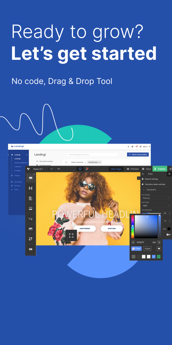
Ok, so the thing is that… even if we have a landing page we don’t automatically get vital stats, so we don’t always know what is going on with it. Some landing page platforms include analytics tools (Landingi, Instapage, Unbounce), but still the best way to get all the data is Google Analytics.
Learn how to install GA on your website – check out official Google support and this youtube tutorial for WordPress users.
The landing page builder mentioned above, Landingi, offers advanced statistics for their users to track the effectiveness of the websites they create. Let’s take a look at the exemplary chart:
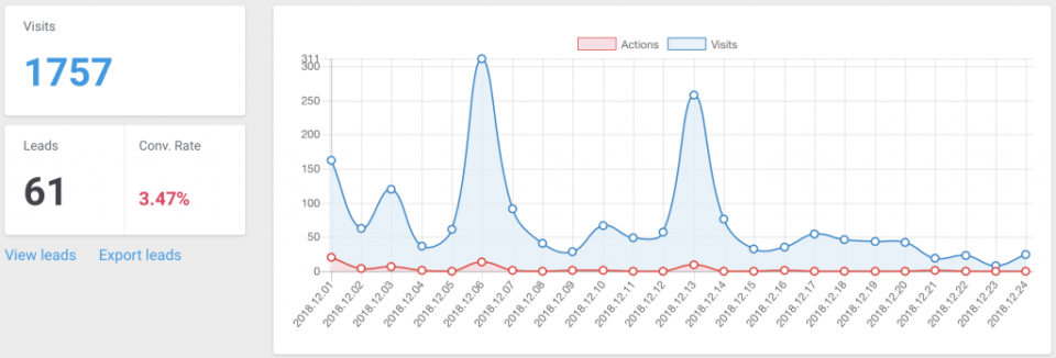
All the necessary info is there, but there are no data like average time spent on a landing page or number of unique visitors. If you need a more in-depth analysis, Google Analytics is what you’re looking for.
If you’re interested in WordPress landing pages, take a closer look at our article!
Conversion rate is the number of people who click on your website and do what you wanted them to do.
Why should I choose a landing page over a regular website?
A landing page is often designed for a single marketing campaign, and for that, it’s a perfect solution. Why? Because there’s nothing to distract the user. We can prove it!
We had such a situation. Our company, Landingi, had this sign-up page, where very important info was available. After directing traffic from a search engine to the address: https://landingi.com/features, we got the results shown below:
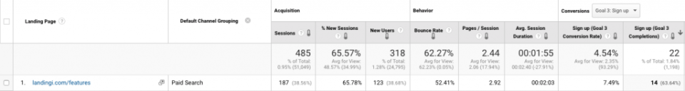
The conversion rate for this campaign was 7.49% (take a look at: “sign up: Goal 3 conversion rate” column). Good? Maybe. But take a look at what happened when we switched to a dedicated landing page:
After this “slight” change we got 13,87%, which makes it more than 6% higher. Better?
Why doesn’t my landing page convert?
Things aren’t always that good. Sometimes, despite putting lots of work into a landing page, the results are far from satisfying. Many marketers have seen something like this in their lives:
Now, this isn’t what we want to see after working hard on creating a landing page for our marketing campaign. What could have gone wrong?
Turns out that the question “why is my landing page not converting” might have a few answers.
No goal specified
One of the most destructive things for landing pages is the lack of a specified, clear purpose. Trying to create a landing page without that almost always ends badly. No goal equals no conversions.
Every landing page should start with choosing its purpose. Once you know what you want to get, you can think about how to do it. A landing page without a clear goal is always a mess. Moreover, if you don’t know what you want, don’t expect your visitors to just get it.
No goal equals no conversions.
There’s another thing: in most cases, it should be a single goal. Killing two birds with one stone may sound excellent, but it hardly ever works the way we’d like in the case of landing pages. For example: trying to sell a product and simultaneously encourage people to sign up for an industry event is much harder than you think.
It’s because some purposes work well together – like when you’re collecting signups for a webinar, you collect leads simultaneously. But usually, they don’t. See?
It looks like an entirely normal landing page, maybe a bit too normal, with a copy-pasted headline and an even more boring subheadline. However, there is one thing at the bottom of the page:
Do you see what I see? The prompt: CTAs. Yeah, they’re totally different. So the top of the landing page encourages you to order pricing, but at the bottom, it says to make contact. It could be done much better, i.e., with a chatbot in the bottom right corner. And why is a chatbot better? Because people can contact you without leaving a landing page. Two completely different CTA buttons are just too messy.
Bad start
All the copy on your landing page is crucial, but the headline is the brain of the operation. It’s the first thing they see, and if it’s boring, it will be the last. No decent headline equals no conversions.
However, being boring is not the worst thing that can happen to your headlines. I’ve seen some irrelevant, offensive, manipulative, spammy or simply stupid ones over the years. The internet is crawling with these. Do you want an example?

This Is One Of The Worst Things On The Internet – Don’t Ever Do It!
And – what’s really interesting – in these few words the author of this headline covered both irrelevant, manipulative, spammy and stupid! Way to go!
Even Worse Copy
Take a look around and compare some of the landing pages you’ve recently stumbled upon. Have any of them stuck in your head? In most cases you won’t remember what you’ve read on various landing pages – there’s too many of them and they’re too similar.
There’s more than just dull copy. One of the most annoying things on the Web is clickbait. I haven’t heard of literally one person who likes it. Maybe it’s not very harmful, but it’s also far, far from being decent marketing behavior. You’ve got to do better than that!
Complexity
A landing page cannot be mistaken for a regular website. There are too many differences that can’t be ignored. This is why we let go of navigation, sidebars or ads on landing pages. Let’s make it simple:
Too many elements cause distraction and a lower conversion rate.
Too many form fields cause suspicion and a lower conversion rate.
Too much copy causes boredom and lowers conversion rate.
There are situations, when – despite all this – you need a long-form landing page. For example, if you’re selling a very specialized product, like some construction equipment. No way can you include every critical feature in a three-point list.
In most cases, though, simplicity is the key. Stick to a few fundamental aspects and leave out all the rest.
Do you want to see how not to complicate a landing page?
This, here, is a perfect example of too much copy on a landing page, and of messy design. Luckily, Neerings crew drew conclusions and now their website looks far better:
Valueless value
We all know those phone calls about free tablets, kitchenware sets or radios. “You just need to come over and pick it up! It’s free!” Not sure about you, but I know a few people who have fallen for it. A grandmother who wanted to get a tablet for grandson, or a middle-aged couple who just needed new cutlery for their kitchen. None of them ever came back from such a “meeting” happy. Evenings like this are always filled with aggressive sales attempts with lots of “are you sure you don’t want this magnificent frying pan for merely $40?” questions and other unpleasant stuff. But what does it have to do with landing pages?
A value. If you want to achieve the goal of your landing page, you need to give people something in return. They won’t just leave their personal information for nothing. Those aggressive marketers from the example above learned that lesson, and they offer something great in exchange for coming to an event. Before getting there, no one knows that a tablet isn’t worth more than $50, and pots are just… potty.
If you want visitors to fill in your form and subscribe to a newsletter, signup for an event or buy a product, you need to convince them to do so. Without an attractive offer, your conversion won’t ever exceed a few percentage points.
Remember: the more you require from your visitors, the better the reward should be.
Broken promises
Hands up, people who like to be cheated! No one? Well, that’s no surprise. If someone makes a promise to us, we expect them to fulfill it. So if they don’t, we feel aggrieved.
If there’s a landing page that says: “Subscribe to our newsletter and get an in-depth report about marketing trends in 2019”, visitors expect to get exactly what it promises. Imagine their shock when they get a 6-page .pdf full of stock photos and truisms instead.
Broken promises maybe don’t affect the landing page conversion rates of a current landing page (after all, they had to click before they realized they were cheated), but it will undoubtedly affect your credibility in a negative way.
Now that we know exactly what not to do with our landing pages, it’s time to review all this newly-gotten information and answer the more important question:
How to make a landing page convert?
Avoiding big mistakes isn’t enough to craft a high-converting landing page. We need to go deeper. In this part of the article I’ll show you which elements affect conversion rate and how to use them well. At the end of the story, you will find a short list of things worth keeping in mind during the landing page creation process.
Set a goal and make it clear
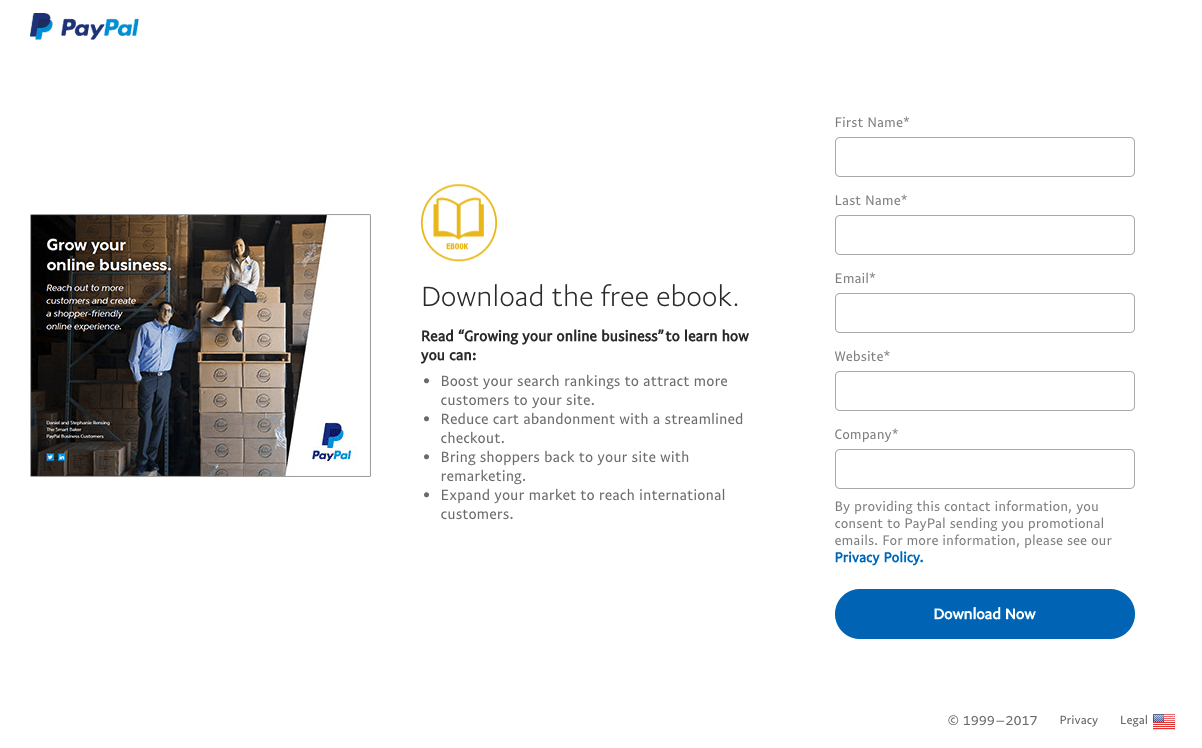
In addition to an example of a landing page with two different CTAs, I’ll show you a simple, one-goal landing page:
In this case, there’s nothing to wonder about. All you can do on such a landing page is to fill in the form and download an ebook. Simple graphics, three key benefits listed and short (!) form – that’s all it takes for a clear landing page goal.
No one should have to figure out what you’ve been thinking during the landing page creation process. You haven’t got much time, and it’s critical to show people what it’s all about the very moment they land on your website.
Get to know your audience
Crafting a landing page is – in some way – similar to writing a book. In both cases, you should know whom you are writing to. Your target, people who will read your work, have to find something familiar there. If you’re creating a landing page for people in business, it will be completely different than the one for teenagers or NGOs.
Your landing page must correspond with the audience. But how to learn something about them? Well, as usual – by talking to them!
There are people on the other side of the screen(s). People with needs, interests, problems, and experiences. Ask them about it – create a Facebook group where you can ask them about the latest book they’ve read, a blog they recommend, or their expectations and hopes regarding your service.
Knowing all this stuff will help you offer your products or services to them directly, not to some “typical internet user” (if there is such a thing, anyway).
10, 9, 8… no time left!
Remember what attention span (not to be confused with spam) is? It’s the amount of time people can spend focused 100% on what they read. Well, you’ve probably heard about Microsoft’s research saying that we’ve lost four seconds of our attention span during the last 15 years. As horrible as it sounds, things aren’t that bad.
New research shows that it’s not smartphones or the internet that damaged our ability to focus – it’s evolution. People are getting adapted to the fast-paced world, and they are more capable of doing many things simultaneously.
However, the fact still remains. People don’t read anymore on the internet. They scan in search of essential content. So don’t be surprised when you notice that your landing page has a 10-second average time spent, despite your calculations saying that they should spend at least 1,5 minutes to read everything.
Oh, and here is this new research on attention span I’ve mentioned above.
Prepare some killer copy
The copy is the most difficult part of a landing page. It has to pass your message, convince people to leave their email addresses, include all the essential things about your offer, and contain a CTA (or CTAs).
I repeat myself, but you should make it short and simple, if possible. Sometimes you will feel like you have to say more about your offer, maybe to dispel users doubts about your offer. In that case, do whatever you think is best for your landing page, but keep in mind that less is more, especially when it comes to the amount of text.
To crown your landing page with great copy, you’ve got to start with the headline. Then write a subheadline (if necessary, but in most cases it is), and then the rest of the copy. Always include a call to action, of course!
A headline
Coming up with a great headline isn’t easy, but it’s not impossible. Get some inspiration below!
These three headlines show some common creativity although with an entirely different approach.
Bitdefender convinces visitors that they offer preventive protection – isn’t that what matters the most when we choose antivirus software?
Apple focuses on the key feature of the MacBook Air (both old and new) – mobility. It’s light. It’s small. You can use it wherever you want.
Lyft, on the other hand, gets a bit metaphorical, giving value to what their clients do. They implicate that your life can be given “direction” with their service.
Call to Action
This, along with the headline, is the most crucial part of the copy. It’s responsible for conversions, as it’s the last thing before performing an action on your landing page.
A great call to action sums up everything a landing page is about. It should encourage the visitor to take one last step, whether it’s submitting for an email list or buying a trip to Asia.
A CTA itself does not have to be “Shop Now!” or “Submit” kind of thing. Feel free to make it a bit longer, more descriptive, maybe with a twist, like in the example below:
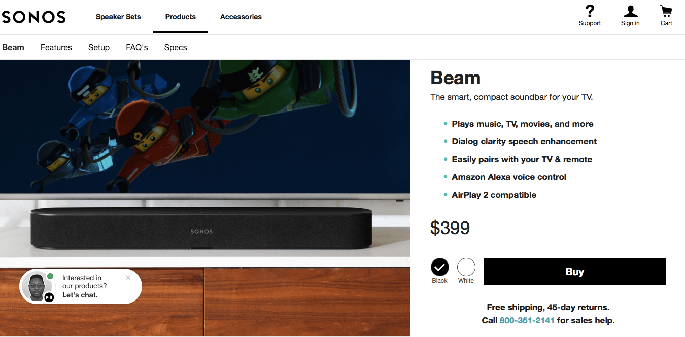
Of course, it’s Netflix. I cropped it intentionally to prove that it’s a brand that doesn’t have to work for our attention – they already have it. For something simpler, check out this:
I’d say it’s a textbook example of a direct call to action. Typically, there is also a button below, but since I work on a MacBook, there is a piece of information about my computer being incompatible with Gwent instead. Well, maybe some day.
In the case of Airbnb, the CTA is very simple – just “Get Started.” However, it is direct, and it encourages a visitor to click the button. Also, the form reacts immediately and predicts future earnings based on what options you select. This simple functionality makes it even more interesting.
Craft highly-effective landing pages
Use Landingi
Benefits
If you have an attractive offer, you have to make it look like one. A list of benefits is also a big part of landing page copy.
The best way to convince people that they need your product is to give them a solution to a problem. If your thing can fix their issues, they may buy it. Prove it to them by writing down all the best that’s in your product. However, don’t write too much – three or four key benefits will be more than enough.
Copy tips
Stand out from the crowd, try to craft a memorable landing page! Easier said than done, eh? So grab some great copy examples:
Examples by Kickofflabs
Copywriting swipe files by Optinmonster
Tips by Landingi
Need more? Get a pack of resources created by Team Landingi – the Marketing Starter Kit. It contains hundreds of free elements to use in your landing page creation process.
Grab attention
Remember what I told you about headlines? They’re like catches and knowing how to use them properly is 50% of your landing page’s success. But I’ve already covered the headline topic. What now?
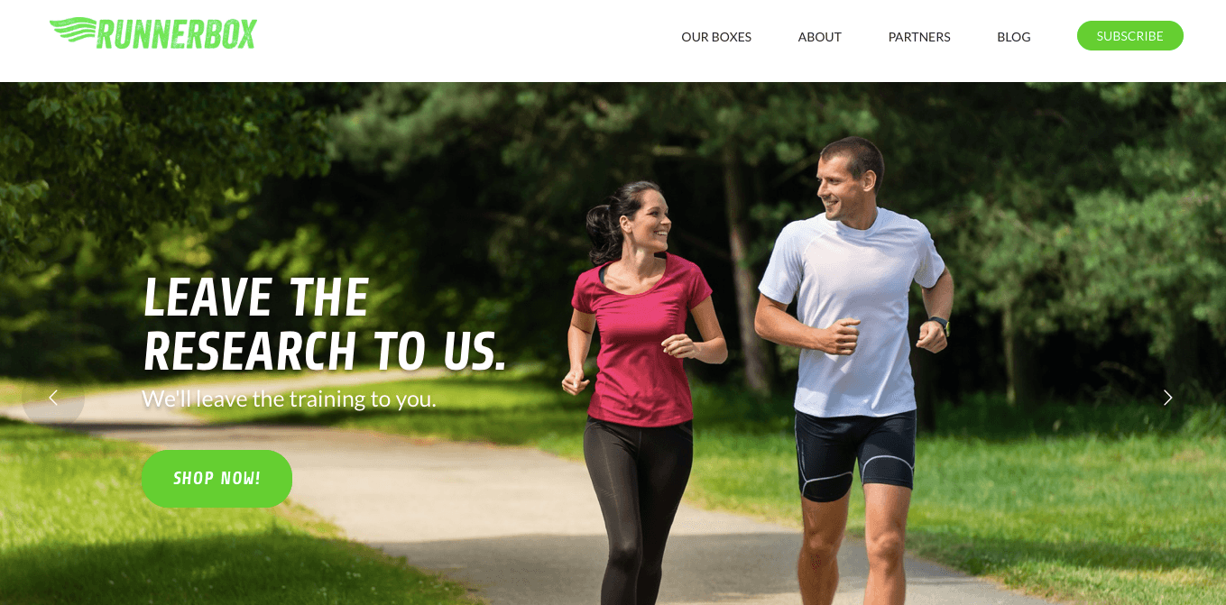
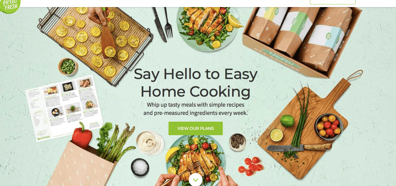
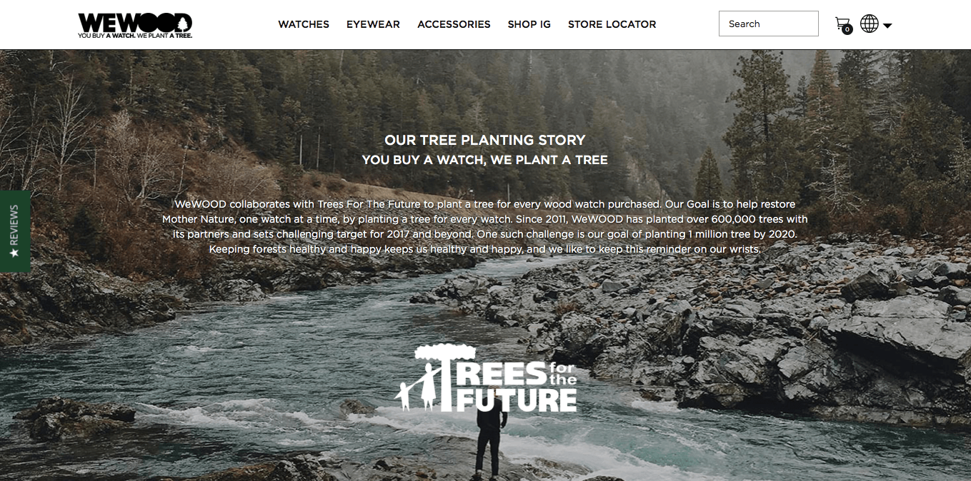
Pictures, videos, animations, gifs. All these work great, if relevant, of course. But a product page without photos is doomed to fail. A complicated internet service without a short introductory video can’t be understood easily. The visuals do the trick for us, people. Remember the old internet rule: pics, or it didn’t happen!
I’ve got an example for you – this is a landing page based on a template available in the Landingi platform. I’ve edited it myself, getting rid of the photo only:
So what exactly is it about? It’s not hard to get if you read the copy carefully! But probably no one will bother since there are no photos. One slight change, and…

Here we go! Despite some silly copy that was meant to be distracting, the second landing page makes you think: “Oh, so I can buy a watch here” rather than “What on Earth is that?” Let’s stick to the second option.
Optimize your landing page
Now that you’re webpage is shiny, filled with fun copy, a great headline, an exemplary CTA, and high-quality photos and videos, let’s visit it… and wait ten seconds before it finishes loading.
There are always two sides to a story. Filling your landing page with goodies will most probably be challenging for your hosting, and it will negatively affect its loading time. Remember the part about attention span? Some people will bounce off your page as soon as they realize that it’s not gonna load fast enough.
Don’t let such a small technical issue drag down your conversion rate. To avoid situations like this, optimize every piece of visual content on your websites and/or landing pages. You can do it via free online tools like TinyPNG for images or ezGIF, in case you need a lightweight video without sound (i.e. to show something).
Keep It Super Simple
Your landing page has to speak to people, it has to be easily acquirable. This is why you should keep it short and simple.
Here’s an example: If you want to collect leads, you’ve got to take care of certain aspects: the looks of your landing page, the value proposition and copy.
Creating a beautiful landing page isn’t rocket science in the era of templates: you just need to find a template that looks great, adjust it to your needs (it’s really easy) and that’s pretty much it. If you’re not convinced about your own skills, you can order a design service to get better results. But in most cases, a template will do its job.
The value proposition, on the other hand, is much more difficult to come up with. You’ve got to get in your visitors boots and try to predict what they would want to get from you. If you already know that, then you’re one step ahead! It has to be something really attractive, like an online course, a webinar or some exclusive freebies. Nobody wants your .pdf written overnight and covering the already-covered topics.
There’s one more thing you should use on your landing page to get it done right: a social proof. If you’re selling a product, a testimonial will work great. If it’s an e-book full of articles written by industry gurus, ask one to say a few words about it and shoot a short video or place the quote somewhere on your landing page. Social proof works great for the credibility of your landing page. Use it anytime you can.
A landing page is ready… now what?
After hours of hard work, it’s finally time to hit the publish button… or is it?
First things first! Check if your landing page is polished enough. Send it to your colleagues for proofreading and testing. After they check it, correct what needs correcting and you may publish.
The funny thing about landing pages is that they’re like lines of code – you can’t really say “It’s finished”, because there’s always something to do better. This is why you need to A/B test it.
Remember our own example I mentioned at the beginning? That when we switched from a website to a landing page, our conversion rate jumped from 7.49% to 13.87%? That wasn’t the end of the story. After some time, Neil Patel reviewed the Landingi platform and we decided to put his quote on our landing page, making its social proof even stronger. That resulted in raising conversion to 14.17%!

What’s the best part? Now, after some changes in Google Ads, our landing page maintains a 15.18% conversion rate. That means we’ve doubled its efficiency in less than six months! How cool is that?
All this teaches us is that there is no such thing as a perfect landing page. We’ve doubled our conversion rate, but why shouldn’t we triple it? I don’t think there’s ever a time to say: stop, we can’t get any better. Because we – and our landing pages – always can.
Check before launch
Instead of a takeaway, I give you a list of things you should keep in mind while creating your own landing page. You can go back to the list below if you’re stuck during the process.