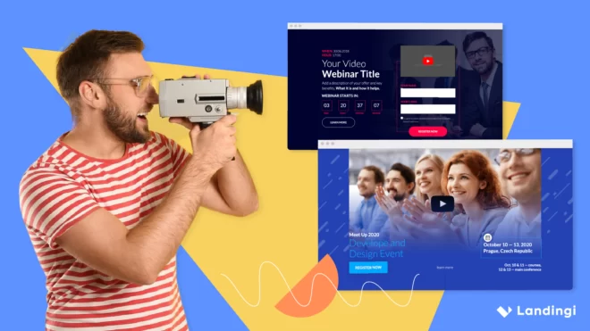

In this blog post, you will examine smartphone landing pages’ good practices among 5 selected cases and find out what is important on mobile landing pages, to create a perfectly optimized page for your product or service.
Simple, traditional landing pages are no longer enough for the smartphone age. To reach your audience and succeed in conversions, you need a mobile landing page that is appropriately optimized to drive excellent user experience.
Yes, the time has come – phones are no longer communication tools only, even though the evolution has lasted for some time now. We use smartphones for daily scrolling SM, shopping, and searching for services, but how is the global market, including your business, prepared for changes that already happened?
For a good start, take a look at the 4 tips for creating a mobile-friendly landing page:
- Keep the content short.
- Optimize layout and graphics for mobile devices.
- Use strong CTAs.
- Optimize loading time.
Before you choose one of the mobile landing page templates from our tool’s library, check out the shortlist of mobile landing page examples below and read more to get takeaways for your use:
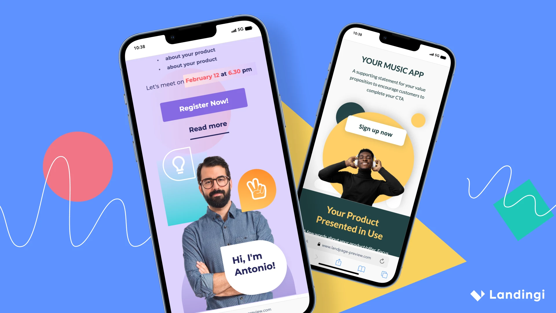
What is a Mobile Landing Page?
A mobile landing page is a single web page specifically designed for optimal viewing and interaction on mobile devices, and saying plainly, it is your secret weapon for dazzling user experiences on phones and tablets. As with every other kind of landing page, the mobile one is a focused entry point for users, often tied to marketing campaigns or specific content.
The 5 essential characteristics of a mobile landing page include:
- Stunning design, with a layout tailored for various mobile screen sizes, ensuring a seamless user experience
- Crucial content condensed to capture the user’s attention quickly
- Irresistible CTA, attracting visitors and encouraging them to take action
- Flash-speed loading, optimized for quick loading times
- Simplified forms optimized for smaller screens
Make your sections smartable and let go of mundane manual tasks with Smart Sections! An easy way to manage bulk changes.
Why Do I Need a Mobile Landing Page?
You need a mobile landing page to reach your target audience, which mostly uses mobile devices. Every marketing campaign that starts from SM ads generates traffic from mobile users, and those require UX and clarity on a level of SM scrolling. By aligning your message with the audience’s needs, you significantly increase the likelihood of achieving high conversion rates.
Mobile optimization is indispensable to ensure a seamless and issue-free experience. Unlike desktop landing pages, which are more extensive and designed for larger screens, mobile users prioritize quick actions without prolonged contemplation.
Therefore, a mobile landing page must feature a responsive design, optimized loading speed, clear and engaging content, and easy navigation.
How Do I Create a Mobile Landing Page?
The easiest way to create a landing page for mobile devices is to use a tool with mobile optimization features. But mobile landing pages differ from traditional ones, so focus on 3 fundamentals:
1. Create catchy headlines and concise content.
Ensure your mobile landing page is clear and attractive enough to get the attention of your audience in a few seconds. Social media and short video platforms have changed user behavior for good – you literally have seconds to engage your visitors and make them want your product.
2. Shorten up your landing page or place essentials on the top
Instead of creating long stories that describe your company, set a bullet list of benefits, read it twice, and shorten it up to essentials. Place that information on the top of a mobile landing page, add a clear, strong CTA, and embellish it with memorable visuals, responsive for mobile.
3. Ensure fast loading
Use optimization tools to shorten the loading time to a minimum. It’s the only way you can reach the audience among smartphone users – none of those will wait more than 2 sec. to see your offer. If it doesn’t load in time, they will find another brand.
According to Think with Google analysis, the best practice is to keep the loading speed under 3 sec., and the best option is to lower the loading time to ca. 1 sec. Further analysis shows that if loading time reaches 5 sec. probability of bounce increases by 90%.
A desktop landing page is not enough if you want to reach the audience and make conversions. Even if somehow it loads on mobile devices and the user will take time to wait for it, poor navigation, which isn’t tailored to smaller screens, causes only exits.
5 Examples of Best Mobile Landing Pages
Take a look at the 5 examples of best mobile landing pages created with Landingi, which show how mobile responsiveness affects UX and increases conversions.
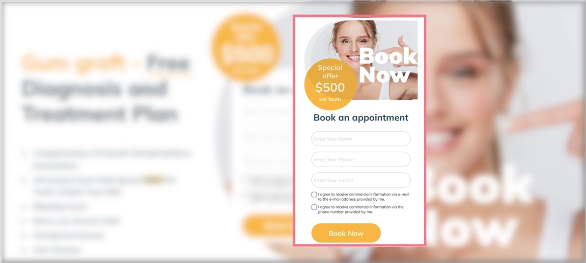
1. Orange County Surgical Specialists
Orange County Surgical Specialists provide periodontal help – their mobile landing page, created by Landingi, was intended to show the essential services they offer patients and promote gum graft services.
A simple and straightforward design with all necessary information placed on the top of the page, a well-designed CTA button, and a simple form guarantee a seamless experience for visitors, encouraging them to ask professionals for help.
A mobile landing page is similar to a desktop one but differs in user experience, providing ease of use and transparency tailored to mobile devices.
Learn from this mobile landing page example:
- Clear layout
- Focused content with essentials on the top
- Well-designed CTAs
- Optimized visuals
Improvement areas for this mobile version:
- Speed index 4,6 sec – the page loads fast, but general speed index could be improved
- Too long content – some blocks are unnecessary in the mobile version
2. CBRE Poland
CBRE Poland is a Polish branch of consultancy services for commercial real estate. Their mobile landing page was created with the best landing page builder – Landingi, to deliver retail reports for their targeted audience.
Its layout corresponds to a desktop landing page, but the design is optimized for mobile devices with a single-column outline, well-placed strong CTAs, and shortened content.
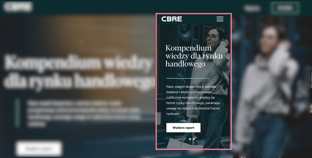
The mobile design includes high-quality visuals but ensures excellent navigation at the same to improve readability and affect high conversion rates.
Learn from this mobile landing page example:
- Clear, alternative CTAs
- High-quality visuals included
- Maximally focused content
- Simple opt-in form
Improvement areas for this mobile version:
- Lack of crucial benefits information on the top
- Speed index – even though the loading time isn’t too high, some elements of this mobile landing page could have been optimized better
3. Loan Expert
The next example is a landing page offering loan consultancy services for individuals and companies. With Landingi, his owner created a landing page, also for mobile, where he encourages visitors to book a call and ask for help with choosing the best loan option.
A mobile landing page with shortened content, including essentials and catchy headlines, clear CTAs, and video content, is tailored for mobile users looking for smooth navigation.

A type of landing page that answers for struggles with a significant part of life, needs a bit more content with information than a simple product page – which requires specific design solutions. One of them is using video content to shorten the page length and give answers to concerns that may appear among users.
Learn from this mobile landing page example:
- Variety of content types
- Simple navigation
- Optimized visuals
- Strong, repeated CTAs
- Well-designed content structure
Improvement areas for this mobile version:
- Lack of sticky bars – it could simplify navigation and improve conversions if CTAs were kept on view within longer mobile landing pages
4. Atelier Redakcji Tekstu
Atelier Redakcji Tekstu is a Polish company that offers proofreading and text correction services. With Landingi, they have created a mobile landing page promoting services for students.
This project shows professional mobile optimization where navigation wins, all significant information is condensed into short content on the top, and the design corresponds with the desktop version.
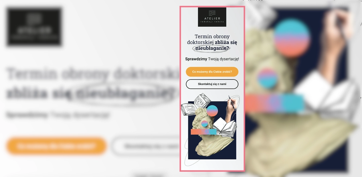
The call now button characteristic for mobile landing pages appears next to a simple opt-in form as the alternative for leaving an e-mail address. It’s one of the best ideas for increasing conversions on mobile devices – adding such a button to the desktop version is pointless. Still, for smartphone users, it simplifies the way to take a desired action: instead of copying the phone number, they can simply click the button to start the call.
Learn from this mobile landing page example:
- Call now button included
- Speed index 3.4 sec
- Excellent navigation
- Content with essentials
- Optimized high-quality visuals
Improvement areas for this mobile version:
- Shorten review box – it could be condensed e.g. into a carousel, to shorten up the page length
5. Agrosimex
Agrosimex is a company that provides crop protection products for fruit growers. They have used Landingi and created a landing page, also with its mobile version, to execute their marketing campaign for customers and offer products in a favorable package.
The mobile landing page of Agrosimex shows that the simple design focused on a product, short content, and great navigation are essentials. Users visiting this page have no doubts about what to do to get the product.
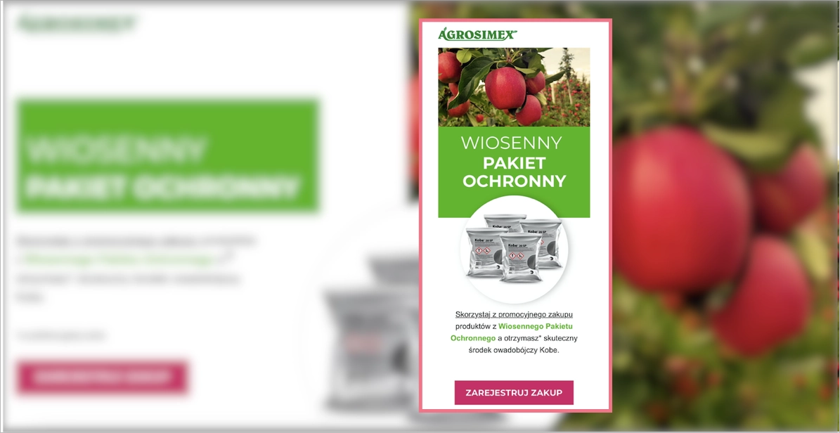
A mobile landing page for wholesale products aims at specific customer segments, so the content is shortened to a minimum, which is enough for a targeted audience. The strategy focuses on call-to-action buttons and clear navigation.
Learn from this mobile landing page example:
- Strong CTAs
- Condensed content
- High-quality product visuals
- Ease of navigation
Improvement areas for this mobile version:
- Visible purchasing forms – the type of landing page conditions it as minimizing steps to purchase a product, but form could be hidden under some button to shorten the page length
Get 111 Landing Page Examples—The Ultimate Guide for FREE
7 Mobile Landing Page Best Practices
Creating a mobile landing page has one purpose – engage mobile users who discovered your product or service and encourage them to take the desired action. As long as you understand the mobile users’ habits dictated by SM giants, you know that your magic tool is UX.
To build high-converting mobile landing pages, take the 7 following pieces of advice:
- Keep the design simple,
- Add concise content,
- Use strong CTAs,
- Set a simple navigation,
- Optimize visuals,
- Use a “Call Now” button,
- Optimize the speed index.
Review the brief explanations and examples provided below to gain a deeper understanding of the seven pillars crucial for creating mobile landing pages that drive high conversions:
#1 Keep the Design Simple
First choose your brand’s colors, set the logo, and keep the layout simple with shapes or fonts. Take a quick look at the example below:
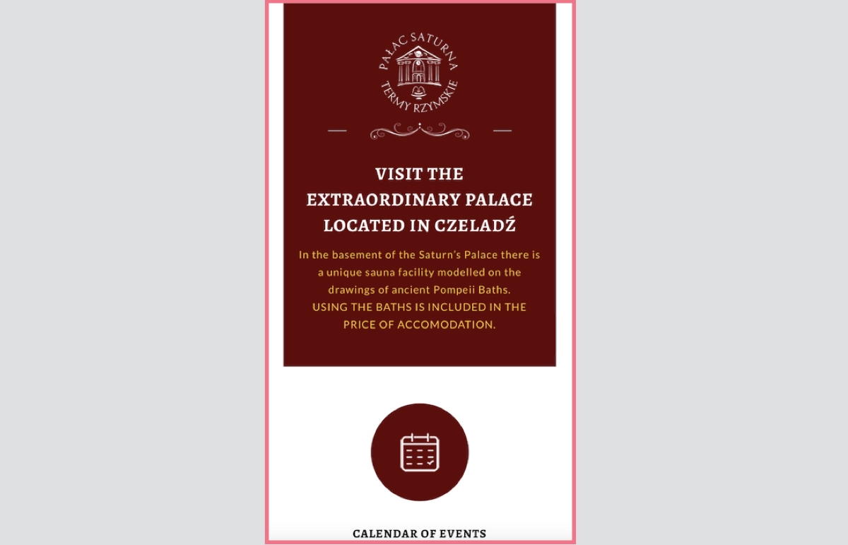
Single color, repeated shapes, and a more distinguished logo make the landing page clear yet attractive for mobile users. Simple design eliminates distraction among users and leads them straight to CTAs.
The example above shows perfection in this area – you can see it’s impossible to miss the calendar button and be sure the next steps are pointed out in the same distraction-free way.
#2 Add Concise Content
Secondly, reach the users’ attention with catchy headlines and add essential information about your product or service on the top of your mobile landing page. Just keep it concise and short enough to maximally focus on the purpose: engaging visitors to take the desired action.
Learn from the example below:
You can see a few good practices, starting from a captivating headline with an offer, through short but inspiring content, to a CTA button boosted with a picture that points the button out.
#3 Use Strong CTAs
Visible and contrasting CTAs with well-designed messaging make the magic. Use alternative buttons to separate actions and choose accurate colors to highlight the essential CTA. Make a choice evident for mobile users and let conversion grow.
Check out the example below:

The example shows how to implement alternative CTAs on your mobile landing page, keeping the main button visible at the same. It leaves no space for doubts; visitors know precisely what to do according to their intentions.
Still, side-conversions don’t make the deal, so for this purpose, there is a main CTA button on the top that can’t be missed with its outstanding size and color.
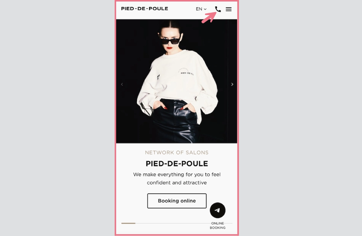
#4 Set a Simple Navigation
Make an effort and simplify navigation on your mobile landing page, especially when it’s a more extended type. Add a sticky navigation menu, buttons that lead to the top, and repeat CTAs. These practices impact user experience and simplify actions. Remember – the easier navigation, the better for conversions.
Learn from the example below:

If you look at the screenshot, you can see clarity. It goes together with a straightforward CTA and navigation menu in the top right corner of a page. There’s no possibility of “getting lost” so users would most likely click the button or look for other options.
#5 Optimize Visuals:
Optimize visuals for mobile – lower the number of pictures, ensure they aren’t too large, and make them fit well with the mobile landing page design. The visuals are attrouble spots – if not optimized, they affect loading speed poorly, which is the fundamental factor of well-working mobile landing pages.
Optimizing doesn’t mean eliminating, though. Visuals are still one of the most essential elements that drive user experience. The point is to find a balance between nice graphics and loading speed, and with that can help the Landingi platform with the landing page builder, which optimizes your design for mobile devices automatically.
Take a look at the example below:
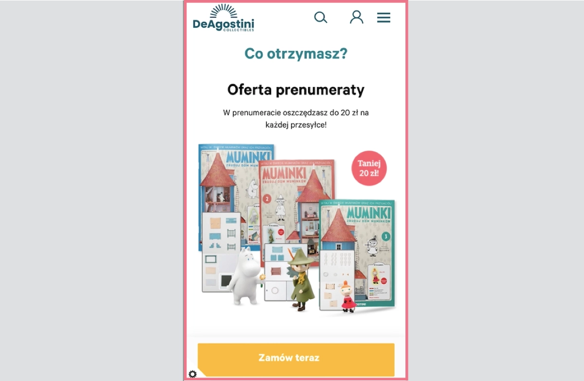
The visuals of magazine covers and collection items are crucial for the mobile landing page offering subscription, but its graphics, even though high-quality ones, are not increasing loading time thanks to proper size optimization.
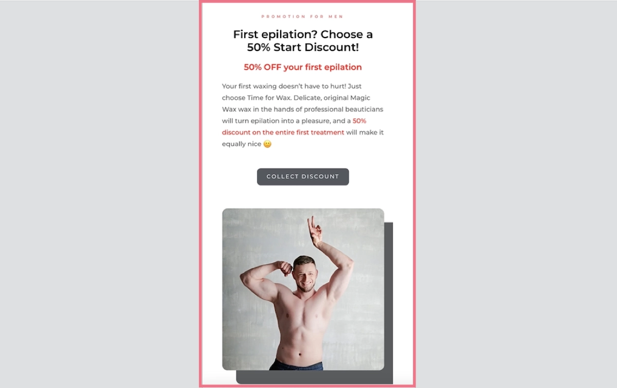
#6 Use a “Call Now” Button
While creating your mobile landing page, remember to use characteristic buttons, such as “Call Now” or “Navigate”, to simplify actions for smartphone users. These little additions allow visitors to make a call effortlessly by choosing a single button instead of copying the number – and similar, the “Navigate” button starts navigation through Map apps without copying the address.
It’s important to use the potential of mobile landing pages in order to facilitate the user’s path. Look at the example below:
The hairdresser’s mobile landing page includes a “Call Now” button to simplify contact. Even if the primary purpose is to encourage visitors to click the “Booking online” CTA, some customers need a consultation before choosing a date.
The “Call Now” button should exist on every service’s mobile landing pages, though it’s not necessary for product pages.
#7 Optimize the Speed Index
Remember the speed index factor is the one that makes your landing page perfect for mobile devices. With responsive design, compressed graphics, and minimized code, you can achieve better results.
Note: according to Marketing Dive’s research, a mere 2-second delay tests a user’s patience, with 53% of mobile visitors abandoning a page if it fails to load within 3 seconds.
It’s a good practice to use dedicated tools to measure key factors comprising speed index, e.g. Google PageSpeed Insights. The solution is simple and easy to use, it’s enough to copy and paste your page’s URL to start analyzing.
What To Avoid While Creating Mobile Landing Pages?
While creating a mobile landing page, avoid 8 pitfalls that badly impact your mobile landing page:
- Excessive content,
- Complex navigation,
- Slow loading times,
- Non-mobile-friendly forms,
- Unoptimized visuals,
- Lack of testing,
- Unclear call-to-action (CTA),
- Ignoring analytics.
Creating a mobile version of your landing page is an excellent chance for your business, so don’t make common mistakes that can distance you from success.
How Do I Make My Landing Page Mobile-Friendly?
To make your landing page mobile-friendly, incorporate best practices described in this blog post, avoid the 8 most common mistakes mentioned above, and remember about analytics with regular optimization.
To minimize your efforts, try out the landing page builder that provides mobile optimization features that automatically adapt your design to various devices.
Do Mobile Apps Have Landing Pages?
Mobile apps themselves do not have landing pages, but their promotion and marketing efforts may involve landing pages to attract and inform potential users.
Mobile apps are typically showcased and introduced via app store listings, such as the Apple App Store. These listings function as a type of landing page featuring vital details like app descriptions, screenshots, user reviews, and options for download and installation.
Yet, certain mobile apps might utilize dedicated promotional or marketing landing pages beyond app stores. In this case, landing pages serve to raise awareness, furnish extra information, and motivate users to download or sign up before guiding them to the app store for installation.
How Long Should a Mobile Landing Page Be?
The mobile landing page should be as short as possible and include catchy headlines, short yet inspiring content, and strong CTAs. Still, an ideal length for a mobile landing page depends on the goals of the page, so the product landing page will differ from the service landing page, etc.
However, as a general guideline, mobile landing pages are often more effective when concise. Usually, the mobile version of a landing page is way shorter than the traditional desktop one.
To drive the best results, try to maximally shorten your page and add only necessary information with great CTAs and memorable graphics.