


March 21, 2024

Car dealerships rely on online advertising to get potential buyers to visit their location, find the right vehicle, test drive it, and commit to a purchase. While TV ads are great for manufacturers, local dealers need to get their name out as they act independently of a car brand.
The ad campaigns aren't cheap, and what happens after the visitor clicks the ad is of utmost importance. Using landing pages instead of traditional websites allows dealers to control the customer journey more effectively since landing pages have a single focus.
Let's discuss best practices and examples of automotive landing pages for your dealership.
Create pages using AI features to generate text, SEO and edit images to work more efficiently and publish high-quality pages.
Conversion rate is not just a marketing buzzword. It translates directly to the number of new contacts and, if you nurture them right, customers. That's why it's important to keep this metric in mind.
In order for your car dealership landing page to convert as high as possible, you need to follow certain practices.
Potential customers are cross-shopping with different brands and dealers, so if they see that a particular model is available at your dealership, they are more likely to make a call or send an email to inquire about it.
There is also the other side of the coin. If you advertise a given model, the customer asks about it, and it turns out it's not there anymore, it might leave a bad impression and discourage the landing page visitor from considering your dealership ever again.
Your automotive landing page might be the very first point of contact with your dealership. That is precisely why you should include a section with a map and opening hours. Even if the visitors don't convert, they might remember where your dealership is and pop in when they are in the area.
It wouldn't count on the conversion stats, but as long as you get people in the door, it's a solid move. Here is an example of what this element could look like:
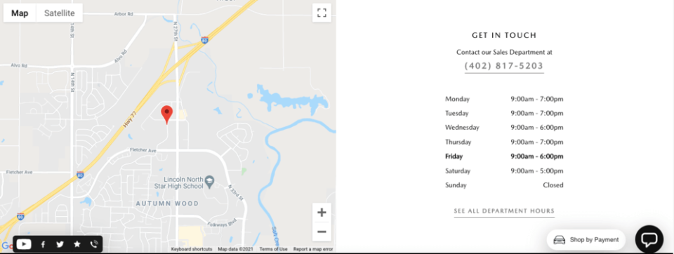
Check out here how to embed a map widget on your landing pages created with Landingi builder.
Just like tons of other dealerships and car manufacturers, you might be tempted to provide visitors with all kinds of links. Contact, setting up a test drive, trade-in options, payment plans… it's a lot.
Landing pages are not supposed to have as many buttons. If you run paid ads that redirect to a landing page, your goal has to be clear and there should only be one. Make sure you limit the number of buttons on your automotive landing page to keep the visitors focused on the goal they are supposed to fulfill.
One thing car brands do very well on their landing pages is use pop-ups instead of redirecting to another site. You might have lots of information to convey, and having a pop-up with technical specifications might make the page shorter.
Some of the examples you are about to see actually stick to these (and other) practices quite often.
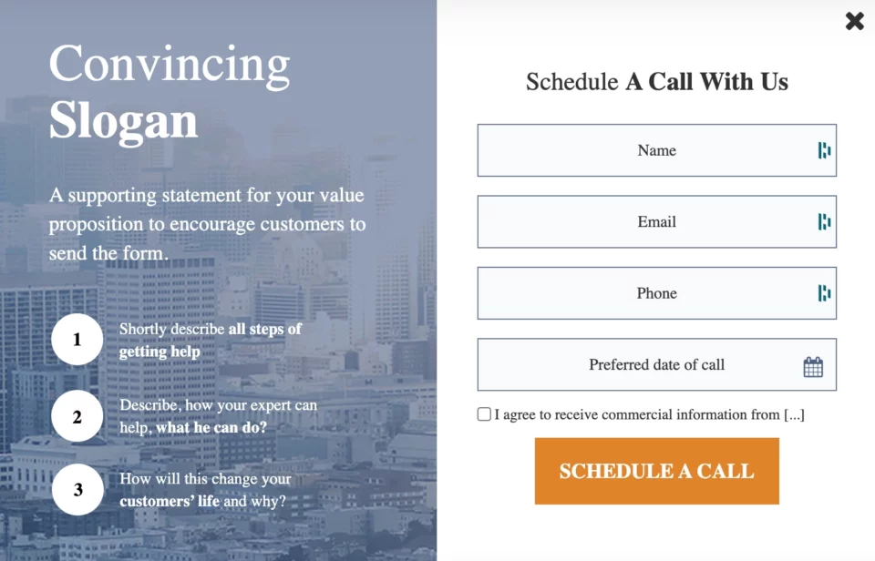
Build a pop-up like this one with Landingi's Schedule a Call 2 template, or check out 100+ pre-designed, fully-customizable pop-up templates in our gallery.
They say imitation is the sincerest form of flattery, so we're going to take a look at examples of automotive landing pages.
We'll see what works and what needs improvement. Once you've seen all the examples, you will have a better understanding of what others are doing and which ideas are worth implementing in an automotive landing page of your own.

View Full Page: Peugeot 308
On this landing page for the 2023 Peugeot 308, the goal is clearly defined right from the get-go. There is only one CTA button in the hero section, and it is centered as well as framed with contrasting color, which makes it instantly visible. Clicking the button takes the visitors to the virtual configurator ready for them to create, personalize and quote a car they are looking for with all the desired features.
There are also several other CTA buttons, which is typical on car dealership or automotive landing page. They are properly placed in sections below the line, making them not compete with the main CTA. All of them seem relevant to the offer and the landing page type. The first one ("Book a Test Drive") redirects to lead capture form, which is perfect for people that are one step ahead of a purchase. The second one ("View offers") is to retain those close to leaving the website and jumping to the competitors.
A headline ("Unique just like you") expresses the idea of 308 and nurtures users, emphasizing their said uniqueness.
The copy in each section is short yet informative, presenting the most valuable features of the vehicle. Even the copy in the hero module is limited, giving the image lots of place to shine.
There are many sections on the page, and some could be removed to keep the visitor engaged. Also, it's full of links that take the viewers out of the landing page, but I must admit that most of them are in the backdrop. Thanks to that, they don't draw the visitors' attention back from the CTAs.
All in all, it's a solid automotive landing page that will likely generate lots of leads for Peugeot.

View Full Page: Ford F-150
This landing page for a Ford F-150 follows the rule of having one goal. There are only two sections there – yes, that's the entire page you're looking at. The video is made by an impartial YouTube channel, which adds to its credibility. It clearly showcases the power and towing capacity compared to the competition.
The other part has everything one could ask for in the contact section, except for the map. The “Contact Us” button is clearly visible, and the opening hours and address is there as well.
Too much of a good thing is not what you want, especially on a landing page. But not enough of a good thing can produce the same effect. This automotive dealership landing page is way too simple. There is no enticing, original copy.
Using a video is a great idea, but it needs to be accompanied by more information, which is not the case here.
As far as visuals are concerned, the image with the logo is broken, which leaves a bad taste since it's displayed in the middle of the top bar.
Generally speaking, it's not a landing page that is an inspiration for those who want to create a high-converting example of their own.

View Full Page: Tesla 3
Compared to the other automotive landing page examples listed here, this one is pretty short. It's not a drawback, though. Each part has its place, and there is nothing here that needs to be removed.
The page uses pop-ups and drop-down sections to save space on the page to achieve that effect. It's clear that a lot of thought went into the packaging of the entire page so it's compact and informative at the same time.
The use of images and animations showcases both the design and the tech features of the car better than any copy would. Also, including the numbers and animated map widget speaks better to clients' imagination than long pieces of text.
The main issue I have with this page is it's sometimes clunky, especially when you scroll up and down a few times. It doesn't load the subsequent sections as smoothly as it should. Tesla is a victim of its own creativity here.
There are a few instances where the white copy is not very legible on the background image, but that is an easy fix to make.
Except for the above, this automotive landing page is surely one of the best.

View Full Page: Citroën C4
CTAs are exposed with red frames, and it's beyond doubt what the target actions are on this landing page.
Instead of customer testimonials, this page attacks the visitors' eyes with a badge of AutoExpress Car of The Year contest along with the info that C4 was the winner. It has the power of thousand anonymous reviews!
Smart pop-up topped with a detailed car picture inviting for (at least) a free drive — a fine way to say, "Take a look: we are upfront and have no secrets!".
A chat widget dedicated to those who need more detailed information.
Check out how to enhance your landing page created in Landingi with chat widgets (WhatsApp, Facebook Messenger, LiveChat).
In sections below the fold, the copy pieces are too long. Visitors typically screening the landing page most likely don't even start to read, which translates that the space is mismanaged, and the chance for communicating the customer value has been partially lost.
I am a bit missing dynamic elements like drive visualization or virtual tour. These techniques seem perfectly fitted for the automotive business as they allow visitors to anticipate the driving experience engaging their emotions.

View Full Page: Mercedes Benz AMG E-Class Sedan
First of all, scrolling through this page feels like an actual landing page, so kudos to Mercedes. The number of links has been reduced to the absolute minimum. The top bar contains the “Build” CTA, so it's always there should the visitor decide to spec their own E-Class.
The hero section is too short in the copy department. The “Build” CTA button is rather small and does not look very enticing.

View Full Page: Hertz
This is a car rental landing page, and it is done pretty well. There is one thing, though, that seems to stop it from converting higher.
The only CTA button won't make anyone distracted. Colors are selected so that the most important elements may contrast with the background.
Showcasing some "whys" for choosing Hertz is a good idea, but...
...but they look somewhat shy. They completely sunk in the background.
The form-like section in the center images has 8 fields, so there are a lot of choices to make here. Having so many options discourage typing, even if there are all relevant or necessary. It's almost always a smart way to make a funnel and move some fields to the second step.
Check out here how you can easily create funnels in the Landingi builder.
Most of the sections are overloaded with images placed one next to the other, which looks poor. Overall, this landing page layout is too simple, and the product features are not exposed so that they would be able to persuade potential customers.
This site may benefit from adding a video instead of some images and enriching it with a piece of creative, smooth-in-read copy.

View Full Page: Volkswagen Golf GTI
The on-page configurator lets you build the car without leaving the page. The interior and exterior galleries open in a pop-up, which saves space. Dropdown menus showing key aspects of the car have been executed smoothly.
Showing reviews of owners (even the ones that aren't perfect) and VW's responses is a nice touch, too. It gives the brand a feeling of transparency, which is what VW needs after the Dieselgate scandal.
But they haven't been used to their full potential. There is a large part of the page that describes the tech features that could have been presented the same way.
The CTA buttons, while very specific, take the journey one step too long. First, there is the hero button, which scrolls to the trim selection. Then, the next button scrolls to the builder. It's complicated but shouldn't be.

View Full Page: Mazda 3
The entire landing page for the Mazda 3 is concise, even on mobile devices. The less scrolling, the better (within reason, of course). The gallery is fantastic, with each of the trim levels having its own 360-degree view in any color, both inside and outside.
The “Build Yours” call to action is used several times throughout the page. Features using full-page pop-ups having the same CTA button as the landing page feels very cohesive.
The button to “Awards & Ratings” is redundant. It would be better to show all of the awards on the page, but make a button that would extend the section if anyone wanted to see the entire list.

View Full Page: Audi A6 Sedan
The menu in the top bar makes navigating the page easier. Using galleries horizontally saves lots of space. Seeing what the car would look like in a certain color can entice the visitors to continue the building process. All sections are divided clearly thanks to the use of images and different colors.
Audi could make the page a bit lighter and shorter by removing a couple of sections. “Explore similar models” and “Learn more about Audi” take up space for someone who is interested in the A6 instead of other cars.

View Full Page: Hillside Honda
The hero image car's color utterly blends with the top navigation bar as well as with the overall layout of this website.
Although the call to action is tripled, it's plain that this is a contact page. Customers (or potential customers) have many options to get in touch with the dealer, and all of them are easy to find.
A slider with top offers, personalized in regards to images and copy, looks up-to-date, giving a sense of motion, which fits well with numerous cars' depictions showcased on this landing page. All of these effects seduce visitors' eyes and imagination with a promise of a perfect drive experience. It's good practice on a selling car website.
Yeah, I called it a "website", as this is a fusion of a landing page and a website, which is rarely successful. Many links at the top menu may get visitors confused and prevent target actions.
Learn more about the differences between a model landing page and a classical website.
Also, car dealerships' landing pages sometimes are entirely unlike the landing pages or websites of the mother-brand, which make the communication less concise. Some visitors may be unsure if car dealers' pages of that kind are really official or not. And thus may weigh heavily while making a decision if there is the right place to make a purchase or even start to explore.

View Full Page: BMW of Beverly Hills
The copy is easy to read — white fonts ideally resonate with dark or deep-blue backgrounds.
The offer line under the navigation bar provides potential "why" for those customers who are close to taking a final step (purchase).
Although for some people, "Beverly Hills" itself may sound like a perfect ad, the value proposition delivered in the headline instead of empty "Welcome', would work better.
The most important issue is, however, overloading this landing page with a multitude of elements like buttons, links, offer bars, widgets and fields. It's a highway to decrease the conversion rate. A landing page should be action-oriented without so many distractions.
Now it's time to build a landing page of your own. You know what best practices to apply and what mistakes to avoid, but that's not all. Picking the right is equally important.
Landingi has all the tools you need to create automotive landing pages quickly and easily. A drag and drop builder lets you create stunning landing pages without the need for a developer, and using one of over 300 templates will shorten the creation time considerably.
On top of that, you can duplicate landing pages with one click, perform A/B tests, and make use of various marketing integrations to combine marketing efforts even smoother.
Dive into our automotive landing page templates and start building ones for your dealership today. Ready to grow? Let’s get started! Join us and create the best-converting landing pages

Related articles

