
It’s been a while since A24 movie studio took off with their membership program. If – just like me – you’re more than slightly obsessed with the studio’s works, you might have even heard about the program.
But what about its landing page? Does it have anything special to offer? Let’s find out in today’s newsletter episode.
Where to take inspiration from?
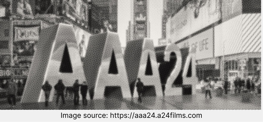
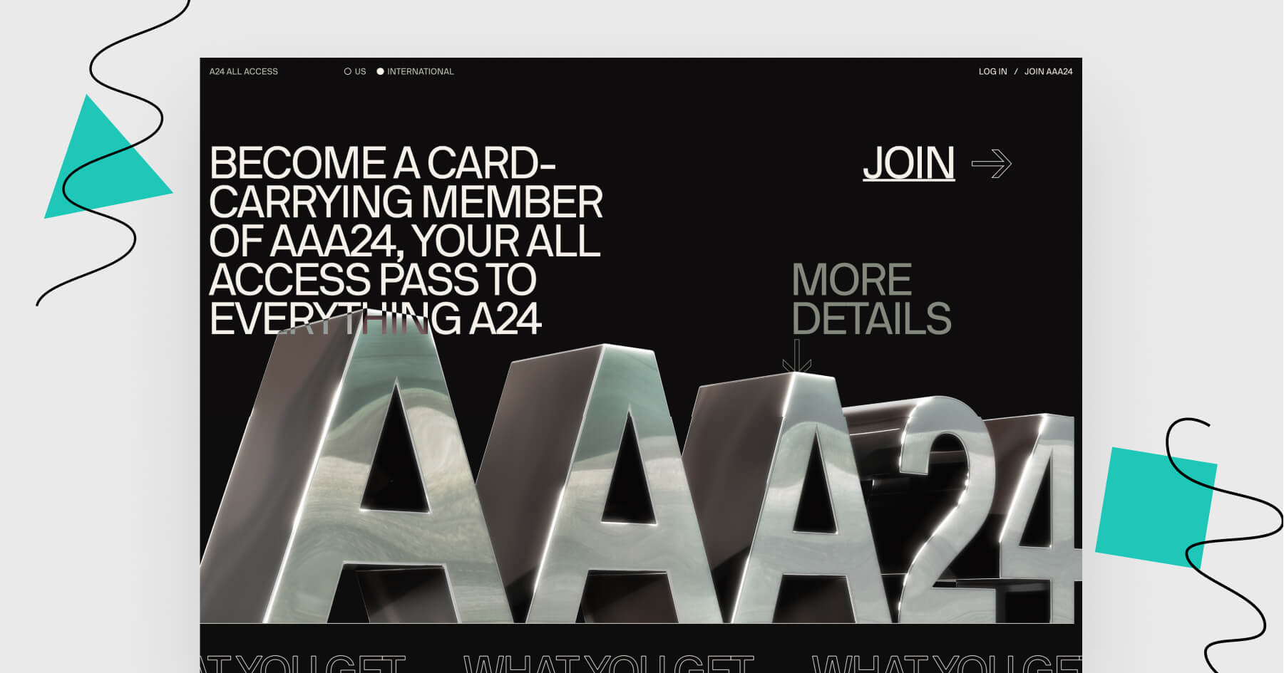
Black & white design is on the go. Does this page look familiar to you? Maybe because the minimalistic trend has been gaining popularity. Do you remember a similar landing page of the week that falls under the same category?

A simple call to action is always a good idea. Like here: they chose one simple verb and created a whole section out of repetitive CTA buttons.

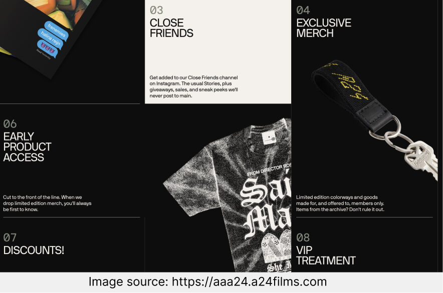
Special perks are well-described. Instead of just listing the items that the subscription members will receive, they came up with something a little bit more creative: short, witty descriptions.
What could have worked better?
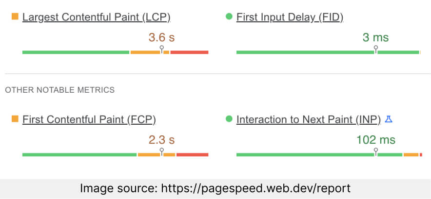
Problems with loading speed. This landing page doesn’t really perform well on some devices. There’s something off about scrolling down this page. I wonder if this page would be better off without that many special effects.
Let’s rate the most important elements
This landing page should appeal to those interested in A24’s movies.
Let’s talk about the elements that are considered crucial for any landing page.
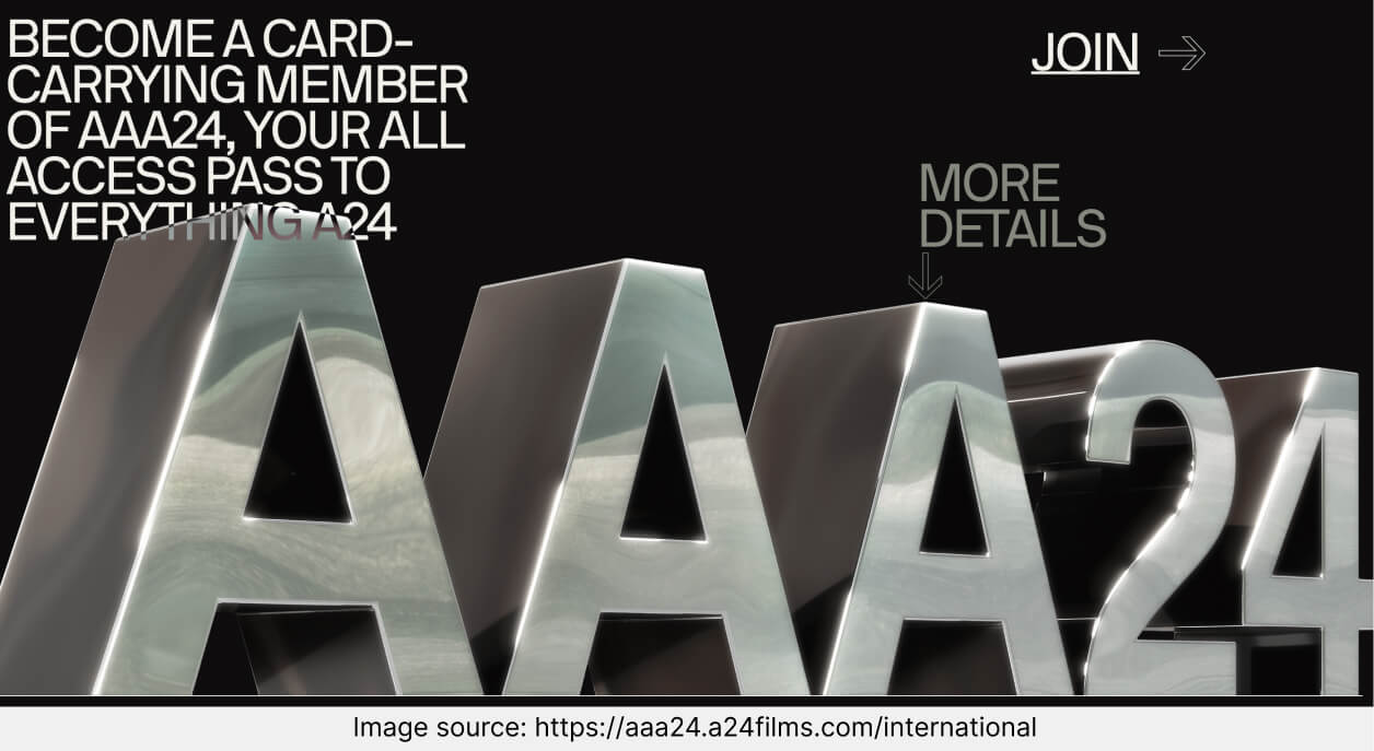
– Headers. It’s hard to pick one main header for this landing page. The one in the opening section is placed over the logo, so it’s not really that visible. And the rest of the headers are used to highlight the benefits and the items that go in the subscription bundle. I’d say this page could use a larger header that doesn’t overlay the logo.

– Personalization. You can choose from two subscription types: US and international. The only difference I’ve spotted is the price for the membership. I don’t like it when I get excited about some stuff to buy online and then I realize it’s US only, so I think this page does it well enough.
To learn more about personalization ideas for your landing page, check out this blog post.
– Copy and language. Is it only me, or does the style of this page remind you of old niche magazines from the long-forgotten era before the internet? It feels as if I came across something uncommon and not mainstream. All that suits the independent movie studio pretty well.
If you want to learn more about how to craft landing pages designed for your industry, join our free Landing Page Academy.
Landing Page of the Week is a series where I review examples of landing pages from the web.