

If you’re building a course landing page or an education landing page, the first impression often determines whether a visitor becomes a student. A modern online course landing page must communicate value quickly, reduce enrollment friction, and guide users toward one clear action – signing up, applying, booking a consultation, or downloading program details.
The best course landing page examples in 2026 combine persuasive messaging with mobile-first UX, behavioral analytics, and AI-assisted optimization. Platforms like Landingi help education brands generate, publish, manage, and optimize landing pages faster with tools like Lunar – a 100% AI-native landing page generator – and Solis, an AI landing page optimization tool that analyzes behavioral data collected through EventTracker.
Below, you’ll find some of the best education landing page examples and course landing page ideas from across the web, along with practical takeaways you can apply to your own enrollment funnel.

Lunar is almost here!

13 Best Course and Education Landing Page Examples
The best course landing page examples combine clear positioning, strong enrollment flows, persuasive social proof, and mobile-first UX. Below, you’ll find education landing page examples from universities, online academies, and training providers that show different approaches to attracting students, generating leads, and increasing course enrollments in 2026.
#1 JobPrepped – digital marketing course landing page
JobPrepped’s landing page focuses on presenting the course as a direct path toward starting a career in digital marketing.

Highlights
- The page explains course benefits through a clear 4-step process
- The form requires minimal information from the user and offers more after sign-up
JobPrepped’s course landing page effectively explains the benefits of its program through a structured 4-step process and social proof. The simplified signup flow also helps reduce friction during enrollment.
However, the page could be improved by simplifying some parts of the layout and making the primary call-to-action buttons more prominent.
#2 Guildford Grammar School – private school landing page
Guildford Grammar School’s landing page uses storytelling and immersive visuals to present the school experience in a more emotional and brand-focused way.

Highlights
- A unique horizontal scrolling layout makes the page stand out
- Visuals, animations, and copy work together to tell the school’s story
Guildford Grammar School’s education landing page creates a distinctive browsing experience that feels more editorial than transactional. The strong visual direction helps communicate atmosphere, values, and student life in a way that traditional enrollment pages often miss.
The page is also well adapted for mobile browsing, although simplifying some animations could improve loading speed and make navigation feel smoother.
#3 Great Learning – online certification course landing page
Great Learning’s landing page focuses on encouraging users to explore the program in more detail before committing to enrollment.

Highlights
- The signup form only appears after clicking the “download brochure” button
- A floating CTA button remains visible while users scroll through the page
Great Learning’s course landing page provides visitors with enough information to consider downloading the brochure without overwhelming them with excessive content. The section presenting instructors and teachers also works as a strong credibility element.
To improve the page further, it could include a demo class video and more student testimonials to strengthen trust and make the learning experience feel more tangible.
#4 General Assembly – professional upskilling course landing page
General Assembly’s landing page focuses on helping marketing teams and professionals transition into digital-first workflows through structured training programs.

Highlights
- Strong hero copy immediately captures attention
- Clear sectioning helps organize a large amount of information
General Assembly’s course landing page presents a convincing case for its training program through data, structured content, and focused messaging. The layout helps visitors navigate through multiple sections without feeling completely overwhelmed.
However, the page could be improved by making the content more concise and easier to scan, especially for busy professionals comparing multiple education options.
#5 Simplilearn – online tech education landing page
Simplilearn’s landing page focuses on building trust around its online tech courses through video, testimonials, and career-focused messaging.

Highlights
- A professionally produced intro video explains the benefits of the course
- Reviews and testimonials are prominently displayed across the page
Simplilearn’s course landing page combines engaging visuals, social proof, and information about career opportunities to strengthen credibility. The page also uses testimonials and success-focused messaging to support its value proposition.
However, the mobile experience and loading speed could be improved to create a smoother browsing experience for users on smaller devices.
#6 Harvard Business School Online – executive education landing page
Harvard Business School Online’s landing page focuses on presenting its programs as premium, career-focused education opportunities.

Highlights
- The page includes a live chat feature for answering questions in real time
- Costs are presented transparently to help users evaluate the program
Harvard Business School Online’s education landing page provides visitors with useful enrollment information, including pricing details, testimonials from past students, and access to live support. These elements help strengthen trust and reinforce the perceived quality of the program.
However, the page could be improved by simplifying some parts of the layout and further optimizing the mobile experience to make navigation smoother for prospective students.
#7 IO Music Academy – music production course landing page
IO Music Academy’s landing page uses bold visuals and creative design to appeal directly to aspiring music producers and artists.

Highlights
- The page makes strong use of video and animations
- Attention-grabbing hero copy immediately sets the tone
- CTA buttons appear consistently throughout the page
IO Music Academy’s course landing page effectively communicates creativity and artistic identity through its visuals and messaging. The combination of dynamic design elements and focused copy helps the page stand out while keeping the offer clear.
However, the mobile experience could be improved, as the page feels heavy and slower to load on smaller devices.
#8 Landingi Academy – platform education landing page
Landingi Academy’s landing page focuses on helping users learn how to use the platform and improve their landing page skills.

Highlights
- The page has a professional appearance, clean lines, and a cohesive color scheme
- The copy is concise but informative, clearly communicating the value of the courses
- CTA buttons are placed in a way that encourages users to take action
Landingi Academy’s course landing page uses clear copywriting, modern design, and well-placed CTAs to present the value of its educational content. The page communicates the course benefits without overwhelming visitors.
#9 WGU – online university program landing page
WGU’s landing page focuses on presenting flexible online education as an accessible path toward career growth and degree completion.

Highlights
- A special offer is prominently featured in the hero section
- Multiple CTA buttons appear throughout the page
WGU’s education landing page effectively communicates the benefits of joining the program through structured sections and a dedicated social proof area near the bottom of the page. The layout helps visitors explore the offer in smaller, digestible parts.
However, the design could feel less cluttered, and the typography could be improved for better readability, especially on smaller screens and lower-resolution displays.
#10 London School of Economics – higher education landing page
The London School of Economics landing page uses a mobile-first structure and clear visual hierarchy to present its educational offer in an accessible way.

Highlights
- A mobile-first design makes the page easy to browse on smaller devices
- Video content helps explain the course experience more effectively
LSE’s education landing page organizes information into well-structured sections and uses video to create a more interactive browsing experience. The clean, professional design also reinforces the institution’s credibility and academic reputation.
The page balances informative content with a straightforward layout, making it easier for prospective students to explore the program without feeling overwhelmed.
#11 Edith Cowan University – university enrollment landing page
Edith Cowan University’s landing page focuses on helping prospective students quickly explore programs and connect with the institution.

Highlights
- A prominent search bar makes it easier to browse programs and information
- Live chat functionality allows students to connect with advisors directly
ECU’s education landing page combines strong visuals, trust-building elements, and structured sections to present a large amount of information without making the experience feel overwhelming. The clean layout also supports navigation across different study options and enrollment paths.
Adding student testimonials or a short campus video tour could make the page feel even more engaging and personal for prospective applicants.
#12 AECC – international student recruitment landing page
AECC’s landing page focuses on helping international students understand their study options and move toward inquiry or application.

Highlights
- A simple, clean design keeps the message easy to follow
- Direct hero copy communicates the offer quickly
- The mobile-first layout supports browsing on smaller devices
AECC’s education landing page uses scholarships, student testimonials, and multiple CTA buttons to guide prospective students through the recruitment journey. The structure is clear and practical, which works well for users comparing study options across countries or institutions.
The form could be shorter to reduce friction, especially for mobile users who are still early in the decision process.
#13 Berlin School of Business & Innovation – business school landing page
Berlin School of Business & Innovation’s landing page uses dynamic visuals and structured content to present its educational offer in a modern way.

Highlights
- Animations make the page feel more interactive and engaging
- Color choices help create a sense of trust and energy
- Testimonials support the credibility of the institution
BSBI’s education landing page combines animations, clear sectioning, and social proof to create a smooth user experience focused on the program’s value proposition. The structure also makes it easy for visitors to move through the page and understand the next step in the enrollment process.
The special offers section could contain more detailed information, and additional CTA placements would help strengthen conversion opportunities across the page.
How to Create a Course Landing Page?
To create a course landing page, many education brands now start with AI-generated page creation instead of building every section manually. Using platforms like Landingi, marketers can generate a complete online course landing page from a prompt, publish it quickly, and optimize enrollments based on behavioral data.
With Lunar – a 100% AI-native landing page generator – you can create a structured education landing page with course information, testimonials, signup forms, FAQs, pricing sections, and mobile-first layouts in minutes. Instead of starting from a blank page, teams can focus on refining messaging and optimizing conversions.
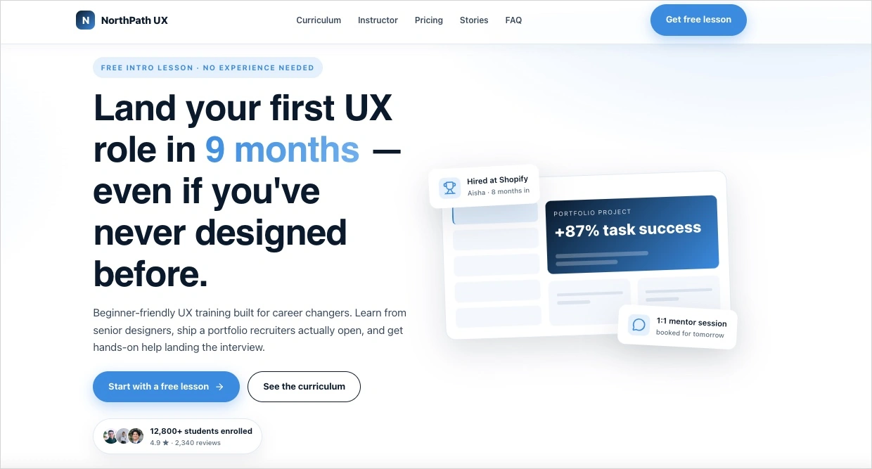
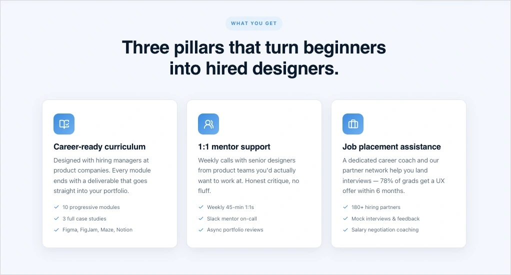
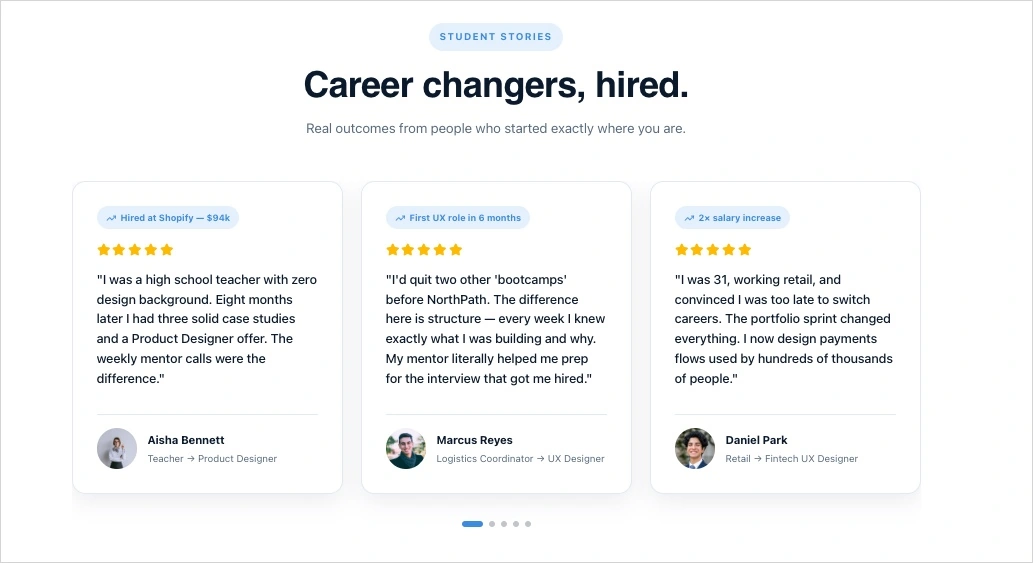
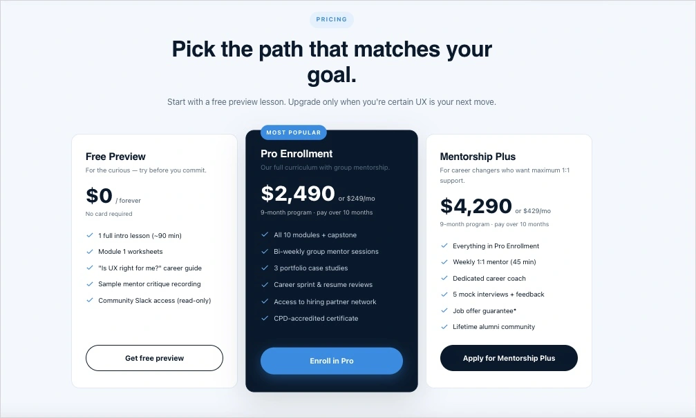
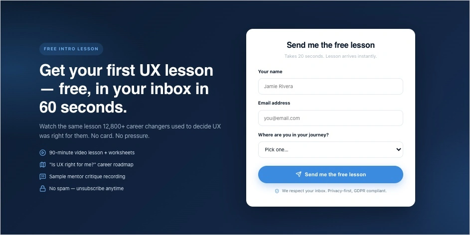
For example, you can use a prompt like this in Lunar:
Create a modern, mobile-first landing page for an online UX design course for beginners aged 20–35 who want to transition into tech careers. Use a clean, minimal visual style with dark navy, white, and soft blue accents. Include a bold hero section with a strong value proposition, student testimonials with profile photos, instructor bio with credentials, curriculum overview, pricing comparison table, FAQ section, trust badges, and a lead generation form offering a free introductory lesson. Add subtle animations, modern sans-serif typography, sticky CTA buttons, and sections optimized for high conversion and mobile enrollment. The page should feel premium, professional, and optimized for lead generation in 2026.In a few minutes, you get a high-converting educational landing page:
After publishing the page, optimization becomes part of the workflow. Solis – an AI landing page optimization tool powered by EventTracker behavioral data – can help identify friction points, weak-performing sections, or form abandonment patterns that affect enrollments.
This approach allows universities, academies, and online educators to launch and improve course landing pages much faster while keeping the entire enrollment workflow inside one AI landing page operation system.
Explore Lunar and generate your first AI-powered education landing page faster.
FAQ About Course And Education Landing Pages
Here are answers to some of the most common questions about creating and optimizing course landing pages and education landing pages.
What should a high-converting course landing page include?
A high-converting course landing page should include a clear value proposition, concise course information, visible CTA buttons, testimonials, instructor credibility, mobile-first design, and a simple signup form. Many successful online course landing pages also use video and social proof to increase trust.
What makes an education landing page effective?
An effective education landing page presents information clearly, reduces enrollment friction, and guides visitors toward one specific action. The best education landing page examples combine strong messaging, easy navigation, and conversion-focused structure optimized for both desktop and mobile users.
Can I use a landing page template for a course?
Yes. Many marketers and educators start with a landing page template and customize it for their course, audience, and enrollment goals. AI-powered tools like Lunar can also generate complete course landing pages from prompts, which speeds up the entire production process.
Are landing pages good for universities and schools?
Yes. Universities, schools, academies, and bootcamps use landing pages to promote programs, collect leads, manage applications, and increase enrollments. Dedicated education landing pages are often more effective than sending traffic to general websites with multiple navigation paths.
How can I increase course landing page conversions?
You can improve course landing page conversions by simplifying forms, strengthening social proof, improving mobile UX, clarifying the value proposition, and testing different CTA placements or messaging. Behavioral insights tools like Solis can also help identify friction points that reduce enrollments.
Use AI-powered behavioral insights to discover friction points, improve signup flows, and optimize your course landing page conversions with greater precision.
Build Course And Education Landing Pages With Landingi
Course landing pages and education landing pages help universities, academies, bootcamps, and online educators attract students, generate leads, and increase enrollments through focused conversion flows. In 2026, the process goes far beyond simply publishing a page – modern teams increasingly rely on AI-assisted workflows to generate, launch, analyze, and optimize enrollment funnels faster.
Landingi is an AI landing page operation system designed for managing the entire landing page workflow in one place. With Lunar – a 100% AI-native landing page generator – teams can create complete online course landing pages from prompts, refine messaging and structure, publish pages quickly, and scale campaigns more efficiently.
After launch, Solis helps optimize performance using behavioral insights collected through EventTracker, including scroll depth, click behavior, and form interactions. This makes it easier to identify friction points, improve signup flows, and increase enrollment conversions over time.
Whether you’re promoting a university program, online certification, webinar, coaching offer, or digital course, Landingi helps you build and optimize education landing pages faster inside one connected AI workflow. Explore Lunar and start building AI-powered course landing pages with Landingi!


