

E-commerce landing pages are crucial tools for driving sales and maximizing conversions in online stores. By eliminating distractions and highlighting a specific offer, these pages effectively guide users toward taking direct action. While capturing leads for future campaigns is ideal for an eCommerce company, the end goal is always the sale. A well-designed eCommerce landing page promoting a special offer, particular product, or seasonal deal can help you do both, but when crafting your page, consider the following tips:
- Focus on a single goal to effectively direct users toward the desired action.
- Use high-quality visuals to show your product professionally.
- Implement social proof elements to build the brand’s credibility.
In this post, we’ll cover the essential elements that all successful eCommerce landing pages use to maximize their conversions. We’ll also show you perfect landing page examples and point out their strengths, giving you quite good inspiration for creating your own eCommerce landing page. Finally, we’ll give you pre-designed templates so you can leverage them to structure your page and put the finishing touches on your own design in the best landing page builder – Landingi.
Check out how various eCommerce companies make use of landing pages in their digital marketing campaigns and learn from the best designs. Let’s get started.

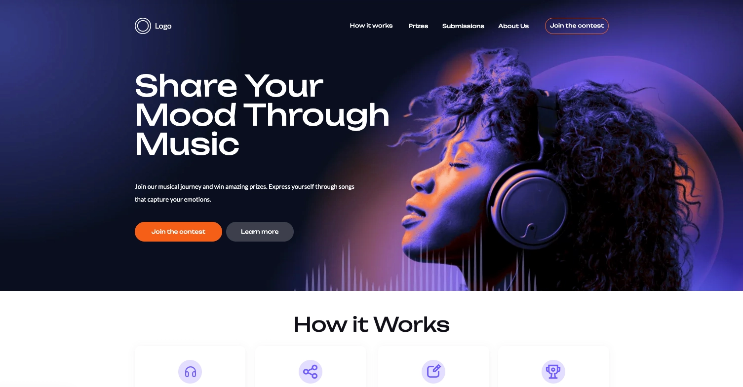
Lunar is almost here!

What Is an eCommerce Landing Page?
An eCommerce landing page is a standalone webpage designed specifically to promote a product, collection, or offer and drive conversions such as sales or sign–ups. Unlike other pages on a website, an eCommerce landing page focuses on a single goal: encouraging the visitor to take a specific action, typically buying a product or subscribing to a newsletter for future deals. This type of page typically eliminates distractions, like unnecessary navigation menus, to help users focus on making a purchase.
An e-commerce landing page is designed to be laser-focused on the featured product or offer. It typically includes eye-catching product images, persuasive copy that highlights key benefits, and social proof like customer reviews. Strong calls to action, such as “Buy Now” or “Add to Cart,” guide users toward the next step in the sales process.
This type of landing page is essential for online stores running promotions or launching new products and for specific brands that want to attract their target audiences and boost brand awareness. These pages can significantly increase sales and customer acquisition by simplifying the decision-making process and making it easy for customers to convert.
How Do I Create an eCommerce Landing Page?
To create a landing page for eCommerce purposes, start by defining your target audience and focusing on a specific, single goal. Then, choose a landing page platform, like Landingi, and design a clean, conversion–focused layout. Structure your page by highlighting your unique selling proposition in the hero section, adding persuasive content, incorporating social proof elements, and prominently placing strong CTAs. Remember to optimize your page for mobile devices. Once your page is up and running, regularly conduct A/B testing and use analytics tools to optimize conversions based on the data.
Follow these essential steps to ensure your page drives sales and engages visitors effectively:
- Define your target audience – research your target audience’s preferences, behaviors, and needs to understand them. Knowing who you’re targeting helps you craft a message that resonates with them and addresses their specific pain points. This will guide the design and content of your page to maximize relevance and appeal.
- Choose a compelling offer or product – focus on a specific product, collection, or offer that you want to promote. Highlight its unique selling points (USPs) and benefits, such as exclusive deals, limited-time offers, or high-demand products, to create urgency and motivate action.
- Design a clean, conversion-focused layout – keep the layout simple, attractive, and easy to navigate. Use high-quality product images, engaging descriptions, and prominent call-to-action (CTA) buttons. Avoid clutter and keep the user’s focus on your product and the action you want them to take.
- Add persuasive content and copy – write concise, benefit-driven copy highlighting what makes your product valuable. Include compelling headlines, product descriptions, and bullet points to explain the product’s features and how it solves a customer problem. Ensure the tone matches your brand and speaks directly to your audience.
- Incorporate social proof and trust signals – build trust by including customer testimonials, reviews, and ratings on the page. Badges such as secure payment options or guarantees like “100% satisfaction” help alleviate visitors’ concerns about purchasing online.
- Create clear, strong CTAs – place easy-to-find and prominent CTAs throughout your landing page. Ensure the CTA buttons stand out visually, using contrasting colors and clear, action-oriented language, like “Add to Cart” or “Get 20% Off Today.”
- Optimize for mobile – ensure your eCommerce landing page is responsive and loads quickly on all devices, especially mobile.
- Test and refine – once your page is live, conduct A/B testing on different elements, such as headlines, CTA placement, or product images, to see what drives the most conversions. Regularly refine your page based on user behavior and analytics data to improve its performance.
35 Best Examples of eCommerce Landing Pages
Check out the 35 best examples of eCommerce pages and inspire yourself to create a promotional landing page for your digital marketing campaigns. The first 5 examples you’ll find below will show you how to effectively implement key elements of a successful landing page. We’ll also give you 5 professionally designed templates, available for free on the Landingi platform. Then, you can scroll through 30 following eCommerce landing pages crafted for various purposes, from promoting a particular product to capturing leads with special discounts. All these cases can give you a great portion of inspiration.
1. FabFitFun
The FabFitFun landing page excels as a top-tier example of an eCommerce experience that combines beauty, fitness, and lifestyle products into one visually captivating platform. The page greets visitors with a large, central banner featuring bold, elegant typography and well-curated imagery that communicates the premium nature of the subscription service. Its hero section instantly grabs attention, showcasing the product benefits and prompting users to take immediate action with a clear, prominent CTA.

The layout is clean and user-friendly, ensuring a smooth navigation experience. The page effectively uses a blend of compelling visuals and concise text to highlight customer perks, including seasonal offers and value-driven memberships. It also cleverly integrates social proof with mentions of “over one million members,” leveraging trust and community to drive conversions.
Key takeaways to learn from this example:
- A visually striking, customer-centric design,
- Clear and compelling CTA,
- Product visuals,
- Engaging copy,
- Strong use of trust-building elements.
Improvement areas:
- Mobile optimization – enhancing mobile version of the page would be a great step to ensure all elements adjust fluidly across different devices.
Pick the Fashion eShop template from Landingi to craft a perfect eCommerce page with a well-structured hero section. Use a strong CTA button, professional pictures, and engaging copy to build interest and effectively convert visitors into customers.

2. Dollar Shave Club
The Dollar Shave Club landing page expertly delivers a streamlined and engaging shopping experience for men’s grooming products. The page is immediately engaging with its clean design, focused on essential items like razors, shaving accessories, and grooming kits. Bold headings and concise product descriptions make navigation intuitive while clear calls-to-action (CTAs) like “Get My $5 Starter Set” help funnel users efficiently toward their purchase decisions.

Notably, the use of personalized membership offers and subscription plans adds a layer of customization that appeals to a broad audience seeking both convenience and value. Trust-building elements such as customer reviews and high-quality images of the products help reinforce credibility and make the page visually appealing. Additionally, the option for bundles and free shipping for orders over a specific threshold encourages larger purchases, increasing conversion rates.
Key takeaways to learn from this example:
- Crisp and minimalist design,
- High-quality imagery,
- Strong value proposition,
- Clear, engaging CTA.
Improvement areas:
- Videos – product demos or grooming guides in the form of a short video could further enhance engagement.
Use the Watch Sale template from Landingi and leverage its well-structured layout to craft a high-converting eCommerce landing page for your product.

3. AVOCA
The AVOCA eCommerce landing page offers a premium user experience centered around the brand’s flagship product, avocado oil, sourced from Mexico. With a minimalist and elegant design, it effectively captures the attention of visitors. The hero section presents a strong call-to-action accompanied by high-quality visuals of the product and clear information about its health benefits. The consistent use of earth-toned colors and typography provides a cohesive and organic feel that reflects the brand’s focus on natural ingredients.

A well-structured layout guides users through product offerings, FAQs, and purchasing options. Trust-building elements, including the promise of premium quality and shipping announcements, help enhance customer confidence.
Key takeaways to learn from this example:
- Clean, nature-inspired aesthetic,
- Effective visuals,
- Strong CTA button,
- Benefits section,
- FAQ section.
Improvement areas:
- Social proof – adding testimonials and product reviews would further build brand’s credibility and, ultimately, increase conversion rate.
Check out the Dietary Supplements template from Landingi and utilize this well-structured layout with plenty of white space to effectively drive sales.

4. The RunnerBox®
The RunnerBox ecommerce landing page exemplifies a highly effective subscription service tailored specifically for runners. The page design is visually engaging, with a well-placed hero image (scroll animation) that highlights the core product — a curated subscription box containing running essentials, snacks, and gear. Bold, motivating headlines like immediately convey the brand’s authenticity and alignment with its target audience. The strategic use of bright CTAs like “Get The RunnerBox®” makes it easy for visitors to sign up, converting interest into action.

The landing page also effectively builds trust with potential customers by showcasing social proof in the form of customer testimonials, and press mentions or partner logos. These elements reinforce credibility and offer reassurance that the product is both popular and valuable. Additionally, the seamless navigation and clear membership pricing options make it easy for visitors to explore various subscription plans, further enhancing the user experience.
Key takeaways to learn from this example:
- Intuitive layout,
- Strong alignment between brand messaging and target audience,
- High-quality product pictures,
- Prominent and engaging CTAs,
- Effective use of social proof.
Improvement areas:
- Page load time – improving the page loading speed would prevent bounce rates.
Pick the Fit Product template from Landingi, craft a compelling headline, use immersive imagery, and encourage users to purchase with a strong CTA button.

5. Stromwerk
The Stromwerk ecommerce landing page is a great example of a well-executed site for selling premium e-bikes. The design is clean, modern, and visually engaging, with a bold, memorable slogan, “Burn Fat not Oil,” anchoring the page’s message. The hero section includes vibrant images and compelling CTAs, guiding users toward both the product catalog and test ride options. The focus on e-mobility is clear throughout, emphasizing the lifestyle benefits of e-bikes through minimal text and stunning visuals.
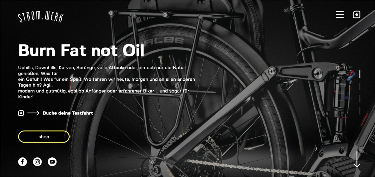
The page is structured to allow easy navigation, with dedicated sections for different bike categories (like E-MTB and Urban Bikes), each featuring high-quality images and pricing information. Trust-building elements, such as social media links and contact information, are readily available, and the inclusion of user-friendly features like appointment booking for test rides further enhances the customer experience.
Key takeaways to learn from this example:
- Clear, visually appealing design,
- Prominent CTAs,
- Well-placed social proof elements,
- Concise product descriptions.
Improvement areas:
- Videos – additional product videos or interactive elements could increase engagement.
Check the Car Gadget template from Landingi and customize the page in a user-friendly editor to craft your own eCommerce landing page promoting a specific product. Leverage a simple form in the hero section to generate leads efficiently.

6. MeUndies
Pros: Opening with a photo of underwear collaboratively designed with Keith Haring makes a strong statement, as does the bold header. The visual design is crisp, and the copy is easy to read.
Cons: Offering two separate call-to-action buttons can confuse potential buyers about how the subscription service works. The lack of an offer or discount might be enough to convince them to ignore either button.

7. Winc
Pros: Aside from the fact that the header and subheader are concise and informative, they’re also snappy and fun. The beautiful picture reinforces exactly what this subscription service offers and the “Get Started” call-to-action is repeated several times down the page.
Cons: The rest of the page has few images, giving this a strong start but a visually lackluster finish.

8. Harry’s
Pros: This shaving kit subscription has a compelling call-to-action copy. In addition, the promise of a trial set with free shipping and blades that are always less than $2 is enough to convert any buyer on the fence.
Cons: While the Harry’s call-to-action button stands out, this company’s voice and overall messaging falls a little flat, especially compared to the larger personality of their main competitor, Dollar Shave Club.

9. Birchbox
Pros: Examples of the typical kinds of products that come inside a Birchbox are well-displayed at several points throughout this landing page. If the customer reviews aren’t enough to convince you to sign up, maybe the pop-up with a 15 percent discount offer is.
Cons: This page has many different call-to-actions, including “Sign up today,” “Let’s get started,” and “Learn more”. Even if all the buttons lead to the same place, the different messaging might be confusing for some customers.

Pick the Fitness Online template from Landingi and leverage its modular layout to present products, build trust with reviews, and drive signups through a clear, conversion-focused form.
10. Hello Fresh
Pros: This page has a clear call-to-action that is repeated several times throughout, with slightly different wording each time, but always including the same keywords. This creates an element of consistency with an authentic tone.
Cons: While this is a very visually driven page with gorgeous colors, it sometimes seems busy and overloaded with text and details. For example, the button does not stand out as well against the busy background.

11. Blue Apron

Pros: This page is cleaner and quicker to read compared to its Hello Fresh competitor. Further down the page, there are bold headers on a crisp white background, which make the copy pop without feeling like there’s too much negative space.
Cons: The lack of customer testimonials or photos sourced from social media gives the service an impersonal vibe.
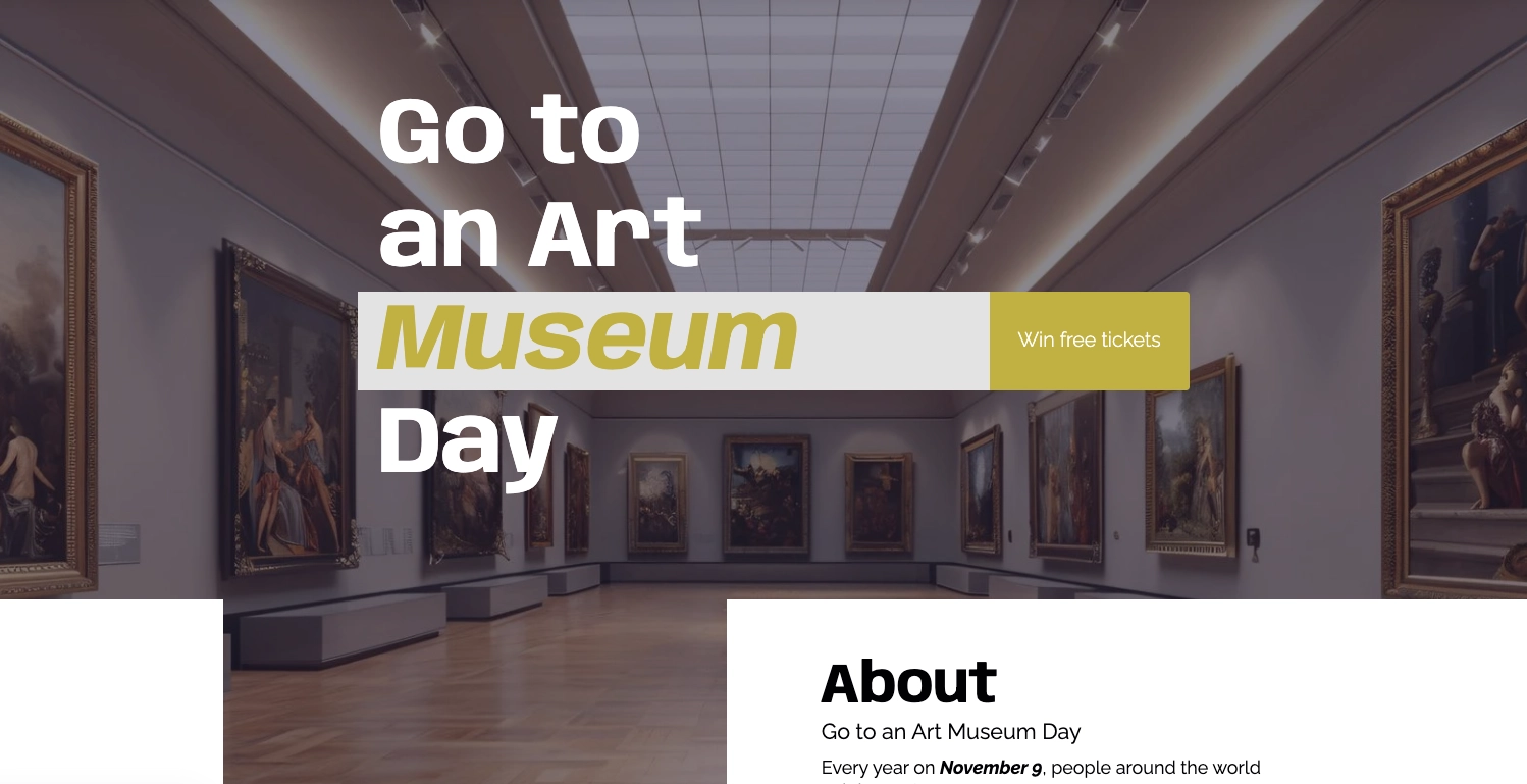
12. Mysterious Package Company
Pros: The large photo and quirky copy makes it clear what this box is all about.
Cons: The white text is sometimes difficult to read on top of the picture, while the company logo partially obscures the summer sale header.

Use the Art Museum Day template from Landingi to combine large visuals with concise copy. Create a clear narrative and lead visitors smoothly toward a single, focused CTA.
13. Bulletproof Coffee
Pros: The carousel header at the top of the page immediately advertises a ten percent discount on one of the products, enticing potential buyers to click through to a product page.
Cons: If you’re new to Bulletproof Coffee, this page won’t provide much introductory information. Potential buyers should do the digging on product pages before they decide to stick around.

14. Four Sigmatic Mushroom Coffee
Pros: An email subscription pop-up immediately asks potential buyers to sign up for a ten percent discount, capturing leads for future campaigns and product launches while incentivizing sales in the present.
Cons: The rest of the page seems cluttered. It’s not immediately clear what some of the sections are there to accomplish, as the headers often seem to play second string to the images.

15. Vital Proteins Collagen
Pros: The first call-to-action is also bundled with a great offer: 20 percent off your first subscription order plus free shipping on all US orders.
Cons: Overall, the page is cluttered and doesn’t do a good job of educating new buyers about the benefits of their products. It’s only after a good deal of digging that buyers begin to understand why they should go with this product.

16. Health-Ade Kombucha
Pros: A small button at the top of the page advertises promotions, giving potential buyers added value for going with this product. Each section is tailored to help inform people new to the world of kombucha. Further down the page, a group of Instagram photos provides another look at the company’s products and culture.
Cons: The Instagram pictures aren’t enough; with few pictures of the actual product on this page, the message starts to fall a little flat.

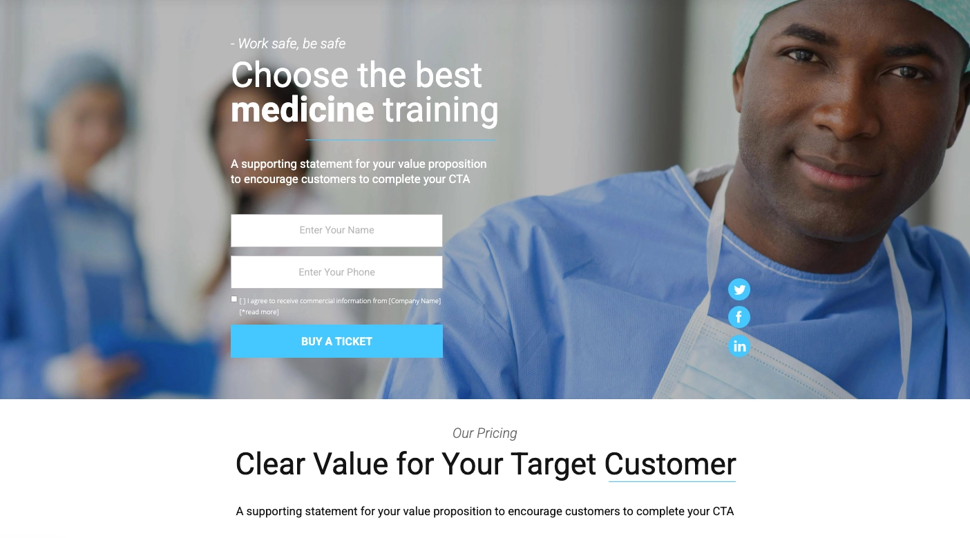
17. Optimind Focus Supplement
Pros: The header and copy make it clear what this product offers and why it’s beneficial for potential buyers. The call-to-action enforces a sense of urgency by including the words “Rush My Order”.
Cons: There’s only one review with a photo of the customer attached. To enhance the credibility of a product, it’s best to feature at least a few.

Check out the Medicine Training template from Landingi and build trust with expert sections, benefit-focused copy, and a clear offer. Encourage conversions with a well-placed CTA and simple form.
18. Matcha Source Tea
Pros: If the promise of 137x the antioxidants of green tea doesn’t pull customers in, then the 10 percent discount for signing up to the email list might.
Cons: The header and smaller text are slightly difficult to read on top of the image, and there’s even less information about the product available the further you scroll down the page.

19. HTWO Hydrogen Water
Pros: If, like many people, you are unaware of the relative benefits of hydrogen water, this page does a great job of clarifying the issue. Customer testimonials from celebrities and high-level athletes further boost the product’s credibility.
Cons: The text on the header image is sometimes hard to read, and potential buyers might quickly pass up the big, wordy paragraphs further down the page. The call to action is not made clear until the very end.

20. TOMS
Pros: TOMS wastes no time offering a deal on its shoes that helps capture leads and incentivize purchases. The promotion itself is presented in large, bold text and is easy to read against the crisp white background.
Cons: The pop-up appears almost immediately upon entering the page, which could be a deterrent for some people. Consider timing it so that it pops up after scrolling or just before leaving the page.

21. Girlfriend Collective
Pros: After you scroll halfway down the page, a pop-up offers a $10 discount in exchange for your email. Anyone who still needs convincing can check out the carousel of customer photos or the glowing review from Vogue.
Cons: It’s unclear until you scroll down that the clothes are made from recycled water bottles. With many more well-known brands already dominating the athletic wear market, keeping the eco-friendly aspect front and center is crucial for setting the company apart.

22. Smile Squared
Pros: The brand sticks to its basic message that for every toothbrush purchased, a toothbrush goes to a child in need. There’s no confusion about the social value the company offers.
Cons: There is no consistent call-to-action throughout the page. Instead, each section leads to different information. To capture more leads or convert customers, a consistent call-to-action at the start and finish would help.

23. One World Play Project
Pros: The page opens with a large, colorful photo of young children with the product. The bold header reinforces what that product is and what makes it valuable. The call-to-action, to “Shop & Give Now,” reinforces that there’s a charitable aspect to this company, even if we’re not sure yet what it is.
Cons: The overall page is very short, with additional information being housed on other pages. It might be better to break down the story into different sections on the same page so potential customers can form a better connection to the product.

Pick the Virtual Volunteer Center template from Landingi to open your page with a strong visual hero and a clear mission-driven message. Combine purpose and action with a prominent CTA that encourages users to get involved.

24. Sockwork
Pros: This subscription sock company clarifies from the first section that purchasing from them benefits a different charity each month. The call-to-action to subscribe is also highlighted and appears again at the end of the page.
Cons: The product itself is not featured well and takes a back seat to the overall message. Plus, while the initial header is eye-catching, the text that comes after is small and a bit wordy.

25. Lokai Bracelet
Pros: The three-column section at the bottom of this page briefly outlines what makes Lokai’s bracelet special, its origin, and its charitable aspect.
Cons: The page lacks a firm call-to-action. Instead, there are several buttons that take you to different pages of the website.

26. We Wood
Pros: The page opens with an attractive picture that features several different models of We Wood watches.
Cons: It takes a bit of scrolling to find the information about the company’s “buy a watch, plant a tree” model, and when you do, the text is small and difficult to read.

27. Slack
Pros: The call-to-action to “Get Started” leaps out right at the beginning of the page and offers a quick way to capture leads. The header font is attractive and the subheader text is just the right size.
Cons: For such an all-inclusive product, the page length is shorter than expected. It’s not until the very end that it’s made clear that you can start using Slack for free.

28. Leaf Bracelet
Pros: The first photo shows off this unusual piece of jewelry, while the header lets potential customers know that there’s more to it than meets the eye.
Cons: However, all information stops there. Without navigating away from the page, customers can’t learn more about this product — and there’s no call-to-action or offer enticing them to do so.

29. Zendesk
Pros: The page opens with an immediate offer to start a free trial. All it takes to start an account is a work email and password. Further down the page, Zendesk receives glowing reviews from heavyweights such as Uber.
Cons: There are few visuals to break up the sections of text, so potential customers are left with no impression of how the product looks and functions.

30. Anker Powerwave
Pros: The company does its best to explain a complex and relatively new piece of technology without overcrowding the page with details. The benefits of using this technology, namely, that it charges devices quickly and wirelessly, is made apparent.
Cons: Anker could’ve picked a better photo to open the page with, as the product itself is camouflaged by the white tabletop.

31. Sonos Soundbar
Pros: This product page almost passes for a landing page, with several sections of information and praise from heavyweight reviewers like CNET. A bulleted list near the top outlines all the best benefits of this particular piece of tech.
Cons: There’s almost too much information on the page, which gives it a cluttered and confusing vibe.

32. Nike+ Run App
Pros: Nike’s minimalist branding is definitely on display here, with several pictures of athletes meant to inspire potential customers to join their ranks.
Cons: The copy in the subsections is sometimes a little wordy while the font is small, making it tempting to breeze right past.

Pick the Music Day template from Landingi t≠o open your landing page with a strong, inspirational hero section. Use bold visuals and a clear headline to motivate users and guide them toward action.
33. Kolibree
Pros: This unusual toothbrush uses augmented reality to encourage kids to brush their teeth. The call-to-action button is repeated a few times and captures only the most qualified leads, as anyone who signs up to the email list does so to be notified when this product launches.
Cons: The headers, text, and photos on this page seem poorly proportioned relative to the negative space. Watching the video is as easy as pressing a button, but there’s no way to adjust the sound without navigating away from the page to YouTube.

34. CleverReach
Pros: The page starts with a picture of a person using the software. If that didn’t make the product clear enough, the header and copy will. The call-to-action to “Try it for free” is another great way to grab a potential customer’s attention.
Cons: Usually some repetition of the call-to-action is a good thing, but CleverReach tends to overdo it. Each section ends with the same call-to-action without any variation in wording, which makes the offer feel a bit more annoying than valuable.

35. Drip
Pros: There are almost no links navigating away from this page except for the 14-day free trial call-to-action button. Drip does a great job of quickly explaining its service as you scroll down the page. They also feature customer reviews and frequently asked questions before ending on a final call-to-action button.
Cons: It’s not immediately clear that Drip is an automated email marketing service that integrates with Shopify and other services. A short, simple subheader near the top could help bridge the gap.

3 eCommerce Landing Page Best Practices
When creating your eCommerce page, focus on the following 3 best practices: focus on a single goal, use high–quality visuals, incorporate social proof. These conversion optimization methods will boost the efficiency of your product landing page.
1. Focus on a single goal
The first best practice for eCommerce landing pages is to focus on a single goal. By concentrating on a single, well-defined goal, you can significantly enhance your conversion rates. This goal could be anything from making a purchase to signing up for a newsletter, but it should be crystal clear to the visitor.
The essence of a successful eCommerce landing page is clarity and focus for the following reasons:
- Reduced cognitive load – visitors are less likely to feel overwhelmed when presented with a straightforward goal. This makes it easier for them to take the desired action.
- Improved user experience – a clear, focused landing page provides a better user experience, as visitors can quickly understand what they need to do.
- Higher conversion rates – by eliminating distractions and guiding visitors towards a single objective, you increase the likelihood of conversions.
- Better Targeting – when you know the goal of your landing page, you can tailor your messaging and design to directly address the needs and desires of your target audience.
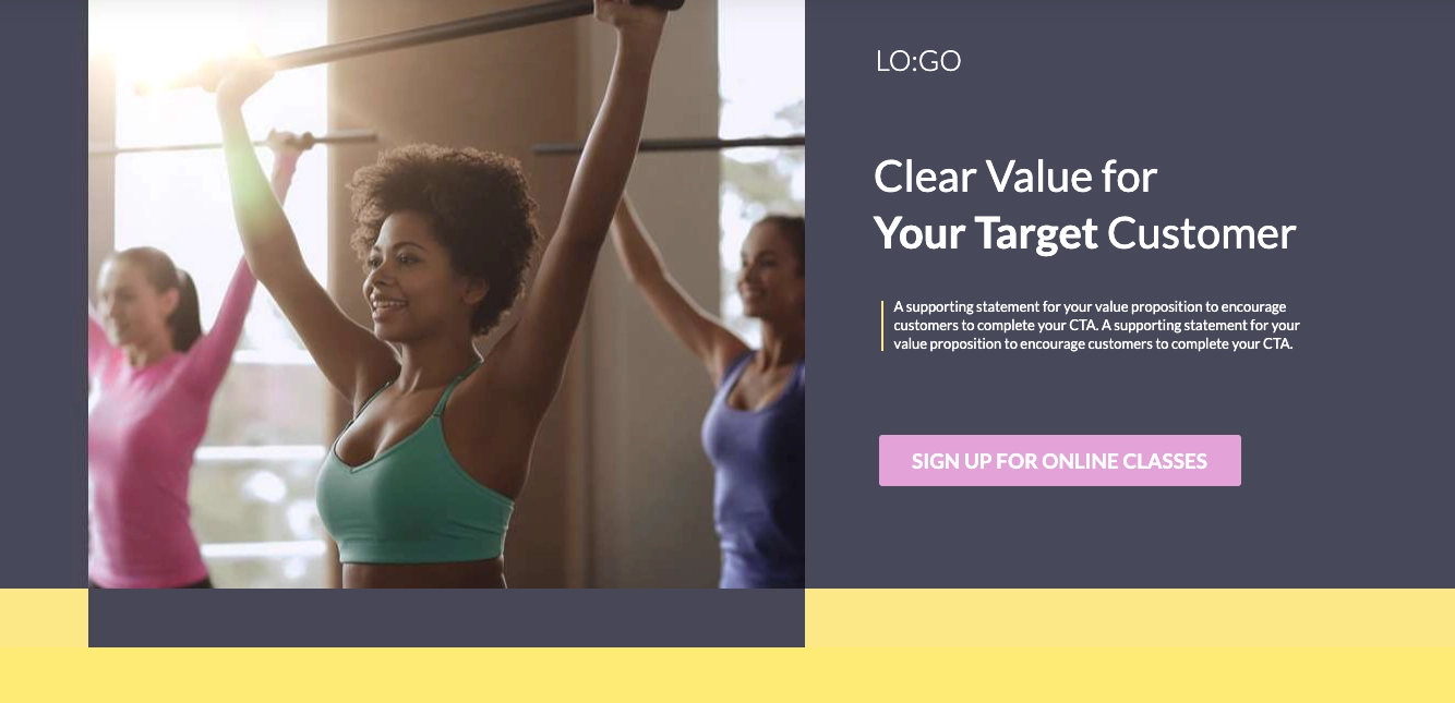
Keep your landing page focused on one clear objective, and eliminate distractions such as unnecessary navigation menus and external links. Guide visitors toward the desired action with strong, singular calls-to-action (CTAs), as in the following example:

2. Use high-quality visuals
The second best practice for an effective eCommerce webpage is to use sharp, high-quality product images or videos to engage visitors visually. Showcase the product from multiple angles, include zoom features, or demonstrate it in use. Strong visuals help build trust and enable potential customers to better understand and desire the product.
In the digital age, visuals play a pivotal role in capturing attention and driving conversions because of the following reasons:
- Enhanced product perception – clear, well-lit images and videos give visitors a realistic sense of the product’s appearance, size, and texture.
- Increased engagement – visually appealing content keeps visitors engaged and encourages them to explore further.
- Improved trust – high-quality visuals can help build trust by demonstrating that you’ve invested in a professional presentation.
- Better understanding – multiple angles, zoom features, and demonstrations can provide a comprehensive understanding of the product’s functionality and benefits.
By investing in high-quality visuals, you can create eCommerce landing pages that are more attractive, informative, and ultimately, more successful in converting visitors into customers, as the one from the following example:

3. Incorporate social proof
The third best practice for eCommerce landing pages is to incorporate social proof. Social proof is a powerful psychological principle that suggests people are more likely to adopt a behavior or belief if they see that others are doing so. In the context of eCommerce, social proof can be a valuable tool for building trust and credibility.
Incorporating social proof can benefit your eCommerce landing pages in the following ways:
- Increased trust – testimonials, reviews, and ratings from satisfied customers can significantly boost your landing page’s credibility.
- Enhanced conversion rates – visitors are more likely to make a purchase if they see that others have done so and are happy with the product or service.
- Reduced perceived risk – it helps alleviate potential concerns or doubts visitors may have about purchasing.
Include customer reviews, testimonials, and ratings prominently on your page. Adding trust signals like secure payment icons and satisfaction guarantees can further build consumer confidence. Check out how other eCommerce businesses incorporate this best practice:

What Is the Average Conversion Rate for an eCommerce Landing Page?
The landing page average conversion rate for the eCommerce industry is 12.9%, with a median CVR of 5.2%, as highlighted in Unbounce’s report. This can be a great benchmark for you to set an achievable goal for your page-based campaign. Yet, you should remember that the eCommerce industry is wide, including various branches and specific products. Conversion rates can differ based on specific product categories, target audiences, and marketing approaches. For proper conversion optimization, you should remember factors such as the design of the landing page, the clarity of the value proposition, and the effectiveness of calls to action play crucial roles in determining conversion success.
How Can I Optimize My eCommerce Landing Page for Higher Conversion Rates?
To optimize your eCommerce landing page for higher conversion rates, craft a compelling headline, use professional visuals, optimize your CTA button, simplify the user experience, incorporate social proof, use incentives, optimize the page for mobile, and continuously conduct A/B tests. Conversion optimization is an ongoing process, so you should regularly analyze your page’s performance and make data-based adjustments to meet your target audience’s expectations and improve your page’s visibility in SERPs, or its quality rank, which is important for PPC campaigns.
While optimizing your eCommerce page, follow these steps:
1. Craft a compelling headline
Firstly, craft a compelling headline. It must be a clear, benefit-driven slogan that captures attention. Ensure it communicates the value of your product or service concisely. The headline should answer the question, “What’s in it for the customer?” as soon as the visitor lands on the page.
2. Use high-quality visuals
Secondly, use high-quality visuals. Incorporate only professional, high-resolution images and videos that showcase your product from multiple angles. Visual content should help users visualize owning or using your product. If applicable, consider using videos to demonstrate product usage, which can significantly improve engagement.
3. Optimize your CTA
Thirdly, optimize your CTA button. Place clear and direct CTAs like “Buy Now” or “Get Started” in prominent locations. Ensure your buttons are visually distinct with contrasting colors and persuasive text. Experiment with wording that suggests urgency or value.
4. Simplify the user experience
Fourthly, simplify the user experience. Keep your landing page clean and uncluttered. Minimize distractions and ensure that users can navigate smoothly from product discovery to checkout. Use a logical layout that guides the visitor toward the purchase decision.
5. Incorporate social proof
Fifthly, incorporate social proof. Add testimonials, reviews, or ratings to establish trust. Display logos of trusted partners or media outlets that have featured your products. Customer success stories or before-and-after images can also serve as effective social proof.
6. Use incentives
Sixthly, use incentives. Highlight what sets your product apart, whether it’s free shipping, a limited-time discount, or an exclusive feature. Clearly display your unique selling points (USPs) above the fold, ensuring they’re seen without scrolling.
7. Optimize for mobile
Seventhly, optimize your page for mobile. Ensure your landing page is fully responsive. With a growing number of users shopping from smartphones, a mobile-optimized experience with fast loading times is crucial for reducing bounce rates and increasing conversions.
8. Implement A/B testing
Eighthly, implement A/B testing. Continuously experiment with different page elements, such as headlines, images, CTAs, and layouts. A/B testing helps identify which versions of your landing page convert better, allowing for data-driven optimizations.
What Are the Key Elements of an Effective eCommerce Landing Page?
The key elements of an effective eCommerce landing page are high-quality product visuals, strong copy, social proof elements, strong CTA and special offers. To increase conversions, keep the following elements in mind when building your own landing page:
- Photos of the product and customers are always a safe bet for a solid opener.
- Strong copy includes a concise header and subheader that clearly defines the product and its benefits, all while staying on brand.
- Social proofs like customer reviews, media shout-outs, and pictures from social media give credibility to the product.
- A call to action that encourages a sale should be repeated at the beginning and end of the page.
- Discounts and other offers help capture leads that might not be willing to buy yet but will be in the future.
What Is the Best eCommerce Landing Page Builder?
The best eCommerce landing page builder is Landingi, a multifunctional platform designed to help users create,test,and optimize their landing pages for maximum performance and conversion. With its intuitive drag-and-drop editor, Landingi makes it easy for users to build professional-grade landing pages without any coding knowledge, making it ideal for both beginners and experienced marketers. The platform offers a variety of customizable templates specifically designed for eCommerce, allowing you to showcase products, capture leads, and drive sales efficiently.
With Landingi’s user-friendly editor, you can not only easily design your page but also craft compelling content for the entire page – its AI landing page features allow you to generate adequate, engaging copy in minutes. If you aim for worldwide audiences, you can craft multi-language pages leveraging automatic translations – Landingi supports translation into 35 languages, allowing for effortless landing page personalization.

One of Landingi’s standout features is its A/B testing tool, which allows you to test different versions of your landing page and gather real-time data on what works best. This feature empowers you to optimize your headlines, images, CTAs, and overall layout based on customer behavior, ensuring you continuously improve your conversion rates. Additionally, Landingi provides an analytics and reporting tool – EventTracker, giving you insights into key performance metrics such as page views, conversion rates, and user engagement.
Moreover, Landingi offers integrations with various marketing tools, including CRMs, email marketing platforms, and analytics software. This connectivity enables you to automate follow-up sequences, track the success of your campaigns, and gain a comprehensive understanding of your customer journey, from landing page visits to final purchases. Landingi is your best choice, not only for the creation of an eCommerce page but also for ongoing conversion optimization, which is key to success.
Create Your eCommerce Landing Page with Landingi
Designing your own eCommerce landing page can be a challenge, especially if you’re not a web designer. In order to convert visitors into leads and eventually paying customers, your landing page has to have a clean layout and design, a clear call-to-action, and strong copy.
Fortunately, we’ve made it possible for e-commerce sites to build their own landing pages even without needing any prior design experience. With over 400 templates to choose from, Landingi makes it quick and easy to build a high-converting eCommerce landing page. Building your page is as simple as picking a template, adding your brand’s message and elements, and hitting “Publish”. Try Landingi now, and discover the power of well-crafted eCommerce pages.


