

Are long landing pages ineffective because we don’t focus on reading long pieces of content anymore? Or is it rather that they do have a purpose, it’s just that it is hard to find a way to truly make use of them?
I don’t know when the discussion about long landing pages will end, if at all. What I know is that I found a pretty long landing page, and came up with some tips for you based on its analysis.
Keep scrolling for more!
Click here to open this page in a new tab.
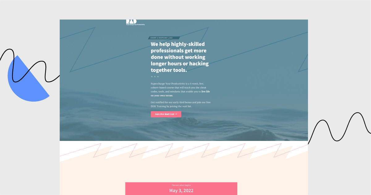
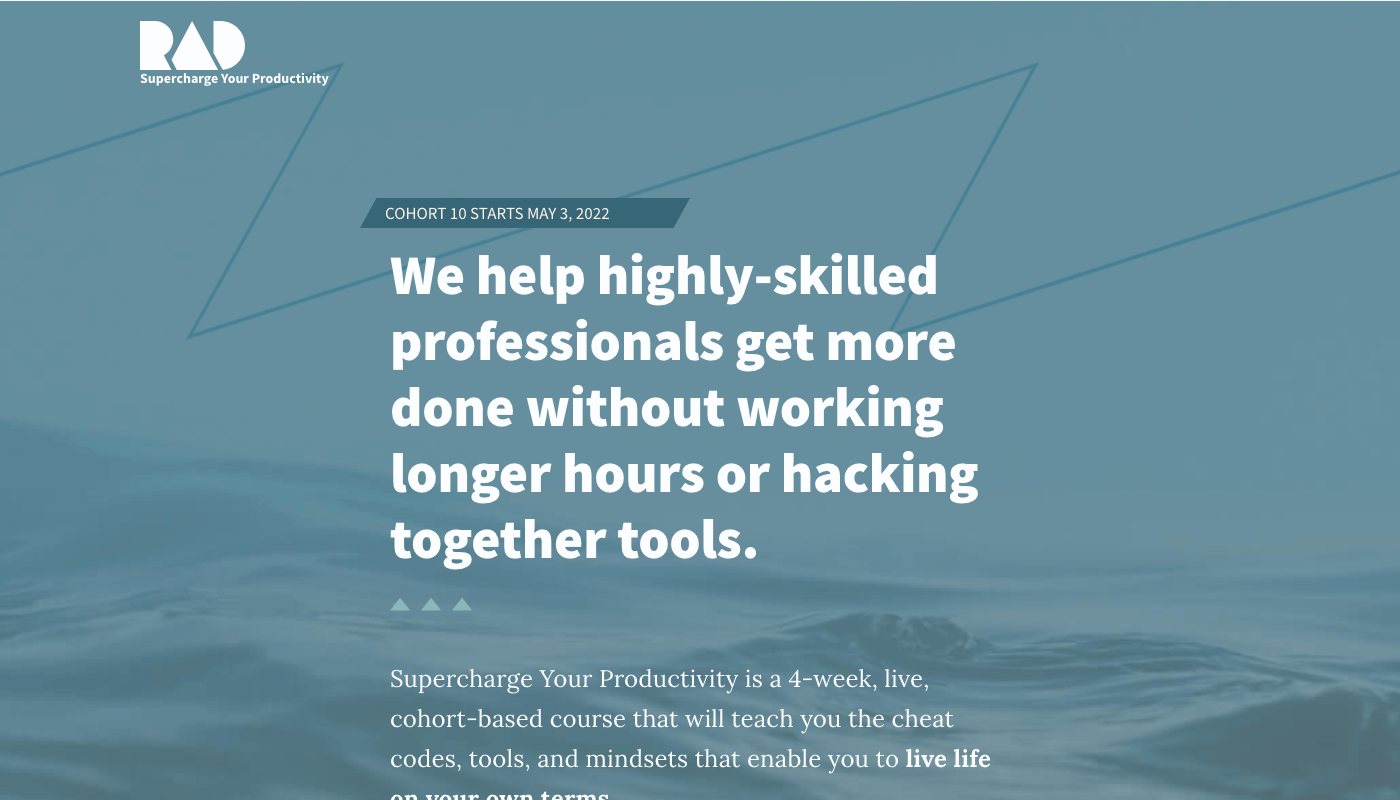
This week’s landing page has been created by Rad Reads. It invites you to join an online course and community and to improve your productivity.
Best bits:
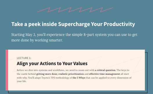
Lesson descriptions. There’s just enough information provided to evoke curiosity and keep you scrolling for more detailed information.
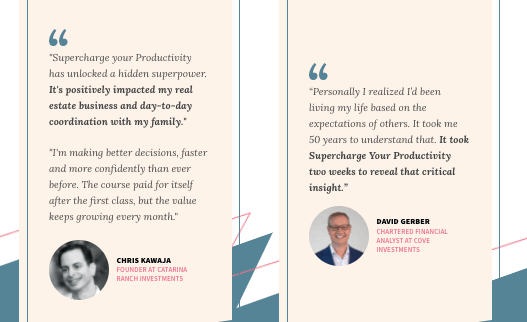
Lots of student testimonials. Genuine reviews with the photos of participants build trust and leave you wondering what might your profit from this course be.
Not-so-good bits:
No image in the opening section. The page’s opening section reminds me of an academic website presenting some complicated research papers. Not really motivating to keep reading.
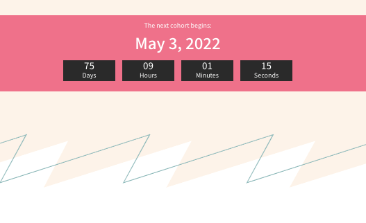
Counter-intuitive CTA button placement. There is no CTA button directly under the timer sections. Usually, this is where such a button is placed, so visitors may be a bit confused. Truth be told, this site could use more CTA buttons, given its length.
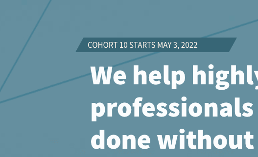
A bit too much about the creators, a bit too little about the visitors. The opening sections look like the “About us” website section. Why might it be a problem? Because it tells what the company does instead of addressing what the visitors may achieve.
Landing Page of the Week is a series where I review various examples of landing pages from the web.