

Selling complex services with a landing page is tough. Especially when your audience doesn’t really get the idea of your offer. We don’t read every word on the Internet, we skim the content and look for highlighted parts. Because our time is important.
This week, we’re gonna look at The Witcher School’s landing page and talk over some tips on how to advertise complex products. What exactly is The Witcher School? Is it better to explain its features thoroughly, or to focus on its benefits for participants? Let’s find out!
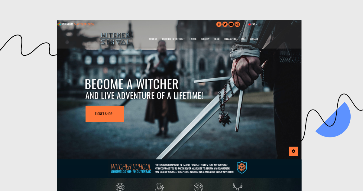
See? Technically speaking, The Witcher School is an adult-oriented Live Action Role Play event. But this information may not be clear for those adults who have no clue what LARPing is. Did the landing page explain what exactly the activity is? No, they focused on its benefits (great memories, adventures) without complex details.
⚔️ Which elements of the landing page slay ⚔️
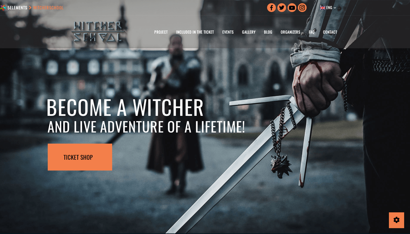
“Become a Witcher and live the adventure of a lifetime”.
We’re responsible adults with jobs, children, and mortgages to pay off – I get it. But what if, for just one weekend, we could immerse ourselves in a fantasy world of witchers’ adventures? This is exactly what is included in the first header. It evokes curiosity and grabs attention. That’s all we need for now!
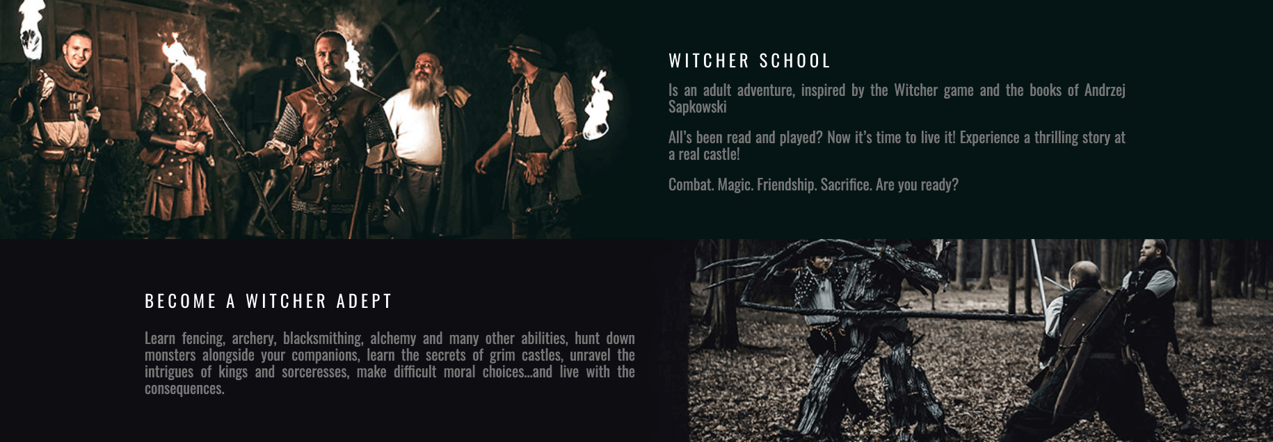
Then, the viewers are slowly presented with what the service is about and how it can benefit them. Photos help to understand the idea (sword fighting in the woods, group adventures to take part in, plot to take part in, characters to portray).
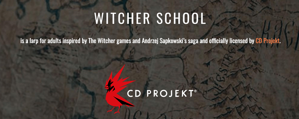
Potential objections are addressed by presenting social proof (participants’ opinions, stats, supporting companies). This helps to build trust and lets visitors know that the organisers know what they are doing.
Still…
🏹 What requires a bit more training 🏹
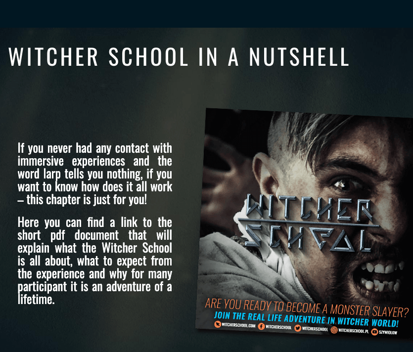
The “Witcher School in a Nutshell” section is too lengthy. Instead of two paragraphs of text, they could have simply written: “Click here to download a guide for beginners”.
This site could be better off without “Articles”, “Other Adventures” and “Blog” sections. Actually, the first half of the landing page is more concise than the second (sticks to one purpose).
Are you destined to see the landing page with your own eyes?
Read more about The Witcher School
Landing Page of the Week is a series where I review various examples of landing pages from the web.