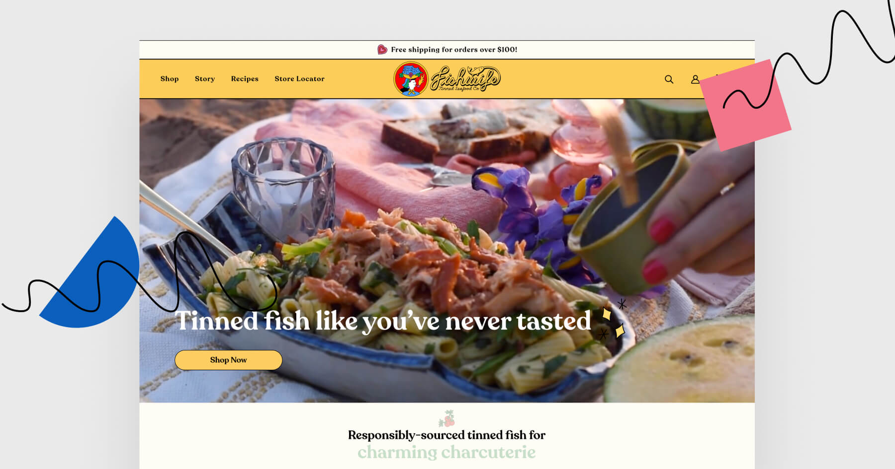
In today’s episode of Landing Page of the Week we’re going to have a look at a page made by a sea food company. Fishwife made its debut in 2020 and has been growing ever since – according to Marketing Brew, the company grew 54% between Q1 and Q2 2022.
Although I am sure that the company’s success isn’t caused by their landing page only, it would be worth taking a look at it.
Like a fish in water – what works best?
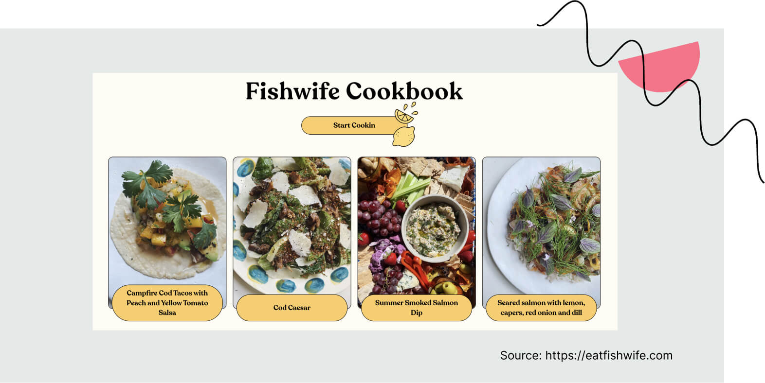
Not so sure how to prepare fish courses? The recipes section is here to help. It shows you what you can use the Fishwife’s products for, and reassures you that you will be able to prepare dishes just as appetizing as the ones in the photos. Chef’s kiss indeed.
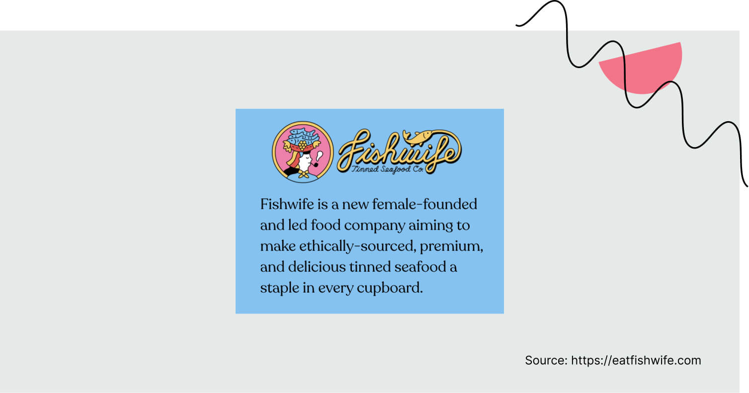
The landing page is client-focused, not company-focused. I like how there is much more information on how the clients may benefit from the product than on the company’s details. The company description is short and located at the bottom of the page.
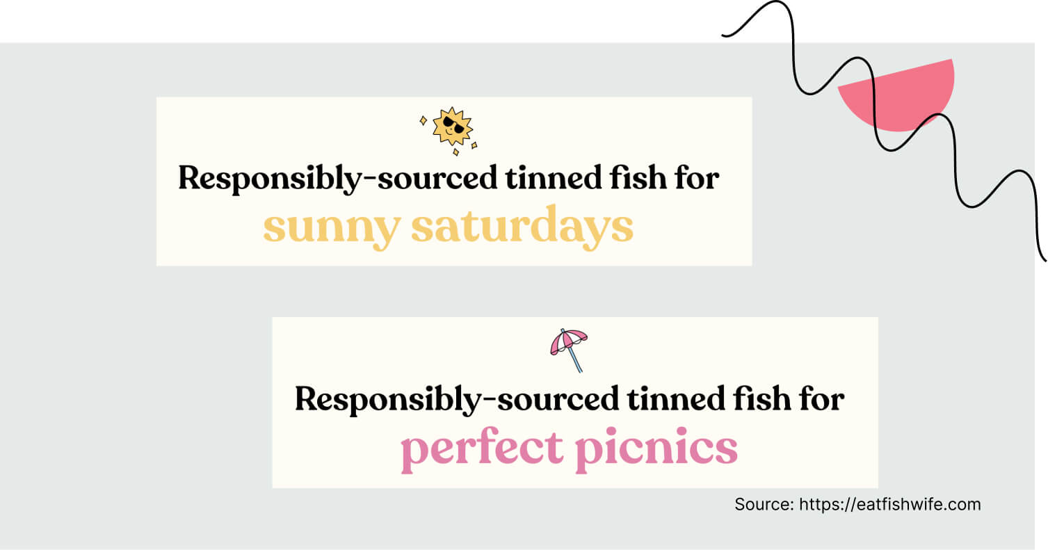
There is a header with changing words included. I must say, I’m not a big fan of such headers (they used to be creative and refreshing, but now I feel like I see them everywhere). To my surprise, I genuinely like this one – it presents many various occasions where you can help yourself with some fish.
Where’s the odd-fish?
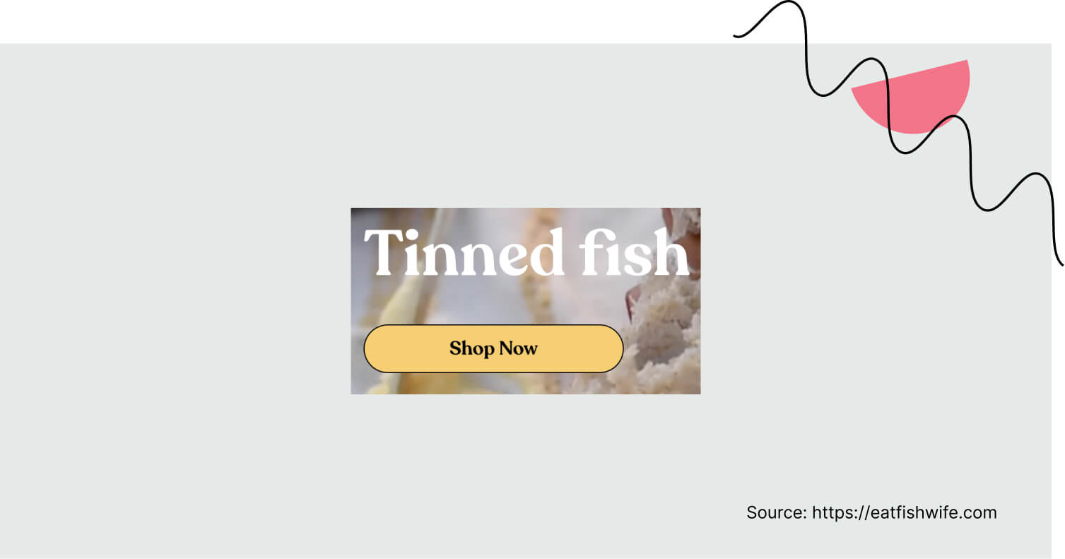
This page could use a bigger, more visible call to action (or even a couple more of them). I wonder if an alternative version with more CTA buttons placed between sections would convert better.

I also wonder what could have been done to showcase the special offer better (collab with Graza – olive oil company). A couple of words on why exactly the collaboration is so special, or how Graza enhances this product’s taste would be a nice idea.
The most important elements of this landing page
The landing page’s design and the product presented on it should walk hand in hand.
Now, let’s go through the most essential elements of this landing page and assess them.
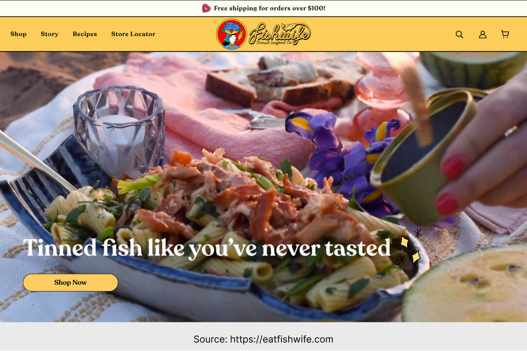
– The main header is “Tinned fish like you’ve never tasted”. In the background of the opening section, there is a video showing a very natural, peaceful picnic scene featuring some Fishwife’s specialties. All clear.
– As I mentioned before, there aren’t many CTAs on this page and the one in the opening section is not really eye-catching (due to the presence of the aesthetic video that the viewers will probably focus on). To see if an alternative version with more CTAs would convert better, I’d recommend running A/B tests.

– Testimonials and logos – everything is in order. There are big brands talking about the product as well as ordinary people providing their thoughts.
– The design is fresh, colorful, and matches the industry perfectly. I love the little doodles, the color combinations, and the retro look – omnipresent both on the landing page and on the tins in which the actual product is sold.
Landing Page of the Week is a series where I review examples of landing pages from the web.
