

What do Titanic, Landing on the Moon, and learning about chimpanzees have in common? The answer is: throughout the years, they all have been featured in one magazine.
National Geographic has been with us since 1888. That’s a lot of bookshelves to fill. Wouldn’t it be fun to browse through archive issues of the magazine somehow more conveniently?
You don’t say – they have a landing page for that and we’re gonna review it?
The key to encouraging visitors to buy your products is simple:
1. Get them interested.
2. Evoke curiosity.
3. Ask to take action.
Easier said than done, don’t you think? Let’s see how National Geographic nailed it, then! 👌
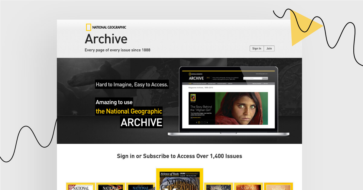
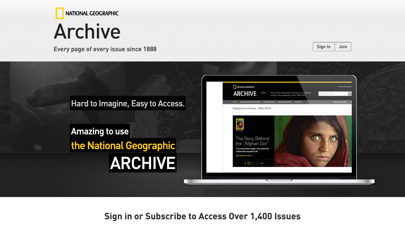
First, there is an interesting possibility introduced. See the header section. Isn’t it curious how over 1,400 issues fit into an online archive? Imagine that: you actually access a newspaper from the year and month you were born.
Then, there’s something viewers are going to click on: an interactive map, and a variety of National Geographic’s covers to browse through. It’s no wonder the visitors click on the covers or map locations.
After they click, a call to action is displayed. The box tells them to subscribe and get access to the magazine. Chances are, the viewers are already intrigued by how the past issues look like. Now, they can consider subscribing.
What might not have been the best idea? 🤷
Putting numerous links on a landing page might hurt your chances to convert visitors into clients. Here, there are quite a lot of links at the bottom of the page and on the pop-up. When faced with too many possibilities, people may feel overwhelmed and not choose anything at all. It’s called Paradox of Choice (credits to Barry Schwartz). Stick to one link per landing page.
Are you curious to see how the landing page looks like?
Your journey starts here
Landing Page of the Week is a series where I review various examples of landing pages from the web.