

Why are some products harder to advertise than others?
One of many possible answers could be: they are not yet widely known, understood or recognizable.
In this review, we’ll talk about red light therapy. Let’s point out some good practices to stick to when creating landing pages for revolutionary products.
What is it all about?
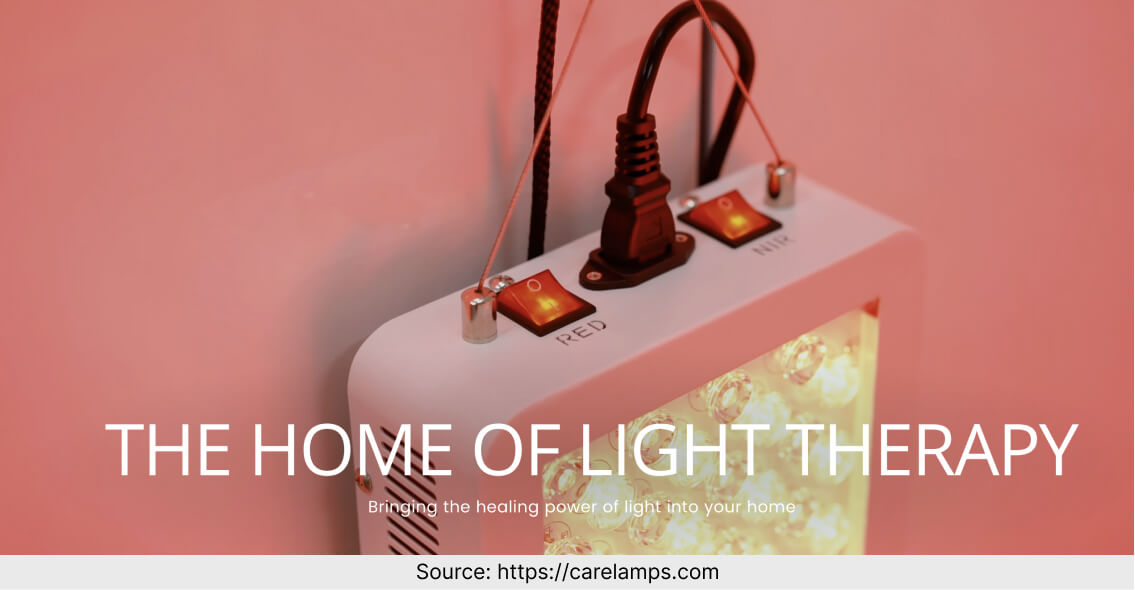
CareLamps offer medical lamps for home phototherapy. According to them, the lamps will cure your skin diseases and improve your health.
They offer a wider range of lamps for UVB phototherapy and red light therapy that you can purchase on their site.

What is convincing?
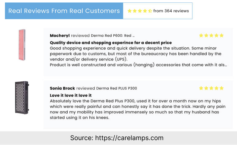
A lot of reviews from real customers. There are over 350 reviews regarding different products explaining how the lamps helped them and confirming that it was worth it.
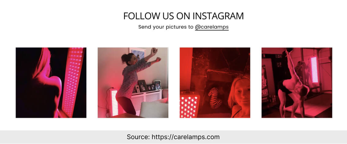
Instagram photos showing how people use the products. It all feels very genuine. It’s also relatively easy to find photos of customers who present their skin before and after the treatment.
What might have been an obstacle?
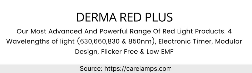
The main issue on this landing page is that there is relatively little explanation of how the lamps work. There is info on wavelengths of light and modular design, but it’s of little use if the visitors are unsure how the product benefits them.
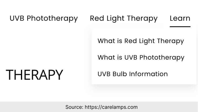
Technically speaking, there are sections explaining how it all works. But to find them, one needs to go to the drop-down menu in top right corner. An explanation right after the opening section could have worked so much better. Remember: it’s you who should be concerned about how to get your message across to the client – not the other way around.
The summary of this landing page creation
Let’s discuss a couple more elements of this landing page.
Design and colors.
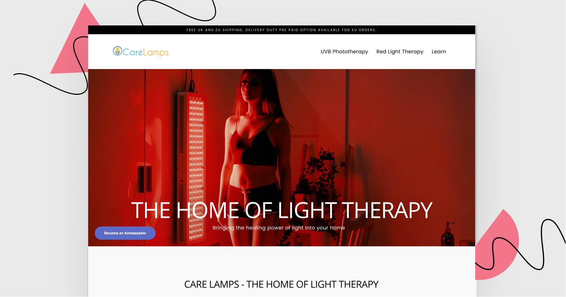
It would be a bit counterintuitive to design a landing page about red light therapy around any other color than red, right? So, red it is – omnipresent on this landing page. I especially like that red is combined with white. If it was black instead of white, the page would look like a nightclub ad. This way, it’s much more of a medical thing.
Opening section.
It was a good idea to include a video of a lamp user. It shows that using the device is easy, that everyone can do it, and that the lamp does not take away much space in one’s room.
Landing Page of the Week is a series where I review examples of landing pages from the web.