

Long story short – I have been asked by one of my subscribers to review a landing page designed by them.
Shall we start the review, then?
Click here to open this page in a new tab.
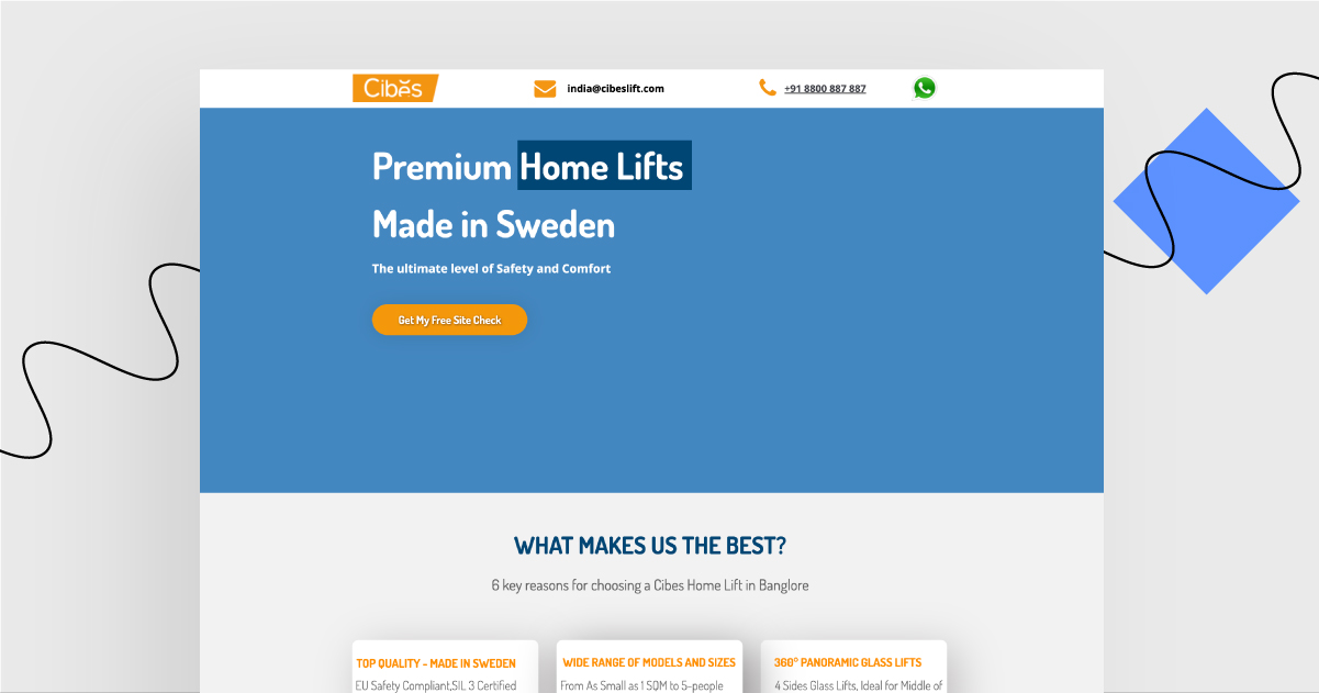
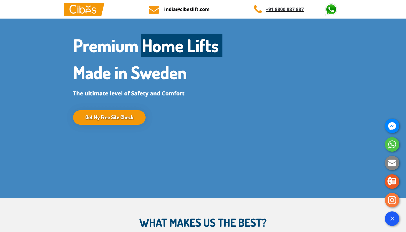
Let’s start with a few words about the company. Their product is a lift (also known as an elevator) that you can install at home to make it easier for the house’s inhabitants to move between floors. Neat, and especially useful when – for some reasons – it’s inconvenient for someone to use stairs.
Best elements of this landing page:
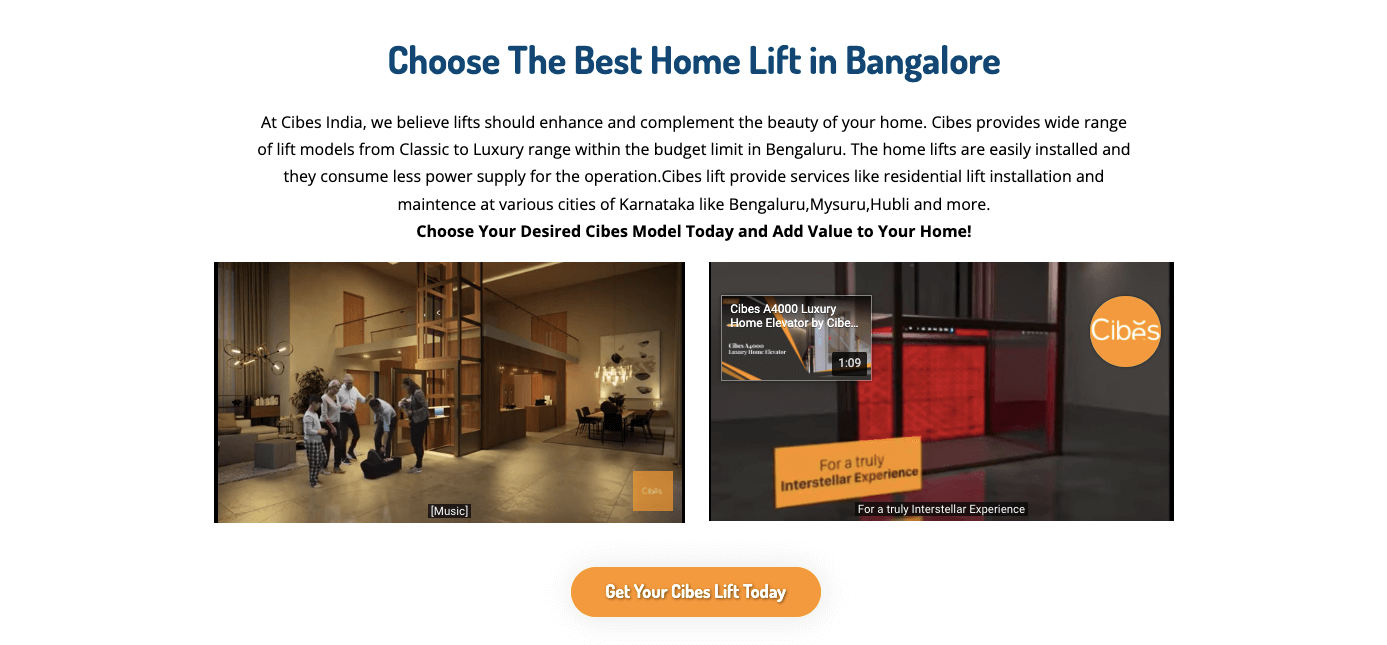
Videos that show the people who use the product. It allows the visitors to listen and watch the product presentation instead of just reading the copy. What is more, as the videos are not included in the header section, there is less danger of affecting the page’s loading speed.
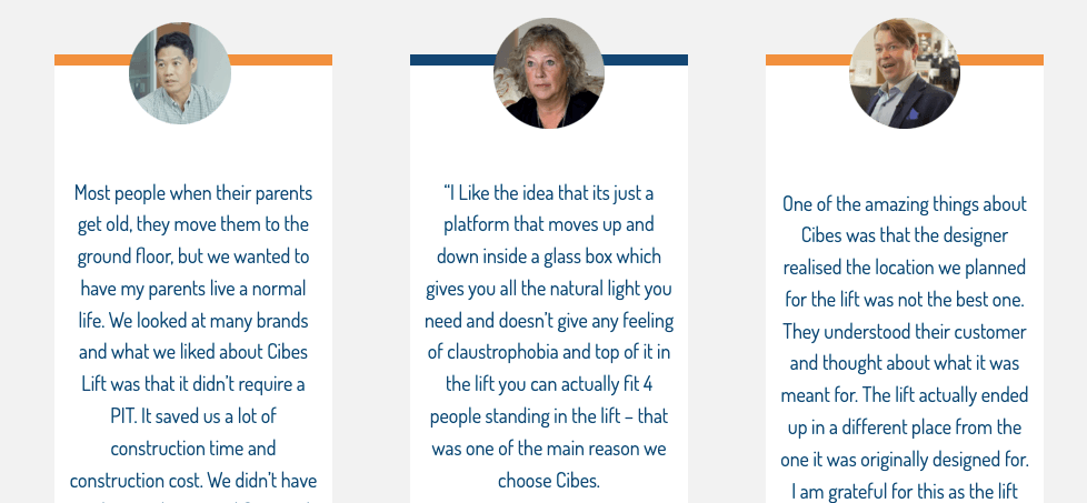
Customers telling their stories. There are actual case studies described in this section, mentioning the problems the viewers may also be facing.
What could have been improved:
Lack of favicon. There are some people who use just a bit too many tabs in their internet browser, and – as I am one of them – without a favicon it was hard for me to find this particular page after I switched to another tab.
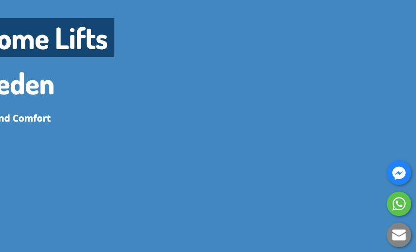
Lack of opening photo. Although I like the neat design, and the premium vibe the product gives off, none of this is included in the opening section, which – for now – looks a bit like a draft version.
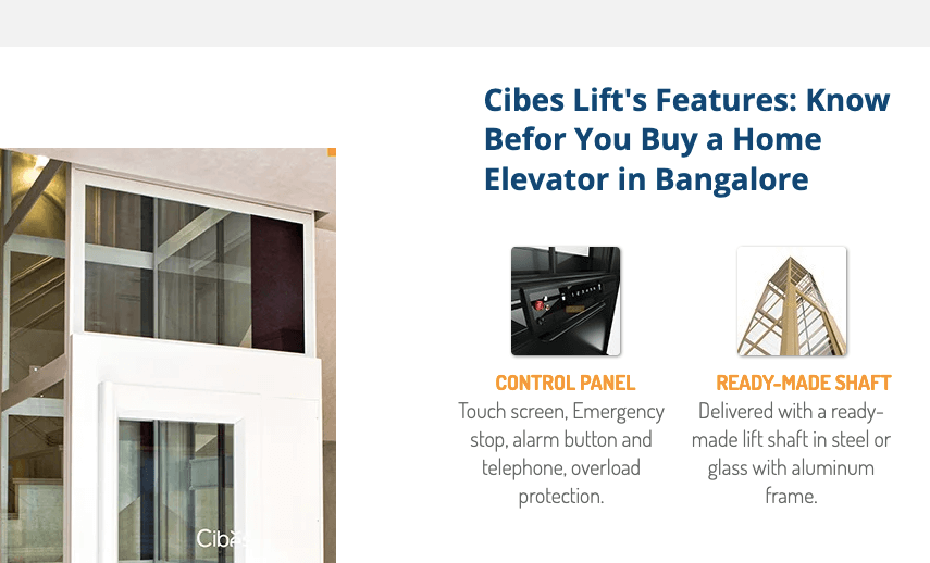
Typos – double check befor you publish. There is no “e” in “before”. Headers without typos looks far more professional than the one wiht mistakes, period.
Landing Page of the Week is a series where I review various examples of landing pages from the web.