

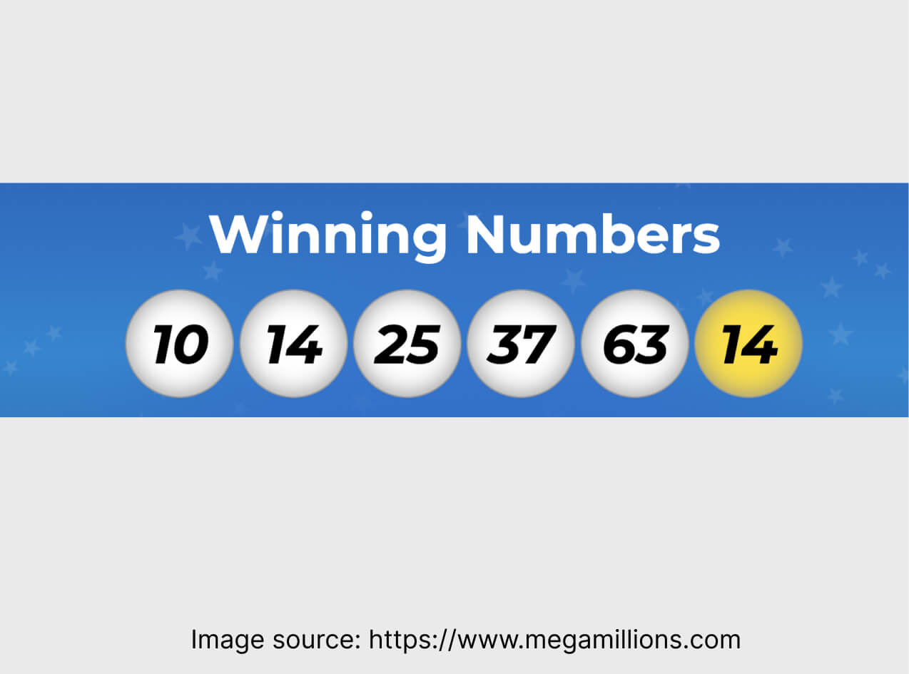
Mega Millions® jackpot run has ended not so long ago. The historic win of $1.337 billion – that’s something to talk about.
When I heard the news, the first things that came to my mind was to check if there is any landing page related to the lottery. And then, I came upon something.
Click here to see this landing page.
Which landing page’s parts hit the jackpot?

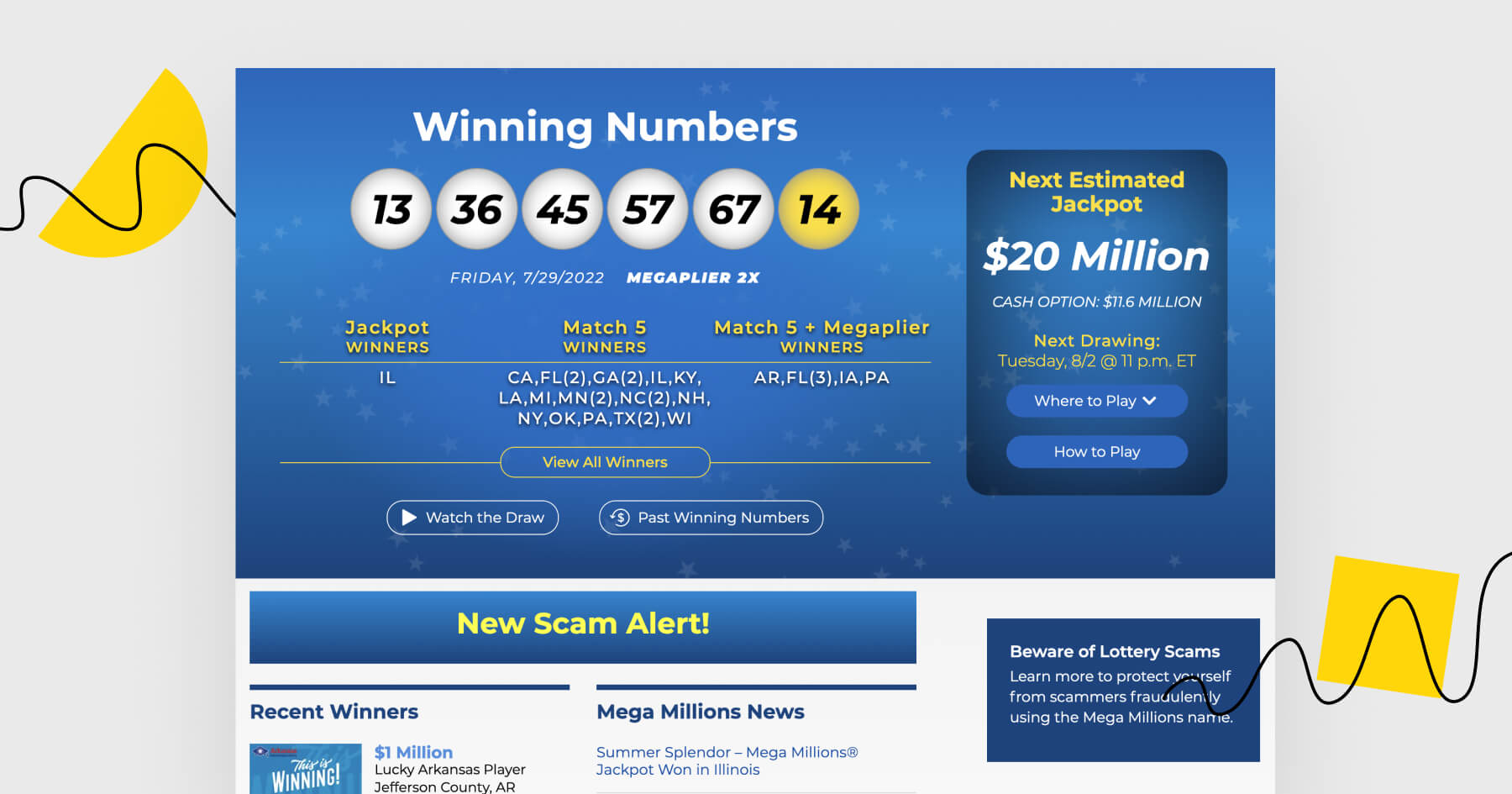
The design is based on the logo and consistent with it. There are stars in the background as well as yellow and blue accents. I feel like they did a good job getting rid of red (otherwise, the page might have looked a bit too garish).
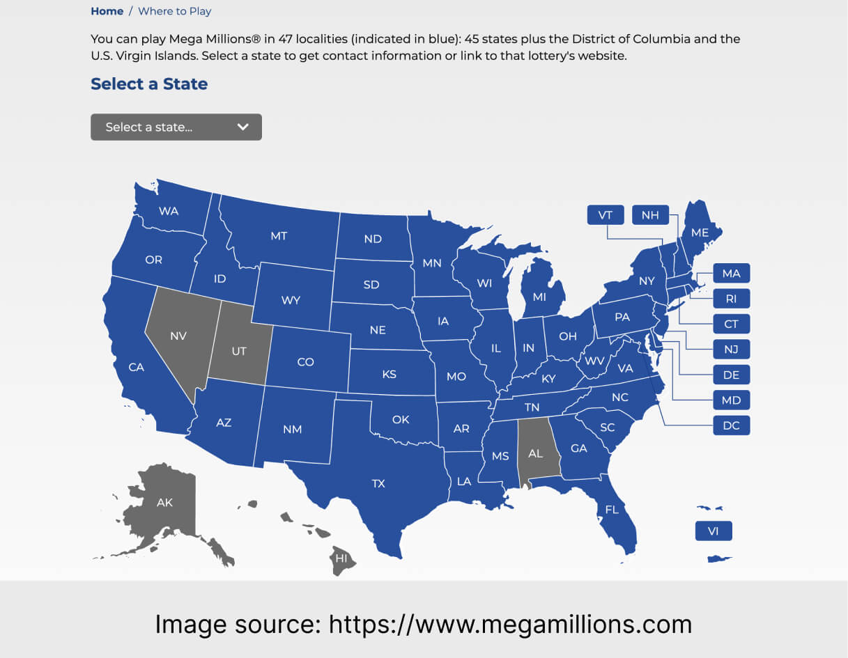
The map where you can get information on where to go to place bets. If the visitors are expected to participate in the lottery, they need to know where they can do it. Providing this piece of information in the form of a map rather than plain text is more visually attractive.
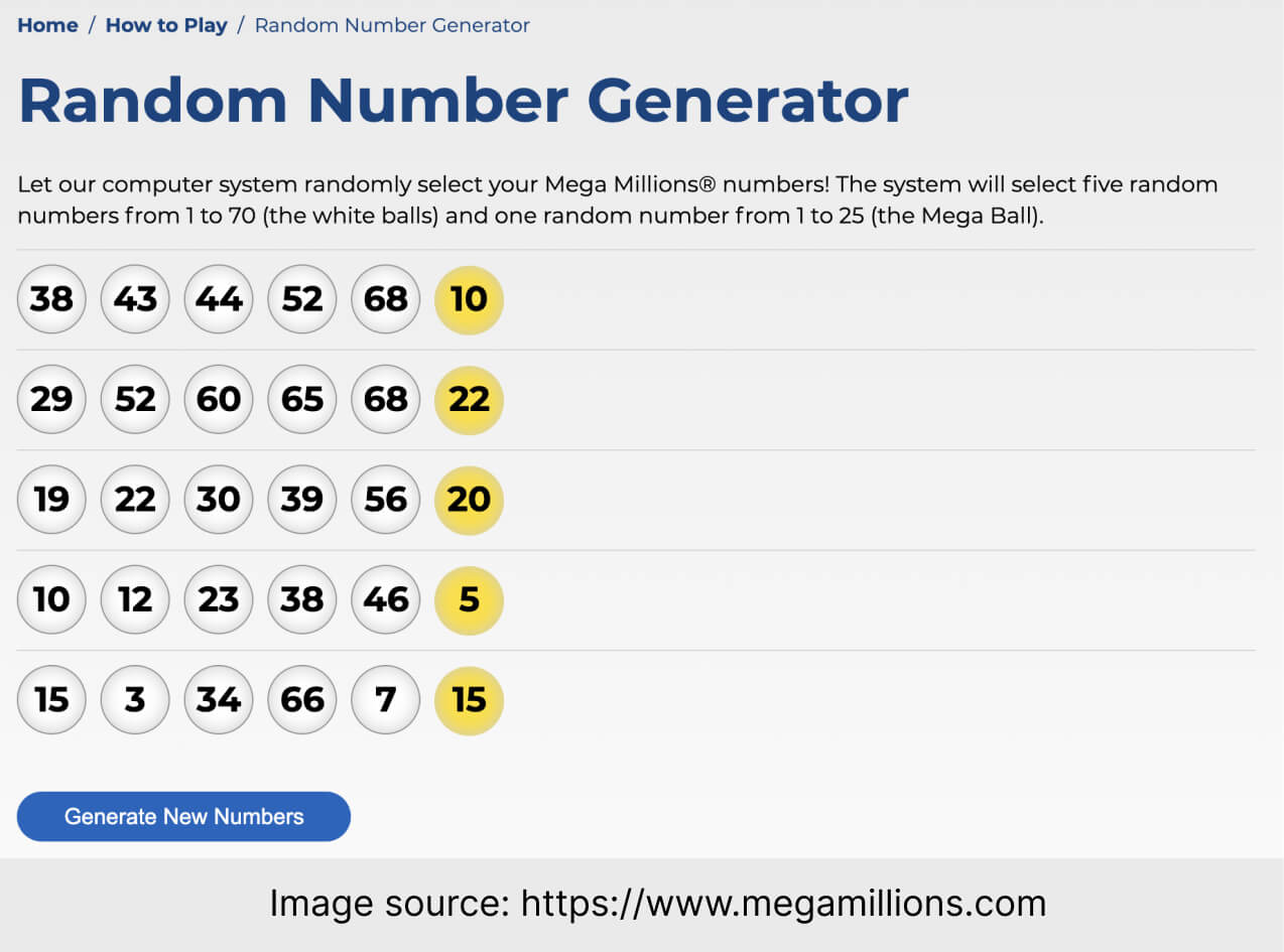
The extra feature – Random Number Generator. Once you click the button, you get five sets of numbers. And now you wonder: what if the numbers selected by the computer system are worth betting on? You’ll never know unless you make a bet. That was subtle, wasn’t it?
A long shot or a matter of chance?

This CTA is supposed to warn the visitors about scam operators and frauds. However, I don’t really like how the biggest CTA on this page is about checking out scam alerts rather than taking part in the lottery.
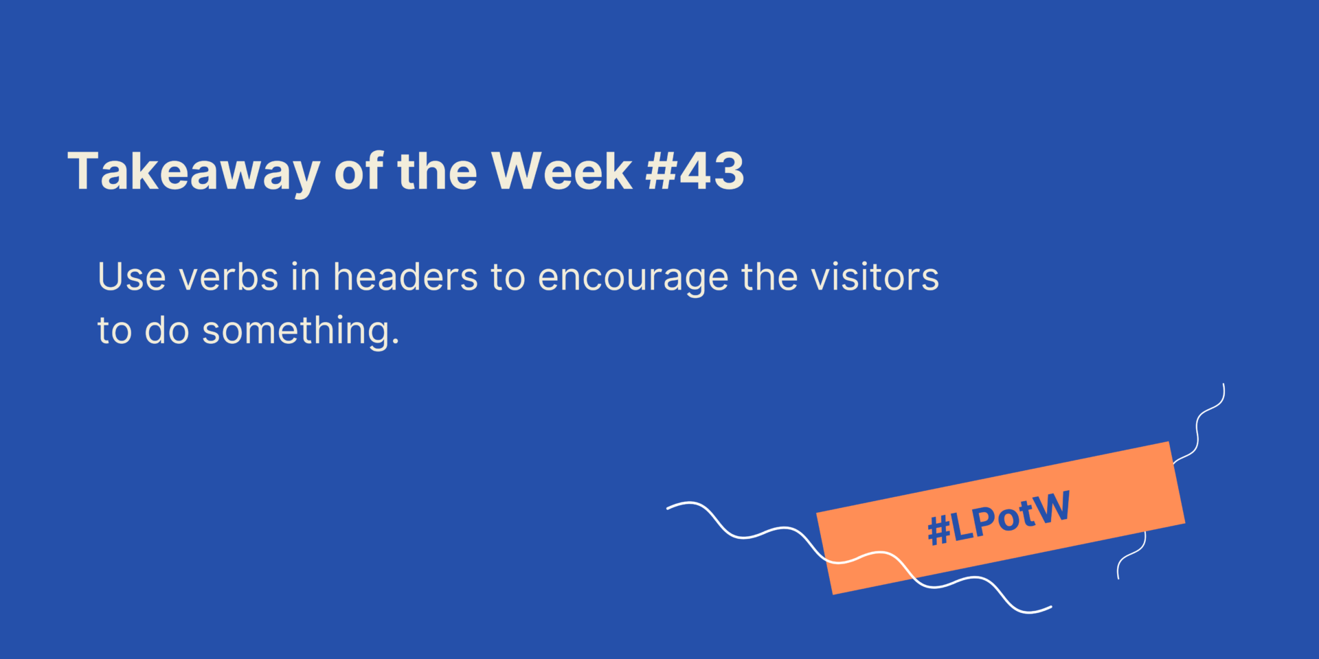
The main header could have been more encouraging. Perhaps a header with a verb inviting to actually do something (to place bets, or to check the numbers) would make the site convert better?
Landing Page of the Week is a series where I review examples of landing pages from the web.