

Google is selling chips. Hopefully, it’s not a permanent rebranding, though, but rather a one-time action. Curious to learn more? Read on!
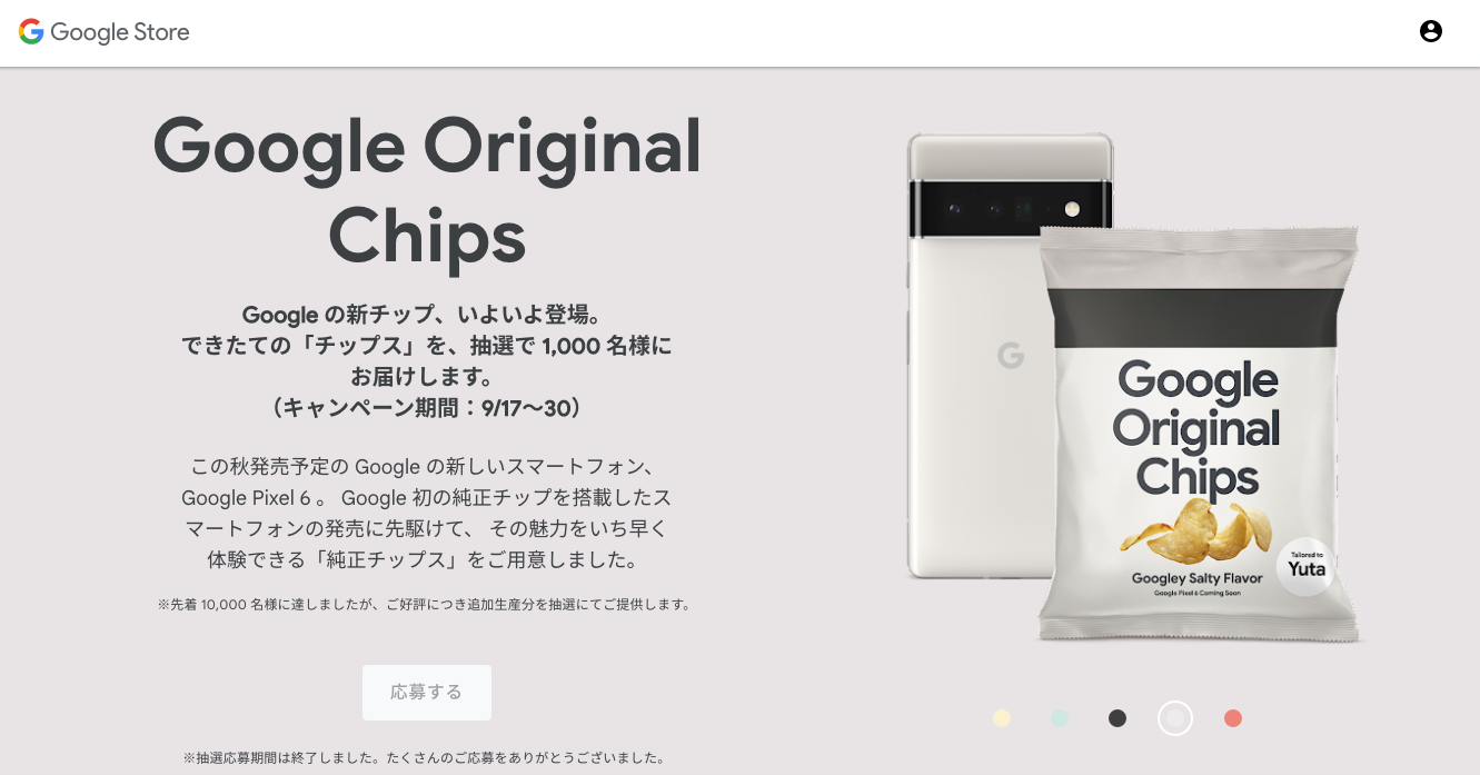
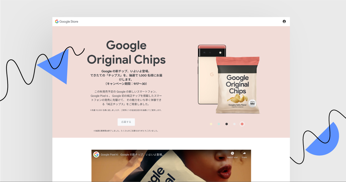
To celebrate the launch of the Google Tensor chip, Google prepared a landing page that allowed Japanese visitors to win their own packet of Google Chips. The lottery has already ended (meaning all the chips packets have been distributed), but the landing page is interesting enough for us to chip in and break it down in our analysis.
TIP: Although the page is written in Japanese, some browsers (for example, Google Chrome) go with a translator tool.
What’s great about the landing page and what could be improved?
Consistent design – Nice! It’s clear that designers used a specific color palette. Black, white and beige in combination. It’s a bit basic, that’s true, but… basic is better than overwhelming.
What is it about? – Clear enough. In the header, there is information about Google Pixel 6 and an explanation on why edible chips were produced. It’s great, because it’s likely that visitors will enter the page, look at the bag of chips and then look for an explanation, which is included in the first section.
Smile-evoking – Yup! If you scroll down, you’ll see the video presenting the chip in a humorous way. (I loved the video’s ending, it felt so real)
Single purpose – Could have been better. Although the first two CTAs tell viewers to take part in the contest, the remaining ones lead either to another page with additional information on Google Tensor, or to a contact page. Great beginning, not-so-great finish. Remember: the less CTAs you put on a landing page, the better.
Engaging?
See the landing page yourself!