

Welcome to yet another episode of the Landing Page of the Week series.
This time, I’ve decided to assess Premium Concierge’s landing page and show you some mistakes that you can avoid when creating landing pages in the future.

Premium Concierge is a good solution for people who would like to receive information on London venues suitable to their party ideas. Meetings, birthday parties, conferences – they claim to know a place that will be just perfect for you.
How about their landing page? Let’s take a look, shall we? Click here to visit the page. Then, come back to this email and find out what I think.
The life and soul of this landing page 🎉
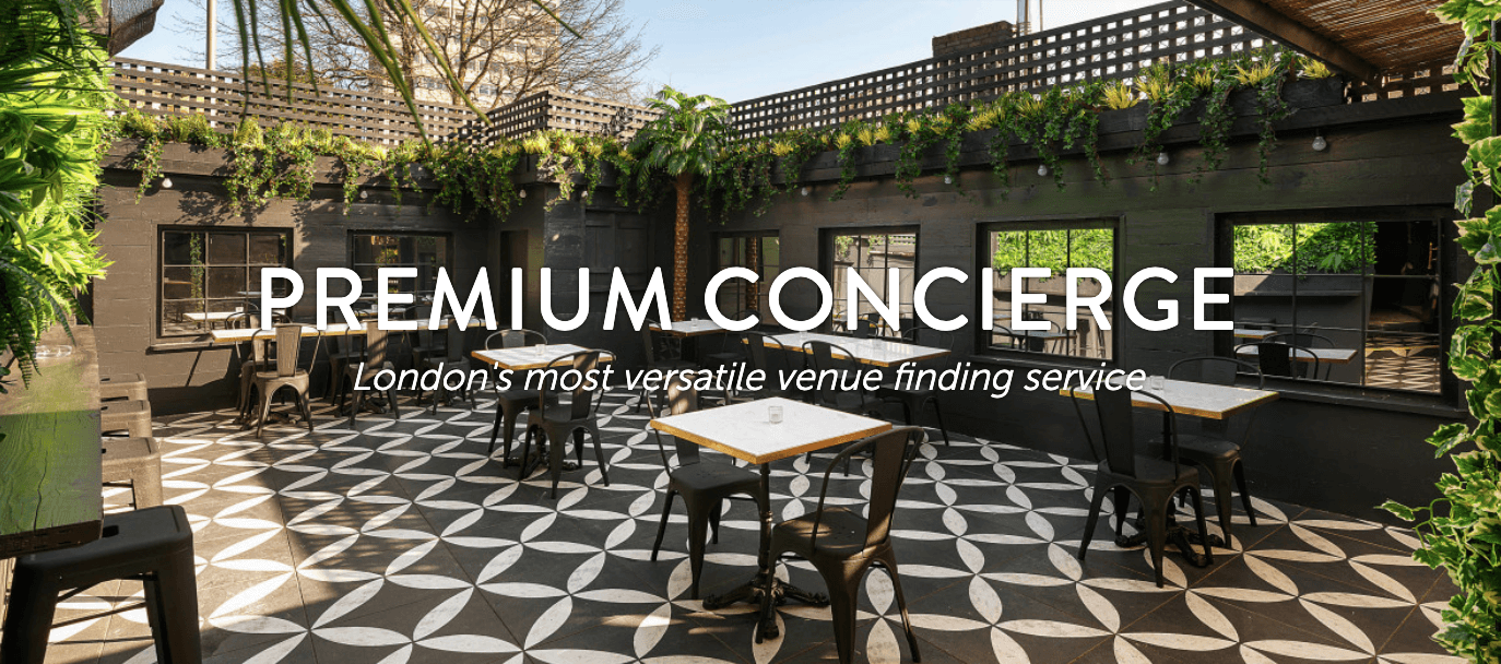
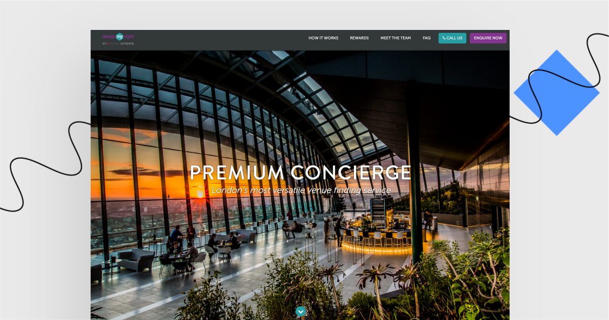
Changing photos in the opening section is a great way to show various places this company can book for you. Sometimes pictures speak louder than words.

There are well-known companies’ logos in their social proof section. And who wouldn’t believe The Guardian or London Evening Standard?
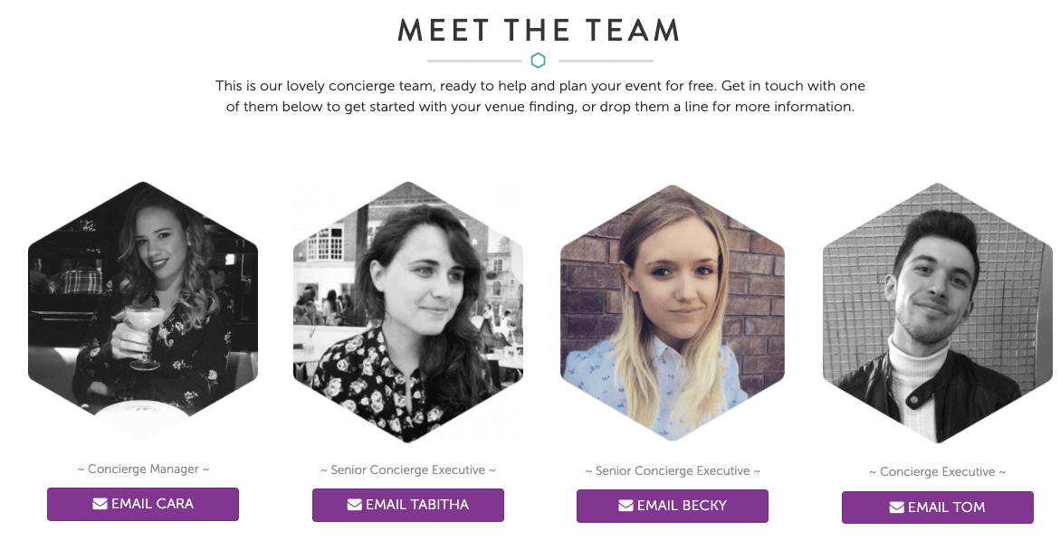
The “Meet the Team” section includes actual photos of the people who are going to deal with your inquiry.
What is not perfect yet:
Generally, benefits are not highlighted enough. Read on:

The opening section screams “premium”, while the information that the service is free is written in small letters below, so viewers might get the wrong impression that they can’t afford it.
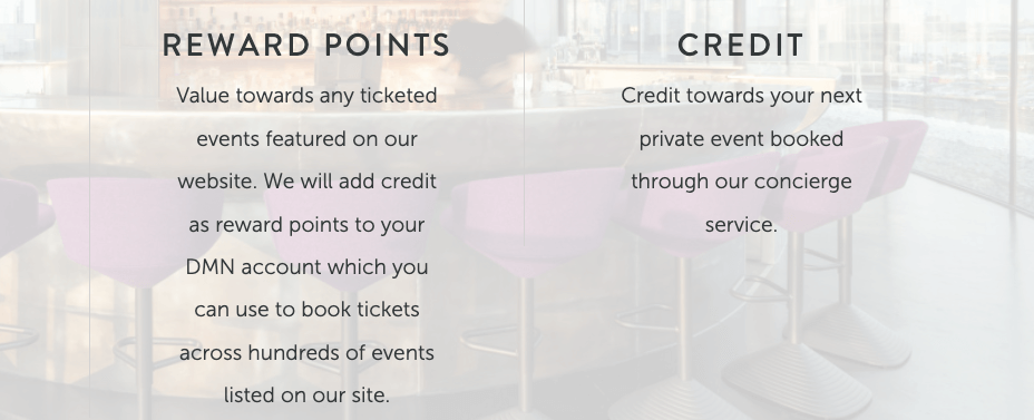
There is little information on how much the rewards are worth. Some viewers would like to know the exact numbers and to know what they sign up for.
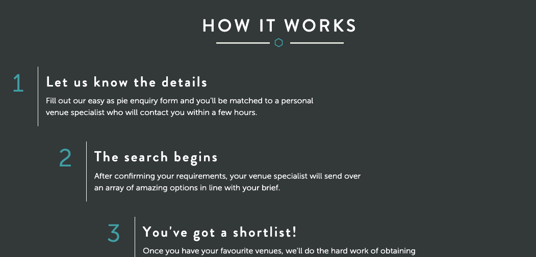
The “How It Works” section could use some photos (or, even better, customers’ photos to make the experience more genuine).
There are way too many links in the footer.
Landing Page of the Week is a series where I review various examples of landing pages from the web.