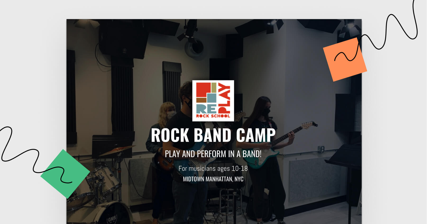


Today we’re reviewing a really cool landing page – ROCK BAND CAMP brought to you by Replay Rock School from NYC. The idea of summer music camps for kids aged 10-18 focused around a rock band sounds very nice.
So without further ado, let’s take a look at this landing page and rock this week’s review!
Click here and see this landing page.
Then, come back to this email and read my review.
Let’s see what’s great about this landing page
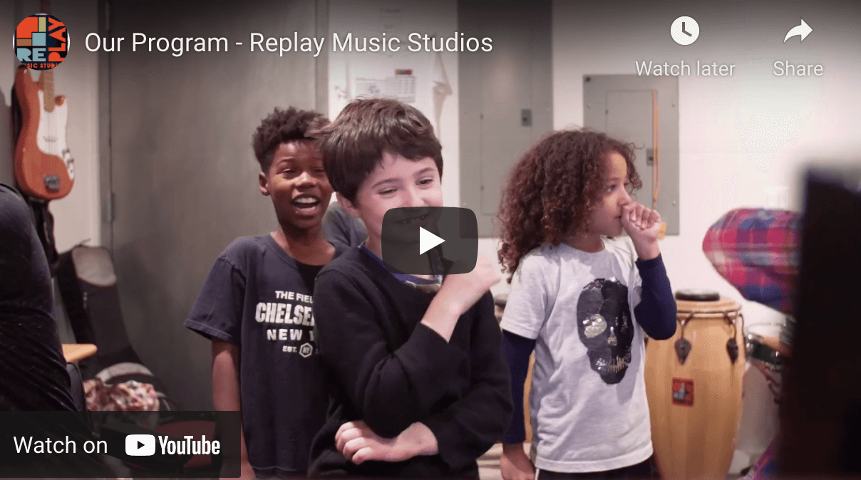
Using a story-telling video, explaining the background of the idea and what kids can expect from taking part in the music activities is a great way to show the audience what’s it all about. I wish it was presented in the hero section of this landing page!
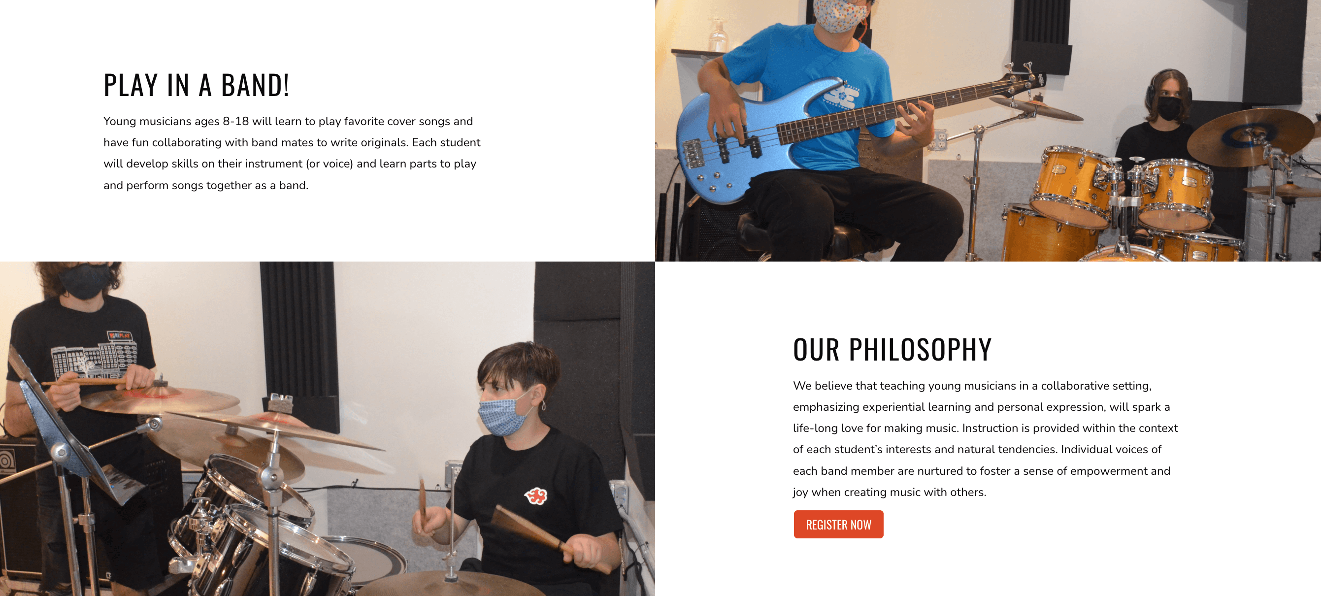
I love that real footage images were used in almost every section of this landing page. It builds credibility of the camp organizers and makes you literrally feel how it’s like on these classess.
Some ideas – what could be improved?
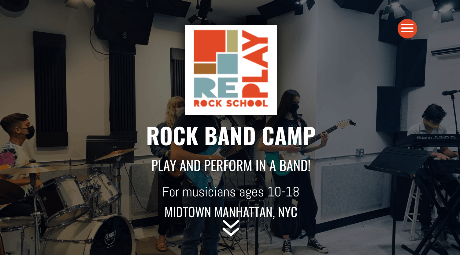
What I miss the most is the CTA button in the hero (1st) section. There’s the slide down arrow in the bottom, but I honestly believe that Rock Camps deserve a proper Call To Action!
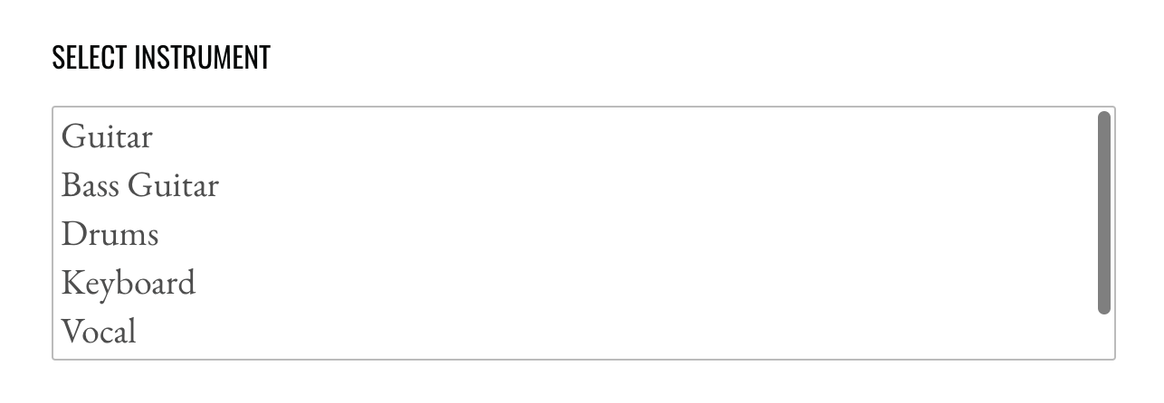
In the registration form, more experienced internet users will know to select multiple options by helding the cmd/ctrl button, but the others won’t be able to select more than one option. This could be solved with checkboxes instead.
Landing Page of the Week is a series where I review examples of landing pages from the web.