

It’s been a while since we talked about short, simple landing pages. You guessed it – today, I’m going to assess such a page.
Now, you may perhaps wonder what is there to talk about, given the fact that the page is made of just a few sections. Well… read on!

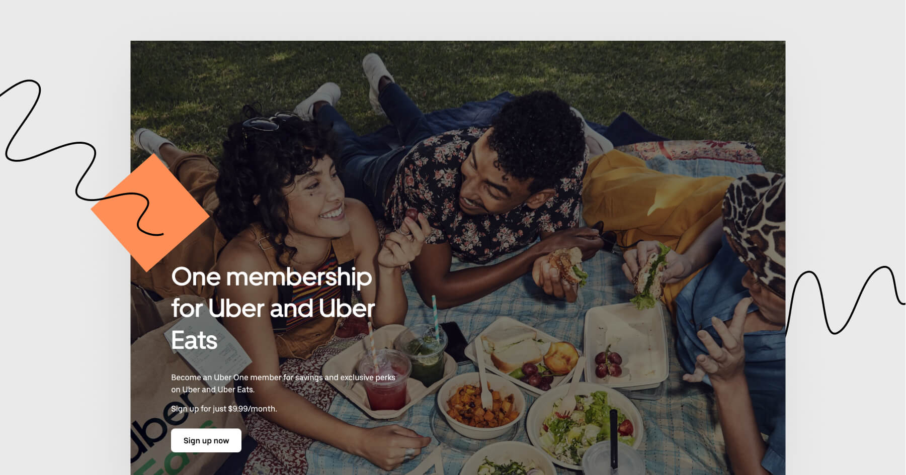
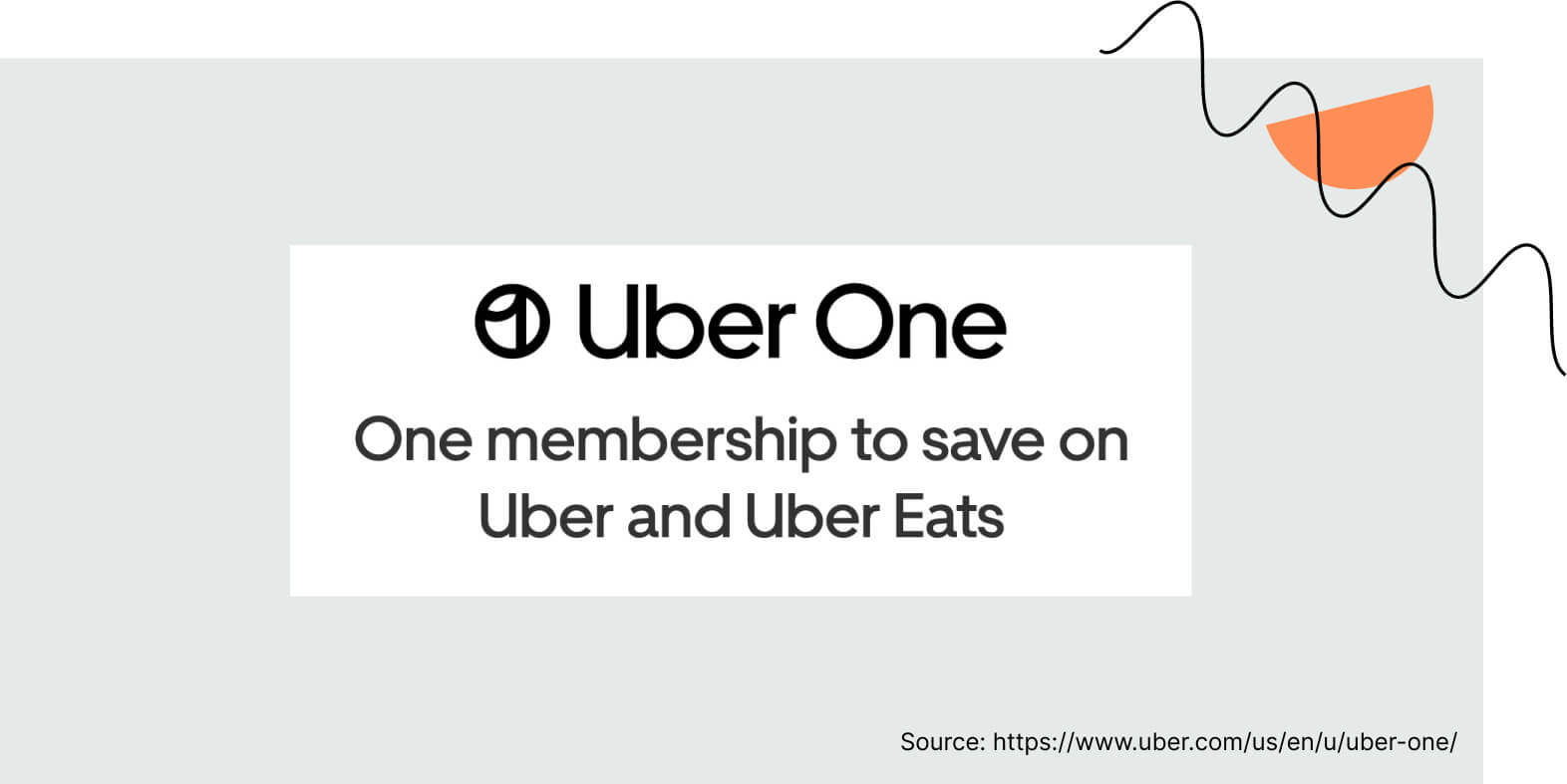
This page is clearly directed to people who know what Uber is and how it works. Here, no one explains what Uber is about as the target group already knows it. Instead, we get to know the membership service and its benefits. Straight to the point, isn’t it?
What works best?
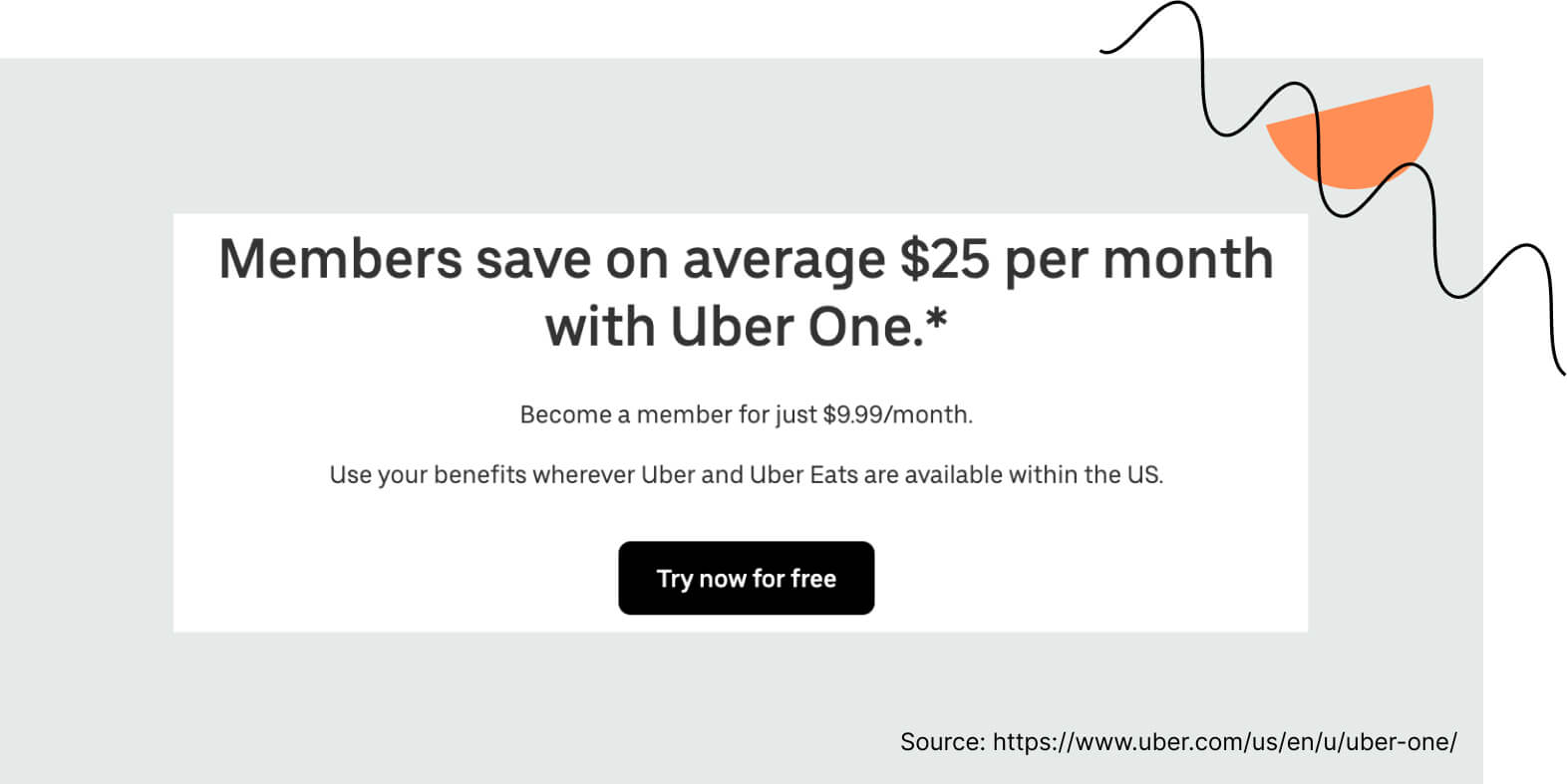
I like the message in the header above CTA button. It shows how much Uber One’s members save and evokes a pretty reasonable question: “will I also save $25 per month”? The answer waits nearby – all you have to do to discover it is to click the CTA button.
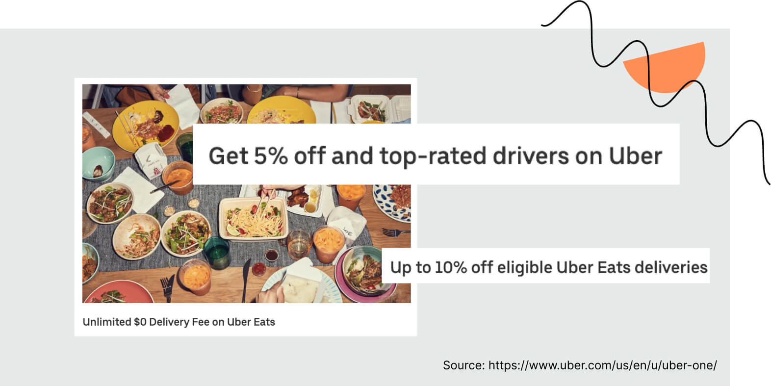
There are four main benefits for Uber One’s members (for example, unlimited $0 delivery fee). All the benefits are presented with four photos and four short descriptions. I like that it’s so concise and to the point.
Where’s the area for improvement?
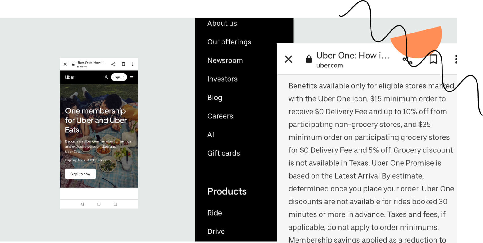
The mobile version per se looks good. The problem begins when we scroll down to the terms and conditions section, which takes half a mobile page. Because of that, the final CTA on the mobile version can be easily missed out.
I also wonder if it would be better to inform that the service is available for the US only in any section other than the last one. I must admit, it was quite a discouragement.
The most important elements of this landing page
The target group is well-defined, and everything on this landing page is directed to them.
Now, let’s go through the most essential elements of this landing page and assess them.
– The main header is “One membership for Uber and Uber Eats”. In other words, this header introduces a new idea – that you can get discounts for ordering food and requesting rides in one subscription service.
– There are two CTA buttons. This is enough for such a short landing page. The copy is a basic “Sign up now” / “Try now for free”.
– The design is very basic. And yet, it matches Uber’s brand. The conclusion? It’s not overcomplicated and works well. Also, the colorful photos remind me of the pictures of food in the Uber Eats app, so everything comes together pretty neatly.
– Blocks of text on a mobile version distract from the final CTA and take up a lot of space. When creating landing pages, make sure you check what the mobile view presents itself like. If it looks disarranged, rebuild the mobile view to get your visitors a better experience.
Landing Page of the Week is a series where I review examples of landing pages from the web.