

It’s Kate from Landingi again, pretty excited to present you the twentieth issue of Landing Page of the Week. (Woah, it went by so fast!).
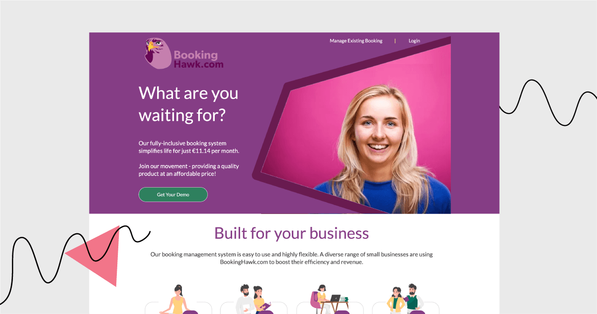
For this anniversary edition, I’ve been asked to review a landing page advertising BookingHawk. Let’s do it!
Click here to open this page in a new tab.
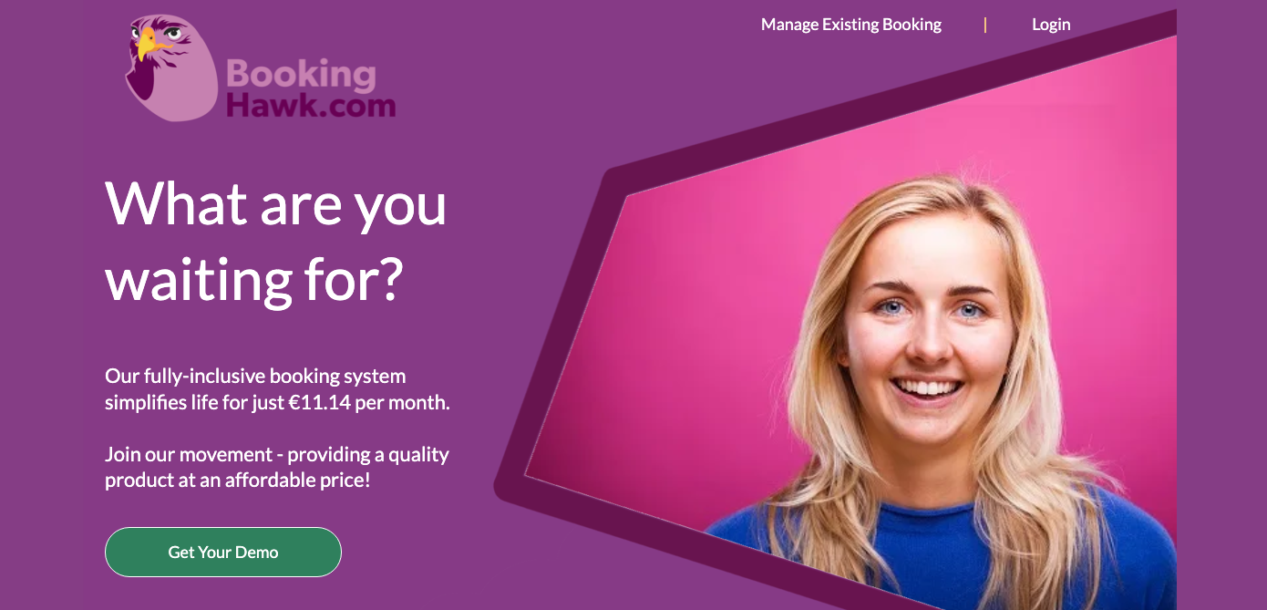
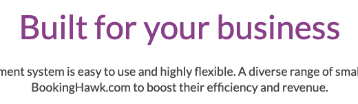
BookingHawk is an Irish company that offers booking management system. Their offer is aimed mostly at 1-person businesses, even the ones without websites.
How did they present their offer? What are this landing page’s strengths and weaknesses?
What’s great:

Marketing funnel. After the users click the “Get Your Demo” button, they are redirected to the page with a sign-up form. It’s a good practice for companies whose services are quite complex and require talking over the client’s needs first.
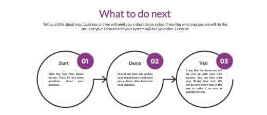
Clear “what to do next” section. How to encourage more visitors to schedule calls and minimize their hesitation? BookingHawk simply shows what happens next. Informing about the free trial period may encourage the doubtful ones to give the app a try first and decide later.
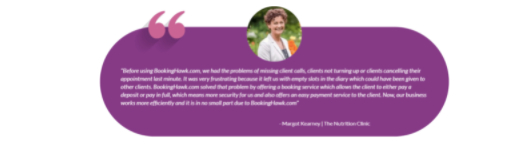
Lots of customer’s testimonials. There are 7 testimonials on the page, including the actual photos of the clients and their detailed opinions.
What could have been done better:
More photos of the product in use. The page is colorful and full of pictures, but, unfortunately, it lacks photos showing the actual booking app in use. The page could benefit from more genuine photos of the team, the app, or examples of booking pages you can create.
Less text, more meaningful phrases. It’s good that parts of it are highlighted, however, there is still room for improvement when it comes to the very essence of the copy. Sometimes, the phrases feel quite vague, non-personal, or not detailed enough.
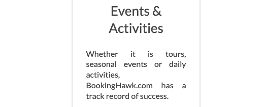
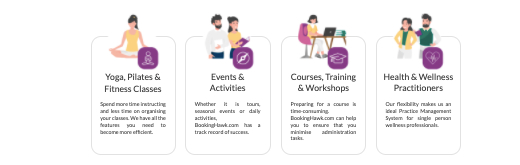
Justified text. There are places where justified text looks messy (e.g. events and activities section). Details like this may impact the general experience of the viewer and their opinion about the company – unfortunately, not in a positive way.
Landing Page of the Week is a series where I review various examples of landing pages from the web.