

This may seem random, but this Tuesday I found out that this year there have already been three lawsuits filed against Pop-Tarts. Supposedly their strawberry Pop-Tarts don’t contain enough real strawberries.
And this is why this week we’re taking a look at Pop-Tarts’ landing page. 🍓
Let’s break it down:
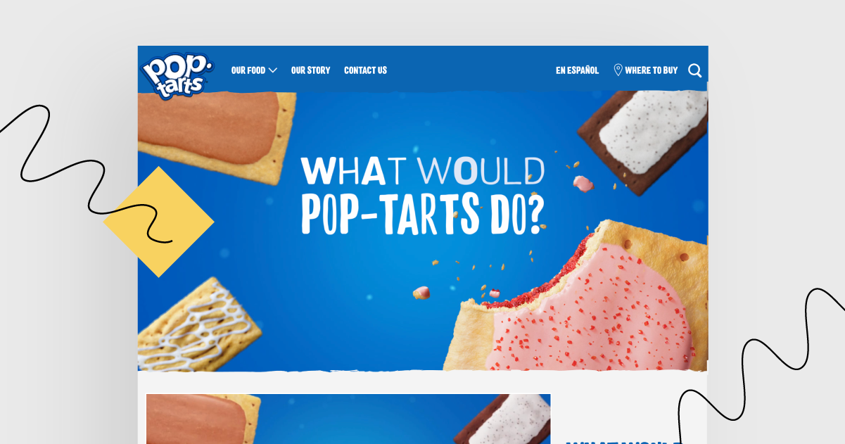
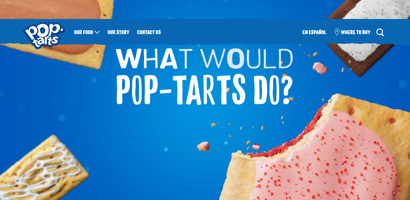
Huge header about Pop-Tarts – it grabs attention!
When you enter the page, the first thing you see is a catchy slogan based on a classic WWJD saying. It’s smile-evoking, fun, and grabs the visitors’ attention.
Graphics correspond with the ones Pop-Tarts use in their social media – it feels familiar!
Message match and consistent design. If you create an ad that leads to a landing page, you have to make sure you use a matching slogan, colors, and present the same products or deals as advertised.
Call(s) to action – something went wrong
If you scroll down the landing page, too many things happen at the same time. There is a CTA encouraging to watch more videos, but also “The Goods” section with more and more places to click on. There was no “buy now” button, so I had no option to buy Pop-Tarts and left the page.
The conclusions are:
Make sure there are enough strawberries in your candies before you decide to label them strawberry 😉
Remember to focus on one CTA at a time.
Go To Pop-Tarts’ landing page