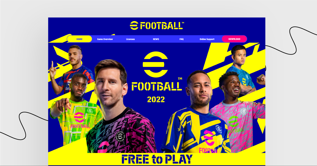


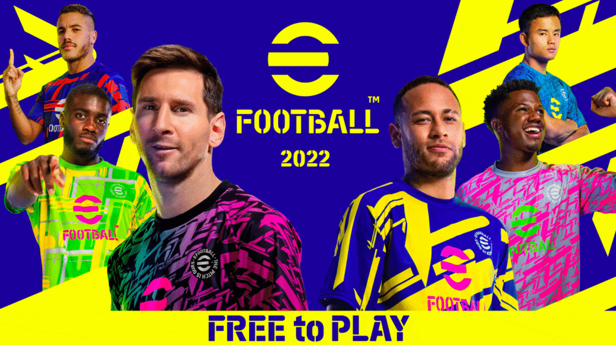
This week, we present to you a landing page advertising eFootball 2022. This freshly released game managed to get over 18,000 Steam Reviews, with less than 10% positive ones, making it the worst-reviewed game in Steam’s history. Congrats, I guess?
If such a magnificent failure isn’t a reason for their landing page to become this week’s gem, the design of the landing page surely is.
Let’s roll with it! ⚽
Why eFootball messed over their landing page a bit too much:
Vibrant and lively design is a great beginning! It reminds me of Cyberpunk 2077’s aesthetics and… oh, wait, of that long-awaited RPG’s failed launch.
Truth be told, it’s nice to see a detailed explanation how PES became eFootball, but why did they score an own goal and put it in a block of text instead of using some visuals?
And why is there so much text in Roadmap, Pre-Order, and Updates sections? Who is this landing page even directed to: new players, fans, followers?
It’s hard to guess the strategy behind using so many CTAs, buttons, and options.
Although the game’s free, it is possible to buy some extensions. Still, there are so many extras to choose from that some viewers may be confused about how much the game really is.
Are you brave enough to see this landing page by yourself?
Challenge accepted!