

A blank-page syndrome is a thing that every creative writer knows too well. The deadline is inevitable and there is no way to move it for another time, but your “paper” is still dead empty. Let’s not worry too much, but look for the solution instead. And the one I want to propose, is creating your own marketing swipe file, that will help you now and in the future. Keep reading to uncover the details!
What is a marketing swipe file?
A swipe file is a personal repository of ideas. You can start creating one any moment, but I have to warn you – it’s going to take some time if you want to be fully satisfied with it.
The idea behind swipe files is to create a box to where you can peek every time you feel a creative blockade, to get inspired. But if you want if to work well, you need to prepare it carefully – start with finding the right tool for the job and then create some categories to easily find what you need in the future.
Theoretically, it works very easy: you read, see or hear something interesting, so you save it for later. But things are getting much harder in practice. Trying to gather everything worth saving leads straight to nowhere. Either you’ll end up having dozens of materials you’d never look into again, or you’ll spend hours trying to keep them in order somehow.
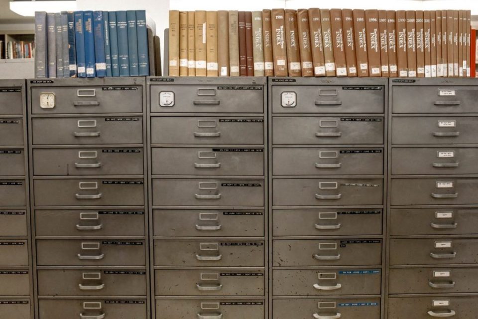
Remember file cabinets at doctor’s? Try putting THAT into your smartphone.
Is swipe file a ready-to-use template?
Naturally, you can’t treat your best findings as things to copy and paste, mostly…

…because that would be stealing.
A swipe file doesn’t do your job for you, but it should give you a friendly kick in the butt idea of how to start or continue the topic you’re on. It won’t replace your writing or whatever it is you do, but it should be used like jumper cables. Ran out of ideas? Browse through some swipe files and make the engine scream!
One more thing: a swipe file won’t tell you how to write, design or speak, ever. It is still and it will remain your job to shape your thoughts and skills and make a good content out of what you have.
You can also use swipe file as serious help in split testing your landing pages or email messages. Sometimes coming up with one idea for a great headline can be a real pain – creating three or four doesn’t get any easier. Especially if they regard the same topic.
How to create your own swipe file?
Of course, you could start with saving everything that speaks to you in any way. Great video campaign, an outstanding article or a compelling headline you’ve seen in the morning paper. But you’ve got to keep in mind a few things before you begin.
- Spend some time on choosing the right tool for your swipe file. You can start with your notepad, if you wish, but to be sure, that you can use it everywhere, I recommend a cloud drive or cloud-driven app. There’s more about it in this article – keep reading!
- It’s no use to write down 50 headlines and never get back to them because they don’t fit your industry or a branch. Don’t hesitate to strip-off the list to just a few examples, or – if it’ll help – create a subcategories like: landing page headlines, article titles, news punchlines (depending on what you need).
Examples in your swipe file should somehow reflect your company’s style of communication. It’s one more thing you should bear in mind while gathering all this stuff – if you’re working on articles for local news portal, there’s absolutely no need to have sales Call-To-Actions in your swipe file. But if you’re working on landing pages – it definitely makes sense! Anyway, try to save only what could become useful someday.
This is what happens when you don’t follow any rules:
When I was building up my first swipe file, I’ve gathered some inspirations and placed them all in one folder called “Swipe files.” Cutting-edge, isn’t it? After a few months weeks days hours of looking for inspirations it got all messy and I couldn’t find anything inside.
After that sorry incident, I’ve finally thought that maybe I should sort my findings, divide them into categories and try to keep them in order. What I started with are different types of swipe files.
What type of marketing swipe files should you use?
Headlines
You probably recognize that moment, when you exactly know what to write about, but cannot figure out how to come up with a title that would be engaging, satisfying and sound great at the same time?
A brilliant title makes users click instantly, but it’s essential for it to be relevant to article contents. Many headlines we stumble upon are clear click baits, and they don’t always work well. Of course, many people will click it, but a huge part of them will bounce off your webpage as soon as they realize it’s not what they were looking for.
The first criterium I choose for a great headline is: did it make me click? If it did, it passed the first test. But that’s not the end. Another crucial thing is relevancy. Is there any chance that I will use it as an inspiration in my future work?
Note that looking for great content on websites that have the same purpose as yours can lead us to mimic them, which is exactly what we have to avoid. Relevancy is the key, but sometimes inspiration strikes from the most surprising direction.
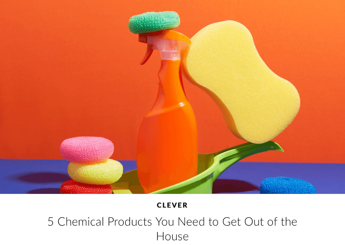
Example no. 1: Architectural Digest
Scanning the web to get some useful information sometimes results in finding some great headlines, such as this one.
What’s so good about it? First: the number that says: you can see five concrete things here. Sometimes I feel like lists of “7 best solutions,” “5 incredible tools” and so on are a bit overused, but in this case the rest of the headline does its job.
Who doesn’t want to know, which chemical products are somehow dangerous? But that’s not it! The title gets even better when you realize that it’s about getting things out of the house, literally. Definitely worth checking out!

Example no. 2: National Geographic
The National Geographic talking about cats is nothing weird, but using it for marketing swipe file may feel a bit odd at first. This headline is based on an element of surprise, which may be considered as click bait, but a quick look inside the article shows that our anxiety was unnecessary. Try doing that with your piece – the results can be as surprising as the headline itself.
CTAs
It’s hard to find a landing page or an article that doesn’t end with a call to action. Some of them are really great, but there are also tons of buttons with “Shop now” or “See more” on them. Ok, maybe sometimes they work, too, but marketers should do better than that.
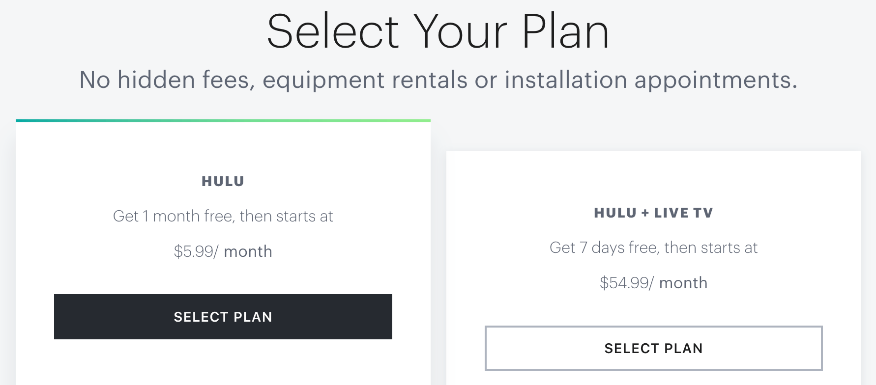
Example no. 1: Hulu
“Buy Now” on the button has to be the most boring CTA ever, so Hulu decided to go with “Select plan” – it’s softer, but could be nice replacement to aforementioned CTA.
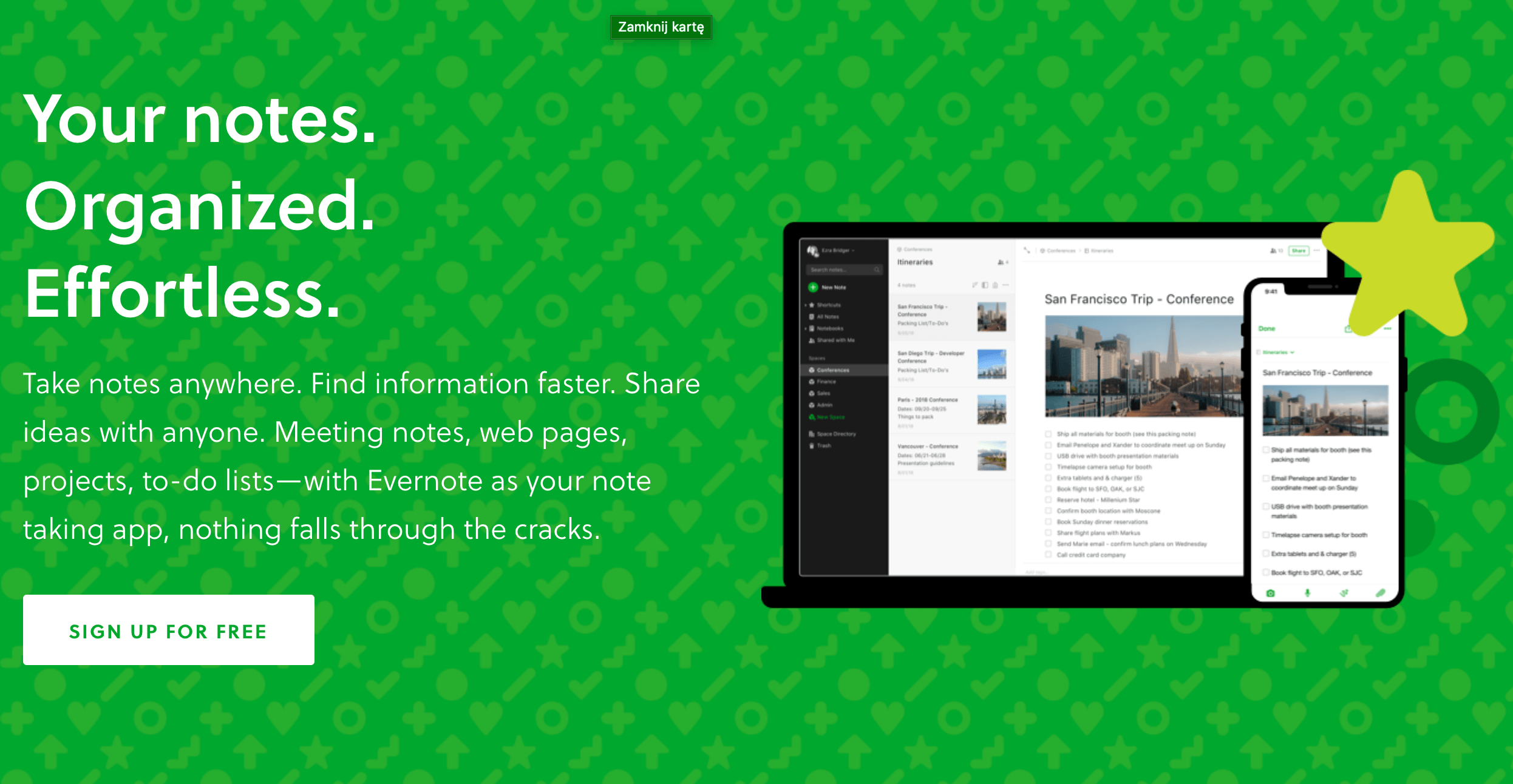
Example no. 2: Evernote
Although Evernote’s CTA isn’t very revealing, it contains function (signing up) and benefit (for free).
Read another article to see some great CTA examples!
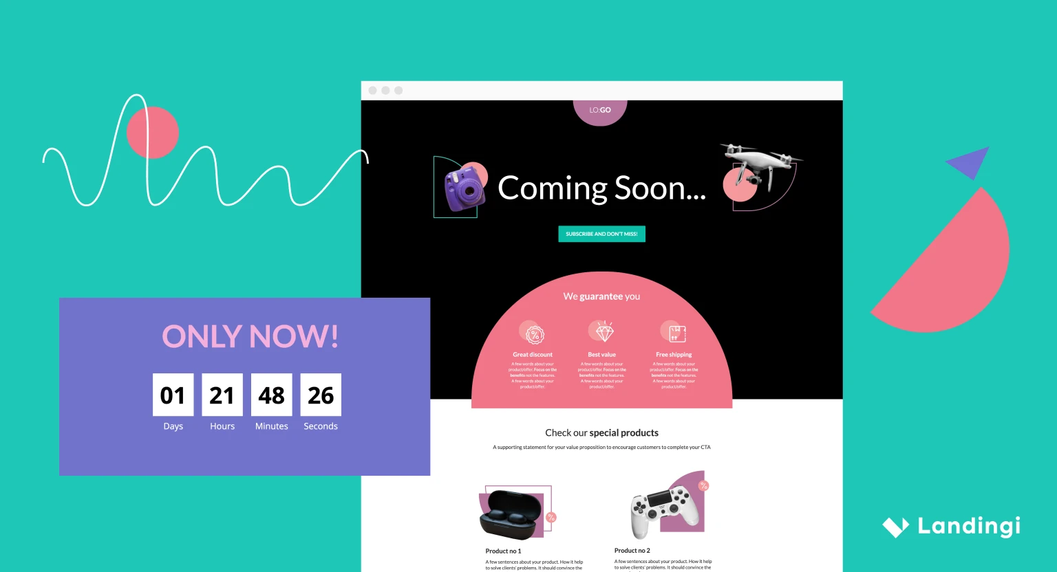
Landing Pages
The most disadvantage of landing pages is that they often disappear quickly. This is why I continuously save the most excellent examples of them to keep myself inspired while creating my own. There are a few landing pages that come to my mind when I think of great-looking, converting ones. Let’s take a look at them:
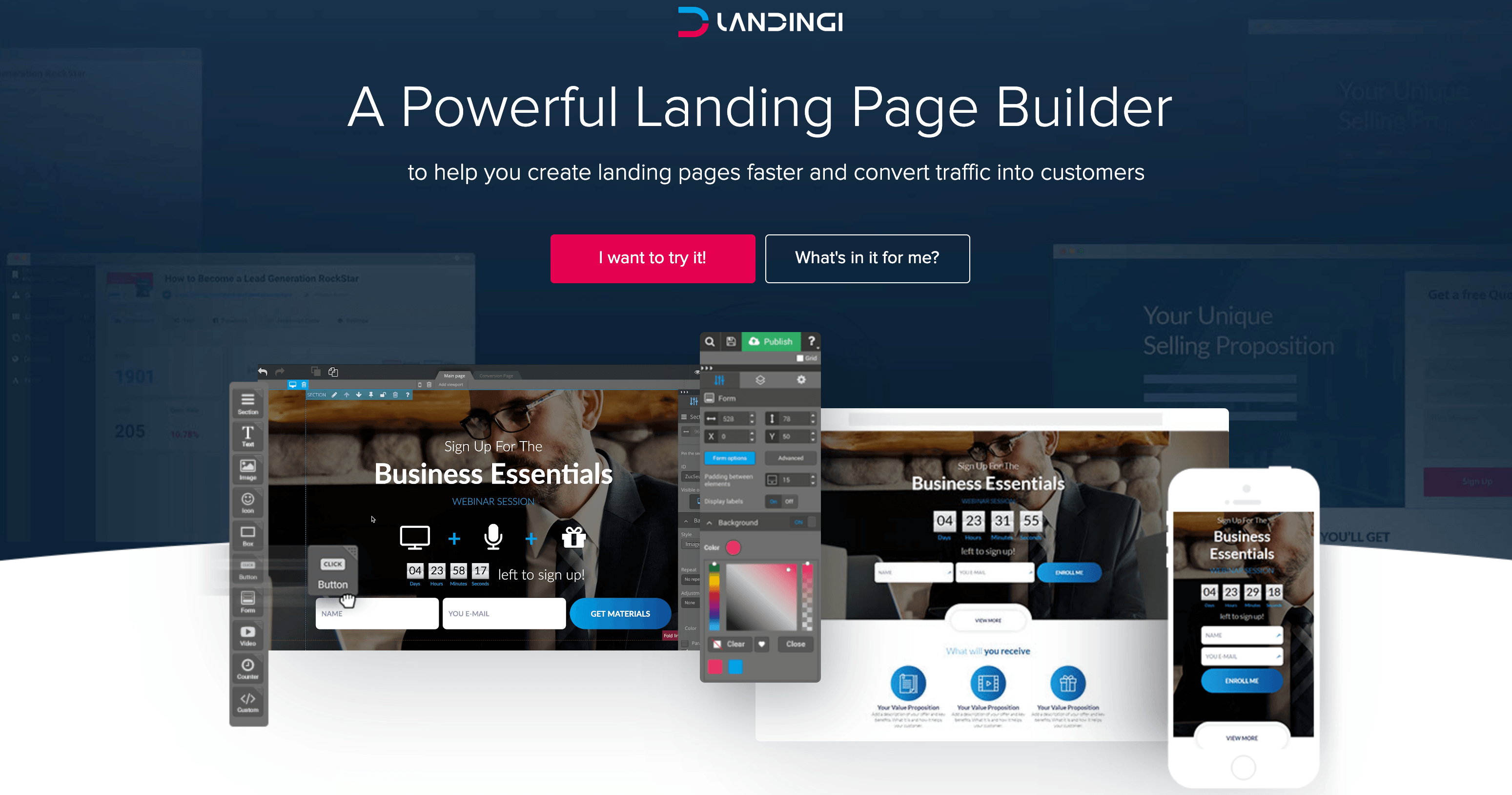
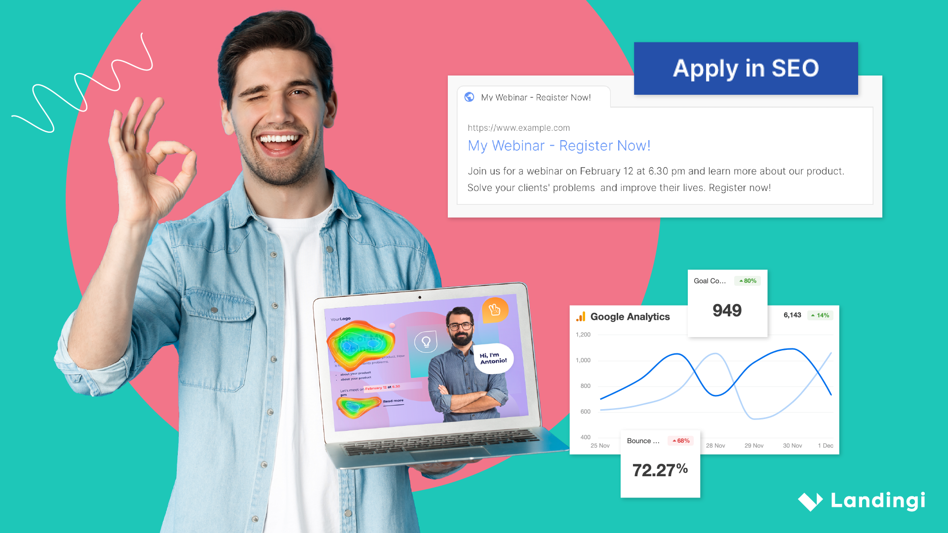
Example no. 1: Landingi landing page
If you want to sell a product, this landing page will be a good example. While packed with information, it remains clear and easy to read. It has product features, a reliable testimonial, a video and a partners section included. Also, a button appears every now and then, that reminds users to perform an action. And it works pretty well!
This landing page – as well as many other successful ones – was created in Landingi platform. Wondering if you could build one yourself? Check out the 14-day free trial and see for yourself!
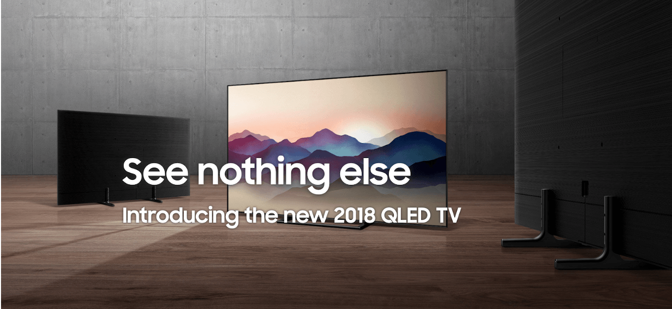
Example no. 2: Samsung QLED TV landing page
Beautiful, picturesque landing page that shows everything necessary… and more.
But this particular landing page – despite its overall greatness – didn’t avoid issues.
What issues, you may ask?
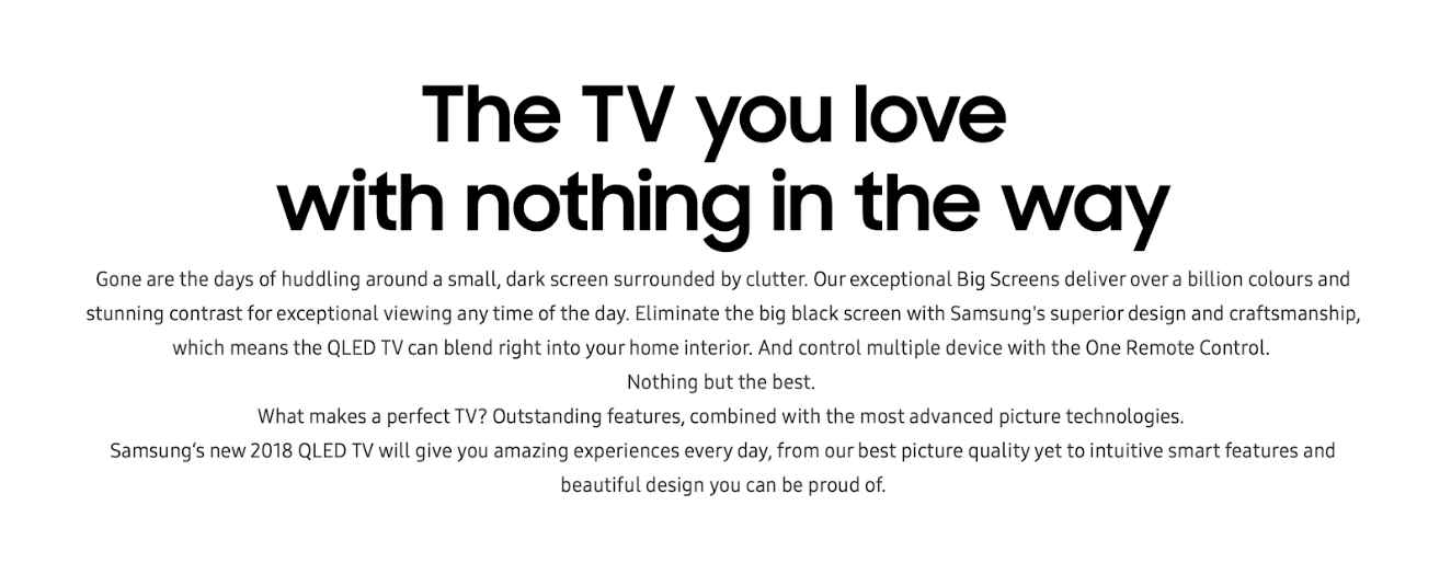
Too. Much. Text.
Still, though, it’s worth saving in your swipe file and gets back when you need to pick up the best from it and get some inspiration – especially if you’re selling electronics. The visuals are top class!
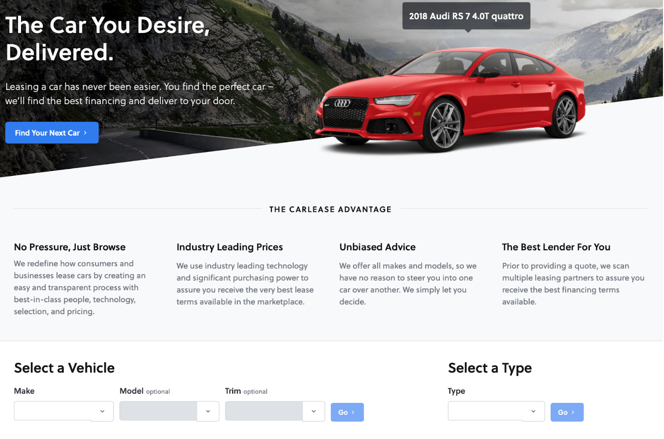
Example no. 3: Carlease
The car-selling industry is one of the most challenging out there. Standing out of the crowd seems to be quite tricky, but no car dealer can afford to let down the opportunity. Take a look at Carlease’s proposition.
Elementary graphics, neat CTA (especially text on a button), a few advantages listed and the most important: vehicle selection widget, where you can choose your future car in one to four clicks.

Example no. 4: Codecademy
Codecademy’s landing page features a lovely design with two eye-catching elements: a call to action and “Start coding now” button distinguished by violet color. Simple form makes signing up quick and painless – you just need to fill out three fields or click to log-in with Google, Facebook or Github account.
Emails
So you have to write another dozen emails, right after you’ve finished the last twenty. That surely can make some trouble, especially if you want them to be fresh and engaging. Try to remind yourself some nice emails you’ve received. I have a special place in mind for emails I get from polish board game editor – Rebel.pl. Their messages are fun, informative and they are written in straightforward, unofficial style. I enjoy reading them and that means a lot to me.
Example no. 1: CoSchedule
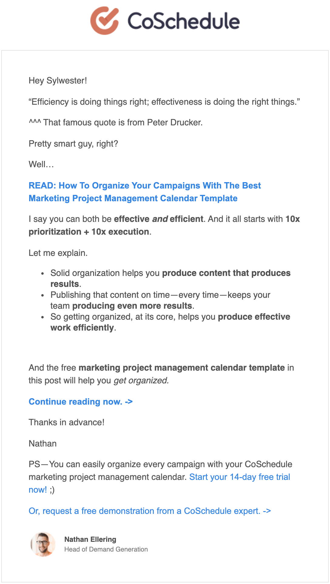
At first, I didn’t pay much attention to these emails. I’ve subscribed only to get some freebie, but a while ago I looked into one of the messages from Nathan (probably by accident), and something caught my attention: a quote. Simple as that – I’ve noticed some word in quotation marks and decided to take a closer look. Shortly after, I realized that CoSchedule’s emails are pretty fun and contain some useful info.
Example no. 2: Landingi again
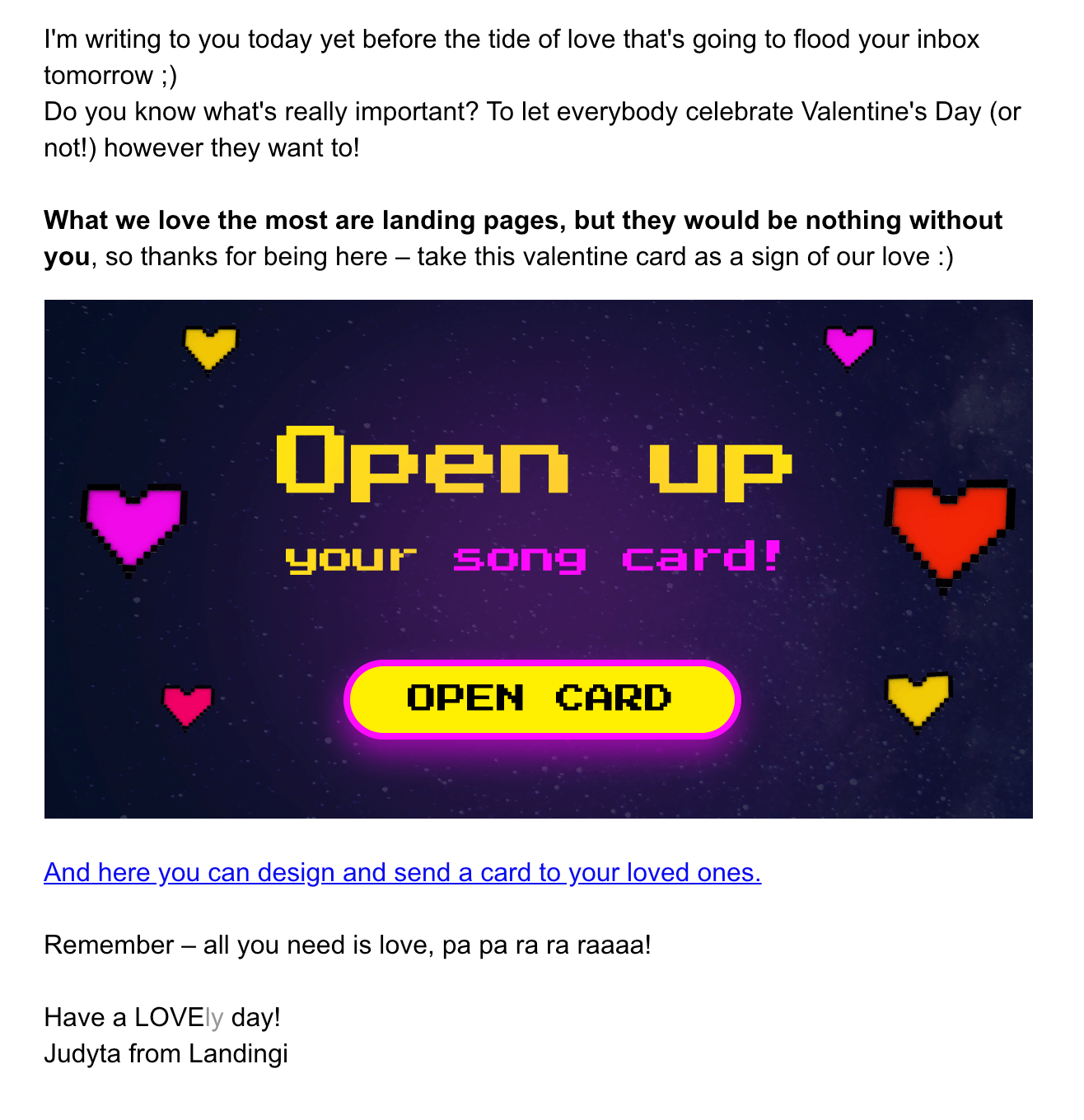
Right before Valentine’s Day our Email Specialist, Judyta, sent this lovely message to our subscribers, informing about our Songcard initiative. Not too long, informative and fun – looks like a nice email to receive!
Others
These are just examples – if your company needs it, you can create a swipe file that contains much more than that, including, for example:
- banners
- full articles (kind of read-later list)
- videos
- presentations
- pop-ups
- surveys
…and many more!
If you need some more examples, check out Marketing Starter Kit by Landingi! We hope that you’ll find many useful swipes for a landing page there, but of course you can use it for any type of marketing communication in your company.
How to organize swipe files?
As you may already know by now, swipe files tend to grow faster than you can manage them. This happens almost unnoticeably while using it unless you’ve got an iron will. The real question is how to make swipe file improve your work rather than slowing it down. To do so, I recommend using some management tools.
Usually, people start to build up their swipe files with a smartphone, computer or a simple pen & paper. But that won’t suffice in a long shot. In fact, some good practices and tools should significantly influence your swipe file creation process as well as its effectiveness. Let’s take a closer look at them.
Your devices
Mobile phone, tablet and computer – these three will be your most faithful companions while creating swipe files. Every smartphone features a quick notes app of some kind that can also be synchronized with your email account or just shared to a computer hard drive. Then you can create a dedicated folder on your desktop to gather all stuff in one place. That’s a primary option, but it still works fine if only you can keep things in order there.
But some software alternatives should improve your swiping experience since not making a mess inside a regular folder seems to be almost impossible after some time.
Evernote
You probably recognize the elephant logo of Evernote or heard about the app before. It’s a trendy tool for those who like to create advanced notes or to save whole websites and synchronize them between various platforms.
The basic plan includes syncing for up to two devices, e.g. your smartphone and desktop, which makes it a great starting option (that is also completely free!). Advanced plans feature a possibility to connect more devices, better functionality, and they are definitely worth checking out, but it’s nice to know that even without paying anything, Evernote can still be a helpful app.
If you need to extend its functionality, consider downloading an Evernote Web Clipper browser plugin. It’s available for Safari, Google Chrome, Opera, Mozilla Firefox and Microsoft Edge. The extension makes saving websites (or their fragments) even faster and they go straight to your ever-notes, where you can access them anytime.
Cloud Drive
There are things you’d like to include in your swipe files, but also make sure they’ll be available for you at all times. Video can be taken down from YouTube, a link to the article can break or a server might go down. This is why it’s much safer to use a cloud drive to create a data archive for private use.
For starters, there are many cloud drives you can use with no need to pay anything – at least if you don’t need much disk space. The following cloud drives comparison is based on Cloudwards:
- Dropbox – 2 GB of free space will suffice for everyday use if all you save is documents or photos.
- iCloud – Apple users have 5 GB of storage available for all their devices, easily synchronizable between all Apple gear.
- One Drive – Microsoft designed their cloud for Nokia/MS Lumia users, but in the end, it’s the cloud that stood the test of time. The free plan includes 5 GB for each user, but advanced plans include up to 5 TB of storage and Office 365 license.
- Google Drive – it features the biggest free storage (15 GB) and quite a good sync between other Google services, so if you’re a G fan there’s really nothing to think about. And speaking of which…
Google Docs
It’s another fine tool that lets you organize your work. Create swipe files in forms of documents or spreadsheets, group them in thematic folders and share if you need to. It is also the best option if you like to work on your swipe files with your teammates – you can share documents and set limited or full rights for every user (e.g. to view, comment or edit).
Social Media
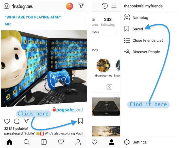
Both Facebook and Instagram offer a simple “save post” feature, which makes finding a specific post possible in a few clicks instead of scrolling through hundreds of already seen posts.
You can also manage swiped files there with self-created collections. Create folders to divide your findings into categories, Facebook gives an opportunity to group all the elements by type of a post (video, ad, photo and so on), too.
After all, I think it’s better to keep swipe files in one place so you may have access to everything you’ve caught anytime you want. The best practice would be to browse through your swipe files and gather them all in one spot every once in a while.
Something good out of… jealousy?
Have you ever read something really great? Something that made you think “too bad I didn’t write this”? Jealousy can be a destructive thing if not channeled in the right direction. But some companies did the right thing. Like Bloomberg. Their “Jealousy list” is often pictured as an example of high-quality journalism that can appreciate others great work, even if it’s their direct competition. Hats off and let’s get to the core of it.
A jealousy list – this term became quite popular after Bloomberg’s annual publications – contains things you would’ve liked to be your own. It’s a great way to keep yourself determined: “Ok, this year someone has overtaken me, but next time I’ll do my best to write something even better!”. This is what we call a positive motivation. Wanna see some examples?
We are jealous of Bloomberg’s Jealousy List — so we create one of our own is a follow-up to the original article and features a list created by e27.co journalists. Damn, We Wish We’d Done These 6 Stories This Month by FiveThirtyEight is another excellent example of getting motivated by someone else’s work.
Go that way.