

When creating a landing page, you need to pay attention to many essential elements like the page’s design, proper arrangement of sections, and adjusting it for different screen sizes to look perfect on any device. Visitors must not be overwhelmed by too much information because your goal is to attract their attention and direct them to perform a specific action.
And that is what a call to action button is made for.
We’re here to show you how a seemingly small element can change much more than you think.
In this article, you’ll learn:
- What is a call to action button?
- What makes it so important for your overall performance?
- What are some good practices (and bad mistakes) when designing a call to action button?
- What are some CTA button examples to follow?
So, shall we start?

Call to action: definition
A CTA, as the term is abbreviated, is usually a button that encourages users to take a specific action. Its main goal is to make users convert in the most desirable way for the business. That’s why CTAs should not only be well-displayed but also straightforward and crystal clear, as we’ll point out here a little later on.
You’re probably familiar with:
- Shop now!
- Book now
- Sign up for a free trial
- Get your copy today
These are among countless other call to action propositions. They usually come in the form of buttons on landing pages, but sometimes you can spot them in other places like:
- web push notifications that pop up in browsers or when scrolling,
- social media ads,
- blog posts,
- emails (e.g. newsletters),
just to name a few examples.
However, today we’ll focus on how you can leverage CTA buttons on landing pages.
Why is a call to action button so important?
- As seen in the call to action definition, a CTA button indicates the desired action, saving everyone from guesswork. Directly communicating what you want your visitors to do may get them to act more swiftly and, in turn, your conversion rates to skyrocket. Simply put, a well-designed call to action button improves the conversion rate. It’s a win-win: users know how to perform the action that you want them to take. Simple as that.
It can impact customer loyalty. Creating a CTA button doesn’t just get you new contacts. It can help with expanding your contact network and building customer relationships for years to come.- A call to action button works towards true action instead of browsing and scrolling only. CTAs allow you to increase engagement with users who may no longer be just observers or researchers, but actually want to perform the desired action.
- If you are wondering how you can redirect more users to your website, a CTA is the answer. This simple button hides a link, even though a potential customer doesn’t see it at first. When clicking through, users will be directed straight to exactly where you want them to land (e.g., your WordPress landing page). The right CTA can improve UX, positively affect the customer experience, and save users the trouble of seeking out the right subpage.
Call to action button: good practices
How to find the golden mean between gaining and losing the attention of your users? Is there a secret recipe for the perfect call to action button that you can copy, paste, and scale? We hate to break it to you, but the answer is no. However, they are a few good practices that you may want to follow.
Attention to detail & design
Besides looking good, your call to action should also follow some principles:
- There is nothing wrong with repeating the same slogan throughout a page, but make sure that the first call to action button is displayed above the fold, where it is easily accessible for everyone who visits your landing page.
- Be sure that your call to action button gets noticed. Utilize different colors and fonts to distinguish it from other elements on your page. It will also stand out if there is some blank, contrasting space around it.
- There’s no one-size-fits-all CTA. Regardless of the device, system, and size, you need to create a call to action button that displays and works well.
- When adding more than one button, make sure they all encourage users to perform precisely the same action. Customers should only have to focus on one specific call to action – otherwise, they might be distracted or overwhelmed with too many messages. CTAs aim to help users focus on one thing at a time, so you shouldn’t demand too many actions from your clients.
Catchy copy
It’s not only appearance that matters! Words also count. More than 90% of visitors who read your headline also read your CTA copy, so you should definitely focus on it. How to write a call to action? What are the best ways to create the perfect copy?
- A clear and straightforward message is essential. Your visitors should immediately know what the purpose of performing a particular action is. If they are misled, then they will lose their time and trust in your brand that will be challenging to rebuild.
- Choose the right tone of voice, suitable for your target group. If you run a campaign for C-level decision-makers, you should use a different set of words than for reaching e-commerce store owners. It may be essential to show the customer how simple the action is. Point out that signing up takes a few seconds, or a purchase can be made within a few clicks.
- Don’t forget to ensure that the user can withdraw or cancel at any time. This will give them more confidence in your brand and actions, so it’s not to your detriment!
Regardless of device, it must look nice
You probably use a variety of devices yourself. Are you annoyed by ill-fitting and inaccessible text and image blocks? It’s likely that users visiting your website will be too! Make sure that both your landing page and your CTA button look good on any device.
- Adapt your call to action to different screen sizes. Your audience use phones, laptops, and tablets, each of which has a different screen size and system. Ensure that the button always looks good, regardless of the device your visitors are using.
- Verify how your call to action buttons look on various devices. Test how your landing page looks. If you have designed a perfect CTA, you don’t want it to appear badly to some potential customers. If you make some changes to your landing page, double-check that your call to action button hasn’t moved. Even a small change can make it display unpleasantly.
A call to action button needs to… call to action. If it’s barely noticeable, unhighlighted, and generally blended into the copy, it won’t do the trick.
Simple as that.
Call to action examples
Communicate the outcome of an action
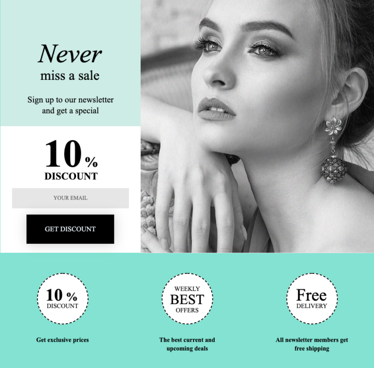
What you want your audience to do and what they will get for fulfilling your “wish” should be crystal clear. An example of straightforward expectations can be seen above. Discounts of 10% are offered to those who sign up for a newsletter by leaving their e-mail address. The discount is meant to act as an immediate reward for subscribers.
A modern landing page creator should come with various templates for both landing pages and call to action buttons that should be customizable in terms of colors, fonts, and size.
Action is a reflection of your goal

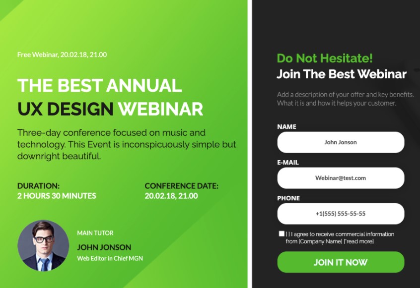
Your CTA should correspond with your goal. If you want sign-ups for your event, you won’t do it with a “Buy now” button. It must say either “Join”, “Sign up” or “Register” to be aligned with what you really want your audience to do. You can follow some ready-to-go landing page examples to pick the most original yet informative CTA – maybe there’s something better than just “sign up now”?
Front line: CTA, price and benefits

A CTA is not an add-on to your landing page, but an integral part that will greatly impact your audience’s actions. It should be in line with benefits and price, so think of them as the Three Musketeers of your landing page. There are many landing page templates that present you with such layouts, so no need to reinvent the wheel.
CTA as a stage in the sales funnel

Sometimes, clicking through a CTA doesn’t mean moving to the very final purchasing step of the funnel. Call to action buttons can be used for simply pushing clients towards the following stage and into a kind of “a CTA loop”:
Landing page -> CTA button [Learn more] -> another page with the actual offer + CTA button [Purchase].
This may work especially for top of the funnel and middle of the funnel solutions, when your potential clients don’t know they have a problem that your product solves or are aware of it but need more convincing.
Recap
It goes without saying that a landing page should include a CTA button – and it’s extremely important to keep your call to action more than… actionable, actually.
Every landing page should have a clearly defined goal, so the call to action button must be equally intuitive and focus on one thing at a time. A well-designed call to action button grabs the user’s attention and stands out with a catchy and straightforward copy.
So now it’s your turn! Think of one specific goal and create your catchy and effective call to action button. It’s simpler than it sounds, especially if you use an intuitive landing page builder.
And that’s Landingi, isn’t it?


