Immerse yourself in the vibrant universe of color palettes.
They’re more than just a feast for the eyes; they’re a critical component of web design. Let’s delve deeper into color theory, its practical application in web design, and learn from real-world examples.
Make your sections smartable and let go of mundane manual tasks with Smart Sections! An easy way to manage bulk changes.
Understanding Color Theory
Basics of Color Theory
Color theory is a framework that designers use to understand how colors interact with each other. It’s based on the color wheel, which consists of primary colors (red, blue, and yellow), secondary colors (green, orange, and purple), and tertiary colors (colors created by mixing primary and secondary colors).
Primary colors are the base colors from which all other colors are made. They are bold, pure, and can stand on their own. Secondary colors are created by mixing two primary colors. They offer a balance, often less intense than primary colors, but still capable of drawing attention.
Choosing Your Main and Secondary Colors
When choosing colors for your website, you’ll want to select a main color and one or two secondary colors. The main color is the dominant color in your palette and should align with your brand identity. It’s the color that you want your audience to associate with your brand.
Secondary colors complement the main color and are used to highlight secondary information on your website. They should contrast with your main color to create visual interest and guide your visitors’ eyes through your site.
Best Color Combinations
- Complementary Colors: These are colors that are opposite each other on the color wheel, such as blue and orange or red and green. They create a vibrant and dynamic look, but need to be used carefully to avoid overwhelming the eyes.
- Analogous Colors: These are colors that are next to each other on the color wheel, like blue and green or red and orange. They create a harmonious and visually pleasing palette, but may lack contrast.
- Monochromatic Colors: This scheme uses different shades and tints of a single color. It’s simple and elegant, creating a cohesive and balanced look.
- Triadic Colors: This scheme uses three colors that are evenly spaced around the color wheel, such as red, yellow, and blue. It’s vibrant and offers a high contrast while retaining harmony.
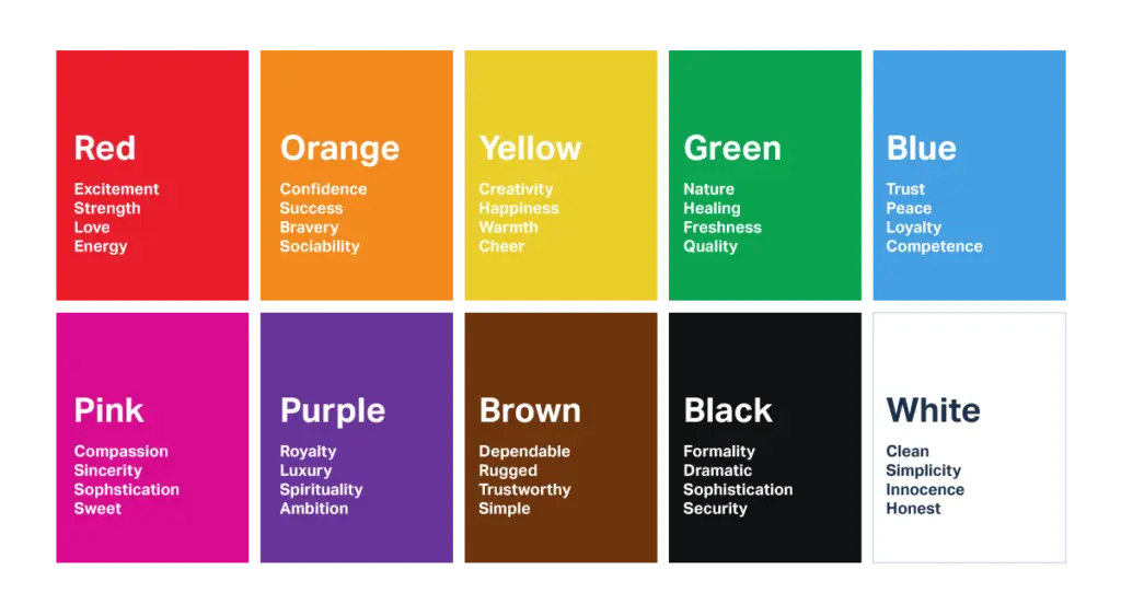
Different colors can evoke different emotions and reactions. For example, red is often associated with passion and urgency, making it a popular choice for call-to-action buttons. Blue is seen as trustworthy and stable, which is why it’s commonly used in corporate and financial websites. Green is associated with nature and health, while yellow is seen as cheerful and energetic.
Color Harmony
Ever stumbled upon a website that just felt soothing to the eyes? That’s color harmony in action. It’s the equilibrium of hues that makes a website visually pleasing. It’s akin to a well-rehearsed orchestra, where each color plays its part to create a harmonious symphony. Striking the right balance can turn a chaotic cacophony into a melodious tune.
Color Psychology
Colors are more than just visual elements; they’re emotional powerhouses. Red can ignite passion, blue can soothe the soul, and yellow can spark joy. They’re silent communicators, subtly influencing our perceptions and responses. It’s like the background score in a movie, subtly setting the mood without uttering a single word.
Color and Branding
Colors are the unsung heroes of branding. They can subtly convey your brand’s personality and loudly proclaim your message. They’re the visual adhesive that binds your brand identity together. It’s like the theme song of a show, instantly recognizable and deeply connected to the brand.
Get 111 Landing Page Examples—The Ultimate Guide for FREE
Practical Application of Color in Web Design
Choosing the Right Color Palette
Selecting a color palette for your website isn’t a game of chance. It’s about aligning with your brand’s message and values. It’s akin to choosing the right outfit for an interview – you want to make a good impression, reflect your personality, and stand out from the crowd.
Colors for Different Types of Websites
Not all websites wear colors the same way. An e-commerce site might rock bold, vibrant hues and marketing icons to attract and engage users, while a healthcare site might prefer the calmness of pastels to evoke feelings of trust and tranquility. It’s all about dressing for the occasion, understanding the purpose of the website, and the expectations of the audience.
Colors for Affiliate Websites
Affiliate websites are a unique breed. You’ve got to consider your target audience, the type of products you’re promoting, and the overall aesthetic of the site. It’s like being a chameleon, changing your colors to match your environment, and blending in while standing out.
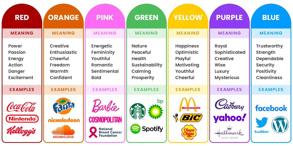
source: sparkinteract.com.auJust as a chameleon changes its colors to adapt to its environment, your affiliate website needs to adapt to its market. This is where TrackDesk comes into play.
It’s like the color palette for your affiliate marketing strategy, allowing you to customize and adjust based on your specific needs. It allows you to tailor offers and organize your affiliates into different commission groups, and track the performance of your campaigns at both regional and individual levels. So, while you focus on the aesthetic and product promotion, TrackDesk takes care of the intricate details of your affiliate program, ensuring you’re not just blending in, but also making a significant impact.
Accessibility and Color
Web design isn’t just about aesthetics; it’s about inclusivity. Choosing and combining colors with care can make your website a welcoming place for everyone, including those with visual impairments. It’s about considering color contrast, legibility, and different types of color blindness. It’s like designing a universal remote, intuitive and usable for all.
5 Best Examples of Color Use in Branding & Page Design
You have the theory down pat. It’s time to move a step ahead toward practice. Explore how big companies exploit colors to communicate their brands effectively and build up desirable associations among target audiences.
1. Fanta

Why Fanta goes with orange?
- Visual Appeal: orange is a vibrant and attention-grabbing color – it stands out and is easily recognizable, making it an excellent choice for attracting consumers’ attention on store shelves or in advertising,
- Positive Associations: orange is often associated with energy, fun, and excitement – Fanta, being a fruit-flavored carbonated beverage, wants to evoke feelings of joy, playfulness, and refreshment through its branding,
- Youthful and Lighthearted: Fanta’s main color is perceived as youthful and lighthearted, which aligns well with Fanta’s target audience, primarily young consumers and teenagers,
- Citrus Connection: orange is also a color associated with citrus fruits like oranges, which is in line with the fruit-flavored nature of Fanta drinks – it reinforces the idea of a refreshing and fruity taste experience,
- Differentiation: in a competitive market, the orange color sets Fanta apart from other carbonated soft drink brands that often use red (like Coca-Cola) or blue (like Pepsi) as their primary colors.

2. Greenpeace
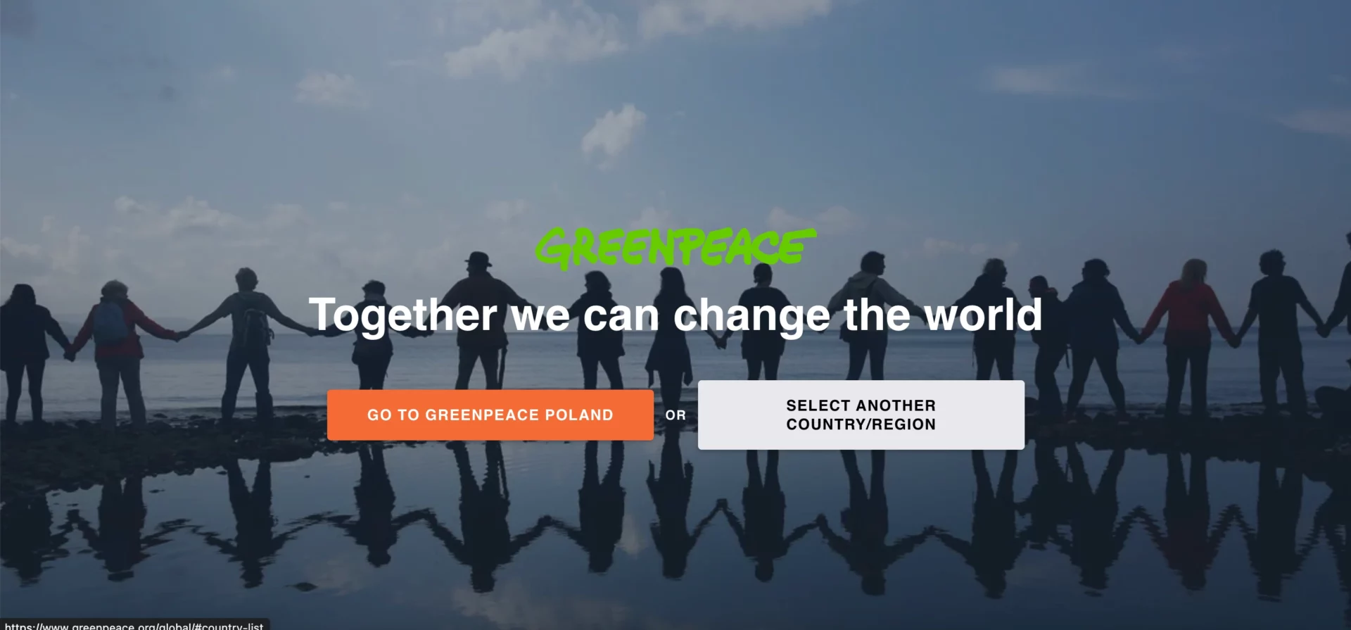
Why Greenpeace bet on green? Is there something beyond the ecology?
- Environmental Focus: green is universally associated with nature and the environment – it represents the organization’s core mission, which is to protect and preserve the natural world, including forests, oceans, wildlife, and ecosystems,
- Renewable Energy: Green is often associated with renewable energy sources like wind, solar, and hydroelectric power – Company advocates for the transition from fossil fuels to clean, renewable energy, and the color green reinforces this message,
- Growth and Hope: Greenpeace core color is also a color of growth and renewal – it represents hope for a better future, one where the environment is protected, and the planet thrives.
- Peaceful Activism: Greenpeace is known for its nonviolent and peaceful activism – green is a calming and peaceful color, aligning with the organization’s commitment to promoting change through peaceful means.

3. BMW
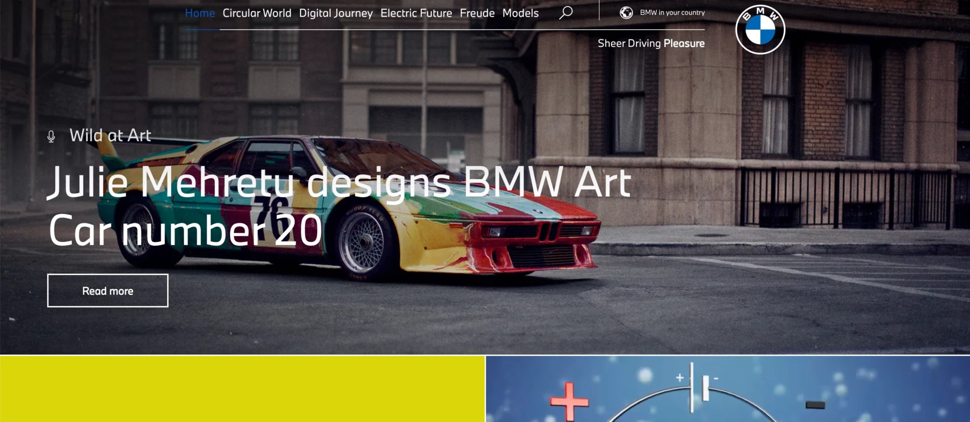
Why BMW combines blue, white and black? What they are intend to say with these colors?
- Blue (BMW Blue): the color blue used by BMW is often referred to as “BMW Blue” or “BMW Corporate Blue” – it is a deep, dark shade of blue that is synonymous with the brand and it’s commonly associated with qualities like trust, reliability, and sophistication; in the context of BMW, it conveys a sense of elegance, technological advancement, and professionalism helping to establish the brand as a high-end automotive brand known for its engineering excellence and luxury vehicles,
- Black: black is a color often associated with power, prestige, and authority; in BMW’s brand communication, black complements the blue, creating a sense of sophistication and luxury; black used in the brand’s logo, symbolizing strength and stability,
- White: white is a color that signifies purity, simplicity, and innovation; it is commonly used in BMW’s branding and represents its commitment to innovative design and technological advancements of their vehicles.

4. Lindt
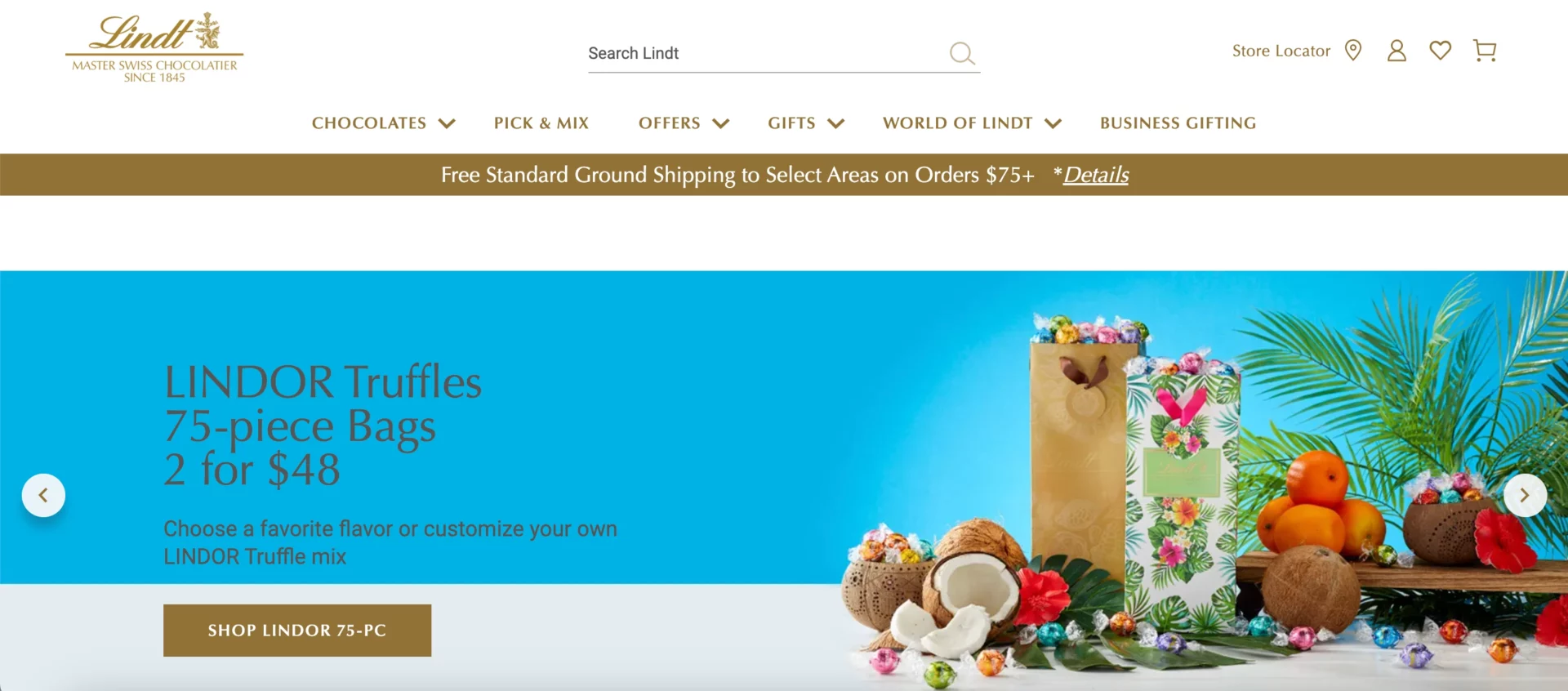
What associations Lindt’s would like to evoke with gold?
- Premium Quality and Luxury: gold is often associated with wealth, opulence, and luxury – in the context of Lindt’s brand communication, the gold color represents the brand’s commitment to premium quality and its positioning as a luxury chocolate brand,.
- Celebration and Festivity: Lindt’s key color is commonly used in celebratory contexts and is associated with special occasions and festivities – thus it enhances the perception of their chocolates as a luxurious and celebratory gift option, making them an ideal choice for special moments,
- Heritage and Tradition: gold is also a timeless color that is often associated with tradition and heritage; for a brand like Lindt, which has a long history of chocolate-making craftsmanship, the use of gold in its branding reinforces its heritage and time-honored traditions,
- Attention-Grabbing: at least, gold is a vibrant and eye-catching color – its use in packaging and marketing materials helps draw attention to Lindt’s products, making them stand out on store shelves and capturing the interest of potential customers.

5. Slack, Ebay, Google, Microsoft and many others.
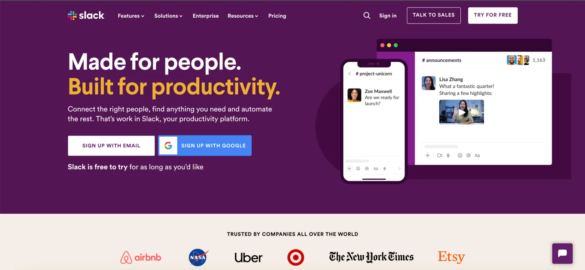
Why these companies goes with a … multi-color?
- Versatility and Inclusivity: multi-color palettes provide a wide range of options and combinations – this versatility allows companies to apply their branding across diverse products, services, and platforms while accommodating various cultural contexts and user preferences,
- Appeal to Creativity and Innovation: the use of multiple colors can convey a sense of creativity and innovation – companies in the technology sector, like Google and Slack, often want to be seen as cutting-edge and forward-thinking, and a vibrant color palette can reflect that image,
- Fun and Playfulness: Brands like Google use multiple colors to exude a sense of fun and playfulness – this can make the brand feel more approachable and relatable to users of all ages.

Conclusion
Mastering color palettes in web design isn’t a luxury; it’s a necessity. It’s the secret sauce that can make your website stand out in the crowded digital landscape. So, go on, paint the town red… or blue, or yellow, or green! It’s about understanding the power of colors, harnessing it, and using it to create a memorable web experience.
FAQs
Got questions? We’ve got answers! Here are some common queries about color in web design.
What’s the role of color in web design?
Color in web design is like the set design in a play. It sets the mood, guides the eye, and reinforces the brand’s personality. It’s a silent yet powerful communicator.
How do I pick the right color palette for my website?
Choosing a color palette for your website is like picking the right spices for a dish. You need to consider your brand’s message, the emotions you want to evoke, and the preferences of your target audience.
What should I think about when choosing colors for an affiliate website?
When it comes to affiliate websites, think about your audience and the products you’re promoting. It’s like setting the stage for a performance – you want the colors to support and enhance the content, not distract from it.
How can I make my website’s color palette accessible to all users?
Creating an accessible color palette is about contrast and legibility. It’s like writing a book – you want the text to be easy to read for everyone, regardless of their visual abilities.
What tools can help me create a color palette for my website?
There are many tools out there that can help you create a color palette. They’re like your personal color consultants, providing advice and inspiration to help you make the best choice.
Mastering color palettes in web design is like learning a new language. It can be challenging at first, but once you get the hang of it, it opens up a whole new world of possibilities. So, don’t be afraid to experiment and have fun with it. After all, the world is your canvas!

