Compared to e-Commerce, Software as a service (SaaS) companies use a different approach to customer acquisition. Most services require a longer research phase than products like clothing or electronics, and companies offering SaaS provide potential clients with opportunities to test their tools before committing to a purchase.
Free trials and demo sessions are two of the most popular ways to reel potential customers in, and in both cases, landing pages can serve as a more effective way of converting visitors into users than traditional websites.
Naturally, only the best-designed websites are able to boost conversions at scale, so let’s look at 10 SaaS landing page best practices and examples of these tips in action.
1. Encourage Free Trials
Getting businesses to purchase a subscription plan for software they have never used before is a tall order. Most companies want to be sure every dollar they spend on third-party tools helps them achieve better results or make their work easier.
The notion of a free trial implies low risk and no commitment. Furthermore, users get the chance to test all the functionalities of your tool and make a more educated purchase decision.
Using a “Start a Free Trial” CTA instead of “Buy Now” should improve your conversion rate. Then, it’s all about making sure your product delivers on the promises of your landing page. That is the best way to retain those who made a decision to try it out.
Shopify, one of the largest eCommerce platforms, does this on its own SaaS landing page:

View Full Landing Page
2. Include Big Name Testimonials
Adding social proof that supports the quality of your product or service is a great thing, but it’s more complicated than that. While most businesses focus on having any testimonials displayed on their website and landing pages, some clients might make a bigger impact than others.
There are a few “rock stars” in every industry – people who are either revered or simply well-known. If you manage to capture at least one testimonial from such a personality, the credibility of your product or service – and the landing page – goes up considerably.
One of the companies that use testimonials well is Signal. Seeing Edward Snowden, a champion of online privacy saying “I use it every day” is more than enough to serve as a strong message regarding the tool’s approach to privacy. His short-but-impactful recommendation is followed by other notable people, so the message gets reinforced even further.

View Full Landing Page
3. Make Conversion Easy
Well-thought-out landing pages create a seamless user experience, no matter the goal. If you’re gathering email addresses for further nurturing, the lead capture form should be visible on the page so there is no unnecessary clicking through to a different page.
They say there is no time like the present, and once you’ve caught the attention of a potential client, you ought to capitalize on it right away.
However, the same can be said about registration to your SaaS business. Most companies redirect to a registration page or pricing, but why not cut out the middleman?
Zoho has done just that on one of their landing pages. There are four fields to complete, and your free trial account is ready. Plus, conversion on a landing page equals a new free trial, which is great from an analytics standpoint.
The phone number field might be discouraging. It’s probably better to ask for that once the prospect has used the tool for a while or when the transition to the paid customer takes place.

View Full Landing Page
4. Add a Video
Using a video on your SaaS landing page is another way to increase engagement and save space. It’s more convenient for the visitors to click and watch a 60-second clip than read for the same amount of time.
You can use your video to summarize your product or service or add extra information. Make sure to keep the length in moderation. Attention spans are short, and the bigger the file, the heavier the landing page is, which impacts loading times and user experience.
ResourceGuru does a nice job of utilizing a video on their page. While it is a bit long (2 minutes and 20 seconds), all of the main features and benefits of the software are presented clearly and the video has a funny tone to it, which will certainly relate to project managers – the target audience of this tool.

View Full Landing Page
5. Make the Tech Jargon Digestible
One of the main challenges of promoting SaaS businesses is explaining the tool itself in a way that is understandable to the target audience. We might be surrounded by tech jargon, but for a lot of people, those are just buzzwords that have little actual meaning.
That’s why it’s important to communicate the features and benefits of your product or service in a way that is simple to understand to a large group of people. Asana does that well. The entire page is focused on simplicity, both in the copy and the visuals. Tech jargon has been replaced with clear messaging of how the tool makes work simpler and more organized.

View Full Landing Page
6. Highlight the USP (Unique Selling Points)
Unless you operate in a niche with no competition, you might be aware that your services could seem similar to solutions provided by other companies in the same industry. Most customers are regular end-users, which means they won’t see the nuances that make your product better after only having used it for a while.
In their research phase, they will see a lot of marketing creations advertising various products, so it’s up to you to present your USP clearly and concisely.
Describing the SaaS product itself is also important, but showcasing how it’s distinguished from the rest of the market might be what convinces visitors to go for your product instead of an alternative.
Take a look at how Front does it. While a headline expresses what their tool is all about, a copy below highlights their edge over the competition. The clause “all customer communication into one collaborative platform” suggests that – in contrast to other tools – no additional apps are needed for Front’s users to manage the whole customer communication process.

View Full Landing Page
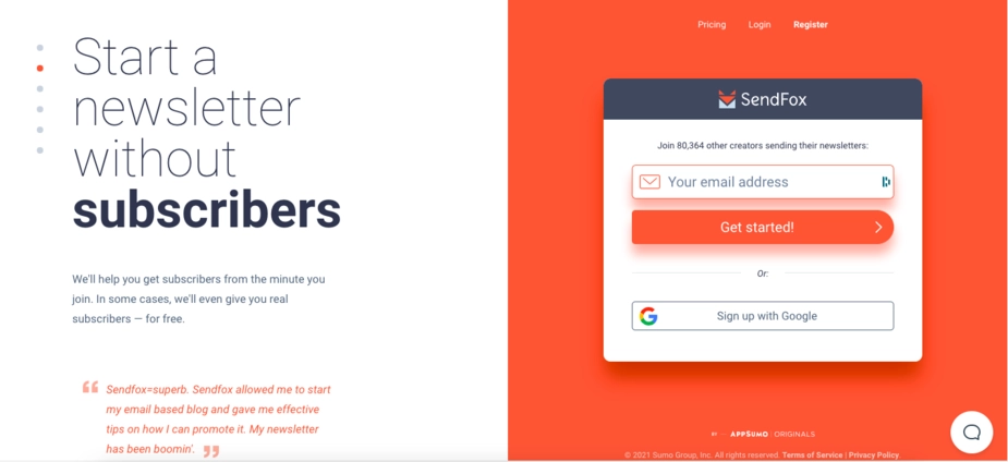
7. Display the CTA Button at All Times
While the entire page must be consistent in order to guide the visitor to fulfilling its sole purpose, the CTA button is often a crucial part of the equation. Aside from the copy and the offer, visitors should feel like the button is there when they want to click it, not a few seconds or mouse scrolls later.
SaaS businesses deal with that in a variety of ways. Some add a CTA button at the end of every section, while others attach a topbar that keeps the button visible all the time. SendFox has decided to take a different approach.
Their landing page is divided into two spaces: The left side contains the content, and the right side is dedicated to the CTA box where visitors have the option to register by filling out a short form. The left side can be scrolled up and down, and the right one stays the same no matter where you are on the page.
It’s an interesting idea and a unique approach to user experience, and certainly one to experiment with.
View Full Landing Page
8. Limit the Form Fields
It doesn’t matter what you use your forms for – whether it’s registration for your service, signing up for a webinar, or generating leads, the rule is simple: Don’t overdo it with the number of fields.
Users are often asked to provide personal information on a daily basis. Accepting cookies, pop-ups that ask for a social media follow – those are just the most annoying culprits. If you use a form on a landing page, it should contain as little information to enter as possible.
Some of the examples seen in other SaaS landing page best practices have applied that knowledge. Unfortunately, not all SaaS businesses have gotten the memo.
Pulsar Platform is one of those examples. Take a look at the screenshot of their landing page. The form is so extensive that it doesn’t even fit on a 13-inch screen in its entirety. That should have been a sign that it’s a bit too long.
As for the required information, the vast majority of these fields can be discussed during the demo itself or inquired about in a follow-up email. Once the visitor completes the form, any further communication is much easier given the initial exchange of information has been established.

View Full Landing Page
9. Schedule Demos on the Page
A lot of businesses use landing pages to send requests for a demo. As a result, the next steps take place via email or on a thank you page. While there is nothing wrong with that per se, and there is an added benefit of capturing an email address of an interested prospect, it can create a clunky user experience.
Thanks to integrations with scheduling tools and calendars, you have the ability to paste a code with a personal calendar and give the visitor the option to schedule a call without the need to exit the page.
Since it’s usually the sales representative who conducts these meetings, the potential customer will experience a high-quality demonstration of your tool, and a personal conversation with a salesperson might work even better than lead nurturing.
After all, that’s when the prospect gets to voice their opinion, ask questions and speak about their needs. It’s difficult to achieve via email marketing. And it will certainly take less time to convince the customer of the superiority of your tool by showcasing it live.
At Landingi, we believe in personal communication, which is why our demo landing page has an easy-to-use calendar for scheduling demo calls. It runs on Calendly, and visitors get to pick a date and the time of the available time slots.
Once they confirm the details, they are asked to provide a name, an email address, and the topic of discussion. All of that is done without leaving the page.

View Full Landing Page
10. Ensure Professional Support
One of the essential components of a successful SaaS landing page is the assurance of professional support. When visitors consider adopting a software solution, they want to know that they won’t be left in the dark if questions or issues arise. By prominently featuring a clear and accessible support channel on your landing page, you instill confidence in potential customers and demonstrate your commitment to their success.
Live Chat and Help Center
A live chat feature provides immediate assistance to visitors who may have questions or need clarification about your SaaS offering. This real-time interaction can address concerns and guide users towards making a confident decision. Additionally, a well-structured help center with frequently asked questions, tutorials, and guides can empower users to find answers independently, showcasing your dedication to providing comprehensive support resources.
Find out here how to increase sales on your saas landing pages using a live chat.
24/7 Availability and Responsiveness
Incorporating elements that convey your team’s availability and responsiveness can make a significant impact. Mentioning that your support team is available 24/7 or within specific business hours reassures visitors that their inquiries will be addressed in a timely manner. This can alleviate concerns and encourage hesitant users to take the next step in signing up or purchasing your SaaS solution.
11. Tell Customer Success Stories
Highlighting success stories from existing customers who have benefited from your SaaS solution and excellent support can further solidify your commitment to helping users achieve their goals. Personal experiences and positive outcomes provide social proof and demonstrate the value of not just your software but also your dedication to customer satisfaction.
One of the greatest examples I’ve discovered on the SaaS landing pages is the below “Wall of Love” section by Agile CRM. It gathers in one place comments and reviews generated by current customers on their key channels. A large part is related directly to the excellent support. Combined with this appealing photo collage, it may stand as valuable social proof for prospective customers.

View Full Landing Page
Incorporating professional support into your SaaS landing page can be a pivotal factor in converting visitors into customers. By establishing trust, addressing concerns, and showcasing your commitment to user success, you create an environment where potential customers feel comfortable making a commitment to your SaaS solution.
12. Showcase Users’ Opinions
One of the most compelling ways to build trust with potential customers and convince them of your SaaS product’s value is by showcasing the opinions of your existing users. In the digital age, where consumers have access to a wealth of information at their fingertips, the experiences and recommendations of real users can make all the difference.
Encourage satisfied customers to leave reviews on trusted review platforms, such as G2 Crowd, Capterra, or Trustpilot, and then feature the best reviews on your site. These authentic voices can speak volumes about your product’s effectiveness and reliability. Take a look underneath to see how we do it at Landingi!

View Full Landing Page
Build SaaS Landing Pages with Landingi
You might think creating landing pages like the ones seen above is difficult, but it couldn’t be further from the truth. With the right tools, you can build an effective landing page that helps you generate leads, demo calls, and sales in no time.
The landing page builder by Landingi has all the tools you need to create, edit, and optimize your SaaS landing pages and follow best practices. With a drag-and-drop editor that requires no coding skills, including over 300 landing page templates to choose from, built-in AI copy and SEO tools, A/B testing, and almost endless integration options, you will be able to build successful saas landing pages (or other landing pages too) easier and faster than you think.