Turns out, you don’t need a complex funnel and weeks of dev work to see serious results.
And by serious, I mean 35% conversionrate — in an industry where 2.4% is considered solid. That’s what happens when you stay sharp, keep it relevant, and build with purpose — just like naffy did.
naffy is a Polish SaaS startup that helps digital creators monetize their content: ebooks, webinars, consultations, you name it. Their goal: let creators launch and earn money online in minutes, not months.
It’s more than a sales tool. naffy is built around a belief that knowledge, passion, and experience deserve reach — and reward. In a world where creators teach, inspire, and lead through content, naffy gives them the means to turn that value into income — without friction, barriers, or platform fees.
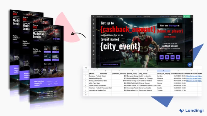
To grow, naffy needed fast, relevant campaigns tailored to each product and audience. Landing pages quickly became their go-to tool to test ideas, validate demand, and drive signups from day one.
So when it was time to launch a new campaign for creators, they already knew the drill. With Landingi’s intuitive builder and a sharp focus on best practices, they rolled out a high-converting, purpose-built page — fast.
And every time they launched another campaign, the process stayed just as smooth: build fast, launch clean, and perform… better than expected.
The Problem: They Had the Idea, But No Time to Build
At naffy, no one questioned whether they needed landing pages. It was obvious. Every product, campaign, and audience needed a dedicated page, tailored to fit.
That meant:
Presenting offers that solved a clear problem or delivered meaningful value,
Writing copy that spoke directly to real questions, using the language their audience actually used
Designing each page to guide users toward one clear action: signing up.
naffy’s challenge: they had no time — and no extra hands — to build custom pages from scratch.
Outsourcing was too slow. Templates felt too generic. And asking the dev team? Not an option — they were already maxed out on product work. naffy needed a way to build sharp, relevant pages without pulling engineers off their core roadmap. A solution that was fast, simple, and flexible enough to match their pace.
So they reached out to Landingi.
The Fix: Fast, Focused, and Inside Landingi
Landingi gave naffy the runway to move fast: no blockers, no code, just a clear path from idea to launch.
It should be noted that we operate as a startup at naffy. Therefore, in the beginning, we used landing pages to validate our ideas before implementing them in our product. This way, we tested different target groups and different services that we could sell through our platform. This allowed us to spell out ideas more quickly and ultimately helped us arrive at the platform’s current form.
Jakub Bischof, naffy’s founder.
naffy used Landingi and stuck to the landing page basics that work, including:
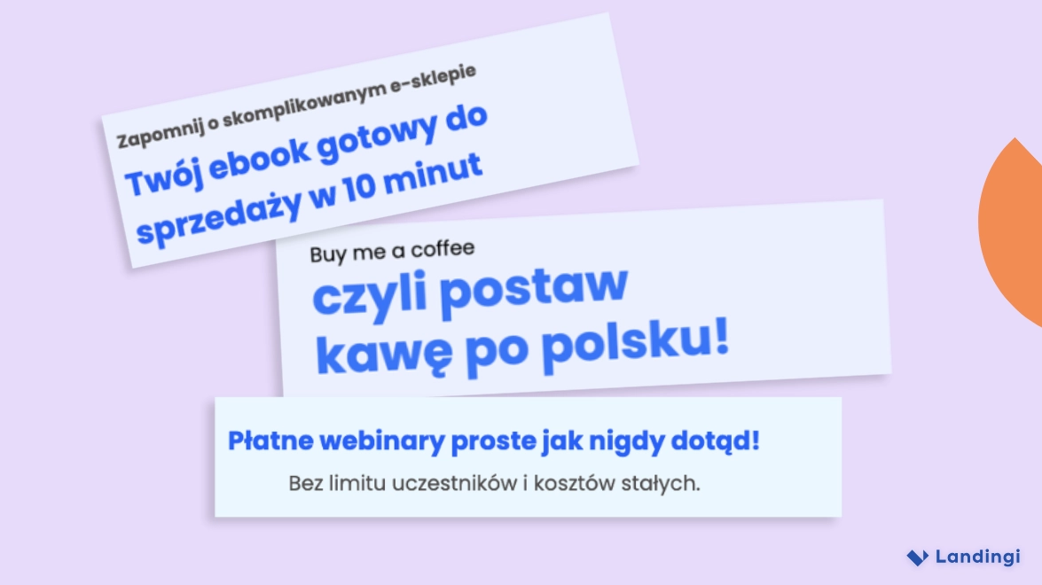
Catchy headlines
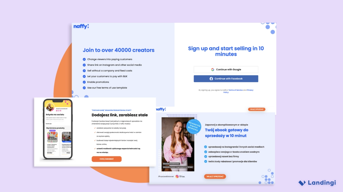
Short, bold, and built around what creators actually want. “Your ebook, ready to sell in 10 minutes” doesn’t try to be clever, it just delivers. That’s naffy’s style: say what matters, say it fast.
naffy keeps it clear and creator-focused — headlines that speak directly to what users want and drive action instantly.
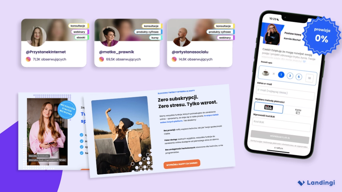
Visuals that speak to creators
They show actual creators, everyday moments, and how the platform works in real life. No stocky, fake stuff, just images that say, “Hey, this could be you.” It’s simple, clear, and designed to help people imagine their own success with naffy.
naffy uses real creators and real content to show what’s possible — no stock photos, just relatable success.
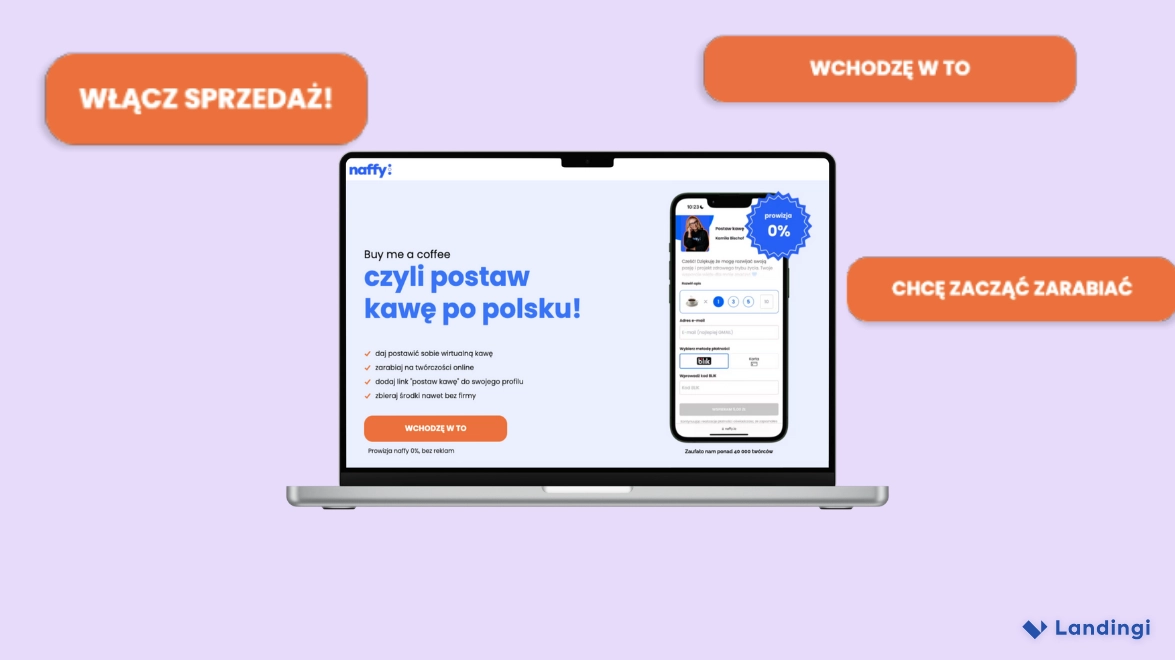
CTA buttons that make it easy to say yes
naffy keeps their calls to action short, clear, and action-focused — just like they should be. Their go-to: “Włącz sprzedaż!” [Switch on the sale!] is bold, direct, and promises exactly what creators want: to start making money. Every CTA button follows the same visual rulebook they use across their entire platform. Bright orange buttons pop against clean blues and whites, creating instant contrast and making the next step obvious. It’s not just about grabbing attention — it’s also about staying visually consistent. That builds trust, keeps the brand recognizable, and helps users feel right at home.
Bright, bold, and unmistakably clear — naffy’s CTA buttons make it easy to take the next step.
Simple forms
naffy keeps things simple. No forms cluttering the page, but one clear CTA that sends users straight to signup. It filters out the noise and brings in people who actually want to take action. Signing up is fast: one click with Google or Facebook, email included. It’s quick, clean, and built for conversions.
Clean, distraction-free forms that make it effortless for creators to sign up and start selling.
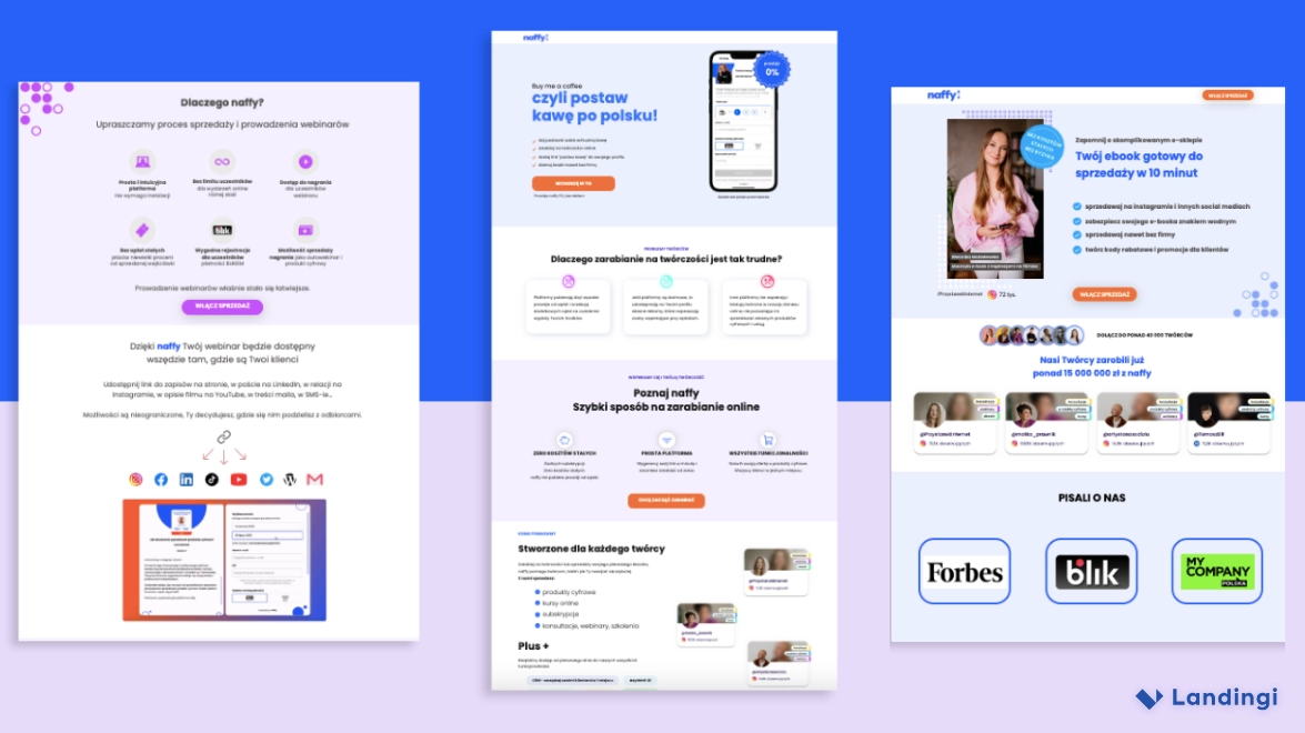
Layouts that guide, not distract
naffy makes smart use of white space to keep things clean and focused. Each section has room to breathe, so the message doesn’t get lost in the noise. With bold headlines, short copy, and clear CTAs, every element has a job — and nothing gets in the way of the next click.
naffy’s layouts guide users with clarity — every section has a purpose, and every click moves things forward.
naffy kept it clear, fast, and consistent — and it paid off.
Landing Pages That Actually Drive Growth
Landing pages are growth tools. Used smartly, even one well-timed campaign can bring in a wave of the right users.
Take naffy’s “Postaw kawę” [Buy me a coffee] campaign. It spotlighted a new feature that lets fans tip creators directly — no subscriptions, no commissions. But the magic wasn’t just in the feature itself. It was in how the team presented it, how they build every landing page like it’s written to one person—and make that one person feel seen.
naffy also launched focused landing pages to promote webinars, digital products, and e-books — all with one goal: get the right people to sign up. To pull it off, the team needed speed and structure.
The great thing about Landingi is that it allows teamwork and from one account we can organize our tasks well.
Jakub Bischof, naffy’s founder.
Using Landingi, they kept the visuals consistent, built pages fast, and tracked results easily through Google Tag Manager—just one of over 170 ready-to-use integrations built into the platform.
And it all translated into numbers.
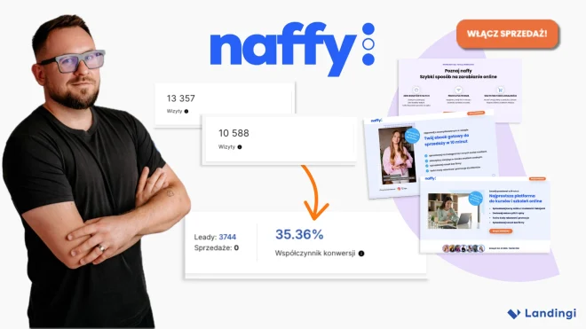
The Payoff: 5 Campaigns, 9K+ Leads, 35% Conversion Rates
Here’s what naffy achieved using Landingi:
Campaign
Visits
Leads
Conversion Rate
Buy me a coffee
745
262
35.17%
Webinars
239
84
35.15%
Digital Products
10,588
3,744
35.36%
How to Sell Ebooks
13,357
3,993
29.89%
Courses and Training
5,413
1,160
21.43%
✅ TOTAL (All Campaigns)
30,342
9,243
30.4% avg.
For context: According to Unbounce’s 2024 Conversion Benchmark Report, the average landing page conversion rate for SaaS is ~2.4%. That means naffy’s campaigns convert over 14x better than the industry norm.
Nothing here happened by accident.
Clean visuals, no distractions, and a signup flow that just works — all built by a small team using Landingi’s collaborative tools. That’s how naffy turns landing pages into real growth drivers.
Inspired by this case study?
Make the next success story yours! Join us and create the best-converting landing pages.
naffy doesn’t overcomplicate things — and that’s exactly the point. Their landing pages convert, because they stay focused on who they’re talking to and what they want users to do. Here’s what you can take from their playbook:
Build campaigns around your audience, not just your product. Every landing page is tailored to a specific creator group — from e-books to webinars to tipping features. The tighter the match, the higher the engagement.
Use tools that boost your speed and clarity. Landingi gives naffy the flexibility to build pages, connect data tools like GTM, and collaborate in one workspace — no developers required.
Use simple, consistent design to build trust. Same fonts, same colors, same visual style across the board. Visual consistency isn’t just about branding. It signals professionalism and builds confidence.
Focus your flow on one action. Most naffy pages aim for one goal: signup. With click-through CTAs and clean messaging, users know exactly where they’re going and why.
Answer objections before they happen. Transparent pricing, strong social proof, and FAQ sections make users feel informed and understood — reducing friction and boosting conversions.
Treat each landing page like a conversation starter. Not just a promo, but a personalized entry point. naffy sees each page as a chance to build trust and start a relationship, not just push a feature.
naffy’s case proves simplicity scales. With the right tools and the right focus, even a small team can do big things. Sure, 2.4% may be the industry average — but naffy, just like Landingi, wasn’t built to be average.
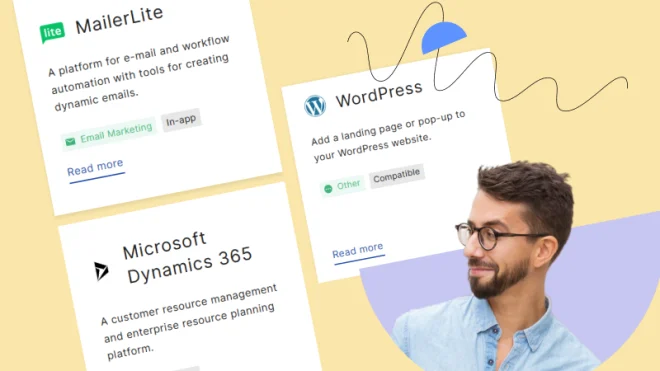
naffy used the following Landingi features to reach their goals. Curious to learn more?
Marta Byrska is a multilingual content specialist with 4+ years in marketing, creating SEO-optimized content and storytelling that engages and converts.
Jakub Bischof is a Polish tech entrepreneur, digital creator, and co-founder of naffy, a platform that enables creators to sell digital products and services easily.