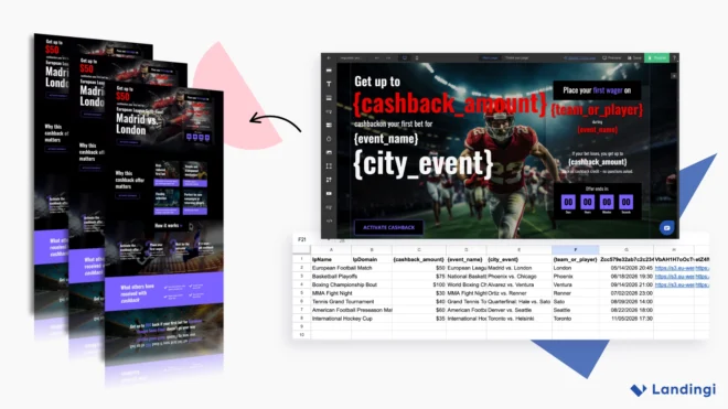
PayU India runs a wide ecosystem of initiatives for founders – from credits and partner benefits to mentorship and onboarding support. To keep everything moving, they rely on a steady stream of landing pages built in Landingi.
What stands out is how intentionally simple their approach is. Instead of complex funnels or heavy automation, they use a clean, repeatable setup that helps them launch and maintain campaigns efficiently while still achieving strong performance.
PayU India is one of the country’s leading digital payment providers, powering transactions for businesses of every size: from early-stage startups to large-scale enterprises. Their solutions span payment processing, risk management, and financial services designed for fast-growing digital markets. Beyond payments, they actively support India’s startup ecosystem with programs that help founders access tools, capital, and expert guidance.
A System Built on Clear Goals and High Engagement
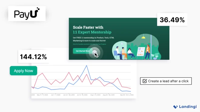
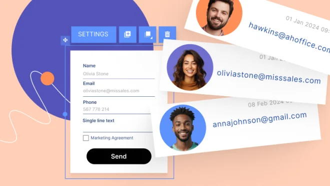
Across their campaigns, PayU consistently sees strong conversion performance – sometimes even exceeding 100%. The reason is simple: instead of relying solely on form submissions, they treat selected click-through interactions as leads.
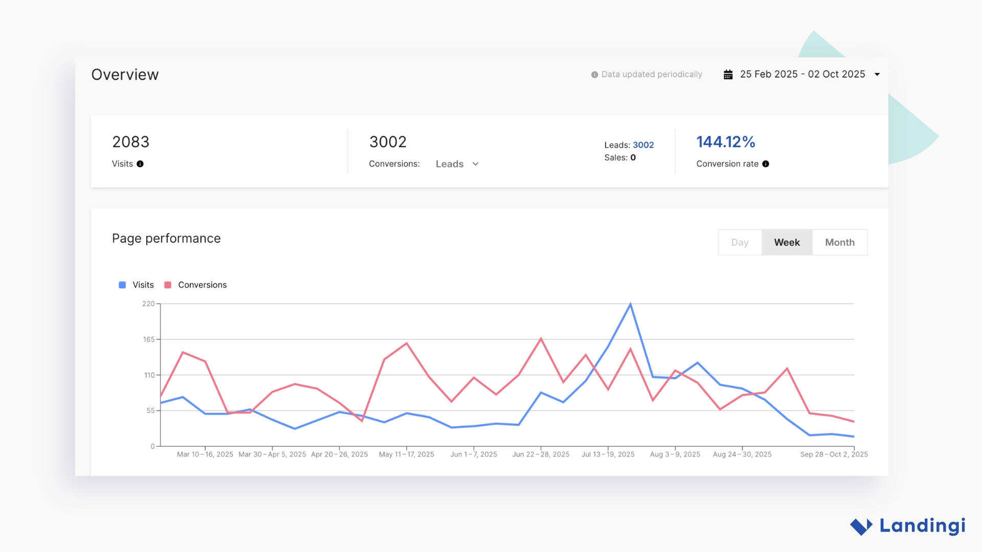
Many of their pages include multiple CTAs tied to program steps or partner offers, and each click is counted as a meaningful action. This provides the team with a clear, lightweight way to determine whether a page encourages users to explore what the Startup Program has to offer – without adding unnecessary complexity to their workflow.
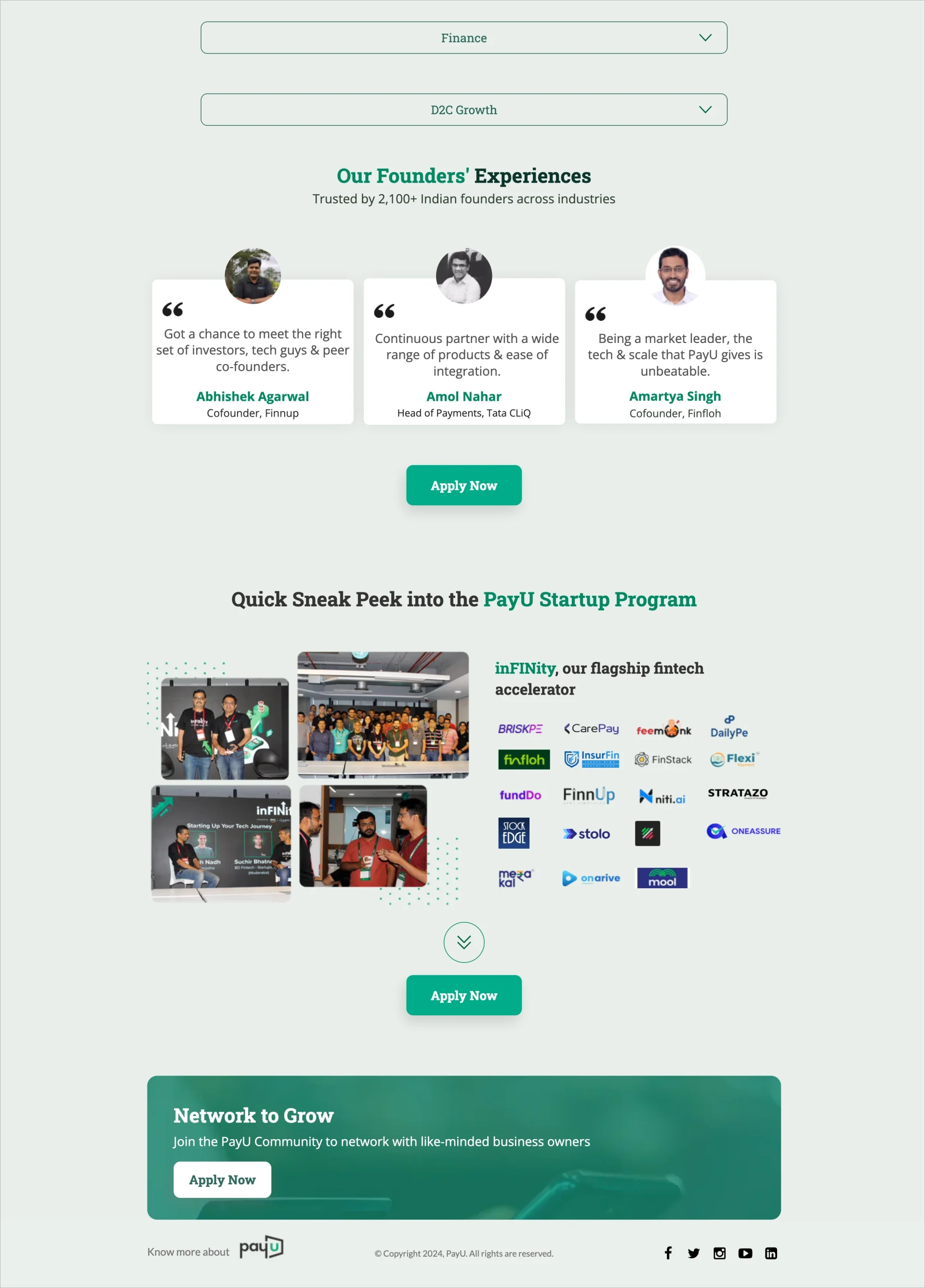
Their setup focuses on clarity: track the actions that matter most and make it easy for the team to evaluate which pages and offers generate the strongest response.
The Features Behind Their Workflow
PayU’s landing pages follow a consistent structure and use a small set of features that keep their campaigns clear, fast to build, and easy to maintain. Over time, the team has developed a repeatable workflow built around a few reliable elements:
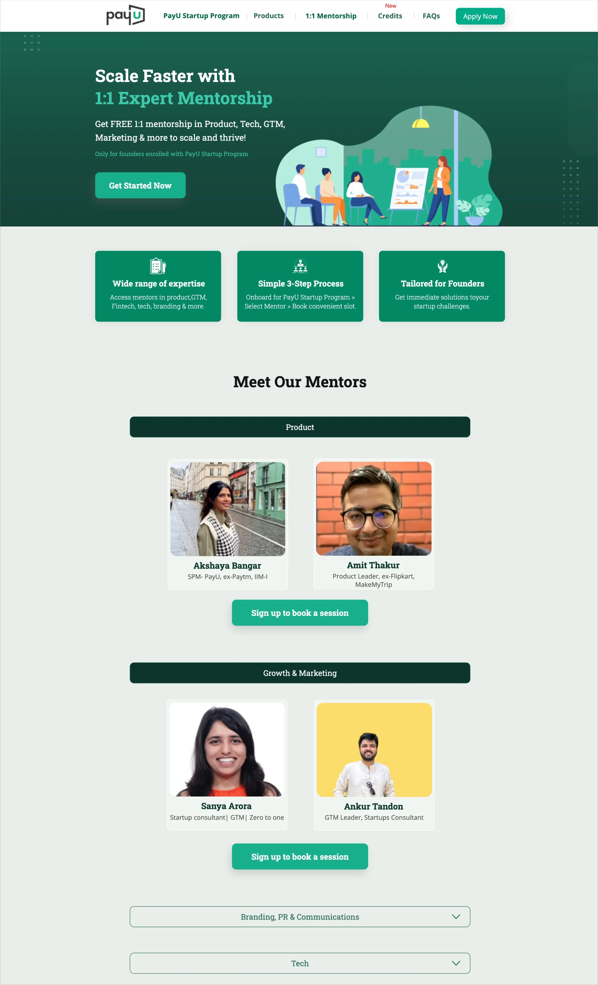
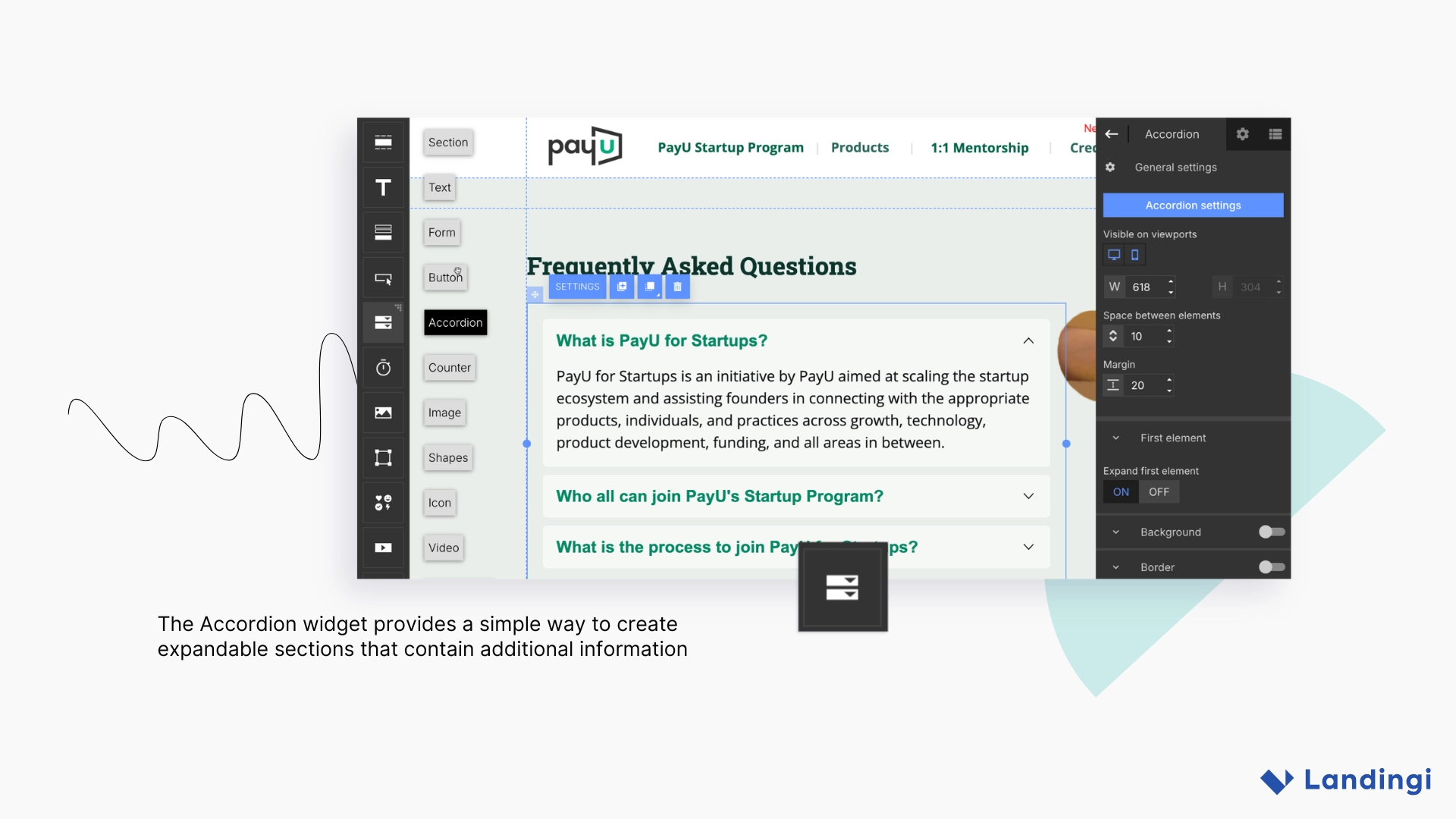
Accordion Sections
Helpful for organizing FAQs, partner benefits, or informational blocks in a clean, scannable way.
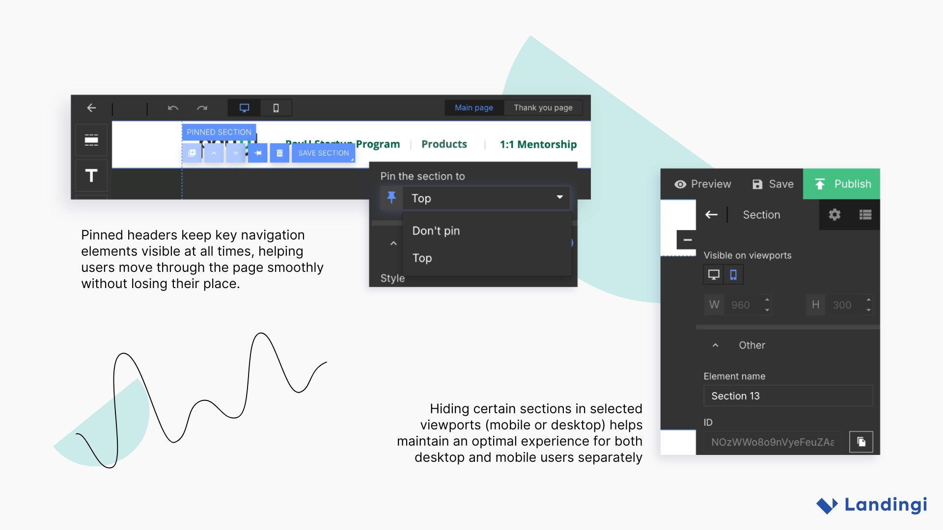
Pinned Headers / Sticky Navigation
Longer, content-rich pages benefit from anchored menus that help users navigate between sections without friction.
Device-Specific Visibility
PayU often adapts navigation and layout for mobile, hiding certain desktop elements and replacing them with mobile-ready versions. This keeps the experience intuitive across devices.
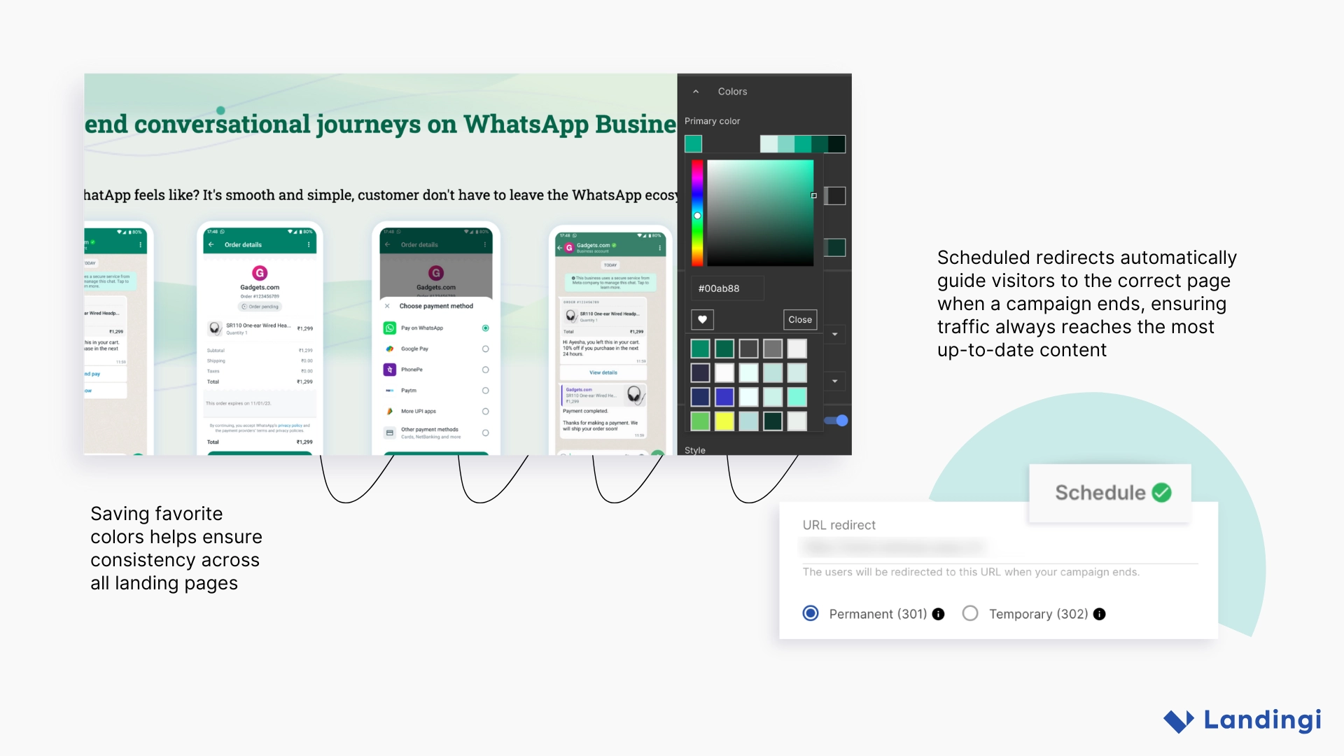
Favorite Colors & Saved Styles
A simple way to maintain visual consistency across all campaigns and contributors.
Schedule-Based Redirects
When an offer changes or a campaign ends, automated redirects help ensure users always land on the most current version – without extra manual work.
What Their Results Reveal
A few consistent patterns appear across PayU’s campaigns. Pages that include several touchpoints (such as category buttons or offer-specific CTAs) often generate a higher number of recorded actions. This reflects how users naturally explore different elements of the page when options are clearly presented.
High-traffic overview pages tend to maintain steady conversion rates thanks to clear structure and well-positioned CTAs. Meanwhile, more focused pages often see a high volume of interactions, which aligns with the stronger intent of users visiting them.
Together, these patterns show how PayU’s straightforward layouts and clear pathways help users navigate content and move toward the actions most relevant to them.

What Other Teams Can Learn From PayU India
PayU’s approach shows that even a lean, straightforward setup can support a wide range of campaigns when the workflow is intentional and consistent. Here are a few takeaways other teams may find useful:
- Track the actions that matter most. Click-based conversions can be just as valuable as form submissions when evaluating engagement.
- Keep layouts familiar and repeatable. Pinned navigation, consistent styling, and clear structure lower friction and speed up production.
- Design purposefully for mobile. Tailored mobile navigation creates a smoother experience than simply shrinking the desktop version.
- Let automation handle maintenance. Scheduled redirects keep campaigns fresh without manual cleanup.
- Simple workflows scale – when they’re deliberate. PayU shows that you don’t need complex personalization or automation to run an effective landing page ecosystem.
Final Thoughts
PayU India’s landing page workflow proves that simplicity can be a strength. By focusing on clear CTAs, clean layouts, and straightforward tracking, the team has built a system that supports multiple initiatives without slowing down production or complicating operations.
Their approach shows how a well-structured foundation (even without advanced personalization or heavy automation) can reliably power effective, high-engagement campaigns.
PayU India uses the following Landingi features to reach its goals. Curious to learn more?

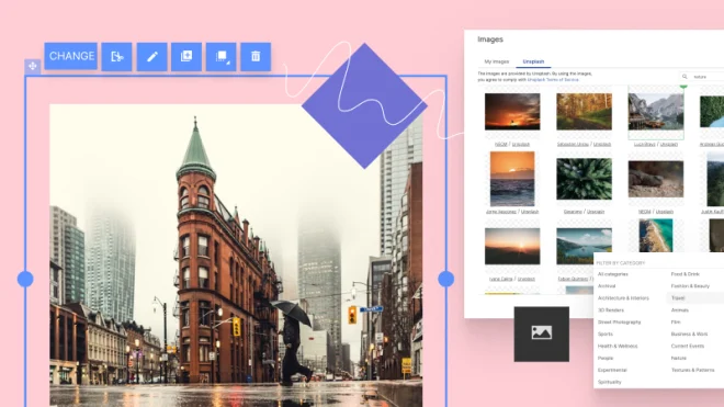
Landing Page Builder
Lead Generation