In 2025, your website doesn’t stand a chance without mobile SEO. As of April 2025, over 63% of global web traffic comes from mobile devices (Statista, 2024), and Google’s mobile-first indexing means it’s your mobile site—not desktop—that decides how well you rank.
If your pages load slowly, buttons are too small to tap, or content breaks on a phone screen, it’s not just annoying for visitors—it’s hurting your business. Google knows this, and so do your competitors.
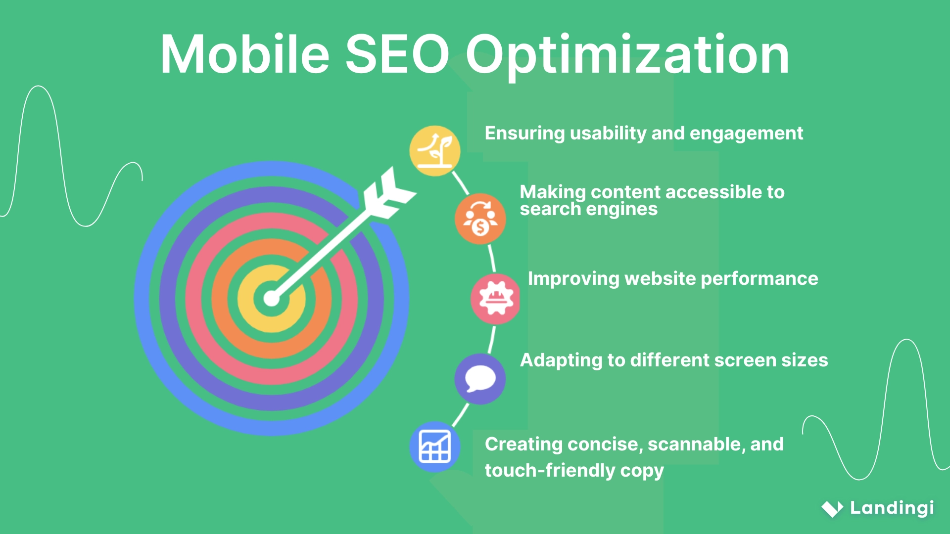
Mobile search engine optimization is the process of making your site not only look good on a phone, but work beautifully on one—fast, responsive, easy to navigate, and conversion-ready.
This guide covers everything you need to know about mobile SEO: what it is, why it matters, how mobile-first indexing works, and which techniques truly boost performance. You’ll find practical tips, top tools, and insights into what turns good UX into great mobile optimization.

What Is Mobile SEO?
Mobile SEO is the practice of optimizing a website so it performs well on smartphones and tablets, both for real users and for search engines. It covers everything from loading speed and responsive layout to touch-friendly navigation, streamlined content, and technical consistency between mobile and desktop. The goal is to make sure your site is fast, functional, and fully crawlable on the devices most people use every day.
Since mobile-first indexing became the rule, not the exception, it’s your mobile site that decides how you rank. That’s the version Google crawls. That’s what it uses to judge your structure, content, speed, and usability.
And mobile users, they’re even less forgiving than Google.They tend to be impatient, multitasking, and swiping fast. If your site lags, breaks, or demands too much effort, they’re gone—probably to a competitor whose site works better.
Mobile search engine optimization is not just about fitting your layout to a smaller screen—it’s about rethinking how your site works in real-world conditions: spotty Wi-Fi, cracked screens, one-handed browsing, and zero patience. Done right, it improves time on site, lowers bounce rates, and increases conversions—because people actually stay and engage.
So when we talk about mobile SEO today, we’re really talking about the version of your brand most users will see first—and sometimes the only version they’ll ever see. And if that version doesn’t deliver, neither will your results.
What Does Mobile-Friendly Mean in SEO?
In SEO, mobile-friendly means that a website is designed to display and function properly on mobile devices, like smartphones and tablets, without requiring users to zoom, scroll sideways, or wait for slow-loading pages. A mobile-friendly site uses responsive design, loads quickly even on slower connections, has easy-to-tap buttons, and keeps content readable and accessible across all screen sizes. It avoids intrusive elements like full-screen pop-ups and ensures smooth navigation on touchscreens.
No one wants to fight with a website. If users need to pinch to read text, chase down tiny links with their thumbs, or stare at a blank screen while your images load, they’re already gone. Google knows this too, so mobile friendliness is a ranking factor. And with mobile-first indexing now standard, your mobile site isn’t just important—it’s the version that defines how your site performs in search. A mobile-friendly site makes life easier for users—and makes search engines more likely to show it.
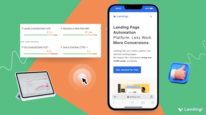
Optimize for mobile users—create a mobile-friendly landing page with Landingi!
Why Is Mobile SEO Important?
Mobile SEO is important because Google now uses the mobile version of your website as the primary one for indexing and ranking. Thanks to mobile-first indexing, your mobile site directly impacts how you appear in search results.
And it’s not hard to see why. As of early 2025, 63% of all Google searches happen on mobile devices, with mobile generating 27.8 billion more queries than desktop—a gap that keeps widening (source: Google). Mobile isn’t a trend anymore. It is search.
But it’s not just about traffic volume. It’s about behavior. Mobile searchers act faster, bounce quicker, and convert differently than desktop users. They’re often looking for answers in real time: searching while walking, commuting, waiting in line. That means slow load times, clunky navigation, or content that’s hard to skim are game over—before the page even loads.
Google knows this.
That’s why performance metrics tied to mobile—like Core Web Vitals, mobile usability, and page experience signals—now play a key role in rankings. And here’s the twist: even your desktop rankings depend on how your site performs on mobile. If your mobile experience is broken, incomplete, or slow, your entire SEO strategy is standing on shaky ground—no matter how good your desktop site looks.
How to Optimize a Website for Mobile Devices?
To optimize your site for mobile, you need to use responsive design, improve page speed, simplify navigation, keep your content consistent, fine-tune technical elements, design for touch, and test across devices regularly.
Let’s break that down.
Start with responsive design. It means: create a layout that fluidly adapts to any screen. With tools like CSS Grid, Flexbox, and media queries, your site can automatically adjust to fit smartphones, tablets, and everything in between—without the need for a separate mobile version.
Next, boost your speed. Mobile users won’t wait around. Compress your images (WebP is a great format), minimize code, enable caching, and use a CDN to get content delivered fast no matter where someone is. Every second saved reduces bounce and increases conversions.
Then, simplify navigation. Think big buttons, thumb-friendly tap targets, and single-column layouts. Menus should be clean and obvious. Make it easy to move around without pinching, zooming, or squinting. Users want quick paths—not a maze.

Keep your content consistent. Whatever’s on your desktop version should also appear on mobile. Hiding important text, links, or images on mobile confuses both users and search engines.
Dial in the technical side. Make sure your site loads cleanly across browsers and devices. Avoid bloated scripts. If AMP works for your use case, it can help with speed—but weigh the trade-offs. And always check for broken links or redirect errors that may only appear on mobile.
Design for fingers, not cursors. Key actions—like form submissions, clicks, or purchases—should sit comfortably within reach of a thumb. Keep spacing generous, text legible, and avoid anything that might accidentally get tapped. No one likes fighting with a UI.
Finally, test everything. Try your site on different phones, screen sizes, and operating systems. Real-world testing catches things tools miss.
Ready to engage mobile users? Design your mobile landing page with Landingi!
What Is the Difference Between Mobile SEO and Desktop SEO?
The difference between mobile SEO and desktop SEO comes down to how websites are optimized and ranked based on the device people are using—reflecting different behaviors, technical needs, and how search results are displayed.
SEO mobile
It is built for small screens, limited attention spans, and fast action. Users often search on the go, using voice or short, natural queries like “coffee near me” or “cheap flights tomorrow.” They want speed and clarity.
That’s why mobile optimization focuses on fast load times, responsive layouts, large tap targets, and simplified navigation. Everything needs to feel effortless—because even the slightest friction means a bounce.
SEO desktop
It supports longer, more detailed experiences. Users are typically at a desk, scrolling with a mouse, exploring options, and comparing products. The layout can be more complex, the content deeper, and the media heavier. There’s simply more room to work with.
Search results look different, too. On mobile, results are visual, card-like, and take up more screen space—usually just 2–3 per view. That makes top rankings even more competitive. Desktop shows 4–5 results at once, making it easier to scan and compare.
There’s also a big shift in indexing. Google now uses the mobile version of your site as the primary version in its ranking systems. That means even if your desktop site is perfect, a poor mobile experience can hurt your rankings across the board.
And finally, keyword usage shifts too. Mobile favors short, conversational, intent-driven phrases. Desktop allows for longer, more specific queries. Optimizing for both means understanding the mindset behind the screen.
| Aspect | Mobile SEO | Desktop SEO |
|---|---|---|
| Indexing Priority | Mobile-first indexing: Google primarily uses the mobile version to rank sites. | Secondary to mobile; still important, but no longer the default for crawling. |
| User Behavior | Quick, on-the-go searches; local intent; voice and conversational queries. | Longer sessions; research-heavy behavior; more detailed search patterns. |
| Search Intent | Fast answers, location-based, immediate actions. | In-depth info, product comparison, decision-making. |
| Search Result Layout | Larger, card-style results; 2–3 per screen; more visuals. | More links visible at once; easier scanning and side-by-side comparison. |
| Navigation Design | Simple menus, large tap targets, single-column layouts. | Can support more complex menus and multi-column designs. |
| Technical Priorities | Speed, responsiveness, lightweight code, touch UX, minimal load time. | Can handle heavier media and complex scripts; less sensitivity to speed. |
| Keyword Style | Short, natural, location-based, often voice-driven queries. | Specific, often longer, typed search queries. |
| Content Format | Concise, scannable, mobile-first copywriting. | Long-form, detailed, structured content. |
| SEO Features | Emphasizes mobile usability, local SEO, and Core Web Vitals on mobile. | Leans on desktop schema (e.g. FAQ, How-To), internal linking, structured data. |
| UX Challenges | Small screens, touch interaction, variable connections and devices. | More control over layout and interactivity; consistent screen dimensions. |
15 Proven Mobile SEO Tips and Best Practices
We’re deep into the mobile-first era, and your SEO game needs to reflect that — not just technically, but strategically. If your site still treats mobile like a secondary experience, you’re leaving traffic, engagement, and conversions on the table.
These 15 mobile SEO tips are handpicked for 2025 — tried, tested, and built to win where it matters most: in your users’ pockets.
- Go Responsive
- Write for Mobile Consumption
- Speed Things Up
- Optimize Core Web Vitals (on mobile first)
- Use Sticky Elements Wisely
- Make Tap Targets Fat and Friendly
- Optimize for Voice and Conversational Search
- Nail Your Local SEO Basics
- Avoid Intrusive Pop-Ups
- Add Mobile-Friendly Schema Markup
- Test on Real Devices — Not Just Dev Tools
- Eliminate Redirect Chains
- Use Lazy Loading (without hurting SEO)
- Compress Images, CSS, and JS for Mobile Optimization
- Track Mobile Behavior Separately
1. Go Responsive
Responsive web design is Google’s preferred approach for handling desktop and mobile versions of your site. Instead of creating a separate mobile URL, a responsive site uses the same HTML code and adapts to different devices automatically.
If your site still uses an m-dot subdomain in 2025, it’s time to retire it.
2. Write for Mobile Consumption
Mobile content optimization is about clarity and scan-ability. Use short paragraphs, clear headings, and content that works with limited screen space. Your user is probably scrolling with one hand and holding a coffee in the other.
Rule of thumb: if your content looks like a Word doc from 2009 on mobile, rewrite it.
3. Speed Things Up
Mobile page speed is one of the most direct paths to improving search engine ranking. On slower mobile networks, even a 1-second delay can hurt mobile performance and engagement.
Use tools like Google Search Console and PageSpeed Insights to uncover slow-loading mobile pages, and optimize assets, reduce code bloat, and enable browser caching.
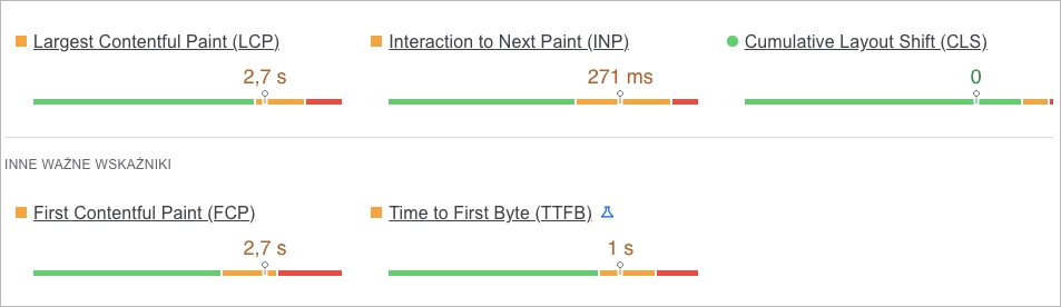
4. Optimize Core Web Vitals (on mobile first)
LCP (Largest Contentful Paint), FID (First Input Delay), and CLS (Cumulative Layout Shift) are non-negotiable. On mobile, FID is your secret weapon — users tap before your page is fully interactive, and if nothing happens, they bounce.
Focus first on mobile device users, then fine-tune the desktop version after.
5. Use Sticky Elements Wisely
Sticky CTAs and headers can boost conversions on mobile websites — but only when they don’t interrupt the experience.
Make sure your floating elements don’t hide core content or slow down your mobile optimized site. It’s all about finding the balance between visibility and usability.
6. Make Tap Targets Fat and Friendly
Ever tried clicking a button on a mobile version of a site and accidentally hit the wrong one? That’s a mobile usability fail.
Mobile SEO best practices recommend tap areas of at least 48x48px (Android), 44x44px (iOs)— enough for thumbs, not mouse pointers. Don’t assume desktop users’ expectations apply to mobile searchers.
7. Optimize for Voice and Conversational Search
Voice search optimization is a fast-growing part of mobile search engine optimization. Users increasingly ask Google questions like “What’s the best sushi near me?” instead of typing keywords.

Include long-tail questions, natural phrasing, and build out FAQ content to match the way mobile searchers actually talk.
8. Nail Your Local SEO Basics
Over 60% of all mobile searches are tied to local intent. That makes local SEO a core component of your mobile SEO strategy.
Make sure your business is listed on Google with consistent NAP data, and optimize your location pages for mobile and desktop users.
9. Avoid Intrusive Pop-Ups
Google cracks down on full-screen pop-ups that block mobile content. These hurt both mobile search optimization and user satisfaction.
Instead, use banners or subtle pop-ins triggered after user interaction (e.g. scroll depth or exit intent) — especially on mobile pages.
10. Add Mobile-Friendly Schema Markup
Structured data helps search engines better understand your content, and can enhance your visibility in mobile SERPs. Think FAQs, star ratings, event info — all perfect for mobile visitors scrolling quickly.
Use mobile optimized markup and test it in Google’s Rich Results tool.
11. Test on Real Devices — Not Just Dev Tools
You can’t fully compare mobile and desktop performance using simulators. Real-world testing on different devices, including budget phones, helps catch layout and mobile performance issues.
Use your Google Analytics account to identify your most common mobile devices and test on those first.
12. Eliminate Redirect Chains
Every unnecessary redirect adds lag — especially for mobile users on 4G or spotty Wi-Fi. That’s bad news for mobile rankings.
Audit internal links and eliminate multiple hops. A clean path = faster loads and better search engine ranking.
13. Use Lazy Loading (without hurting SEO)
Lazy loading is key for mobile optimization, but you’ve got to do it right. Broken or improperly implemented lazy loading can prevent Googlebot from seeing your mobile content.
Stick to native loading=”lazy” and always test with Google Search Console’s URL Inspection tool.
14. Compress
Images, CSS, JavaScript — everything needs compression. Use WebP, GZIP, or Brotli to reduce file sizes and improve mobile SEO. Optimizing for mobile traffic means giving your users fast access to your web page, regardless of their network quality.
15. Track Mobile Behavior Separately
Google Analytics and Search Console let you slice your data by device type. That’s crucial because mobile and desktop users behave very differently.
Set up dedicated reports to track mobile content performance, bounce rate, and conversion paths for mobile device users. Insights here can fuel smarter A/B tests and better design decisions.
Make your landing page mobile-first—design it with Landingi now!
How to Perform a Mobile Friendliness Audit?
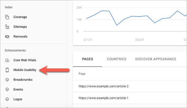
To run a proper mobile friendliness audit in 2025, start by making sure your mobile version matches your desktop version in content, metadata, and internal linking — Google indexes the mobile site first. Use Google Search Console’s Mobile Usability Report to catch design issues like tiny text or overlapping tap targets, and run PageSpeed Insights to assess Core Web Vitals for mobile. Make sure your layout is fully responsive, easy to navigate with thumbs, and readable without zooming. Test across devices, check form functionality, and avoid intrusive pop-ups. Finally, monitor mobile behavior in Google Analytics, fix issues fast, and re-test regularly to stay aligned with the latest mobile SEO standards.
Where Can I Check if My Website Is Mobile-Friendly?
To check if your website is mobile-friendly, use tools like Google Lighthouse or PageSpeed Insights. Both tools audit your site’s mobile performance, accessibility, and usability directly from your browser. You’ll get detailed insights into things like layout shifts, tap target spacing, and loading speed.
For a more user-focused view, tools like SE Ranking’s Mobile-Friendly Test or BrowserStack let you preview how your site performs on real mobile devices.
And sometimes, the best check is the simplest: open your site on your own phone. If it feels slow, cramped, or frustrating to use, your visitors are probably feeling the same.
What Are the Best Mobile SEO Tools?
The best mobile SEO tools are: Google PageSpeed Insights, Google Search Console, Screaming Frog SEO Spider, and Ahrefs.
1. Google PageSpeed Insights
Best for: Analyzing website speed and Core Web Vitals.
This free tool evaluates your site’s performance on both mobile and desktop, offering insights into metrics like First Contentful Paint (FCP) and Largest Contentful Paint (LCP). It provides actionable suggestions to enhance loading times and overall user experience.
2. Google Search Console
Best for: Monitoring indexing performance and mobile usability.
Google Search Console offers data on how your site performs in search results, highlighting mobile-specific issues and indexing errors. It helps identify and fix problems that could affect your site’s visibility on mobile devices.
3. Screaming Frog SEO Spider
Best for: Technical SEO auditing.
This desktop program crawls your website, identifying issues like broken links, duplicate content, and redirect chains. It’s invaluable for ensuring your mobile site is technically sound and optimized for search engines.
4. Ahrefs
Best for: In-depth SEO and mobile backlink analysis.
Ahrefs lets you track search rankings, audit content, and monitor backlinks — including those affecting your mobile pages. It’s also useful for understanding how mobile searchers find your content and which keywords perform best across mobile and desktop. You can compare mobile and desktop keyword positions, check SERP features, and identify opportunities for mobile content optimization.
| Tool | Best For | Key Features | Mobile-Specific Strengths | Pricing |
|---|---|---|---|---|
| Google PageSpeed Insights | Website speed & Core Web Vitals analysis | – Mobile & desktop performance reports- FCP, LCP, CLS metrics- Actionable performance suggestions | Deep insights into mobile load speed, UX issues, and Core Web Vitals | Free |
| Google Search Console | Mobile usability & indexing monitoring | – Mobile Usability Report- URL Inspection Tool- Mobile crawling & indexing data | Tracks mobile usability errors, index coverage, and rendering issues | Free |
| Screaming Frog SEO Spider | Technical SEO audits (desktop app) | – Full site crawl- Detects redirects, meta issues, broken links- PSI & Core Web Vitals integration | Identifies viewport config issues, tap targets, mobile alternate URLs | $22+/mo |
| Ahrefs | Mobile SEO strategy & backlink analysis | – Keyword & content audit- Mobile vs desktop rank tracking- Mobile SERP feature tracking | Compares mobile/desktop search performance, backlink health, keyword intent | $129+/mo |
What Are the Limitations of Mobile SEO?
The limitations of mobile SEO include slow page speed, design issues, intrusive pop-ups, clumsy navigation, technical errors, setup complexity, and the sheer variety of devices and browsers to support.
Start with speed. Mobile pages are still slow. On average, 88% slower than desktop. And on mobile, waiting even three seconds feels like forever. Most users won’t stick around long enough to see your headline load.
Design can backfire too. What looks clean on a laptop might break completely on a phone. Tiny text, buttons you can’t tap, layouts that slide out of place—it all adds up. And with mobile-first indexing, Google doesn’t just see it. It ranks you for it.
Then there are pop-ups. What’s a nice email sign-up on desktop becomes a full-screen blocker on mobile. Can’t find the “X”? You’re out. So is your visitor—and your ranking.
Navigation can get messy. Overlapping links, menus that are too small, CTAs that jump when you try to click them. One mistap, and the whole journey goes sideways.
The tech side is equally tricky. Redirects fail. Images don’t show. Pages return 404s. If your mobile version has issues your desktop doesn’t, Google still treats it as the main one. That’s risky.
And the setup isn’t simple. Responsive design is safest—but not foolproof. Separate URLs? A pain to manage. Dynamic serving? Easy to mess up. AMP? Lightning fast, but stripped down—and not always on your domain.
Top it all off with device chaos: budget Androids, giant iPads, slow networks, old browsers. Fix one issue, break another.
Improve your mobile conversions—design a responsive landing page with Landingi
Use Mobile SEO to Improve Traffic on Your Landing Pages
Mobile SEO gets people to your page. But what they see once they land? That’s where it counts.
On a phone screen, you’ve got seconds. Maybe one scroll. One thumb tap.
That moment—when a mobile visitor decides to stay, convert, or bounce—is shaped by how fast your page loads, how clear your message is, and how easy it is to act. Mobile search engine optimization might get you in front of the right eyes, but only a high-performing landing page turns those eyes into leads, sign-ups, or sales.
With mobile SEO friendly templates, a drag-and-drop builder tailored for responsive design, and built-in tools for A/B testing and real-time analytics, Landingi helps you build landing pages that follow mobile SEO best practices—without writing a line of code. Every layout is crafted for small screens, fast thumbs, and even faster decisions.
Want to put your mobile SEO optimization into action? Combine it with mobile SEO techniques that convert. Use mobile SEO tips to improve visibility, but make sure your UX, copy, and layout do the rest. Make your mobile landing page not just searchable, but irresistible.
Bring in the clicks with smart SEO. Close the deal with smarter landing pages. Try now!


