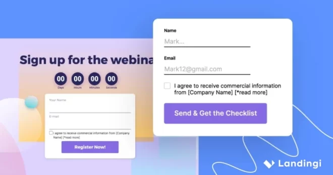
An email capture landing page is one of the most effective tools for growing your email list and engaging with potential customers. Digital marketing pros use landing pages to achieve higher conversion rates on various goals, but most landing pages have one thing in common: getting users to share their contact information, known as lead generation.
Of all the things you can ask for, email addresses are the most popular. Email marketing is deemed crucial by 87% of businesses, as Litmus reports. The effectiveness of email marketing strategies is still high, which is why using landing pages to collect emails is the way to go – it combines the best of both worlds.
Whether offering a free resource, exclusive content, or a special discount, a well-crafted landing page can entice visitors to share their email addresses in exchange for something valuable. If you have ever wondered how to create a landing page to collect emails, this comprehensive guide with the best landing page examples is for you. For a good start, grab a handful of tips on creating a high-converting email capture landing page:
- Use a relevant lead magnet to attract your target audience.
- Keep the layout clear to direct users’ attention to the desired action.
- Incorporate social proof elements to build trust and influence the users’ decision-making.
- Craft outstanding CTA that clearly indicates to users what to do next.
- Use a simple form to generate leads effectively.
Read on and learn about the best practices to apply in your creations to increase the conversion rate and grow the number of your email subscribers. To put a cherry on top, you will see seven examples of the best email capture landing pages. Analyze them and get inspired.
What Is an Email Capture Landing Page?
An email capture landing page is a single-purpose webpage designed to entice visitors to share their email addresses. This type of landing page contains a form that visitors are encouraged to fill out. It typically offers something valuable in exchange, such as a free eBook, discount, newsletter subscription, or access to exclusive content.
The design of an email capture landing page is usually straightforward, with minimal distractions, ensuring the visitor’s attention is directed toward the form where they enter their email address. The messaging is clear and concise, often highlighting the benefits the visitor will receive by providing their email. The form is usually placed prominently on the page, accompanied by a strong call-to-action (CTA) button encouraging visitors to take the desired action.
Beyond just collecting email addresses, an effective email capture landing page helps establish trust with the audience. It often includes elements like testimonials, trust badges, or a brief description of what the visitor can expect after signing up, which can help increase the conversion rate by reassuring the visitor of the value and safety of sharing their contact information.
The point of email capture is to use the contact information in email marketing campaigns. By filling out a form and giving consent to receiving marketing messages, your leads give you the green light to send them promotional emails. You can use that to nurture relationships with your prospects and turn them into customers. It’s usually a long process, but it’s worth it – and that’s why you should focus on creating a well-performing email capture landing page.
How Do I Create an Email Capture Landing Page?
To create a landing page for email capture purposes, start by defining your offer, then craft an engaging headline and persuasive content, create a strong CTA, include trust–building elements, use a simple form, and focus on clarity in your page‘s design. Remember to optimize the page for mobile to ensure a seamless experience for all users. Once your page is live, conduct A/B tests and leverage analytics for ongoing optimization.
Follow the short guide below to ensure your new email capture landing page is professionally designed to maximize conversions:
- Define your offer – decide on a valuable reward to encourage visitors to sign up. This could be anything from a free resource to exclusive content. Make sure it’s something your target audience will appreciate.
- Craft a compelling headline – your headline should clearly communicate the value of your offer and entice visitors to sign up. Keep it concise and focused on the benefits they’ll receive.
- Create persuasive content – clearly explain the benefits of your offer and address any potential concerns or objections your visitors might have. Use bullet lists, adequate icons, professional graphics, and high-quality visuals.
- Add a Strong CTA – your CTA button should be visually appealing and use strong, action-oriented language. Use compelling messaging that tells the visitor exactly what they’ll get by clicking, for example, “Claim Your Free Offer” or “Subscribe for Exclusive Tips”.
- Include trust-building elements – enhance your landing page by adding elements that reassure visitors about the safety of their information. These could include testimonials, security badges, or a clear privacy policy.
- Use a simple form – craft an effective lead capture form with clear labels and easy-to-understand instructions. Avoid requiring unnecessary information that might deter visitors from completing the form.
- Design a simple and focused layout – your landing page design should be clean and distraction-free. Use a minimalistic approach and place the form above the fold, ensuring it’s the page’s focal point.
- Optimize for mobile – make sure your landing page is mobile-friendly so it looks great on all devices. Create a responsive landing page that adapts seamlessly to different screen sizes. This is crucial for capturing emails from mobile users.
- A/B test your page – experiment with different variations of your landing page to see what resonates most with your audience. A/B testing can help you identify the best-performing elements and improve your page’s effectiveness in driving conversions.
- Analyze and optimize – use analytics to track page performance. Monitor key metrics like conversion rates, bounce rates, and the number of emails captured. Use this data to make informed adjustments and improve your landing page’s effectiveness.
Use these tips to create a landing page that attracts visitors and encourages them to sign up for your email list.
6 Best Examples of Email Capture Landing Pages
Check out the 6 examples of high-converting, professionally designed email capture landing pages. These samples can be not only a great inspiration for your own landing page design but also a visual guide on how to strategically implement all the key elements to capture qualified leads effectively. Let’s find out how others encourage their target audience to leave email addresses.
1. Trello – Free Access
The first example showcases the Trello email capture landing page, which leverages free access as a lead magnet. This page owes its efficiency to a clean, conversion-centered design and user-focused approach. The company behind Trello banked on a clear value proposition placed just above the one-field e-mail form. The message encoded in white fonts standing out from the light-pink background is truly unmissable. It bears what presumably visitor deems valuable. This form below is so discreet that one can hardly even find it a form! And thus, it’s more likely to catch him/her a lead.
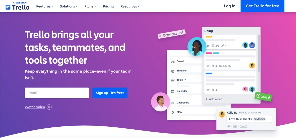
So, the email capture form is simple, requiring minimal information, which reduces friction and increases the likelihood of conversions. Two CTA buttons also express that sign-up is free, helping make the right decision. Additionally, the page is visually appealing with a balanced layout, making it easy for visitors to focus on the key message without distractions.
Key takeaways to learn from this example:
- Clear value proposition,
- Hero image,
- Catchy headline,
- Prominent CTA,
- Minimalistic form.
Improvement areas:
- Video – there is a button to watch a video, but displaying it right in the hero section instead of the picture could enhance engagement.
2. CXL – Newsletter
The second example illustrates an effective CXL lead generation page, which leverages the newsletter as a lead magnet. It demonstrates the power of strategic design and clear messaging. The page immediately grabs attention with a compelling offer and a brief but impactful description of the benefits of subscribing. The email capture form is simple, requiring only an email address, which lowers the barrier to entry and encourages more sign-ups.
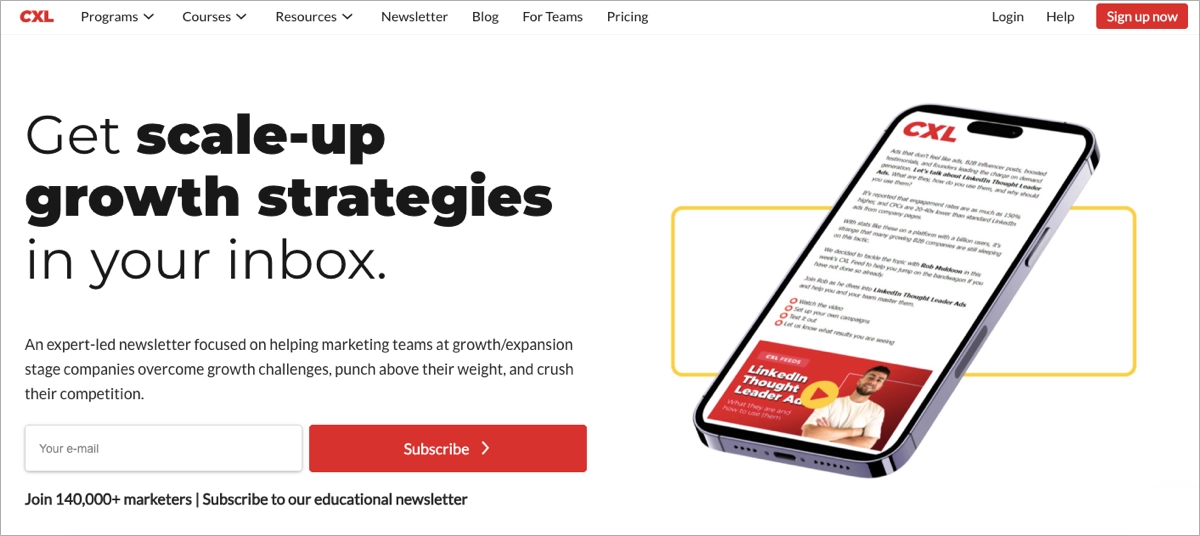
The social proof – the number of subscribers – placed below the signup form not only builds trust but also acts as another incentive. It also highlights the group of people the newsletter is for – a neat touch. This page strategically leverages white space and perfectly distinguishes a crucial CTA button with a contrasting color consistent with the brand’s visual identity. What makes this page a strong email capture tool is additional social proof, where users can see renowned brands subscribing to this newsletter.
Key takeaways to learn from this example:
- Clear layout,
- Effective social proof,
- Concise and persuasive messaging,
- Minimalistic form design,
- Outstanding CTA button.
Improvement areas:
- Visual elements – including more engaging visuals could increase interest and lead to higher conversion.
3. Kiwi Creative – Helper Video
The third example is Kiwi Creative’s email capture landing page, which offers a free helper video in exchange for user data. They know exactly who their target audience is, so the page is centered around a clear, value-driven offer that directly addresses their challenges and provides a solution. A clear layout with well-designed benefits sections effectively builds interest among visitors, encouraging them to take action.
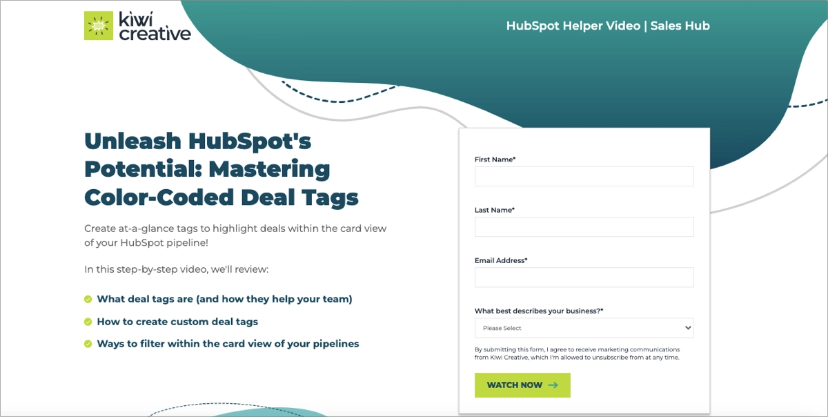
The landing page includes a prominent CTA designed to stand out, making it easy for visitors to engage with the content. The form itself is straightforward, requiring basic information, yet there are unnecessary fields that can cause friction – if these fields were optional, it would increase the likelihood of conversion.
Key takeaways to learn from this example:
- Well-structured layout,
- Compelling headline,
- Targeted content,
- Clear benefits sections,
- Effective CTA placement,
- High-value offer.
Improvement areas:
- Social proof – adding some social proof elements, like testimonials or the number of video impressions, would further enhance the conversion rate.
4. Laurie Wang – Planner
The fourth example showcases Laurie Wang’s landing page which is designed to collect email addresses, offering a free resource in exchange. This landing page is a powerful example of how to effectively generate leads through a streamlined and focused approach. It offers a valuable freebie relevant to the target audience’s needs, capturing their attention immediately with a bold, effective headline.
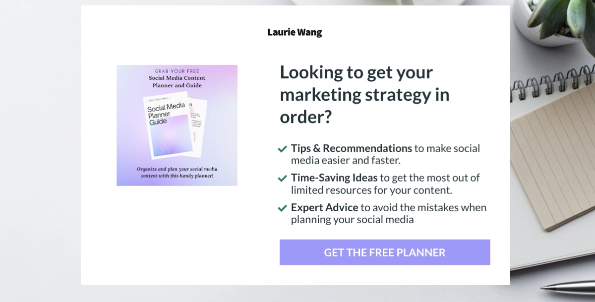
The design is clean and professional, with a strong emphasis on the benefits. The call-to-action is clear and encourages immediate action, which is critical for conversion. Clicking the button opens a popup with a simplified sign-up form, requiring minimal information – just a first name and the email address – which lowers the barrier to entry and makes it easy for visitors to subscribe. Additionally, the page makes good use of visual elements, including icons and a well-organized layout, to guide the visitor’s eye to the most important parts of the page.
Key takeaways to learn from this example:
- Strong value proposition,
- Simple layout,
- Minimalistic form,
- Clear CTA.
Improvement areas:
- Visual diversity – adding more dynamic visuals or interactive elements could further enhance engagement.
5. AlterCall – Free Consultation
The fifth example illustrates AlterCall’s landing page, designed to capture emails by offering a free consultation. The page is optimized to motivate visitors to sign up, featuring a strong headline and an inviting layout that highlights the service’s value. It leverages strategic social proof – a story told by an expert who has built his experience through years of challenges, highlighting numbers that say more than a thousand words. To make the story stronger, the page includes real-life client results and testimonials.

The page also uses color contrast and visual hierarchy, directing the visitor’s eye to the most important elements, such as the CTA and the form. The CTA is prominently displayed, urging visitors to take immediate action. The email capture form is hidden behind this effective CTA button. Clicking on it first displays a popup with additional meeting information and a calendar, and the form itself shows up after picking a date. It’s straightforward, but it includes unnecessary (and required) fields, such as a phone number, which can rather deter than encourage visitors to complete the sign-up process.
Key takeaways to learn from this example:
- Clear and compelling value proposition,
- Storytelling elements,
- Strong social proof,
- User-friendly design,
- Visual appeal.
Improvement areas:
- The form – the page is strategically designed and meets all lead generation landing page best practices, but the form itself is extensive and requires too much data. Making some unnecessary fields optional would improve conversion.
6. by Humankind – Discount
The last example is a squeeze page for the By Humankind beauty brand. It offers a discount in exchange for an email address. The page is particularly effective due to its compelling offer and clean, visually appealing design. It highlights a specific product – natural deodorant in a refillable container – and immediately captures attention with its eco-friendly proposition, illustrated in a compelling image. This clear and focused message appeals to the environmentally conscious consumer, making the product more desirable.
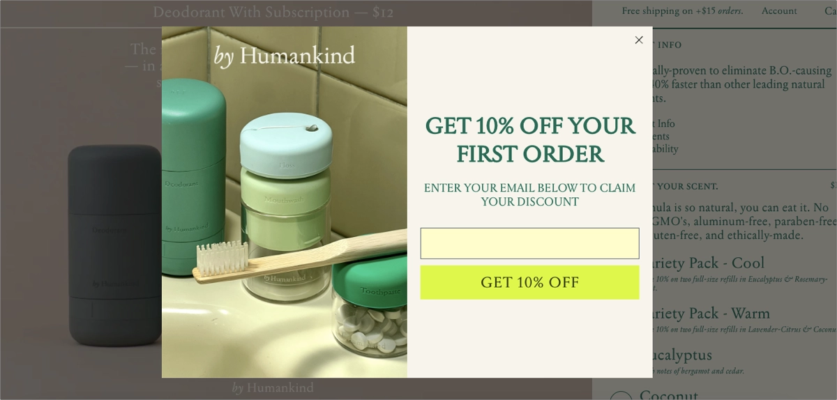
The email capture form is prominently displayed in the popup, accompanied by a discount offer to entice visitors. This approach not only incentivizes sign-ups but also encourages immediate action. The form itself is simple, requiring minimal input (just email address), which reduces friction and increases conversion rates. Additionally, the use of high-quality product images and a clean, modern design helps to keep the visitor’s focus on the key message and the CTA.
Key takeaways to learn from this example:
- Strong, relevant value proposition,
- Incentive-driven CTA,
- Minimalistic and clean design,
- Effective visuals,
- Simple form.
Improvement areas:
- Enhanced mobile experience – further optimization for mobile users could increase conversion rates from this segment.
4 Email Capture Landing Page Template Examples
Explore Landingi’s top-notch email capture landing page templates. These pre-designed templates offer a solid foundation for creating effective lead-generation pages. With outstanding CTAs, simple forms, and user-friendly layouts, they include all the essential elements. Best of all, they’re free and fully customizable, allowing you to tailor them to your brand and audience.
1. Webinar
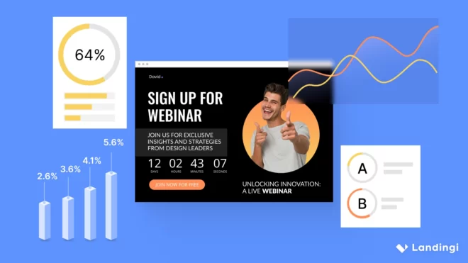
The first example is a Designer Webinar & Countdown template, designed to capture emails in exchange for access to a free live webinar. You can leverage its powerful design to attract your target audience easily. The bold headline captures users’ attention immediately, and the countdown timer creates a sense of urgency. These elements, combined with persuasive, benefit-oriented copy, and an outstanding CTA button, can guarantee a successful email capture campaign.
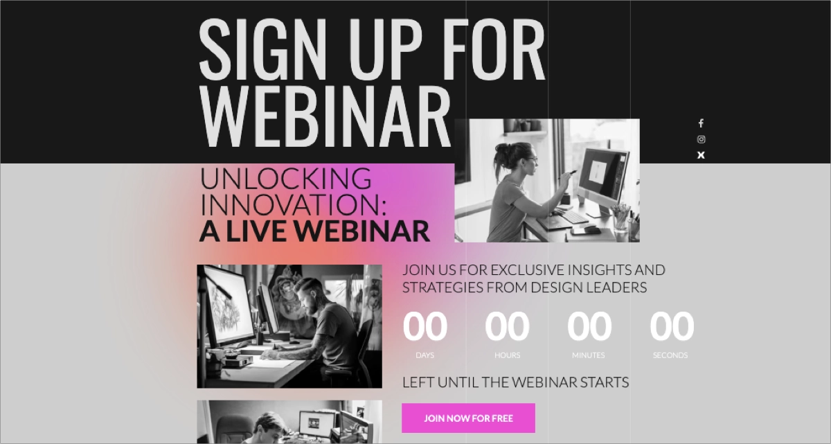
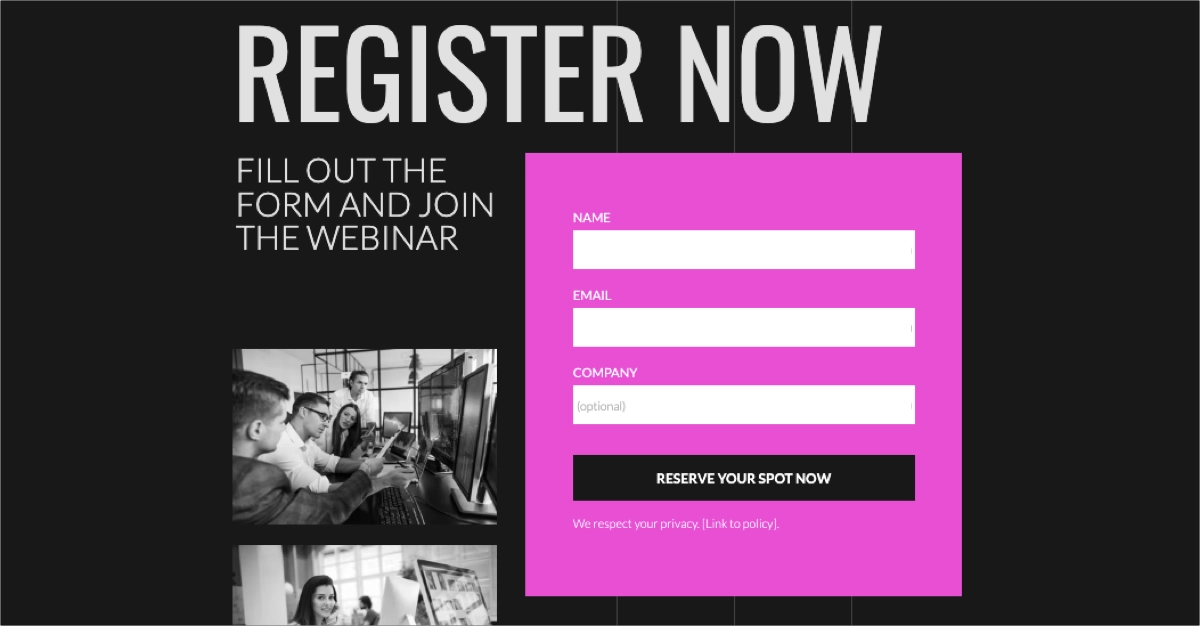
This template can inspire you to leverage high-contrasting colors, effective images, and short but engaging copy to build interest among users. The simple form with just two required fields and an outstanding CTA button can significantly boost conversion rates – yet you can always customize its look or use Form Builder to craft another perfect form for your page.
2. Newsletter
The next example is a World Travel template, perfect for crafting an email capture landing page offering a newsletter with valuable content in exchange. This template is simple but strong – it includes a well-structured hero section with bold headlines that can immediately convey your value proposition. There is a space for inspiring visuals, and a simple signup form with an outstanding CTA button.
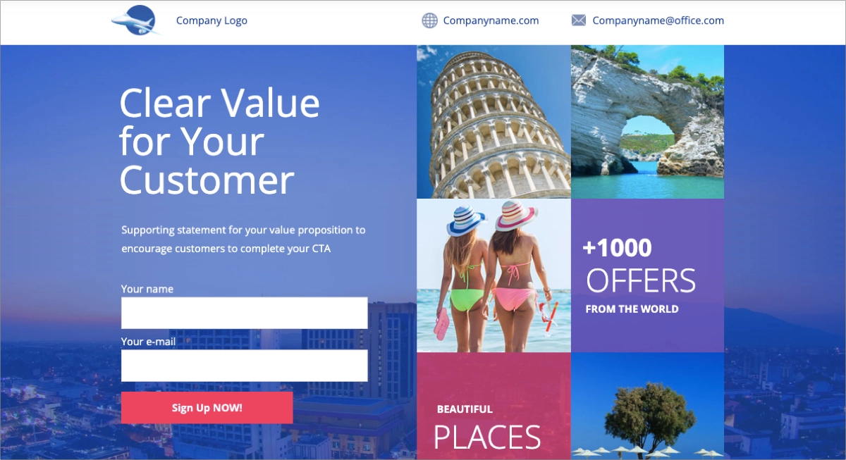
You can use the following sections to show previous newsletter samples or to describe your offer in detail, showcasing the benefits users will gain by subscribing to a newsletter. You can also add social proof elements and describe your mission. This template will help you craft a visually appealing, engaging, and effective email capture page.
3. Free Resource
The third example is a Workout Plan template, which is a great starting point for creating a lead capture page with a free resource offer. You should add professional visuals and create a compelling headline that will immediately attract users. The inclusion of a minimal signup form with an outstanding CTA in the hero section and the strategic page sections will increase the conversion rate.
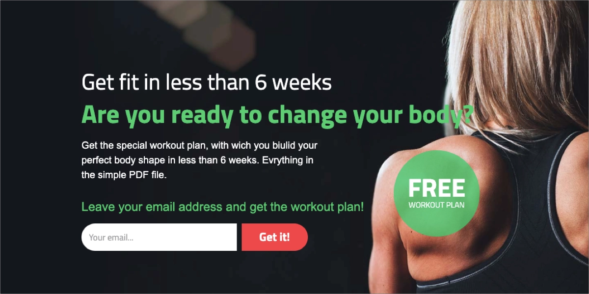
This template will let you effectively highlight benefits and show social proof to encourage signups. You can fully customize this template to craft a page relevant to your offer – you can offer an ebook, report, whitepaper, recipe, cheatsheet, template, checklist, or any other downloadable resource, and this template structure will work well for any of them.
4. Discount
The fourth example is a Dentist – Coupon Download template, which can be used to craft an effective lead capture page for any business. Add your logo and contact details on the top bar, leverage an immersive background picture, and clearly state your offer in the hero section.
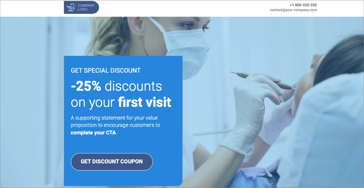
Place an outstanding CTA button in the strategic landing page sections, e.g., in the hero section, near the benefits sections, and close the testimonials. Briefly describe your offer, show your team, and generate leads with a simple form. This template can help you expand your email list and grow your business.
What Is the Best Email Capture Landing Page Builder?
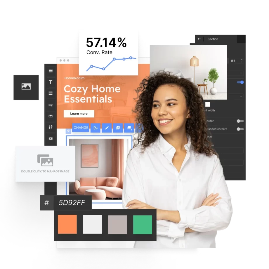
The best email capture landing page builder is Landingi, a multifunctional platform that allows users to create high-converting landing pages without any coding knowledge. Landingi offers a drag-and-drop editor that makes it easy to design professional-looking pages tailored to your brand’s style. The platform is equipped with various customizable templates specifically designed for email capture, helping you quickly set up a page that resonates with your audience.
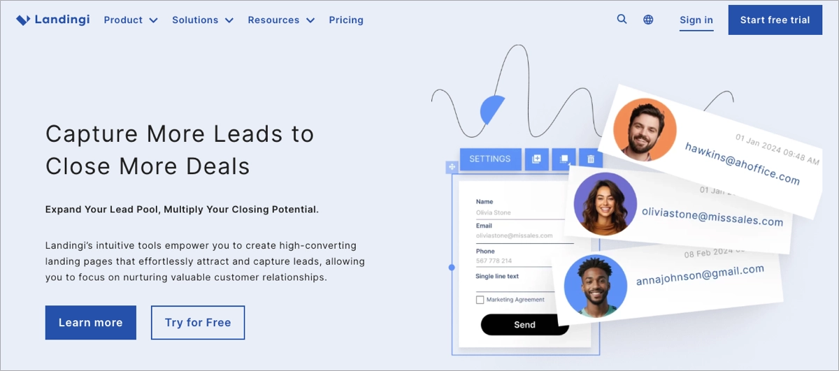
The platform also offers AI landing page features, thanks to which you can easily generate high-quality content for the entire landing page or its selected sections. Another AI-powered feature, AI + SEO, allows for optimizing your page for search engines by creating adequate meta titles and meta descriptions. With Landingi, you can also leverage artificial intelligence to enhance visuals on your page. The platform also lets you craft multi-language landing pages in minutes and reach global audiences with personalized content – automated translations involve 29 languages.
Landingi offers over 180 integrations so that it can be easily combined with many email marketing services, enabling seamless automation of lead collection and follow-up processes. Its built-in analytics tool, EventTracker, allows you to track the performance of your landing pages, providing insights into visitor behavior and conversion rates. Additionally, Landingi supports A/B testing, so you can experiment with different landing page versions to optimize it for higher email capture rates.
Overall, Landingi is a robust and user-friendly solution that provides all the necessary features to create effective email capture landing pages. Thanks to this professional platform, businesses of all sizes can effortlessly realize their lead-generation strategies.
How Can I Optimize My Email Capture Landing Page for Higher Conversion Rates?
To optimize your email capture landing page for higher conversion rates, strengthen your offer, refine the headline, simplify the lead capture form, improve the CTA button, use social proof strategically, create a sense of urgency, and improve the page’s load speed. These proven conversion optimization methods can help you create a well-performing landing page that collects leads effectively.
Check out the following strategies and use them as your landing page optimization checklist:
#1 Strengthen your incentive
Firstly, strengthen your incentive. Ensure that the value proposition you’re offering in exchange for email addresses is compelling and directly relevant to your audience. Ensure it’s directly relevant to their needs or interests. To craft an offer that truly engages, adjust it to the following pillars of a perfect incentive:
- Personalization – tailor your offer to your target audience’s preferences or demographics.
- Exclusivity – offer something exclusive to subscribers, such as early access to new products or content.
- Timeliness – limit the availability of your incentive to a specific period.
- Value – ensure the incentive is perceived as valuable and worth exchanging email addresses.
- Clear benefits – clearly articulate the specific benefits subscribers will receive.
Tailor the offer to solve a specific problem or meet a pressing need, making it irresistible for visitors to sign up. Experiment with different offers, such as exclusive content, discounts, or free trials, to see which resonates best with your audience. By providing a compelling and relevant incentive, you’ll significantly increase the likelihood of visitors opting into your email list.
#2 Refine headline
Secondly, refine the headline. It’s often the first thing visitors see, so make sure it grabs attention and communicates the value of your offer. A strong headline can significantly impact your landing page’s conversion rate, so take the time to craft a compelling and effective one, and consider if it meets the following areas:
- Clarity – ensure the headline clearly communicates the value proposition and benefit of your offer.
- Conciseness – keep it short and sweet, using no more than 70 characters.
- Keyword optimization – incorporate relevant keywords to improve search engine visibility.
- Power words – use strong action verbs and persuasive language to create a sense of urgency or excitement.
- Benefit-focused – highlight the specific benefits visitors will receive by signing up.
You shouldn’t rely on only one headline version. A/B testing different headlines can help you find the best-performing option that drives the most conversions.
#3 Simplify the form
Thirdly, simplify the form. The fewer fields your form has, the higher your conversion rate will likely be. Ideally, only ask for the email address unless additional information is absolutely necessary. If you need more details, consider a multi-step form that spreads the input fields across several stages, reducing the perceived effort required. When crafting a lead capture form for your landing page, focus on the following optimization strategies:
- Essential fields only – include one, a maximum of two fields, asking for an email address and, optionally, a name.
- Clear labels – use clear and concise labels for each field.
- Default values – if you use a larger form, pre-fill fields with common values (e.g., country) to reduce user input.
#4 Improve the CTA button
Fourthly, improve the CTA button. Your CTA should be action-oriented and clearly state what the visitor will get. Use persuasive language that aligns with the offer, such as “Get Your Free Guide” or “Claim Your Discount.” Also, ensure the CTA button is prominently placed, easy to find, and visually distinct from the rest of the page. To optimize your CTA, follow the mini-guide:
- Use compelling copy – clearly state the benefit of signing up.
- Align it with the offer – ensure the CTA messaging aligns with your value proposition and the incentive you’re offering.
- Ensure visual prominence – place the CTA button in a prominent position on the page, making it easy to find and visually distinct from other elements.
- Use contrasting colors – choose a button color that contrasts sharply with the background to make it stand out.
- Find the best design – experiment with different button sizes and shapes to see what works best for your audience.
#5 Use social proof
Fifthly, use social proof to build trust and credibility. Seeing that others have benefited from your offer can reassure visitors and make them more likely to provide their email addresses. Social proof acts as a powerful motivator and can significantly increase conversions. You can use the following examples of social proof to build trust among users and persuade them to take action:
- Testimonials – share positive feedback from satisfied customers.
- User reviews – display ratings or reviews from your audience.
- Subscriber count – showcase the number of people who have already signed up for your offer.
- Third-party endorsements – if applicable, feature endorsements from industry experts or influencers.
- Case studies – highlight success stories of how your offer has benefited others.
#6 Create a sense of urgency
Sixthly, create a sense of urgency. Adding a sense of urgency can motivate visitors to act immediately. Use messaging like “Limited Time Offer” or “Only a Few Spots Left” to encourage quicker decisions. Countdown timers or stock indicators can also create urgency and push visitors to sign up before it’s too late. Check out the short list of effective strategies to create a sense of urgency:
- Limited-time offers – clearly communicate that the offer is only available for a specific period.
- Scarcity tactics – emphasize the limited availability of the offer, such as “Only a few spots left.”
- Countdown timers – use a visible countdown timer to create a sense of urgency and encourage visitors to act before time runs out.
- Stock indicators – show a limited quantity of available offers to create a sense of scarcity.
- Urgency-inducing language – use persuasive language that conveys a sense of urgency, such as “Don’t miss out” or “Act now.”
#7 Optimize page load speed
A slow-loading page can cause visitors to leave before even seeing your offer. Make sure your landing page loads quickly by optimizing images, using efficient code, and choosing a reliable hosting service. Page speed is critical, especially for mobile users, so test your page’s performance regularly.
What Are the Key Elements of an Effective Email Capture Landing Page?
The key elements of an effective email capture landing page are the following:
- Simple and user-friendly design – a minimalist, uncluttered layout that helps focus the visitor’s attention on the email capture form and the value proposition.
- Clear value proposition – immediately communicating benefits headline supported by a brief description.
- Compelling CTA – outstanding, drawing attention button with clear, action-oriented messaging indicating what the user should do next.
- Incentive – something of value in exchange for the email address, such as a free eBook, discount code, or access to exclusive content.
- Trust signals – testimonials, reviews, trust badges, partner or renowned customer logos, or numbers that enhance credibility.
- Easy-to-fill form – simple, visually engaging form with a minimum number of required fields that encourage users to leave their e-mail addresses.
- Post-conversion experience – thank you page that displays after capturing an email. It should also confirm their subscription and outline what to expect next.
A well-performing email capture landing page should not only explain the benefits and encourage visitors to fill out a form but also reassure visitors they can trust the brand. User experience is the most influential aspect of these pages, so strategic implementation of all these key elements and their ongoing data-based optimization can guarantee success in lead generation.
What Are the Email Capture Landing Page Best Practices?
Meet the 4 best practices to help you get a better conversion rate on your email capture landing pages: showcase the offer attractively, use a strong lead magnet, keep the form short, and utilize social proof. These strategies improve user experience, encourage people to take your offer, and reduce possible friction that might deter them from taking action.
You already have a specified goal – gathering email addresses for further nurturing. It’s the most important action you need to convince users to take. Once you know the goal, you can build your page around it. Think of the email capture landing page best practices listed below as a Fantastic Four – a solid core of superheroes that will help your campaigns achieve better results (more email subscribers).
#1 Answer the Key Questions
The first lead capture landing page best practice is to answer the key questions. Regardless of the industry you operate in, your landing page visitor should know a few things almost straight away:
- What the offer is,
- Why the visitor should convert,
- What the next step to take is.
The thing that will convince visitors to leave you their email address is the “Why“. What is it about your offer that is better than anything else they have seen? That’s exactly what a value proposition is.
Simply put, a value proposition is a short statement that lets your visitors know why your company, product, or offer is better than whatever the competition offers. It can refer to anything: price, availability, ease of use, popularity, or a million other things – as long as it’s accurate and provides unique benefits, you can use it as a value proposition.
Make sure to convey your value proposition succinctly and place it in a visible spot on the landing page. That way, your visitors will get the answer to why they should enter their email address and click the CTA button.
#2 Add a Special Offer or a Lead Magnet
The second best practice for lead generation landing pages is to add a special offer or a lead magnet. Sometimes, even the best value proposition of your product or service may not be enough to entice a visitor to enter their information on your lead capture landing page. That’s where special offers and lead magnets come into play.
A lead magnet is a free resource that is sent in exchange for contact information – in this case, an email address. Once the email address is in your marketing list of contacts, you can send the lead magnet to the recipient’s inbox.
There are lots of examples of lead magnets:
- Ebooks,
- Checklists,
- Reports,
- Whitepapers,
- Webinars,
- Product samples,
- Courses.
Lead magnets work well because the visitors get something tangible for filling out the form. In B2B, the most popular magnets are industry-specific ebooks, but feel free to get creative with this idea. Before you set out to create your lead magnet, answer the following questions:
- Is it useful to the target audience?
- Is it valuable enough to leave an email address for it?
If the answer to both questions is “Yes,” you can promote the lead magnet on your landing page. It usually takes some time to prepare a valuable resource, but your visitors will remember you as the company that creates expert content.
#3 Keep the Form Short
The third lead capture landing page best practice is to keep the signup form short. No matter how enticing the copy and the offer are, when the form of your lead capture landing page has too many fields to fill out, the visitors might feel discouraged and get off at the very last stop before the destination, aka conversion.
Many companies make this mistake – they ask for too much information on top of the email: phone number, job title, industry, etc. Visitors to your landing page don’t know you yet, which is why they are apprehensive about sharing lots of personal information. The other reason for leaving a lead capture landing page is time. No one wants to spend too long completing complicated forms unless the reward is well worth it.
What should your form contain? Name, email (obviously), and, if necessary, one other field at most. It’s crucial to include a checkbox with consent to send marketing emails. Otherwise, you won’t be allowed to send any marketing communication – that’s the rule.
If you don’t believe in the power of short forms, feel free to run A/B tests. Create two nearly identical landing pages with one change and see which is more effective.
#4 Utilize Social Proof
The fourth best practice for email capture landing pages is to utilize social proof. The voice of your customers will always shine brighter than your own words. People are more likely to go for an offer from which someone else has benefited, even if they don’t know these customers personally.
A solid testimonials section contains a few things:
- The name of the customer,
- Their job title,
- An image,
- The testimonial.
It’s vital to include real testimonials on your landing pages. After all, your integrity is on the line here. For B2B list building, adding a testimonial of someone well-known in the industry will make the biggest impact.
Some companies include social proof, pointing out a small imperfection in their product, offer, or service. It gives a more realistic impression to a visitor, and it shows that you are not afraid of showing both the bad and the good.
Build a High-Converting Email Capture Landing Page with Landingi
An email capture landing page is a crucial tool for businesses seeking to grow their email list. By understanding its purpose and key elements, you can create a page that effectively engages your target audience. The goal is to convert visitors into leads by crafting compelling offers, clear messaging, and a user-friendly design. This involves creating an enticing headline, simplifying the sign-up process, and optimizing your call to action.
Try Landingi now and let this powerful platform do the hard work for you – use professionally designed templates, leverage AI landing page features to craft compelling copy in minutes, and use Form Builder to craft the most effective lead capture form for your page. You saw successful lead capture page examples, so inspire yourself, implement the best practices explained in this guide, and continuously optimize your page with Landingi to improve its effectiveness and drive your email marketing efforts forward.
