No two businesses are exactly alike. For example, one company’s formula for an effective, engaging headline might not deliver the same results for another brand. The best way to figure out why is by A/B testing. This way, you can determine exactly what factors are contributing to the discrepancies and tweak them to be more effective. This method is especially relevant for landing pages.
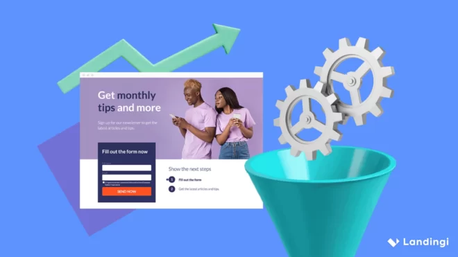
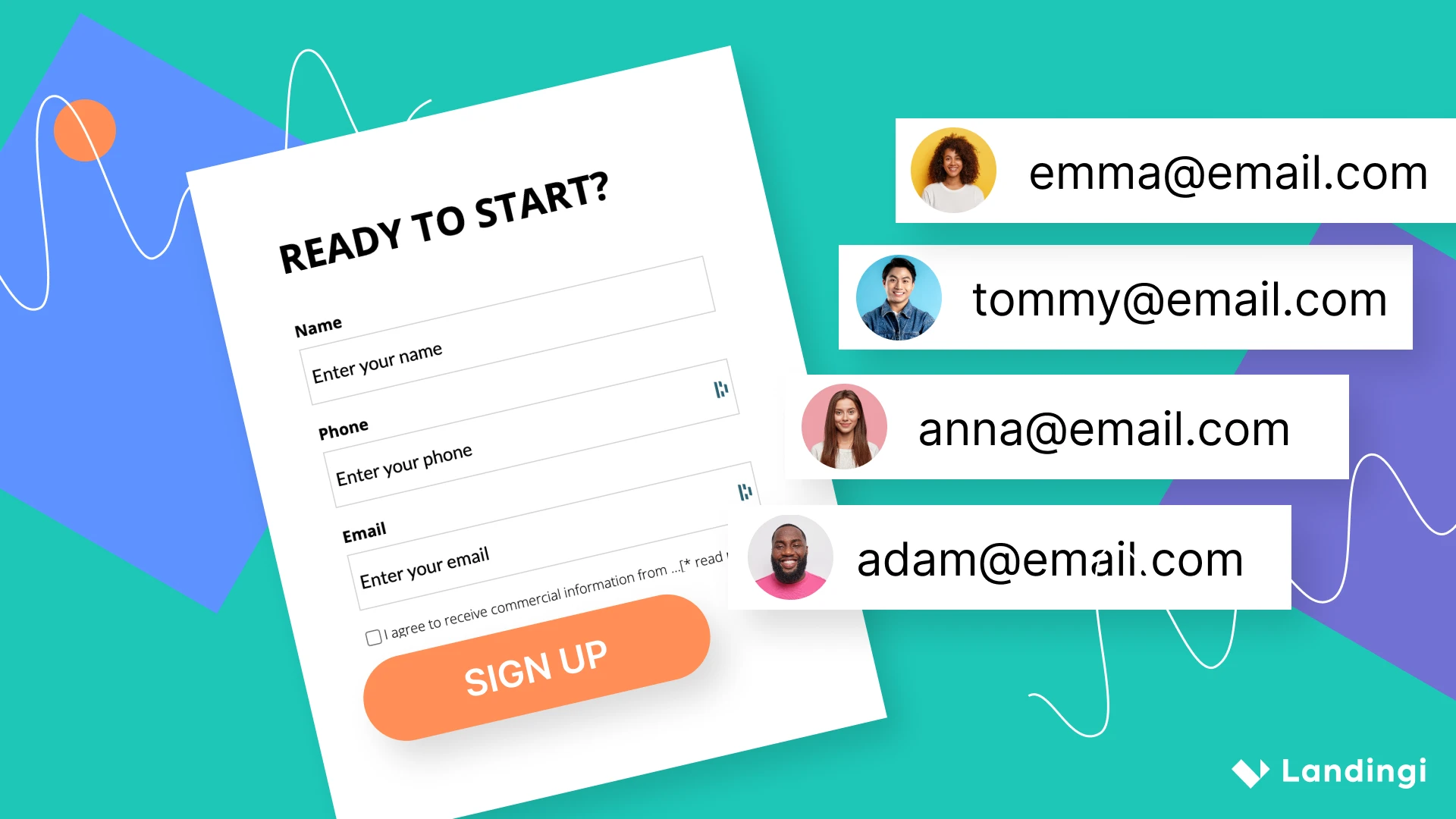
Landing pages typically have very few components. Each one is thoughtfully crafted to make sure that it delivers positive results. A/B test makes sure that these elements are optimized in the best way possible to deliver the conversions you need. If you don’t run A/B tests, it’s likely that decisions you make about your landing page could be based on personal inclination rather than actual customer preferences.
While marketing instinct and experience can influence how effective your landing page components will be, there’s nothing like seeing actual numbers and statistics to understand what your customers really want. That said, here are 3 reasons why you should always A/B test your landing pages:
1. Helps you write copy that resonates with your audience
A/B Testing can help you determine just how much impact your choice of words have on your visitors. Sometimes, just shortening the copy can lead to significantly more conversions.
In an example reported by Wordstream, simply shifting emphasis on call to action copy resulted in significant improvements. Changing “Get $10 off the first purchase. Book online now!” to “Get an additional $10 off. Book online now.” led to click through rates doubling.
2. Determine what kind of design attracts and engages your audience
Based on aesthetics alone, it would probably be easy to design an eye-catching landing page. However, the placement of your CTA, the button color choice, where your navigation button is located, the number of images, the size of your headline – all these components can have different variations that can deliver better results in terms of engagement.
Keep in mind that a landing page is not designed for the sole purpose to be attractive. It has to prompt action.
Something as simple as changing your CTA button to a brighter color can spur urgency and lead to more clicks.
3. Maximize conversion potential by tweaking individual elements
There are certain aspects of landing page design that you would assume are benchmarks when it comes to efficacy. For example, given that you want visitors who end up on your landing page to take immediate action, it’s logical to assume that fewer steps to sign up, leads to higher conversions. After all, visitor attention spans are short, and you want to get to your point where your visitors become leads as quickly as possible.
To be fair, this is usually true. However, there are some instances when it isn’t–the only way to tell is by testing. For example, an extra step leading to the purchase of an actual product could actually yield better results—as proven by Chris Kostecki who was A/B testing between two landing page sequences. This was a critical piece of insight into his landing page that he couldn’t have determined without actually testing it.
Keep these three points in mind if you’re still second guessing whether or not you should test landing pages. If you think your landing page is doing well now, picture how much better it could be knowing exactly what your visitors want.
Optimize Landing Pages to Boost Your Conversions Today