
The affiliate marketing landing page is a dedicated webpage designed to attract potential affiliates to your offer and convert them into real partners. One affiliate landing page can make or break an entire marketing campaign – it all depends on optimization. A well-designed page can attract numerous qualified prospects who can become long-term partners.
In this article, we will explore everything you need to know about landing pages for affiliate marketing, from their definition to tips on creating successful ones. It’s important to ensure these pages are clear, engaging, and persuasive to convert visitors effectively. To inspire your campaigns and help you create effective affiliate landing pages, we also provide 20 real-world examples with in-depth analysis:

Lunar is almost here!

20 Best Examples of Affiliate Landing Pages
The best affiliate landing pages combine clarity, strong visuals, and direct calls to action. Examples from brands like Miro and Shopify show how focused design and messaging can drive higher conversions. Studying these pages helps identify what works – and why.
1. Kwik.insure
Kwik.insure’s affiliate landing page is built to attract and convert potential partners with clarity and structure. The design uses a branded banner image and a clean layout that introduces the affiliate program in clear steps: sign up, promote, and earn. Icons reinforce each stage, helping visitors quickly grasp the process and benefits.
The page also includes video testimonials to build trust through social proof. A direct call-to-action — “Ready to start?” — makes it easy for visitors to take the next step. Legal information is clearly stated in the footer, supporting credibility and transparency.

What Works:
- Clear, step-by-step instructions with visual support
- Brand-aligned design and icons for easy comprehension
- Engaging testimonials that add authenticity
What Could Improve:
- Dense text blocks in the program details may overwhelm users
- Back-to-back videos reduce impact due to lack of spacing or variation
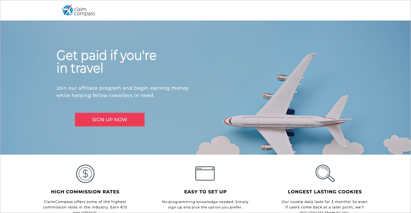
2. ClaimCompass
The ClaimCompass affiliate landing page offers a clean, focused layout that highlights its unique value: helping users earn by assisting air passengers with compensation claims. The headline communicates this clearly, while high-quality images and consistent branding build credibility. The page guides visitors toward sign-up with strategically placed CTA buttons and simple navigation.
Responsive design ensures a seamless experience across devices. Key information is concise, making the offer easy to understand. The visual hierarchy helps users stay focused on the core message without distractions.
What Works:
- Clear headline and value proposition
- Prominent CTAs that drive conversions
- Strong visual branding and mobile-friendly layout
What Could Improve:
- Slightly larger font size would enhance readability and accessibility
3. Animaker
The Animaker affiliate landing page promotes both affiliate and enterprise lead generation programs with clarity and focus. A strong headline and prominent CTA — “Become Affiliate Partner” — direct users toward immediate action. The layout is clean and professional, clearly presenting the benefits of the program and making the sign-up process easy to follow.
The page appeals to a wide range of potential partners, including bloggers, influencers, agencies, and enterprises. Key benefits such as uncapped commissions and dedicated partner support are clearly highlighted to boost conversion.

What Works:
- Clear headline and direct call-to-action
- Clean layout with a focus on program benefits
- Messaging tailored to multiple types of content creators
What Could Improve:
- Adding testimonials or affiliate success stories could build trust
- Differentiating the secondary CTA would reduce confusion
4. Shopify
The Shopify Affiliate Program landing page stands out for its clear messaging, strong structure, and effective design. The headline and subheading immediately explain the program’s purpose — earning commissions by referring new merchants to Shopify plans or POS Pro. A prominent “Apply now” CTA encourages quick engagement from interested users.
The layout is clean and consistent with Shopify’s branding, using whitespace, high-quality visuals, and a logical content flow. The “Two ways to refer and earn” section breaks down earning paths with supporting visuals, helping affiliates understand how they can generate revenue.

What Works:
- Direct, benefit-driven headline and subheading
- Strong CTA placement for easy sign-up
- Visually balanced layout with clear earning options
- Trust-building content like testimonials and success stories
What Could Improve:
- Better mobile optimization could enhance experience and conversions on smaller screens
5. Landingi
The Landingi affiliate landing page offers a clear and persuasive introduction to its program. A concise headline — “Join Our Affiliate Program – Earn Commissions” — immediately communicates the offer. The page emphasizes benefits like competitive commissions, easy registration, and reliable tracking, supported by strategically placed CTAs that guide users toward signing up.
The visual design is cohesive and professional, using branded colors, high-quality icons, and clean formatting to enhance readability. Testimonials and an FAQ section provide added credibility and answer common concerns, helping build trust with potential affiliates.

What Works:
- Clear headline and purpose-driven content
- Strong CTA placement to drive conversions
- Visual consistency and use of trust-building elements like testimonials and FAQs
What Could Improve:
- Adding interactive features, such as a live chat, could increase engagement and assist hesitant users
6. BigCommerce
The BigCommerce affiliate landing page effectively targets potential partners with a clear offer and strong visual design. The headline — “Earn money with the BigCommerce Affiliate Program” — communicates the core benefit upfront. The layout is simple and easy to navigate, allowing visitors to quickly find key information, such as commission details: 200% of the customer’s first monthly payment or $1,500 per enterprise customer.
Visually distinct CTAs are placed strategically to drive conversions. High-quality images support the content and help create a professional, trustworthy impression.

What Works:
- Clear, benefit-driven headline
- Simple layout with high-impact commission info
- Well-placed CTAs for immediate user action
- Clean, professional visuals that support user engagement
What Could Improve:
- Adding a FAQ section could address common concerns and build additional trust
7. Wati
Wati.io’s affiliate landing page presents a clear and structured offer, focusing on recurring commission opportunities. The headline quickly communicates the value of joining the program, and a well-placed “Become an Affiliate” CTA streamlines the path to sign-up. Bullet-point formatting highlights key benefits, making the content easy to scan.
The page uses a clean, branded design with high-quality graphics and images. Trust elements — including client logos and testimonials — strengthen credibility and reinforce the legitimacy of the offer.
What Works:
- Clear headline with a strong value proposition
- Organized layout with scannable, bullet-pointed benefits
- Effective use of testimonials and client logos for trust-building
What Could Improve:
- Simplifying the sign-up form could increase conversions by reducing friction
8. Coursera
Coursera’s affiliate landing page clearly communicates its offer with a strong headline — “Join our Affiliate Program” — and a persuasive subheader that emphasizes impact and opportunity. A prominent “Join for free” CTA invites immediate action. The program’s value is outlined through details like up to 45% commission on 4,000+ courses and Specializations.
The page is well-organized, with step-by-step explanations, visual aids, and a robust FAQ section. It also emphasizes affiliate support through promotional assets and weekly newsletters, making it appealing to both new and experienced partners.

What Works:
- Clear headline and compelling value proposition
- Strong CTA that simplifies onboarding
- Transparent breakdown of program structure and benefits
- Comprehensive FAQ that builds trust and reduces uncertainty
What Could Improve:
- Adding stronger visual elements to the hero section would increase engagement and first-impression impact
9. Jimdo
Jimdo’s affiliate landing page is structured to inform and convert with clarity and simplicity. The headline — “Jimdo’s Affiliate Program” — sets clear expectations, followed by a brief summary of key benefits such as up to €100 per referral and access to promotional tools. Prominent CTA buttons like “Apply Now” guide visitors to take action quickly.
The page outlines the sign-up process in three clear steps: registration, email verification, and access to promotional assets. A helpful FAQ section addresses common concerns, streamlining the onboarding experience.

What Works:
- Straightforward headline and benefit summary
- Step-by-step guidance for easy sign-up
- FAQ section that preempts user questions
- Clean design with supportive visuals
What Could Improve:
- Including testimonials or trust badges would add credibility and encourage more sign-ups
10. Time etc
Time etc’s affiliate landing page effectively promotes its virtual assistant referral program with a clean layout and clear messaging. The hero section includes a direct headline — “Join our affiliate program” — and a concise subheading that explains the opportunity. A strong “Join now” CTA linked to ShareASale makes the sign-up process accessible and familiar.
The page highlights key benefits such as $250 per sale, free membership, and robust tracking tools. A simple three-step process — Sign up, Promote and Track, Earn — helps visitors quickly understand how the program works. Additional resources in the footer support navigation and credibility.

What Works:
- Clear headline and subheading to set expectations
- High-visibility CTA linked to a trusted affiliate platform
- Straightforward explanation of steps and benefits
What Could Improve:
- More engaging visuals or video could increase retention
- Adding affiliate reviews or success stories would enhance trust
11. Miro
Miro’s affiliate landing page uses clean design and strategic structure to attract potential partners. The headline — “Join Miro’s Affiliate Program” — and subheadline immediately highlight the opportunity for content creators to earn commissions. The layout is modern, with strong typography and well-spaced content that maintains clarity and visual balance.
Sections clearly explain how the program works, the benefits of joining, and the steps to get started. Prominent CTA buttons guide users toward sign-up without distraction, making the page easy to navigate and action-oriented.

What Works:
- Clear value proposition and targeted messaging for creators
- Clean, modern layout that enhances readability
- Strong visual hierarchy with focused CTAs
What Could Improve:
- Adding interactive visuals like explainer videos could boost engagement
- Including testimonials or recognizable partner logos would strengthen trust and credibility
12. Involve Your Senses
The affiliate landing page from Involve Your Senses offers a clean, professional design with a focus on clarity and conversion. The headline and subheadings clearly communicate the value of joining the program, emphasizing ease of sign-up and the opportunity to earn by promoting products. A consistent color scheme and high-quality visuals reinforce brand identity and enhance user experience.
The page is mobile-optimized, ensuring accessibility across devices. Content is concise and action-oriented, designed to appeal to users who are ready to monetize their passion.

What Works:
- Clear, benefit-focused headline and subheadings
- Strong visual branding and mobile-friendly layout
- CTAs placed to support easy navigation and action
What Could Improve:
- Adding a CTA button in the hero section could boost early conversions
- Including testimonials or trust badges would increase credibility and user confidence
13. iCard
The iCard affiliate landing page is structured to recruit partners effectively through clear messaging and a professional design. The headline — “Become iCard’s affiliate partner – it’s worth it!” — immediately conveys the value of the program, while a prominent CTA encourages registration. A concise description of benefits and visually appealing graphics enhance credibility and user engagement.
The “How it works” section outlines the process in three steps: Register, Refer iCard, and Earn money. This straightforward structure, supported by visuals, makes the program feel accessible. The page also highlights affiliate support and includes a helpful FAQ section to address common concerns.

What Works:
- Persuasive headline with immediate value proposition
- Step-by-step explanation with visuals for clarity
- Strong CTA and clean layout to drive user action
- FAQ section that preempts objections
What Could Improve:
- Adding social proof (e.g., testimonials or partner logos) would increase trust
- Optimizing the mobile experience could boost conversion rates from mobile users
14. DesignNBuy
DesignNBuy’s affiliate landing page focuses on clarity and benefit-driven messaging to attract potential partners. It highlights the main incentive — a 10% commission on sales — alongside other exclusive perks. The page uses concise language and a clean design to keep users engaged while guiding them toward signing up.
High-quality visuals and a professional layout enhance the overall presentation. CTA buttons are strategically placed to encourage conversions and make it easy for visitors to join the program.

What Works:
- Clear value proposition emphasizing commission and perks
- Visually appealing design with professional imagery
- Well-placed CTAs to prompt user action
What Could Improve:
- Reducing text in the hero and body sections would improve readability
- Adding testimonials, FAQs, and detailed program info would boost trust and answer common questions
15. MACMAN Pro
MACMAN Pro Ltd.’s affiliate landing page presents a clear offer: 5% commissions and customer discounts for promoting their tech products. The copy is persuasive and highlights benefits such as passive income, easy tracking, and affiliate support. The clean, modern layout reflects the company’s branding and adds credibility.
Social media links provide an extra layer of trust through social proof. The step-by-step instructions for joining the program make the process approachable, while the overall structure is clear and informative.

What Works:
- Direct explanation of program benefits
- Modern, professional design aligned with brand identity
- Social media links support trust-building
What Could Improve:
- CTA buttons need better placement and relevance to the offer
- The form is too lengthy and may deter sign-ups
- The benefits section should be broken into bullet points with icons to improve readability and engagement
16. Discover Cars
Discover Cars’ affiliate landing page presents a structured and professional overview of its car rental affiliate program. The headline and content clearly communicate the offer, including a $20 payout per client. A prominent CTA invites visitors to sign up, supported by concise bullet points outlining program benefits like global reach, high conversion rates, and marketing support.
The layout is clean and easy to navigate, with strong use of trust-building elements such as testimonials, awards, and logos of supplier partners. These additions reinforce credibility and support user confidence.

What Works:
- Clear presentation of benefits and payout structure
- Strong CTA and scannable bullet-point format
- Multiple forms of social proof enhance trust
What Could Improve:
- The hero section design looks dated and could be refreshed for visual impact
- The sign-up form could be simplified to reduce friction and boost conversions
17. Nordstrom Creators
The affiliate landing page for Nordstrom Creators targets influencers, content creators, and affiliates looking to partner with a premium retail brand. It features a clean, elegant layout that emphasizes clarity and conversion. The hero section presents a clear headline — “Partner with Nordstrom” — and a strong, centered CTA button that reads “Apply Now,” removing distractions and encouraging immediate action.
The design uses a refined color scheme and high-quality visuals to reflect Nordstrom’s upscale branding. The short-scroll format helps maintain user focus while clearly outlining key benefits such as commission earnings, brand alignment, and tracking tools. With no top navigation menu, all attention is directed to the sign-up form.

What Works:
- Focused messaging that communicates value instantly
- Elegant and minimal design consistent with brand identity
- Prominent CTAs placed strategically for higher engagement
- Benefit-driven copy that appeals to creators
What Could Improve:
- Adding testimonials from current creators to enhance trust
- Including an FAQ section to clarify expectations and reduce friction
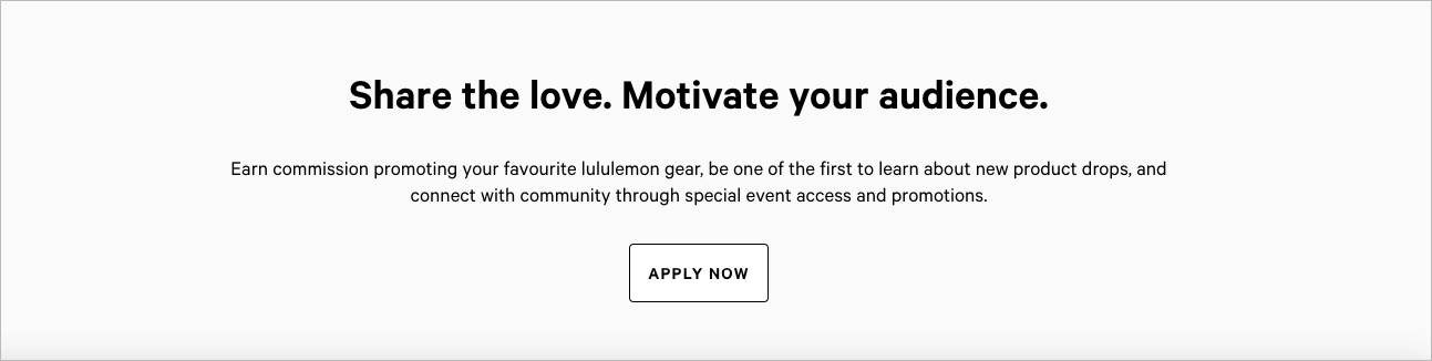
18. Lululemon
The Lululemon Affiliates & Creators landing page takes a community-focused, lifestyle-driven approach to affiliate recruitment. It opens with a bold headline — “Affiliates & Creators” — paired with a high-impact image that reflects Lululemon’s energetic, wellness-centric brand. Right away, the page defines its ideal applicants: wellness advocates, athletes, and content creators, and outlines key benefits such as commission, exclusive perks, and brand collaboration.
The design emphasizes visual storytelling, using minimal text and bold imagery to capture attention and maintain flow. The application process is simplified into clear steps with multiple “Apply Now” buttons placed throughout. Lululemon also reinforces its inclusive culture and values, which appeals to creators who align with its mission.
What Works:
- Lifestyle-driven imagery that resonates with the brand’s audience
- Clear messaging on who the program is for and what they gain
- Strong alignment with brand values, fostering deeper connection
- Consistent, action-oriented CTAs throughout the page
What Could Improve:
- Adding testimonials or showcasing current brand partners for credibility
- Providing more detail on commission rates to enhance transparency and motivate sign-ups
19. Meesho
The Meesho affiliate landing page is built around simplicity and quick conversion, with a form-first design that immediately invites users to register using just a phone number. The headline — “Become a Meesho Affiliate and Earn Money” — is followed by minimal content, making the page highly accessible and action-driven.
The page focuses on a broad audience, particularly first-time affiliates or individuals in emerging markets, by promoting messages like “zero investment” and “earn easily.” Its mobile-first layout ensures usability on low-bandwidth devices, and the straightforward tone matches the expectations of non-corporate users looking for accessible income opportunities.

What Works:
- Fast, frictionless registration with a phone-number-first form
- Clear value proposition that appeals to cost-conscious audiences
- Mobile-optimized design for broader reach
- Localized messaging for relevance and trust
What Could Improve:
- Adding visuals (product examples or affiliate testimonials) to build trust
- Including more information on commission structure and available tools to attract more serious affiliates
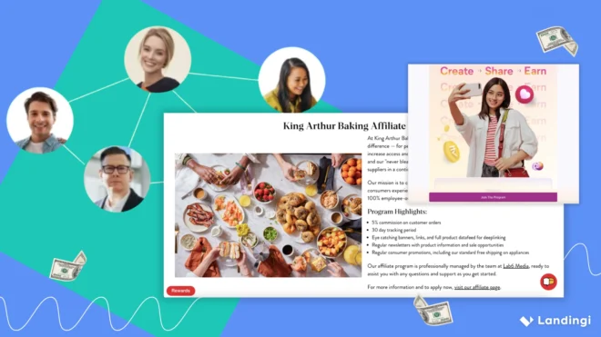
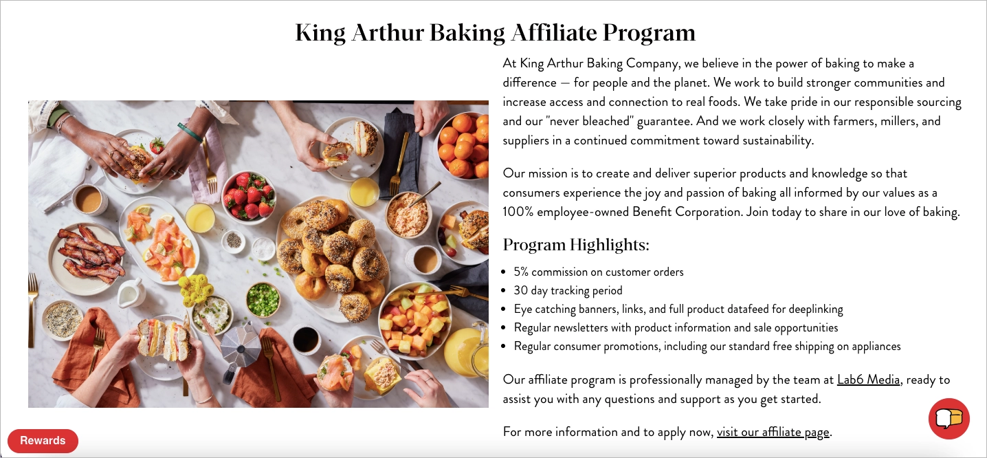
20. King Arthur Baking Company
The King Arthur Baking Affiliate Program landing page embraces a warm, community-driven approach that aligns perfectly with the brand’s values of quality, tradition, and passion for baking. It opens with a welcoming headline — “Join the King Arthur Baking Affiliate Program” — accompanied by cozy imagery of fresh-baked goods. The offer is clearly stated: 5% commission on every referral purchase.
The page emphasizes trusted brand recognition, a loyal customer base, and seasonal promotions that help affiliates succeed. Its personal tone and simple design make it feel more like an invitation to join a shared mission than a typical sales pitch. The “Sign Up” CTA directs users to ShareASale, maintaining a clean, low-friction onboarding process.
What Works:
- Friendly, values-based tone that resonates with the baking community
- Clear commission details eliminate uncertainty
- Strong alignment with brand mission and customer values
- Simple, focused layout that enhances trust
What Could Improve:
- Adding testimonials or affiliate stories would build social proof
- Including more lifestyle visuals (e.g., baking creators in action) could deepen emotional appeal
How to Create a Landing Page for Affiliate Marketing?
To create a landing page for affiliate marketing, focus on crafting a compelling headline with appealing visuals and concise copy to engage visitors, along with clear CTAs and relevant social proof to boost conversions. Use Landingi, pick up a perfect template, or generate your page draft with Composer and go to a user-friendly editor to customize its design. To create a landing page for referral marketing, it is essential to include the following elements for the best outcomes:
Compelling Headline & Hook
Your headline is the first — and often only — chance to capture attention. It should clearly state the main benefit of your offer and spark curiosity. A strong headline keeps visitors engaged long enough to discover your affiliate product and reach your CTA.
In Landingi’s editor, you can quickly customize the headline by clicking on the text element and replacing it with your copy. Use the AI Text Assistant to generate variations that align with your audience and value proposition. Aim for clarity, brevity, and direct benefit language — avoid vague or generic phrases.

Appealing Visuals & Simple Design
Effective visuals help your landing page communicate faster and more clearly than text alone. Images draw attention, support your message, and increase engagement, especially when they align with the affiliate product and user intent. A clean, distraction-free design ensures visitors stay focused on your offer and call to action.
In Landingi’s editor, you can easily add and customize visuals. Use the Image widget from the left panel to drag and drop images onto your page. Open the Image Gallery to upload branded graphics or product visuals. You can also use the AI Assistant to remove backgrounds, apply effects, or set clickable actions to guide user behavior.

Use high-quality images that support your message, such as product previews, lifestyle shots, or visual cues pointing toward your CTA. Keep the layout minimal, with plenty of white space and a consistent color scheme to maintain a polished, user-friendly design.
Clear, Concise Copy
Strong copy is essential for converting visitors into affiliates or customers. It should speak directly to your audience’s needs, highlight how your offer solves their problem, and guide them smoothly toward your call-to-action. Avoid fluff — focus on benefits, not just features.
Striking the right balance is key: too short, and your message may feel incomplete; too long, and you risk losing attention. Aim for short paragraphs, bold subheadings, and persuasive language that builds interest and trust as users scroll.
With Landingi’s AI Text Assistant, you can generate effective, targeted copy in seconds. Select any text widget, click the AI Text Assistant, then enter your company name, describe your offer, and specify the goal of your landing page. Choose whether you want full-page copy or just a few sections, select your language, and click Generate text. You’ll instantly get conversion-ready copy you can use or refine.

Relevant Social Proof
Social proof builds trust and credibility, especially in affiliate marketing, where audiences often rely on others’ experiences before taking action. Testimonials, reviews, endorsements, and partner logos help validate your offer and reduce hesitation.
Showing a variety of social proof can be more persuasive than a single quote. Consider including customer testimonials, affiliate earnings, ratings, media mentions, or trust badges to support your message and drive conversions.
In Landingi, most templates include built-in social proof sections. To add one manually, drag the Section widget from the left panel and select a testimonial layout. You can edit the content using text widgets or add visual elements like badges or logos near your CTA or in the hero section. Use real quotes, names, or images when possible to maximize authenticity.

A Direct Call-to-Action (CTA)
Your call-to-action is where the conversion happens — it tells visitors exactly what to do next. Whether it’s “Join Now,” “Start Earning,” or “Get Access,” your CTA should be clear, specific, and action-oriented. Avoid vague phrases and eliminate friction by making the process simple and unmistakable.
To increase effectiveness, place your CTA in key positions — such as the hero section and after key benefit sections — and repeat it as needed throughout the page. Use A/B testing to compare variations and analyze micro-conversions to understand where users hesitate and how to improve.
In Landingi, you can easily create and customize CTAs using the Button widget. Drag it onto your page or select an existing button, then use the toolbar on the right to adjust font, color, shape, and actions. Create a short, compelling label (e.g., “Join the Program” or “Start Earning Today”) and link it directly to your form, sign-up page, or external affiliate portal.

Know Your Benefits, Make Them Clear
A high-converting affiliate landing page starts with knowing your audience and clearly communicating what they gain. Visitors should instantly understand what’s in it for them — whether it’s earning commissions, solving a problem, or accessing exclusive content. Highlight benefits over features, and focus on outcomes your audience values most.
Tailor your messaging to match your audience’s needs, goals, and language. The more specific and relevant your content, the more likely you are to build trust and drive action.
With Landingi’s AI Text Assistant, use the “Tailor audience” feature to define who you’re targeting, select the appropriate tone, and emphasize specific benefits. This helps you generate page content that resonates and converts — whether you’re targeting niche affiliate traffic or broader segments. The clearer the benefit, the stronger the impact.

What is The Best Affiliate Landing Page Builder?
The best affiliate landing page builder is Landingi, thanks to its drag-and-drop editor, conversion-focused tools, and robust optimization features. Marketers can run A/B tests to identify the highest-performing elements and use EventTracker to analyze user behavior. Landingi also includes a customizable form builder, essential for collecting leads and engaging potential customers.

With over 170 integrations with leading MarTech apps, Landingi seamlessly connects with your broader marketing ecosystem. It also offers a wide library of fully customizable templates, allowing users to quickly create affiliate landing pages tailored to their target audience.
Choosing the best landing page builder depends on your goals, technical skills, and budget. Below are some top alternatives:
Leadpages
Leadpages offers a user-friendly interface and a broad range of templates designed for high conversion rates. It’s great for beginners and small teams looking for simplicity and speed.
Unbounce
Unbounce is known for advanced features like dynamic text replacement, smart traffic, and AI-driven optimization. It’s best suited for experienced marketers who want more testing and targeting options.
Instapage
Instapage supports collaboration with real-time team editing and advanced analytics. It’s a strong choice for agencies or marketing teams working on multiple campaigns.
ClickFunnels
ClickFunnels goes beyond landing pages, offering complete sales funnel functionality. It’s ideal for affiliate marketers who want to guide users through multi-step journeys with upsells, downsells, and email automation.
When choosing a landing page builder, consider:
- Ease of use
- Template quality and variety
- A/B testing and analytics
- Integration with your existing tools
- Scalability and pricing
- Customer support and learning resources
Take advantage of free trials to evaluate which platform aligns best with your affiliate marketing goals.
Stop losing traffic – convert visitors into buyers with high-performing Landingi pages.
How Can I Optimize My Affiliate Landing Page for Higher Conversion Rates?
To optimize your affiliate landing page for higher conversions, start with a clear and compelling headline that immediately communicates the main benefit of your offer. Use concise, persuasive copy that speaks to your audience’s needs and leads them toward action. Make sure your call-to-action (CTA) is specific, visually prominent, and uses strong language like “Get Instant Access” or “Start for Free.”
Add social proof through testimonials, reviews, or trust badges to build credibility. Use high-quality visuals to support your message and keep the design clean and mobile-friendly. Page speed matters—optimize loading times by compressing images and minimizing unnecessary code.
Run A/B tests to find out which headlines, layouts, and CTAs perform best. Tools like Landingi’s EventTracker can give you valuable insight into user behavior. Creating a sense of urgency with limited-time offers or countdowns can also help drive quicker decisions. All of these elements work together to increase engagement and boost conversion rates.
What Are The Key Elements of an Effective Affiliate Landing Page?
An effective affiliate landing page includes the following key elements:
- Attention-grabbing headline
- Subheadline that elaborates on the main benefit
- High-quality images or videos of the product or service
- Clear and concise product description
- Bullet points highlighting key features and benefits
- Customer testimonials or reviews
- Trust badges or security seals
- Clear and prominent call-to-action buttons
- Limited-time offers or scarcity elements (when appropriate)
- FAQ section to address common concerns
- Exit-intent pop-up
Continue reading to discover more about these elements.
Attention-grabbing Headline
Craft a persuasive, benefit-driven headline that captures attention instantly.
Example: “Earn Big with Our Top-Rated Affiliate Program – Start Making Money Today!”
Subheadline
Support the headline by expanding on the value. Mention secondary benefits to increase interest.
Example: “Maximize Your Earnings – Enjoy High Commissions and Exclusive Marketing Support.”
High-quality Images or Videos
Use professional, relevant visuals that showcase the product or its results. Demonstrations, before-and-after images, or branded graphics can build trust and engagement.
Clear and Concise Product Description
Provide a brief, jargon-free explanation of what the product does and why it matters. Break it into sections or short paragraphs for easy scanning.
Bullet Points of Key Features and Benefits
Make the core offer clear and digestible. For example:
- High commission rates to maximize your earnings
- Ready-to-use marketing resources
- Real-time tracking and detailed performance analytics
- Dedicated support team for affiliatesCustomer Testimonials or Reviews
Customer Testimonials or Reviews
Add 3–5 authentic testimonials with photos, names, or affiliations if possible. Real stories build credibility and help visitors see the potential impact.
Trust Badges or Security Seals
Display recognizable trust symbols — such as SSL badges, payment provider logos, or industry awards — to reduce hesitation and signal credibility.
Clear and Prominent Call-to-Action Buttons
Use visually striking buttons with action-oriented text like “Join Now” or “Start Earning Today.” Place them strategically across the page to guide users.
Limited-time Offers or Scarcity Elements
Create urgency with phrases like “Only 10 Spots Left” or “Double Commissions This Week Only.” Time-sensitive incentives can push undecided users to act.
FAQ Section
Answer common questions around payments, commissions, tools, and expectations. This builds trust and removes conversion barriers while supporting SEO.
Exit-intent Pop-up
Trigger a pop-up when users move to leave the page. Offer a last-minute incentive — like a bonus guide, a higher commission, or a limited-time offer — to re-engage them.
The right landing page makes all the difference! Design yours with Landingi now.
What Is the Average Affiliate Landing Page Conversion Rate?
The average affiliate landing page conversion rate is approximately 2.35% across all industries, according to Capturly. However, actual performance can vary widely based on niche, offer type, traffic source, and landing page quality.
Here are general benchmarks to keep in mind:
- Average: Around 2% to 3%
- Good: 2% to 5% (SeedProd)
- Exceptional: 10% to 15% or more (SeedProd)
- E-commerce average: 2.5% to 3% (Speed Commerce, 2024 report)
Affiliate marketing remains effective overall — 60% of business leaders report success in converting leads through affiliate programs.
Key Factors That Influence Conversion Rates:
- Niche: B2B offers may convert lower than B2C but bring higher-value leads.
- Traffic Quality: Targeted traffic from email or SEO performs better than untargeted paid ads.
- Offer Type: Free trials and low-cost offers convert better than high-ticket products.
- Device Type: Desktop users generally convert more, though mobile is catching up.
- Page Quality: Relevant, fast, and well-designed pages see higher conversion rates.
- Brand Recognition: Known and trusted brands enjoy higher trust and click-through rates.
If your landing page receives 1,000 visitors with a 3% conversion rate, that results in 30 conversions. Increasing your rate from 2% to 4% would double your conversions without needing more traffic.
While benchmarks are helpful, focus on testing and improving your own page over time through A/B testing, better targeting, and optimized design.
Build Landing Pages For Your Affiliate Business With Landingi
Creating high-converting affiliate landing pages is essential for growing your affiliate income. You can build landing pages in your existing CMS — such as WordPress — or use a dedicated landing page builder like Landingi, which offers far more specialized tools designed specifically to boost conversions.
Using a professional platform like Landingi comes with several key advantages. Its drag-and-drop editor makes page creation fast and code-free. You also get access to A/B testing, Smart Sections for reusable design blocks, and an AI Assistant that helps generate persuasive, conversion-focused copy. These features are built to save time and improve performance.
Landingi also integrates easily with email marketing tools, CRMs, and analytics platforms, ensuring your landing pages fit seamlessly into your broader marketing stack. With over 400 templates, dedicated affiliate program support, and an intuitive interface, Landingi is ideal for both beginners and experienced marketers.
Instead of piecing together plugins and custom code in a general CMS, a tool like Landingi gives you speed, flexibility, and higher control over performance — all in one place. Plus, with a 14-day free trial, it’s easy to test its full potential risk-free.
Get started today and take advantage of Landingi’s tools, templates, and support to create landing pages that convert.