Creating a high-converting landing page is essential for any successful marketing campaign. A landing page design focuses on simplicity, leverages visual hierarchy, and ensures mobile responsiveness, making it a crucial tool for generating leads and sales. This guide outlines 12 principles that can transform any landing page into a powerful conversion tool. These design principles are:
- Grab attention
- Keep it simple
- Incorporate social proof
- Apply contrast and colors effectively
- Design for people, not algorithms
- Utilize white space
- Write concise headlines
- Add satisfying visuals
- Get serious about landing page copy
- Highlight the value proposition
- Optimize your CTAs
- Implement responsive design
These design guidelines are fundamental, considering that 50% of consumers believe website design is crucial to a business’s brand, as Anna Peck from Clutch reported. This statistic suggests that companies should prioritize web design to align with consumer expectations and enhance their brand perception effectively.
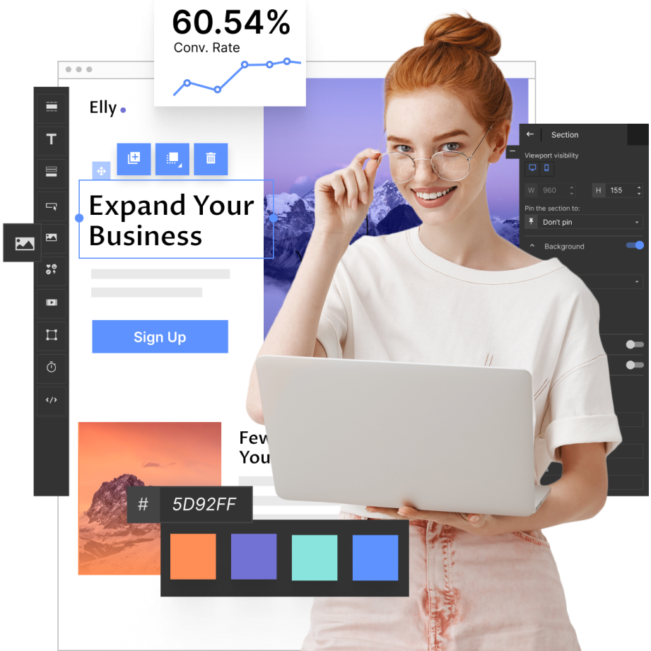
Landing page design can be efficiently managed with Landingi. By utilizing their design services, templates, and builder, the creation process is significantly streamlined, laying a solid foundation for an impactful landing page. Landingi offers essential tools for businesses to create professional and optimized pages, customizing design services to ensure visual appeal, functionality, and a focus on driving conversions. Moreover, the templates and builder assist in maintaining consistency and incorporating trust signals, making the design process even more effective.
What Are The Core Principles Of a Landing Page?
The core principles of a landing page begin with a compelling headline. This headline must be clear, concise, and aligned with the ad or link that brought the visitor to the page, instantly communicating the page’s value proposition. Alongside the headline, an eye-catching and relevant image or video can significantly enhance engagement. The imagery should complement the message and evoke the desired emotional response. A well-crafted landing page also includes concise, benefit-focused copy that highlights what the user will gain. Bullet points are particularly effective for breaking down information into digestible chunks, making it easier for the visitor to quickly understand the offer.
Another critical principle is a strong call to action (CTA). The CTA should be prominently displayed and compelling enough to encourage immediate action. It should stand out visually and be straightforward, telling the visitor exactly what they need to do next. Moreover, the landing page should have a clean, uncluttered design to keep the visitor’s attention focused on the essential elements. Removing navigation menus and external links helps minimize distractions, guiding the user towards the CTA. Additionally, trust elements such as testimonials, reviews, and badges can significantly boost credibility and persuade visitors to convert.
The core principles of a landing page revolve around creating a user-centric design that drives conversions. This includes focusing on simplicity, ensuring consistency, and optimizing for speed and responsiveness.
12 Landing Page Design Principles
Effective landing page design hinges on twelve key principles that aim to capture visitor interest and drive conversions. These principles emphasize the importance of grabbing attention through compelling visuals and headlines, maintaining simplicity, and incorporating social proof to build trust. The strategic use of contrast and color, user-friendly designs, and white space contribute to an optimal user experience. Additionally, persuasive copy, a strong value proposition, optimized CTAs, and responsive design ensure that the landing page is appealing and functional across all devices. Together, these elements create a cohesive and effective landing page that encourages visitor interaction and boosts conversion rates.
Landing page design principles are important guidelines for creating effective and high-converting landing pages. See the list below for more details.
1. Grab Attention
The first principle of landing page design is to grab the visitor’s attention immediately. This can be achieved through compelling headlines, striking images, and engaging videos. The goal is to make a strong first impression that encourages visitors to stay on the page and explore further. Effective use of color and contrast can also draw attention to important elements, such as the call-to-action (CTA) button.
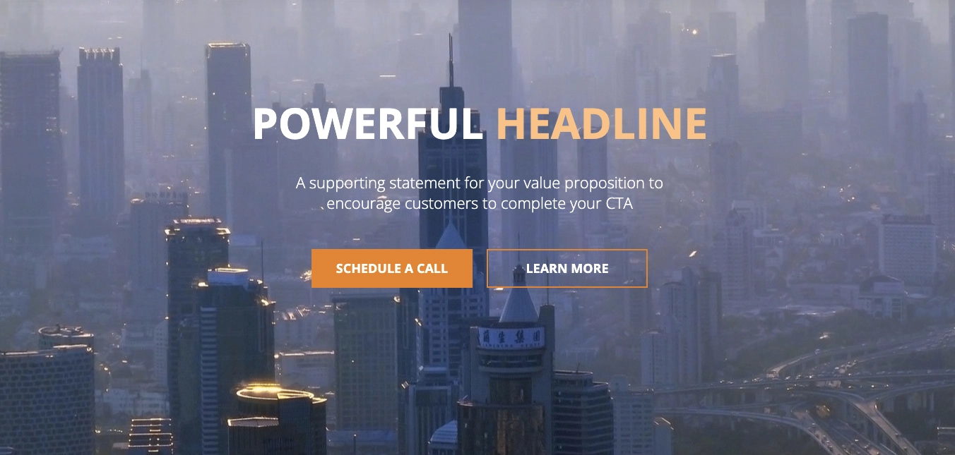
It’s essential to prioritize the layout and content above the fold as it’s crucial for capturing attention. The key information should be placed at the top to grab the reader’s attention immediately, and all elements above the fold should be visible without the need for scrolling when the page loads.
What should you insert in the above the fold area?
- Logo: This is the very first step towards building brand awareness and helps people connect your landing page with your brand on the spot. Make sure it’s visible by putting it at the top left or top right.
- A catchy headline: Consider what might be most valuable for your target group and highlight the main benefits.
- Key message: You gain readers’ attention in the first 1-4 seconds, so keep the message straightforward!
- An eye-catching and relevant image: Be it a mock-up, photo, visualization, or an explainer video. Pictures speak louder than words!
- CTA button: To convert visitors, it should be compelling and action-oriented, but firstly accessible in the above-the-fold part of the page. Make sure it’s clickable and your potential clients can purchase from there.
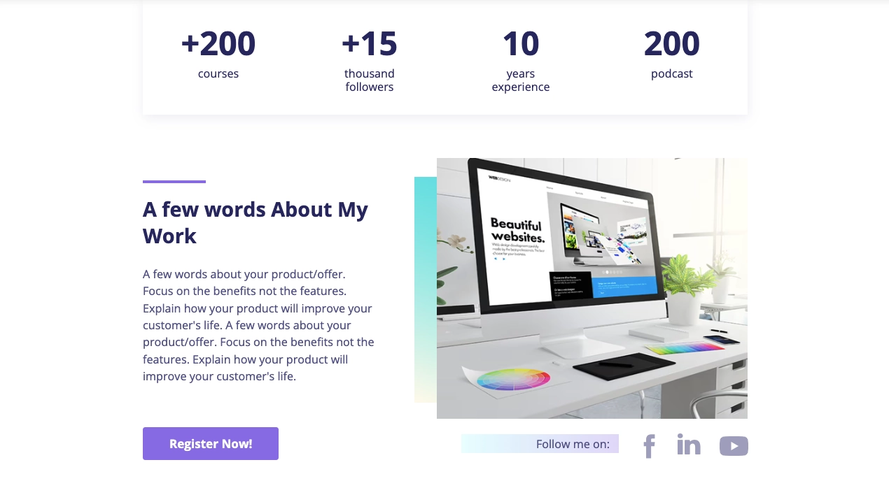
The hero section of this template includes all the necessary elements.

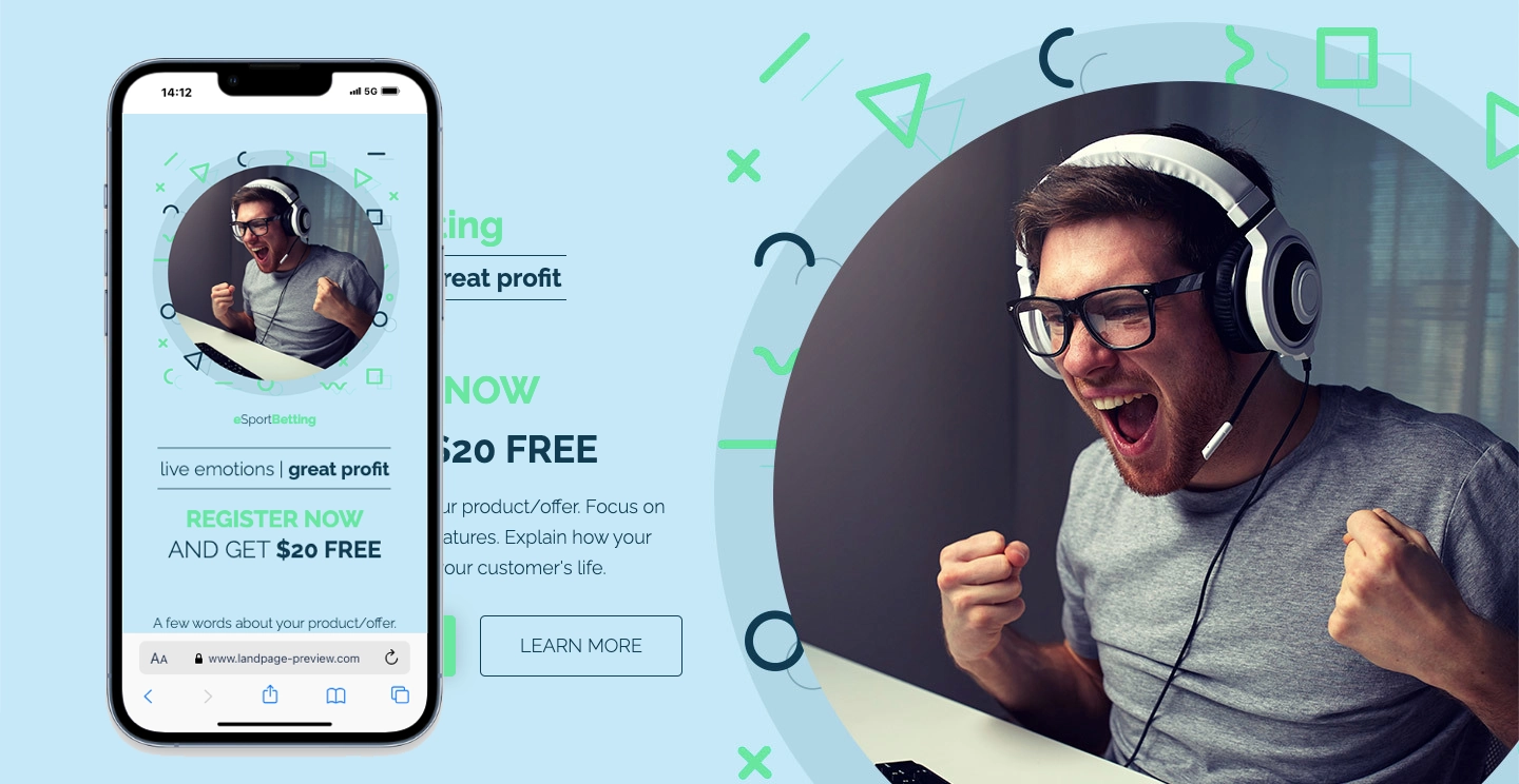
2. Keep It Simple
Landing page design focuses on simplicity, avoiding clutter and unnecessary information to keep the visitor’s focus on the key message. A landing page that is packed with too much information will overwhelm the reader. That’s why it’s vital to find a solution that reduces the number of essential details to a minimum. It needs to be brief, concise, and to the point.
Statistics support this approach – according to HubSpot, 76% of consumers say that the most important factor in a website’s design is “the website makes it easy for me to find what I want.”
A clean and straightforward design helps visitors understand the offer quickly and easily. Simplifying the layout, reducing the number of form fields, and eliminating distractions are key strategies to keep the design simple and effective.
Streamline the form by minimizing it. Aim to simplify the entire process leading to the goal as much as possible. Consider which information about the lead is truly necessary and eliminate any redundant or non-essential questions. This approach will not only speed up the process but also improve the user’s experience by reducing effort and frustration. People are more likely to complete a form if it doesn’t take much time.
The simplicity of this SaaS landing page template is what makes it stand out.
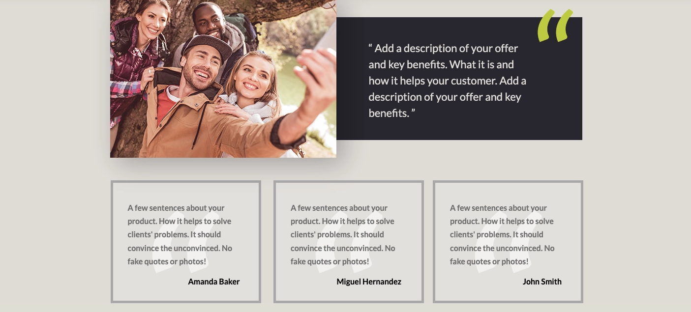
3. Incorporate Social Proof
Social proof is a powerful tool for building trust and credibility with visitors. It leverages the influence of others’ experiences to reduce skepticism and encourage action. To effectively incorporate social proof, include testimonials from satisfied customers, highlighting specific benefits they have received. Showcase reviews and ratings from credible sources to demonstrate widespread approval.
Case studies are particularly impactful, as they provide detailed accounts of how your product or service has successfully solved problems for clients. Displaying logos of well-known clients or partners can also enhance credibility, signaling to potential customers that reputable organizations trust your brand. Integrating social proof throughout your landing page, especially near the call-to-action (CTA) button, can significantly boost conversions.
The Travely template is a great example of how to effectively incorporate testimonials on a landing page.
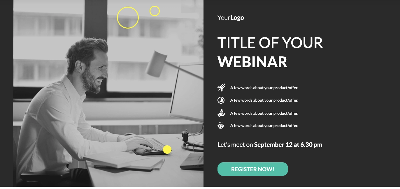
4. Apply Contrast and Color Effectively
Using contrast and color effectively is crucial for highlighting important elements on the page. Contrasting colors can make the CTA button stand out, guiding the user’s attention to where you want them to click.
Consistently using brand colors helps maintain a cohesive and professional look. It’s important to ensure that color schemes reflect your branding, as they can impact brand awareness and the connection between a specific campaign and your overall brand. If visitors can’t see the connection between your landing page design and brand, they might become confused and leave your site to never look back.
The first thing people see is the visuals, followed by the text. Therefore, consistent landing page design is essential to encourage visitors to stay on the site.
Effective use of color scheme enhances the visibility of the CTA and value proposition on this Webinar Sale landing page template.
5. Design for People, Not Algorithms
Landing page design prioritizes user experience, focusing on creating a page that is intuitive and easy to navigate for real users. While SEO is important, the primary focus should be on designing for human visitors. This includes using clear and concise language, intuitive navigation, and ensuring that the most important information is easily accessible.
Try to personalize your message so that the recipient perceives it more individually. The key is content with a strong narrative that appeals to the audience’s emotions and personal circumstances. People want to hear how the product or service might influence their lives or work.
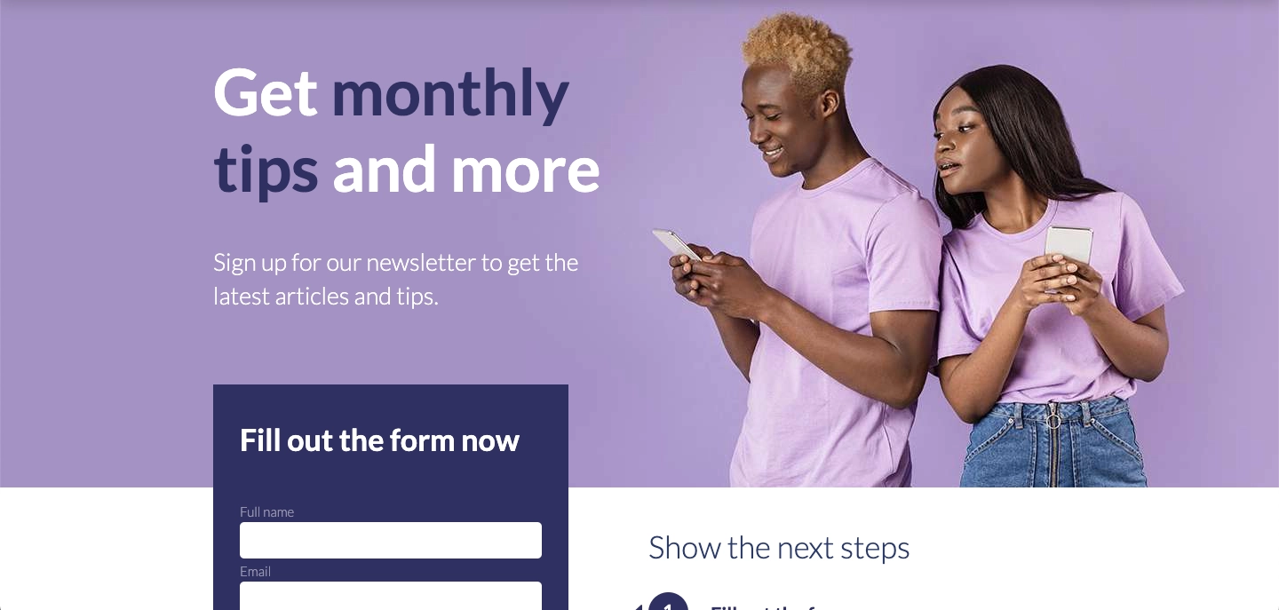
The clear layout of the Newsletter landing page template qualifies it as an excellent web design.
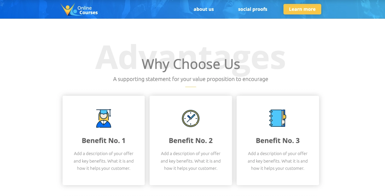
6. Utilize White Space
White space, or negative space, is an essential design element that helps create a clean and organized look. Utilizing white space effectively can make the page more readable and help draw attention to key elements. It prevents the page from feeling cluttered and overwhelming, enhancing the overall user experience.
Similarly, using short paragraphs with headings, subheadings, and bullet points allows readers to scan the text quickly and focus on their areas of interest.
White space utilized in the Online Course template directs attention to text and visuals.
7. Write Concise Headlines
Headlines are often the first thing visitors read, so they need to be clear and concise. Craft headlines that immediately convey the main benefits and value propositions effectively. Avoid jargon and focus on what matters most to your audience.
A strong headline can capture attention and encourage visitors to read further. For example, instead of saying “Our Product Helps Improve Efficiency,” you could say “Boost Your Efficiency by 50% with Our Product.” This approach highlights a specific benefit and provides a clear reason for visitors to continue exploring the page.
When writing headlines, consider A/B testing different versions to see which ones resonate most with your audience. The goal is to create headlines that are not only attention-grabbing but also informative and aligned with the overall message of your landing page.
Headings in this landing page template are well-positioned, engaging the audience effectively right from the start.
8. Add Satisfying Visuals
Visuals play a crucial role in engaging visitors and conveying information quickly. Use high-quality images, videos, and graphics that are relevant and add value to the content. Visuals should support the overall message and help illustrate key points. Ensure that images and videos are optimized for fast loading times.
No other content may engage the viewer as much as an interesting short video that illustrates a product or service’s values. In fact, according to Wyzowl’s video marketing study, 82% of consumers make a purchase after watching a video! Plus, you can communicate more information within a short period of time.
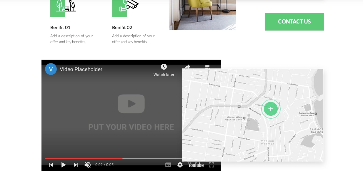
With this Real Estate landing page template, you can present your offer using videos and high-quality visuals.
9. Get Serious About Landing Page Copy
The copy on your landing page should be persuasive and relevant to your target audience. Address your visitors’ needs and pain points and clearly explain how your product or service can help. Focus on benefits rather than features and use a strong narrative that appeals to emotions. Effective copywriting can significantly increase conversions.
Try using language that indicates that access to the product or service may be limited, i.e., use the FOMO approach. This will make visitors more motivated to take action and to do so faster in order not to miss a unique opportunity.
Try connecting your copy with a countdown timer to create a sense of urgency, similar to the strategy used in this landing page template.

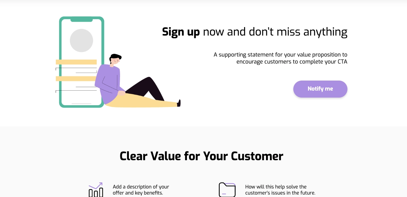
10. Highlight the Value Proposition
Your value proposition is what sets you apart from competitors. Clearly state what makes your product or service unique and valuable to the user. Highlight the key benefits and features that solve the visitor’s problem or fulfill their needs. A strong value proposition can convince visitors to choose your offer over others.
To effectively highlight your value proposition, use concise and impactful language that communicates the core benefits. For example, “Unlock Faster Growth with Our Advanced Analytics Platform” succinctly tells the visitor what they can expect. Incorporate visual elements like icons or infographics to reinforce your message and make it more memorable.
Position your value proposition prominently on the landing page, ideally above the fold, so it’s one of the first things visitors see. Reiterate it throughout the page to reinforce the key benefits and ensure that it remains top-of-mind as visitors move towards the CTA.
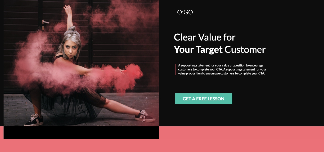
This landing page design perfectly directs visitors’ focus toward the value proposition.
11. Optimize Your CTAs
The call-to-action (CTA) button is a critical element of any landing page. Design prominent and compelling CTAs that stand out and encourage visitors to convert. Use action-oriented language that clearly tells visitors what they will get by clicking the button. Test different CTA designs, colors, and copy to find the most effective combination.
Human nature compels us to pay attention to anything that is highlighted, distinguished, or in contrasting colors. Therefore, when placing the CTA button on your landing page design, ensure that it stands out from the background in order to be noticed within seconds.
Well-optimized CTA on this landing page template ensures visitors know what to do and what to expect.
12. Implement Responsive Design
Landing page design ensures mobile responsiveness, providing a seamless experience across all devices. With a growing number of users accessing the web via mobile devices, it’s essential to ensure that your landing page looks and functions well on smartphones and tablets. Use a responsive design that adjusts to different screen sizes and orientations.
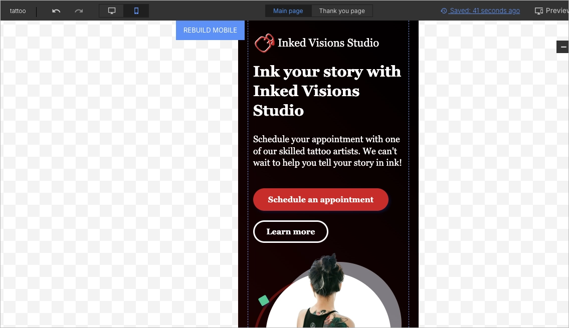
Your chosen landing page builder should support the intuitive creation of responsive web design. It would be perfect to have the option to edit the mobile view separately, as it allows you to optimize it exactly for mobile users. This is what you have in Landingi editor, where the mobile view of the landing page is built automatically based on the desktop view, but you can also change it independently anytime you need.
See the Esport template by Landingi in two versions: desktop and mobile. They are perfectly cohesive, though the dislocation of elements may be a bit different.
What Are The Best Landing Page Design Examples?
The best landing page design examples showcase how strategic design principles can enhance user experience and boost conversion rates. The Yieldbird Prebid Stack landing page features a bold headline, clear subheading, ample white space, and high-quality visuals. Attio’s landing page has a clean look, concise messaging, and a responsive design that guides users to the call-to-action buttons. Oh My Code’s page grabs attention with its striking headline, minimalist layout, and vibrant CTAs. All three landing page examples highlight the importance of strategic white space, strong CTAs, social proof, and clear value propositions in creating engaging and effective landing pages. They are also achieving great performance results and fast page load speeds.
#1 Yieldbird
The Yieldbird Prebid Stack landing page is an exemplary model of effective landing page design, adhering to essential principles that enhance user experience and conversion rates.
This landing page immediately grabs attention with a bold and clear headline, “Prebid Stack. The most efficient Prebid management dashboard,” followed by a concise subheading explaining its core value proposition. The simplicity of the design, with ample white space and clean lines, ensures that the user’s focus remains on the key message without unnecessary distractions. High-quality visuals, including illustrative images and icons, complement the textual content, adding to the page’s overall appeal.
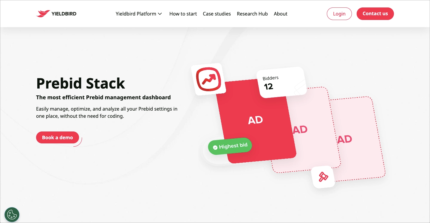
Social proof is incorporated through client testimonials, showcasing positive feedback from satisfied users, which helps build trust and credibility. The page uses a consistent color scheme with strategic contrasts to highlight important elements such as the call-to-action (CTA) buttons. These CTAs, like “Book a demo” and “Start a free trial,” are prominently placed, encouraging user engagement.
Key takeaways to learn from this example:
- Effective use of visuals: The illustrations and client logos enhance the visual appeal and break up text, making the page engaging.
- Concise and clear headline: The main headline is straightforward and effectively communicates the value proposition.
- Social proof: Featuring client testimonials and partner logos builds credibility and trust with potential users.
- Prominent CTAs: The call-to-action buttons are highly visible, encouraging users to engage with the platform.
- Strategic use of white space: Keeps the design uncluttered and focused.
#2 Attio
The Attio landing page exemplifies effective design principles, ensuring an engaging and user-friendly experience for visitors. The page immediately grabs attention with a clean and professional look, featuring a bold headline “CRM for data-driven sales teams” that clearly communicates the core value proposition. The concise subheadline and the visually appealing design elements support the message, making the value proposition clear and compelling.
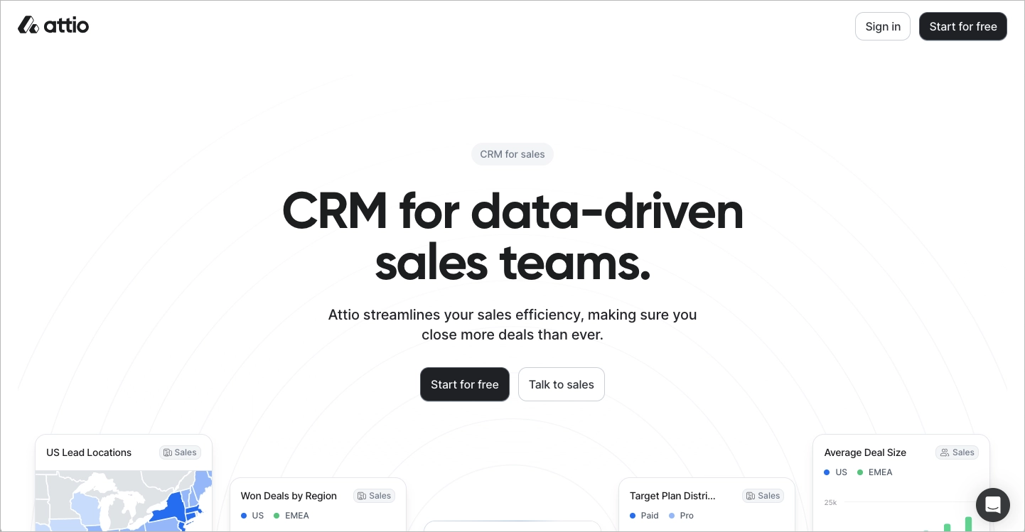
Key strengths of this landing page include the use of contrasting colors and ample white space, which guide the visitor’s eye towards the most critical elements, such as the call-to-action buttons. The primary CTA, “Start for free,” is prominently displayed, encouraging users to take action. The use of social proof is another strong aspect, with testimonials and user statistics enhancing credibility. The landing page incorporates engaging visuals and an intuitive layout, ensuring a seamless user experience across different devices through responsive design.
Key takeaways to learn from this example:
- Clear and concise headline and subheadline: The copy effectively communicates the value proposition.
- High-quality images and use of white space: Visuals improve the attractiveness and readability of the content.
- Simplicity: The straightforward layout and clear messaging ensure easy navigation and understanding.
- Strong CTAs: Buttons are strategically placed to encourage user action.
- Responsive design: Mobile-friendliness ensures a seamless experience across devices.
#3 Oh My Code
The landing page of “Oh My Code” is an exemplary model of effective landing page design, adhering to fundamental principles that ensure user engagement and conversion. The page opens with a captivating headline, “Marre des QR codes moches ?” (Tired of ugly QR codes?), immediately grabbing the visitor’s attention and clearly addressing a common pain point. The headline is accompanied by a strong value proposition, offering a solution with customized, visually appealing QR codes. This initial interaction is enhanced by visually satisfying elements, including high-quality images and a hero section showcasing a significant number of QR codes created, which serves to build credibility and social proof.
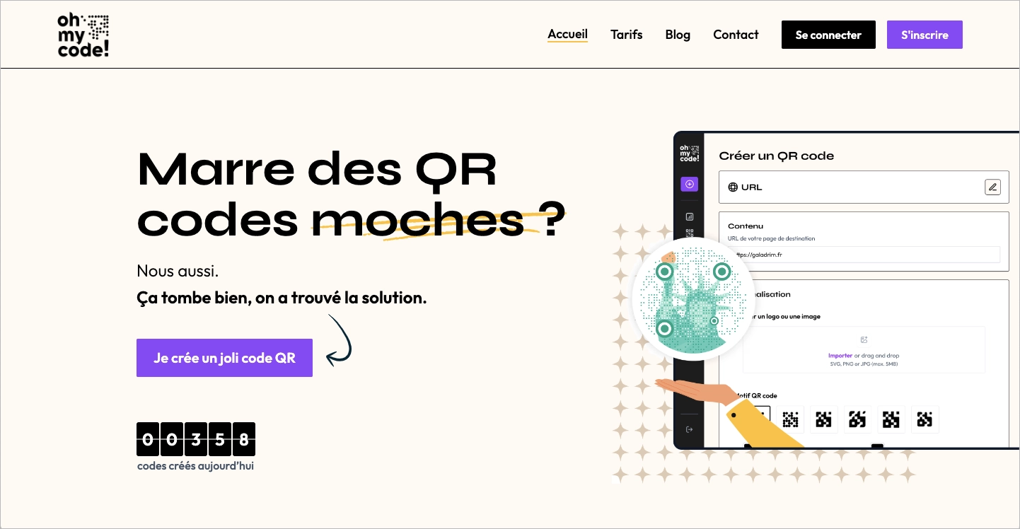
The design utilizes a minimalist layout with ample negative space, guiding the user’s eye towards key information without overwhelming them. The color contrast is applied effectively, with vibrant CTA buttons that stand out, such as “Je crée un joli code QR” (Create a pretty QR code), ensuring that the desired actions are prominent and enticing. The page’s copy is concise and engaging, explaining the benefits of their service in straightforward language that appeals directly to the user. Additionally, the landing page includes testimonials and visual examples of customized QR codes, further incorporating social proof and demonstrating real-world applications of their product.
Key takeaways to learn from this example:
- Attention-grabbing headline and strong value proposition: The headline immediately addresses a user problem, while the value proposition offers a compelling solution.
- Effective use of white space: The layout is clean and uncluttered, focusing user attention on important elements and CTAs.
- Incorporation of social proof: Testimonials and examples of real QR codes build credibility and trust with potential users.
- Effective contrast and color use: Vibrant CTAs and strategic color choices make the page visually engaging and guide user actions.
- Concise and engaging copy: The text is straightforward and relatable, effectively communicating the benefits of the service.
What Is The Best Tool For Implementing Landing Page Design Principles?
The best tool for implementing landing page design principles is Landingi. It offers a comprehensive suite of tools and services to create, customize, and optimize landing pages effortlessly. Landingi platform includes:
- an intuitive, visual builder for landing pages, pop-ups, lightboxes, and sections
- fully customizable widgets and templates
- 180+ integrations with external apps
- A/B testing tool
- lead inbox
- possibility to add custom HTML, JavaScript, or CSS codes
- built-in AI Assistant for content generation, SEO content generation, and background removal
- EventTracker for gathering all data about events occurring on landing pages
- more add-ons such as Smart Sections, automatic translations, ecommerce hub, agency hub, etc.
Using Landingi, you can effortlessly create professional and high-converting landing pages without needing coding skills, making it one of the best landing page optimization tools.
How Can Landingi Templates Streamline The Landing Page Design Process?
Landingi templates streamline the design process by providing pre-built, customizable layouts that follow best practices. These templates are designed to be visually appealing, functional, and optimized for conversions, saving time and ensuring high-quality results.
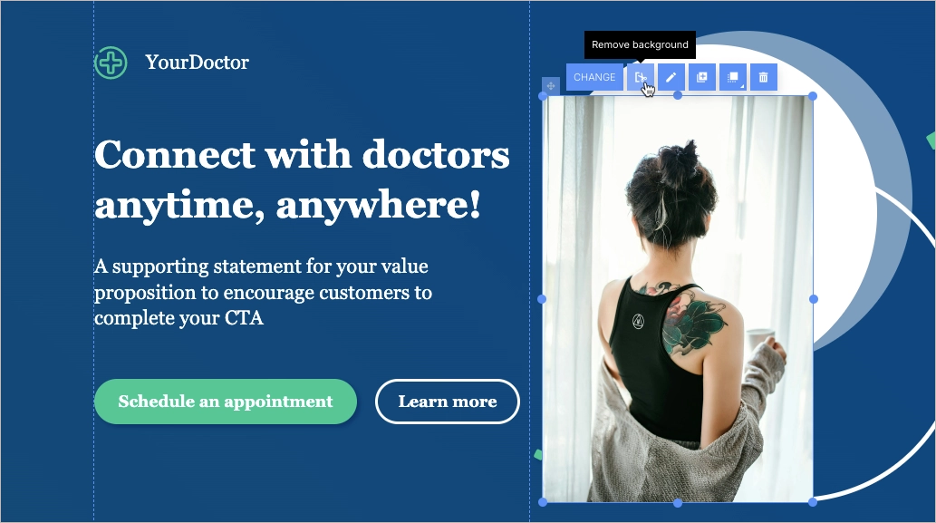
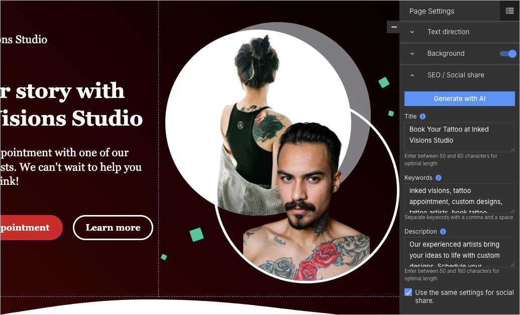
For instance, let’s take the Call Doctor template and attempt to adjust it for a tattoo studio. To learn more about the creation process and possibilities, check the Help Center.

First, we need to update the pictures in the first section. We can either upload our own images or find free ones in the Unsplash library. By using AI background removal, we will remove only what is unnecessary from the image. Additionally, we will place the images within an ellipse shape to give them a rounded appearance.
Now, let’s modify the colors. The background will be black and dark red, and the button will be red. Also, let’s adjust the content to align with our offerings. The AI Assistant can help generate content ideas.
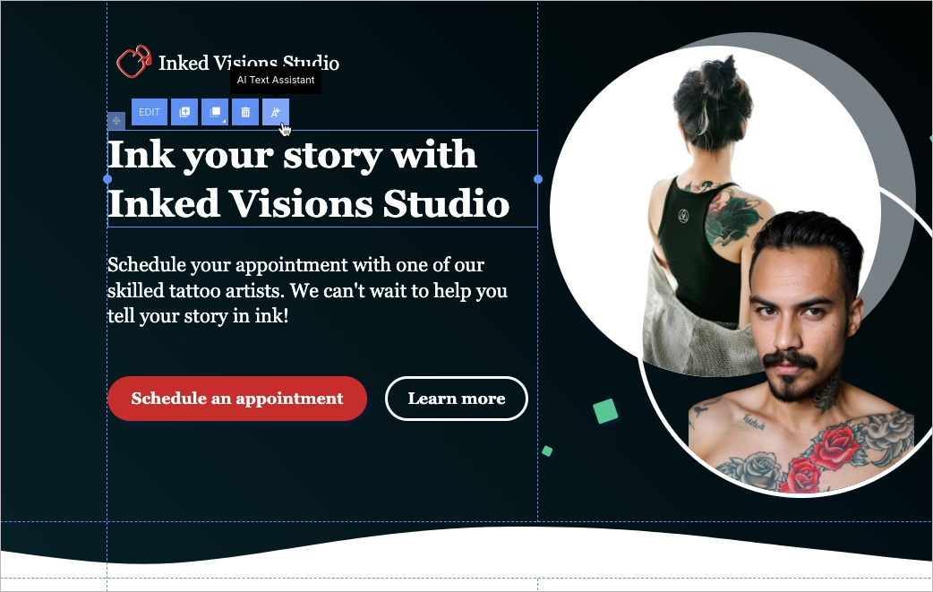
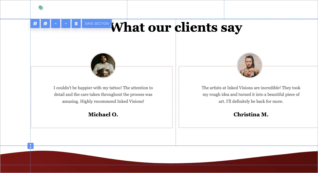
We will customize the rest of the landing page, including the images, headers, descriptions, and form. Additionally, we will add a section featuring reviews from past customers.
Adding a meta title and description will improve the visibility of our landing page in search engine results pages (SERP). We can do this by ourselves or seek assistance from Landingi’s AI Assistant that can generate SEO content based on the existing text on our landing page.
We shall not forget about a mobile version and a thank you page! Let’s make some adjustments.
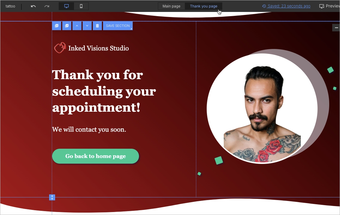
This is the landing page that needed just one hour to be completed, including the mobile version and the thank you page:
By using Landingi templates, you can maintain consistency in design, leverage visual hierarchy, and focus on user experience. The templates cover various industries and purposes, making it easy to find one that suits your needs.
How Can Landingi Design Services Enhance Landing Page Creation?
Landingi design services are professional solutions that enhance the creation of landing pages by providing customized and professional web page design, ensuring each landing page design incorporates trust signals and a visually appealing layout that effectively communicates the brand’s message, engaging visitors and encouraging them to take action.
This approach not only captures attention but also prioritizes user experience. When you lack the capacity, experience, or time, Landingi services are the solution to help you achieve your goals quickly. Their dedication to creating designs that stand out includes ensuring that every landing page is mobile-responsive and optimized for speed. By maintaining consistency and leveraging visual hierarchy, they guarantee maximum impact for your online presence.
Whether you need a completely new design or want to import an existing project into the Landingi platform, our team can handle it efficiently, providing you with a ready-to-use landing page in a short time frame, enabling you to launch your marketing campaigns faster and more effectively than ever before.