

This week’s landing page is something entirely different.
Imagine you need dental implants, and that money is not a problem. You consider your options, look for dental clinics, and find yourself on a landing page. The page shows a Turkey-based clinic that will take care of your beautiful smile.
The question is – how do you make the landing page’s visitors go to Turkey to get their teeth done by you?
Let’s go through this landing page’s elements with a fine-tooth comb to see how its creators chose to present Saphire and what worked best.
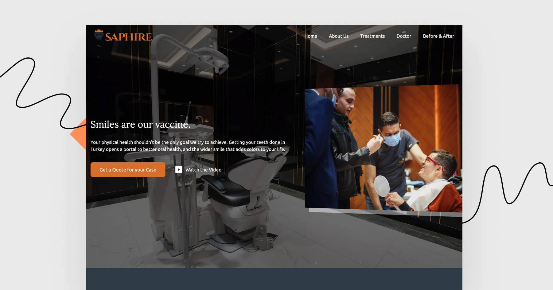
Click here to see this landing page.
What shines?
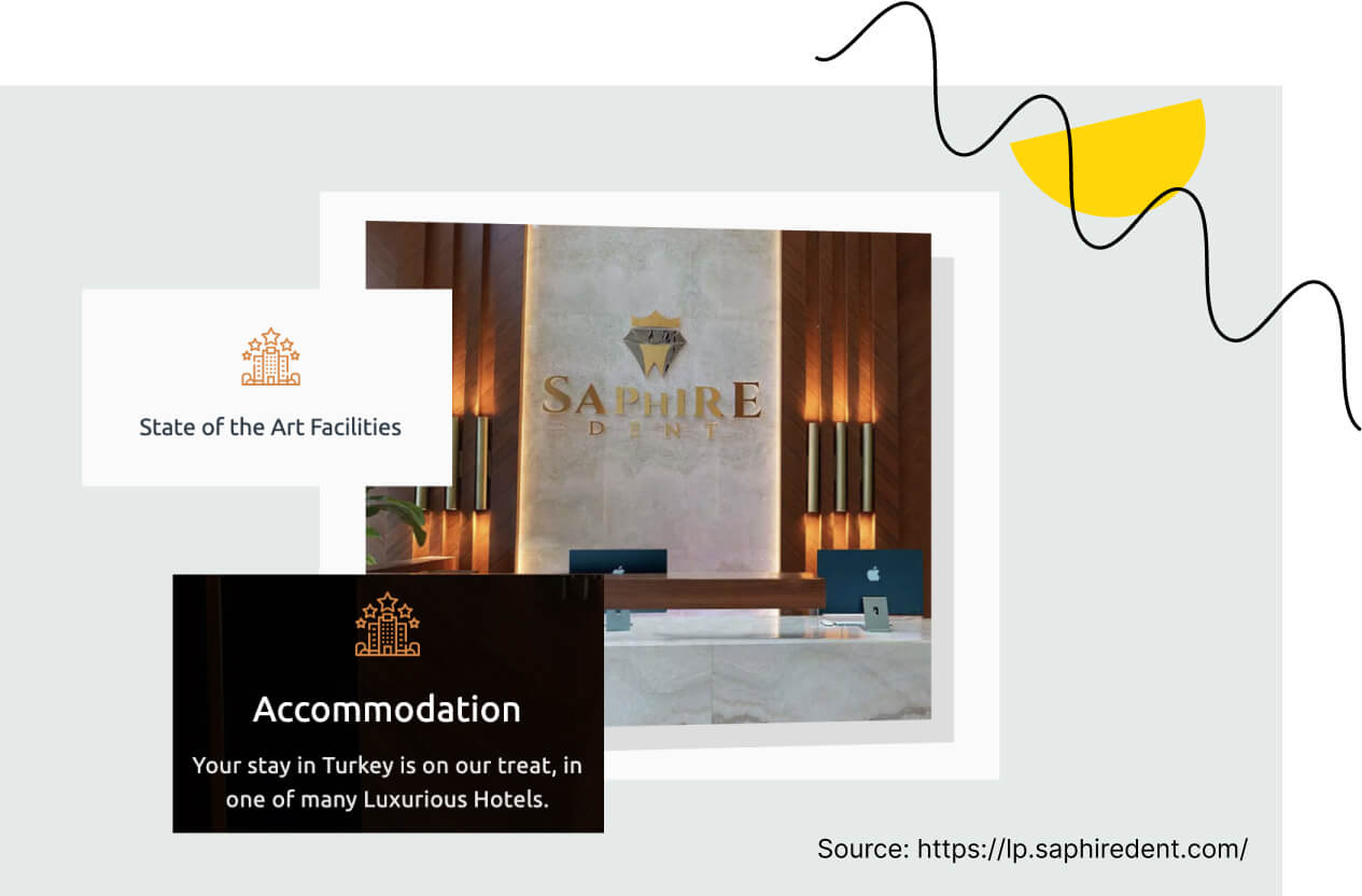
It’s obvious that this clinic is not for everyone. I love how every section screams “luxurious”, “expensive” and “exclusive”. To me, the target group is well-defined (wealthy people in need of dental implants, not afraid to travel abroad).
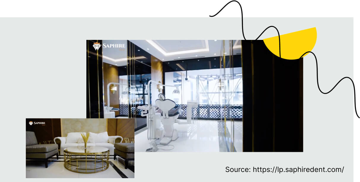
There is a video that serves (at least) two purposes. The first one is to present what the clinic’s facilities look like. The second one is to prove that the clinic exists for real. Let’s be honest – no one would want to travel to a shady dental clinic in another country. The video deals with potential objections.
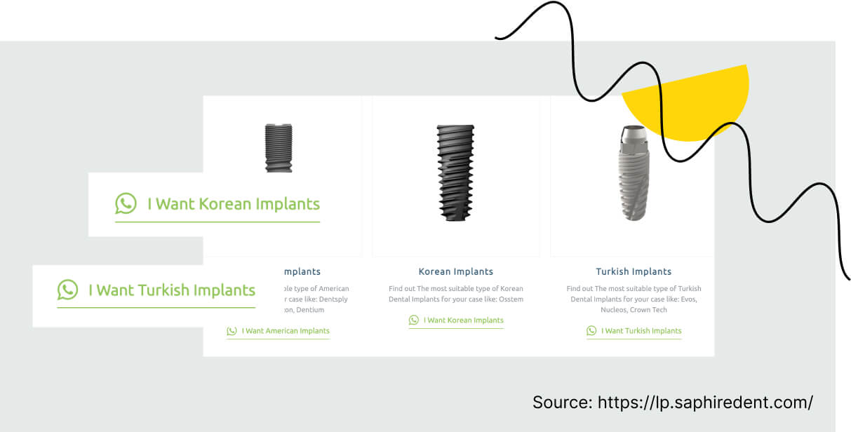
Are you curious to know how much the service costs? Look at CTAs next to the implant types. This page aims to make the visitors open a WhatsApp chat and ask for a quote for their case. (I bet there is a salesperson waiting on the other side who would love to answer all the visitors’ questions.)
What could shine brighter?
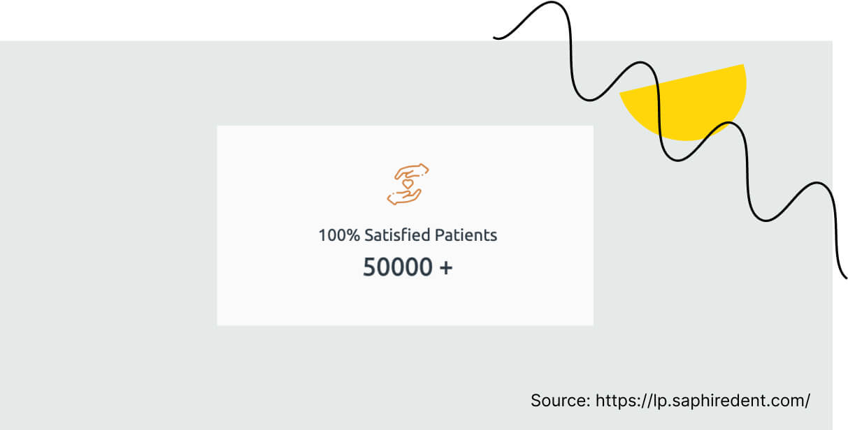
I feel like this page lacks customers’ reviews. It’s lovely that the patients are satisfied, but if I were to go for Saphire Dent, I would need at least one honest review and a living person telling me their story.
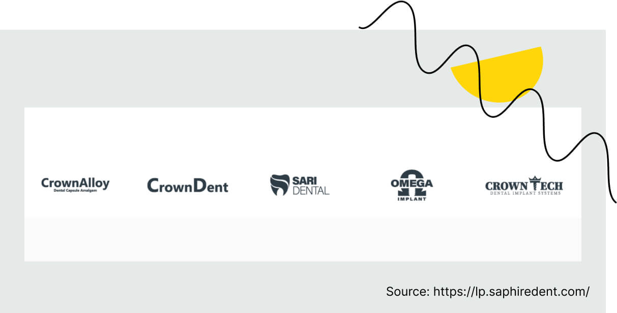
Let’s not forget we’re talking to common people, not cosmetic dentists. A word of explanation on what these brands are would be helpful.
The most important elements of this landing page
Let’s focus on those elements that are considered the most impactful when it comes to fulfilling conversion goals.
Now, let’s go through the most essential elements of this landing page and assess them.
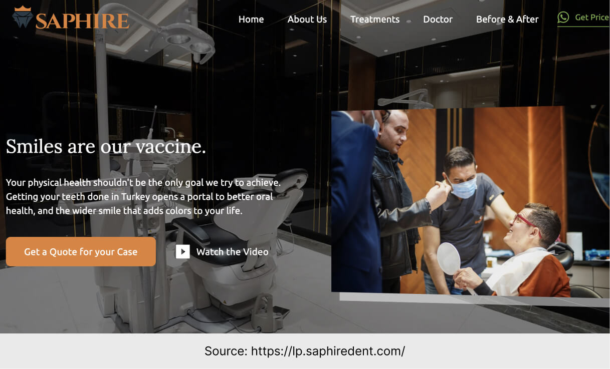
– The main header is “Smiles are our vaccine”. Personally, I don’t buy the vaccine reference. Nevertheless, the header catches attention, presents a unique approach to the smiling business, and is in line with the company’s industry.
– There are numerous CTAs that are all focused on the same conversion goal. They are slightly different and always fit the context (“Get price”, “Get a quote for your case”, “I want (…) implants”). Remember – a good call to action is short, precise, and includes verbs.
– The language and style fit the target group. The landing page is directed to people from all over the world – there is no country of origin specified. Because of that, there are little wordplays, inner jokes, or hidden references. Whenever vocabulary gets harder to understand, there are pictures to illustrate particular implants and methods.
– The design fits the health and beauty industry. Colors like black, white and golden are omnipresent both on the landing page and in the clinic’s rooms.
Landing Page of the Week is a series where I review examples of landing pages from the web.