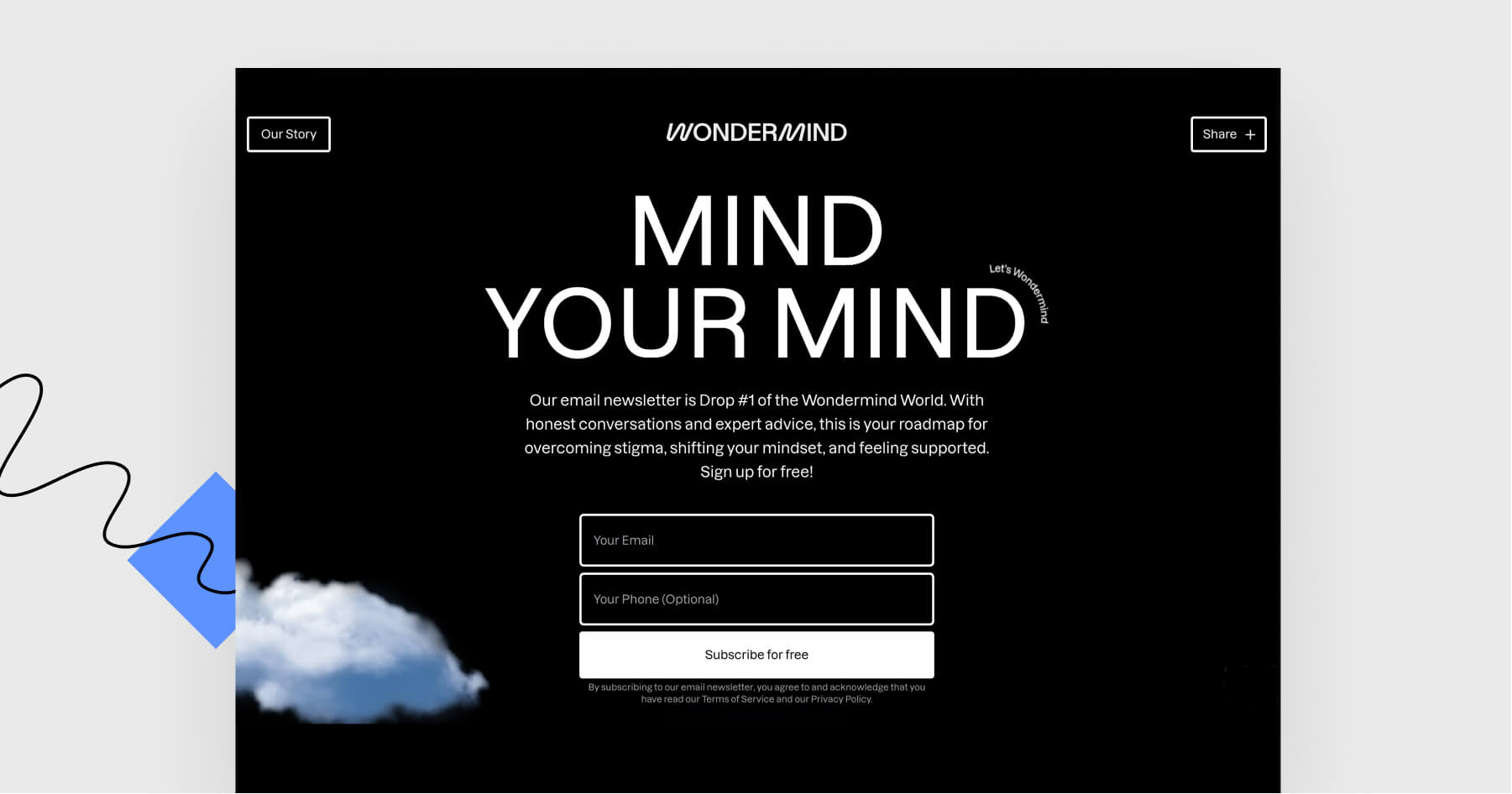


Today, I’d like to introduce you to a landing page from an innovative mental fitness company by Selena Gomez, Mandy Teefey, and Daniella Pierson.
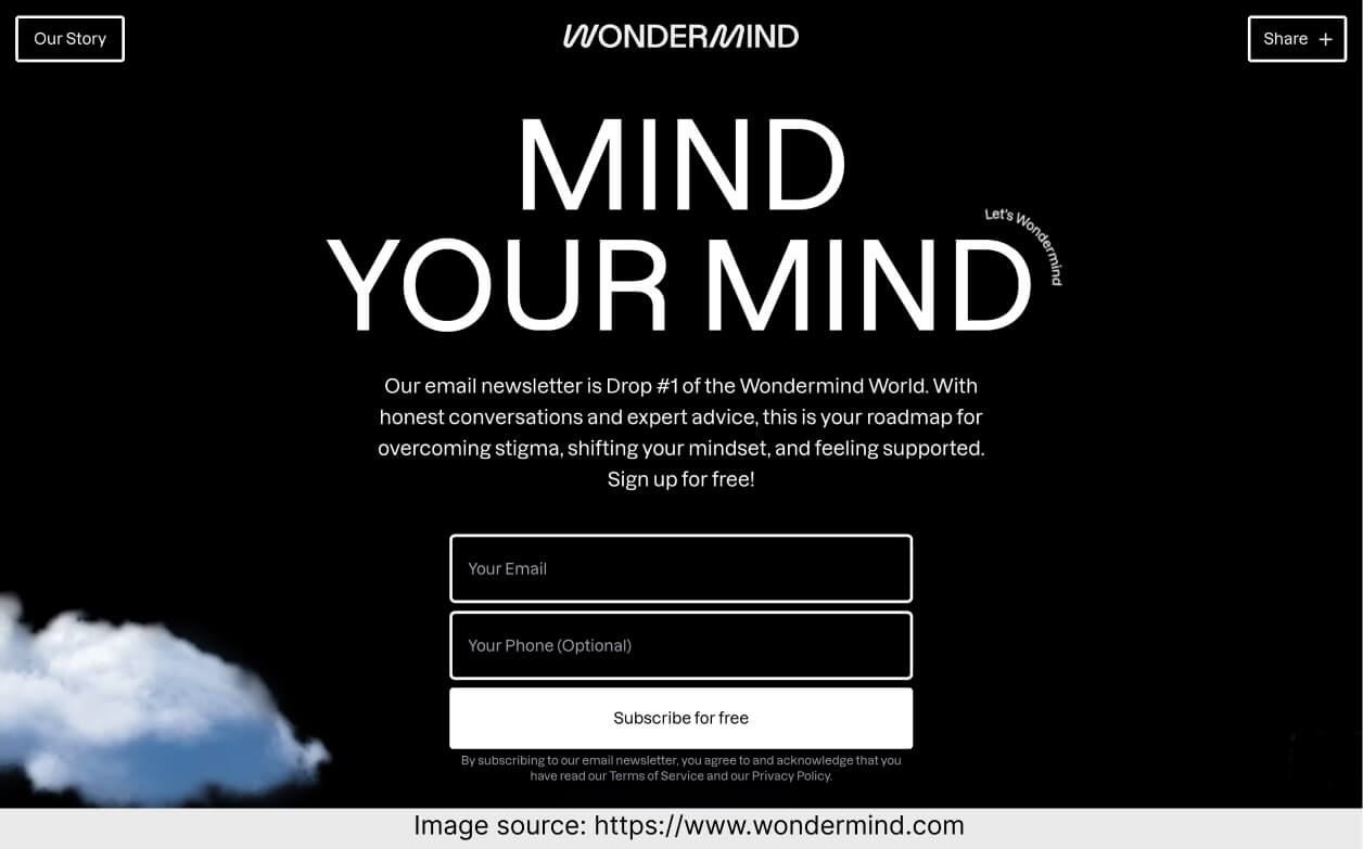
Technically speaking, this page is a newsletter signup landing page including a short contact form. It’s black and white and minimalistic.
Let’s go through this page and check what’s worth remembering!
What is worth keeping in mind?
I admit – I was skeptical about the minimalistic design at first. But the more I think about it, the more sense it makes. The page is about keeping our minds fit and uncluttered. It makes no sense to overload such a page with distracting stuff – I’d even say, it’s not in line with Wondermind’s approach to life.
This page’s designer decided to use black and white for backgrounds and blocks of text, and (mainly) light blue for clouds. It helps to evoke the feeling of inner peace and calmness.
Is there room for any more wonders?
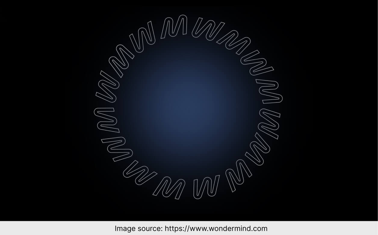
As I mentioned before, I’m okay with the landing page being minimalistic…
But this section confused me. I don’t know how long I’ve been waiting for something to appear in the circle, but it left me even more confused. I don’t follow why it’s so huge and yet empty.
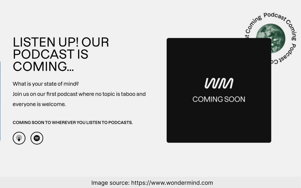
There is an upcoming podcast mentioned, but there is no option to sign up for a notification when it becomes available. This section could use a call to action and a form encouraging to stay in touch.
Mind the most important elements
A minimalistic landing page does not have to be a boring landing page.
How are the most essential elements of the landing page doing? Let’s talk them over.
– The main header is “Mind Your Mind.” They went for a wordplay rather than a fully explanatory header. But fear not – below the main header is a more down-to-earth description of the project. Looks good.
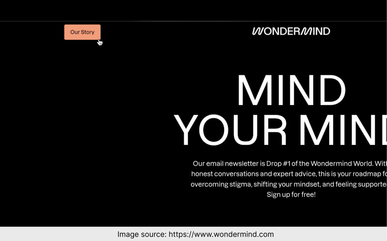
– There are two CTA buttons that support the main goal (“Subscribe for free”), one in the opening section and the other at the bottom left. I’d say it’s enough for a landing page that long.
– The mobile version looks good. I’d even say I like it more than the desktop view (but it’s a matter of personal preferences).
– The contact form consists of two fields, one of which (phone number) is optional. It’s extremely simple and very in line with this page’s design. Remember that an ideal contact form on a landing page requires as little information as possible.
Landing Page of the Week is a series where I review examples of landing pages from the web.