

One of the goals of a landing page is generating leads. Leads are the obtained contact data that are collected in order to use them for specific purposes, e.g. sales. The tool that enables creation of such a potential clients’ database is a form. However, before you use it for the campaign, answer several questions and pay attention to some details, which can significantly affect the increase in the quantity of obtained information. Read how to create an ideal form on a landing page.
Does less mean more?
The biggest dilemma when designing the form is its length. The more fields to be filled in, the more information about the Client you can get, and the detailed data will pay off at personalized sales negotiation. At the same time, the expanded form requires greater involvement, therefore it may discourage users.
To sum up, each additional field statistically reduces the chance to get lead, but ensures their better quality. Since the main purpose of landing page is to obtain the greatest number of applications, the form should be maximally short. Go through the list of desired data and think whether really all of them are necessary to achieve the goal? Delete those less important and leave only those really necessary. Eventually, the remaining information can be completed during direct contact with the Client.
Do you know who will fill in your form?
A maximally short form does not always have to be the best solution. Its filling depends on the involvement of our target group. If the message is addressed at people who know our company, we can use a longer form. In the case of unknown recipients, the chance is smaller that they will want to devote more time. An ideal form is one that retains balance between how much information you need and what data the users are able to provide you with.
[UPDATE 12/19]
But there’s another way. If you wish to collect more data, but you’re afraid of losing too many visitors because of a too long form, funnels might be helpful here. There’s no need to create complicated forms with numerous fields to fill in. A simple funnel combines several landing pages into a straightforward process, that collects bits of data on every step. Such approach may attract users and convince them to close the deal – especially when the information you collect is relevant to the case.
Are you trustworthy?
Get the trust of users so that without any worries they entrust their contact details to you. The Internet users are reluctant to share information about themselves because they do not have certainty about the way it will be used. Increase your credibility by placing the link to privacy policy, in which you ensure safety of any data collected.
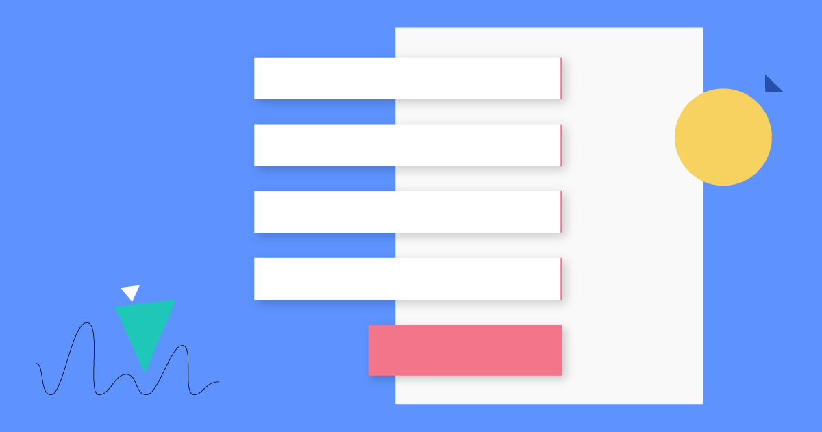
Is your form visible enough?
Make sure that the form is visible to the greatest extent. Place it in a border and highlight by means of contrasting colours. Bear in mind the aesthetic value. Provide sufficient free space and use margins. As a result, it will be more legible and encouraging. The whole landing page should be designed so as to direct the user’s eyes to the form. Thanks to that you can plan the path of users’ eyesight, e.g.
Heading – > key benefits of filling in the form – > form – > button
Such an operation will be achieved by publishing special instructions facilitating navigation, e.g. arrows, or pictures that direct the eyes to the place of the form. Thanks to that, the users will move on the website exactly as you want to.
Does call to action stand out on the website?
Your goal is that the user fills in the form and clicks the action button. For this reason, do not make the action difficult and try to make the button sufficiently visible. Large size and colour contrasting with the background of the form will definitely distinguish it on the website. You can use the emphasizing effect, by means of a combination of lighter and darker hue of a given colour that will make an impression of protruding. Placing the text on the button, indicate exactly what will happen to data after clicking, e.g. save in the newsletter, send inquiry. Do not hesitate to use longer sentences – repetition of specific expressions on the button will increase the sense of users’ confidence.
Are you looking for optimum solutions?
You still don’t know how many fields the form should include? Which button will be more effective: simply “Buy” or maybe “Buy it for free”? Your doubts will be solved by the A/B test. Create two identical landing pages which differ only in one element of the form (the number of fields, text, button, colour…) that you want to test and check the way users behave. You will see which version is characterized by higher conversion. It is also a good way to learn optimal number of fields in a given form.
Do you take care of mobile users?
Do not forget users who visit your website via mobile devices. Lack of a mobile landing page may result in difficulties with filling in the form. Therefore, make your landing page suitable for mobile versions: check whether the form is visible on the screen, whether fields of the form can be filled in without problem by means of touch and whether the button call to action is big enough to be tapped with a finger. Thanks to that, you will get professional image and you will not lose leads.
Are you using integration?
Have you got CRM base? You can integrate your form with CRM system which definitely makes your work easier. Thanks to that you will be sure that the obtained leads will automatically go to your database, which will make contact with the user easier for you. Thus, you save time by not entering data manually.
Acquisition of data from the contact form is an effective way to get a comprehensive potential customers’ database. The collected data are valuable because the users intentionally and independently have decided to entrust them to you. Thanks to that you get information from people really interested in your offer. For this reason, every contact is important! Thus it is worth taking care of qualitative landing page that will guarantee optimal amount of information.