“In my opinion, the future of mobile is the future of everything.”
– Matt Galligan, Serial Entrepreneur (Business Insider 2011)
Across all industries and sectors of the digital age, mobile appears to be booming. Not only is 2017 likely to mark the first time that digital ad spend surpasses TV, but mobile ad spend looks ready to dramatically increase from 2016’s numbers (i.e. around $32 billion in total ad spend).
To put these projections in plain English, mobile is hot.
In 2016 mobile commerce (i.e. “mCommerce”) shattered revenue records with $123 billion in sales. Last year saw a 39.1% increase over 2015’s numbers, and doubled the number of sales for 2014. As a result, mCommerce is now demanding the attention of even the staunchest of traditional marketing advocates. In 2017, mCommerce is expected to pull in $151 billion in sales revenue (or a 23% increase over 2016’s numbers).
What does this massive growth mean for marketers?
It means that the time to focus on the mobile landing page is now…
Global smartphone usage only continues to display steady growth, especially with 36% of Americans now digitally connected via smartphones, tablets, AND computers. Mobile success in 2017 will depend directly upon the ability of marketers to expertly navigate the consumer demand for high-functioning mobile landing pages.
As mobile devices are the devices most commonly used when searching for local businesses (52.8%), landing pages should be one of the top digital priorities for 2017. Understanding this, we have put together a list of the four “must-haves” for mobile landing page optimization. Use a landing page builder allowing mobile view edition to test them all.
Let’s take a look!
Make your sections smartable and let go of mundane manual tasks with Smart Sections! An easy way to manage bulk changes.
Must-Have #1: Fast Load Times
Slow load times are alarmingly overlooked by many of today’s mobile marketers. Not only do they have a detrimental impact on mobile bounce rates, but they can also potentially affect mobile search engine rankings. While load times are currently a Google Chrome and HTML ranking factor, Google’s Gary Illyes says load times are still a few months away from having a significant impact on SEO mobile rankings. While load times are sure to become an important future aspect of mobile SEO strategies, there is an even more important judge and jury when it comes to slow mobile load times:
The customer…
According to a recent 2015 global mobile commerce report by Episerver, slow load times are considered the biggest frustration for modern mobile users (with one-in-five consumers switching to a competitor site as a consequence). Further studies show that not only are 43% of users unlikely to return to a slow-loading landing page, but 85% of mobile users expect their mobile pages to load as fast or faster than their desktop. Looking at bounce rates, the digital performance managers at Soasta found that bounce rates experience a steady increase when load times hit 2.3 seconds. This means that mobile pages loading just one second faster will experience a 27% increase in conversion rates. This study clearly demonstrates that mobile marketers who fail to focus on load time optimization might as well be throwing money away. There’s no use designing beautiful WordPress landing pages if you do not intent to optimize them.
Do you want to avoid the dreaded “slow to load” label?
Then it is important to remember, no matter how great your mobile copy, landing page template, and CTA’s are, if you fail to optimize your load times, your landing page will fail to reach its ROI potential. A great resource for load time testing is Pingdom’s website speed test. This great tool allows you to check speed times through different servers located across the globe. This ensures that your websites can handle diverse clients in our globalized world.
Must-Have #2: Optim-“sized” CTAs
As confused visitors will never be converting visitors, it is a best practice to place your CTAs above the fold while optimizing your button size and how it interacts with your mobile visitor. According to some important research by the MIT Touch Lab, the average width of a human thumb is 2.5 cm (i.e. 72 pixels), and the average width of a human index finger is 1.6 to 2 cm (i.e. 45-57 pixels).
What does this mean for your CTAs??
It means that your CTAs need to be optimized for pixel size. It is a best practice to accommodate the hands and fingers of today’s mobile browsers, as these are their tools for purchasing. According to research by UX Matters, users hold mobile phones in three basic ways. The majority (49%) employ a one-handed position, while 54% employ one of two potential two-handed positions. Yet, as the research demonstrates, no matter the position the thumb will always play the most vital role when it comes to mobile touchscreen interactions
In order to accommodate their fingers and thumbs (and in-turn facilitate conversions), it is important to have CTAs that measure at least 44 pixels. This will go a long way in making it easier to identify and use your call to action buttons. A great example can be found in the photo above. Amazon’s CTA is not only clearly identified via compelling and action-oriented copy (i.e. “Shop All Deals”), but it has prime positioning above the fold. Another great aspect is its contrasting color scheme. As mobile real estate is limited, it is important to implement a CTA color theme that stands out from the rest of the page and draws the attention of mobile users.

Must-Have #3: Click-to-Calls

While not typically thought of when it comes to mobile landing page optimization, click-to-calls are a logical extension of mCommerce and mobile use. As recent research from Think With Google points out, mobile users are actually interested in making phone calls while engaging in mobile use. The results of the study reveal that almost half of those mobile users surveyed (42%) had used click-to-call buttons, with the motivating factors including the need to inquire about inventory,
- availability, and booking information
- The desire to schedule an appointment or make a reservation
- The need to check for the business’s hours of operation
94% of those users surveyed stated that they “have had the need” to call a business directly while engaging in mCommerce, while 72% reported click-to-call conversations lasting longer than 30 seconds (with an average call length of six minutes).
The study also found that not having a click-to-call may detrimentally impact the conversion potential of mobile landing pages.
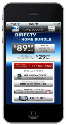
More than 36% of mobile users stated that they would be more likely to explore other brands if they did not find a click-to-call button when required. A further 32% indicated that they would feel frustrated or annoyed with the brand in question if this were to happen. A great click-to-call example can be seen in the DirecTV mobile landing page photo above. With a clearly identifiable and above-the-fold red button, DirecTV’s landing page compels visitors to “click here to call now.” This is especially helpful for a complicated product such as satellite TV.
The line is that the research demonstrates that click-to-calls are a necessary element of an optimized mobile landing page. In the words of Google’s Ian Carrington:
“Globally, we know that 40m calls are driven by Google Ads each month so it’s fair to say that click-to-call is a clear sales driver. Moreover, for businesses that haven’t yet built a responsive or mobile site, click-to-call is a great way to ensure consumers can still reach your business easily, showing that mobile advertising doesn’t just have to be for the mobile-ready.”
Just like it is important to consider the size of the human hand when creating your mobile CTA boxes, it is also necessary to recall that the majority of mobile screens are extremely small when compared to desktop, laptop, and tablet screens. Given that the average mobile commerce session is only likely to fall between three and five minutes, the maximum amount of text that should be placed on a mobile screen at one time is two-three sentences worth (not paragraphs!). This is especially important if you consider the fact that most people will only reach a reading level of around 300 words per-minute,
Remember,
Visitors
Have to scroll
In order
To
Understand
Your
Value proposition…
This means it is important to draft mobile copy and headlines in the form that they are going to be read.
A great technique to try is drafting your copy directly on your device. While it may not evolve into an everyday exercise of mobile landing page optimization, it provides great utility in allowing marketers to draft copy from the point of view of their target audience. For drafting and publishing purposes Google recommends using a base font of 16 CSS pixels, with size adjustments made as needed based on the properties of the font being used. A second important conversion driver is to remember to keep value driven copy above the fold. Important research from the Nielsen Norman Group shows that on average, 80% of a user’s attention is concentrated above the fold. It therefore follows that users will focus on headlines first, subheads second, and all other copy last.
A final technique that can be applied to ease the tension that results from condense copy is the implementation of scroll cues. As I am sure you realized when reading above, no consumer wants to scroll endlessly. You should therefore strategically place scroll cues throughout your mobile landing page to help encourage readers to keep on reading. Whether an arrow or “sneak peak” of the next section, scroll cues should at least hint to your potential consumer that there is more value come.
How big of an impact can simple, clean, and value driven copy have on your conversions?
Well, a recent case study performed by NextAfter found a 21% increase in mobile conversion when employing easy to read copy. As the picture above demonstrates, by introducing the effect of the gift before highlighting the cause (i.e. clarity), NextAfter was able to increase the likelihood that visitors would donate to their website. With a focus on copy layout, testing, and simplification, these types of results are easily attainable, even for those brands marketing complicated and highly detailed products.

In Conclusion…
The most successful brands of the digital age understand that mobile must be treated differently. Not only are mobile consumers notoriously distracted when they engage in mobile browsing, but mobile landing pages typically compete with mobile push notifications, text messages, and emails for consumer attention. By focusing on the four “must-haves” of mobile landing page ROI, you will be well on your way to taking advantage of today’s ever present mobile boom.


