

Nailing your landing page copy can be a challenge if you don’t know what to look out for. There are plenty of mistakes which are easy to make, no doubt you’ll have seen some of them. Avoiding them is just the first step in creating a landing page that successfully converts.
The best thing about your landing page is that it’s not final, it’s possible to create multiple test versions so that you can analyze which one works best. By working this way, you can not only optimize your landing page, but if any of your test ones are not right, you can scrap them and improve upon your mistakes on the next one.
Avoid a Writing Overload
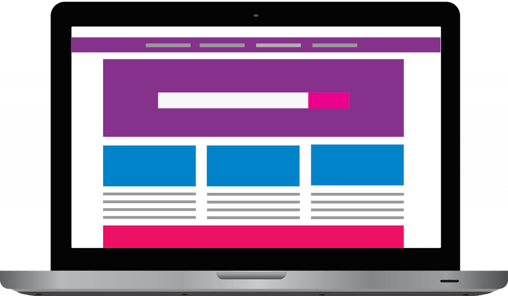
You’ve probably seen them at some point on your journey through the internet. A landing page which is practically a wall of text. Where do you start? Where’s the information you need? Why is it all on the first page? Before you know it, you’ve clicked back and have gone elsewhere. Although it can be tempting to provide your customers with all of the information all at once, that’s not what they want. The information needs to be easy to find, however, this doesn’t mean it all needs to be on the landing page.
The copy for your landing page needs to be easily digestible, think of it as the aperitif to make the consumer hungry for the main course – the main course being the rest of your website. The landing page is there to generate leads, not sales. It should convince them to read more, to want more and to know more. By making sure your copy consists of no more than one to three paragraphs you should be able to provide them with the basics, the need to know USPs that will draw them smoothly into the more text-heavy website pages.
“To avoid a writing overload in your users, try to stick to single columns of text, not only will this speed up the user’s reading, but it also displays much better on mobile devices than multiple columns do,” adds Richard Fletcher, content marketer at Last Minute Writing and Researchpapersuk.
Make an Easy Choice
Following on from the writing overload, you should also avoid giving the user too many choices. They’ve just got there, they don’t need five lists of options to decide what’s happening next. It’s off-putting and confusing. By having too many choices, you’re forcing the user to read and scan more than they need to in order to find what they want. You need to make the CTA clear and concise, more options can come later. For now, make it as simple for the user as possible. Try a learn more CTA, this can then branch into more options once the user understands more about the business and their own needs.
The landing page should show your top services. Try to limit these to the ones which are most likely to get the most clicks, or to another page where you can use more options to discern what the user wants. The key is to not overload the landing page with too much text, too many options or too much information. Keep it clean, clear and concise so that your users convert.
Understanding Your Customer
One of the most common mistakes is misunderstanding who your customer is. It is vital to know your customer, who is going to be using your website and who is likely to convert. This affects the tone of the landing page copy as well as the content. You need to keep it professional whilst still having a voice that the user can connect with. That doesn’t mean that if you’re talking to teenagers, you need to try to use as many colloquialisms as possible. The landing page is going to be there for a while, so try to keep it natural, neutral and timeless.
The next point to consider is what stage of the sales funnel is the user in? If this is the first time, they’ve ever heard of you, they’re not going to appreciate the sales pitch rammed straight at them as soon as the page loads. You’ll need to ease them into it, build the relationship, make them feel valued as a potential customer and lead them gently to the details if they want them. This links back to the CTA that you use and the information that you put on the landing page.
However, users which are already at the middle or end of your sales funnel may get fed up by trying to find what they need from the very beginning. It is good practice to have more than one landing page designed for each different stage of the funnel. This will help to guide users in the right direction and avoids them getting frustrated if they can’t find the CTA or information that they need.
Don’t Make the User Guess
The user needs to clearly understand the next steps. If they need to Learn More, make sure that it’s obvious that’s where they need to go. If they need to fill out their name and email, make sure that that’s clearly situated, and they understand why that’s needed. The user shouldn’t have to work for the information or feel like they’re lost on your website. Lead them to where they need to be and let them know why they need to be there. If it feels like too much hard work, the user will simply leave.
Landing page copy should explain what you do in simple terms. There’s nothing more frustrating than a landing page which gives you no clue as to what the company does. If they don’t know what you do, how will they convert? You don’t need to write a whole WhitePaper on it, you just need to cover the basics. Tell the user who you are, what you do and why they should use you. The easiest way to cover this is with your company name, your tagline and a brief description of your top services that highlights your USP without feeling like a forced sales pitch.
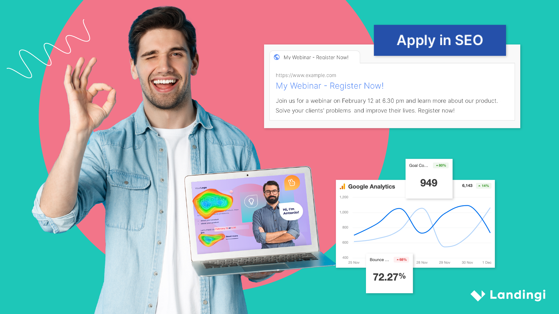
Remember About SEO
Though landing pages are generally optimized for paid traffic from Google ads or Facebook, it doesn’t hurt to bear SEO in mind. Take a look at any search and you’re likely to find paid, sponsored ads always come first. This means you are likely to yield greater results through PPC. But this doesn’t mean you should neglect optimizing your landing page for those who find you through organic searches. Keep your keywords and tags relevant but also be aware that if you do end up having someone stumble onto your landing page that they will want to instantly see what the website is really about. For both Ad generated search results and organic searches this means ensuring you title your page with an effective title tag – this will be the first thing a person sees in their search results. Ensure that it captures everything that your site has to offer and prepares the visitors for what they will see when they click through.
Harness the power of AI to generate copy, edit images, and improve SEO. All within a single platform.
Save time and get one step closer to perfection.
Watch Your Language
It might be tempting to show off your proficiency within the English language, but it doesn’t always look that good. Unless your service is offering something to do with using long, unusual words, you should make sure that you’re keeping your sentences tidy, professional and easy to read. Is the language use SEO ready as well as customer appropriate? If you can use a simpler term rather than a more uncommon word, go for the simpler option. Customers won’t appreciate unnecessary complex terminology, it makes it seem like you’re trying too hard or makes them feel uncomfortable – neither of which you want to happen.
How Are You Different?
Unless you’re very lucky, there’s probably a lot of competition out there. With so many other companies offering the same services, you need to find a way to set yourself apart from the rest. Your SEO research will help with this, enabling you to get higher in the search rankings. However, SEO alone won’t show how you’re different. You’ll need to do research on the competition, particularly those ranked near to you and the top. What are their USPs and how are you different? Once you know what makes your company different you need to sell it. The landing page copy should clearly state in the simplest terms why your company and service are better. If a user can easily access that information, they’re more likely to convert.
“It needs to be easy and obvious to a user what sets you apart, otherwise they’re just going to think you’re like the next company. It doesn’t need to be an over the top explanation, it just needs to be visible so that the user can see straight away why they should use your company and not another one,” says Mildred Pena, web designer for Draftbeyond and Writinity.
As well as identifying why you’re different you also need to point out why the customer needs your product or service. This means spelling out the pain points to them. This is where your USPs shine. Is your service/product vegan, environmentally friendly, recyclable, sustainable? All of these are becoming more important to more people. It is your job to identify what is important to your target audience and how your product/service combats or avoids these issues. This will help your customers understand the key points as well as hitting more SEO – those people searching for “service” plus “sustainable”, will have narrower search results and your landing page will be ranked even higher than those people just searching for the service. It ensures you reach the niches that are looking for exactly what you provide.
Focus on Conversion
Overall your landing page copy should focus on conversion. It’s the aim of the landing page and why you’re drawing customers there. There should always be an option which leads them to more information, a form which signs them up to the sales funnel or marketing campaign and/or a CTA to take them to the next step of the sales funnel. It should be as clear and easy for a user to use as possible. Excess information and choices are only going to confuse or put off a user. Rather than thinking about how you should write the copy or even what you should write, consider what the user wants to read? This way you can make sure that your landing page copy is focused upon what matters most, the customer. By keeping them happy and enticing them in they are much more likely to convert than if they were overwhelmed with too much information.
If you are finding that your current landing page isn’t converting as well as it should, try following these tips. It also doesn’t hurt to ask for feedback from your customers. See if there’s anything that you can add, takeaway or change in order to improve user experience.