

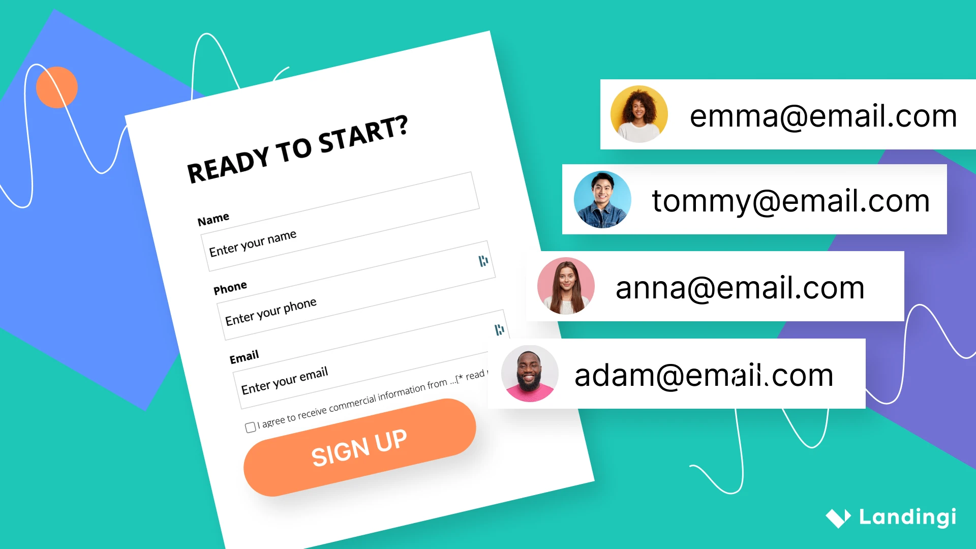
How fast do you think visitors will abandon your website if they are forced to scroll for 10 seconds every time they want to add a new item to their shopping cart?
Wait, don’t answer that yet.
What if they endure that terrible experience but can’t make a purchase because your checkout form is 7 times larger than their smartphone’s screen? Well, you wouldn’t have lost that customer if you’d adopted responsive web design.

According to SearchEngineLand, 54% of websites with the most mobile traffic use responsive configuration for their websites.
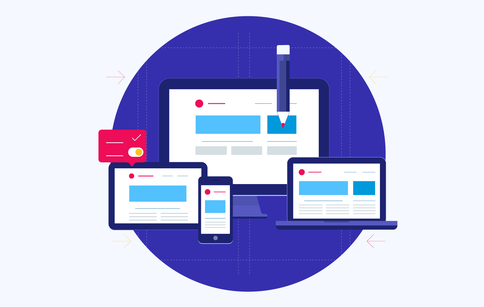
Responsive web design is so important right now because all websites need to be able to provide the best possible user experience to all visitors regardless of what device each visitor uses. According to Statista, 48% of all website views are from mobile devices, so there’s a huge chance that many of your website visitors use mobile. If that’s the case, implementing responsive web design will help your site’s visitors achieve their objectives without hassle.
When your website provides positive user experience on all devices, your visitor/customer retention and conversion rates are bound to rise. In 2015, Google announced that it will henceforth use mobile-friendliness as a criterion for ranking websites. So having a mobile-friendly website significantly boosts your SEO performance and increases your visibility.
Now, you’re probably thinking people surf the internet on different devices so, how do you ensure your website provides seamless user experience if 48% of your website visitors use smartphones, 30% use PCs, and the remainder use a hundred other devices including tablets.
Whether you run an e-commerce store, a blog, or a company website, there are thousands of devices that your prospects or customers can use when visiting your website. You cannot dictate what these devices will be, but you do have 100% control of the way you present content to each visitor, and there are three ways to go about that:
- Build a static/fixed website that looks exactly the same on every device but is difficult to navigate on mobile devices.
- Build multiple websites for different screen sizes and allow the server to determine which site a user will see on each device, or;
- Build one website that adapts to the screen size of all devices by using the principles of responsive web design to dynamically format content and provide exceptional user experience.
If you’ve been following along, then you already know the first option above is bad for business. The second seems reasonable, but is the third option any good? Is responsive web design necessary? Read on to find out exactly what this concept is, how it’s implemented, and weigh its pros and cons to determine if you should be using it.
What is Responsive Web Design?
Responsive web design is an approach to creating websites that dynamically adapt their content to any screen size, device orientation, or browser window without reloading the page. The design of a page is responsive if it can be rendered correctly on all screen sizes without forcing the user to scroll horizontally or pinch or zoom in order to view its content.
This is not to be confused with a site that dynamically serves content to visitors by detecting what device they are using and then alternating between stylesheets. Responsive web design uses the same stylesheet for all devices.
Many internet-enabled devices with different screen sizes are produced each year and responsive web design is pretty much the industry standard for ensuring that websites display content on these devices in an appealing and effective manner. Wondering how it’s done? Let’s find out.
How Does Responsive Web Design Work?
Responsive web design adopts a mobile-first approach to web development. So, while building websites that will cater for the multi-screen user, designers start out by writing some code that prevents content from overflowing beyond the screen’s width. This is especially useful on smaller devices like smartphones, and it is usually done with the following command.

The line above tells the browser to make the width of the website exactly the same as the width of the screen displaying it. After this is defined, other factors come into play. Some of them are:
#1. Flexible Layouts and Responsive Units of Measurement
Flexible layouts are a major component of all responsive web pages. Instead of defining using fixed units like pixels and points to set the size of text, images, and columns on a page, responsive units of measurement.
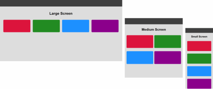
This combination allows web pages to display, reflow, shrink or grow in percentages thereby making text legible providing users easy access to elements on a page. The following image illustrates this point.
In a NON-flexible layout, the colored boxes in the above image will always be positioned side by side (as seen in the “Large screen”) regardless of screen size. Responsive web design takes the opposite approach by wrapping elements using fluid layouts that adapt to the display of the different devices.
#2. CSS3 Media Queries
CSS3 is the latest version of the language used to style websites. Its media queries use factors like screen size, resolution, orientation, and device type to set rules of how content is displayed on each device. In simple terms, it’s the part of a responsive web page that tells the flexible layout how to display the page’s content to the user.
So, do designers write a different rule for every single device on the tech market? No, they don’t. Each kind of device; smartphones, tablets, and desktops often have similar screen sizes, so designers define media queries for specific screen sizes as follows:

#3. The Same Content, The Same Code, Multiple Devices
Responsive web design serves the same content, written in the same code to all devices while tailoring it to optimize user experience on each device.
Responsive Web Design Examples
Here are some responsive web design examples that incorporate the aforementioned design techniques and several others. These screenshots were taken at different screen resolutions to highlight the way the page adjusts its content as the width of the viewport changes.
Transferwise
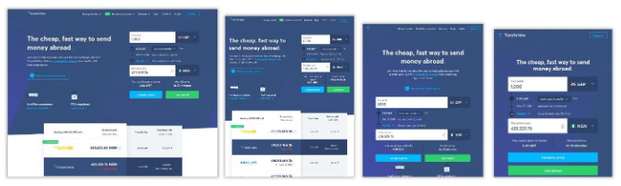
Accessibility is one of the major issues that responsive web design resolves for users. Transferwise achieves this by displaying a different layout depending on your screen size and the forms remain easily accessible in all cases. On large screens, the navigation bar is a horizontal list. On tablets, however, some items are removed from the top navigation in order to ensure the buttons can be easily accessed by the user. Instead of using the same navigation bar on smaller screens, Transferwise implements hamburger menu (the three bars at the top left of the screen) which displays a vertical navigation bar to the user when clicked.
Microsoft
The tech giant, Microsoft has implemented a simple, elegant, yet responsive web design on its website. Like Transferwise, Microsoft’s website makes navigation simple on all devices by using the hamburger mobile menu on smaller devices. It uses 1 to 4 column grids to position content on different sections of the site while changing the percentage of the screen taken up by each element according to the size of the screen. For example, the second row of the page has a four-column grid on large devices so each item in that row takes about 25% of the container. However, the same items are set to take up about 50% or 100% of the container’s width on tablets and smartphones respectively. This ensures the text in each section remains visible and that the images, forms, and buttons remain accessible to the user regardless of their screen size.
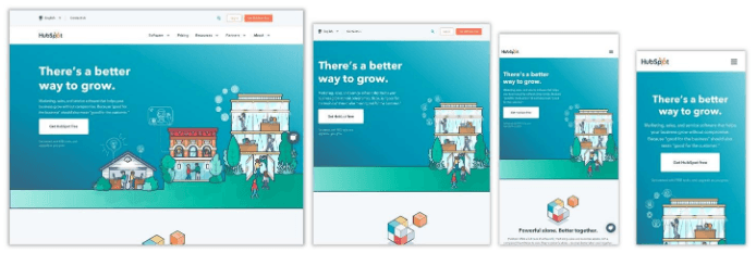
The marketing experts at Hubspot are truly practicing what they preach in terms of providing consistent customer experience. This can be seen in the responsive web design of their website. The layout of the site systematically positions one section atop the next on smaller screens thereby making sure their “Get Started” CTA button is always one of the first thing the user sees. Notice how the header image moves from the left side of the screen on large devices to the center on smartphones. As users move from large screens to smaller devices, the container of the hero image is decluttered to allow a neat, and intuitive interface. And yes, they’re totally in on the hamburger mobile menu style too.
Adaptive vs. Responsive Web Design
Adaptive web design is an alternative to using responsive web design to build web pages that have a user-friendly interface on different screen sizes. Unlike responsive web design which loads the same code, the same content, and the same website through a single URL, adaptive design relies on multiple versions of a website. That’s why you see a different URL in the address bar of your browser when you visit the same site with a mobile phone or your PC.
The URL changes because the server of the adaptive website is configured to detect the kind of device that is making the HTTP request and load the version of the website designed for that device category.
Adaptive design displays a different website to the user depending on whether she is visiting the site on a tablet, mobile phone, or PC. Every time a user visits the website, the version that is designed for her device is what is loaded by the browser. Responsive web design on the other hand displays the same website to every user. It does this by adjusting the content of the page in real-time to fit the device size.
So, adaptive design vs responsive web design, which of the two is better?
Responsive web design and Adaptive design both have their pros and cons but choosing one over the other really depends on your business model or user base. But since responsive web design is a big deal right now, let us check out its pros and cons.
Pros and Cons of Using Responsive Web Design
Responsive web design obviously provides tons of benefits over fixed and static websites, but is it the right option for your website? The following arguments for and against it will help you decide.
#1. Consistent, Yet Tailored User Experience On Any Device
By adapting a website’s elements to the display of the device accessing it, responsive web design is able to provide a consistent experience to all users visiting your site on modern browsers. This enables your website’s visitors to easily achieve their objectives on your website thereby increasing conversions. For example, after making the switch to responsive web design, Baines and Ernst made significant gains on their average mobile visit duration and saw a 51% rise in mobile conversions.
#2. Improved SEO
Responsive web design is the number one web design technique recommended by Google. This suggests that the world’s most used search engine is likely to prioritize responsive websites in search results. Additionally, User experience and SEO can together transform your online business so it makes sense to opt for a solution that improves both.
#3. Flexibility: One Code, Multiple Devices
The code and content of a responsive website is compatible with various devices and browsers (wide support).
#4. Forward Compatibility
The adaptive capabilities of responsive web design make it future-ready. This can help you stay ahead of the competition in today’s world where hundreds of new devices, with different screen sizes hit the market every year.
#5. Ease of Management and Maintenance
The content and code of a responsive website are a lot easier to manage than that of adaptive websites. Since it’s the same website that is served to every device, responsive web design saves you from spending a lot of time maintaining the code of multiple websites or managing content on multiple versions of a site.
#6. Better Analytics
Responsive web design offers an easy and effective way to track user behaviour/activity on your site because you only have to use analytics on one site instead of multiple sites.
#7. Cost Effective Solution
Not only is it easy to manage content, track analytics, and maintain the code of responsive websites, the cost of doing all these is also cheaper compared to using adaptive design.
It’s important to understand that responsive web design has a few downsides.
a. Poor Backward Compatibility
Responsive web design relies on a single HTML5 structure and CSS3 media queries which are not supported by older browsers (especially on smartphones). For that reason, pages with responsive web design may not be rendered correctly on such browsers.
b. Load time may be slow on mobile
Since it has to load every element (including those that are not required on mobile devices), large images and videos could slow down the loading speed of a page.
c. Usage may Differ Across Devices
Features that are available on computers may not be available on mobile phones, therefore, some designs may not look very good on mobile.
Irrespective of these shortcomings, responsive web design remains a great solution if your website has a multiscreen user base. The forecast that mobile traffic will grow by 46% every month until the year 2022 further underscores the need to adopt responsive web design now. So do you think a responsive website will be the best design for your website? Let us know in the comment section.