
A SaaS landing page is a standalone web page designed to showcase a software product, capture leads, and drive conversions—whether through free trials, demos, or sign-ups. But what makes one truly effective? How can you create a page that attracts potential users and convinces them of your product’s value?
While 42% of SaaS landing pages focus on product demos or consultations, according to Unbounce, diversifying your approach can significantly boost conversions. Free trials, lead magnets, and other targeted offers help engage different segments of your audience. With Landingi, the ultimate landing page platform, you can effortlessly create, manage, and optimize pages for PPC, SEO, and lead generation—all in one place.
Whether you’re a startup establishing your presence or a growing SaaS company looking to optimize conversions, a well-crafted landing page is key. To make yours stand out, highlight your unique value proposition in the headline, focus on how your product solves real problems, and use videos to showcase its capabilities. A clean layout with strategic white space helps guide focus, while social proof—such as customer success stories—builds trust. Keep forms simple by requesting only essential information, and consider adding an FAQ section to address common concerns upfront.
Now, let’s explore top SaaS landing page examples that set the standard for high performance and conversion!

Lunar is almost here!

What Is a SaaS Landing Page?
A SaaS (Software as a Service) landing page is a dedicated, standalone web page designed to promote a SaaS product. As SaaS provides software solutions, its standalone page focuses solely on presenting the SaaS offering and encouraging visitors to take a specific action, such as signing up for a free trial, subscribing to a newsletter, or requesting a demo. The primary goal of a SaaS landing page is to convert visitors into leads or customers by clearly communicating the product’s value proposition and benefits.
SaaS landing pages are crucial for lead generation and customer acquisition. They focus on addressing potential users’ pain points and demonstrating how the software can provide a solution. A well-crafted SaaS landing page is informative and persuasive, using clear messaging, strong visuals, and strategic CTAs to encourage conversions and support the growth of the SaaS business.
Convert more users—build a high-converting SaaS landing page with Landingi!
The structure of a SaaS landing page should include key elements such as an attention–grabbing headline, a succinct description of the product, key features and benefits, social proof like testimonials or reviews, and a compelling CTA button. Visuals, such as screenshots or demo videos, are often used to illustrate how the product works and its impact on solving the user’s problem.
Why Do I Need a SaaS Landing Page?
You need a SaaS landing page because it gives potential users a clear, direct path to discovering your software and signing up. Unlike a standard website, which spreads attention across multiple pages, a SaaS landing page focuses on a single goal—getting visitors to start a free trial, book a demo, or subscribe. It highlights your software’s key benefits, shows how it solves real problems, and makes it easy for users to take action. Without a dedicated landing page, visitors may lose interest or struggle to understand why your SaaS product is the right choice for them.
A well-optimized SaaS landing page also helps you attract the right users by aligning with your marketing campaigns. Whether you’re running PPC ads, promoting through email, or driving organic traffic, a landing page lets you tailor your message to match user expectations. It can showcase product screenshots, feature explainer videos, and include customer testimonials to build trust. By eliminating distractions and guiding visitors toward conversion, a SaaS landing page increases trial sign-ups, reduces friction in the sales process, and helps turn leads into long-term customers.
How Do I Create a SaaS Landing Page?
To create a landing page for SaaS, begin by understanding your target audience and their pain points, then choose the right tool and start creating landing pages. Craft an attractive headline, write an engaging product description, and focus on highlighting its benefits. Incorporate social proof elements and design a powerful CTA button. Add high-quality, immersive visuals. Remember about landing page optimization, and don’t leave it be after launching – continuously test and refine your page to achieve the best results.
Showcase your SaaS product—create a professional landing page with Landingi!
Learn how to create your own SaaS landing pages in Landingi with the following guide:
1. Sign Up and Choose a SaaS-Optimized Template
Log in to your Landingi account or sign up for a free trial. Click “Create new landing page” and “Select template or start with blank page.” This will redirect you to a template library. You can also generate page with Composer or import your project from Figma. In the template library, filter by “Software & Technology.” Choose a template designed for software businesses—one that includes a clear hero section, CTA buttons, and space for testimonials and feature highlights. Templates with a conversion-focused layout save time and ensure an optimized design from the start.


2. Customize Your Landing Page with Landingi’s Drag-and-Drop Editor
Once you’ve selected a template, it will open in Landingi’s drag-and-drop editor. Modify the header, sections, and buttons to align with your brand. Adjust font styles, colors, and background images to create a professional and consistent design. Structure the page to highlight key information in a logical order, ensuring that the most important elements—like your headline, benefits, and CTA—are above the fold so visitors see them immediately.

3. Craft a Compelling SaaS Headline That Captures Attention
Your headline should clearly communicate the main value proposition of your SaaS product. Instead of stating what your software does, focus on how it benefits users. Replace the default template text with something specific, such as “Automate Your Payroll in Minutes – No Manual Work Required” or “Boost Your Sales Pipeline with AI-Powered Lead Scoring”. A/B test different versions using Landingi’s built-in testing tools to find the most effective one.

4. Showcase Your SaaS Benefits with Clear Visuals
Replace any stock images with real product screenshots to provide a visual demonstration of your software’s user interface. If possible, include an explainer video that walks users through key features. Use Landingi’s image and video widgets to easily add GIFs, animated product demos, or interactive elements. Clear, high-quality visuals help potential customers quickly understand how your SaaS product works and why they should try it.

5. Add Social Proof for Trust and Credibility
Trust is a critical factor in SaaS conversions. Add a testimonial section using Landingi’s widgets and insert real customer feedback. Showcase positive reviews, user ratings from G2 or Capterra, or logos of well-known companies using your software. If you have case studies, summarize them in a success story section, highlighting real data and measurable results.

6. Create a High-Converting Call-to-Action (CTA)
The CTA button should stand out with a bold, high-contrast color. Click on the button in the Landingi editor and update the text with something action-oriented, such as “Start Your Free Trial – No Credit Card Required” or “Get a Live Demo Today”. Position the CTA in multiple places—at the top of the page, in the middle, and at the bottom—to maximize visibility. Enable the sticky bar feature to keep the CTA visible as users scroll down the page.


7. Set Up a Lead Capture Form for Free Trials or Demos
Go to the form widget in Landingi’s editor and add a simple, easy-to-complete lead form. Only ask for essential information like name, email, and company name to reduce friction. If a longer form is needed, use a multi-step format, which has been shown to increase completion rates. Connect your form to a thank-you page with a confirmation message and next steps, such as access to a free trial or a scheduled demo.


8. Automate Lead Management with Landingi’s Integrations
Integrate your landing page with your preferred CRM or email marketing platform to automate lead collection and nurturing. In Landingi’s Integrations panel, choose from tools like HubSpot, Salesforce, Mailchimp, or ActiveCampaign. If your SaaS product requires an immediate response after signup, set up an autoresponder email sequence within Landingi to welcome new leads and guide them through the next steps.

9. Optimize for Mobile Responsiveness
Ensure that your landing page looks perfect on all devices. Switch to Mobile View in Landingi’s editor to preview the page on different screen sizes. Adjust text size, button spacing, and image positioning to ensure a seamless experience for mobile visitors. Mobile users often convert at a lower rate due to poor usability—so make sure buttons are large enough and forms are easy to fill out.

10. Publish and Track Performance with Landingi’s Analytics
Once your landing page is ready, click Publish to go live. After publishing, you can monitor key performance metrics directly within Landingi’s Landing Page Dashboard, where you’ll find data on views, conversions, and conversion rates without needing external tools.
For more in-depth insights, Landingi offers EventTracker, a built-in tool that allows you to track microconversions and user interactions, such as button clicks, form completions, or video views. EventTracker helps you understand how visitors engage with different elements of your SaaS landing page, making it easier to optimize based on real user behavior.
If you need advanced tracking, integrate Google Analytics, Meta Pixel, or LinkedIn Insight Tag to monitor traffic sources and audience demographics.

11. Run A/B Tests to Improve Conversions
Experiment with different elements to find what drives the most conversions. In Landingi’s A/B testing tool, create variations of your page, testing changes such as different headlines, CTA button colors, pricing displays, or layouts. Analyze results and apply the winning version to maximize conversions. Heatmaps from Hotjar or Google Analytics tracking can provide additional insights into user behavior.

12. Continuously Improve and Scale Your SaaS Landing Pages
Once your SaaS landing page is live and optimized, consider scaling your efforts. Use Landingi’s subaccounts and user management features to create multiple variations for different target audiences. For example, create separate landing pages for enterprise clients, startups, or industry-specific solutions. Use Landingi’s Smart Sections to update recurring elements (such as footers, pricing tables, or testimonials) across multiple landing pages at once.

Drive sign-ups for your SaaS platform—design your landing page with Landingi!
7 Examples of High-Converting SaaS Landing Pages
Look at the 7 best examples of SaaS landing page designs and inspire yourself to create a well-performing web page for your SaaS products. These exemplary SaaS landing pages effectively demonstrate the application of fundamental design principles and best practices to optimize conversion rates. If you’re looking for design inspiration, these examples offer valuable guidance to create compelling landing pages that effectively promote your SaaS products.
1. Booky
The landing page for Booky presents a highly effective SaaS platform for financial management. The page immediately communicates its core value proposition: simplifying financial management for entrepreneurs and small businesses. With a focus on tracking expenses, managing transactions, and providing clarity, the landing page emphasizes ease of use and affordability. The page provides clear UVP, highlighting that this SaaS ensures data security, which is important for their potential customers. The design elements are clean and professional, using a modern aesthetic that appeals to its target audience.

The layout is strategically designed to guide visitors toward conversion, featuring prominent call-to-action buttons that stand out against the page’s minimalist background. Key features are highlighted through concise, impactful text and complemented by high-quality screenshots, reinforcing the platform’s benefits. Additionally, social proof elements such as testimonials and trust badges are included to build credibility and trust with potential customers. The bottom part of this page includes a clear pricing table and FAQ section, providing additional information for interested users.
Key takeaways to learn from this example:
- Clear and concise value proposition,
- User-friendly design,
- Streamlined navigation,
- Strong visual appeal,
- Effective CTAs,
- Clear pricing table,
- FAQ section.
Improvement areas:
- Enhanced user interactivity – incorporating interactive elements like live demos or videos could further engage users and showcase the platform’s capabilities.
Maximize your SaaS conversions—optimize your landing page with Landingi!
2. Sundial
The landing page for Sundial is an outstanding example of a SaaS landing page. It emphasizes Sundial’s key value proposition: enabling users to transform raw data into actionable insights quickly and at scale. The tagline “Turn data into insights, superfast and at scale” sets the tone for the page, highlighting the platform’s efficiency and capability. The design is clean, modern, and professional, using vibrant colors and high-quality images that resonate with the target audience of data professionals and business analysts.

The page layout is intuitive, with clear and compelling call-to-action buttons that guide users toward signing up for a demo. Social proof, such as customer testimonials and recognizable brand logos, builds credibility and trust. The content is structured to provide a logical flow of information, explaining the problem Sundial solves. This landing page displays key benefits and features in an engaging way, capturing users’ attention. Additionally, integrating interactive elements, such as animated insights and detailed walkthroughs, engages visitors and enhances the user experience.
Key takeaways to learn from this example:
- Strong value proposition,
- Visual appeal,
- Effective CTAs on a sticky bar,
- Interactive elements,
- Lack of extensive navigation menu,
- Customer testimonials.
Improvement areas:
- Detailed case studies – including more detailed case studies or success stories could provide deeper insights into how Sundial has helped other businesses achieve their goals.
Ready to scale your SaaS business? Build a landing page with Landingi today!
3. Ahead
The Ahead landing page is an exemplary SaaS landing page designed to engage users with its straightforward and bold approach. The page opens with a striking headline and a clean, minimalist design that immediately captures attention. Large fonts and well-implemented white space ensure the content is easy to read and digest, emphasizing the product’s focus on efficiency and productivity.

The landing page has a user-friendly design, featuring prominent call-to-action buttons that encourage visitors to join the beta. The visuals are limited to a single software screenshot and well-integrated icons that enhance the overall aesthetic. The grid layout showcasing the product’s key features provides a clear and concise overview of what Ahead offers. The bold and motivating language throughout the page aligns with the product’s mission to help users tackle their tasks effectively.
Key takeaways to learn from this example:
- Minimalist design,
- Clear value proposition,
- Strong, outstanding CTA,
- Engaging content.
Improvement areas:
- Social proof – including testimonials or star ratings could further engage potential customers and show them real value of the SaaS product.
Turn visitors into paying customers—design your SaaS landing page with Landingi!
4. Bloggi
The landing page for Bloggi exemplifies an ideal SaaS landing page through its clean design and clear messaging. The hero section of this page is clear, including an outstanding CTA button encouraging users to sign up for a free trial. The landing page contains a clear headline immediately conveying the platform’s main selling point: simplicity and efficiency in setting up a blog. The subheadline further emphasizes the ease of use and user-centric design.

The layout is visually appealing and easy to navigate, with a balanced combination of text and visuals. High-quality images and a sleek video demonstration provide a clear understanding of the platform’s functionality. The landing page includes call-to-action buttons that are strategically placed to guide users toward signing up. It also highlights key features like a distraction-free editor, seamless design customization, and integration capabilities, which cater to both novice and advanced users. This landing page provides trust signals, such as rating badges from well-known platforms.
Key takeaways to learn from this example:
- Clear and compelling value proposition,
- User-friendly design,
- Visual appeal,
- Feature highlights,
- Trust signals,
- User testimonials,
- Strong CTA.
Improvement areas:
- Mobile optimization – ensuring the page is fully optimized for mobile devices can enhance the user experience on smaller screens.
Get more leads for your SaaS—start building your landing page with Landingi!
5. Clerk
The landing page for Clerk is the next SaaS landing page example, showcasing a comprehensive user management platform. The headline immediately establishes the platform’s value proposition, while the subheadline effectively communicates the platform’s extensive features in just a few words. The hero section is complemented with an outstanding CTA button, encouraging users to sign in for a free trial.

The modern and professional design uses a clean layout with high-quality images and well-placed call-to-action buttons. The page is structured to guide visitors through the Clerk’s benefits and features. This SaaS integrates third-party applications, which is highlighted on the page as one of the strongest benefits for their target audiences. Social proof is provided through logos of trusted companies using Clerk, building credibility and trust.
Key takeaways to learn from this example:
- Intuitive layout,
- Clear value proposition,
- Outstanding CTA button,
- High-quality visuals,
- Detailed feature highlights,
- Social proof elements.
Improvement areas:
- FAQ section – incorporating a FAQ section could provide additional information and impact the decision-making process, ultimately increasing conversions.
Launch your SaaS product effectively—create a landing page with Landingi!
6. MeetGeek
The MeetGeek landing page is a great example of an effective SaaS landing page. It showcases MeetGeek as a SaaS enhances collaboration – this comprehensive AI-powered meeting assistant automates video recording, transcription, summarization, and insight extraction from meetings. The headline immediately conveys the platform’s primary value proposition, which is effortlessly transforming meeting content into valuable insights.
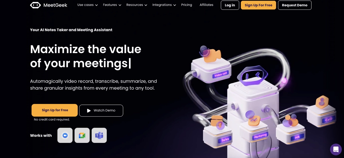
The page’s modern and professional design has a clean layout emphasizing usability and visual appeal. High-quality images and an engaging video demonstration illustrate the platform’s capabilities, while prominent call-to-action buttons are strategically placed to encourage user engagement. The content is well-structured, highlighting key features such as automated meeting summaries, task generation, and seamless integration with popular tools, making it clear how MeetGeek can enhance productivity and organization.
Key takeaways to learn from this example:
- Intuitive layout,
- Well-placed CTAs,
- Clear value proposition,
- Great use of visuals,
- Detailed features,
- Benefit-oriented content,
- Testimonials,
- FAQ section.
Improvement areas:
- Minimized design – website visitors might feel overwhelmed by too many distractions on the page. Adding more strategic white space and clarifying the layout could improve conversion rates.
Simplify your SaaS onboarding—build a user-friendly landing page with Landingi!
7. Corexta
The landing page for Corexta is the last example of a SaaS landing page we share with you in this article. Note how effectively this page showcases its comprehensive features and benefits. The landing page opens with a strong headline, conveying the core value proposition of streamlining business operations. The subheadline further emphasizes the platform’s capabilities, including project management, client relations, finance tracking, and HR tasks, all managed seamlessly on a single platform. Although this SaaS has many features to promote, the page is clean and well-structured, ensuring a seamless conversion path.

The professional design features a clean layout with high-quality visuals that enhance the user experience. Call-to-action buttons are prominently placed, encouraging visitors to take action – starting a free trial. The content is well-structured, with sections dedicated to different aspects of the platform, including detailed feature descriptions, customer testimonials, and social proof through recognizable brand logos. This comprehensive approach ensures that potential customers can easily understand the benefits and functionalities of Corexta.
Key takeaways to learn from this example:
- Effective hero section,
- Irresistible value proposition,
- Clean layout,
- Intuitive navigation,
- Strong CTA,
- Detailed pricing table,
- Trust signals,
- Social proof,
- FAQ section.
Improvement areas:
- Page load speed – improving the page load speed would ensure a seamless user experience and prevent bounce rates, ultimately leading to a higher conversion rate.
Boost SaaS sales—optimize your landing page for conversions with Landingi!
SaaS Landing Page Templates
Check the 4 free SaaS landing page templates available on the Landingi platform. These pre-designed layouts provide a solid foundation for high-converting pages, incorporating essential elements for optimal performance. With a focus on clear design and intuitive navigation, these templates offer a streamlined approach to building effective SaaS landing pages.
SaaS Coming Soon Template
The SaaS Coming Soon template we present is perfect for digital marketing strategies in the SaaS industry. The page can be leveraged to promote your product even before its official launch and to collect lead data for further marketing efforts. The clear layout leaves space for effective, attention-grabbing headlines and immersive pictures of your product in the hero section.

The template contains a product description section, a space for presenting your UVP, and well-placed CTAs with space for encouraging slogans. You can easily customize this template in Landingi’s builder for free. Leveraging its AI landing page features can help you create compelling content and optimize the page for search engines. You can add widgets, like a countdown timer, to create a sense of urgency and build engagement among interested users or use accordion to craft an FAQ section with additional product information.
SaaS Website Template
The SaaS Website template is our second proposition, perfect for creating a landing page promoting your digital products. It’s designed to present a unique value proposition from the first moment the visitor enters your page, giving you a chance to capture their attention and effectively guide them through your page to complete the desired action. With this pattern you can showcase your product’s use cases, answering your target audience’s needs.

This free template includes benefit sections, social proof sections where you can easily implement user testimonials, and a clear pricing table, which is a great pattern for creating your SaaS offer. It also contains an effective form with just two fields, ensuring a seamless user experience and encouraging visitors to sign up for a free trial. You can leverage this template to run A/B tests directly in the Landingi platform to find the most effective headlines, visuals, or CTA buttons.
Software Functionality Template
The Software Functionality template from Landingi is another great proposition for creating a high-converting SaaS landing page. This template will help you catch user attention immediately, thanks to the video you can add in the hero section. This, combined with effective headlines and a strong CTA button, is the best option to build interest among potential customers and encourage them to test your SaaS product.

The template leaves an outline of your new site’s layout. It shows where best to place the benefits section and how to incorporate user reviews effectively. You can customize it for free within Landingi’s editor, adding product descriptions, changing backgrounds, implementing immersive visuals, and using forms. You don’t have to worry about mobile version dimensions – everything will be done automatically, although you can effortlessly change your page mobile view in the same user-friendly editor.
Sign up for Test Template
The Sign up for Test template is our proposition for SaaS businesses offering free trials for their customers. With this free pattern, you can effectively create a sense of need among your target audience and encourage them to give a try for your digital product. The template includes a countdown timer in the hero section, which builds a sense of urgency. As you can see, it showcases the number of users that have signed up – this is psychologically one of the strongest motivators for taking an action, showcasing that others trusted your offer.

You can easily capture the user’s attention by adding immersive visuals or demo videos in the hero section. The strong headlines will give a clear understanding of your offer, while the minimal form will further simplify accessing your product’s trial version. This template’s benefits section is kept clear and concise, allowing your target audience to understand your message without friction. This template, customized for your brand identity in Landingi’s builder, can be a lead-generation machine for your business.
Ready to convert visitors into users? Build your SaaS landing page with Landingi!
What Is the Best SaaS Landing Page Builder?
The best SaaS landing page builder is Landingi, a multifunctional platform with a range of features designed to simplify designing, launching, and optimizing landing pages. Landingi’s intuitive drag-and-drop editor allows users to easily create and customize landing pages. You can easily add, remove, and rearrange elements such as text, images, buttons, and forms, so the design process is simple and accessible to non-technical users.
Landingi offers a great library of professionally designed templates tailored for various industries and purposes. This includes templates specifically for SaaS products, which can save time and provide a solid foundation for your landing page. These templates are fully customizable to match your brand’s look and feel. While creating your page in its builder, you can leverage AI landing page features, like an AI-powered text generator to create content for the entire landing page or its chosen sections, or an AI + SEO tool, which ensures your page is also optimized for search engines. You can also use Composer, a smart tool that generates a complete landing page based on your selections in just minutes!

The platform offers a variety of tools to boost conversions, such as pop-ups, countdown timers, and lead capture forms. These tools can be strategically placed and customized to engage visitors and encourage them to take desired actions. Landingi includes a built-in A/B testing tool, allowing users to test different versions of their landing pages to determine which elements perform best. This helps in optimizing conversion rates by making data-driven decisions based on user behavior and preferences. With EventTracker, a built-in analytics and reporting tool, you can track the performance of your landing page. You can monitor key metrics such as visitor numbers, conversion rates, user interactions, and more, helping you understand the effectiveness of your campaigns and identify areas for improvement.
All landing pages created with Landingi are mobile-friendly and responsive, ensuring they look and function well on any device. This is crucial for reaching a broader audience and providing a seamless user experience across desktops, tablets, and smartphones. The platform supports integrations with over 170 third-party tools and services, making it easy to connect your landing page with your existing marketing and sales workflows. All Landingi features make it a versatile landing page builder ideal for SaaS companies looking to create effective, high-converting landing pages with minimal hassle.
Create a high-converting SaaS landing page—start using Landingi today!
How Can I Optimize My SaaS Landing Page for Higher Conversion Rates?
To optimize your SaaS landing page for higher conversion rates, consider implementing proven strategies, such as ensuring mobile responsiveness, simplifying the form, enhancing page load speed, implementing A/B tests, or using exit–intent popups. Your landing page design also matters – focus on attractive headlines and clear copy, use high-quality visuals or videos, and create a value proposition. Add social proof elements and incorporate trust signals.
Check out the detailed explanation of how each of those strategies can help increase conversion rates on your SaaS landing page:
1. Optimize for Mobile
The first step in optimizing the SaaS landing page for higher conversion rates is to optimize it for mobile. Given the prevalence of mobile usage, a responsive design that seamlessly adapts to various screen sizes is essential. Ensure your landing page is fully responsive and looks great on all devices, including smartphones and tablets. Pay attention to key landing page elements, like CTA buttons – these should be large enough to enable effortless clicks, ensuring a seamless user experience.
For this purpose leverage the best landing page platform – Landingi, that automatically adjusts your page designs for mobile screens. You can always customize the mobile view, but the most hard work, like ensuring right dimensions of each element, is done without your effort. By prioritizing mobile optimization, you can enhance user experience, increase engagement, and ultimately convert a larger proportion of mobile visitors into customers.
2. Enhance Page Load Speed
The second method of optimizing your landing page for higher conversion is to enhance page load speed. Extended loading times can significantly undermine user patience and lead to increased bounce rates. To prevent this, it’s essential to implement strategies such as image compression, code modification, and browser caching. Ensure your landing page loads quickly to prevent visitors from leaving due to slow performance. By prioritizing performance optimization, you can reduce friction, improve engagement, and, ultimately, increase conversion rates.
3. Use Exit-Intent Popups
The third proven strategy for increasing conversion rates on landing pages is to use exit-intent popups. Implement those popups to capture visitors who are about to leave your page. Offer them a last-minute incentive, such as a discount, to encourage them to stay and convert. By strategically timing the display of a compelling offer, such as a limited-time discount, exclusive content, or a valuable resource, marketers can incentivize visitors to reconsider their exit and complete a desired action.
With a proper tool, like Landingi, you can easily create popups. The platform offers a large library of popup templates, which can be easily implemented in your landing pages. Each pattern is designed to maximize user engagement and increase conversions. You can easily customize your chosen popup pattern in Landingi’s editor and implement it into your pages. This technique allows for a final opportunity to convert potential customers who may otherwise abandon the website.
4. Simplify the Form
The fourth strategy to boost landing page conversions is to simplify the form if your web page includes one. Keep it short and only ask for essential information to reduce friction. Long forms can be intimidating and deter potential leads from completing them. Minimizing the number of fields increases the likelihood of form completion. For example, limit the form to just a name and email address instead of requesting full contact details. This not only speeds up the process for the user but also lowers the barrier to entry, encouraging more visitors to take the desired action. Additionally, consider using auto-fill features and clear, concise field labels to streamline the form-filling process further and enhance user experience.
Use Form Builder from Landingi – this tool allows you to create user-friendly forms and design them to maximize conversions. It also allows you to use an autoresponder to send personalized messages once the user completes the form, boosting user experience to build better relations with your leads.
5. Implement A/B Testing
The fifth landing page optimization strategy for boosting conversions is to implement A/B testing. Regularly test different versions of your landing page elements, such as headlines, CTAs, images, and copy, to identify what resonates most with your audience. Creating variations of these elements and comparing their performance allows you to gather valuable data on user preferences and behaviors. Use this data to make informed decisions and continuously refine your landing page for better results.
A/B testing allows you to understand which changes lead to higher engagement and conversions. Thanks to this, you can optimize your page effectively and ensure it meets your visitors’ needs. Regularly updating and testing your page ensures it remains relevant and compelling, ultimately driving more conversions.
6. Create Attractive Headlines
The sixth method for increasing conversion rates on your landing pages is to create attractive headlines. A well-articulated headline should immediately capture attention, clearly communicate the primary benefit of the product or service, and create a compelling value proposition. By employing concise, persuasive language and addressing specific customer needs, you can effectively entice visitors to explore further and ultimately convert.
7. Write Clear Copy
The seventh technique to boost landing page conversions is to write clear copy. Ensure your content is straightforward, focusing on the pain points of your target audience and how your SaaS product solves them. Use bullet points to highlight key features and benefits, making it easy for visitors to scan and understand the value proposition quickly.
8. Create Irresistible Value Proposition
The eighth strategy to increase conversion rates on your web page is to create an irresistible value proposition. As SaaS automates business processes, your page must precisely match your target audience’s needs to build interest and engagement from the moment visitors enter your landing page.
Clearly state the unique value your SaaS product offers. Explain how it can solve the visitor’s problem or improve their situation better than competitors. This value proposition should be evident in your headline, subheadings, and throughout the page to ensure a clear path and encourage users to take the desired action.
9. Use High-Quality Visuals
The ninth technique to optimize your landing page for higher conversions is to use high-quality visuals. Including images, screenshots, and demo videos that showcase your product in action can significantly enhance visitor engagement and understanding. Visuals are a powerful tool for communicating complex information quickly and effectively, allowing potential customers to grasp how your software works and the benefits it offers.
High-quality images and videos can illustrate key features, demonstrate usability, and highlight the user interface, making your product more tangible and appealing. Ensure that all visuals are professional, clear, and consistent with your brand identity to build trust and reinforce your brand’s credibility. Consistency in visual style helps create a cohesive and polished look that can attract and retain visitors’ attention, ultimately leading to higher conversion rates.
10. Create Strong CTA
The tenth method to optimize your SaaS landing page for better conversions is to create a strong CTA. Your CTA should be prominent, action-oriented, and clearly state what you want visitors to do next, such as “Start Your Free Trial,” “Get Started Now,” or “Request a Demo.” Use compelling, urgent language to motivate visitors to take immediate action. Additionally, make the CTA button visually distinct by using a contrasting color that stands out against the rest of the page, ensuring it catches the eye.
Placement is equally important. Strategically position the CTA button above the fold and in multiple sections throughout the page to provide multiple opportunities for visitors to click. Consider adding directional cues, like arrows or images of people looking toward the button, to draw further attention. Ensuring your CTA is clear, attractive, and strategically placed will guide visitors smoothly toward conversion, significantly enhancing the effectiveness of your landing page.
11. Add Social Proof
The eleventh method to increase conversions on your web page is to add social proof. Incorporate testimonials, reviews, case studies, and logos of well-known clients to build trust and credibility with potential customers. Testimonials from satisfied customers can provide authentic and relatable experiences, showcasing the benefits and value of your product. Highlighting positive feedback and success stories helps demonstrate the reliability and effectiveness of your SaaS solution, reassuring visitors that others have had successful outcomes with your product.
Including case studies can provide detailed examples of how your software has solved specific client problems, offering concrete evidence of its capabilities. Additionally, displaying logos of reputable clients can leverage their brand recognition to enhance your brand’s credibility. Video testimonials can be particularly powerful, as they add a personal touch and allow viewers to see and hear real customers discussing their positive experiences. By strategically placing these elements on your landing page, you can create a more persuasive and trustworthy presentation, ultimately encouraging more visitors to convert.
12. Incorporate Trust Signals
The last conversion optimization strategy is to incorporate trust signals. Adding trust badges, security certifications, and privacy policy links reassures visitors that their information is safe and secure, which can significantly reduce their hesitation about taking the desired action. Trust badges, such as those indicating SSL encryption or membership in reputable industry organizations, visually signal to users that your site is credible and reliable.
Displaying security certifications emphasizes your commitment to protecting user data. Including links to your privacy policy and terms of service further demonstrates transparency and respect for user privacy. These links should be easily accessible, typically placed in the footer or near form submission areas, ensuring visitors can quickly find and review them.
By prominently featuring these trust signals, you build confidence and alleviate concerns about data security and privacy. This makes visitors more comfortable completing transactions, signing up for services, or providing personal information. Ultimately, an enhanced sense of security can increase trust and higher conversion rates.
Applying these strategies can significantly enhance your SaaS landing page’s effectiveness, leading to higher conversion rates and better overall performance. Remember to regularly analyze your landing page metrics and user behavior to refine your approach and achieve optimal results.
Engage more users—create a compelling SaaS landing page with Landingi!
What Are the Key Elements of an Effective SaaS Landing Page?
The key elements of an effective SaaS landing page include attractive headlines, an irresistible value proposition, key features and benefits section, an outstanding CTA, and demo videos or screenshots of the product. A crucial role in building an efficient SaaS landing page plays social proof and demo or trial offer. The page shouldn’t miss pricing information, an FAQ section, and contact information.
All of these components, combined together, create well-performing web pages for SaaS businesses.
A compelling headline immediately captures attention, clearly communicating the main benefit of the SaaS product. A supporting subheadline adds context, elaborating on the unique value proposition. The product description should be concise yet informative, outlining how the software solves a specific problem and encouraging users to take action, such as signing up for a free trial or trying a demo.
Highlighting key features and benefits is essential, as they demonstrate how the product addresses user pain points. These details can be presented in a structured manner to create a sense of necessity for potential customers. A well-designed call-to-action (CTA) button guides visitors toward the next step, using contrasting colors to stand out and leave no ambiguity about what action they should take.
Visual elements play a crucial role in enhancing user engagement. High-quality images, screenshots, and demo videos showcase the product’s functionality, helping visitors grasp its value more effectively. Social proof, such as testimonials, case studies, reviews, and client logos, builds credibility and trust, reassuring potential customers of the product’s effectiveness.
Offering a free trial or demo allows visitors to experience the product firsthand, reinforcing the unique value proposition. Transparent pricing plans with clearly outlined tiers and features help users make informed decisions, ensuring they choose the right plan for their needs.
An FAQ section addresses common concerns and objections, providing additional information to facilitate decision-making. Strategically placing a CTA near this section can further boost conversions by aligning the call to action with the visitor’s thought process.
Trust signals, including security badges, certifications, and privacy policy links, reassure visitors that their data is protected, fostering confidence in the brand. Finally, easily accessible contact information ensures that potential customers can quickly reach out for support or further inquiries, reinforcing a seamless user experience.
Boost SaaS trial sign-ups—design your landing page with Landingi today!
What Are the SaaS Landing Page Best Practices?
SaaS landing page best practices involve the 3 main areas: core elements and structure, design and user experience, and conversion optimization. Once you focus on these optimization areas, you can create a well-performing web page for your SaaS business that effectively builds interest and engagement, provides a seamless experience, and fulfills its purpose: generates conversions.
Whether you’re aiming to use a landing page for advertising or organic strategies, learn the following SaaS landing page best practices to empower your digital marketing strategy and achieve success:
#1 Craft a Strong Foundation with Core Elements
A strong SaaS landing page starts with a compelling value proposition. It should speak directly to your target audience’s pain points and clearly showcase how your product provides a solution. An attention-grabbing headline helps reinforce this message, immediately conveying the benefits of your offering.
High-quality visuals, whether images, videos, or product demos, play a crucial role in engaging visitors and making the content more digestible. Persuasive copy is essential—focusing on benefits, keeping language clear and concise, and avoiding unnecessary jargon ensures a smooth user experience.
A prominent call-to-action (CTA) should use strong, action-oriented language and be strategically placed to guide visitors toward the next step. To build credibility, incorporating social proof such as testimonials, reviews, and customer logos can help establish trust and encourage conversions.
#2 Optimize Design for a Seamless User Experience
A well-designed SaaS landing page ensures a seamless user experience across all devices, making mobile optimization a priority. A clean and focused layout enhances readability and prevents visitors from feeling overwhelmed.
Speed is another critical factor—optimizing images and code ensures the page loads quickly, reducing bounce rates. While a landing page should remain conversion-focused, providing intuitive navigation allows visitors to explore additional information without leaving the page, creating a smoother journey toward conversion.
#3 Boost Conversions with Data-Driven Strategies
Maximizing conversions requires ongoing testing and data-driven improvements. A/B testing different elements such as headlines, CTAs, visuals, and copy helps identify the most effective combinations. Tracking key performance indicators (KPIs) provides insights into user behavior, allowing for continuous optimization based on real data.
Personalization can further enhance engagement by tailoring content to visitor demographics and behavior. Eliminating distractions, such as unnecessary external links or cluttered design elements, keeps users focused on the desired action. Establishing trust through security badges, privacy policies, and accessible contact information reassures visitors and encourages them to take the next step.
#4 Strengthen Your Strategy with Additional Enhancements
Consistency in branding is essential—aligning the landing page with your overall brand identity creates a cohesive experience. Targeting specific audience segments with tailored messaging, especially in PPC strategies, helps maximize relevance and engagement. Storytelling can be a powerful tool, using narratives to connect with visitors on an emotional level and make the offer more compelling. Finally, offering incentives such as discounts or free trials can provide an extra push, encouraging potential customers to convert.
What Is the Average SaaS Landing Page Conversion Rate?
The average SaaS landing page conversion rate is 9.5%, while the median shows 3.0% success in conversion, as evidenced by Unbounce’s Conversion Benchmark Report. This puts SaaS web pages’ efficiency in the third lowest position across all industries. Yet, it’s not a bad result – as a mere SaaS offers a subscription model, it possesses a higher customer lifetime value (LTV), so a lower acquisition cost per customer, represented by a lower conversion rate, can be strategically justified.
Despite meticulous adherence to established best practices, many SaaS landing pages often fail to create a deep emotional connection with potential customers. While effectively incorporating core elements and clearly articulating the unique value proposition, these pages frequently neglect to evoke the emotional resonance necessary to drive a compelling sense of need. This oversight presents a significant opportunity for differentiation and increased conversion rates.
Simplify SaaS conversions—optimize your landing page with Landingi’s tools!
To achieve the best possible results and increase conversion rates, you must create a well-looking, professional landing page and continuously optimize it after launching. The best tool you can leverage in this process is EventTracker, which provides you with actual data on user behavior. Specific data overviews, like scroll depth analysis, can give you actionable insights on refining your page to meet user expectations better. Using the A/B testing tool in combination with EventTracker, you can find the best page version with the most powerful headlines, best-engaging visuals, and the most effective CTAs or forms. Achieving the highest conversion rates requires your efforts focused on data-based optimization.
What to Avoid While Creating SaaS Landing Pages?
While creating SaaS landing pages, avoid cluttered designs, vague messaging, weak CTAs, slow-loading pages, and asking for too much information in forms. A landing page should make it easy for visitors to understand your software’s value and take action. Overloading it with too much text, unnecessary visuals, or competing elements can confuse users and reduce conversions. If your messaging is unclear or generic, visitors won’t see why your SaaS product is different or worth their time. Weak or poorly placed CTAs make it harder for users to sign up, while long forms asking for excessive details can discourage potential leads. Additionally, a slow-loading page can cause visitors to leave before they even see your offer.
A SaaS landing page should be focused, fast, and friction-free. Keep the design clean, with clear sections that highlight key benefits, use compelling CTAs that stand out, and ensure your page loads quickly on all devices. Forms should only ask for essential information—name, email, and maybe company name—to reduce drop-off rates. Regularly test different elements like headlines, visuals, and CTA placements to improve conversions. By avoiding these common mistakes, you’ll create a landing page that engages visitors, builds trust, and drives more trial sign-ups or demo requests.
Build Landing Pages For Your SaaS Business With Landingi
Creating an effective SaaS landing page is an art that combines clear messaging, compelling visuals, and strategic design to convert visitors into loyal users. By understanding the core elements that define a successful SaaS landing page and following a structured approach to its creation, you can significantly enhance your product’s appeal and drive conversions. The seven best examples we’ve highlighted illustrate the power of a well-executed landing page, showcasing how different strategies can be employed to achieve impressive results.
As you build or refine your own SaaS landing page, remember to focus on clarity, simplicity, and user engagement. Tailor your content to address your target audience’s needs and pain points, use high-quality visuals to capture attention, and ensure your call-to-action buttons are prominent and persuasive. By learning from the best and continuously testing and optimizing your page, you can create a landing page that attracts visitors and converts them into satisfied customers.
Embrace these practices, and you’ll be well on your way to maximizing the impact of your SaaS landing page. To achieve your goals with a well-executed landing page, try Landingi now and let it guide you on your path to success!


