

A splash page is a single-purpose web page that appears before a visitor accesses the main content of a site. It’s often used for announcements, limited-time offers, lead capture, age verification, language selection, or highlighting a product or campaign. Unlike a homepage or a full landing page, a splash page has one clear goal: to deliver a message quickly and prompt a specific action before guiding users further.
While splash pages might look simple, their strategic value shouldn’t be underestimated. A well-executed splash page can grab attention, build anticipation, and increase conversions – especially when it’s visually engaging, distraction-free, and focused on one strong call to action. Whether you’re launching a product, building your email list, or showcasing a time-sensitive promo, the right design and messaging can help you make the most of every visit.
In this article, you’ll find 16 splash page examples to inspire your next campaign. You’ll also get practical tips on what makes a splash page work – and how to quickly build one yourself using Landingi’s ready-to-use templates.

Lunar is almost here!

What Is a Splash Page?
A splash page is a single-page introduction that acts as a bridge to the rest of a website. Unlike a traditional homepage, this page type appears before users can access the site’s main content. It’s designed to grab attention and encourage users to take a specific action. Splash pages often feature minimal design elements and brief messages, drawing attention to one key purpose – whether it’s asking users to choose a language, verifying their age, or showcasing an announcement, promotion, or event.
Splash pages are often used for specific campaigns, product launches, or important announcements. For example, e-commerce sites may use a splash page to announce a sale, while a gaming website might use one for age verification before entering the main site. This kind of approach can be a valuable part of the user journey, helping to direct visitors toward relevant content or actions before they engage more deeply with the site.
Turn first impressions into conversions – build your own splash page in minutes.
While both landing pages and splash pages can be effective for specific purposes, splash pages are sometimes criticized for adding an extra step between the user and the main content. Therefore, they should be simple, focused, and quick to load to avoid negatively impacting user experience.
How Do I Create a Splash Page?
To create a landing page that will serve as a splash page, determine its purpose, design a simple yet attractive layout, and use concise messaging and a prominent CTA. Optionally incorporate a form. Then, ensure quick loading, make it optional or skippable, and test your page for mobile and desktop compatibility.
A simple, thoughtful layout built in Landingi can make a big difference in how your visitors engage from the very first second.
Let’s walk through how to do it in Landingi, step by step.
Step 1: Define the purpose of your splash page
Before building anything, decide what you want the splash page to achieve. Are you directing users to different content paths, encouraging email sign-ups, or simply showing a short announcement? Having a single goal makes it easier to design and measure success.
Clarity, focus, and sign-ups are just a click away! Start building your splash page now – it’s free.
Step 2: Create a new landing page in Landingi
Log into your Landingi account and click Create new landing page. You can start with a blank template for full control or choose a minimal template from the gallery. For splash pages, less is usually more, so a clean layout works best.


Step 3: Design a simple and visually clear layout
Once inside the editor, begin placing your elements. Typically, you’ll need a background (color, image, or video), a short headline, a supporting message, and one main call to action. Use the drag-and-drop builder to arrange elements quickly, and align everything centrally to focus the visitor’s attention. You can add a logo or brand visual (with the Image widget), but keep the layout uncluttered.

Step 4: Add a call to action (or form)
Use the Button widget to create a clear next step – something like “Enter Site,” “Continue,” or “See the Offer.” Make the CTA easy to spot and tap, especially on mobile. If your goal is to collect data, insert a Form widget instead. Landingi allows full control over fields, and integrations with tools like Mailchimp or HubSpot are built-in, making it easy to automatically sync leads into your email lists and trigger follow-up campaigns.
Step 5: Optimize for speed and mobile
Splash pages need to load fast. Use compressed images and avoid heavy scripts. In Landingi, you can switch to Mobile view and fine-tune how your layout appears on smaller screens. Adjust element sizes, reposition buttons, and check that fonts are readable across devices.

Step 6: Make it optional (if needed)
If your splash page isn’t mandatory (for example, if it’s promotional) consider adding a “Skip” or “No Thanks” link. This gives users control over how they proceed. To set this up, just link the button to your main homepage or a dedicated landing page in the same workspace.
Stop losing traffic at hello! Capture more leads with powerful splash pages.
Step 7: Preview, test, and publish
Before you hit publish, use Landingi’s Preview feature to check how the page looks and behaves on both desktop and mobile. Test the CTA, check the loading time, and make sure the goal of the page is clear at a glance. Once everything looks good, click Publish, and your splash page will be live.

Check publishing options in Landingi to decide whether you want to go live on your own domain, embed the page on WordPress, export it as PHP, or use a reverse proxy setup.
16 Best Examples of Splash Pages
Explore the 16 best examples of splash pages – each created for a different purpose. These pages can inspire you on how to craft a compelling message, design a visually stunning layout, and utilize effective calls to action.
Whether you’re aiming to boost engagement or introduce a product, a well-designed welcome screen can make a powerful first impression. Once you discover splash page design secrets, consider how they fit into your broader digital marketing strategies. Then, check out pre-designed templates and use Landingi to build your perfect landing page.
1. Fossil
Fossil’s splash page aims to grab the users’ email addresses in exchange for a 15% discount. The lack of additional mandatory contact details and the presence of two exit buttons make it easy for users to sign up or proceed to the main webpage right away.

This splash page effectively captures users’ attention with a high-quality picture of Fossil’s products in use. Its concise copy and compelling headline convey the unique value proposition. The CTA buttons stand out through contrasting colors, while their copy is clear and straight to the point.
Key takeaways to learn from this example:
- Clear value proposition,
- Straightforward messaging,
- Single-field signup form,
- Strong CTAs.
Improvement areas:
- CTAs’ visual differentiation – the “Decline Offer” CTA should be less prominent than the one leading to the desired action.
Pick the Coupon Sale popup template from landingi and enhance your ecommerce landing page with a special discount offer. Use a high-quality image, craft a compelling headline, and leverage simple form to generate leads effectively.

2. Budweiser
The Budweiser splash landing page is an impressive blend of bold visuals and strong branding, designed to engage users immediately. In this case, the company uses a splash page to verify the visitors’ ages, preventing underaged people from entering the website.

Budweiser uses the splash page’s color palette to highlight the company’s brand identity. The navigation is simple and directs users to the core area: age verification. The splash page’s copy mentions that user data won’t be stored or shared, eliminating any potential factors that may cause visitors to click away.
Key takeaways to learn from this example:
- Strong visual branding,
- Focused user action.
Improvement areas:
- Visuals – including more engaging elements like a video or simple animation instead of an image could increase user engagement.
Use a Mosaic Splash Page template from Landingi to build an effective age verification splash page for your website.

3. GAP
GAP’s splash page offers a discount code in exchange for email addresses. It leverages a clean, modern interface, making it an ideal example of an effective e-commerce splash landing page. The page includes a photo showcasing its products. The extra visual support is excellent for pushing users to enter their details.

It clearly highlights the value proposition within a compelling headline and concise copy, guiding visitors toward the desired action. The simple form is user-friendly, and an outstanding CTA button has amazing messaging pointing out the benefits.
Key takeaways to learn from this example:
- Minimalist design,
- Attractive visuals,
- Clear messaging,
- Strong CTA button.
Improvement areas:
- Headline – it should be bold and visible to engage users effectively with the offer.
Use the Discount on First Order popup template from Landingi and use its bold headline to convey the value proposition. Generate leads thanks to a single-field form and an outstanding CTA button.

4. Maaemo
The splash landing page for Maaemo Restaurant offers a visually stunning and captivating user experience, focusing on simplicity and elegance. The page’s black and white color palette reflects the restaurant’s elegance, while the lack of excessive design elements eludes to its minimalist setting. Additionally, the copy under the header refers to the restaurant’s Scandinavian origins.

With a clean design, the splash page emphasizes essential navigation elements, including Reservations, Gift Cards, and Contact options, making it easy for users to take action. The minimalist approach allows visitors to focus on the core message: Maaemo’s commitment to providing an exceptional dining experience, as evidenced by its three Michelin stars.
Key takeaways to learn from this example:
- Visual impact,
- Simple navigation,
- Effective communication.
Improvement areas:
- Interactive elements – more dynamic content, like video backgrounds, could enhance engagement.
If you feel inspired by this example, you can build a similar page using the Restaurant template from Landingi. Craft an engaging headline, use an immersive background, and implement a visible CTA button.

5. ZARA
The splash landing page for ZARA stands out as an exemplary design in e-commerce, offering a visually clean and modern aesthetic. Upon landing, users are greeted with a sleek, minimalist layout, focusing on ZARA’s brand identity with high-quality visuals and bold typography.

The brand leverages a splash page for location and language selection. They use two simple dropdown lists and a simple CTA button. This splash page is simple, clean, and user-friendly. It loads fast and is mobile-optimized, ensuring a seamless user experience across all devices.
Key takeaways to learn from this example:
- Visual minimalism,
- User-friendly navigation,
- Mobile responsiveness.
Improvement areas:
- Fonts – although the site is clean, the main element – language and localization selection – should be more readable.
Use a Free Shipping popup template from Landingi to build a splash page that greets visitors and asks them to select their country. Use immersive visuals, craft a straightforward headline, and use a dropdown list to enhance user experience.
6. Umani Ronchi
The Umani Ronchi splash landing page exemplifies a visually compelling and elegantly designed introduction to the winery. This splash landing page includes eye-catching visuals, including an immersive background video showcasing the beautiful vineyards.

The minimalist splash page immediately conveys the brand’s commitment to quality and sustainability. Navigation is clear and user-friendly, guiding visitors to explore the winery’s website by clicking a visible CTA button, “Enter Site”, which is well-matched to the page design.
Key takeaways to learn from this example:
- Elegant design,
- Stunning visuals,
- Compelling headline,
- User-friendly navigation.
Improvement areas:
- Page loading time – faster loading is essential to ensure a seamless user experience, especially for mobile users, and to prevent bounce rates.
Use the Schedule a Call template from Landingi to craft a simple splash page that will serve as a welcome screen and encourage visitors to discover your website with an immersive background video, powerful headline, and functional CTA button.

7. Vivaia
The splash page from Vivaia is a clever and interactive example of a lightbox pop-up designed to engage users immediately upon visiting the website. Presented in the form of a spin-the-wheel game, the lightbox creates a sense of excitement and gamification, inviting visitors to enter their email for a chance to win discounts or perks like free shipping or holiday gifts. The offer feels exclusive and personalized, leveraging curiosity and reward psychology to boost email capture and increase the likelihood of conversion.
The design is visually aligned with Vivaia’s clean and fashion-forward branding, with a soft-toned wheel and minimalist pop-up box. Once the user submits their email and spins the wheel, the splash page transitions smoothly into a win screen with the revealed reward. Notably, dual CTA options become available at this stage, such as “Upgrade to $15.00 OFF” or “Just for $10.00 OFF,” allowing users to choose how they want to proceed, which subtly nudges them toward greater value while enhancing engagement.
Key takeaways to learn from this example:
- Gamification strategy
- Interactive experience
- Email capture integration
- Visually cohesive
- Instant gratification with dual CTA options
Improvement areas:
- Mobile optimization feedback – ensure the lightbox is fully responsive and maintains a high-quality experience on smaller screens to maximize conversion from mobile users.
8. Oysho
The splash page from Oysho is a visually striking and focused introduction to their website experience. It prompts users to select their market with a clean, minimal form that includes a dropdown menu and a “Remember my selection” checkbox. The design is straightforward and clear, making it obvious what action is required next. The brand logo at the top reinforces identity, while the full-screen yoga-themed background visually aligns with Oysho’s activewear line, immediately communicating the brand’s niche and lifestyle message.

Despite the simplicity of the form itself, the splash page does rely on a very detailed and dynamic background image that includes numerous people in various poses. While this reflects brand energy and inclusiveness, it can compete with the form’s visibility, especially for users visiting on smaller screens or with visual impairments. Nonetheless, the UX structure is intuitive, and the button placement (“Go”) reinforces seamless progression into the site.
Key takeaways to learn from this example:
- Signal purpose clearly
- Simple form
- Intuitive navigation
Improvement areas:
- Too busy background – the detailed visual behind the form can distract from the main action.
- Accessibility contrast – the white text over a colorful background may reduce readability for some users.
If you’re looking to guide users into action with an eye-catching visual and strong headline, try the Start Exercising Today template in Landingi. Add a short description of your offer, keep the call to action visible, and use the background image to set the tone—just like the Oysho splash page does.

9. Hebe
The splash page from Hebe Health & Beauty offers a clean and purpose-driven user experience as the first interaction with the brand’s online presence. Dominated by white space and a centered design, the page presents the Hebe logo, a direct headline, and three selectable country options – Poland, Czech Republic, and Slovakia – each visually enhanced with national flags. This minimalist approach ensures that the visitor immediately understands what is expected: select a shopping region to proceed in their preferred language.

The copy is exceptionally straightforward, reducing cognitive load and aligning perfectly with the user’s intent. The focus remains on clarity and function rather than distraction. The use of clean, rounded buttons and bold, legible typography contributes to a welcoming and intuitive interface that supports mobile and desktop browsing alike. Its lack of excessive elements and navigation distractions makes it a prime example of a high-performing entry page.
Key takeaways to learn from this example:
- Signals purpose immediately
- Straightforward copy
- Simplicity with white space
- Visually engaging flags
Improvement areas:
- Add language toggle – helpful for multilingual users who might want to switch languages at this point.
- Include a brief value statement – a short tagline could reinforce why visitors should stay on the site after selection.
10. Williams Sonoma
The splash page for The Heart & Soul of Japan Sweepstakes is a well-crafted example of how to captivate and convert visitors quickly. The page effectively uses a rich visual collage featuring Japanese cuisine, culture, and the chef himself to create immediate emotional and aesthetic appeal. The dark blue background contrasts well with the vibrant images, allowing key elements like the headline and CTA to stand out.

The right side of the splash page clearly communicates the value proposition: a once-in-a-lifetime culinary trip to Japan with exclusive experiences. The purpose is clearly signaled through the headline and a short paragraph that outlines exactly what visitors stand to win. The clear layout encourages visitors to take action, with a prominent “Enter Now” CTA sitting just below the email input, making the action path obvious and straightforward.
Key takeaways to learn from this example:
- Signal purpose clearly
- Good CTA (“Enter Now”)
- Strong value proposition
- Emotional visuals
Improvement areas:
- Too much text in one block – the dense paragraph could be broken into bullet points for easier readability.
- Better balance between text and visuals – while images are compelling, adding short captions could help connect them directly to the offer.
11. Beretta Gallery USA
This splash page serves as a strong example of a minimalist and purpose-driven entry point into a luxury e-commerce experience. The page features a dominant image background and two clear call-to-action buttons – one leading to continue browsing and the other likely acting as a filter or gateway. There is no form to fill out, which aligns with modern UX best practices for splash pages, keeping user friction to a minimum.

The visual emphasis and simplicity signal the page’s sole purpose immediately, making it clear that the visitor is being asked to make a simple decision before proceeding. The aesthetic aligns with the branding, using clean lines to reflect sophistication. The absence of distractions helps guide user behavior with intent.
Key takeaways to learn from this example:
- Clear signal of purpose
- No form, just action
- Minimalist design
- Atmospheric imagery
Improvement areas:
- Outdated font style – the serif typography used feels slightly dated and could benefit from a fresher modern serif alternative.
- Image dominates too much – the central image overpowers the call-to-actions and message.
- Scroll required on smaller screens – users must scroll down to reach the YES or NO buttons, which can reduce conversion due to added effort.
12. Rhoback
The splash page on Rhoback’s homepage is a strong example of using a lightbox format effectively. When a user enters the site, they are greeted with a full-screen overlay that dims the rest of the content, drawing complete focus to the promotional message. The copy is straightforward: “SAVE 15% On Your First Order” with a prompt asking, “What products are you interested in?” followed by three buttons – MEN’S, WOMEN’S, BOTH – and a SKIP option. This layout simplifies the decision process and maintains high visual clarity.

Design-wise, the page nails the basics: a strong headline immediately communicates the offer, and the layout is clean and distraction-free. The consistent brand colors and font choices align with the overall look of the website, creating a cohesive user experience. It’s designed to convert visitors quickly without overwhelming them, which is a central goal of effective splash pages.
Key takeaways to learn from this example:
- Strong heading
- Simple layout
- Branding consistency
- Clear segmentation
Improvement areas:
- Unexpected second step – when a user clicks a button (e.g., MEN’S), a form asking for an email address appears, introducing a step the user wasn’t prepared for. A splash page should feel like a quick, single-step experience.
- Lack of transparency – there’s no indication on the initial screen that clicking a button will trigger a sign-up prompt. Users may feel misled or annoyed, potentially hurting conversion rates.
If you liked how Rhoback’s splash page focuses attention and simplifies user choices, use the Your Beauty Webinar template in Landingi. Use a clean layout, a strong value proposition, and a visible form to promote your event and drive quick sign-ups.

13. VitaRX
The splash page from VitaRx (presented in the form of a lightbox overlay) is an excellent example of a well-crafted promotional splash experience. As soon as a visitor lands, the rest of the site is dimmed to spotlight a compelling offer: “Unlock 30% cash back.” This headline is bold and benefit-driven, immediately grabbing attention. Supporting copy reinforces the value by highlighting a 30% credit and exclusive wellness content, new product launches, and insider deals – creating urgency and curiosity. The form is kept minimal with just an email field, reducing friction and encouraging quick sign-ups.

Visually, the lightbox is sleek, clean, and in line with the brand’s overall aesthetic. The typography and button design are consistent with VitaRx’s branding, and the use of whitespace makes the offer easy to digest. The “Continue” call-to-action button is straightforward and inviting. Altogether, the splash page does a great job of quickly communicating value and encouraging immediate interaction from visitors.
Key takeaways to learn from this example:
- Clear purpose
- Clean design and a well-defined visual hierarchy
- Consistent with branding
- Strong value proposition
Improvement areas:
- CTA clarity – replacing “Continue” with something more action-oriented like “Get My 30% Credit” could improve conversions.
- Social proof opportunity – adding a small testimonial or trust badge might increase form submissions by reinforcing credibility.
14. Miller Lite
The page for Miller Lite’s Age Verification is a clean, no-frills example of a splash page built with purpose. The first visual you see is a full-screen background in a deep navy, highlighting the brand’s logo and a simple form asking users to enter their date of birth. This gatekeeping approach emphasizes simplicity and clarity, ensuring only legal-age users continue to the main site.

The form itself is minimalistic, using placeholder fields (MM/DD/YYYY) and a single prominent “ENTER” button. The design is intuitive with clear spacing and strong contrast, making it easy for users to understand and act upon. There are no distractions, extra content, or unnecessary visuals – just a direct path to confirm age and enter the main site.
Key takeaways to learn from this example:
- Design simplicity
- Form simplicity
- Strong branding
- Purpose-driven flow
Improvement areas:
- Lack of trust signals – there are no clear assurances such as security badges, age confirmation policies, or partner trust logos that might make users feel more secure about entering personal information.
- No visual guidance or feedback – while minimalist, the form could benefit from real-time validation feedback or subtle animations to make the interaction more intuitive.
If you appreciate the clarity and focus of Miller Lite’s splash page, try the Money App template in Landingi. Customize the countdown, tweak the headline, and adjust the calls to action to build a splash page that grabs attention and gets users excited before launch.

15. Splash Wines
The splash page for Splash Wines, presented as a lightbox overlay, exemplifies a strong and effective approach to capturing user attention the moment they land on the website. By dimming the rest of the page, it focuses the visitor’s gaze entirely on the pop-up, minimizing distractions. The modal requires visitors to confirm their age and select their state, both essential for compliance and regional content targeting. The design itself is minimalist and straightforward, enhancing usability with clear typography, intuitive buttons, and a clean visual hierarchy.

The use of a lightbox splash page in this instance does a great job at funneling users through necessary legal and regional filters before they can access the site’s offerings. Its quick-load format and lack of visual clutter contribute to a fast and frictionless experience. This page is also consistent with Splash Wines’ brand presentation – professional and no-nonsense.
Key takeaways to learn from this example:
- Draws immediate attention
- Minimalist design
- Fast load time
- Brand consistency
Improvement areas:
- Clarify dual purpose – the lightbox serves two roles (age confirmation and state selection), but combining them may overwhelm or confuse first-time users. Separating these into two steps or providing clearer context could enhance clarity.
- State-specific logic – adding explanatory text or context on why selecting a state matters (e.g., shipping laws, pricing, or availability) would improve transparency and user trust.
16. BetMGM
The splash page of BetMGM effectively delivers a sleek, brand-aligned introduction to its platform, using clean, modern design and a prominent celebrity endorsement. The headline is direct and clear, instantly communicating purpose and drawing user focus. Elegant dark-themed colors, combined with gold highlights, exude luxury and professionalism, which aligns with BetMGM’s high-stakes brand image. The visual appeal is further enhanced by a well-known public figure, increasing trust and immediate recognition. The page also adapts smoothly to mobile devices, providing a consistent and optimized experience across all screen sizes.

Trust signals are subtly but effectively integrated into the design. Footer sections include responsible gaming logos, social proof with verified social media links, and mention of secure transactions and compliance via reCaptcha. These elements collectively work to build visitor confidence right from the first impression, which is vital for a gaming and betting platform.
Key takeaways to learn from this example:
- Straightforward headline
- Elegant black and gold color palette
- Use of celebrity image
- Mobile-optimized design
- Trust signals
Improvement areas:
- Page speed – due to heavy visual content and background assets, optimizing load times would improve user experience, especially on slower connections.
Your next top-performing page is one click away! Let AI do the heavy lifting.
3 Splash Page Best Practices
The 3 splash page best practices involve keeping the layout simple, clarifying the purpose, and using a simple form. Check out how to incorporate these elements and learn from examples how to build your own well-performing splash page that will boost user engagement or generate leads effectively, depending on your goals.
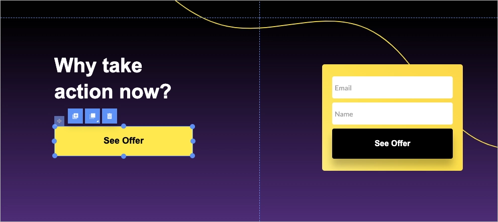
#1 Keep the layout simple
Keep the layout simple – that’s the first rule of an effective splash page. A cluttered or overwhelming design can distract visitors and reduce the effectiveness of your message. Instead, focus on creating a clean and uncluttered layout that highlights the most important elements, such as your brand logo, a compelling headline, and a clear call to action.
Start with a minimalist structure. Splash pages’ purpose is to deliver a single message and prompt a quick decision, whether that’s entering the site, signing up, or clicking through.
Make sure your key elements are impossible to miss. The logo should confirm brand identity at a glance, the headline should spark interest immediately, and the call to action should be prominent and easy to act on. Provide spacing between elements to give the page room to breathe, making it easier for users to absorb the content without distraction.
Typography plays a bigger role than you might think. Stick to a clean, readable font that works well across devices. Splash pages often appear before users engage deeply with your brand, so first impressions count – if the text is hard to read, users may bounce before taking any action. Color choice also matters. Use a limited palette that supports your brand and draws attention where it’s needed – usually to the call to action. Too many colors can feel chaotic and reduce clarity.
Following these tips will help you create a simple and effective splash page that engages visitors and encourages them to take the desired action, as in the example below:

#2 Clarify the purpose
The purpose is the first thing your splash page should communicate. Visitors should immediately understand why the page exists and what action you want them to take.
That clarity starts with a strong, informative headline that highlights the reason they’re seeing this page – whether it’s to verify age, announce a sale, promote a product launch, or encourage sign-ups.
Your call to action should be just as clear. Whether it’s “Enter Site,” “Sign Up Now,” or “Shop the Collection,” make it obvious and persuasive. A specific call to action not only tells visitors exactly what to do but also reduces friction by guiding them with purpose. Avoid ambiguity – confusing language or too many choices can cause visitors to leave before taking any action. The more focused your message, the more effective your splash page will be.
Clarifying the purpose of your splash page can help visitors understand the value proposition and encourage them to take the desired action. Ballantine’s splash page leveraged for age verification purposes is clear and straightforward:

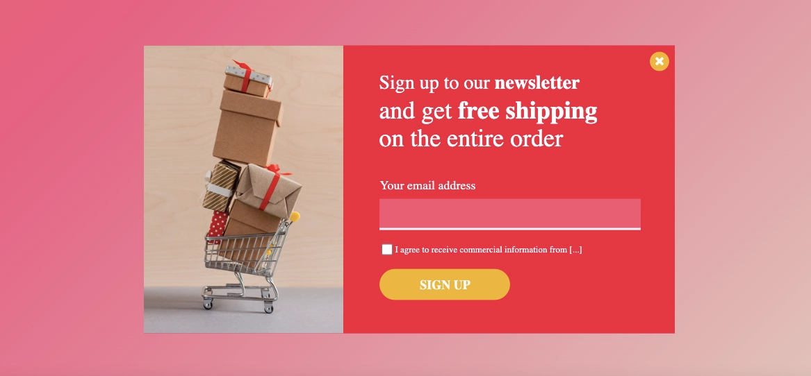
#3 Use a simple form
The form on a splash page should be short, clear, and easy to complete – especially if your goal is to generate leads. E-commerce brands often use splash pages to promote limited-time offers or discounts in exchange for basic customer data, such as an email address. But if the form is too long or asks for too much, visitors are likely to leave before submitting anything.
Stick to a name and email address unless you have a strong reason to ask for more. Use clear labels so people immediately know what to type, and make sure the form works just as smoothly on mobile as it does on desktop. A straightforward, well-designed form keeps visitors focused and makes it easier for them to say yes.
A simple and user-friendly form, such as in the example below, can increase the likelihood of visitors completing the process and becoming leads for your business.

What Is the Average Conversion Rate for the Splash Landing Page?
The average conversion rate for splash landing pages can be deduced from the general benchmark for landing pages, which sits at 2.35% across all industries. Some reports, like those from HubSpot, suggest even higher averages – around 5.89%. While exact data for splash pages specifically isn’t widely available, these numbers offer a practical starting point for setting realistic goals.
Remember that continuous conversion optimization can help you reach above-average results.
Once your splash page is live, you should track its performance with professional tools like EventTracker from Landingi. The data gathered will help you make informed decisions about refining your splash pages, which is the best, proven method for boosting conversion rates.
Know what works. Fix what doesn’t! EventTracker shows you the truth behind your splash page performance.
How Can I Optimize My Splash Page for Higher Conversion Rates?
To optimize your splash page for higher conversion rates, use a minimalist design, craft a clear CTA, ensure fast loading speed, focus on mobile optimization, add social proof elements or trust signals, and, depending on the page’s purpose, use a simple form. Remember to run A/B tests and use analytics to make data-based changes.

Here’s how to make sure yours is doing its job effectively.
Start with a clean design. A splash page should highlight a single message or action, so avoid unnecessary elements that compete for attention. A simple layout helps site visitors stay focused on what matters.
Your call to action needs to be obvious and inviting. Use strong contrast, clear language, and make sure it’s placed where people can’t miss it. Whether you’re asking users to subscribe, claim an offer, or continue to the main site, don’t make them guess what to do next.
Speed is non-negotiable. A splash page should load almost instantly. Compress images, remove any scripts or animations that aren’t essential, and keep the code lightweight. Visitors won’t wait – they’ll just leave. Mobile optimization is also critical. Your splash page should work just as well on a phone as on a desktop. Make sure all elements resize correctly, buttons are easy to tap, and forms are functional on smaller screens.
Trust matters. Add social proof like customer reviews, the number of people who have already signed up, or verified trust badges. These cues help build credibility and reduce hesitation. If you include a form, keep it short. Ask only for the information you truly need. The fewer fields people have to fill out, the more likely they are to finish the process.
Test your ideas. Use A/B testing to compare variations of headlines, images, calls to action, and layouts. Small changes can have a big impact, and data will tell you what actually works with your audience. Keep refining the page based on real user behavior. Track how visitors interact with the relevant content, see where they drop off, and look for patterns. Use that insight to make smart adjustments that improve conversions over time – an essential part of successful digital marketing.
What Are the Key Elements of an Effective Splash Page?
The key elements of an effective splash page include an engaging headline, strong visuals, concise copy, an impactful CTA, minimal design, simple form, and trust signals. When combined effectively, these elements create a splash page that captures attention and encourages action.
A strong headline is essential. It should be short, clear, and immediately communicate your offer or purpose. If it doesn’t grab someone in seconds, you risk losing them.
Visuals also play a key role. High-quality images or short videos that reflect your brand can create an instant emotional connection. They help website visitors feel something before they even start reading.
The text needs to be just as efficient. Keep the copy brief, persuasive, and focused. This isn’t the place for long paragraphs – explain the value, highlight the benefit, and move the reader toward the next step.
That step is usually a call to action, and it needs to stand out. The CTA button should be prominent, specific, and action-driven, like “Get Started” or “Claim Your Free Trial.”
Design should be minimal. A clean layout with lots of white space makes it easier for users to focus on the message and CTA without distractions. If your splash page includes a form, keep it simple. Ask for only the information you truly need – usually just one or two fields. The fewer the barriers, the better the conversion rate.
Stop guessing – start designing smart! Explore our conversion-focused web design services.
Finally, build trust. Add visual cues like customer testimonials, industry awards, or security badges to reassure visitors that your offer is credible. Each element should contribute to a smooth, intuitive user flow that guides people naturally from arrival to action.
What Is the Best Splash Page Landing Page Builder?
The best splash page landing page builder is Landingi, a landing page operation system designed for creating high-converting pages without requiring coding skills. It offers an intuitive drag-and-drop editor, making it easy to customize your page layout and design. With various landing page and pop-up templates, you can quickly create professional splash pages tailored to your brand’s needs.

Landingi also offers advanced AI landing page capabilities that go beyond generating copy, headlines, and visuals. With Lunar, Landingi’s AI-native landing page generator, you can create complete, editable, launch-ready pages from prompts, which makes building splash pages much faster. Once your page is live, you can use the A/B testing tool to experiment with different versions and identify the one that performs best. EventTracker lets you monitor user behavior through a transparent dashboard, while Solis AI builds on that data by analyzing landing page context and behavioral signals to deliver insights, alerts, and practical optimization recommendations. Together, Landingi tools help you improve user engagement and make smarter, data-based adjustments without relying on external software.
Additionally, Landingi supports integrations with popular marketing tools like CRM systems, email marketing platforms, and others, making it a comprehensive solution for capturing leads. Its user-friendly interface, flexible design options, robust marketing integrations, and expanding AI ecosystem make Landingi a top choice for building effective splash pages for various purposes, including lead generation.
Craft Perfect Splash Pages with Landingi
Overall, today’s splash pages are highly versatile. You can use them to make announcements, promote new products or discounts, grab visitors’ contact details, introduce your brand to potential customers, and much more. Whether digital marketers want to drive engagement or simply guide where users land first on a website, splash pages offer countless possibilities.
That said, consider implementing them into your website – especially with Landingi. The platform makes things easier than ever. With 400+ templates, a pixel-perfect builder, Lunar for AI page generation, and Solis for AI optimization, you can build and improve fully customized splash pages in less time. And if you’re still unsure about splash page vs landing page, Landingi’s resources can help you understand when and how to use each one effectively.


