

A startup landing page is a crucial tool for converting visitors into potential customers, investors, or subscribers. It’s often the first interaction people have with your brand, making it a key element in your marketing strategy. Startups are more incentivized to keep visitors interested and follow through on desired goals. Since brand recognition is low in the early days of the company’s life cycle and remarketing costs can consume the budget, using landing pages instead of traditional homepages is a solid choice. Waseem Bashir of Apexure estimates the typical cost of designing a landing page with tools is $113, but to create a single, powerful page, you can leverage professional tools that offer a free plan, like Landingi.
After all, landing pages are more conversion-focused than regular web pages. Keeping conversions high is one of the key performance indicators for marketers in any business, especially in startups. While creating your startup landing page, set up achievable conversion goals based on the average landing page CVR in your industry, and stick to the following tips:
- Keep the layout clear and intuitive.
- Highlight unique value proposition.
- Use benefit-oriented language.
- Leverage high-quality visuals.
- Use strong CTAs and simple forms.
- Implement social proof elements.
This article will help you understand the basics, guide you through the creation of a high-converting landing page, and show the best practices within great real-life startup pages. Whether launching a new product or building brand awareness, mastering the art of creating a well-performing landing page is vital for your startup’s success. Explore landing page examples, get inspired, and create your own startup landing page that will be your ticket to converting more visitors into leads or customers.

What Is a Startup Landing Page?
A startup landing page is a dedicated web page designed to capture the attention of visitors and convert them into leads, customers, or subscribers. Unlike a full website, a startup landing page is focused on a single goal, such as promoting a product launch, gathering email sign-ups, or driving app downloads. It’s often used to test ideas, generate buzz, or validate a concept before a full-scale product launch.
The page is typically simple and straightforward, with a clear call-to-action (CTA) that guides visitors toward a specific action (signing up for a newsletter, requesting more information, etc.). The design and content are crafted to resonate with the target audience, addressing their pain points and showcasing the unique value proposition of the startup.
In the context of a startup, a well-designed landing page is a powerful tool for building initial traction. It allows startups to engage potential users or investors, gather valuable data, and measure the effectiveness of their marketing efforts, all while operating on a lean budget.
How Do I Create a Startup Landing Page?
To create a landing page for a startup, start with two important steps: define your objective and identify your target audience. Then, choose the best landing page platform –Landingi, choose a template, and customize it to match your brand‘s visual identity. Keep the layout clear, craft a compelling headline, and add persuasive copy and visual elements. Remember to optimize your page for mobile. Once your page is ready, launch it and conduct A/B tests to find elements that perform best. Leverage analytics to make data-based adjustments.
When creating a startup landing page, stick to the following 9-step guide to ensure it captures attention and drives conversions:
- Define your objective – start by identifying the primary goal of your landing page. Whether it’s to gather email sign-ups, promote a new product, or secure pre-orders, having a clear objective will guide the design and content choices.
- Identify your target audience – understand them and research their pain points, preferences, and motivations. This knowledge will help you tailor the messaging and design to resonate with them, making your landing page more compelling.
- Design a user-friendly layout – it should be clean and visually appealing, guiding visitors naturally toward your call-to-action (CTA). Use a simple design with plenty of white space, and ensure the CTA is prominently placed and easy to interact with.
- Craft a compelling headline – your headline should immediately grab attention and convey the core benefit of your product or service. It needs to be clear, concise, and aligned with the needs of your target audience.
- Create persuasive content – use clear, benefit-focused language to communicate your value proposition. Include key details about your product or service, but keep it concise. Use AI landing page features in the Landingi editor to generate high-quality content for your startup page. Support content with testimonials, case studies, or social proof to build credibility and trust.
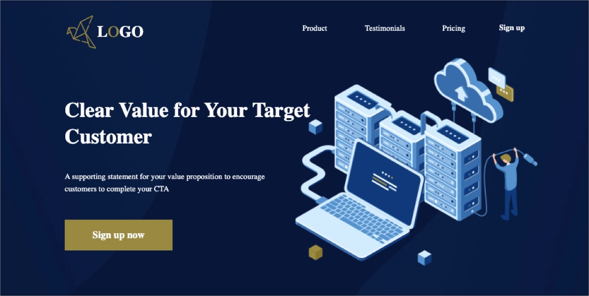
- Add visual elements – incorporate high-quality images, videos, or graphics that support your message and make the page visually engaging. Visual elements should enhance the overall message and guide users toward the CTA.
- Optimize for mobile – ensure your landing page is responsive and looks great on all devices. With many users accessing content via smartphones, a mobile-friendly design is essential for capturing leads effectively.
- Test and iterate – before launching, test your landing page to ensure everything works smoothly. After launching, use A/B testing to experiment with headlines, CTAs, and designs. Gather data on user behavior and continuously optimize the page to improve conversion rates.
- Analyze performance – monitor the performance of your landing page using analytics tools, like EventTracker from Landingi. Track metrics like conversion rates, bounce rates, and user engagement to understand how well your page performs and make necessary adjustments.
5 Best Examples of Startup Landing Pages
Check out the 5 examples of well-performing startup landing pages and inspire yourself to create a high-converting page for your business. Find out which key elements influence the success of these pages and discover powerful designs that drive startup success.
1. Vaayu
The first example showcases Vaayu’s landing page, which effectively combines sleek design with a powerful message. This page immediately communicates its value proposition as a leader in carbon and impact management for retail, using clear, concise language and visually appealing elements. It’s clear that someone took a lot of time to prepare Vaayu’s landing page since it’s a technically advanced page. The first element you’ll notice is the plethora of animations. There is movement in most sections. One of the most exciting parts of the page is the “How Vayyu Works” section. Instead of scrolling vertically like most pages, it scrolls horizontally from left to right. It’s a clever idea that makes the viewing experience more interesting.

The page is strategically structured, guiding visitors through key information about the platform’s benefits, how it works, and trust signals that build credibility. As for the negatives, there are a few. The first one concerns testimonials. While the page is nice and interactive, Vayyu’s customer stories and testimonials from clients are displayed in a different tab, which can make the visitor leave the page forever instead of keeping them on it. Animations build interest, but they make the page heavy, so it loads slower than it could. Instead of conversions, it can increase bounce rates.
Key takeaways to learn from this example:
- Clear layout,
- Interactive elements,
- Compelling headline,
- “How it works” section,
- Trust signals.
Improvement areas:
- Page load speed – the rich visual elements and animations may impact load times, so optimizing these for speed could enhance the overall user experience.
2. Ranktracker
The second example is Ranktracker’s landing page. It combines a professional design with clear, compelling content to effectively showcase its all-in-one SEO platform. Ranktracker’s landing page immediately highlights its core offerings, making it easy for visitors to understand the value of the service. The page is visually engaging, with strategic use of imagery and color to draw attention to key features and calls to action (CTAs). The copy is short, but the message is clear from the get-go. A promise of increasing traffic data by using SEO tools is probably exactly what the audience may be looking for at sites of this kind. For those who need more information, a video on the left delivers a more extensive (yet still very precise) list of benefits for Ranktracker users.

Additionally, Ranktracker’s landing page is optimized for conversion, with multiple CTAs placed throughout the page to encourage visitors to sign up or learn more about the platform. It also includes customer testimonials, logos of well-known clients, and trust badges, building brand credibility. The overall user experience is seamless, ensuring that visitors are guided smoothly from learning about the product to taking the desired action, making it an exemplary startup landing page designed to convert leads into customers.
Key takeaways to learn from this example:
- Compelling headline,
- Video in the hero section,
- Clear layout,
- Features and benefits section,
- Trust signals,
- Outstanding CTAs.
Improvement areas:
- The page length – the landing page is stuffed with too much information, which makes it impossible for visitors to read everything from end to end. It may result in losing interest and overlooking the most important information.
3. Perspective
The third example, Perspective’s landing page is a strong startup landing page designed to attract developers, partners, and researchers interested in online moderation tools. The page is clean and visually engaging, making use of a consistent color scheme and simple yet effective typography that ensures readability and a modern aesthetic. The headline clearly communicates the value proposition, capturing attention and setting the tone for the rest of the content. The animation in the hero section looks nice.

The short copy conveys the tool’s goal, giving visitors enough context to know what Perspective does. There is a text box where people can type in any text and see the tool in action. It’s an amazing idea – giving potential customers a taste of how it works. The call-to-action (CTA) buttons are strategically placed and are easy to find, guiding users toward further exploration of the product or immediate action, such as getting started with the API.
Key takeaways to learn from this example:
- Interactive demo,
- Clear value proposition,
- Effective use of multimedia,
- Partner logos,
- Strong CTAs.
Improvement areas:
- Simplification of content – while the content is informative, further simplification or summarization of key points might help retain visitors who prefer a quicker overview.
4. Dibbs
The fourth example is Dibbs landing page that effectively communicates the company’s innovative approach to digital asset management. The page is visually appealing with a modern design that features a sleek layout, combining vibrant colors with clear, high-quality images that align with the brand’s tech-driven identity. The headline immediately captures attention, positioning Dibbs as the premier platform for asset-backed NFTs, which is further reinforced by the succinct and compelling subheadings.

One of the strengths of the Dibbs landing page is its well-organized content that guides the user through the benefits and functionalities of their platform. The page includes sections that explain who they serve, how their service works, and the advantages of using their platform. The use of partner logos adds credibility and trustworthiness to the brand. Additionally, the “Schedule a Demo” call-to-action (CTA) is prominently placed, making it easy for potential customers to engage further with the service.
Key takeaways to learn from this example:
- Intuitive layout,
- Strong visual identity,
- Interactive elements,
- Clear Value Proposition,
- Prominent CTAs.
Improvement areas:
- Mobile optimization – while the desktop version is visually compelling, ensuring that all elements are optimized for mobile could improve accessibility and user experience across devices.
5. Pave
The fifth example is Pave’s landing page. With a clean and minimalist design, the page uses a modern aesthetic that aligns with the tech-savvy nature of its audience. The use of a simple yet effective color scheme, combined with the sleek typography, ensures that the content is both readable and visually appealing. The headline is straightforward, likely focusing on the core value proposition of the app, which grabs attention without overwhelming the visitor.

One of the key strengths of the Pave landing page is its focus on user experience. The page is short but in a good way. There is a clear distinction between each section, both visually and content-wise. Everything is in its own place. The layout is intuitive, guiding users naturally through the content with clear and concise messaging. The page likely highlights the product’s main features and benefits, making it easy for potential users to understand what Pave offers and why it is valuable. Additionally, the presence of a prominent call-to-action (CTA), helps to drive conversions by encouraging visitors to take immediate action.
Key takeaways to learn from this example:
- Minimalist design,
- User-centric layout,
- Effective CTA placement,
- Social proof elements.
Improvement areas:
- Content depth – the minimalist approach is effective, yet adding more detailed content or use cases could help to further convince potential users of the product’s value.
3 Startup Landing Page Template Examples
Check out the best examples of landing page templates for startups from Landingi. These pre-designed pages can be a great starting point for creating an effective landing page for your business. These templates include the key elements you should use on your page, and their layouts are designed for a smooth user experience. Each template is free and fully customizable, so you can easily adapt them to your brand identity, showcase your unique offerings, and make them engaging for your target audience.
1. Software Functionality
The first example is a Software Functionality template designed to capture users’ attention immediately with a video in the hero section. By creating a compelling headline that clearly contextualizes the video, you can effectively engage users to learn more about your offer.

This template includes sections for showcasing features and benefits. These sections are designed to be concise and visually appealing – you can add short copy and attractive pictures illustrating your product in use. There is also space for testimonials and other social proof elements, so you can leverage them to build trust among potential customers. Outstanding and well-placed CTA buttons will make your page highly effective in driving conversions.
2. SaaS Website
The second example is a SaaS Website template that can help you craft an effective landing page for your SaaS startup. Its hero section includes eye-catching headlines, an image, and an outstanding CTA button. The page has a clear feature section and allows you to not only show your product but also convince your audience they need it with concise use cases and a list of benefits.
The template includes space for user testimonials and a pricing table, an important element of every SaaS landing page. Offering a free trial and using a simple sign-up form with two just two fields can generate leads effortlessly. This template is professionally designed to help you craft a high-converting startup landing page, including all the key elements it should have.
3. New Technology
The third example is a New Technology template with a lead capture form in the hero section. This form, placed near the compelling headlines and attractive image, is highly effective, particularly thanks to a minimized number of fields and an additional, concise benefit list. The page template includes a space for partner or renowned customer logos and allows you to highlight the value proposition in a concise, visually appealing way.

It also has additional social proof elements, such as testimonials and company experience sections. With outstanding CTA buttons, you can easily direct the user’s attention to take the desired action. This template will allow you to craft a perfect landing page with a short yet effective structure.
How Can I Optimize My Startup Landing Page for Higher Conversion Rates?
To optimize your startup landing page for higher conversion rates, you should fine-tune its key elements, including design, CTA, social proof, content, and form, to ensure they resonate with your target audience and encourage them to take the desired action. You should also ensure mobile responsiveness. Remember that all these adjustments should be made based on data gathered with analytics tools, such as EventTracker. Don’t rely solely on guesswork – a data-driven approach ensures that your optimizations are targeted and yield the best possible results.
Learn the following strategies that will help you achieve the best conversion results:
1. Simplify page design
Firstly, simplify your landing page design. A clutter-free layout keeps the focus on your call-to-action (CTA). Use plenty of white space to create a clean and uncluttered appearance. Limit distractions by removing unnecessary elements that don’t contribute to the conversion process. Ensure your page is easy to navigate with clear headings, subheadings, and a logical flow. A simple, visually appealing design helps guide users directly to the call-to-action (CTA) you want them to take. By focusing on simplicity and clarity, you can improve user experience and increase the likelihood of conversions.
2. Improve call-to-action (CTA)
Secondly, improve your call-to-action (CTA). It should be clear, compelling, and easy to find. Use action-oriented language that tells users exactly what to do, such as “Sign Up Now” or “Get Started Today.” Make the CTA button stand out with contrasting colors and strategic placement, typically above the fold or near key information. The CTA is the most important element on your landing page, as it’s the final step in the conversion process, so it should not only focus the user’s attention but also persuade them to take action.
3. Use social proof
Thirdly, use social proof elements to influence user decision-making. Incorporate testimonials, reviews, case studies, or logos of well-known clients to build trust and credibility. Show numbers – they work best at convincing potential customers. For instance, you can display a number of current newsletter subscribers near the signup form to create a sense of social proof. Social proof reassures visitors that others have benefited from your product or service, making them more likely to convert.
4. Personalize your content
Fourthly, personalize your content. Customize your messaging to target specific audience segments and deliver a more personalized experience. Use dynamic content that adapts to individual user behavior, location, or preferences. This tailored approach can significantly boost engagement and conversions by addressing the unique needs of each visitor.
5. Leverage urgency and scarcity
Fifthly, leverage urgency and scarcity to create a sense of FOMO (Fear Of Missing Out) and encourage immediate action. Various strategies can help achieve this, including using limited–time offers, leveraging scarcity messaging, displaying countdown timers, or offering exclusive access. Offer time-bound discounts, promotions, or bonuses, and highlight the limited availability of your product or service, whether it’s a specific quantity or a short-term promotion. By leveraging urgency and scarcity, you can increase the perceived value of your offer and motivate visitors to take action before it’s too late. However, it’s important to use these tactics ethically and avoid creating a false sense of urgency.
6. Ensure mobile responsiveness
Sixthly, ensure mobile responsiveness. Optimize the layout, buttons, and content for mobile users to provide a seamless experience and capture leads on the go. A mobile-responsive design ensures your page looks and functions correctly on all devices, from smartphones to tablets. This not only improves the user experience but reduces bounce rates and increases the likelihood of conversions.
7. Optimize page load speed
Seventhly, optimize page load speed. Optimize images, use efficient coding, and leverage caching techniques to ensure your landing page loads quickly. A slow-loading page can drive visitors away before they even see your content. A faster page not only improves user experience but also boosts conversion rates.
8. A/B test regularly
Eighthly, conduct A/B tests regularly. Optimize your landing page through continuous testing. Experiment with headlines, images, CTAs, forms, and layouts to see what resonates best with your audience. A/B testing allows you to make data-driven decisions and continually improve your landing page’s performance based on user behavior and real performance.
9. Utilize analytics tools
Ninthly, utilize analytics tools, like EventTracker, to track user behavior, conversion rates, and other key metrics. You can gain valuable insights into visitor behavior and identify areas where your landing page may not meet expectations. By analyzing this data, you can make informed decisions about optimizing your landing page to improve user experience and drive conversions.
What Are the Key Elements of an Effective Startup Landing Page?
In addition to the components of a valid landing page, there are a few key elements of best startup landing pages, such as a visual eyecatcher, a compelling value statement, emotional tug, reliability cues, product or service explanation, a special offer, and a lead capture form. Your startup’s landing page shouldn’t lack these elements in order to be effective and provide the expected results.
Use the following components to ensure your pages generate leads efficiently:
#1 Visual Eyecatcher – the First Impression Matters
The first of the well-performing startup landing page essential elements is a visual eyecatcher. This initial element grabs visitors’ attention and draws them into your landing page. It should be visually appealing, relevant to your product or service, and immediately convey the key message or value proposition.
You can inspire yourself with the following eyecatcher examples and choose the one that best fits your brand and offer:
- High-quality hero image – a captivating image that sets the tone for your landing page and showcases your product or service in action.
- Eye-catching animation – a short animation or GIF that adds movement and interest to your page.
- Compelling video – a video that visually explains your product or service and tells a story.
- Iconic graphic – a unique and memorable graphic that represents your brand or product.
- Attention-grabbing headline – a bold and engaging headline that immediately grabs the visitor’s attention.
#2 Compelling Value Statement – the Offer Must Engage
The second element your startup page shouldn’t lack is a compelling value statement that succinctly articulates the unique benefits and value your product or service offers to your target audience. It should be clear, concise, and easy to understand, highlighting the key problem your solution solves and the positive outcomes it delivers.
To create a strong value statement, consider the following tips:
- Clearly define the problem – identify the pain point your product or service addresses.
- Highlight the benefits – emphasize the positive outcomes your solution delivers.
- Use persuasive language – employ strong verbs and vivid imagery to create a compelling message.
- Align with your target audience – tailor the statement to resonate with the needs and desires of your ideal customer.
By crafting a compelling value statement, you can effectively communicate the value of your offering and entice visitors to learn more.
#3 Emotional Tug – the Connection Drives Motivation
The third element of a high-converting startup landing page is an emotional tug. Implementing emotional appeals is a strategy that creates a personal connection and makes your landing page more memorable. By evoking feelings such as joy, excitement, fear, or empathy, you can increase engagement and encourage visitors to take action.
To create an emotional tug, use some of the following methods:
- Tell a story – share a personal anecdote or a customer success story that resonates with your audience.
- Use evocative imagery – choose high-quality graphics that evoke specific emotions and create a visual connection.
- Appeal to a shared value – highlight a common value or belief your audience can relate to.
- Create a sense of urgency or scarcity – use limited-time offers or scarcity messaging to create a sense of FOMO.
- Leverage social proof – showcase positive reviews, testimonials, or endorsements from satisfied customers.
#4 Reliability Cues – Trust and Credibility Boost Conversions
The fourth element of a winning startup landing page is reliability cues. These cues signal to visitors that your startup is trustworthy and credible, helping build confidence in your brand and increasing the likelihood of conversions.
Incorporate some of the following trust signals into your page to achieve the best results:
- Customer testimonials – positive reviews and testimonials from satisfied customers.
- Industry certifications – any relevant certifications or accreditations that establish your expertise and credibility.
- Media mentions – media coverage, press releases, or awards.
- Secure payment badges – recognizable security badges.
- About Us page – detailed information about your company, team, and mission.
- Contact information – email address, phone number, and social media links.
Trust signals are powerful tools that answer your target audience’s common doubts. Once they feel reassured, they are more likely to take desired action.
#5 Product or Service Explanation – Understanding Creates Needs
The fifth component of best-converting startup pages is a product or service explanation. This helps visitors quickly grasp what you offer and how it can benefit them. Yet, your explanation needs to be straightforward and accessible, ensuring that even those with no prior knowledge of your industry or product can easily understand its value. Simplifying complex ideas and avoiding jargon can make your offering more approachable, allowing potential customers to connect with your brand and feel confident in taking the next step.
While crafting your product or service explanation section, include the following key elements:
- Key features – highlight the most important features and benefits of your offering.
- How it works – explain the process or steps involved in using your product or service.
- Unique selling points – emphasize what makes your product or service different from competitors.
- Target audience – clearly define who your product or service is designed for.
- Problem it solves – explain the specific problem your product or service addresses.
#6 Special Offer – Incentive Drives Desire
The sixth key component of a great startup landing page is a special offer. A special offer is a limited-time incentive designed to encourage visitors to take action, such as making a purchase or signing up for a newsletter. It can be a powerful tool for increasing conversions and generating revenue. Depending on your industry and business model, your special offer can be a discount, free trial, special gift with purchase, limited-time offer, or even bundle deals.
When creating a special offer, consider the following areas:
- Relevance – ensure the offer is relevant to your target audience and aligns with your overall marketing strategy.
- Value – make sure the offer provides a significant value to the customer.
- Clarity – clearly communicate the terms and conditions of the offer to avoid confusion.
- Urgency – create a sense of urgency to encourage immediate action.
- Tracking – track the performance of your special offer to measure its effectiveness.
#7 Lead Capture Form – Simple Form Increases Conversions
The last element any startup landing page shouldn’t be missing is a lead capture form. It’s a tool to collect information from visitors interested in your product or service, so it must be perfectly designed, considering the most important principles of user experience. The gathered information can be used to nurture leads, build relationships, and ultimately drive sales.
The key elements to include in your lead capture form are the following:
- Clear and concise fields – only ask for information that is essential for your business, such as name, email address, and phone number.
- Strong call to action – use a compelling call to action, such as “Sign Up Now” or “Get Started,” to encourage visitors to submit the form.
- Benefits of submitting – clearly yet concisely state the benefits of submitting the form, such as receiving exclusive offers, updates, or valuable content.
- Privacy assurance – reassure visitors that their information will be kept confidential and used only for marketing purposes.
- Easy to find – place the form in a prominent location on your landing page, making it easy for visitors to find and complete.
What Is the Best Startup Landing Page Builder?
The best landing page builder for startups is Landingi, offering an intuitive, drag-and-drop editor that makes it easy to create professional, responsive web pages without needing any coding skills. Startups can benefit from its extensive library of over 400 customizable templates designed to accelerate the creation process. These templates cover a variety of use cases, ensuring that startups can find the perfect design for their unique needs.
While crafting your startup landing page with Landingi, you can leverage its AI landing page features to generate attractive content for the entire page or its selected sections, effortlessly craft SEO titles and descriptions, and edit images to create a professional design that builds engagement. You can also automatically translate your landing pages for 29 languages to reach global audiences. Crafting multi-language landing pages for digital marketing purposes with Landingi takes minutes and can significantly boost your conversion rates by eliminating language or cultural barriers.

Landingi also offers essential tools, like A/B testing, thanks to which you can duplicate your page and implement variations to check which one performs best. With a built-in EventTracker tool, you can micro-conversions and user behavior across your page without any complex external software. EventTracker collects all data in a transparent dashboard, making it easier to leverage data for further optimizations.
Additionally, Landingi’s mobile-friendly designs ensure that landing pages look great on all devices, which is crucial for reaching a broad audience. The platform’s ability to handle everything from page creation to optimization makes it an all-in-one solution for startups looking to build and grow their online presence efficiently.
What Are the Startup Landing Page Best Practices?
The 5 startup landing page best practices involve comparing your webpage with other pages in the industry, using animations, leveraging visual content, shifting focus on lead generation instead of sales, and using social proof elements. Check out how these proven methods can enhance your startup landing page’s efficiency:
- Compare your landing pages with the competition – leverage the power of professional tools, such as Ahrefs, to check your competitors’ pages. Using them as a point of reference is a solid idea. Just to be clear: Compare does not mean copy. In fact, knowing what your rivals are doing allows you to get creative and distinguish your creations from theirs.
- Use animations – animations and scroll effects impact the way visitors perceive your page. Movement catches the attention and allows you to showcase more than a regular image. Of course, animations come at a price. The more you use them, the heavier your page gets. Size impacts loading times, so it’s important to keep the animations in moderation.
- Engage with visual content – a similar role is played by traditional visuals. They help convey information quickly and effectively, making it easier for visitors to understand the key messages and benefits of your startup. By using compelling images, videos, and graphics, visual content can evoke emotions, enhance storytelling, and increase the overall engagement and interest of visitors, ultimately encouraging them to explore further and take desired actions. Yet, remember to keep your own startup landing page design straightforward and clear. Sometimes, a sole outstanding and well-thought-out hero image may get the job done.
- Generate interest before making the sale – most landing pages are meant to entice visitors to complete a specific goal. Still, the goal in question must be achievable after scrolling and reading through a relatively short piece of content. For purchase or subscription to happen, the visitor usually takes time to think about all the pros and cons, no matter how well-crafted and convincing the landing page is. That’s why you should shift the focus towards collecting leads for a demo call or waitlist signup. This solution lets the sales team do all the heavy lifting, and you have an email address to send marketing emails and nurture your lead before the purchase takes place.
- Bet on social proof – testimonials, reviews, case studies, logos, and other social proof techniques are great tools for building trust and credibility. If you are at the very early stages of your business journey and your portfolio does not include any reputable clients or partners, simply use what you have. Any positive feedback is relevant to those who are not yet familiar with your brand. Giving them anything that can put your product or service in a positive light may be a good starting point for your persuasion strategy.
What Is the Average Startup Landing Page Conversion Rate?
Since startup is a term that contributes to various industries, there is no specific data reflecting startup landing page efficiency, yet, in general, the average landing page CVR across all industries is 5.89%, according to the newest HubSpot report. This can be a great benchmark to set achievable goals for your newly crafted page. Remember that continuous conversion optimization, based on data, leads to ongoing improvement so you can increase conversions and achieve above-average results.
Build Landing Pages For Your Startup Business With Landingi
A well-designed startup landing page is a powerful tool for generating conversions and building your brand. By understanding the key elements of a successful landing page and following a strategic process to create one, you can effectively attract your target audience and guide them toward action.
The examples we’ve explored demonstrate the diverse possibilities and creativity that can be incorporated into a landing page. Whether you aim to promote a new product, gather leads, or simply raise brand awareness, a well-crafted landing page can be a game-changer. As you implement these strategies, remember to continuously test and optimize your page to ensure it delivers the best results for your startup’s specific objectives.
Build your startup landing page with Landingi – leverage the most valuable landing page platform to craft a standalone web page that truly converts.


