Before we get to the “WHY?” and “HOW TO?” let’s start with some basics. Of course, if you are digital marketing savvy, you may as well skip this part and scroll to (I hope) a bit more interesting aspects of this article.
Personalization of the “message” is one of the essential parts of any marketing campaign. Simply look around you. Almost any communication directed at you, the consumer, tries to be as personalized as possible. It refers to your potential needs, desires, dreams, or aspirations. And it does not matter one bit if we are talking about the car, banking services, or anything else.
Depending on the medium used to communicate with potential customers, the message sent out tries to address at least one of those things. The online ads and their very best companion, the landing pages, allow you for the very detailed personalization of the content message. The better it is done, the more conversions and the better camping effect can be expected.
In this article, we will use a pretty simple example of the landing page and product to give you an idea of what it means to personalize the landing page and
Deliver a better user experience
You may still be wondering why this “personalization” is so important. After all, when we talk about websites in general, we all crave traffic, visits, and clicks. Many of you probably have the experience of starting a page from scratch. Remember those first 100 or 1000 visits and how happy you were? Traffic and the position in the organic search was the thing of focus. The key to your traffic growth at first was the content itself. However, we can bet that with time passed, your content was more and more specific and directed at your target group of visitors or clients.
It is a similar case with landing pages. You do need visits and clicks, but simultaneously, you have to leverage your knowledge about your potential clients to prepare a relevant experience. Tons of traffic that does not convert will be pretty useless. Moreover, it is mostly paid traffic as landing pages are relatively short-lived. You look for specific groups of people potentially interested in your product or service. But very rarely – unless your offer is highly specialized and niche – such a group is a sort of a monolith.
We can safely assume that all and any of such groups can be further divided. Sometimes it will be enough just to look at the potential demographical data – like sex, age, and geographical location. Sometimes you will have to look deeper and analyze “your target group” further. Why do they buy your product? What are the things they are looking for in an offer like yours?
Once you have the potential answers and subgroups, it will be easier for you to deliver them the experience they need to convert.
It is better to use slightly different versions of the landing pages directed at each specific target group.
The above is one of the differences between landing pages and “traditional” websites, like your home page or a product page. Such pages are always more general to suit larger groups of visitors. However, their purpose is different from the landing page.
So, if the ads experience should be as personalized as possible, it would make sense to direct visitors to a personalized landing page rather than your home page, product/service page, or a generic landing page.
We have prepared a simple example to give you a better idea of what we have in mind.
The landing page “must have…”
As you know, on most occasions a standard landing page should consist of a few basic sections.
- An opening section – with a clear ned preferably a catchy header. Here, you can still use a subtitle or so-called subheading to even further enhance the message.
- Section two – the subject of the offer. Present your product or service. Its key benefits, who is it for. This is where your visitors will consider truly, for the first time if the offer is what they are after.
- Section three – what problems, benefits, or advantages will your product or service resolves. How it helps. Focus on the needs and expectations of your clients.
- Section four – if you managed to focus on potential resolved problems in the section above (and this is our recommendation) it would be great if now you could say more about the direct advantages for the user/client. Both the product/service itself as well as of the offer itself. Perhaps it is a sale? Or the offer is limited and it is only available right now. The limitation of the offer addresses what psychology calls a FOMO – “fear of missing out”. “Will I be able to benefit the same way in the future if I’ll pass on the offer now?
- Section five – reinforce your message. You can do so by the use of “socialproof”. Show others – reviews, opinions, etc. – who are already using your product with success.
- Section 6 – summarize the above with a short catchy heading, don’t forget to address the CTA in a strong way.
Having said that, the different types of “call to action” – presented as buttons or heading should come in between almost all sections of the page. But, if your sections are shorter don’t overdo it. You wish to create “the need” not to sound pushy.
So… how we did do it and how did we go about the personalization of the landing page?
We have started with a simple page for one product, a hand blender.
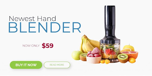
A simple ad and a simple page should describe the product. It might feel like that is all you need. People searching for this kind of offer will see your ad. When clicking on the ad, they get to a page with a broader description of your offer.
It is how it usually works with ads linking to pages in online shops. Does such a page offer a personalized experience? To put I bluntly, it does not. And this is where personalized landing pages kick in.
Who may be interested in buying a hand blender? – divide and conquer!
We’ve started by dividing the group of buyers into three potential subgroups.
The first group included “people on the run.” Those who need to prepare healthy meals fast. At home, at work. Who are conscious of what they eat but do not have time to prepare healthy and tasty snacks.
The second group we section off were “sports enthusiasts.” They have a similar need for preparing quick and healthy snacks but for a bit different reasons.
And lastly, the third group included parents who would prefer to prepare a healthy snack for their child instead of relying on ready-made meals and sweets.
For all three groups, we have used exactly the same page and used the duplication to quickly prepare three copies that we can now personalize for each of those sub-groups.
So, what did we change?
The first section of the page has to clearly respond to a visitor and be in pair with the reasons, needs, why’s, and wants. We’ve focused on the message and headings. This is what we came up with.
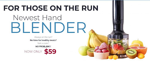
For “people on the run”.
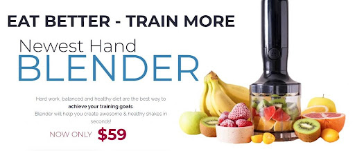
For sports enthusiasts.
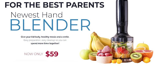
For parents.
As you can see, with a little effort, we have three slightly different pages for each individual group of potentially interested buyers.
This kind of approach allows us to prepare three separate groups of ads that, again, will be better suited for each of the selected groups.
It is worth mentioning that this kind of approach to ads translates directly into the cost of each click and the campaign as a whole. The narrower the target group and the more specific words and phrases you target – that also means you can use a smaller number of them – the more valuable are the clicks and the achieved conversion rate.
What’s more, you will be able to see which group converts better, which is more profitable, and is worth investing more funds into your campaign. At the same time, a clear difference in the campaign results may point you towards better optimization of both ads themselves and the landing page they are linked to.
Time to look at how we have changed the second section of each page. In our case, it is a product description that refers to the particular needs of each of the three groups.
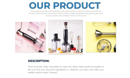
Our message to those on the run refers to the lack of time for snack preparation, health, and hassle usually involved with meal preparation and control – you are what you eat.
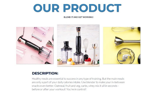
In a similar way, we have addressed the “wants” of sports enthusiasts. However, in the case of this group are message focuses on the training outcome – which is the goal and how a simple blender can help achieve that goal.
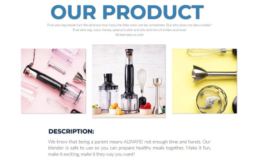
And last, the parents. In the case of this group, we have emphasized the issue of eating fruits & veg, and we do know kids are fussy sometimes. After all, who would prefer a simple carrot over a chocolate bar? But children love shakes. And blending such snacks can be yet another quality time spent together, and something parents and kids can do as a “team”. The safety of the product was also mentioned as this is one of the most important things for any parent.
As you can see, so far, the only thing we were changing is the page content. But a picture is worth a thousand words. Not only in a simple and clear way, it can show the benefits or the problems it addresses, but it also works on the subconscious level. That means it is time to change some of the graphics for something to better match each target group.
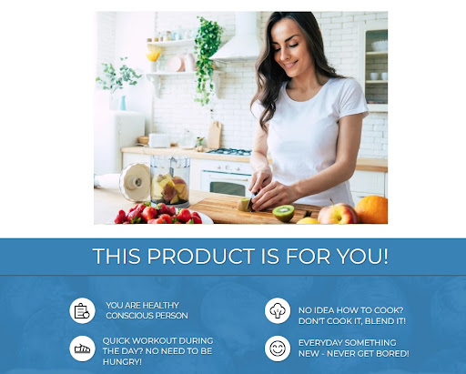
And again, we are showing how our product fits into the needs of busy people looking for a quick and healthy snack during the day.
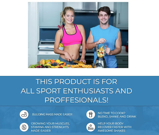
It simply makes sense to show people who are fit, healthy, and using our product. The content below refers to the needs of this group and why they would want to buy and use it.

And since our third group features parents and we have already mentioned the “quality time” and fun parents and children can have together when preparing snacks, it is only natural that we are showing just that.
We have looked at and changed in exactly the same way other sections of each page. Wherever we could adjust the content or the graphics to offer a more personalized experience and the message, we did just that.
The essential part of the landing page that needs addressing is a “social – proof”. It has to show that people similar to visitors are using the product successfully. It requires a little effort but can have a significant impact on the overall performance of the page.
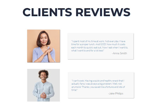
As you can imagine, we present the opinions of people who found our blender helpful in their daily work routine – saving time and money and allowing them to eat more healthily.
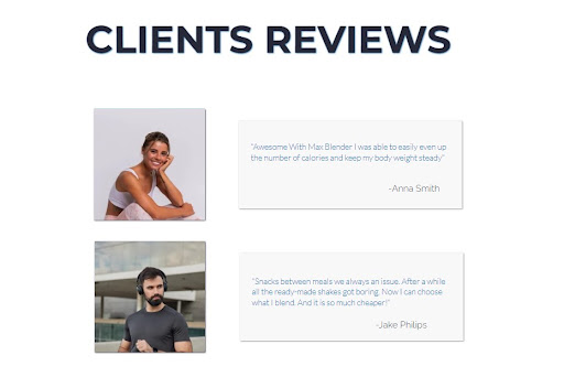
People who found our blender helpful in their daily training routine get better results from their training and exercises.
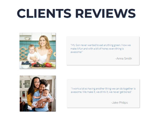
And finally, parents, who at last are able to have even more fun with their kids and get them to eat the healthy stuff.
Of course, each page – as all and any landing pages – has to have a clear CTA and the content that persuades visitors to take action – to buy the product or fill-up the form on the page. CTA should be reflected in buttons and subheadings.
To summarize
Duplicate and personalize the landing page whenever possible. You can start with a single page, but whenever you can, try delivering a more personalized message and experience.
Keep it simple – don’t overload your page with information and text. You do wish to address the basics in an easy-to-follow way.
Don’t go crazy with CTA’s – you need them, but if you overdo the message “BUY,” it will put the people off.
Make sure your page is clear in how its design delivers the content. Too many graphical elements can create a mess on the page and take the focus off the main massage and the CTA. Consider using tools like the PageInsider.
Focus on the user – before starting your campaign, ensure that the content reflects your potential clients’ needs.
More on that here: https://landingi.com/blog/landing-page-design-9-principles/

