
Unlike other types of web or landing pages, splash pages have an introductory role. These pages appear right before a visitor enters your website and are used to make announcements, show promotions, or deliver disclaimers.
Websites can also use splash pages to verify users’ ages or help visitors set their language and country preferences. Although they may not seem like much at first glance, splash pages remain highly versatile.
They can help drive conversions, deliver important messages, grab attention, highlight specific products, and prevent particular audience segments from entering your website.
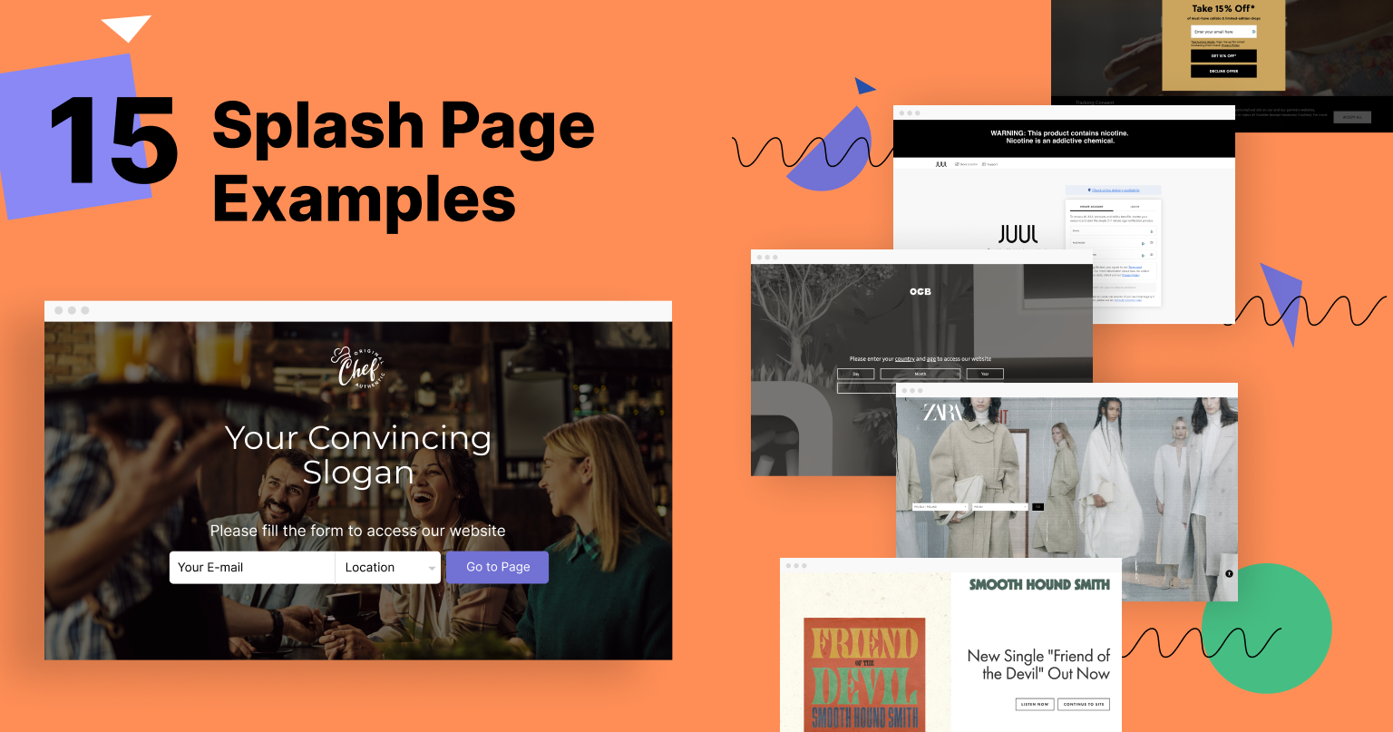
That said, this article will go through 16 splash page examples so you can get inspired and create your own stunning designs for your website. We’ll also show you how easy it is to make a splash page using Landingi’s templates.
So let’s get to it!
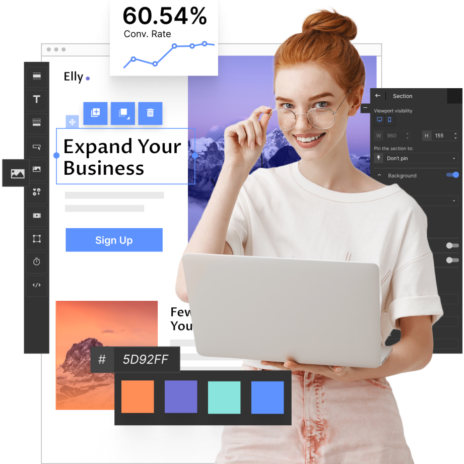
Make your sections smartable and let go of mundane manual tasks with Smart Sections! An easy way to manage bulk changes.
Splash Page Examples And Templates
1. Zara
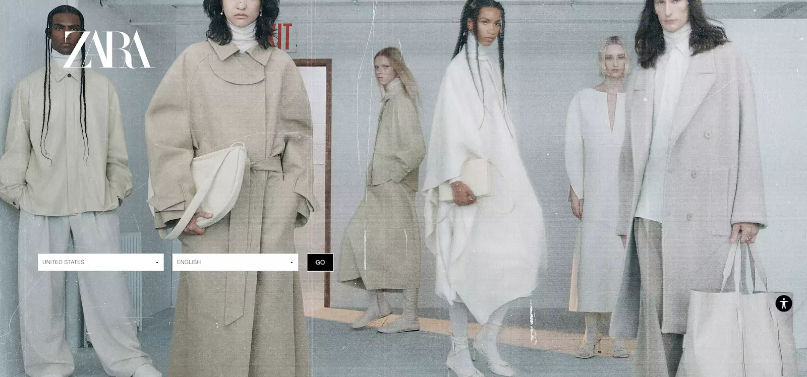
Highlights
- Zara’s splash page declutters the screen by hiding language and country preferences under a drop-down menu
- The web page makes full use of the background to showcase Zara’s products and brand identity
Zara is the perfect example of one of the most common types of splash pages. These pages aim to improve the user experience by allowing visitors to select their country and language preferences prior to entering the website.
Once visitors select their preferences, they’ll be driven to a website that offers products relevant to their region.
In terms of design, Zara brings full attention to its background image by hiding the options under a drop-down menu. This is excellent for setting the overall tone of the website and highlighting key products. It also prevents visitors from clicking away by presenting too many options at once.
2. H&M
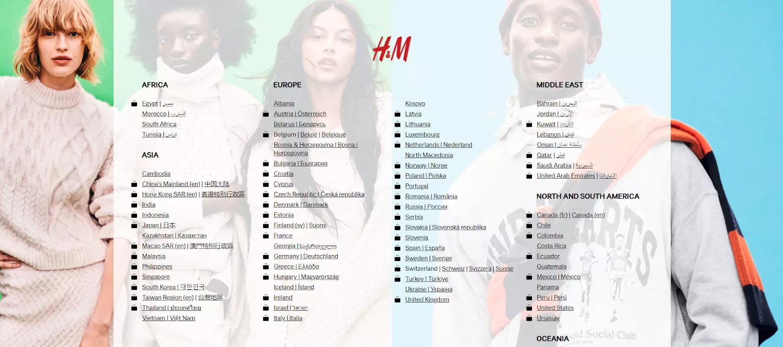
Highlights
- H&M ditches the drop-down menu in favor of listing every location right away
- The background highlights the store’s brand identity and products
Unlike Zara, H&M keeps all of its options visible. Also, each country has a translation to its appropriate language next to it. This makes it easier for visitors to identify their language and country preferences.
Additionally, note how the first layer of the background is transparent. This allows H&M to highlight its brand identity and products despite the presence of multiple language/country preference options.
3. Budweiser
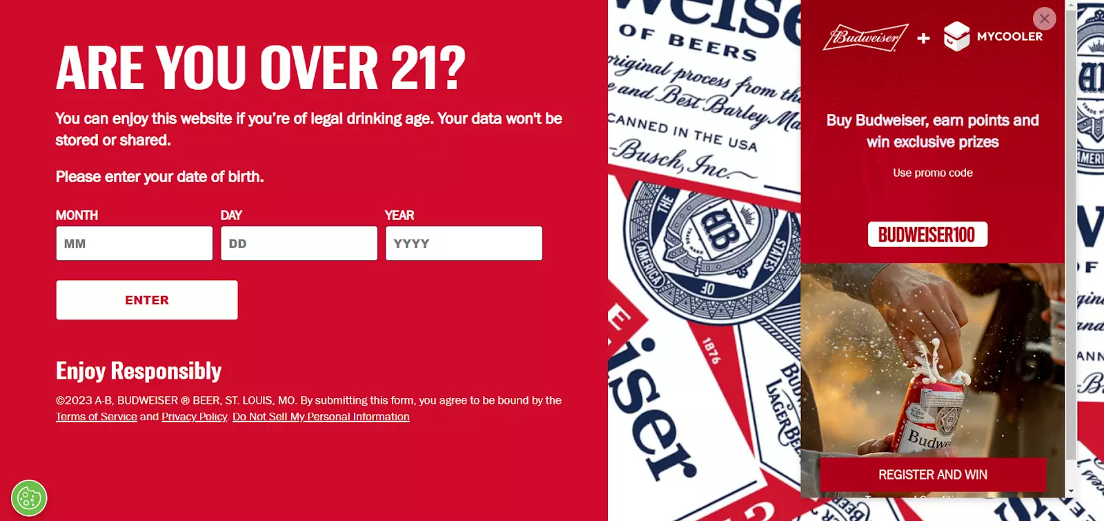
Highlights
- Budweiser uses the splash page’s color palette to highlight the company’s brand identity
- The splash page compels users to enter the website by offering a promo code via an additional pop-up
Budweiser is another common splash page example. In this case, the company uses a splash page to verify the visitors’ ages, preventing underaged people from entering the website.
Although the web page serves a simple main goal, Budweiser also manages to fulfill some secondary objectives.
For one, there’s a pop-up that compels users to sign-up for Budweiser’s loyalty program. This helps grab the visitors’ contact details and generate long-term customers.
Secondly, the splash page’s copy mentions that user data won’t be stored or shared, eliminating any potential factors that may determine visitors to click away.
4. Cannadips
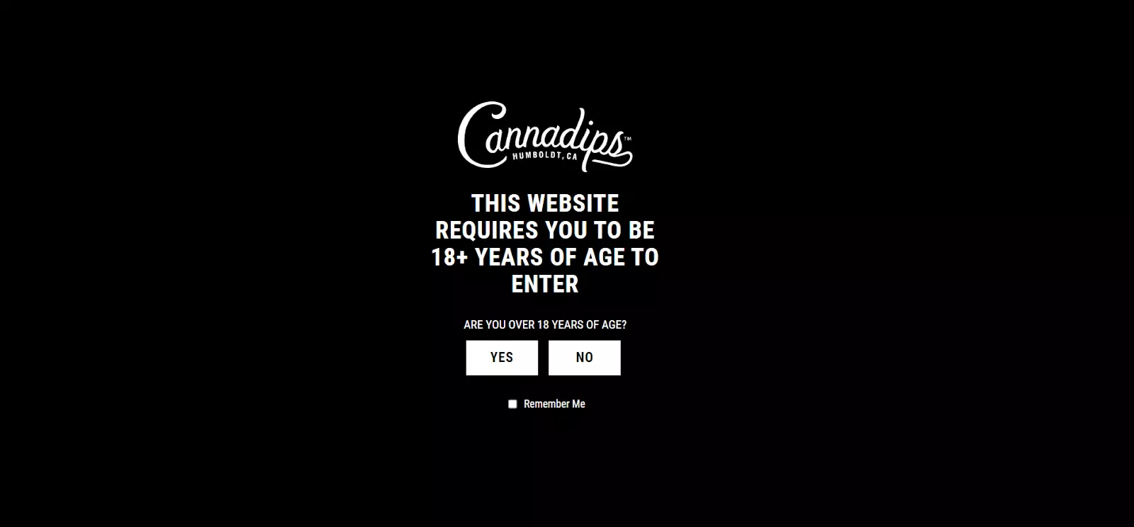
Highlights
- The page’s copy is straight to the point, clearly stating the conditions of entering the website
- The Yes or No buttons allow visitors to enter the website quicker
Cannadips also verifies the visitors’ ages through a splash page. However, unlike Budweiser, Cannadips requires users to confirm whether they’re above 18 years of age via the Yes or No buttons.
This process is much quicker than requiring users to enter their full date of birth, which can minimize bounce rates. Also, the buttons are highlighted using contrasting colors to attract attention.
5. OCB
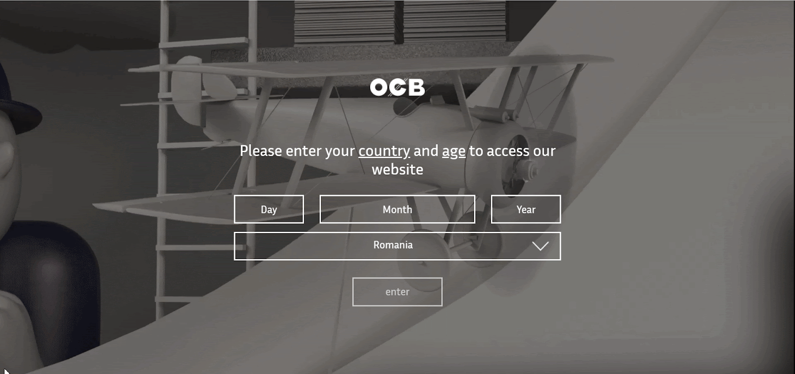
Highlights
- The video background is attention-grabbing and portrays the company’s products/history in a fun manner
- The splash page also requires users to enter their country so they can be redirected to a website relevant to their region
Unlike the other age verification pages above, OCB is slightly different. The company uses a background video to present its products, origins, and achievements throughout its history — an excellent way to get visitors to know the company.
Moreover, OCB requires users to enter their country. They can either type in their country’s name or select one of the options found in the drop-down menu. Visitors will be redirected to different OCB websites depending on their regions.
6. Adidas
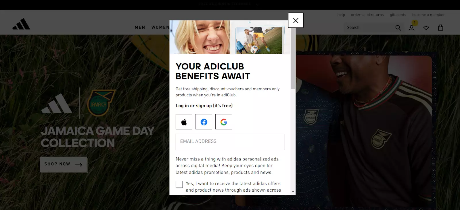
Highlights
- The copy clearly states the benefits of singing-up for the membership club, prompting users to enter their contact details
- The exit button is highly visible, while users can view the main webpage in the background, making the splash page less obtrusive
Adidas uses this splash page to promote its membership club. Aside from highlighting the club’s benefits from the get-go, Adidas gives visitors the option to quickly sign-up with their Facebook, Google, or Apple accounts, making the process as prompt as possible.
Additionally, Adidas asks for minimal contact details. Visitors only need to type in their email addresses. Consequently, they will see the sign-up process as less of an obstacle. Coupled with the clearly stated benefits, Adidas aims to increase conversions.
7. Smooth Hound Smith
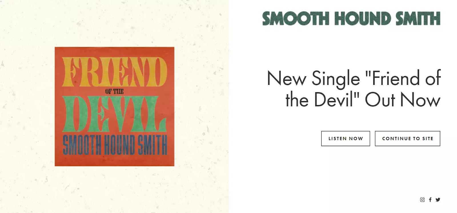
Highlights
- The design is simple, but eye-catching due to its split-screen layout
- The CTAs are highly visible and give visitors clear instructions
Smooth Hound Smith uses the splash page to promote its new album. The page keeps the design simple, but it’s still eye-pleasing through its split-screen layout and a splash of color on the left side, which drives attention toward the album cover.
Meanwhile, the right side uses a straightforward black-and-white color scheme. This emphasizes the page’s copy, which concisely promotes the album release. The CTAs are clearly outlined and offer visitors clear instructions on what to do.
Also, notice how the band included social media links in the bottom-right corner of the screen.
Build a page just like this one with Landingi’s Music Promotion template.
8. CrazyEgg
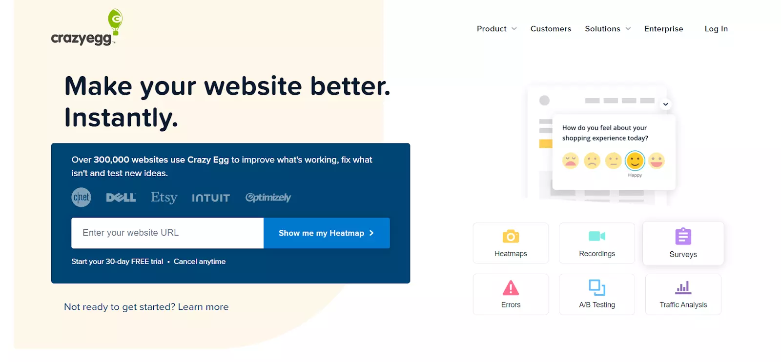
Highlights
- The splash clearly explains what CrazyEgg’s product is and what it does
- The splash page allows users to learn more about the product by clicking on the Learn more button, educating visitors about the platform’s benefits
CrazyEgg aims to increase free trial sign-ups by nudging users to try its heat mapping tool. The copy’s goal is to briefly highlight what the product does and earn the visitor’s trust by mentioning how many websites already use it.
If visitors need further convincing, CrazyEgg encourages them to click on the Learn more button to find out more about how the product works.
Also, notice how there’s no visible exit link/button. Instead, the splash page includes navigation links in the top-right corner, pushing users to explore the website.
Build a page just like this one with Landingi’s Sign-up for Test template.
9. Fossil
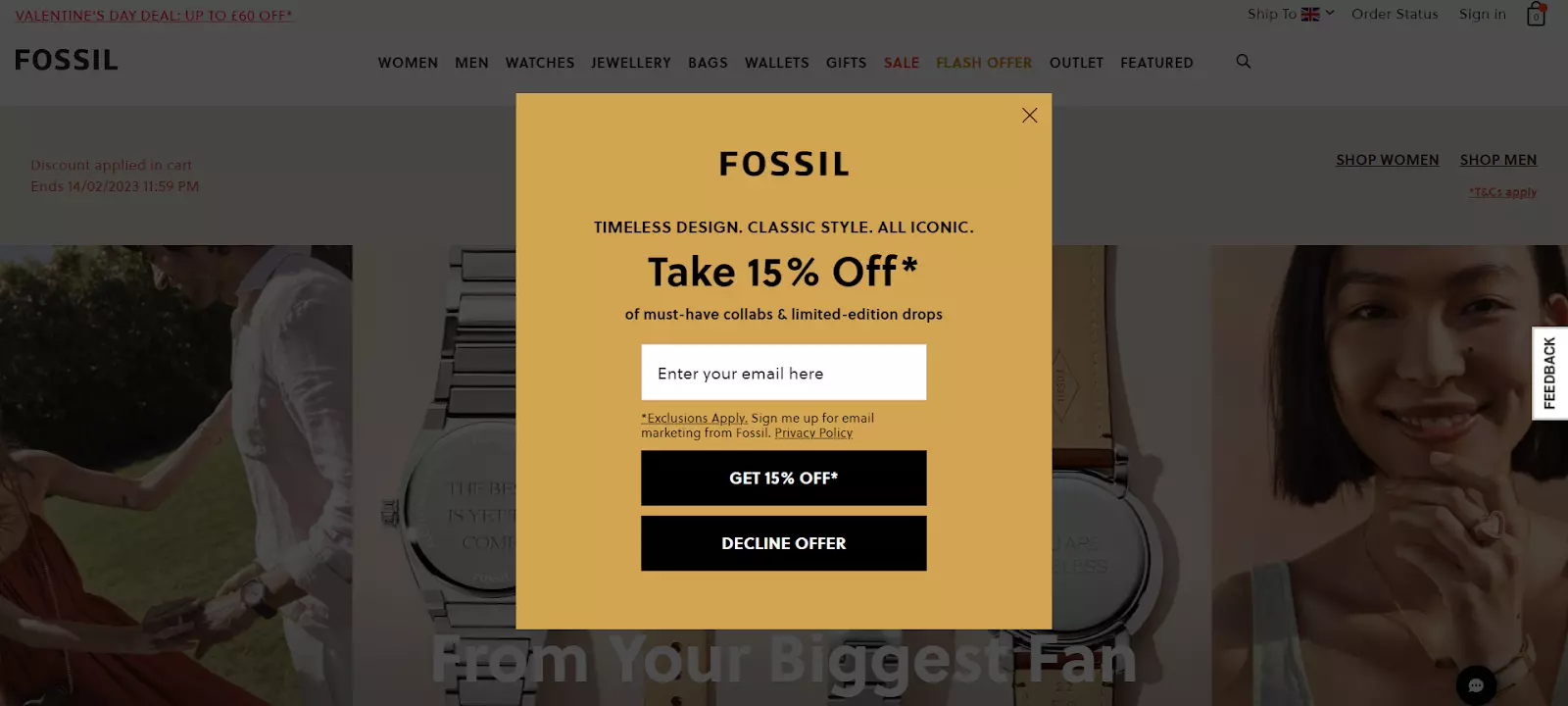
Highlights
- The splash page uses two exit buttons: one in the top-right corner and the other at the bottom
- The discount percentage is evident, using a larger bold font
Fossil’s splash page aims to grab the users’ email addresses in exchange for a 15% discount. The lack of additional mandatory contact details and the presence of two exit buttons make it easy for users to sign-up or proceed to the main webpage right away
The CTA buttons stand out through contrasting colors, while their copy is clear and straight to the point.
Build a template just like this one with Landingis’s Mosaic Splash Page template.
10. GAP
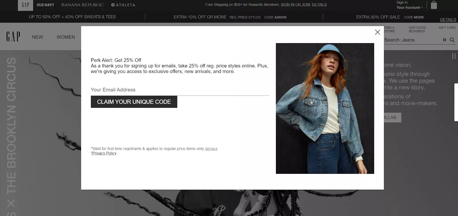
Highlights
- The photo shows GAP’s products, giving visitors an idea of what they can purchase with the 25% discount code
- Besides the discount code, the copy highlights extra benefits to encourage more sign-ups
Similar to Fossil, GAP’s splash page also offers a discount code in exchange for email addresses. However, there are some differences.
As mentioned, GAP uses a photo showcasing its products. The extra visual support is excellent for pushing users to enter their details.
Moreover, the word “unique” within the CTA copy brings out the discount code’s importance. This adds a sense of urgency and persuades visitors to convert.
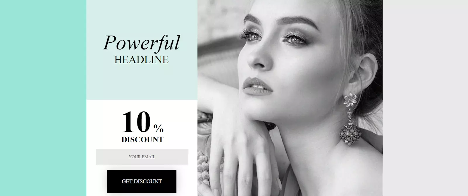
Build a template just like this one with Landingi’s Jewellery Shop template.
11. Schmoll Creative

Highlights
- The splash page drives attention to the copy and CTA button by using minimal design elements
- It makes full use of the background picture to set the overall tone of the website
Schmoll Creative’s splash page is minimalistic, yet highly effective. The copy explains the type of available services, while the CTA button clearly conveys Scmoll’s intentions. Additionally, visitors can scroll down the page to find more information about the art director’s experience and portfolio.
Build a page like this one with Landingi’s Schedule a Call template.
12. Rage Against The Machine
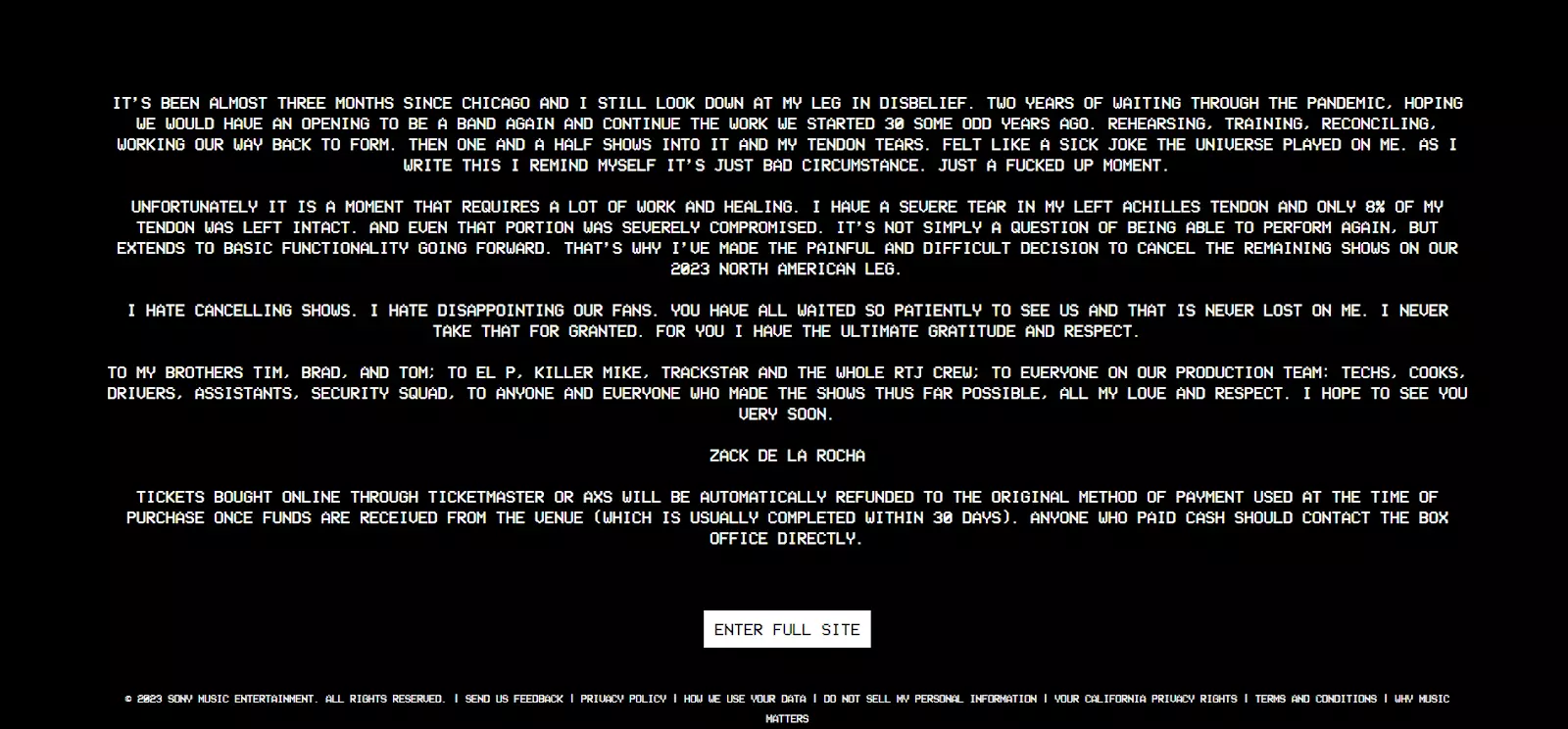
Highlights
- The splash page uses white text on a black background to create contrast and draw the users’ attention
- The CTA button is highly visible, while its copy clearly states its purpose
Rage Against The Machine uses a splash page to share an important announcement — letting users know that the 2023 North American tour has been canceled due to the vocalist’s injury.
Using a splash page for this purpose is an excellent idea, as the band ensures that all visitors acknowledge this piece of news prior to entering the website.
Moreover, the text eliminates any potential uncertainties by specifying that all tickets bought through AXS or Ticketmaster will be refunded. It also includes instructions for those who bought tickets with cash.
13. Poolsuite
Highlights
- Poolsuite uses 90s-style aesthetics to convey the overall look and feel of the website
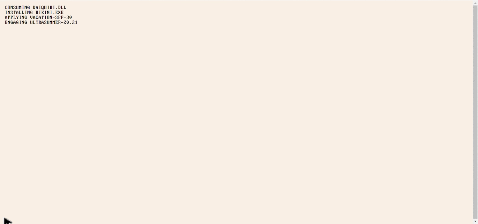
- The splash page is animated to simulate an old-school computer boot-up
Poolsuite’s color scheme, logo, and rudimentary graphics drive users to think about the funky summer dance parties from back in the 80s and 90s — exactly what the website is about. Poolsuite hosts a radio station with 90s-themed dance music.
The splash page simulates the boot-up sequence of an old Macintosh computer, adding an extra layer of nostalgia.
14. WRC
Highlights
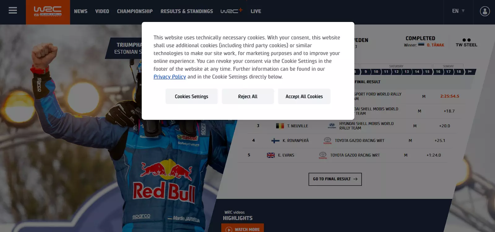
- WRC uses a splash page to display its cookie policy
- The background is transparent, making the splash page less obtrusive
Although some websites display their cookies policy through pop-ups, WRC does it via a splash page, meaning that you can’t proceed to the website without clicking one of the buttons.
The page’s copy briefly explains to users what cookies are for, while the buttons allow visitors to easily accept and reject all cookies, or tweak their preferences through the settings.
15. Maaemo
Highlights
- The page’s black-and-white color scheme reflects the restaurant’s classy atmosphere
- The navigation links are placed at each corner of the screen, making them easy to spot
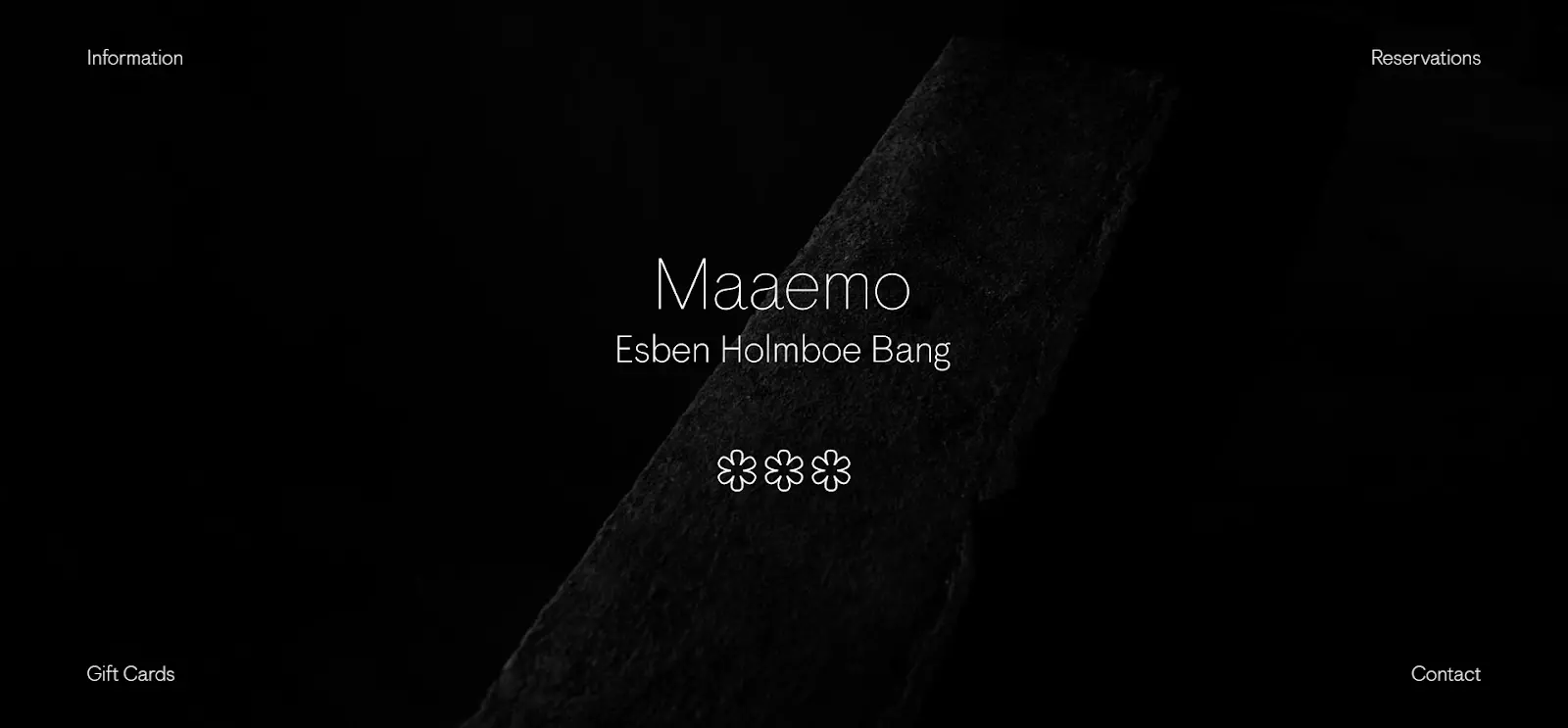
The Norwegian restaurant Maaemo successfully portrays its personality digitally. The page’s black and white color palette reflects the restaurant’s elegance, while the lack of excessive design elements eludes to its minimalist setting.
Additionally, the copy under the header refers to the restaurant’s Scandinavian origins. Although the webpage doesn’t include a CTA button, it offers visitors navigation links to all the necessary information.
Build a page just like this one with Landingi’s Restaurant template.
16. Juul
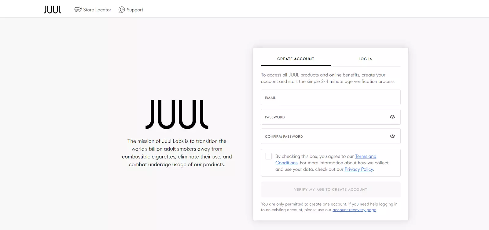
Highlights
- Juul explains its mission under the logo
- The benefits of creating an account are highlighted within the sign-up form’s copy
Juul is an example of a gated splash page — where users need to create an account to access the website. The sign-up form doesn’t require much information so as to not deter users from clicking away.
Moreover, Juul displays the benefits of signing up at the top portion of the form. This helps nudge visitors to fill in their details.
The splash page also serves an introductory role. The company’s main mission is highlighted under the logo, letting first-time visitors know what Jull aims to achieve.
Build a page just like this one with Landingi’s Simple Lead Generation template.
Final Words
Overall, splash pages are highly versatile. You can use them to make announcements, promote new products or discounts, grab visitors’ contact details, get people to know more about your company, and much more.
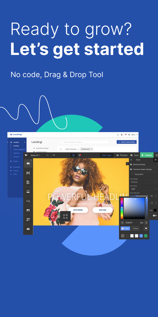
That said, consider implementing them into your website, especially with Landingi. The platform makes things as easy as ever! With its 400+ available templates and pixel-perfect builder, you can set up fully-customized splash pages in no time.