After reading this article, you will learn how to boost your conversions on your landing page by following these principles:
- Utilize the attention ratio
- The Hick’s Laws should be followed
- Utilize contrasting to make your landing page stand out
- Utilize your white space
- Take advantage of highlighting
- Keep your landing page simple and well written
- The 8-second rule is the perfect strategy
- Use faces to make your landing page more human
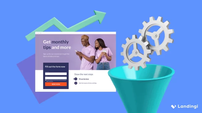
Why does a great landing page matter?
People would much rather interact with a landing page that is good-looking compared to one that isn’t. As per Adobe, if a consumer were given fifteen minutes to absorb content, two-thirds of them would instead read content that is aesthetically pleasing compared to something plan. And even further, 38 percent of those consumers would decide to leave the website. That could be the make or break for a business.
A business cannot afford to overlook landing page design. Fortunately, even if you are not versed in web design, you can learn from videos, hire a designer, etc. to help you with this.
The best place to start, however, is right here with this manual. Follow these principles to boost conversions on your landing page.
Utilize the attention ratio
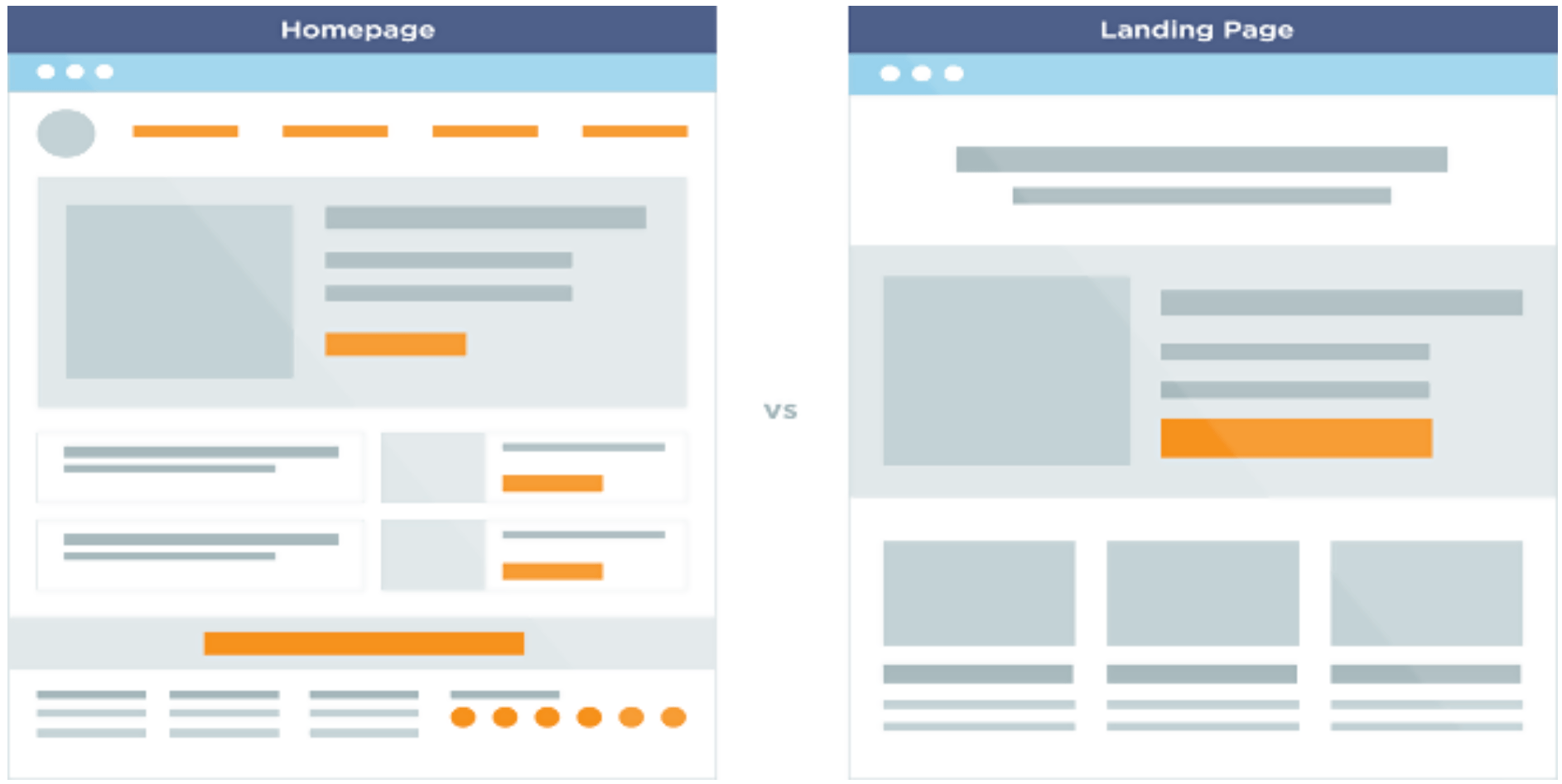
The Hick’s Law should be followed
The Hick’s Law, named after William Edmund Hick, a British psychologist, is a prevalent theory that is used for many different industries – as well when it comes to landing page design.
The law says that’s that the amount of time it takes for a person to make a decision is entirely proportionate to the number of potential choices they have to make. If the number of options increases, the decision time increases as well. When it comes to landing page principles, action by your consumer will be lost by an increased amount of choices to be made.
For you to maximize conversions, you need to limit the decisions your customer needs to make. To go back to the last section on this guide, the amount of choices on your landing page is directly correlated with the customer’s decision to click or not. The Hick’s Law also defines many other obstacles you as a web designer, and your customers have to deal with.
A couple of examples are:
- Picking between browsing more products, reading reviews about the product, or purchasing the product.
- Skimming the names of different blog posts, choosing which one to read.
- Trying to figure out if they should use the scroll down the page more or use the navigation bar.
- Deciding if they should leave a comment on your social media post, share it, or download something you are offering.
There are countless decisions your customers need to make. After reading this, you should understand that cutting back on the number of choices they make is beneficial. It may be stressful for you to have to delete some decisions; however, you can do add a full-screen welcome mat.
If you install a full-screen welcome mat on your landing page, there will only be one call to action your customer has to make right off the bat. If they want to see more, they will have to scroll down. Using this idea will help mute the distractions on your landing page, and you won’t have to remove a lot of the hard work you put into it.
Charlie Kanes, a content expert at Big Assignments and OXEssays, reiterates, “it is vital for you to understand your bottom line and how it is affected by certain actions. What do you want from your customers? Do you want them to add a product to their shopping cart or sign up for a newsletter? There should be one main objective every page on your website should try to achieve.”
Remember Hick’s Law. The fewer choices a customer has to make, the incentive to make a decision goes up. The higher the chance of a favorable decision means, the higher the opportunity your conversions will boost.
Utilize contrasting to make your landing page stand out
By using contrast, you can emphasize whatever you want on your page. Some examples of how to use contrast are blue on green, black on red, using a bold font against a narrow font. If you use one of these ideas, you can highlight your call to action or value-added decision. By using the tactic contrasting, you will highlight whatever is important on your landing page. Your customers will end up focusing on that part of the page and will be more inclined to click.
Utilize your white space
White space is known as an empty space or negative space. The space that encompasses all the components of your website is called positive space. Although it is called a negative space, it is a good thing to have. If you didn’t have the white space, your page would be way too convoluted.
White space does not only refer to the space that is between prominent elements of your page, like the space between your content and the header, or between your content and sidebar. It also refers to all of the space that encompasses around your smaller elements on your page. For example, these are the spaces between paragraphs, lines of texts, and letters.
In order to keep your website readable and specifically scannable, make sure you understand white space. If the site is legible, then there is a distinct correlation to conversions. The customer should not feel overwhelmed when reading the contents of your website.
The most successful websites out there typically use a massive amount of white space to keep customers focused on the action the business is hoping they take. Here are some tips for using white space.
- The smaller the font, the more white space you need in between the letters. The space above and below your text, called the line-height should be around 150 percent of the font size for body copy. Smaller fonts require more generous line-heights.
- Adding white space on your website for more significant components like the sidebar, body, header, or footer will make the site less cluttered.
- Large sections of text should be broken up into smaller paragraphs. The more paragraphs there are, the more white space is produced. This will make your website more readable.
If you are interested in reading a blog that contains examples of great landing pages, click here.
Take advantage of highlighting
Kevin Barker, a conversion manager at State of Writing and Elite Assignment Help, says, “make your text stick out with highlighting. By highlighting a particular point or claim, use highlighting to capture the person’s attention. Most people will scan an article quickly, so that’s why highlighting what you want them to scan is very important.” As eyes skim, they are attracted to bold text. The method of highlighting will deliver your point quickly. However, make sure you do not highlight a lot of your writing. If a good amount of your text is highlighted, you lose the effect you are trying to go for.
Using the method of highlighting correctly is a sure way to increase your conversions on your landing page.
Keep your landing page simple and well written
Driving conversions is fueled by simplicity. You should always ask yourself if there is a more straightforward way to make it. This will lead to more conversions as the page is better looking and more comfortable to follow. Do this by limiting options, uncluttering the page, and make sure the content is well written. People can only handle so much information at once. Avoid overwhelming the consumer.
Having a well-written landing page is crucial for your professional appearance. It is imperative to have well-written content and to have that content proofread. Tools like UKWritings and Essay Services will help you out with this.
Driving conversions is fueled by simplicity. People can only handle so much information at once. Avoid overwhelming the consumer.
The 8-second rule is the perfect strategy
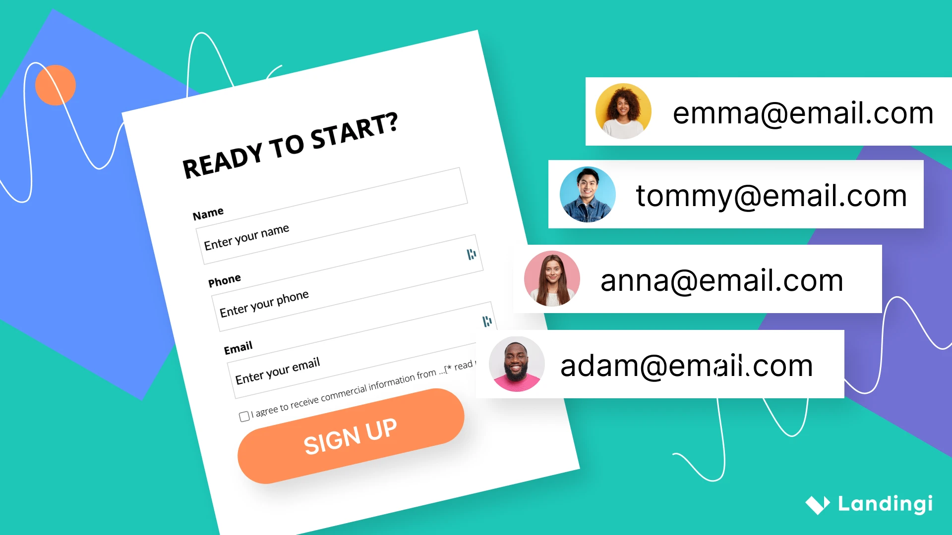
- Sign up buttons should be clear and straightforward as well as big
- Use imagery that does two things. Catches the eye of the person and explains your call to action quickly.
- Your headline should be brief, to the point, and outline a direct benefit for the consumer.
- Animated exit-popups are a great strategy to try and re-engage a consumer who has seemingly lost interest.
- Entice and engage consumers with power words
- Using other forms of media like video, audio, gifs, etc.
- Hover effects on your selection buttons to make them more engaging to click.
Using the eight-second rule is vital for conversions. Understanding your customer and the psychology behind how they are operating is crucial. Click here to learn how to understand a customer.
Use faces to make your landing page more human
By incorporating human faces, the consumer will automatically be more emotionally connected to the content. So use faces on your landing page to invoke this emotion. If your company has a face for the brand, use that one. It is also important to have consumers have some familiarity with the brand. If they recognize the person, then they will feel more comfortable with the content. Do a professional photoshoot, taking a lot of horizontal photos and white space on either the right or left side of you. That space is critical because you can place a call to action in or text beside you.
Starting with basic psychological principles to recommendations from experts, these tips use science and experience to deliver you the best way to build a landing page. They take advantage of recent trends in designing and writing as well, so you can rely on them to work for your landing page and bring you many happy customers.