

I will be showing you the answer in a second, take a look at the background first.
The background
I am a Customer Success Manager at Landingi.com. My role is to help our customers achieve their success. I wish they would ask me questions like: “Listen Mike, how can I make this to high converting landing pages?”, that’s easy, my usual answer is “Just make it simpler – add more value and you’re done”. This does not happen, ever.
Customers want MORE… more slides, animations, gifs, pop ups, background videos, blinking texts and kittens. They want every element to distinguishing itself from other distinguishable elements. To which, my usual response is facepalm.
They think they know better. They heard that kittens, gold fishes and pop ups convert better. I somehow heard rumors too. I agree that things like pop ups can* convert** better*** (many gotchas here). But there are costs that marketers does not take under consideration – user confusion, irritation, bad experience and finally – low quality of converted leads.
Let’s get to the point.
How to achieve high conversion rates?
- Deliver high value. Focus on the needs of your potential customer.
- Set a low barrier. Don’t throw bricks in your user’s face! You have to minimise the number of barriers.
- Make your offer clear and easy to understand. No hidden catches.
- Carefully target your audience. Say NO to random visitors (they just bring costs).
Achieving high conversion is simple. Just show clear value to a good target audience and you will be rewarded. That’s it.
You want to know how does a ~80% conversion rate landing page looks like? Here you go:
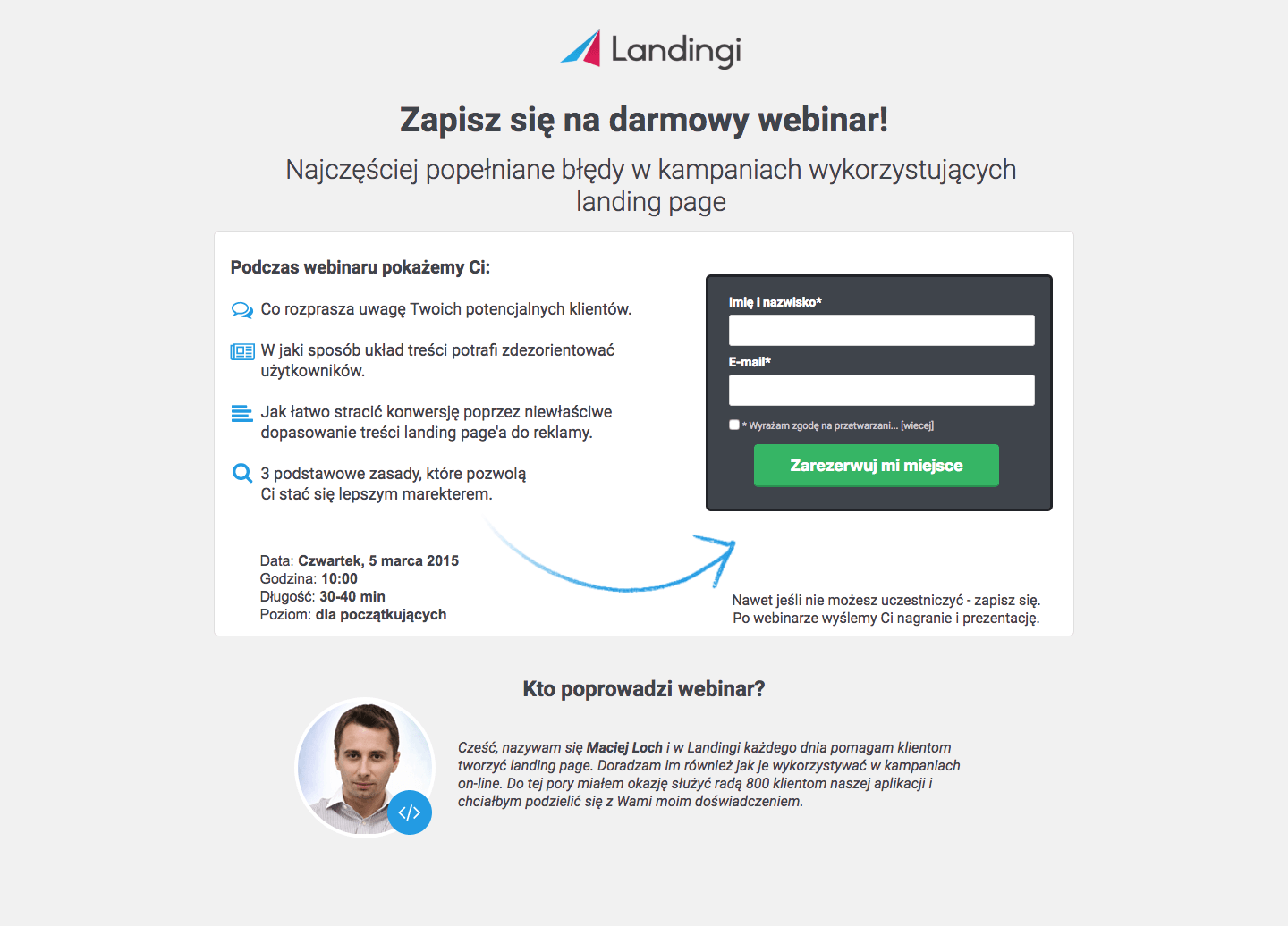
It was targeted at Polish audience so… it’s in Polish.
What makes it special?
I’m gonna explain what’s going on here – this high converting landing page consists of:
- Company Logo.
- Headlines corresponding to the previous context.
- Bullet points with value for the user.
- Additional information (date, length).
- Sign up form with name, email address and marketing agreement checkbox.
- Few words about the speaker.
It’s a webinar sign up page with clear message, contrasting call to action and some visual cues pointing at the CTA. No magic.
That’s why it’s so successful.
But that’s not the end of story. That’s just the beginning.
Depending on the target audience and the title of the webinar (title can be perceived as value) the landing page that converts was constantly performing at 60 – 80% conversion rates. So I thought to myself that I can give this template to my customers and help them achieve similar results.
But, as I said before… customers always know better. They were experimenting with different variations.
I was displeased at first. I was looking at the mutated experiments with regret. I thought that all my efforts to educate my customers went down the drain…
I have moved on to new project and forgotten about the whole case.
A year has passed, I have been analyzing some of the most successful campaigns ever created in Landingi and I’ve stumbled upon a very interesting case. One of my clients had repetitive campaigns with 80 – 95% conversion rates. At first I thought it must be some kind of mistake – I dug deeper.
The template that did the trick
It turned out that the most successful campaigns were made using my landing page template. But how did he manage to get the 95% conversion rate?
He was using the template I gave him with one extra feature – exit intent pop up, offering additional value for the unconvinced users. Checkout the results from one of his micro campaigns:
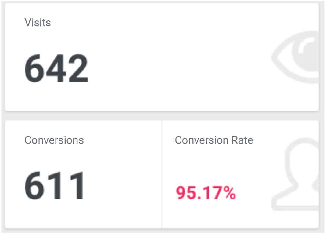
He has offered that little bit of additional value that tip the scales to his favor. He has used a pop up that was showing up when the user scrolled the mouse up (high probability of closing the page). I would have never taken that approach. I would have given the full value to everyone. He did something I would never even attempt to try. It made me think.
I have analyzed every mutation of that template and I have found one of the keys to conversion rate optimization success – evolution.
Conversion rate optimization requires many, random, sometimes counterintuitive changes. It’s going to break the conversion most of the time. But sometimes you will get results that greatly exceed your expectations.
Takeaways
There are some ground rules that never change. Your conversion rate will be mostly dependent on perceived value, conversion cost and the target audience. The more distractions you put on your landing page, the higher the cost is. Focus on the value. You will be able to regulate the quality of leads by adding or removing the number of form fields.
Go ahead and try similar landing page for yourself. Remember that I have only tested it as a webinar sign up page directed at the ‘warmed up’ audience. I am unable to guarantee any results for your target audience.
I recommend checking it out for yourself.
And if you want to create your own landing pages in Landingi…