If you are a part of the fast-paced business world, then possibly, you often ponder about optimizing your landing page so that it generates massive leads. You might even turn to some lead generation software. But like a lot of other people in your domain are you also guilty of overlooking the things that might be hurting your landing page marketing?
Because, let’s face it – most of the time we are tweaking this and testing that without even realizing that there might be something in our site that is turning users away. You don’t want your prospects to be turned off by something in your website – especially the most crucial of them all – your landing page.
And this is no small deal either. This friction element can cause you a major problem. Remember that improving the website always comes second (even if close second) to fixing frictional elements. Because to impress your prospects, you have to make them stay long enough to explore things without immediately bouncing back. And no matter whatever lead generation software you use, nothing would help you unless you realise the root of the problem.
So, what do you think is the problem? What is going wrong with your landing page?
This post will give you an insightful overview into the mistakes that might be hurting your landing page marketing. Along with some helpful tips and tricks that will help you fix them in no time.
Harness the power of AI to generate copy, edit images, and improve SEO. All within a single platform.
Save time and get one step closer to perfection.
Slow Landing Page Speed
You may think that the loading speed is secondary, but believe it or not speed has probably the single biggest impact on landing page performance.
If you don’t believe word of mouth, then here’s some interesting detail for you.
Sites that loaded within 5 seconds boast 25% higher ad viewability, 70% longer average sessions, and a 35% lower bounce rate.
And unfortunately, it doesn’t matter what you are offering, how jaw-dropping your deal is if people don’t even stick around to discover it. Especially on mobiles (Overlooked that, eh?)
Okay, so that’s enough of where you went wrong. Before you start fretting and cursing yourself for this anomaly, here are a few quick tips to make landing pages blazing fast.
Do You Know What Your Landing Page Speed Is?
You know that your landing page is not loading fast enough. But have you ever thought of testing that why what margin are you lagging behind?
Maybe you have a lot of catching up to do? Or maybe you are almost there, just a few tweaks here and there will make your page load faster.
All you have to do is to test your landing page speed with Google’s PageSpeed Insights tool to quickly get a sense for how quickly (or, not) your pages are loading on desktop and mobile.
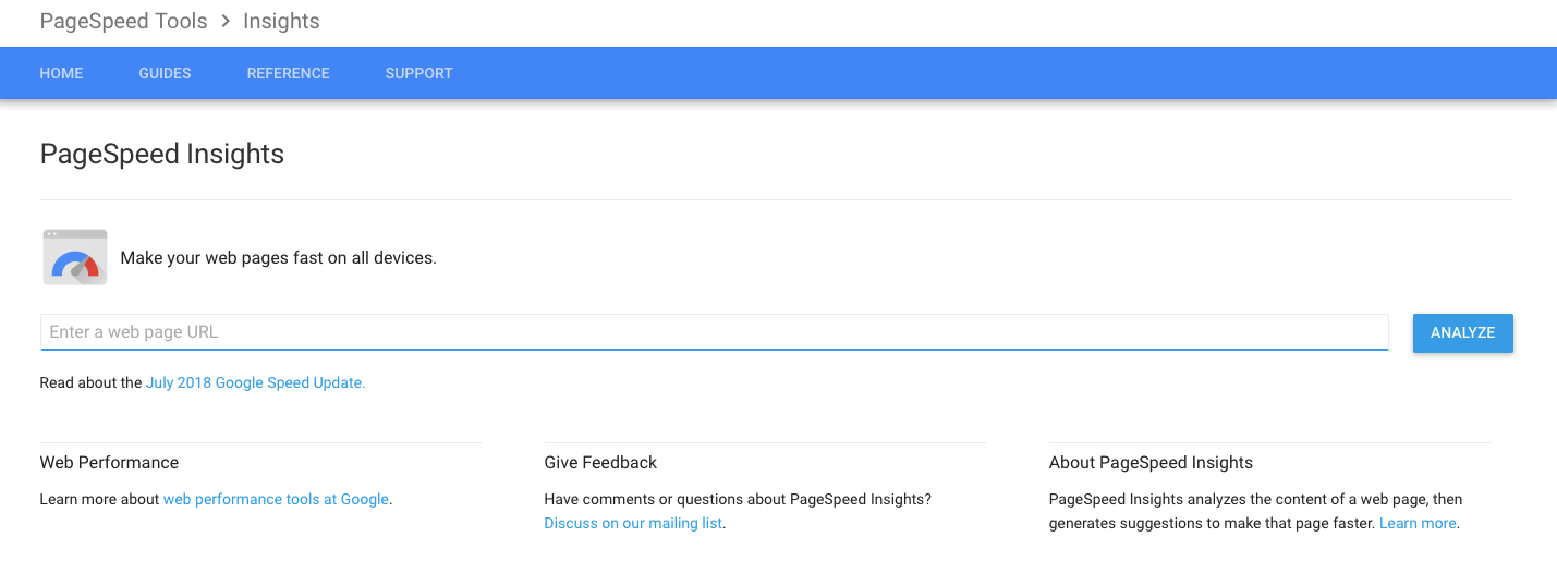
Once you enter the URL for your landing page, you will get some recommendations for possible fixes to mend your landing page speed. And you will know exactly where you are going wrong.
Is Your Code Clutter Free?
The best landing pages are clutter-free and well organized. You might think that what’s under the hood is of no importance to the audience. However, superfluous junk impinges on your page speed like nothing else.
What I mean is that don’t go overboard with your Javascript or Ajax code. It will help you in the long run if you clear all the clutter that includes unneeded sections and tags, etc.
Minimize The Redirects
What are redirects exactly?
Redirects are instructions or methods that automatically take visitors of one file to another file or location. A lot of people generally use the 301 redirect site as it has been recommended for SEO reasons for years. Therefore, if you want to keep this one, you can do that.
However, it is a good time to check for other redirects and see if you have anything else that might be slowing down your website. Useless redirects dramatically affect your landing page and not in a good way either.
How Can You Remove Redirects?
Although, there are umpteen number of ways to accomplish this. But here is one of the best and the easiest way you can follow to remove redirects.
- First and foremost, find the redirects.
- Understand why they exist.
- Then follow by checking how it affects your landing page or how it is affected by other redirects.
- Remove it if not needed.
- Update it if it affect /is affected by other redirects.
- If your site is secure, consider using HTTP Strict Transport Security to remove the ssl redirect.
Are Your Images Too Large?
Your use of visuals (both images and video) on a page can also substantially impact loading times. Therefore, make sure that you resize your images prior to upload so as to make the landing page load quickly without any hassle.
Just Say No To Cheap Hosting
When you avail the services of a cheap hosting, you might exult because you have saved a few dimes. However, in the long run, it is going to be extremely harmful to your traffic. Moreover, nothing kills load times faster than shared hosting splitting up resources across multiple sites.

Thus, simply say NO to cheap hosting.
Check this great infographic about website loading speed: https://www.top10-websitehosting.co.uk/load-time-statistics.
2. Are You Not Explaining Clearly What You Do?
Now that your customers are able to open our landing page readily, without any obstructions, what do you think is the first thing they see?
Of course, a HEADING.
So, if your headline is not clear enough, or interesting enough to grab their interest then it’s early impossible for your landing page to do what it was supposed to do, that is – converting visitors into customers.
Before we discuss how to write your landing page headline in such a way that it achieves maximum conversion, let’s discuss the things that are completely a no go.
What Should A Landing Page Headline Not Have?
- It should be free of jargons or heavy marketing terms. Because, your prospect is here to get their problems solved, not to confuse the customer.
- If your landing page lacks a personal connection with the audience, then it is a poor landing page. Sorry to say, but this is the truth. You have to build a connection with the audience.
- Don’t use ALL CAPS. Just ask yourself, if you have to read a HEADLINE IN ALL CAPS, how would you feel? Most of the time, all caps is viewed as a psychological trigger, generating feelings of fear, anxiety or anger.
- Don’t add a warning message to your headline. Or anywhere else in the landing page, for that matter.
Just imagine that you go to a website, and the first thing that you see is – “visiting this website may harm your computer” Or “This is not a private connection”
It’s like you are running your prospects away. And no amount of conversation optimization or SEO will be able to help you.
Now, you know what you have to steer clear of. Let’s move on to the next part. That is, what would you add to your headline to get your customers to take action?
Is Your Headline Believable?
Make sure that you follow these ethos without any compromise.
Don’t lie in your headline.
Don’t make a claim that’s too large for your readers to believe. I mean, don’t think that if you are promising starts to your customers, they’re gonna believe you.
Having said that, if you are indeed promising starts, then back such claims with some stellar proof. Add testimonials, case studies and more to add credibility to your “unbelievable” heading and make it believable.
Add A Purpose To Your Headline
Suppose, your prospects came across your landing page and they read your headline that goes on like,
“Sell More With Us”
WHAT? Sell what with whom? How does this help the customers? Why should they “sell” anything with you?
If you think that you can cover that part in other section of your landing page, then there’s a news for you – people don’t care enough to scroll down further to read. They will simply exit your website and avail someone else’s services.
Therefore, you have to make your headline snappy, descriptive and meaningful. It should exactly tell the customers what you do and how you are going to help them.
Is Your Headline Irresistible?
Making your headline irresistible is actually easier than you might think. All you have to do is to offer your ideal customer an attractive offer. However, the offer should not be meaningless, it should be of some value to your customer.
Here are some examples of some nice landing page headline that you can try to emulate (not word to word though).
Look at one example below,

In this case, the message is clear. “Cheat Sheets” means “hacks” or something simple that might help people work out. All in all, the offer is compelling enough to persuade a lot of people into opening up the page. They are promising simple hacks for people to get healthy (Who wouldn’t lap it up?)
How about this one:
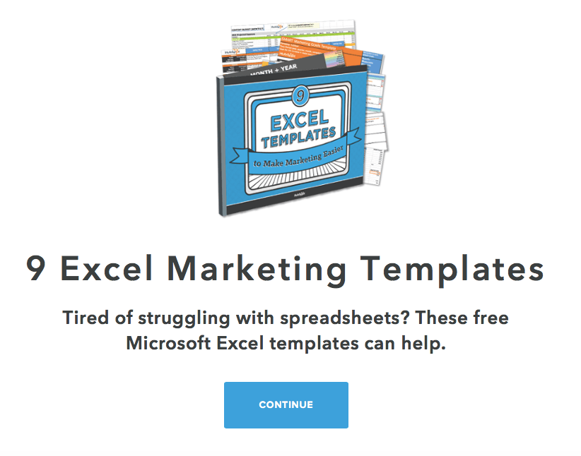
The above headlines fulfil these purposes:
- They give a solution to their audience.
- And they take away the effort on the customer’s part.
It is a win-win situation for the audience, hence, it results in heavy conversion rate.
Once you have optimised your headline according to the above conditions, run an A/B test against your existing headline.
Did the new headline win the test? Why what margin?
If you get a satisfactory answer, then it’s well and good. If not, keep running tests until you find what messaging does resonate with your audience. A/B testing your landing page is important for so many reasons.
3. Images And Other Visuals That Don’t Add Value To Your Landing Page
High quality imagery is very imperative as it generates interest in the landing page. Moreover, it creates a feeling of trust in the audience. Having said that, if you are trying to achieve all this using a “Stock Photo” then you are simply moving in the wrong direction.
Not only are those photos overpriced, but they are simply useless. Might as well put your money in the drain. Using people in real photos (instead of stock ones) can result in a 35% conversion increase.
Instead of this gimmicky visual tactic, you should focus more on this:
- Try your best to show your product or service in the best light. Better yet, show your service in use so as to give your customer a better idea of what you are offering.
- Give your audience an apt example of what they are being offered.
- If possible, show the offer and after transformation.
- Make sure to highlight the after part so people can relate to your services.
Also, make sure that you show real people. Not that people in the stock photos are not real but you get the gist, right? The high quality, original images also helps create a mood and set a tone that perfectly resonates with the words used in the headline and subhead. Together, it makes a powerful statement that people can connect with.
Couple all this with a bold, snappy headline, testimonials, social proof and you have got yourself a winner.
Which brings us to…
An amazing hack.
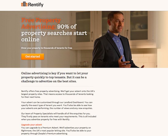
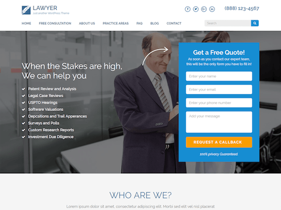
Your visitors tend to look in the direction the image is gazing in your landing page.
The landing page above, however, didn’t get the memo, it seems. Humans are social-animals and they are wired in such a way that they reflexively look where the person in the image is looking.
Now, in this landing page example, the audience will automatically be prompted to look at the CTA as the person in the image is looking downwards, somewhat in the same direction as the CTA.
4. Are Your Calls To Actions Too Generic?
It always comes down to this part – Call to action button.
You have went through a whole lot of process to direct your viewers into contemplating whether to click on the CTA or not. Now is the time for the CTA itself to work its magic.
But, some people go wrong with the basic. They put it in the wrong place altogether. It may seem like a small detail (which is sadly often overlooked), but you have to make sure that it stands out from everything else on the page. Because in the end it’s what will generate profit for your business.
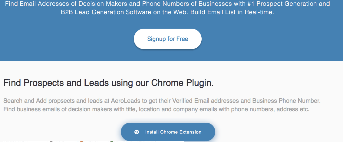
The place, word choice and the size matters a lot when it comes to your CTA. The AeroLeads example is relevant. They are pointing out what they do and how they can help their target audience and then immediately asking them to Sign Up.
And note that they have pointed out that this service will be “free” in the CTA itself. So, this way they are generating better results than the same old “Sign Up”.
Remember that bad CTAs are conversion kryptonite. All the efforts that you have done up till now will all go to waste if you don’t make your CTA right and then place it in the right place. This is your last chance to convince your customers and to prove your credibility.
5. Are You Using The Testimonials Given By Your Own Employees?
Testimonials are a great way to optimise your landing page. But if you are doing it wrong, then it may end up causing irreparable damage. And if you are using in-house testimonials then it may cause a negative reaction.
Say, for example, you are a marketing firm and you are using testimonials from one of your own marketer, then this isn’t a great way to build some credibility in the market. Not only, it will be deemed false (even if it is not), it also comes across as very unethical.
If you want to boost your conversion rate, the best way to go about it is by integrating third-party testimonials. Who’s gonna believe you if you beat your own trumpets?
6. Does The Whole Landing Page Look Okay?
Okay, so you are done with everything!
But are you really?
We have talked about the speed, the headline, the images and other visual aesthetics and we have also talked about what should an effective CTA entail and where should it be placed in your landing page. And we also discussed how you should add a perfect mix of testimonials, offers and social proofs as well.
Phew! That was one long list.
However, your work has just started. Now is the time to put it all together and finalise your landing page.
But here’s some bad news – if you don’t put it all together concisely, it might all go wrong.
250+ Landing Page Templates
Here are a few examples that might steer things in the wrong direction:
- Is The Whole Landing Page Looking Cluttered? If you are putting too many elements, no matter how relevant you think they are, they might end up distracting your viewers. And in the end they will probably leave without taking any action.
- Are Your Images Matching The Content Of Your Landing Page? Okay, you have created an amazing headline and one amazing image (that even prompts the viewers to look towards the CTA), but wait… do they match?
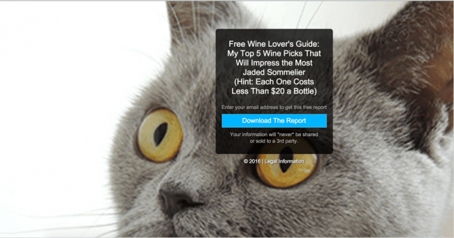
Who is going to take your seriously if you want to sell wine but showing the image of a cat?
- Where Does The Design Lead You? Your landing page should be optimized in such a way that the viewer has no doubt about where is the action button. And what it is all about.
- Where The Heck Is The CTA Hiding? Your customers should not have to go to special lengths to hunt down your call-to-action buttons. And trust me, a lot of them will not. Ideally, you should place your first call-to-action button somewhere is it is easy to spot and another at the bottom of your page.
- Does Your Ads Match With Your Content? Your landing page should match whatever paid media ads and social media posts are driving traffic to this page. You don’t want your viewers to become skeptical enough so that they exit your page without taking an action. Because, if your ads do not match with your landing design visitors may start to question whether they have landed in the right place. Or worse, they can get irked by the fact that the ads may be flagged.
- Are The Colors Too Flashy Or Too Dull? Don’t choose a color scheme that is either too bright for the eyes or something that is too sombre. Choose a color scheme that works with your brand and draws attention to the most important parts of your landing page. And make sure that all your call-to-action buttons should have the unique colors to not only draw attention of the viewer but it should also match with the overall scheme.
Hopefully, you will run down this list before optimizing your landing page. It is most important to access your landing page with a critical view so as to ensure that you are not leaving anything out. And if you think that one critical eye is not enough, it would be better if you could ask a friend or a colleague to look at the design.
Still Worried About Your Landing Page Lead Generation Strategy?
Even after following all the above points closely your landing page is still failing to generate leads then it is highly advisable to avail the services of some reputed lead generation software. But distinguishing the best fit for yourself amidst hundreds of lead generation software out there is no cakewalk.
But why do you need a lead generation software?
Simply because to automate your process and in turn negating some chaotic burden of managing your landing page leads, at some point or the other every company needs a lead generation software.
What are the things that you should consider before choosing a lead generation software?
- The lead generation software should be able to fit your budget.
- Consider the size of your company and compare whether the lead generation software is scalable
- Don’t overlook the ease of your lead generation software before choosing it
- Some lead generation software might fail to provide ROI, you should steer clear of any such software. Because such a lead generation software fails to serve the purpose.
Concluding Thoughts
It is very easy to make these mistakes (or overlook these mistakes). But as is discernible, they are not very difficult to fix. In fact, if you come to think of it, they are pretty easy to fix. You are not required to tamper with a complex code or anything.
All you have to do is to spend a little extra time building a whole strategy about your landing page. Make sure to analyze how well they speak to your customers with a critical eye. With a little extra attention, you can improve conversions and will be making money with each click!
And if you are unable to generate leads and improve conversions using in-house tactics, then it’s time to appoint a lead generation software. Don’t worry about the cost, because a lead generation software will not only automate the marketing of your landing page but also generate quick results. In the end, the money spent on the lead generation software will be worth every penny.
