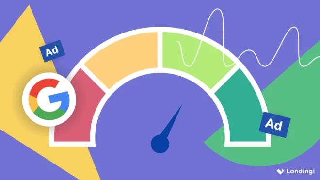
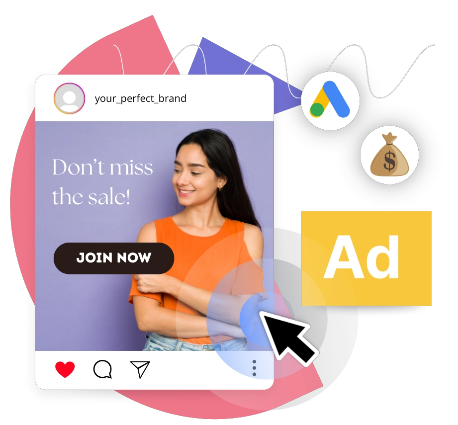
The best Facebook ads don’t just get clicks – they generate profitable conversions through strategic alignment of targeting, creative, and post-click experience. According to a WordStream study, Facebook ads achieve typical benchmarks of 2.53% CTR for lead-generation campaigns and 1.57% CTR for traffic campaigns, confirming that structured messaging and clear value propositions drive predictable engagement.
Performance, however, depends on more than the ad itself. A relevant landing page that aligns with the promise, tone, and offer in the ad increases conversion rates by reducing friction and strengthening message consistency. When your page mirrors the ad’s promise, tone, and offer, you reduce friction and strengthen message consistency – improvements that research shows can significantly boost conversion rates across industries. For this reason, advertisers who study proven Facebook ad examples and apply their structure to optimized post-click experiences transform clicks into qualified leads and sales, making an integrated strategy the foundation of effective digital advertising.
In the sections below, you will find carefully selected sample Facebook ads, insights behind the best Facebook ads, breakdowns of what defines good Facebook ads, and actionable lessons drawn from real high-converting Facebook ad examples that translate creative strategy into scalable results.
3 High-Converting Facebook Ad Examples
High-converting Facebook ads achieve one goal: turning impressions into leads or sales with measurable efficiency. The conversion rate reveals how well your ad performs this function—a high percentage means your audience targeting, creative execution, and landing page transition are working in harmony. What drives these conversions? Thumb-stopping visuals with high contrast that interrupt scrolling, concise copy that delivers one clear benefit, and credible social proof such as testimonials or star ratings. This combination reduces hesitation and compels action.
Facebook ads run on an auction system managed through Meta Ads Manager. When advertisers define their objective (lead generation, traffic, or sales), set a budget, and specify audience parameters, such as demographics, interests, and behaviors, they enter a competitive bidding environment. Meta’s algorithm decides which ads appear in users’ feeds, Stories, and other placements by evaluating three factors: bid amount, estimated action rates, and ad quality. The winning combination determines both ad delivery and cost per impression (CPM). Since auction performance depends on these variables, success requires both strategic targeting and creative relevance.
There are several main types of Facebook ads, each aligned with specific business goals:
- Image ads – single-visual ads that deliver a focused message and clear call to action.
- Video ads – motion-based creatives that explain products or demonstrate value within 15–60 seconds.
- Carousel ads – multi-card formats that showcase several products or features in one scrollable unit.
- Collection ads – mobile-first formats that combine video or image with product catalogs to drive e-commerce sales.
- Lead ads – native forms that capture user data directly inside the platform, reducing friction.
Each format supports different funnel stages, from awareness to conversion. The best Facebook ad examples combine the right format with precise targeting and a dedicated landing page that mirrors the ad’s promise.
From scroll-stopping ads to sales-driving pages! Start building with Landingi.
Below, you will find three high-performing cases that demonstrate how structure, clarity, and relevance transform creative assets into measurable growth.
1. AirAsia MOVE
Brand: AirAsia Move
Industry: Travel booking
Results: 3.8× lift in incremental conversions
AirAsia Move’s 3.8× incremental conversion lift demonstrates what happens when ad creative aligns precisely with high-intent travel behavior – the campaign captured urgency, showcased value, and eliminated booking friction within a mobile-first context.
Visual strategy drove initial engagement. The ad featured vibrant, location-specific imagery that immediately translated abstract destinations into tangible experiences. This approach leverages a fundamental principle of travel marketing: visual triggers stimulate aspirational intent more effectively than descriptive copy. Headlines layered on urgency through limited-time offers and competitive fares, directly addressing the price sensitivity that drives comparison shopping across Southeast Asia’s travel market.
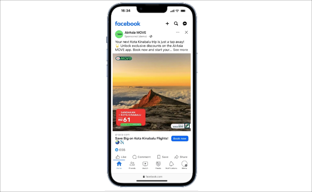
Copy and execution completed the conversion path. Messaging stayed concise and action-focused, highlighting immediate booking benefits – discounts, bundled options – instead of generic brand messaging. The call-to-action fed directly into a streamlined mobile booking flow, a design choice backed by conversion data: reducing steps between ad click and payment confirmation significantly increases completed transactions on mobile.
Three elements combine to drive the 3.8× performance: urgency-based pricing that compels immediate action, immersive visuals that transform consideration into desire, and frictionless booking that prevents drop-off. AirAsia Move proves that when creative both ignites intent and removes execution barriers, incremental conversions scale measurably.
2. PrimeCredit
Brand: PrimeCredit Limited
Industry: Consumer finance/credit cards
Results: 39% increase in completed registrations
PrimeCredit, a consumer financial group, needed to drive applications for its new WeWa credit card among Gen Z consumers. The company deployed a two-phase strategy: first, a video ad campaign featuring a young Hong Kong actor built brand awareness. Then, the team used Meta Ads Manager’s Opportunity Score – a 0–100-point diagnostic tool that evaluates campaign setup and suggests improvements – to optimize performance.
Following these recommendations, PrimeCredit diversified its creative approach by adding creator-led partnership ads alongside standard Reels content. An A/B test confirmed the impact: combining Reels partnership ads with standard ads increased completed registrations by 39% compared to standard ads alone.
Three elements combine to make this campaign effective: platform-native placement, credible social proof, and data-driven optimization. By using Reels, PrimeCredit matched Gen Z’s consumption behavior for short-form video. Creator-led content added authenticity, reducing ad resistance – a critical factor when targeting younger audiences skeptical of traditional advertising. Opportunity Score provided the optimization layer, enabling real-time adjustments based on campaign diagnostics.
Measurable results validated each phase: Brand Lift testing revealed a 12.1-point lift in ad recall and a 9.8-point increase in message association during awareness building, while A/B testing quantified the conversion improvement.
3. Reserved
Brand: Reserved
Industry: Fashion retail/apparel
Results: 13% lift in incremental omnichannel conversions (across website, app, and in-store)
Reserved achieved a 13% lift in omnichannel conversions through strategic campaign design, but the creative execution deserves equal credit for the results.
The ad’s effectiveness begins with its visual approach. Fashion advertising requires high-resolution product imagery, strong color contrast, and clear product focus to drive discovery – elements that increase thumb-stopping power and improve recall in competitive feeds. The messaging layer adds intent alignment by featuring current collections and seasonal relevance, matching the 4–12 week purchase cycles that define apparel retail, where trends shift rapidly. The call to action completes the structure.
This multi-path approach reduces purchase friction. When users click, they can buy immediately online, explore further in-app, or locate a physical store – the choice depends on their context and preference. Reserved’s case demonstrates that retail advertising performance requires an integrated approach: compelling product visuals that stop scrolling, messaging that aligns with purchase intent, and calls to action that mirror real shopping journeys. Align creative with customer behavior, and incremental conversions follow.
Stop sending traffic to generic pages! Design Facebook-ready landing pages with Landingi.
4 Creative Facebook Ad Examples
Creative Facebook ads use originality, storytelling, and visual contrast to cut through feed clutter and drive engagement. The challenge is timing: Facebook users decide within 1–3 seconds whether to keep scrolling or engage with sponsored content. This brief evaluation window makes creative differentiation essential for performance in competitive feeds.
Creativity manifests through unexpected visuals, bold hooks, humor, interactive formats, or narrative-driven structures – executions that break pattern recognition and command attention. Strong ad copy reinforces these visual concepts by delivering one clear message with precise wording and emotional direction, ensuring the creative concept translates into comprehension and action.
Below, you will find four creative Facebook ad examples that demonstrate how originality, clarity, and contextual relevance transform standard promotional content into high-impact campaigns.
1. Realtor.com – Real Estate Facebook Ad Example
Realtor.com combines celebrity endorsement with product demonstration to create a narrative-driven real estate ad. The video opens with Reba addressing viewers directly, which immediately captures attention through familiarity and authority. Instead of starting with listings, the ad begins with personality, which increases initial retention in a competitive scroll environment.
The creative structure follows a simple arc. A couple searches for homes using traditional methods, then Reba introduces the Realtor.com app as the smarter solution. The phone screen display showing property images shifts the message from emotional storytelling to functional proof.
The ad’s effectiveness comes from balancing entertainment and utility within a single creative execution. The combination of storytelling, endorsement, and interface visibility, used in sequence, demonstrates how 30 seconds can communicate both what a product feels like and what it actually does.
2. Ethos – Life Insurance Facebook Ad Example
Ethos builds its creative strategy around simplicity. The ad strips away visual noise to spotlight emotional headlines and bold pricing tiers against a neutral background. Strong green price blocks create immediate contrast, directing attention to coverage amounts and monthly costs. What could be an overwhelming financial decision becomes a scannable, digestible offer.
The creative angle focuses on responsibility and family identity. Lines such as “Keep being the dad they can count on” speak directly to a specific target audience – parents who evaluate financial decisions through protection and long-term security. Instead of technical policy explanations, the ad leads with emotional resonance, then validates choice through transparent numbers.
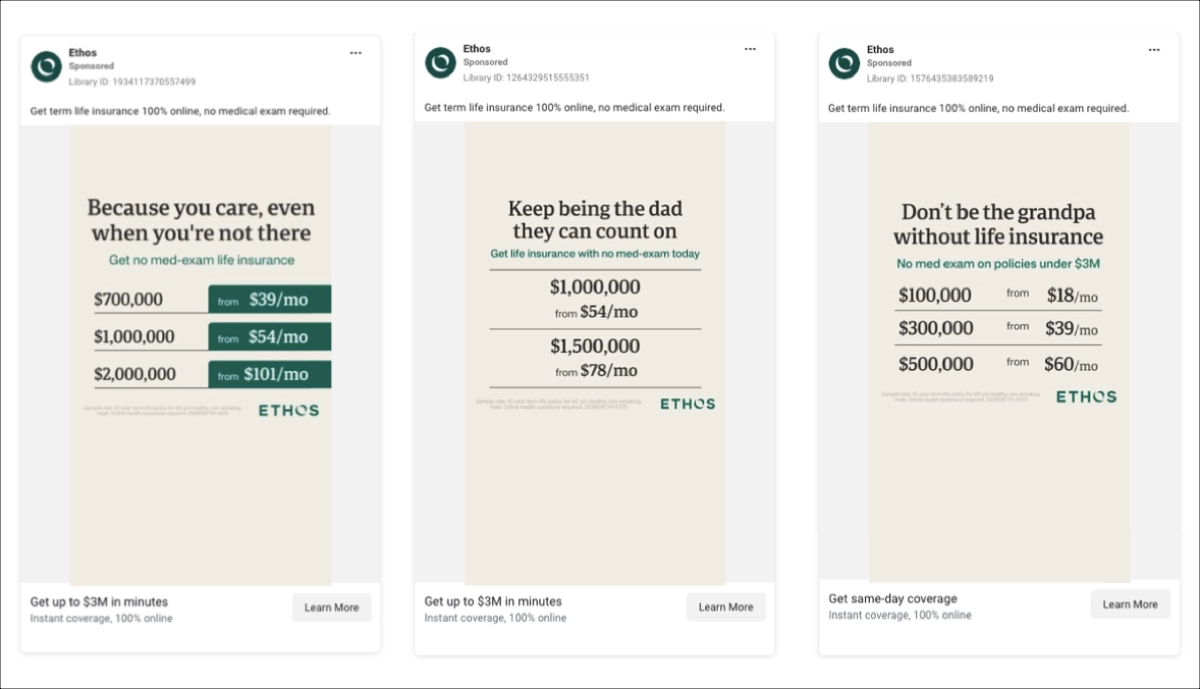
The effectiveness stems from addressing two barriers simultaneously. “No medical exam” removes process friction while visible pricing corrects cost overestimation – a common obstacle in life insurance consideration. Emotional messaging stops the scroll; clear pricing builds confidence. This combination of empathy and clarity drives conversion intent in the critical first seconds of exposure.
3. Retro BŁYSK – Photography Facebook Ad Example
Retro BŁYSK positions wedding photography as memory preservation rather than technical service through emotion-first storytelling. A warm golden-hour embrace between bride and groom immediately captures the audience’s attention, using intimacy and light as the primary engagement mechanism. Cinematic glow, deliberate soft focus, and refined typography establish artistic credibility within seconds of viewing.
The ad’s image carries the persuasive weight. Expertise is demonstrated visually rather than described through copy – a more credible approach for a service where output quality determines purchase decisions. The minimal centered headline preserves compositional elegance, while secondary gallery previews beneath the main frame communicate portfolio breadth without fragmenting the viewer’s attention.
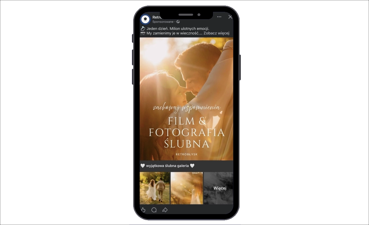
The strategy aligns precisely with how wedding photography purchases are made. Couples select photographers based on aesthetic resonance, emotional trust, and aspirational alignment rather than service descriptions. This structure naturally functions as a lead-generation ad, guiding emotionally engaged viewers toward inquiries, pricing requests, or gallery exploration. Emotion and visual authority combine to generate both lasting memorability and measurable inquiry intent.
Boost your Facebook Ads ROI with optimized landing pages from Landingi.
4. Houk Air Conditioning DFW – HVAC Facebook Ad Example
Houk’s ad succeeds by dramatizing a common household problem and converting it into a bold visual offer. The creative angle centers on discomfort – the opening line speaks directly to heat-related frustration, immediately activating emotional relevance. Rather than a generic HVAC promotion, the ad frames the service as relief from a specific seasonal pain point.
Design amplifies urgency through oversized typography that makes “10% OFF REPAIR SPECIAL” the dominant focal point. The large numeric discount commands attention while red and blue contrast increases visual intensity, a color pairing that signals both urgency and trust.
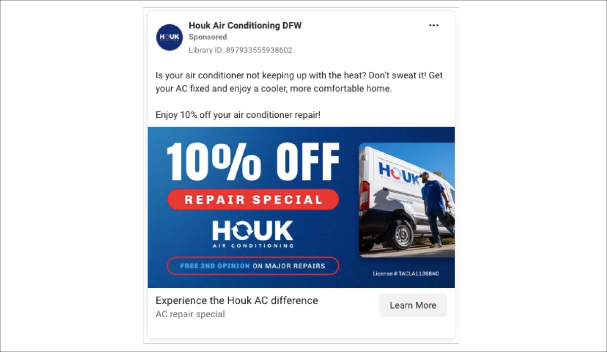
The creative structure follows a proven formula: identify the problem, present a bold financial incentive, and reinforce reliability with visual proof. For service-based businesses, this direct offer format converts attention into inquiries by making the value proposition instantly measurable and emotionally relevant.
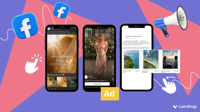
3 Carousel Facebook Ad Examples
Carousel Facebook ads display 2–10 scrollable images or videos within a single placement, creating an interactive format that increases engagement time and content depth per impression. Each card supports its own headline, description, link, and call to action, enabling structured storytelling or product segmentation within a single ad unit.
The format serves multiple strategic purposes:
- showcasing product collections (apparel, footwear, accessories),
- explaining processes through sequential steps,
- comparing features side-by-side,
- demonstrating transformations through before-and-after sequences.
E-commerce advertisers leverage unique URLs per card to track product-level clicks and accurately attribute conversions. Service businesses use the sequential structure to present benefits, pricing options, and trust signals in logical order.
Performance of carousel ads hinges on strategic card sequencing. The opening card must stop the scroll with a compelling hook or standout product. Middle cards build value by expanding on features, presenting proof points, or showing variations. The closing card creates urgency or delivers a direct call to action. When card order mirrors natural decision-making flow, carousels increase dwell time, lift click-through rates, and pre-qualify traffic before the landing page.
The three carousel Facebook ad examples below illustrate how structured visual sequences and narrative design convert casual scrolling into measurable engagement and action.
1. Waldorf Astoria Seychelles Platte Island
Waldorf Astoria positions exclusivity and prestige through visual storytelling that works in seconds. Multiple images flow through the carousel format: turquoise waters, private villas, sunset dining, refined interiors – each card presenting a distinct luxury dimension. Nature, privacy, design, and recognition emerge as distinct narrative beats rather than competing elements in a single static frame.
The opening card captures the viewer’s attention with Forbes Five-Star recognition, an authority signal that elevates perceived value immediately. This credential placement functions as upfront social proof before users engage deeper. The following cards build emotional connection through immersive island environments and intimate guest experiences, reinforcing both aspiration and lifestyle alignment.
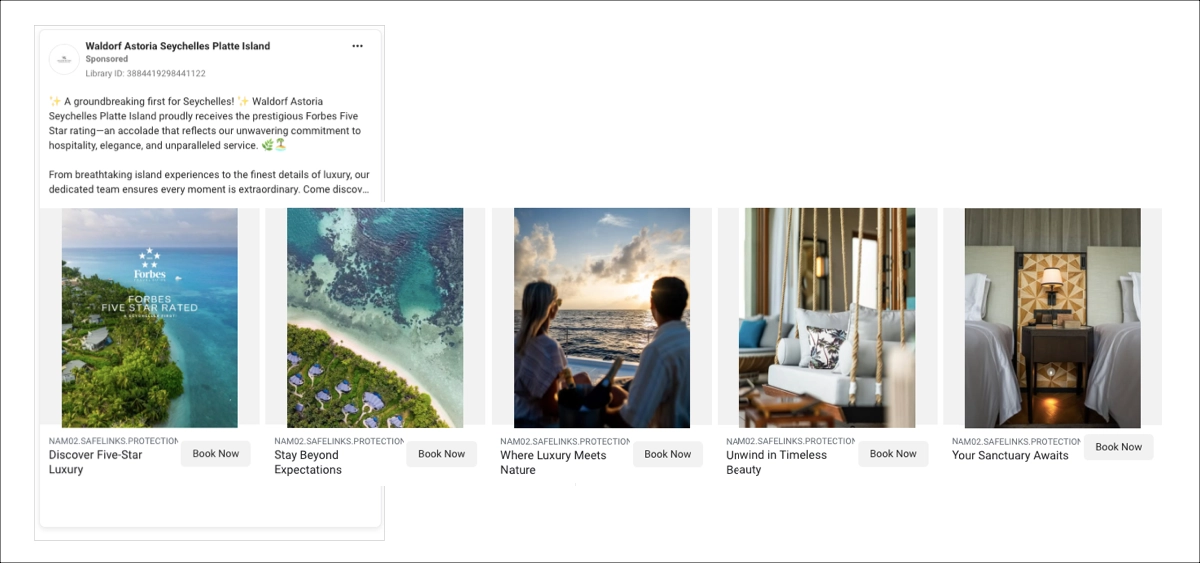
The creative power resides in controlled progression. Each swipe reveals another sensory dimension of the resort experience, making this ad feel like curated storytelling rather than direct promotion. The “Book Now” call-to-action button remains consistent beneath every card, providing transactional clarity without interrupting the visual narrative. Authority validation, aspirational imagery, and seamless booking access converge to convert emotional response into booking intent.
Click. Convert. Scale. Power your Facebook campaigns with Landingi landing pages.
2. ZeroB Pure Water Solutions
ZeroB uses structured visual communication to convert technical specifications into lifestyle value. Each carousel card presents one isolated benefit (portability, 99.99% germ protection, zero electricity dependency, stainless steel durability, and environmental impact) rather than competing for attention in a single layout. This distributed approach enhances both message clarity and audience retention.
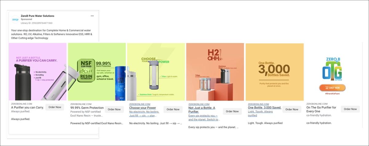
The carousel structure follows decision-stage logic. Each card swipe answers a specific buyer question in a natural progression:
- product identity,
- performance validation,
- operational simplicity,
- and comparative advantage.
This sequencing mirrors actual consideration behavior, extending engagement duration while building complete product comprehension. Through quantified proof points, color-coded visual organization, and single-benefit card focus, the ad transforms technical product complexity into a clear purchase rationale.
3. Polène
Polène uses carousel storytelling to announce its first London flagship store, prioritizing location-driven engagement over transactional promotion. The creative avoids discount messaging and feature lists, instead focusing on a singular objective: driving foot traffic and establishing brand authority in a premium retail environment.
The carousel structure operates as a virtual storefront. Each card maintains the “View the store” headline alongside a “Get Directions” button, transitioning user intent from digital exploration to physical destination. For ad viewers, this design eliminates conversion friction by embedding wayfinding functionality directly in the ad experience.
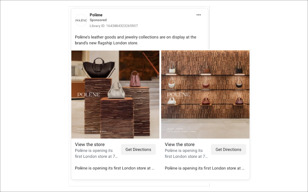
The ad’s effectiveness stems from strategic-creative alignment. Minimalist visual treatment amplifies perceived value, the flagship opening provides discovery novelty, and the integrated location-based action converts passive interest into trackable store visits.
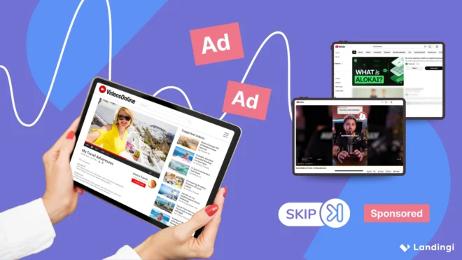
2 Video Facebook Ad Examples
Facebook video ads capture attention within just a few seconds, making the opening frame and the first 3–5 seconds the most performance-critical elements of any video campaign. Motion, sound, and sequencing give video an inherent advantage over static formats—communicating value faster and with greater emotional impact.
The format’s flexibility extends this advantage across multiple content types. Unlike image ads, video ads allow brands to demonstrate product use, document transformation results, feature customer testimonials, or share behind-the-scenes processes. Each approach increases message retention and strengthens purchase consideration.
Four primary video formats serve different campaign objective:
- In-feed video ads autoplay in the main feed, requiring strong visual hooks and captions to sustain engagement
- Stories and Reels video ads occupy the full screen in a 9:16 vertical format, demanding fast-paced mobile-native editing that matches platform consumption behavior.
- In-stream video ads deliver concise brand messaging within longer publisher content, prioritizing recall over extended storytelling.
- Video carousel ads present multiple short clips in a swipeable sequence, making them effective for showcasing product variations or communicating benefits step by step.
Regardless of format, high-performing video follows the same four-part structure: a hook that stops the scroll, a demonstration that communicates the offer, proof that builds credibility, and a call to action that directs response.
The five video Facebook ad examples below demonstrate how motion, pacing, and storytelling translate into engagement and conversion performance.
1. Auk
AUK transforms a product update into entertainment through period drama storytelling. A Bridgerton-inspired setting – 19th-century costumes, aristocratic mannerisms, theatrical dialogue – frames the launch of an AUK Mini garden in cork as a scandalous society revelation. Two women react with theatrical shock, elevating a material change into a cultural moment worth watching.
Contrast drives the creative concept. Placing a modern Scandinavian indoor garden within a classical aristocratic environment creates a deliberate time collision that generates humor and memorability. The exaggerated reactions (“Such bold… Scandalous!”) transform an ordinary product feature into dramatic entertainment, sustaining attention for 20–30 seconds without relying on specification lists or promotional copy.
Effectiveness stems from the intersection of trend culture and brand positioning. Period-drama visual language attracts audiences conditioned by streaming-series aesthetics, while the cork material connects directly with Scandinavian design principles of natural materials and minimalism. Humor reduces advertising resistance while narrative structure carries viewers through to the final product shot that grounds the entertainment in brand context. The result is a feature announcement with genuine recall value and organic shareability potential.
Turn engagement into revenue! Build conversion-focused pages with Landingi today.
2. Cider
Cider builds its persuasion strategy around movement and immediacy. A short-form vertical video captures a model adjusting a satin dress in natural outdoor light, using the opening seconds to grab attention through fabric flow and texture contrast. Rather than static posing, subtle movement demonstrates how the dress responds to light, increasing the product’s perceived realism in a format where authenticity drives engagement.
Creative execution acknowledges the in-stream context, where viewers encounter ads mid-content and make immediate engagement decisions. The visual atmosphere reinforces the dress’s aesthetic positioning, while consistent center framing maintains product focus throughout the full clip.
Ad copy distills the brand into a single memorable line: “Wake up. CIDER. Sleep. Repeat.” Rhythmic brevity builds recall without competing with the visual experience. The “Shop now” button links directly to the online store, converting engagement into a purchase before the viewing context shifts.
Effectiveness stems from replacing explanation with demonstration. Motion proves fabric quality, natural lighting establishes authenticity, and a call to action captures shopping intent at the moment in-stream exposure creates it.
Start Building Landing Pages that Boost Your Facebook Ad Performance
Successful Facebook ads do not rely on luck. They rely on structure, testing, and alignment. The brands featured in this article – from global retailers to regional service providers – achieved measurable results by treating every element of the campaign funnel with equal strategic discipline: audience selection, creative execution, and the continuous testing that determines whether good campaigns become great ones.
However, understanding what makes great Facebook ad creative is only half the equation. The other half is building post-click environments that sustain the momentum the ad created. Personalized landing pages matched to specific ad sets, offers, and audience segments eliminate the message inconsistency that kills conversion rates. This alignment is where paid campaigns optimization moves from theory into measurable revenue impact.
Landingi makes this process accessible and scalable. Its landing page builder enables rapid creation of tailored post-click experiences for every campaign variation. Built-in A/B testing helps identify which page elements drive conversions, while EventTracker captures the behavioral data needed to optimize continuously. Together, these tools close the gap between ad performance and landing page results. Try Landingi now and start converting your Facebook ad traffic with the precision it deserves.