
Display ads are visual ads that appear across websites, apps, and platforms such as the Google Display Network. They can use images, text, video, or interactive elements to build awareness, promote an offer, bring visitors back through remarketing, or drive traffic and conversions. Because they compete with the content people actually came to see, the message has to land quickly.
But even the best display ads only get visitors through the door. After the click, the landing page should continue the same offer, messaging, and campaign goal. Strong message match makes the journey feel natural, while sending highly specific ad traffic to a generic page can waste the attention – and budget – the creative worked to earn.
With Landingi, you can quickly create dedicated landing pages for Google Ads and other display advertising campaigns, including generating complete, editable pages with Lunar, its AI-native landing page generator. This makes it easier to build separate post-click experiences for different offers, audiences, and campaign messages rather than forcing every ad to lead to the same destination.
Below, you’ll find 10 display ad examples worth studying for their creative, messaging, and approach to turning a few seconds of attention into action.

10 Best Display Ad Examples
The best display ads don’t all chase the same result. Some introduce a product, some bring previous visitors back, and others push a specific purchase or sign-up. What they have in common is focus: one audience, one message, and a clear reason to take the next step.
The following display ad examples show how brands approach that challenge across different industries and campaign goals. For each one, we’ll look at why it works and what you can take from it for your own display advertising campaigns.
1. ING – consideration
ING shows that a financial-services ad doesn’t have to look like every other financial-services ad. The creative uses an upside-down portrait to interrupt a familiar visual pattern, while the short message directs attention toward ING’s expertise for large corporate clients. That fits the bank’s broader Wholesale Banking positioning around global reach, sector expertise, and helping businesses navigate complex decisions.
This is a good example of a display ad built for consideration rather than an immediate sale. The visual earns attention first, while the message gives the right audience a reason to explore the offer further.

Why it works: The unexpected image creates a strong visual stop without making the message difficult to understand. The creative is distinctive enough to be remembered, but still connected to ING’s positioning.
What to learn from it: In categories where most ads look similar, breaking the visual pattern can be more effective than adding more copy. If the ad creates curiosity, make sure the landing page answers it quickly and continues the same idea rather than dropping visitors onto a generic corporate page.
2. Netflix – engagement
Netflix’s Wednesday Season 2 creative takes almost the opposite approach: it doesn’t need to explain the product because Wednesday Addams is the message. The character, gothic visual language, and dark humor make the campaign recognizable almost immediately, while the copy builds interest around the show’s return rather than pushing viewers toward a subscription pitch.
It’s a useful display advertising example of engagement-led creative. Netflix can rely on an established character and visual world to generate recognition and anticipation, keeping the ad focused rather than filling limited space with plot details or platform benefits.
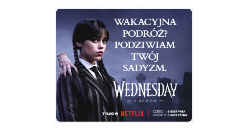
Why it works: Strong visual identity does much of the communication before the viewer even reads the copy. The tone is also consistent with the series, so the advertising feels like an extension of the product being promoted.
What to learn from it: If your product or campaign already has recognizable assets, use them. Consistency between the ad, its message, and the destination after the click can be more powerful than trying to introduce a new creative idea at every stage.
3. Booking.com – lead generation
Booking.com for Business uses a much more straightforward approach: make the value easy to understand before asking for the sign-up. The ad promotes a business travel account that brings accommodations, flights, and rental cars into one platform, giving companies a practical reason to click rather than relying on a broad travel message. Booking.com for Business still centers its offer around booking and managing these parts of business travel from one place.
That specificity matters for lead generation. The audience knows who the offer is for, what they’ll get, and what action comes next without having to decode the creative.
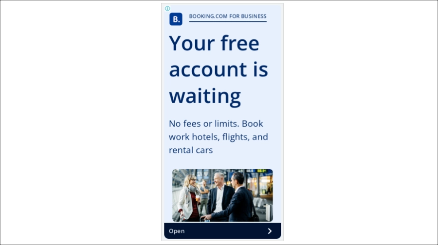
Why it works: The value proposition and CTA are direct, while the business-travel imagery reinforces the use case without competing with the message.
What to learn from it: If the goal is registration, reduce ambiguity before the click. Then carry the same promise onto the landing page – ideally with the offer, benefits, and sign-up action immediately recognizable from the ad.
4. Chime – product consideration
Chime takes the entertainment route. Its 2025 holiday campaign casts Jason Momoa as a series of mall employees – including a mall cop and mattress salesman – while introducing financial tools designed to make holiday spending less stressful. The campaign ran across several channels, including programmatic display and video, making it a useful example of how one creative idea can stretch across different ad formats.
The celebrity is there to earn attention, but the joke isn’t the whole ad. Chime works product benefits such as fee-free banking and cash-back points into the story, giving viewers something concrete to associate with the brand after Momoa has done his part.
Why it works: Entertainment creates the hook, while recognizable product benefits give the campaign substance. The concept is also flexible enough to stay consistent across display, video, social, and other placements.
What to learn from it: Humor and celebrity can win attention, but they shouldn’t become the only thing people remember. Effective display ads connect the creative hook to a clear product benefit, so the audience leaves knowing both who entertained them and what is actually being offered.
5. Merrell – sales
Merrell keeps the sales message simple: one product, one context, one next step. The Ontario hiking boot takes center stage against an outdoor backdrop that immediately communicates where the product belongs and what it is built for. There is little need for explanatory copy because the setting does part of that work.
This is a useful banner ad example for product-focused campaigns. Rather than showing an entire footwear range, the creative concentrates attention on a single item and supports it with lifestyle imagery that makes the product easier to imagine in use.
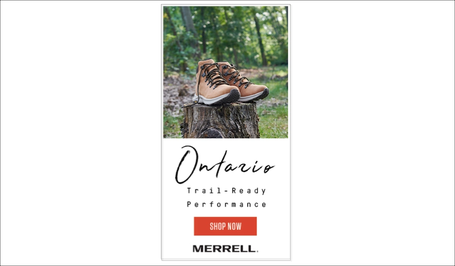
Why it works: The product is unmistakably the focal point, while the outdoor setting reinforces its purpose without cluttering the limited ad space. A clear CTA completes a very short path from product discovery to shopping.
What to learn from it: For sales-focused display ads, don’t make one small creative carry your entire catalog. Give a strong product room to sell itself, then send the click to a page where the same product, imagery, offer, and purchase path are immediately recognizable.
Build a dedicated landing page that continues your ad’s offer and gives visitors a clear path to conversion.
6. ECCO – catalog engagement
ECCO takes the opposite route and makes choice itself part of the creative. By placing several footwear styles side by side, the ad works like a miniature storefront: viewers can compare products before they even click.
That makes it a useful example for broader retail display advertising campaigns, where the goal isn’t necessarily to sell one hero product but to bring shoppers into a relevant category or collection. The restrained branding also leaves more space for the shoes themselves.
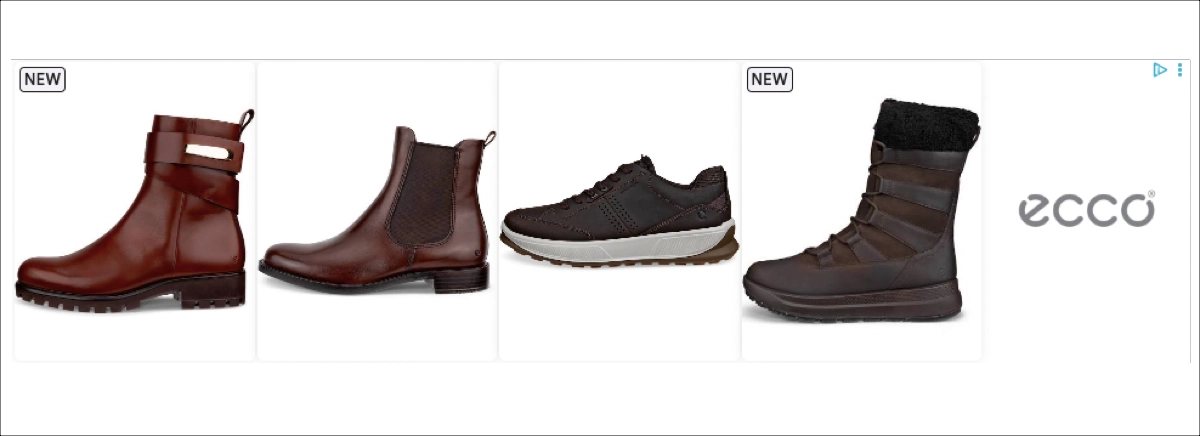
Why it works: Multiple products create an immediate sense of range while keeping the creative easy to scan. For someone already interested in footwear, seeing several options can provide more reasons to explore the collection.
What to learn from it: Match the amount of choice in the ad to the destination after the click. A multi-product creative should lead to the corresponding category or curated collection, not an unrelated homepage where visitors have to find those products again.
7. Fanatics – remarketing
Fanatics uses a familiar e-commerce formula: products, recognizable team merchandise, and visible discounts in one compact creative. Price reductions such as 25% or 30% give shoppers an immediate reason to look again, while the product-led layout makes the ad easy to understand without much supporting copy.
This format is particularly well suited to remarketing, where the audience may already know the retailer or have shown interest in sports merchandise. Fanatics also operates offsite programmatic advertising built around reaching sports audiences beyond its own properties, so display remains part of its broader advertising ecosystem.
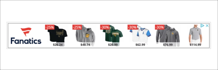
Why it works: Familiar products and prominent savings communicate value almost instantly. There’s little for the viewer to decode before deciding whether the offer is worth a click.
What to learn from it: Remarketing works best when the creative gives people a specific reason to come back. A discount, recently viewed category, relevant product, or limited offer is more persuasive than simply showing the brand again. Just make sure the destination reflects what the ad promised.
8. Busuu – app promotion
Busuu makes the product itself part of the ad. By showing the learning interface and speaking experience, the creative gives potential users a quick preview of what using the app actually feels like rather than relying on generic promises about learning a language.
That’s particularly useful for an app like Busuu, where features such as Speaking Practice provide AI-generated pronunciation feedback. Showing that experience makes an otherwise abstract benefit – becoming more confident speaking another language – much easier to understand.
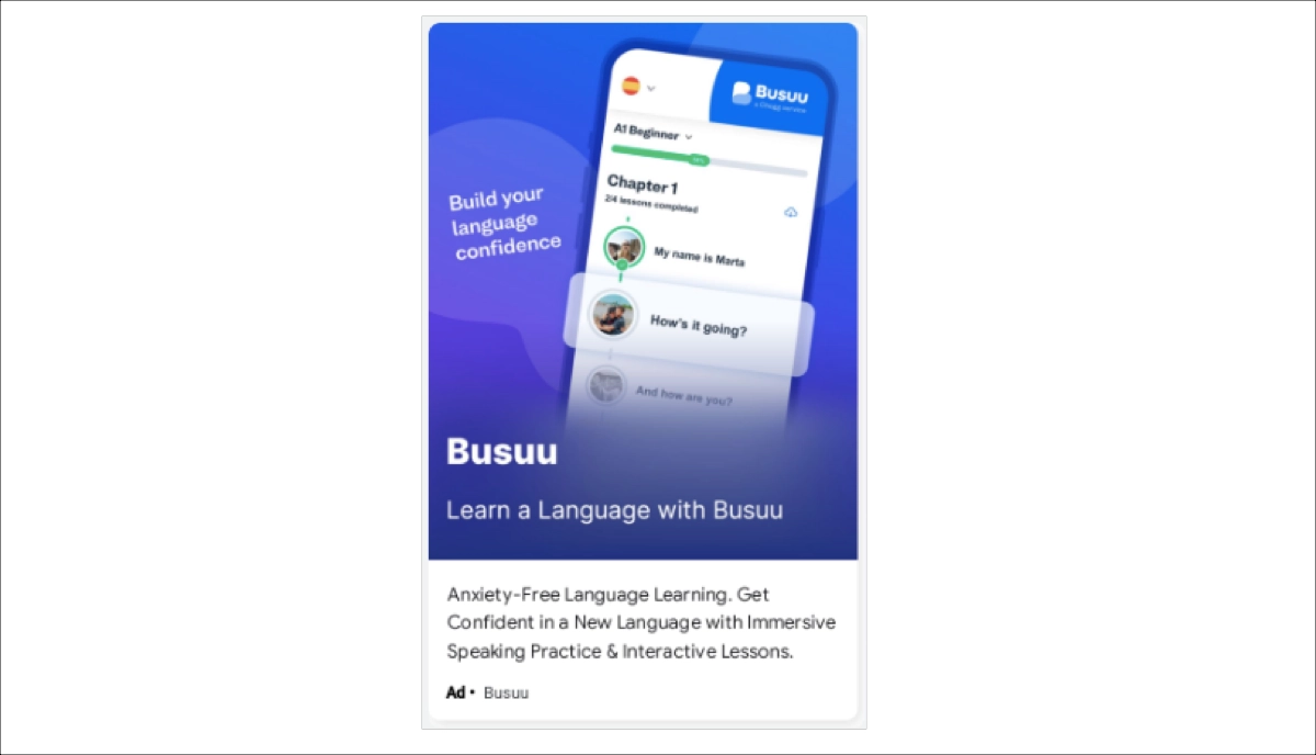
Why it works: The product demonstration does much of the explaining. Viewers can connect the promise of language practice with a concrete feature before they click.
What to learn from it: If your interface is one of your strongest selling points, show it. Effective display ads don’t always need elaborate creative concepts – sometimes a clear glimpse of the product plus one meaningful benefit is enough to earn the click.
Build campaign-specific landing pages with Landingi and give each audience a post-click experience that matches the ad they clicked.
9. FIXIT Mobile – traffic
FIXIT Mobile tackles the questions people naturally have before handing over an expensive phone for repair: How much will it cost? How long will it take? Can I trust the service? Its display ad puts those practical benefits upfront and then gives viewers a low-commitment next step – visit the website and explore the offer.
That makes it a useful example of traffic-focused display advertising. The ad doesn’t try to complete the entire sale inside a small banner. It gives someone with a specific problem enough information to make clicking worthwhile.
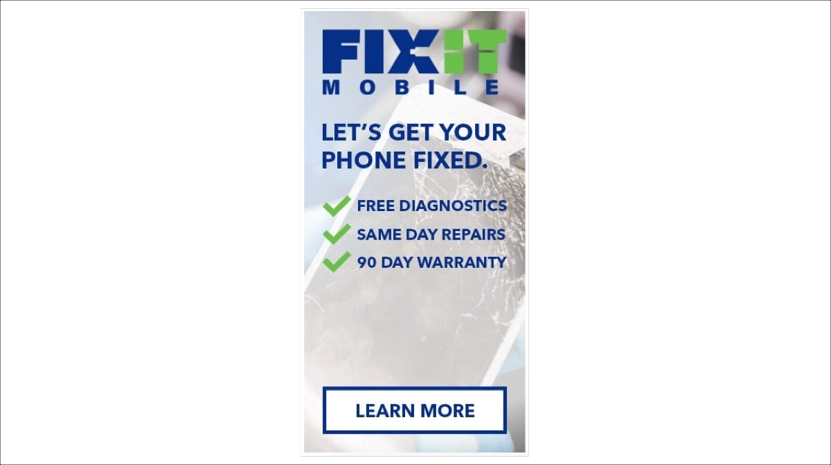
Why it works: The message addresses real purchase barriers rather than filling limited ad space with generic claims about quality. Each benefit gives the viewer another reason to consider the service.
What to learn from it: For service businesses, start with the questions customers ask before buying. Your ad can answer the first two or three, while the landing page takes over with pricing, service details, trust signals, and a clear booking or contact path.
10. TaskRabbit – conversion
TaskRabbit can be much more direct because its audience often arrives with a job already in mind. The ad pairs home-improvement messaging with a Book Now CTA, moving quickly from “here’s what we can help with” to “here’s how to get it done.” That fits TaskRabbit’s current service model, where users choose a task, match with a Tasker, and schedule the work.
The image of someone actually doing home improvement work also makes the service tangible. That’s useful for a marketplace selling other people’s time and skills rather than a physical product.
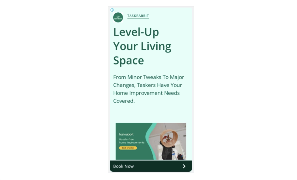
Why it works: The creative combines a recognizable problem, a human visual, and a specific action. There’s little ambiguity about what TaskRabbit offers or what happens after the click.
What to learn from it: When the audience already has strong intent, don’t make the CTA unnecessarily soft. High-converting display ads can move directly toward booking, getting a quote, or purchasing – provided the landing page makes that same action just as easy to complete.
What Makes a Good Display Ad?
The strongest display ad examples combine a clear benefit, distinctive creative, relevant targeting, and an obvious next step.
Several elements consistently make effective display ads stronger:
- A visual that earns attention. Display ads compete with the content around them, so the creative needs enough contrast or personality to break through banner blindness. That can mean an unusual composition like ING’s, a recognizable character like Netflix’s, or simply a product shown clearly in the right context.
- One clear value proposition. Limited ad space rewards focus. The viewer should understand what is being offered and why it matters without having to work through several competing messages.
- Concise copy and a specific CTA. Headlines should do the heavy lifting, while the CTA should make the next step predictable. Book Now, Shop Now, or Check Availability tells users much more than a generic Learn More when the campaign supports that level of intent.
- A format that supports the message. Static banners, responsive display ads, video, animation, and dynamic product creatives can all work. Motion or interactivity isn’t automatically better – the format should make the product or message easier to understand, not harder.
- Creative matched to audience intent. A remarketing ad can be specific about products or offers because the viewer may already know the brand. An awareness campaign usually needs more context. The best creative reflects where the audience is in the decision process.
- Strong message match after the click. This is where even a great ad can lose the conversion. The landing page should continue the same offer, imagery, value proposition, and CTA rather than making visitors start over on a generic homepage.
For display advertising campaigns, the ad and landing page should therefore be treated as one conversion path. A creative earns the click; the post-click experience has to justify it.
Create campaign-specific landing pages with Landingi that carry your ad’s message all the way to the conversion.
How to Create an Effective Display Ad?
Start by deciding what the ad should achieve – awareness, traffic, remarketing, lead generation, or a sale – and build each creative around one offer and one action. From there, Google recommends a few practical steps for creating effective display ads:
- Use responsive display ads. Upload assets in several formats so Google Ads can adapt the creative to different placements and devices. You can provide up to 15 images. Google supports landscape (1.91:1), square (1:1), and optional portrait (9:16) assets, with recommended sizes of 1200 × 628, 1200 × 1200, and 900 × 1600 px, respectively.
- Keep imagery clean. Use high-quality images with a clear subject and simple composition. Google recommends avoiding text-heavy images, collages, and excessive blank space. Logos should also remain legible at small sizes.
- Write for limited space. Use a straightforward headline that communicates the product or benefit, then let the description add useful context. Avoid all caps, clickbait, and generic copy that says little beyond “Learn more.”
- Show concrete reasons to click. If price, a discount, promo code, exclusive offer, or another decision-making detail is important, put it in the creative rather than expecting users to discover it later.
- Create several variations. Google recommends creating 3-4 ads per ad group with different combinations of messaging and imagery. This gives the system performance data to work with and helps identify which approach resonates with the audience.
- Match the landing page to the ad. Don’t send a product promotion to your homepage or make visitors search for an offer they just clicked. The destination should immediately reflect the ad’s product, promotion, message, and CTA.
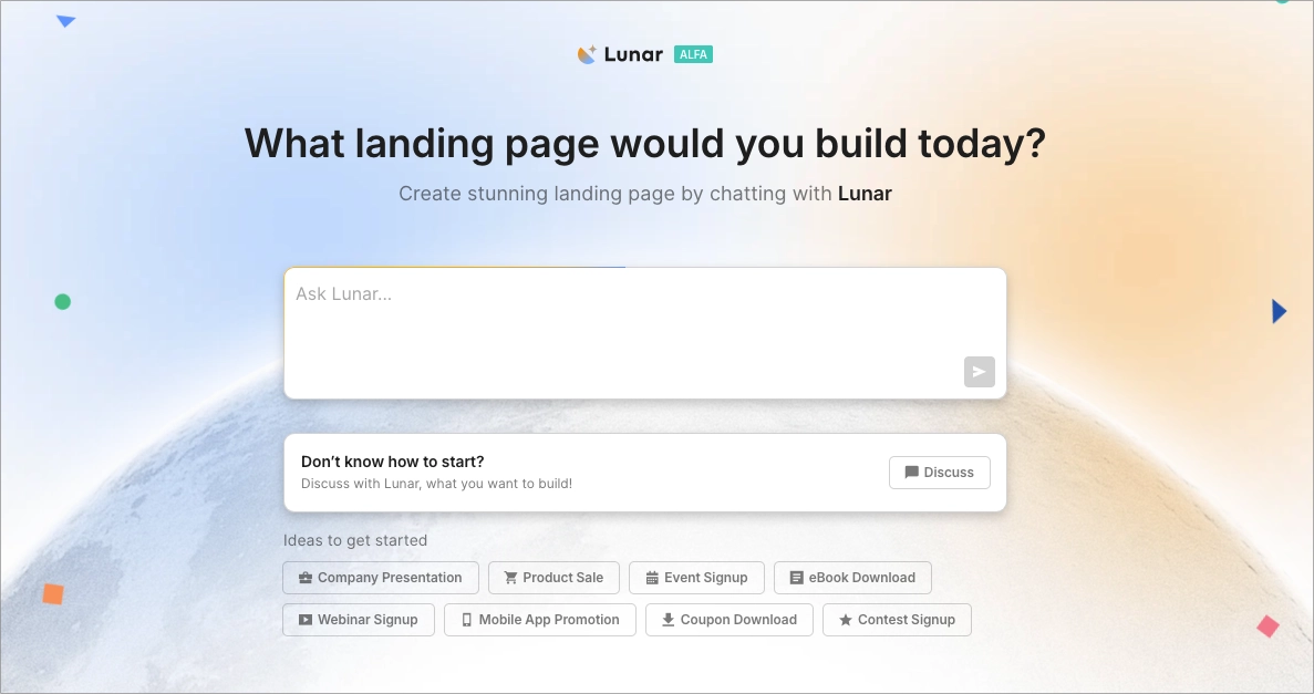
That last point is worth planning before the campaign goes live. With Lunar, you can turn a campaign brief into a complete, editable landing page in minutes, making it practical to create separate post-click experiences for different offers or audience segments. This way, improving message match doesn’t have to mean manually building every campaign page from scratch.
Turn your display campaign brief into a complete, editable landing page that matches your ad’s offer and message.
FAQ About Display Ads
Display advertising covers more than traditional banners, and its performance depends on what happens both before and after the click. The answers below clarify the most common formats and how display ads fit into the wider conversion path.
What are the most common types of display ads?
The most common types of display ads include static image ads, responsive display ads, animated ads, video ads, rich media ads, and dynamic or remarketing ads.
Responsive display ads are particularly important in Google Ads because they automatically adapt combinations of uploaded images, logos, headlines, and descriptions to available placements. Dynamic ads can go a step further by tailoring products or content to the viewer, which makes them especially useful for e-commerce and remarketing campaigns.
The right format depends on the campaign goal. A simple static creative may be enough for a focused promotion, while video can demonstrate a product and dynamic formats can reconnect users with products or offers relevant to their previous behavior.
How do display ads and landing pages work together?
A display ad creates interest and earns the click; the landing page turns that interest into the intended action. The two should therefore share the same offer, message, visual direction, and CTA.
If an ad promotes 20% off a specific product, for example, visitors should immediately see that product and discount after clicking. Sending them to a generic homepage forces them to search for what the ad already promised.
This message match is particularly important when running multiple display advertising campaigns for different audiences or offers. Dedicated landing pages let you continue each campaign’s message and give visitors a focused path toward purchasing, registering, requesting a quote, or another conversion goal.
Are banner ads and display ads the same?
Not exactly. Banner ads are a type of display ad, but display advertising is the broader category.
Banner ads traditionally refer to rectangular visual ads placed within websites or apps. Display advertising can also include responsive ads, animated creatives, video, rich media, and dynamic formats that adapt their content or dimensions to the placement.
So, while many banner ad examples are also display advertising examples, not every display ad is a traditional banner.
Turn your campaign traffic into conversions with dedicated landing pages built for every offer and audience.
Build Landing Pages for Your Display Ads with Landingi
A strong display ad can earn attention, but the landing page has to turn that attention into action. If you’re running several ads for different products, audiences, or promotions, sending every click to the same generic page makes it harder to maintain message match and gives visitors more work to do.
With Landingi, an AI landing page operation system, you can create and manage dedicated post-click experiences for Google Ads and other display advertising campaigns. Use Lunar to generate complete, editable landing pages from campaign briefs, then adapt the offer, copy, visuals, and CTA to the ads sending traffic to each page.
Once campaigns are running, EventTracker captures how visitors interact with those pages, including clicks, scrolling, form activity, and other events. Solis analyzes this behavioral data together with the landing page and campaign context to surface alerts, discoveries, and optimization recommendations. This creates a continuous workflow from launching campaign-specific pages to understanding where ad traffic converts, where it drops off, and what may be worth improving next.
A display campaign shouldn’t end at the click. Try Landingi and turn every ad into a complete conversion path – from the first impression to the final action.